Ecommerce User-Centered Design: Core Principles That Drive Better Results
User-centered design improves your customers' experience and your conversion rate. It's a win-win. Here are 12 principles that drive results.

When shoppers arrive on your ecommerce website, you want them to feel at home. You want them to feel like your site was made specifically for them, like everything is right where they left it.
Why should the experience feel familiar and intuitive? It’s not complex: Customers who feel known and understood are more likely to buy from you.
Therefore, the design of your store – and your entire business – should come from a place of empathy. You need to create a customer-centric experience if you want to maximize conversion.
In this article, we’ll briefly define the concept of user-centered design and explain why it’s important for ecommerce. Then we’ll lay out the fundamentals of user-centered design and teach you the process. Our aim is to provide you with practical, usable ideas you can leverage to boost your key performance indicators across the board with a user-centered website.
What is User-Centered Design?
User-centered design is an iterative design process where you focus on your users’ needs. It’s how you create valuable, intuitive, and accessible products and experiences for your customers. The international standard 13407 is the basis for many UCD methodologies.
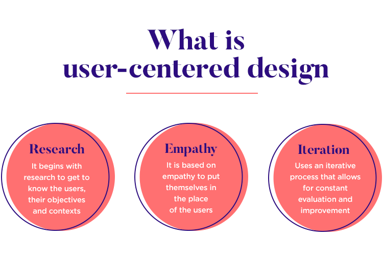
A keyword there is “iterative.” This isn’t something you do once and forget about. Understanding your users’ needs and baking that learning into your store is an ongoing process that only ends when you close up shop or sell the business.
User-centered design comes from a place of empathy with your customers.
Keep in mind that you don’t need to optimize your ecommerce experience for all humans. You only need to focus on certain visitors – the ones who are most likely to become customers.
The user-centered design process requires four important phases: context, requirements, design, and evaluation. Once you complete a cycle of this design process, it starts all over again from the top. We explain this process in more detail below.
Why User-Centered Design is Crucial to Ecommerce
User-centered design is a clear way to boost your ecommerce conversions, improve customer engagement, and create a better overall experience. Let’s illustrate this with a fictional example.
Imagine you are an amateur guitarist. You’re done with your cheap starter guitar and ready to move on to something more serious. So you visit a popular online guitar store. When you arrive on the site, you are immediately overwhelmed by choices. There are links to different guitar styles and types (which you don’t understand) and guitar brands (which you’ve never heard of). You don’t understand what any of this means, so you leave the site.
On another guitar vendor’s site, you find categories for “best amateur guitars” and “best guitars under $300.” Those are exactly what you’re looking for, so you start there. You find a much smaller selection of guitars. Now your decision is much easier.
The first site isn’t designed for new guitarists, but the second one knows that new guitarists don’t have enough knowledge to make complex decisions. They need recommendations that make their choices simpler. At this point in their musical hobby, price is a bigger factor than, say, string material or fretboard length.
Does this mean the first site has a poor user experience? Not exactly. It just means they are focused on a different kind of customer. Perhaps their customers are experienced guitars who already know enough to make decisions about style, brand, and other details.
And that’s just one example of how user-centered design affects the ecommerce experience. Imagine that same vein of thinking throughout every element on your site – your navigation menu, your category pages, footer links, etc.
Implementing user-centered design principles offers three big benefits:
1. User-centered design improves the customer’s experience
Customer experience is the biggest benefit of user-centered design. It makes it easy for users to navigate and explore your ecommerce site because it matches the journey with their expectations and needs.
The easier it is for them to find and checkout with the items they want, the more you’re going to be able to sell them. Strong user-centered design fine-tunes the interaction between buyers and your website.
Good website design means putting information and actions in front of the user at the right time so their path to conversion is smooth and frictionless. You want them to effortlessly land on product pages that make sense for their needs.
Notice how Apple uses a clever row of icons within their Mac category to help you find the right subcategory. This helps users understand, at a glance, what they need. If a customer isn’t sure which product is right for them, the icons give them visual clues. For instance, you can tell right away that iMacs are not laptops.
The goal of user-centered design is to create an intuitive experience. Ideally, your website visitors shouldn’t even be aware that you have taken steps to create a quality experience. This is one of those things that’s invisible if it works.
2. User-centered design establishes credibility
People want to be known. They want to know that you understand them well enough to provide solutions to their problems. When they realize that you understand them, you become a trusted ally in their eyes. Thus, they become far more willing to make a purchase.
You can establish this credibility by creating an ecommerce experience that meets their specific needs. They say, “Ah, finally someone who knows what I want.”
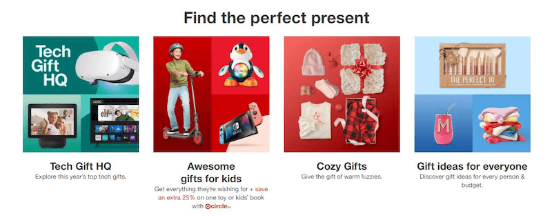
Target excellently builds credibility with their customers by including this row on their home page. They know that some customers come to their store to buy gifts, but don’t know what to get. In response, Target built custom categories to help them find the perfect presents.
If users don’t find you credible, there’s no way they will trust you with their money or private information. They will assume that your lack of credibility extends to your products. 95% of new products launched each year fail because of a lack of perceived credibility.
Keep in mind that this credibility doesn’t develop spontaneously. It requires you to consistently meet their needs with each interaction, before, during, and after the transaction.
3. User-centered design fosters customer loyalty
The formula is simple: If customers have a good experience on your site (because it’s made specifically for them), they are more likely to return in the future. We all shop at Amazon because the experience is reliable and fast. Though you may not be able to replicate the hundreds of tests their team runs to improve user experience and profitability, you can study your users at a smaller scale and create experiences that help them purchase the products they want and need.
In fact, you can even go so far as to think of user-centered design as part of your relationship with your customers. Creating an experience that serves them well is a function of empathy. Answering their questions before they ask is – in a roundabout way – conversation.
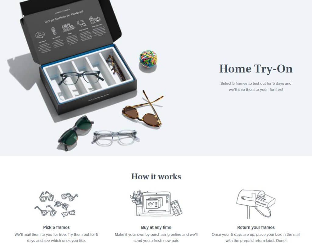
Consider Warby Parker’s offer. They know their customers want to try on glasses before they commit to buying. But that was previously impossible when purchasing online, so they give customers the opportunity to try multiple pairs at home and send the unneeded ones back. After using a system like this, could you imagine going anywhere else to buy glasses online?
User-Centered Design Principles
In the hyper-competitive world of ecommerce, one little tweak can spell the difference between a happy customer and a lost transaction. If your website helps your visitors reach their goals, they will see value in it. If you do it better than other brands, then you have a significant competitive advantage. Therefore, user-centered design principles are at the core of conversion rate optimization.
Your best prospects have two primary desires when they visit your ecommerce website: research products and buy products. Your job is to make it super-easy to do both by following these 12 principles.
1. Speak their language
The job of your ecommerce website isn’t to show visitors how knowledgeable you are. It’s to simply and plainly guide them towards learning what they need to learn and buying what they need to buy.
Keep explanations and commentary straightforward and succinct. If you only need 10 words to say something, don’t use 11 words. Avoid industry jargon and esoteric terms. One exception is on business-to-business sites where technical talk might be expected and necessary.
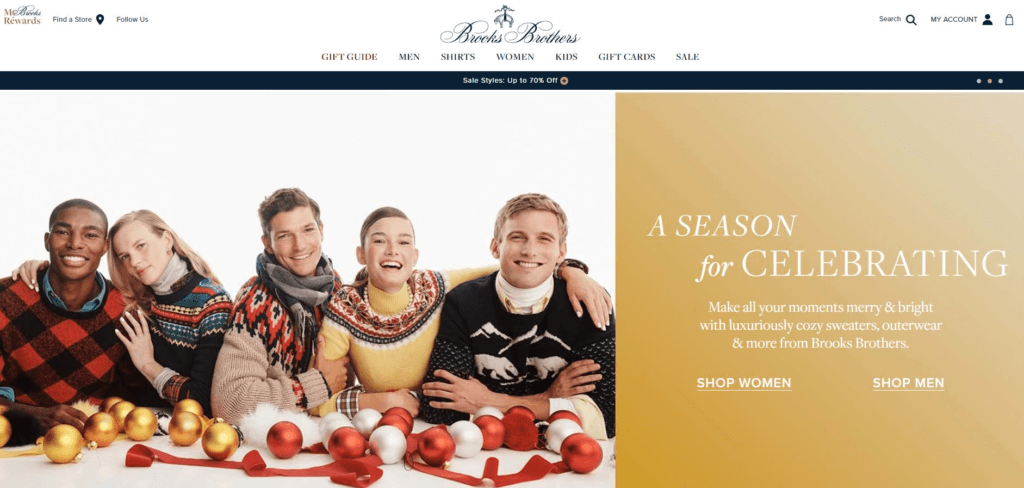
Brooks Brothers know their customers aren’t shopping their store for products they need. They’re looking for luxury products that make them happy. The store’s language is clear and direct.
2. Don’t ask your visitors to think too much
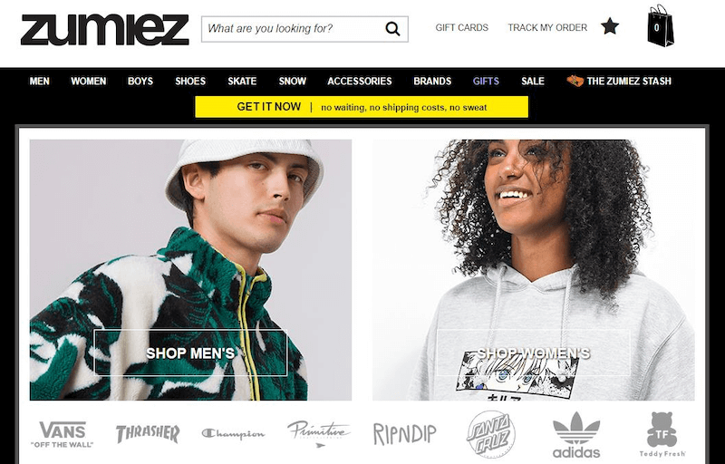
Shoppers want the path to be uncomplicated. They don’t want to make too many choices or be forced to stop and think very deeply. When you arrive on Zumiez’s site, you have to make one simple decision right away: shop men’s or shop women’s? (That doesn’t require much thinking!)
Pre-fill information where possible. Never ask them to re-enter the same data into different forms (think about how much you like filling out redundant paperwork at the doctor’s office).
Keep instructions visible and accessible at all times. Don’t make them leave the current page to find something related to the task at hand.
Aim to make buying from you the easiest, most natural thing they’ve done all day. Avoid the manufacture of cognitive overload. It will sink your site.
3. Design for speed and simplicity
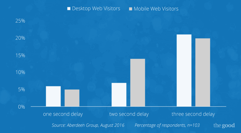
If your website takes more than a few seconds to load in a visitor’s browser, chances are high that person will leave and go somewhere else. This graph shows how quickly visitors will abandon your site when they encounter load delays.
Keep in mind that this doesn’t just apply to your homepage. If your filters or product images are sluggish, that will reduce your conversion rate as well. Slow-loading sites lose customers. Never stop checking yours. It’s quick and easy.
4. Maintain consistency
If visitors move from one page to another on your ecommerce site and feel like they’ve gone to a different site instead of a different page, they’ll soon be clicking away. Not maintaining a consistent look and feel breeds distrust. Shoppers need reassurance that you are stable and will follow through on the promises you make. Consistency is a major factor in trust.
5. Give shoppers plenty of feedback
Did entering an email address in your form achieve the desired result? Did the shipping choice apply properly? Your customers don’t want to guess whether their actions registered or not. They want certainty.
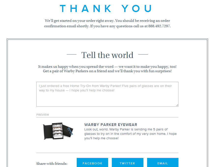
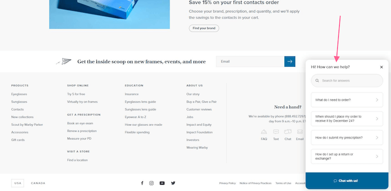
If a transaction needs a few seconds to complete, then make it evident to the shopper the gears are whirling and confirmation is on the way. When the transaction is complete, a simple “thank you” page signals the end of the process. Warby Parker does this well by 1) telling the customer what happens next, 2) offering contact information, and 3) collecting feedback.
6. Design for mobile
According to the latest stats, 79% of smartphone users have made a purchase using their mobile device within the last 6 months. And 80 percent of shoppers turn to their phones to begin product research, rather than heading to the store to browse.
Saying that mobile is hot with consumers is an understatement. Make sure your ecommerce website performs flawlessly on desktops, tablets, and mobile devices. How do you do that? Test and adjust.
7. Make navigation clear and consistent
Navigation mechanisms are a huge part of user-centered design. Like road signs on the interstate, they let you know where you are now and where you can go next. Components of a well-functioning navigation system include menus, page titles, search capability and breadcrumbs.
Banana Republic uses a clear navigation hierarchy to help customers find what they need. Customers are never asked to make a difficult decision, so the process is frictionless.
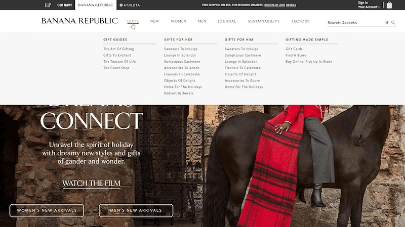
Your navigation strategy should be arranged to suit the preferences of your best prospects – typically, that means focusing on task completion for an ecommerce site. Clear, simple, user-centered navigation keeps customers happy.
8. Provide appropriate directions and support
At every point where a potential question arises, give the visitor a way to get that question answered. Provide contact information for customer support. Add a live chat function to guide the shopper along the path to sales.
The key is to provide enough freedom for confident shoppers to get through selection and checkout with minimum barriers and interference, but to be right there and available to anyone needing assistance.
9. Give the visitor options
Some customers need more information than others. Don’t overload every visitor with a page of information about each product you sell, for example. Instead, give them the option of clicking a link to open up that page.
User-centered design principles put the steering wheel firmly in the hands of visitors. Don’t force them to do things your way. Find out what they like best and arrange your site so they can do it their way.
10. Keep it simple
This can’t be stressed enough. Look out for designers who “over-design.” Keep your copy and graphics simple and direct. Don’t expect visitors to slow down long enough to “get it.”
Think of Super Bowl commercials you’ve seen that leave you wondering what in the world they’re trying to sell. Then do the opposite. Cute might impress a few, but plain and simple will sell a lot.
11. Provide context (and catch errors along the way)
Too many or too few numbers in a phone number or zip code, not choosing the preferred method of shipment – the list could go on.
Providing hint text and clear instructions on your forms will create a more seamless experience.
For example, if the form field reads “Phone number” a good hint text might be 555-555-5555 or (___) ___ – ____. These are good context clues for users because they are specific to that field only and they suggest correct formatting.
If the user does happen to make a mistake, don’t wait until they submit the form to announce errors, do it at the point the mistake was made.
12. Get user feedback
How do you know what works and what doesn’t? The sure path to understanding is to observe prospects as they interact with your website. You can do that in the wild by using tools that allow you to watch live as visitors navigate your site, or you can do that as part of a pre-arranged testing protocol.
User-Centered Design Process
A good user-centered design process addresses the entire user experience. This includes more than just your website. You should also consider your social media campaigns, email campaigns, ads and retargeting, and pre-sale and post-sale support.
Think about it like this: The last time you made a purchase on an ecommerce store (including Amazon) probably involved several touchpoints. You might have discovered the product on Facebook or another site’s banner ad. You may have read a blog post review of it by a third-party or checked the company’s Google reviews. You may have explored the product’s page on the store’s website or mobile app. After purchasing, you may have visited the “shipping policy” page to find out when you would receive your item.
These kinds of touchpoints are growing each day. They are key opportunities to learn about your customers, but they also deserve to be managed as part of the overall user experience.
There are four steps to the user-centered design process. You should apply all four steps to each of your touchpoints.
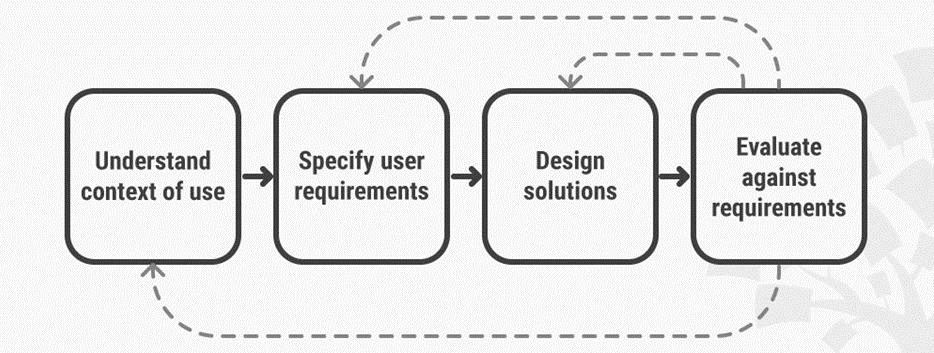
- Understand the context of use: Who will use the product? What will they use it for? Under what conditions will they use it?
- Specify requirements: Do your customers have any goals or requirements that must be met for the experience to be successful?
- Create design solutions: Build from solutions from a rough concept to a complete design. This part may require several stages.
- Evaluate designs: Test your design via usability testing with actual users, then evaluate if your solutions satisfy the context and requirements.
Let’s walk through this process with an example to give you an idea of how it works. Let’s say we want to apply our user-centered design principles to one of our touchpoints: the “My Account” page.
What’s the context of this page? Customers who made an account typically access it after they make a purchase to check on the status of their order or instigate a return/refund process. They might also use this page to change their account password, default address, or payment details. It is not used by non-customers.
What are the requirements of this page? Since customers come to this page with a clear need to access one or more of its controls, the page needs to be simple and accessible. The design should be intuitive. All of the necessary links should be visible right away. Fast usability is key because no one comes to this page for fun.
What design changes can you make? This depends heavily on what you know about your customer, but for the sake of example, let’s say your customers are anxious buyers who like to follow their purchase’s tracking information closely. You could design a better experience for them by adding this tracking information to a tab in the My Account page.
Your last step is to evaluate the change. Do people use the new tracking feature? You could measure this by setting up a Google Analytics event for the feature and/or gauging how many people create support tickets for tracking details. Gather as much feedback from real users as you can.
Getting Started with User-Centered Design
We’ve already outlined the user-centered design process, but you may still be wondering, “How do I get started with user-centered design?”
Remember: User-centered design is design that stems from empathy with your customers. Your first step, therefore, is to learn as much as you can about your customers. You must unpack everything about them – their hopes, dreams, needs, preferences, frustrations, loyalties, and goals. You must have a better understanding of them than they have of themselves.
Where can you learn more about your customers?
- Website analytics
- Your shopping cart analytics
- Usability testing
- Heatmaps/session recordings
- Interviews with customers
- Surveys, reviews, and testimonials
Once you’ve collected data and knowledge on your customers, use it as a lens to examine every aspect of your store. Then walk through the four steps of the user-centered design process, armed with your understanding.
The Key to Effective User-Centered Design
It’s a tough pill to swallow, but your own preferences can get in the way of ecommerce results for your company. Executives who make marketing decisions based on what they like and what they think are quickly being overtaken and beaten out by executives who realize the value of data-driven decision making.
Know your prospects. Find out what they want. Give it to them. Your customers are the key to effective user-centered design.
Need help implementing user-centered design principles in your store? We can help with our digital experience optimization services. We’ll help you understand why more visitors are not buying from your website. Learn more.
Enjoying this article?
Subscribe to our newsletter, Good Question, to get insights like this sent straight to your inbox every week.
About the Author
Jon MacDonald
Jon MacDonald is founder and President of The Good, a digital experience optimization firm that has achieved results for some of the largest companies including Adobe, Nike, Xerox, Verizon, Intel and more. Jon regularly contributes to publications like Entrepreneur and Inc.