
Why Cognitive Load is Hurting Your Conversions (and How to Fix It)
Get cognitive load UX right and you remove obstacles from your buyer journey. Get it wrong and you're working against yourself.

Could cognitive load theory (CLT) be the answer to your conversion rate optimization woes?
Do you wonder why your visitors can’t seem to follow the path to sales you’ve so painstakingly provided – even though you know all the information they need is right there on the page?
We get it.
At The Good, the “lost visitor syndrome” is an integral part of our work. We often tell clients, “Hey, this is actually great news. You have most of the ingredients for a high-performing ecommerce site already collected. All we need to do now, is find out how to put the pieces together in a way that keeps your prospects moving forward.”
User experience (UX) is where cognitive load comes into play. Get cognitive load UX right, and you remove a huge obstacle from the buyer journey. You make it simple for people to buy from you. Get it wrong, and you’re working against yourself.
Let’s look at cognitive load theory from an ecommerce marketer’s point of view. In this article, we’ll talk about what cognitive load is, why it’s important to your business, and how you can leverage CLT to make more sales.
What is cognitive load?
Cognitive load is the amount of active mental processing needed to complete tasks. In the same way that a computer will run slower when doing too many things simultaneously, your prospects’ brains get bogged down when you ask them to focus on too many things at one time.
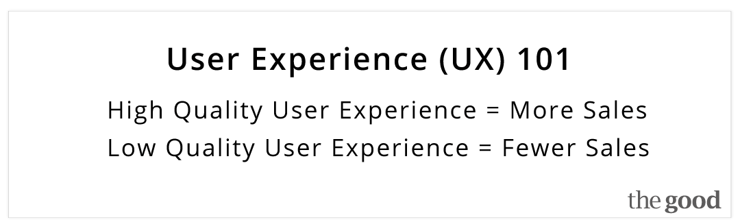
Put simply, as cognitive load increases, user experience decreases; and sales suffer Share on XIf your visitors are easily able to find what they need, pay for it, and arrange shipping, then the user experience is optimal. On the other hand, if friction is introduced at any step and it becomes difficult to buy from you, then user experience tanks.
Put simply, as cognitive load increases, user experience decreases; and sales suffer.
Here’s an example:
During the checkout process, your payment processing system requires shoppers to enter their zip code, then choose between several shipping options. You’ve effectively erected a stop sign on the road to sales.
You switch to a new system that makes shipping selection a breeze. Friction at checkout goes way down, cognitive load decreases, user experience goes up, and sales are rejuvenated.
That’s cognitive load UX in a nutshell.
How to reduce cognitive load on your ecommerce website
The cognitive load your ecommerce site requires of your visitors directly impacts their conversion. Non-vital mental processing reduces their ability to successfully navigate the sales journey. The harder your visitors must work, the more likely they are to disengage and leave the site before making a purchase.
You can never get the cognitive load to zero, but you can remove unnecessary confusion. Every move visitors make on your site is going to impose some amount of cognitive load. The key is to keep it limited to the essentials.
Your job is to remove non-essentials and minimize friction. When we asked interaction designer Jon Yablonski how he would reduce cognitive load on an ecommerce site, he said:
Make sure you have thoughtful and straightforward product categories, provide product details that prioritize information, and break the checkout flow into steps. - @JonYablonski Share on XWe agree. These sum up some of the key places of friction on many ecommerce sites. How do you improve these areas? Start with these three fundamentals of smart ecommerce website UX design:
1. Reduce visual clutter and increase path to sales recognition
- Don’t allow site designers to champion visual appeal over practicality. Meaningful design can help conversions, but distracting or irrelevant design elements hurt usability.
- Consider your target audience, and give them what they want. Do they prefer larger typefaces for readability? Give it to them. We’ve seen management rave over a site design that users found confusing. Set your own preferences aside. Design for the customer, not for your staff.
- Make user experience testing a priority. If you need help figuring out how to draw information from your ideal prospects, see the resources listed at the end of this article.
2. Stop making your visitors clear hurdles to buy from you
- Examine every place on your ecommerce site where visitors must read, remember information, or make a decision. Replace or upgrade those spots with a helpful graphics, auto-generated form fills, or smart defaults. Do everything you can to reduce needless steps in the process. Simplify the process radically.
- Crystalize each phase of the buyer’s journey. Know exactly what you want to see happen at each juncture, then remove or replace everything that doesn’t support that purpose.
- Leave room for white space on your pages. Clutter adds to the cognitive load. You don’t need to fill the page with information. Your primary concern is making it functional (guiding visitors along your path to sales) and understandable.
3. Build on existing mental models
- Exploit familiarity. Visitors bring their own mental models with them. Use labels and layouts that they have encountered on other websites to reduce the amount of cognitive load they need to exercise on your site.
- Design with your audience in mind. Are they digital natives who naturally pick up on a certain level of functionality, or are your best prospects better suited to traditional labels and layouts?
- Be consistent with pages and branding. Guide them every step of the way with familiar navigation. Watch out for design elements meant to be cute or unique. Your aim is for easy to grasp graphics and no-brainer next steps.
Reduce cognitive load to increase sales
Nobody likes cognitive overload, especially not your prospective customers. Thinking is hard work. Each day presents plenty of reason to figure things out. Make your ecommerce site a place where getting tasks accomplished is a breeze, not a chore.
The easier you make it for your visitors, the more they’ll buy from you.Don’t create web pages to impress the art enthusiasts on your team. Design every page on your site to make life easier for your customers. And don’t wait for a drop in sales to warn you about cognitive overload. Leverage user experience testing to point the way.
Need help? Contact The Good.
Resources:
- 3 Powerful Design Principles That Improve UX and Conversions
- Top Usability Testing Tools: The Complete List (82 Tools & Free Spreadsheet)
- Research on Cognitive Load Theory and Its Design Implications for E-Learning
Enjoying this article?
Subscribe to our newsletter, Good Question, to get insights like this sent straight to your inbox every week.
About the Author
David Hoos
David Hoos is the former Director of Marketing at The Good and a trusted advisor to marketing experts.