Munchkin Decreases Bounce Rate By Improving The Mobile User Experience
Discover how Munchkin leveraged research-backed recommendations to decrease bounce rate and improve customer engagement with The Good’s Digital Experience Optimization Program™.


The Overview
Munchkin is a baby and toddler products company. They offer everything from bath toys to bottles to changing pads. All of their products and accessories make parents’ lives more enjoyable by thinking of “the little things.”
In this case study David Embree, former VP of Digital Direct to Consumer at Munchkin, shares his experience working with The Good and how the team created a strategic roadmap to solve some of Munchkin’s most complicated ecommerce challenges.
The Challenge
In his role at Munchkin, David was tasked with creating, maintaining, and growing the direct-to-consumer operation.
Munchkin, like many ecommerce companies, has a particularly challenging ecommerce circumstance. Not only do they compete with other baby and toddler product companies, but they also compete with larger chain stores (Target, Walmart, etc.) where their products are sold.
They have to give their customers a reason to shop on the Munchkin site rather than picking up their products on the next run to Target.
For David, the direct-to-consumer umbrella covered everything from product to ecommerce to strategy to operations. That is a lot to manage, and he knew the best way to get started prioritizing the areas for growth was to look at the data.
So, he tapped into the Digital Experience Optimization Program™ from The Good and began prioritizing implementations.
The Process
As a part of the program, The Good did a deep dive into Munchkin’s analytics data, customer base, user behaviors, and internal resources. With all of the information, the team of expert strategists and researchers synthesized learnings into a comprehensive report on how to best optimize the digital journey.
Each learning came with associated recommendations. Essentially, Munchkin was equipped with a data-backed roadmap to improve their ecommerce experience.
“The Good gave us a playbook and I just needed to put these proposed concepts into action.”
– David Embree, VP of Digital Direct to Consumer, Munchkin
Some of the key areas for optimization included findability vs. discoverability, the mobile user experience, and differentiation.
Findability vs. Discoverability
A main user challenge identified in the audit was findability vs. discoverability.
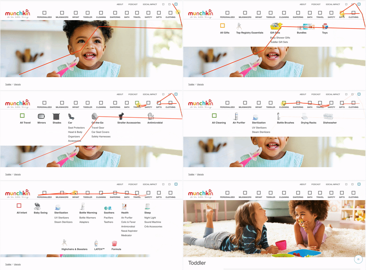
Users were reliant on the navigation to find products, but the navigation lacked meaningful grouping and top-level category labels to aid in directness.


Above you can see a lot of user attention on the navigation, with shoppers looking around and peeking into all the different mega menu dropdowns.
But for brand loyalists who come to the site with a specific product or category in mind, this hunting and pecking didn’t prove efficient in finding what they were looking for.
Mobile User Experience
When The Good reviewed analytics during the initial Digital Experience Optimization Audit™, it became clear that there was room to optimize the mobile user experience. In fact, it was going to be a priority considering 70% of site traffic to Munchkin’s site was on mobile.
User research exposed a few key opportunities when shoppers got frustrated with popups, the mobile navigation, etc.
“We had some annoying popups on the homepage. If you’re a busy parent and you’re coming to a site, you don’t want anything getting in your way, especially on mobile.”
– David Embree, VP of Digital Direct to Consumer, Munchkin
Differentiation
The Good also found an opportunity to aid shoppers by differentiating products, offerings, and why they should shop on Munchkin.com vs. a retailer.
During the customer journey, shoppers weren’t easily able to find the specific color or type of product they wanted. On collections pages, category pages, landing pages, and more, visitors weren’t sure what product variations were offered.
The Solution
David puts it like this: If you’re paying to invite someone to your store, you don’t want them to walk in and immediately turn around to go somewhere else.
There were a number of research-backed recommendations that our team made to decrease bounce rates and increase engagement, including:
- Optimizing the display of content, products, and categories on the homepage
- Getting rid of popups to improve user experience
- Improving the main navigation for an easier shopping experience
- Enhancing on-site search and search results
All the recommendations supported the key performance indicator that the ecommerce team was gunning to lower: bounce rate.
And it paid off:
“The biggest impact was helping us to decrease our bounce rate.”
– David Embree, VP of Digital Direct to Consumer, Munchkin
After implementing the recommendations, users had a smoother experience that wasn’t interrupted by invasive popups and clearly showed how Munchkin could solve their problems.
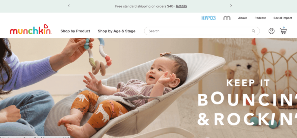
For example, this is what Munchkin’s desktop navigation looks like now. A clearly directed shopping journey rather than a browsable shopping aisle where a user might be exposed to a lot of product categories, but needs to carefully look for what they seek.

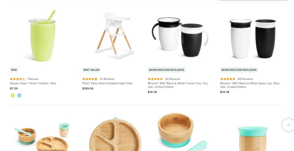
Munchkin added product attributes and color swatches to product tiles throughout the site. Now, if a shopper sees a toy in orange, they also know it comes in blue, green, yellow, and red.
They’ve also added “Munchkin.com Exclusive”, “New”, and “Best Seller” tags on collections pages as a result of the audit’s recommendation to help with product differentiation through the shopping journey.

The Results
Along with decreasing bounce rate and improving engagement, recommendations from The Good helped lift various KPIs across the site.
“Over the span of about six months, we were able to implement about half of the improvement areas that you all had called out. And we were definitely starting to see some lifts across various KPIs of the site.”
– David Embree, VP of Digital Direct to Consumer, Munchkin
But, beyond numerical improvements, David emphasized the importance of external expertise in the improvement of Munchkin’s ecommerce site.
“What you all bring to companies is this large and respectfully anonymized database of what you’ve seen work for other companies or what you’ve seen work for other industries.”
– David Embree, VP of Digital Direct to Consumer, Munchkin
David continues “If I’ve been at six different places and I’ve moved the needle in six different ways, that’s a data set of six. And you all are bringing a data set of a couple hundred. So having the data to back it up, but also having the breadth of experiences across different types of platforms, different types of user interfaces, different types of goal metrics, etc. I think that goes a long way to infuse trust in the program.”
How Munchkin Decreased Bounce Rate By Working With The Good
The results unlocked for Munchkin were the direct result of the Digital Experience Optimization Program™. Every program starts with a Digital Experience Optimization Audit™ to properly diagnose your greatest conversion barriers and opportunities. Then our expert team creates a custom plan for implementation based on the needs and resources of your team. Get in touch with the form below.