10 Of The Best Checkout Page Design Examples to Inspire Your Own
In this article, we review our favorite checkout page designs. We explain why we like them and how they could be improved.

It’s easy to neglect your checkout page. You might assume that if a customer reaches checkout, you’ve scored the conversion. But that isn’t always the case.
Just because a shopper fills their shopping cart and initiates checkout doesn’t mean they will complete the purchase. In fact, 70% of checkouts are ultimately abandoned. There’s plenty of opportunity to lose a sale if you don’t optimize this part of the customer experience.
What does a great checkout page look like? In this article, we review our favorite checkout page designs. We explain why we like them and how they could be improved.
What Makes a Good Checkout Design?
Your checkout page represents a critical moment where your shoppers become customers, so it deserves your thought and attention.
The best ecommerce checkout designs are simple, clear, and intuitive. They give shoppers all the information they need to get through checkout quickly, easily, and securely. The process should be clear of distractions, disruptions, or points of friction.
Your checkout page should inhabit all of the qualities of good visual design. The aesthetics of the page should support efficiency, accessibility, and a good user experience. It should use principles like hierarchy, scale, and contrast to make the page easier to use.
Furthermore, the best checkout designs are optimized for conversion. You should measure the page’s performance, experiment with new ideas, and implement new optimizations regularly.
To learn more about improving your page, check out our guide on optimizing your checkout page. We also recommend reviewing our guide on mobile checkout design and our primer on form design principles.
The 10 Best Checkout Page Examples
The following are some of our favorite checkout page examples. Use these as inspiration to design and optimize your store’s checkout page.
1. Infinite CBD
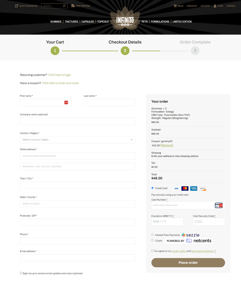
What we like:
Infinite CBD uses a common two-column checkout design that’s clean, simple to follow, and looks good on mobile devices. The contents of the cart are available, but not in the way. The minimal checkout form asks for just the right amount of information to keep the checkout process simple.
There aren’t any non-checkout elements to disrupt the transaction. It also uses good visual design to separate the shopping cart and payment details fields from the primary form. The call-to-action is obvious, but slightly gray until the form fields have content. The checkout progress indicator at the top is a great tool to keep customers oriented.
What could be better:
We’d like to see more payment options, like Google Pay or PayPal, as well as a way to save progress in case customers want to come back. The page could also use some trust symbols and badges to inspire confidence and a minimal header without so many distracting links.
2. Allbirds
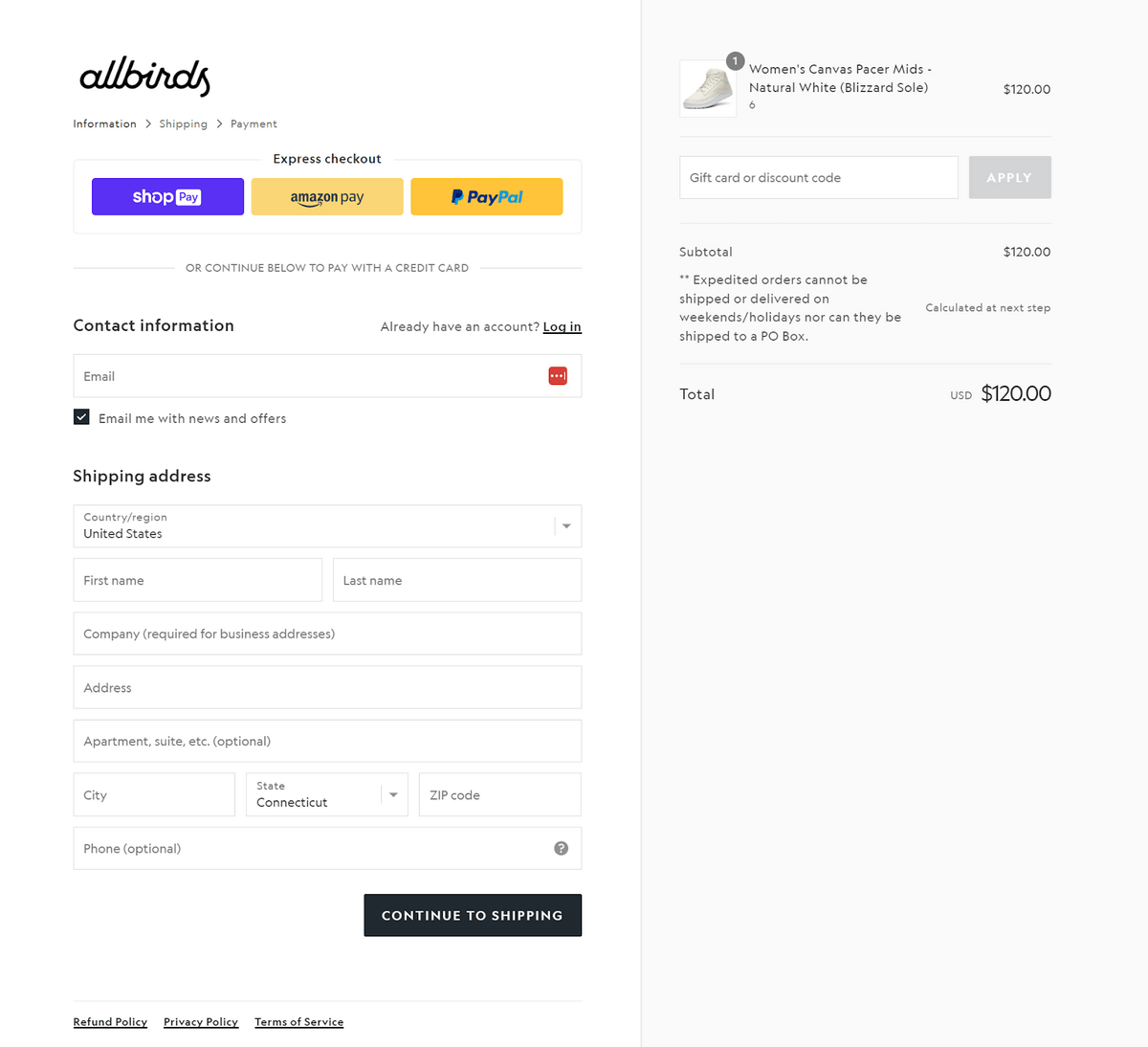
What we like:
Allbirds is built on Shopify, which means it uses Shopify’s checkout flow. Naturally, Shopify knows what they’re doing when it comes to checkout optimization. This checkout design is stripped-down, minimal, and clean. There’s no header, footer, or menu full of links to distract the customer.
We like the alternative payment options at the top of the page that lets customers skip to checkout without dealing with the form. They smartly grayed out the coupon field until a value is inputted so it doesn’t confuse customers from clicking the “Continue to Shipping” call-to-action.
What could be better:
This is the first page of a multi-page checkout design. For such a minimal checkout design, the multi-page checkout process could probably be consolidated into one. However, it’s good that all three pages use the same layout so there’s no confusion.
The breadcrumbs that indicate progress should be more obvious. It’s not apparent right away that this page is not a one-page checkout.
Finally, there’s very little branding because it’s a Shopify site. This isn’t a huge problem, but you don’t want your site to feel like every other store. Some light branding would be good for the user experience.
3. Samsung
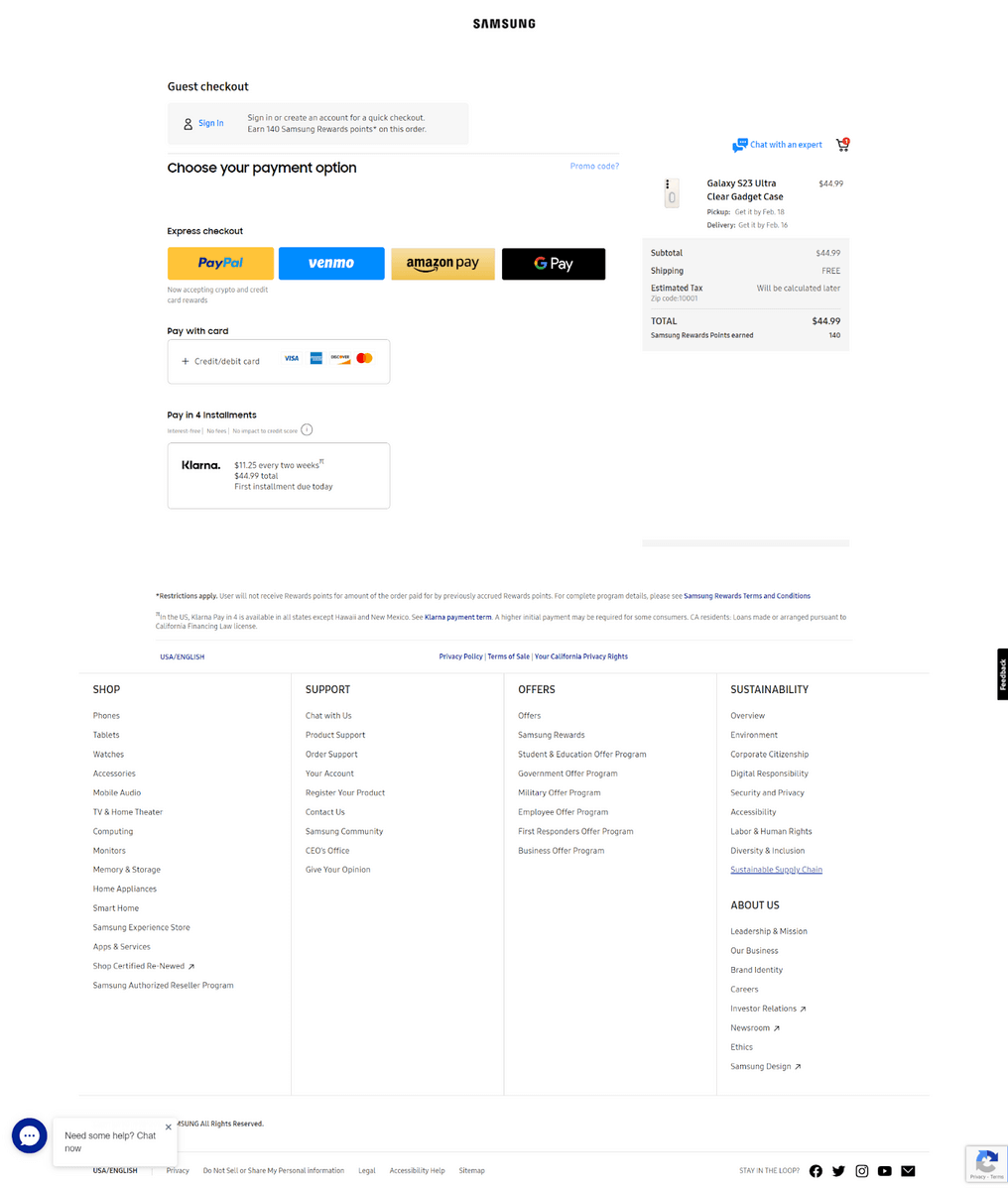
What we like:
Samsung has a unique checkout design. Unlike many pages that make all of your fields visible, Samsung only shows you what they need at the time.
For instance, you won’t see any billing address fields until you select a payment method. If you select an express checkout option, you won’t see any fields at all. This makes the page remarkably simple because there’s only one choice to make at a time.
This checkout design assumes you want to checkout as a guest and offers an option to sign in. Guest checkout capabilities are a great way to expedite the process.
Cart contents, taxes, shipping, and delivery data are clear and transparent. The “Chat with an expert” link opens a live chat window. This is a great way to resolve last-minute objections or friction.
What could be better:
While the header has been minimized properly, the footer is packed full of links that could distract customers from completing the transaction.
When the page loads, the four colorful buttons make it seem like Samsung only offers four payment methods. The “Pay with a card” option deserves similar attention. At the very least, it should be grouped with the other payment options so it doesn’t seem unrelated.
4. Bed Bath & Beyond
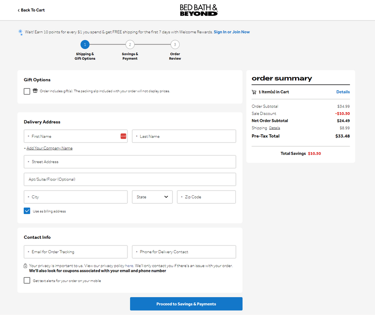
What we like:
As a retailer of more than 50 years, it’s no surprise that Bed Bath & Beyond has an effective checkout process. The message at the top about earning rewards is a great way to make customers feel like they’re getting a little extra. It also encourages opening an account.
The visual design is excellent. Dividing each section with background colors creates separation, which makes it easy to follow. Instead of slogging through a long form, it feels like less work. The progress indicator is simple and reassuring and there are no distractions in the header and footer.
“Email for order tracking” and “Phone for delivery contact” is superb copywriting. Now those details feel like they’re part of the transaction and not for marketing purposes.
“Get text alerts for your order on your mobile” is a great little feature to keep your customers engaged and build an SMS-based relationship. We also like that the “Details” link by the shipping cost opens a popup with valuable shipping information. This prevents the customer from leaving the checkout to learn about shipping.
What could be better:
There’s no way to contact support or get answers to any last-minute questions. This is unfortunate because Bed Bath & Beyond probably has enough customer support resources to do this well.
We don’t like that you have to visit the second page to input your payment information. This could probably be squeezed into the first page to create a one-page checkout experience.
Bed Bath & Beyond should definitely have some trust symbols or badges from reputable security services, the Better Business Bureau, or similar.
5. Bellroy
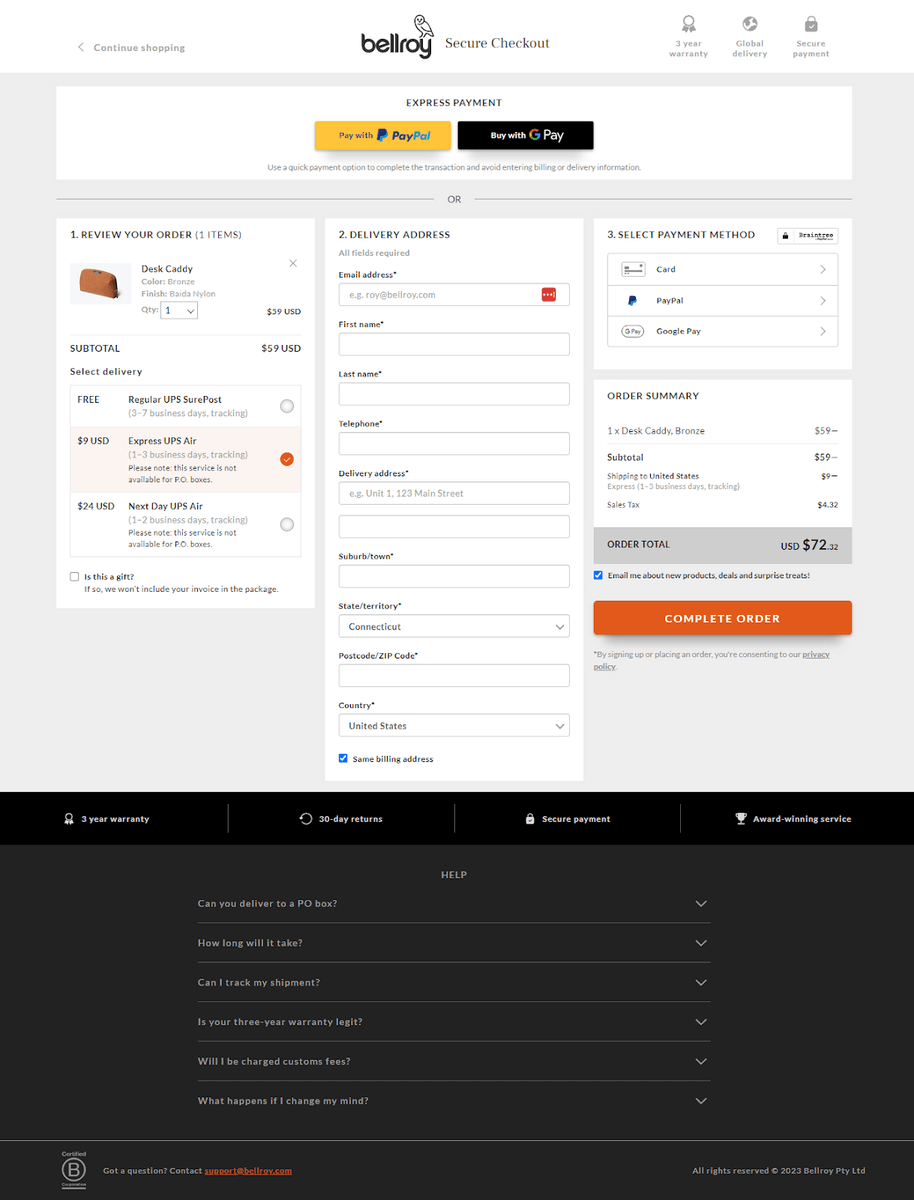
What we like:
Bellroy’s three-column checkout page deviates from the typical checkout style, but it’s still an intuitive checkout process. There’s a lot to like about this page.
- Express payment at the top gives customers a chance to skip the rest of the page.
- The three numbered columns create an easy-to-follow flow.
- Choosing shipping options first means there are no surprises when it’s time to pay.
- The checkout form is about as minimal as it gets.
- The call to action is clear, bold, and interactive.
- There are lots of powerful conversion-pushing elements, such as “secure checkout,” “3-year warranty,” “global delivery,” “30-day returns,” and “award-winning service.”
- The FAQ at the bottom of the page is a brilliant way to overcome objections.
What could be better:
There is a lot of information on the page, so it would be great if the form dynamically updated to hide anything irrelevant as you went through the process. For example, once a shipping option is selected, hide the rest of the information in that column so the customer isn’t distracted.
6. Xero Shoes
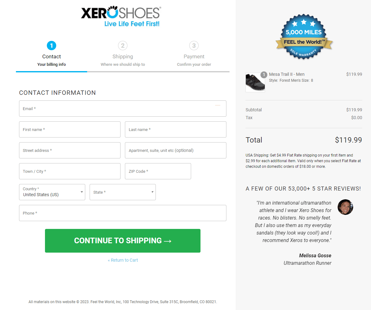
What we like:
Xero Shoes’ checkout page includes a few powerful elements. The “5,000 miles sole warranty” is a nice touch. We tend to consider the quality of our shoes more than other apparel, so it’s smart to reassure customers that the products will last.
We also like the bit of social proof in the bottom right corner. “53,000+ reviews” is quite the endorsement! They also choose a good testimonial that’s appropriate for all kinds of customers.
What could be better:
This is the first page of a three-page checkout flow that could probably be consolidated into one. There’s no mention of shipping fees or taxes here, but those fees are added on page two. Surprise fees are the top reason people abandon checkout, so that information should appear earlier.
7. B&H Photo Video
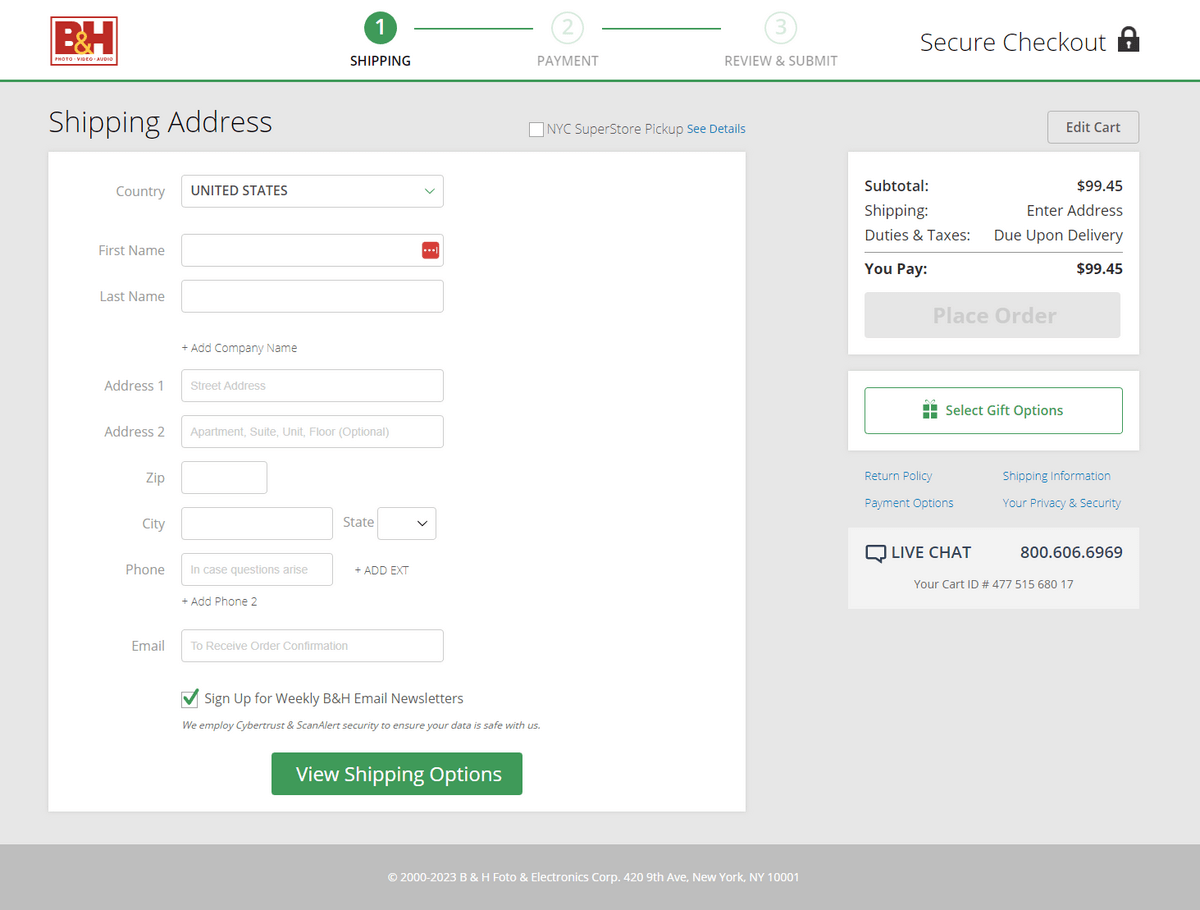
What we like:
Like many stores with robust product lines, B&H’s site is quite busy. They like to push upsells of similar products, bundles, accessories, and warranties, but they are smart to strip all of that away for their checkout experience. As you can see, it’s quite simple.
Normally, the lack of tax and shipping information would be a detriment. However, B&H uses some clever copy to indicate that more information is needed before these fees can be calculated. This way the customer knows that fees may appear later in the checkout flow.
We also like the use of a secondary call-to-action style for the “Select gift options” button. Customers know it’s clickable, but not the primary method forward.
Furthermore, the large “Secure checkout” heading, live chat link, links to information pages, and customer support phone number are great ways to make customers feel more secure.
What could be better:
We’d like to see more detail about the cart checkout items at this stage in the checkout to remind the customer why they’re buying in the first place. There should also be some optional payment methods available.
8. Peloton

What we like:
Peloton’s checkout design is another example of a clean, minimalist page that only uses design to facilitate usage. We like that the checkout form in the left column has a reasonable flow: email address, shipping options, and payment.
Using upsells at this point in the process is complicated. In most cases, this is not the place to ask customers to make more purchase-related decisions. In the case of Peloton, however, an upsell makes more sense since they’re selling a warranty for an expensive item.
We also like the minimal header and footer, the live chat link, the presence of the shopping cart contents, and the estimated delivery address field. The “30-day home trial” reminder is a great way to make customers feel more comfortable about their purchases.
Finally, the financing payment option is very smart. Plenty of customers would prefer to pay over time for products this expensive.
What could be better:
This checkout page design would do well to include some social proof. Peloton products are expensive and many of them require significant commitments. It would be helpful to read some comments or reviews from past customers about their positive experiences. It would also be good to see an endorsement from an expert, such as a doctor, physical therapist, or personal trainer.
9. ASOS
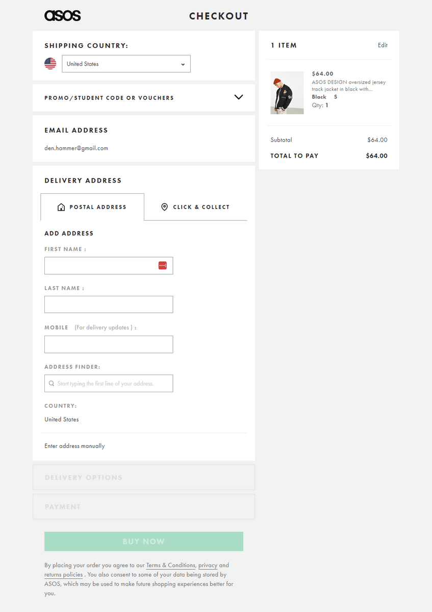
What we like:
This is a well-designed checkout flow. We like that everything is on the same page, but ASOS uses an accordion-style checkout to make the second and third steps (delivery address and payment information) inactive until the user completes the first step. This is a fantastic way to create a simple flow and avoid overwhelming customers.
The “Click and collect” tab is an excellent addition. It gives customers the option to get their orders faster and avoid shipping complications or delays.
In the payment details section, ASOS offers multiple ways to pay, including financing. All of the options are hidden behind tabs so the customer is only presented with those requirements when they select an option. This keeps the page clean and simple.
Furthermore, ASOS uses a stripped-down header and footer to limit distractions. They also keep the shopping cart contents present so the thing the customer wants is always within sight.
What could be better:
We’d like to see a trust symbol or badge that indicates a secure purchase. The page could also use some information about the shipping methods and returns policy.
10. Happy Socks
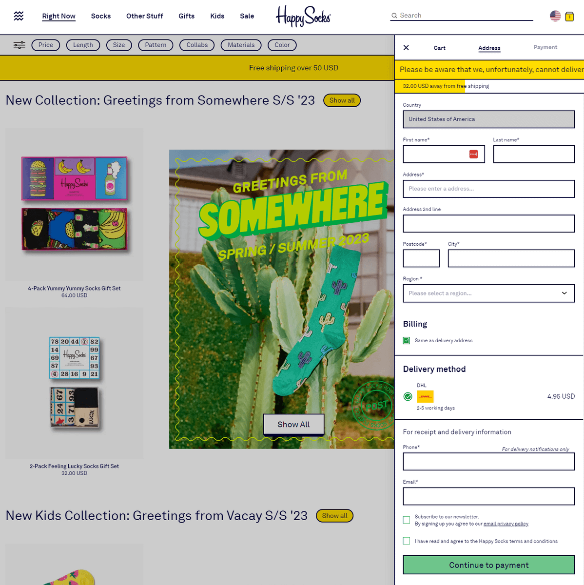
What we like:
Happy Socks has a unique checkout flow. Instead of using a standalone page, the entire checkout process happens in a slideout sidebar. The style fits nicely with Happy Sock’s branding.
We like the two notifications at the top of the sidebar. One notification warns that they can’t deliver to P.O. boxes, which helps avoid future friction if someone enters a P.O. box number. The other notification shows how far the customer is from free shipping. This is a great way to improve the average order value.
We also like that the shipping fee is apparent from the beginning. This ensures there are no surprises later. The payment screen offers multiple payment methods. Overall, the checkout flow is fast and easy to follow.
What could be better:
Our major concern about Happy Sock’s checkout design is only that it may be too different from most online stores. Customers generally don’t expect to complete the entire checkout process in a sidebar, so they may find this confusing. You don’t have to do things the same way as every other online store, but fighting customer expectations is hard. Hopefully, Happy Socks has performed some research as to whether their customers find this confusing.
Experiment, Test, and Optimize Your Checkout Design
We’ve shown you some of the best checkout page examples on the web, but that doesn’t mean you should reproduce them for your site.
Build a checkout page that satisfies the unique means of your business and your customers. Make changes and test the results. Create a cycle of iteration that slowly improves your checkout design’s performance over time.
Furthermore, look beyond your conversion rate to your real goal: revenue. Some changes (like adding upsell offers) might decrease your conversion rate but boost your overall revenue. These kinds of smart tweaks are worth experimenting with.
If you’re struggling with your checkout process design, we can identify what’s stopping conversions, where customers get confused, and how to improve.
About the Author
Caroline Appert
Caroline Appert is the Director of Marketing at The Good. She has proven success in crafting marketing strategies and executing revenue-boosting campaigns for companies in a diverse set of industries.