10 Principles of Good UX Form Design (+ Winning Form Design Examples)
These are the key principles of form design for SaaS and ecommerce brands. Learn more and explore over 31 form design examples.

Key Takeaways
By the end of this article, you should have the knowledge and resources to “check the box” in these areas…
- What makes a winning form design for ecommerce and SaaS brands
- How to build a form that converts for your website
- Understand the principles and common practices of over 32 form design examples
Form design seems like a website element that doesn’t require much thought, but there are actually many ways the form experience can go wrong. When it happens, you can lose a sale or lose a lead, and in turn give those users a bad impression of your brand.
Website forms are one of your most important onsite elements. They are the crux of a user’s path to conversion.
Bad form design can cause users to drop off during critical conversion opportunities, leaving them frustrated or confused, while great form design creates a seamless user experience that can increase conversion rates and leave users feeling excited about a product or company.
In this article, I’ll cover:
- The basics of form design
- 10 UX form design principles
- Form design examples that convert
What is form design?
Form design is the process of putting together text fields and other form elements to collect user information while keeping usability, customer experience, and appearance in mind.
For ecommerce specifically, form design is used when putting together website pages for:
- Registration forms (a sign up or login form)
- Contact forms
- Checkout forms
- Questionnaires
Improving the web form design on any of these pages of your ecommerce site can see incredible ROI – increasing conversions and building a better customer experience.
So how do you do it?
Here are a few of the form design principles that you should consider as well as corresponding desktop and mobile form examples from winning ecommerce brands.
10 UX form design principles with form design examples from winning brands
1. Priming
The first principle to consider when designing your form is priming. We consider “priming” anything that sets user expectations for what is to come, so they aren’t deterred by any surprises.
That might mean:
- Telling users how many steps they can expect and what is in them
- Setting expectations for what will be required of users (for example, whether or not they might need to get their credit card out, vs indicating “no credit card required”)
- Sharing what happens after the form is complete (for example, “we’ll ship within 1 business day”)
This principle is when elements in the interface guide user behavior and inform them of what to expect from their interaction.
Priming often takes the form of progress bars. Adding this element tells the user what they can expect from the process during or before completion of the form, setting the expectation so that users come prepared to fully fill out the form.
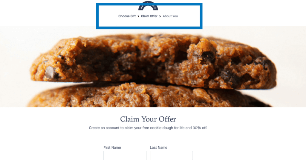
See this example from Hungryroot.com. The brand features a progress bar with clear labels to prime users about what to expect during the experience.
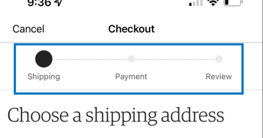
Etsy uses a similar progress bar on mobile to prime users on the checkout process.
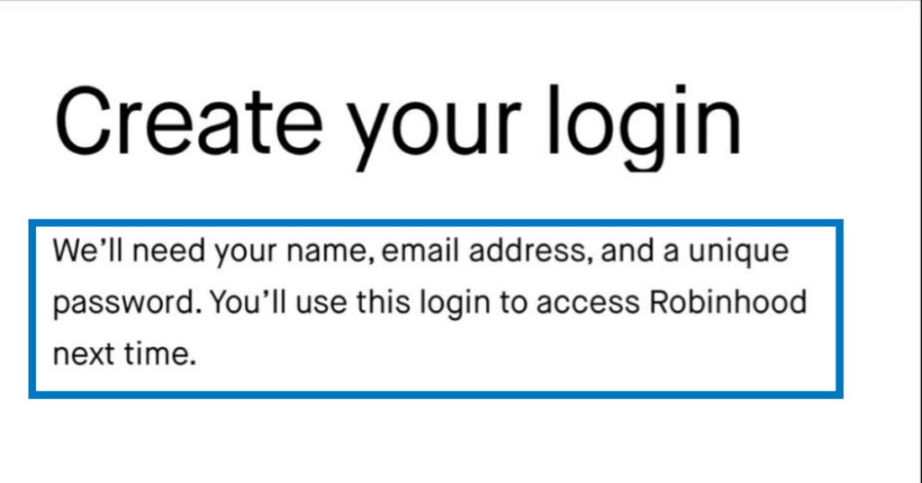
This example from Robinhood tells users exactly what information will be required from them to register.
Another example of priming is sharing the end result or value they’ll receive upon completing the form. This helps them anticipate what to expect once the form is complete and generate excitement for the product, motivating them to complete the form.
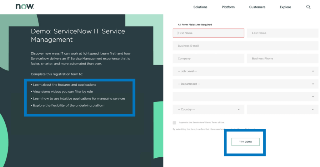
The “Try Demo” button, shown below, primes users to know what they can expect after they fill out the form, in this case, they get to demo the product once the form is complete. For additional priming, the brand has a bulleted list of what the user can expect after the form is complete.
2. Error prevention
Great form design should always include error prevention. Provide clear and adequate instructions that help users fill out forms correctly on the first try and prevent errors before they are committed.
Here are a few examples of error prevention in action.
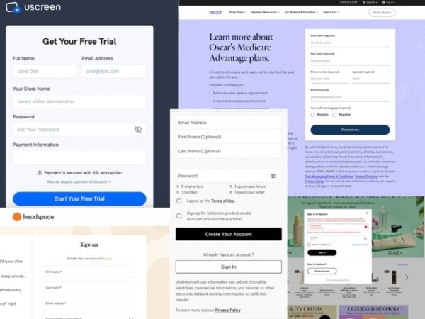
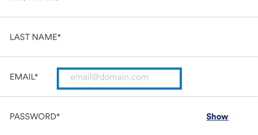
Providing an example of how the text input field should be completed. Both Canva and Petco use hint text in the email field to remind users of proper formatting.
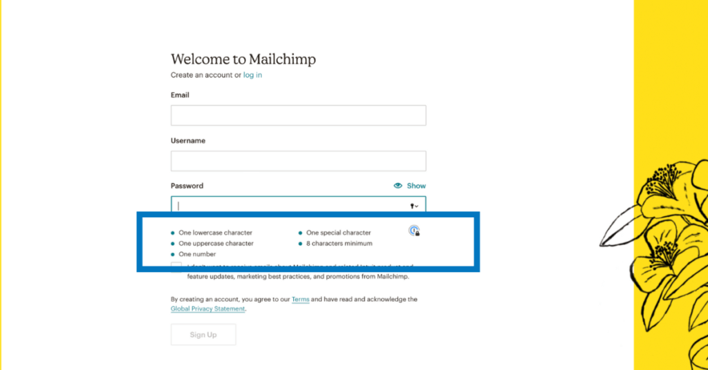
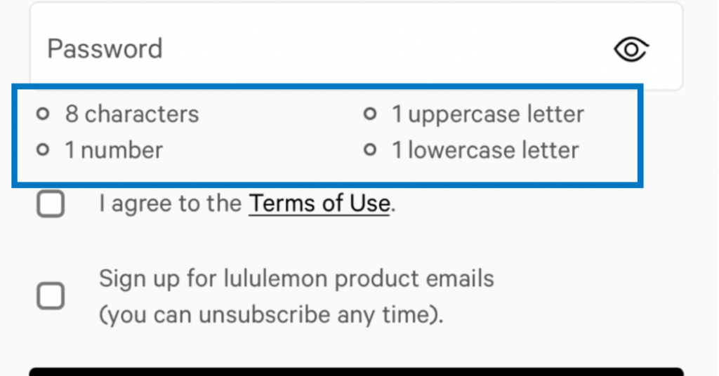
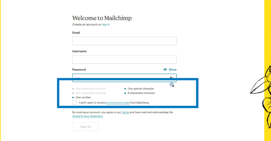
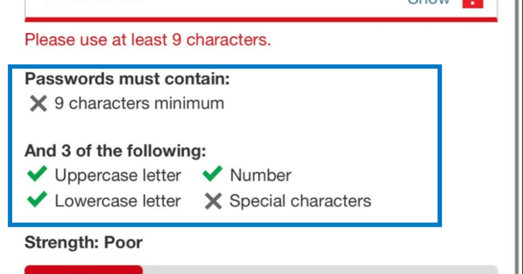
Mailchimp and Lululemon provide a password requirement checklist to assist users in creating a password that meets the requirements.
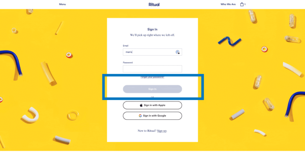
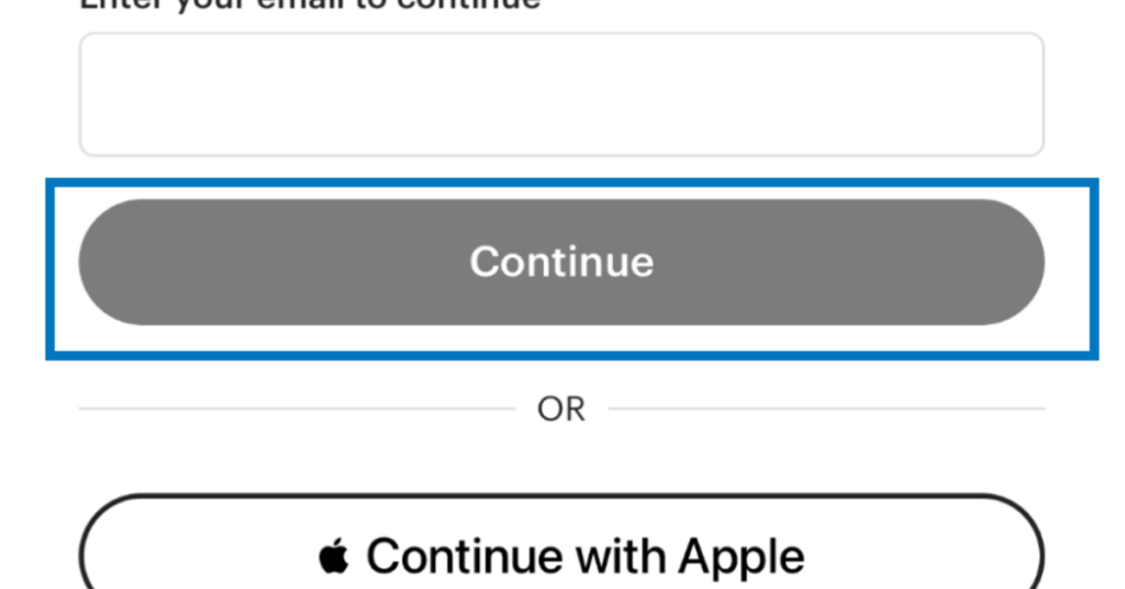
Ritual and Etsy use an inactive CTA that turns colorful when the user has properly filled out the form, giving them feedback and validation that they are ready to move on to the next step.
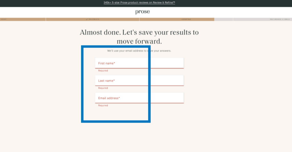
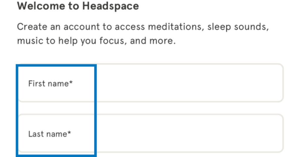
Highlighting required fields, like Prose and Headspace do here, assures users won’t skip the necessary fields.
When you’re clear about the expectations and requirements of your form, you avoid user error and in turn avoid user frustration.
Enjoying this article?
Subscribe to our newsletter, Good Question, to get insights like this sent straight to your inbox every week.
3. Error recovery
Even with the best error prevention methods, mistakes still happen and are always frustrating. That’s why we have error recovery!
When errors happen, it’s important to notify users immediately, in a friendly tone, and provide clear and specific instructions to help them fix the issue on their own.
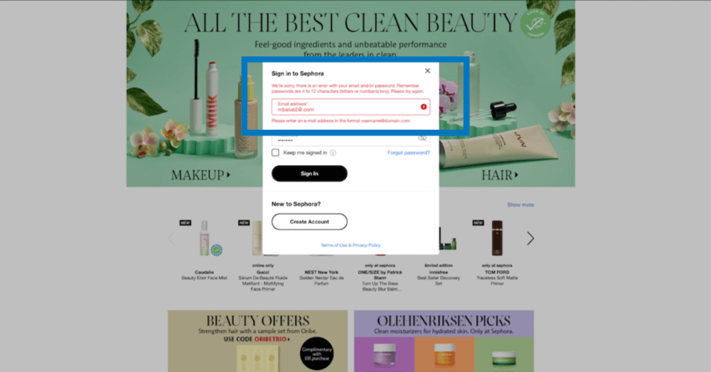
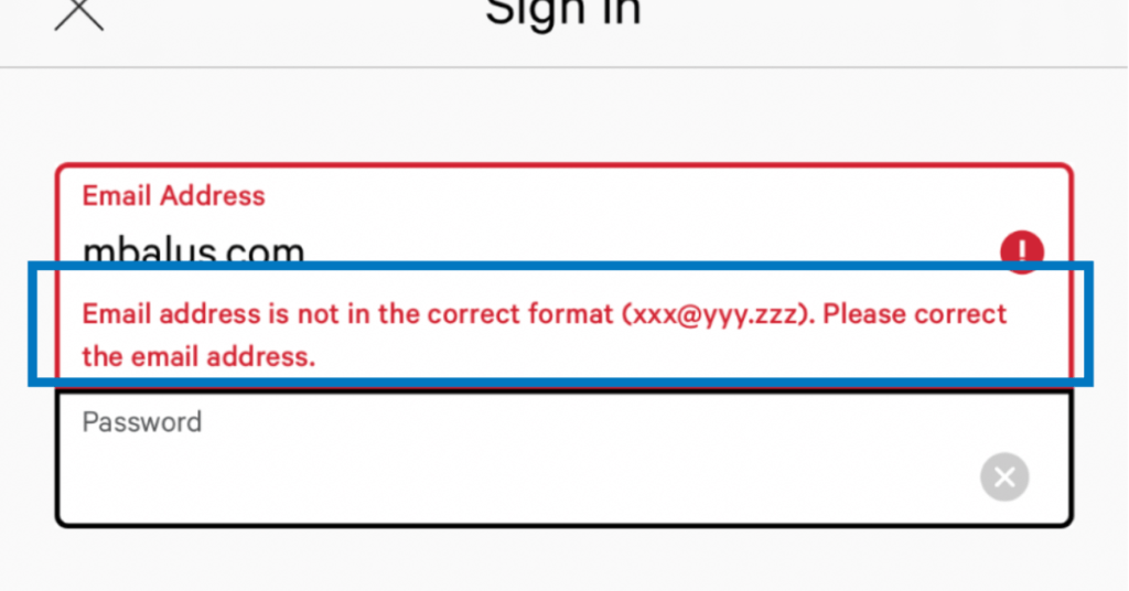
For example, highlight text form fields with incorrect information in order to catch the user’s attention. Then provide clear instructions to fix the error.
Sephora and Lululemon do this well on desktop and mobile respectively.
4. Feedback
The same way humans need feedback in our day to day life, we also need it in our digital interactions. Feedback is a combination of error prevention, error recovery and priming to let users know they are on the right track to achieving their goals.
Feedback refers to visibly and simply communicating the results of any user interaction, providing positive reinforcement if a user succeeds at performing a task.
Inline validation that confirms a user is entering the correct (or incorrect) information, is an example of form feedback.
Mailchimp and Home Depot share real time feedback to let the user know whether they are successfully inputting a password or not.
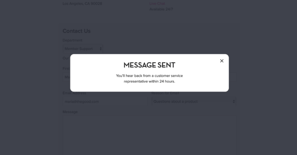
Another example of feedback is confirmation or error messaging during a user experience. For example, Hum Nutrition sends a success message as feedback letting users know they successfully completed their task.
5. Proximity
In your form design, take advantage of gestalt principles like proximity to indicate to users what is needed from them. Psychology shows that through the Law of Proximity, items closer together will be perceived as more related than items further apart.
By closely grouping related fields, users can quickly make sense of your form at a glance, which can reduce form completion time and create a much more seamless and enjoyable experience for the user. For example, you can group together related form text fields such as shipping information in order to help users easily make the distinction between form content.
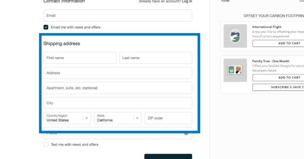
Shopify separates the email field from the shipping info, so users don’t have to think too hard about what is being asked of them.
And don’t forget to use the principle of proximity in your labeling. Keep your form labels close to their corresponding input fields to minimize confusion and prevent errors.
6. Convention
There are some elements of web design that remain consistent, even across different industries, which users depend on to navigate the digital world much more quickly. For example, an account icon in the top right corner of an ecommerce website or a checkout button in the cart.
Using platform and industry standards that align with users’ expectations and mental models of the digital world helps minimize confusion or frustrations, and increases the usability of the interface
Form design also has conventions that need to be followed in order to create a positive user experience and promote conversions.
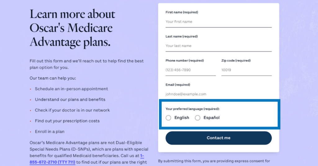
Here’s an example from Oscar, a Medicare Advantage company, uses radio buttons for language selection that universally indicate the ability to select only one option.
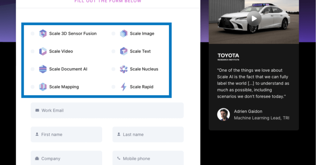
Here, the SaaS company Scale uses checkboxes for interest selection that universally means that users can select multiple options.
Additionally, checkout how Headspace (and most forms) have some type of “Submit” CTA that are always placed at the end of the form.
These are just a few examples of industry and platform standards in form design that are in line with user expectations. When industries deviate from basic standards, usability breaks down.
7. Momentum
How do we encourage users to convert and avoid abandonment? We can accomplish this by making users feel a sense of accomplishment, like they are progress toward their goal during the form filling process.
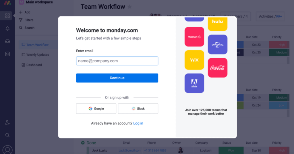
Leverage the product’s value in order to inspire users to complete your form. For example, like monday.com, put a scrim behind a sign up form to give a sneak peek of what’s coming upon completion. It illustrates to users that they’re almost to their goal of trying out your product and only need to complete the form to see the dashboard.
Momentum is a well tested and verified form design principle that keeps users motivated through completion.
8. Proof
Humans have the tendency to “reference the behaviors of others to guide their own behavior” (NNG, 2014). In forms, we can stimulate this tendency to increase conversion rates by using different types of proof, such as social proof, testimonials, and proof in numbers. When we build these elements into our design, we foster a sense of trust between the user and the brand, making it more likely that users will convert.
Here’s how that might look in action, with various forms of social proof:
- Ratings and accreditation: 5 star ratings on a customer review site
- Expert endorsement: Including logos on the homepage of your site
- Customer testimonial: A satisfied customer quote
- Expert testimonial: Known brands and experts lend their names to the review a product or service
- Proof in numbers: Show your success using a phrase like “trusted by 2 million moms” or something that builds confidence and connects with your target audience.
Keep in mind, the numbers, testimonials, and social proof you’re using should be the primary, or at least secondary, text on the form screen in order to catch the user’s attention.
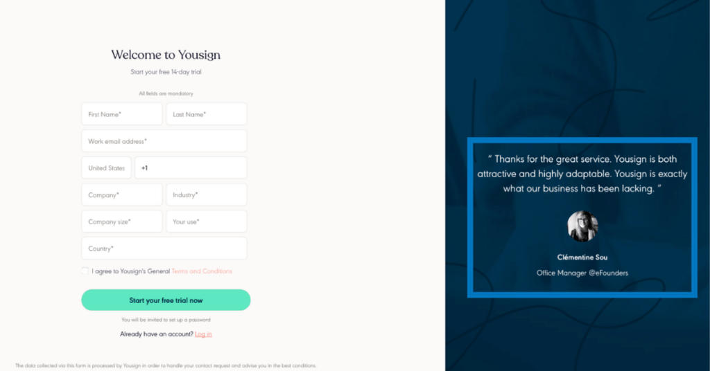
Here’s an example from Yousign, using a testimonial.
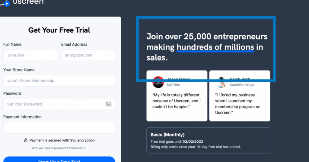
Uscreen uses proof in numbers to build trust with users on desktop.
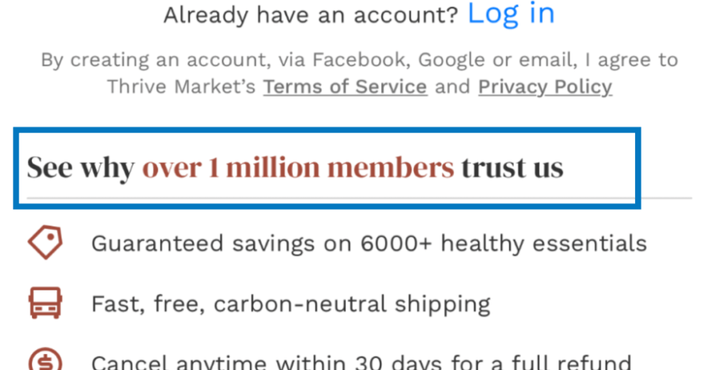
And Thrive Market does the same on mobile.
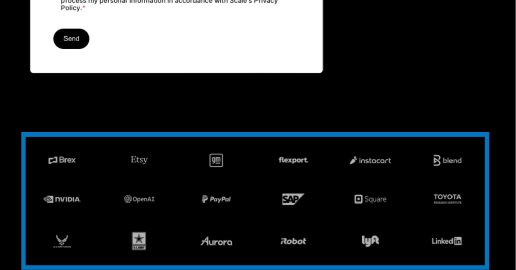
Scale uses logos on their form to build trust.
9. Demonstrated Value
How are you telling the user what they will get in return for their effort?
Are you making it clear that it’s worth their time?
If not, you need to demonstrate the value users will get by taking the time to fill out your form. Highlight the main benefits of your product in a way that’s visible and concise.
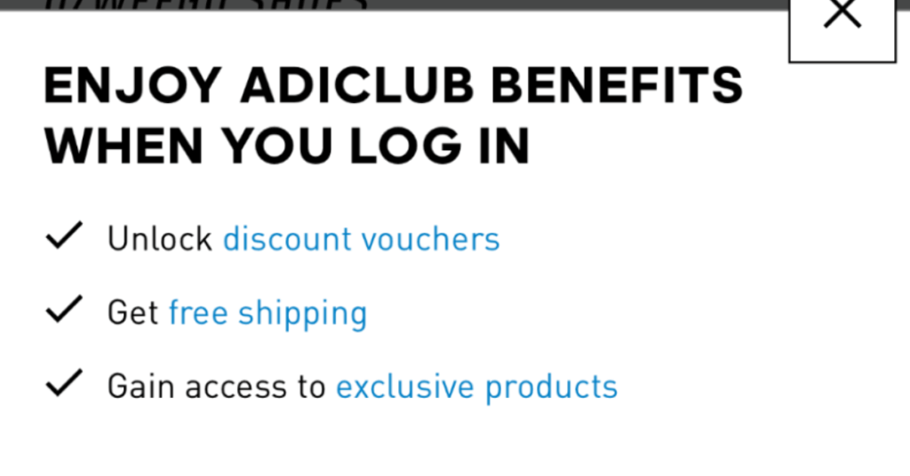
Adidas and Dominos offer lists of the benefits they offer upon signup or login.
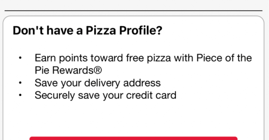
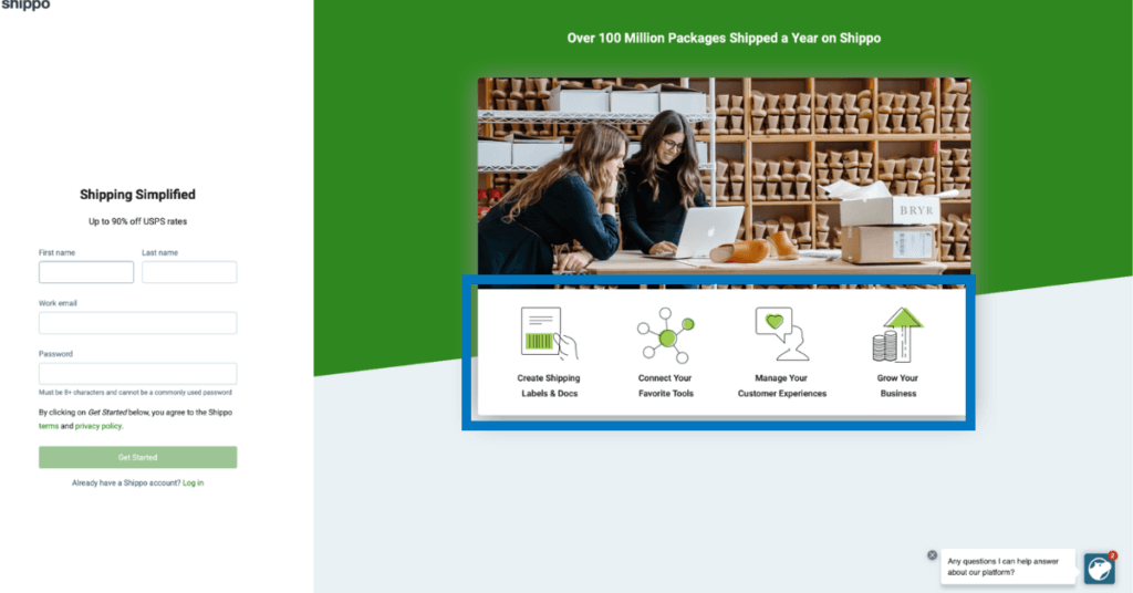
Shippo, shown below, uses icons to demonstrate value on their signup form, in a skimmable and impactful format.
10. Perceived Effort Level
Users are busy and their attention is fleeting. To increase the likelihood of completion and conversion, make sure your form appears – and really is – low effort for the customer.
In practice, this looks like honest and specific references to the timing (7 minutes to complete or only three steps, shown with an accurate progress bar) and only asking for necessary information. Gather the information you need, and then you can follow up for more, less crucial details later if necessary.
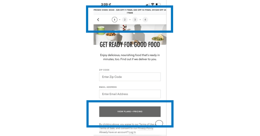
On mobile, Daily Harvest shows that users only need to enter two pieces of information to see plans and pricing. Once they fill out the initial information, they are one step closer to subscribing. Additionally, users can see to complete the whole process there are only 4 steps.
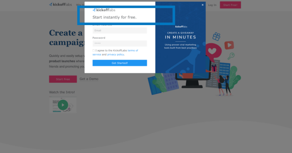
On desktop, Kickoff labs uses the word “instantly” and lets users know that they won’t need to input any payment info to signal a fast and free sign up process.
Apply these principles to desktop and mobile form design
While desktop and mobile users have different needs, and there are certainly ways that forms should differ, each principle listed above still applies. That’s the beauty of this list and these examples, you can implement them no matter where you’re designing your form.
Some principles are even more relevant when applied to mobile devices. If a user on their smartphone clicks through to an ecommerce site’s sale from a social media ad, the form on the landing page should minimize the number of text fields even more than a desktop form, automate answers when possible, and use a single column layout.
For an easy to follow checklist on mobile form design checkout the NNG’s checklist of usability requirements for mobile, and implement the form design principles we covered today on top of that.
Forms are just one part of your user experience
Implementing the principles we covered today can help you improve your site’s user experience and conversion rates, but form design isn’t the only thing that needs to be considered in order to see a larger, iterative improvement.
Forms are just one element of your ecommerce website. Each step in the customer journey is an opportunity to test and optimize the experience you deliver. If you’re interested in partnering with experts in digital experience optimization to understand your users and improve their experience, contact us.
Enjoying this article?
Subscribe to our newsletter, Good Question, to get insights like this sent straight to your inbox every week.
About the Author
Maria Balus
Maria is a UX Specialist at The Good. She uses her knowledge of user-centered design, evidence-based methods, and human behavior to provide research that inspires intuitive, functional design.