
14 Mobile Checkout Best Practices to Increase Conversions and Build Trust
Your customers are shopping on their phones and these mobile checkout best practices will help you deliver an experience that converts.
If scrolling through online stores while knee-deep in a Netflix binge was a sport, most consumers would be pros. The pandemic increased how much time people spent on their mobile devices and, not surprisingly, one of the activities they enjoyed doing the most on those devices was online shopping.
In fact, many stores now attract more mobile traffic than desktop traffic, and this is only going to increase. But mobile users are fickle. They add to their cart until it’s bursting at the seams and then, *poof*, they disappear into the sunset because the checkout was confusing, they were hit with last-minute fees, or the shipping time was much longer than they were willing to wait.
Whatever the reason for abandonment, it can be fixed. Capturing this new wave of mobile shoppers means optimizing the mobile checkout experience and removing any moments of friction or frustration.
Mobile checkout optimization is more important than ever
While stores are enjoying a huge influx of mobile traffic, they’re struggling to convert those numbers into sales and revenue. Typically, mobile conversion rates are around half of desktop conversion rates despite the disconnect in traffic.
And it makes sense – when on a desktop, you can navigate backward and forwards quite easily, see everything on one page, and generally feel a bit safer handing over your cash. If you want to reap the rewards of high mobile traffic, the key is creating a mobile checkout that’s right for the device.
Shoppers want less clutter, reassurance around privacy and safety, and clear information about shipping. This guide will highlight some critical mobile checkout best practices, both pre-and post-checkout that will tackle buyer objections and create a seamless shopping experience.
Demystifying mobile checkout best practices
As an organization, we try not to overemphasize the value of “best practices.” They can be a great target for young, emerging brands. After all, they are called best practices for a reason – they tend to work pretty well.
When you’re first starting out, or when you’re not quite big enough to support a dedicated expert, team, or outside authority to help with optimization, best practices are an acceptable substitute. They allow you to check a lot of the right boxes with a modest resource investment and a reasonable level of confidence in your results.
However, best practices will only take you so far. That’s because best practices are often promoted heavily in podcast episodes, webinars, and articles (just like this one!), which means they quickly go from “best practice” to “common practice.” When this happens, applying best practices usually devolves into becoming the fastest path to mediocrity.
So, if you’re just getting started with optimization and you’re ready to dedicate time and attention to your mobile checkout experience – kudos to you! You’re making a smart choice.
But you should know that, while the recommendations we share in this article are a solid foundation, they aren’t necessarily optimized for your business, products, or customers. To get the very best results, you’ll still want to plan for an intentional research, testing, and optimization process down the road.
Great! Now that we’re aligned on expectations, let’s take a look at what you should be aiming for in terms of mobile conversion rate and then we’ll start sharing strategies that can help you get there.
What is a good mobile conversion rate?
According to a recent study, the average ecommerce mobile conversion rate is 1.1%. It might seem like a minuscule amount, but if you’re getting huge swathes of traffic it can really add up. Even the top 20% of stores only generate a 2.7% conversion rate, while a modest 3.9% would put you up there with the top 10% of brands.
The goal is always to get your conversion rate as high as possible with your desired audience. At the end of the day, a good conversion rate is one that is always improving.
14 mobile checkout best practices that dramatically increase conversions
1. Make the checkout button stand out
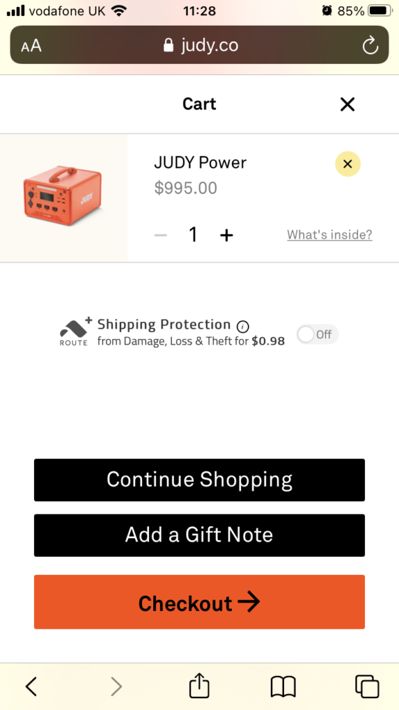
The last thing you want is shoppers with a full cart leaving your site because they can’t find the checkout button. We’re not saying you need to make it an all-singing, all-dancing show with flashing colors and a 90s style glitter background, but it needs to be visible.
Some ways you can do that include:
- Using contrasting brand colors
- Implementing a floating checkout button
- Having the cart button visible at the top of the page at all times
Most importantly, keep the checkout button above the fold to avoid shoppers having to scroll endlessly to find it – or, at the very least, make it sticky at the top or bottom of the screen.
Judy’s checkout button is displayed in contrasting colors to the other buttons.
2. Provide a guest checkout option
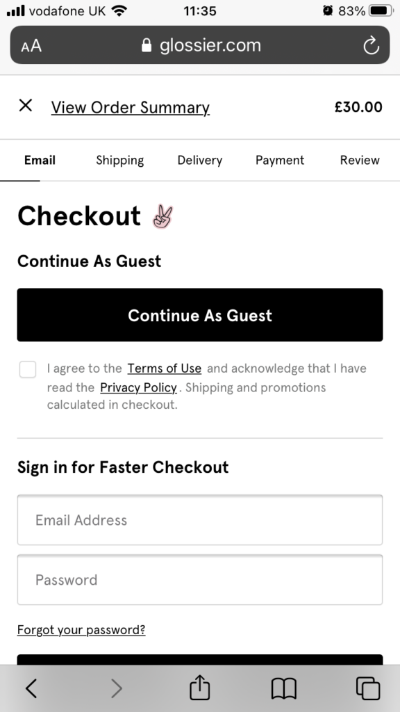
Not every consumer will want to hand over all their personal information to you (especially if they’ve never done business with you before). Avoid potential hesitation at this point by offering a guest checkout option that requires very few details from the customer – namely, just their email address to confirm their order and their shipping address to deliver the product.
60% of US retailers offer a guest checkout option that doesn’t require shoppers to fill out a profile and join the mailing list, while 14% of shoppers list “no guest checkout” as their number one reason for abandoned carts. Give people what they want and let them buy without signing up.
Glossier’s guest checkout option takes front and center stage on the checkout page.
3. Allow shoppers to use Google or social media
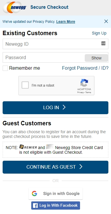
Alternatively, give shoppers the option to checkout using their social profiles or Google account. This makes it easy for shoppers to come back and see their past purchases without having to fill out a load of redundant forms.
It’s also great for you, too, since you’ll be able to remarket via social ads to customers that have given you their social media information and personalize their experience based on their general shopping habits.
Newegg lets customers log in as a guest, or with their Facebook or Google accounts.
4. Keep it simple
The KISS mentality (Keep it Simple, Stupid) is definitely one of the mobile checkout best practices. Phone screens have very little space for frivolities, and you want to keep the attention of the shopper on the most important elements – the buy button and the checkout button.
Get rid of unnecessary information and clutter, and make sure there’s plenty of white space to offset any text and images.
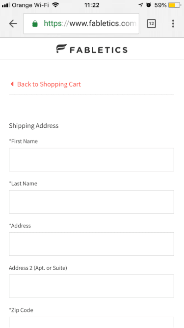
Take it one step further and apply a minimalist approach to the checkout experience. Only ask shoppers to provide information you really need to process the order and keep form fields to a minimum.
Fabletics keeps its checkout page incredibly simple and clutter-free.
5. Be clear about the shipping information
Pushing surprise costs on shoppers is a surefire way to erode trust and ensure they don’t come back. Instead of surprising shoppers at the end with excessive delivery fees, make sure you’re upfront and honest about them from the start. Is it going to cost an extra $5.95 to deliver? Say it! Will they be able to unlock free shipping when they spend a certain amount? Shout about it!
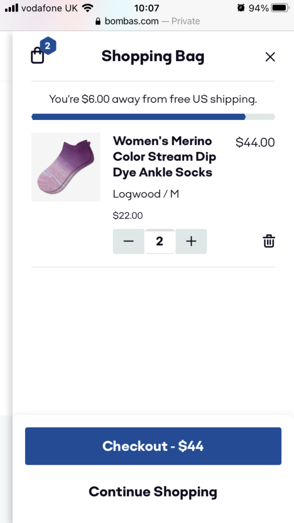
Get creative like DTC sock brand Bombas and add a progress bar that tells shoppers how far they are from unlocking free shipping. Not only does this keep them updated, but it can also drive up the AOV as people push to claim free shipping.
6. Show off your safety badges
Security is key when shopping online. Many consumers who are new to the whole buying online thing are wary about handing over their credit card information to brands they’ve never heard about before. In a recent Ipsos survey, almost half expressed distrust of online shopping.
Give hesitant buyers peace of mind by adding security badges and safety protocols to your site to show what measures are in place to protect their privacy. SSL certificates are a firm favorite for mobile checkout best practices, as are safety badges provided by your hosting company.
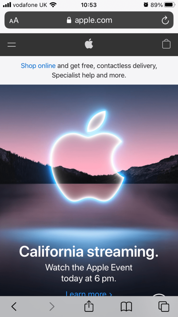
Apple promotes its security with a locked padlock against its URL – something a lot of secure brands choose to do.
7. Incorporate a progress bar
Lengthy and complex checkout processes are a turn-off for shoppers. The whole point of online shopping is that it’s convenient and easier than walking into a store and hand-picking a product.
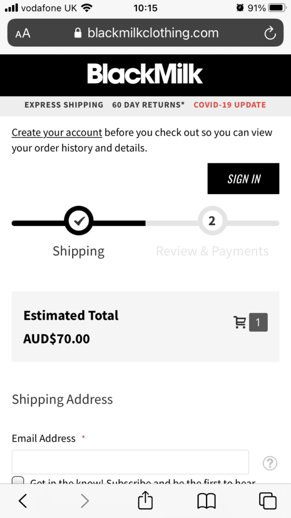
The clothing brand BlackMilk includes a progress bar that shows consumers where they are in the buying process. They can quickly and clearly see what section they have completed and how much further is left to go.
8. Offer different in-app payments
Apple Pay now has 507 million users around the world, and research suggests that by 2022 a third of US shoppers will use it to make purchases online.
Providing payment options that customers prefer, such as Apple Pay, PayPal, and Klarna will make buying from you a no-brainer. Plus, in-app payments mean customers don’t have to leave your ecommerce store and can usually buy with one simple click. It takes the friction out of the process and eliminates the increasing chance of a customer abandoning their shopping cart if they have to fill out endless fields for their credit card information.
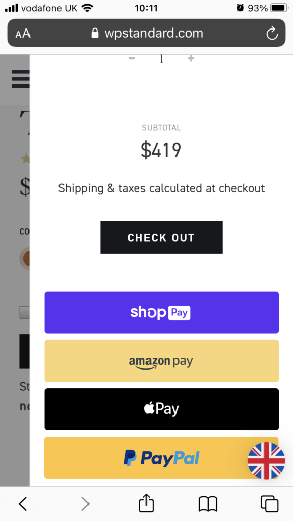
Whipping Post clearly states the payment options customers can use when they add items to their cart.
Enjoying this article?
Subscribe to our newsletter, Good Question, to get insights like this sent straight to your inbox every week.
9. Maintain a hierarchy of product information
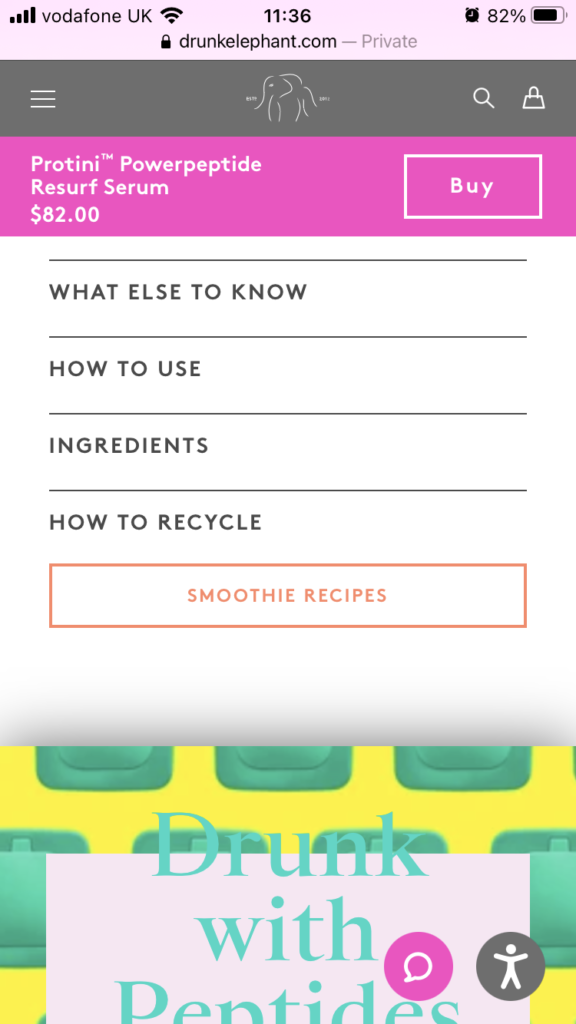
Coming face to face with a screen packed full of text and information can be overwhelming for a shopper. Keep things simple by creating a hierarchy of product information, starting with the need-to-know stuff, like what the product actually is, and providing either bulleted lists of secondary information (like benefits and features) or an accordion menu that provides further reading if shoppers wish.
Drunk Elephant features dropdown menus that shoppers can explore if they want to find out more information about a product.
10. Make use of floating buttons
It’s easy to “lose” a checkout button or a buy button if it’s buried on a page somewhere. Shoppers might find themselves scrolling up and down to find it or navigating back and forth between pages which can be frustrating and make the shopping experience longer than it needs to be.
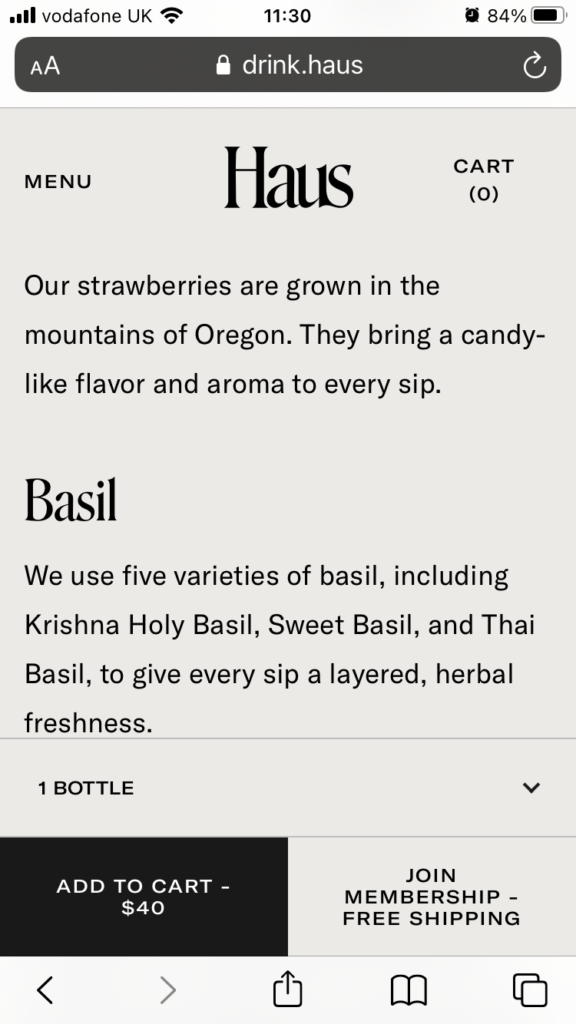
Make it easy by adding floating buttons to prominent pages. This might be a floating “buy now” button on a product page that stays stuck to the screen while the customer reads the description, or a floating “checkout” button that remains in place throughout the entire shopping experience.
Haus wines has a floating “add to cart” button that sticks around when a shopper scrolls up and down a product page.
11. Auto-fill information where possible
A consumer on a shopping spree doesn’t want to get held up typing in the same information over and over again – in fact, this can be detrimental for sales since you want to capture people who are in full-on buy-mode.
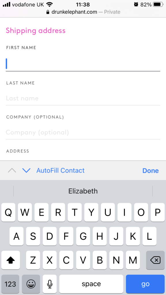
If someone has bought from you before or you can use a plugin that auto-fills important information like address and email address, do it. This reduces the touchpoints a customer has to go through to make a purchase and eliminates several moments of potential hesitation. The quicker a shopper can buy, the less time they have to talk themselves out of the purchase.
Drunk Elephant allows guests to autofill checkout forms based on information saved on their phones.
12. Offer upsells to increase AOV
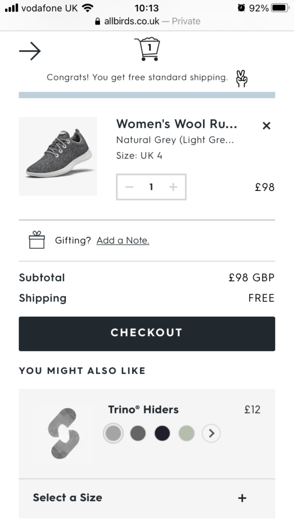
While the checkout flow needs to be smooth, it’s also a great opportunity to pitch other products to customers and increase the AOV. Upsells can boost visibility on your product line and build trust with customers as they start to feel like you “get” them (but only if the upsells are relevant!).
Take Allbirds, for example. They have a “you might also like” section inside the shopper’s cart that promotes relevant products. Here, they’re promoting a pair of trainer socks that someone buying a pair of trainers might want or need.
Post-purchase mobile checkout best practices
Once checkout is complete, you have a chance to really secure your relationship with a new customer. Instead of dropping off the face of the earth, keep the connection going with these best practices.
13. Send an order confirmation
You can lose a lot of trust with customers if you don’t send an order confirmation. Remember, they’ve just handed over their hard-earned cash, and proof of their transaction is crucial to maintaining their comfort levels with your brand.
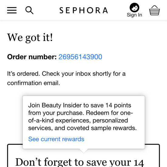
As well as sending an email, you can also create a “thank you” page that customers are directed to when they make it all the way through an ecommerce checkout. This can include their order number, subtotal, an order summary, a personalized message, and a little dose of your brand personality.
Sephora directs shoppers to a thank you page that confirms their order and offers them a little incentive.
14. Keep customers updated on the delivery timeline
Stay connected with your customers right until they receive their orders. Send regular email updates and let them track their order via your mobile ecommerce site – just generally keep them in the loop so they don’t start panicking about where their product is. This also cuts down on the number of customer service tickets you’ll receive asking “where is my product?”, so it’s a win-win situation for everyone.
Mobile checkout examples that convert
Easton Baseball increase mobile revenue by 659%
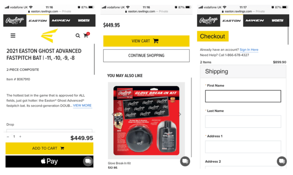
Easton Baseball was keen to grow its mobile conversion rate but didn’t know where to start, so they went through The Good’s Conversion Growth Program that identified a series of UX improvements the brand could put in place. The results showed that the majority of their customers were arriving on-site via mobile, but they weren’t converting. As well as making the product selection process easier, Easton Baseball improved the checkout experience to increase the path to purchase.
The checkout now includes a floating, stand-out “add to cart” button, upsells at cart level, and a guest checkout option.
Since implementing these best practices, the brand has seen a 659% increase in mobile shopping revenue, not to mention far happier customers.
Klean Kanteen increase mobile revenue by 80%
When Klean Kanteen came to The Good, their website wasn’t mobile-friendly, had a poor user experience, and wasn’t optimized for conversions. After a detailed audit, the brand implemented a number of mobile checkout best practices to optimize the buying process which led to an 80% increase in mobile revenue.
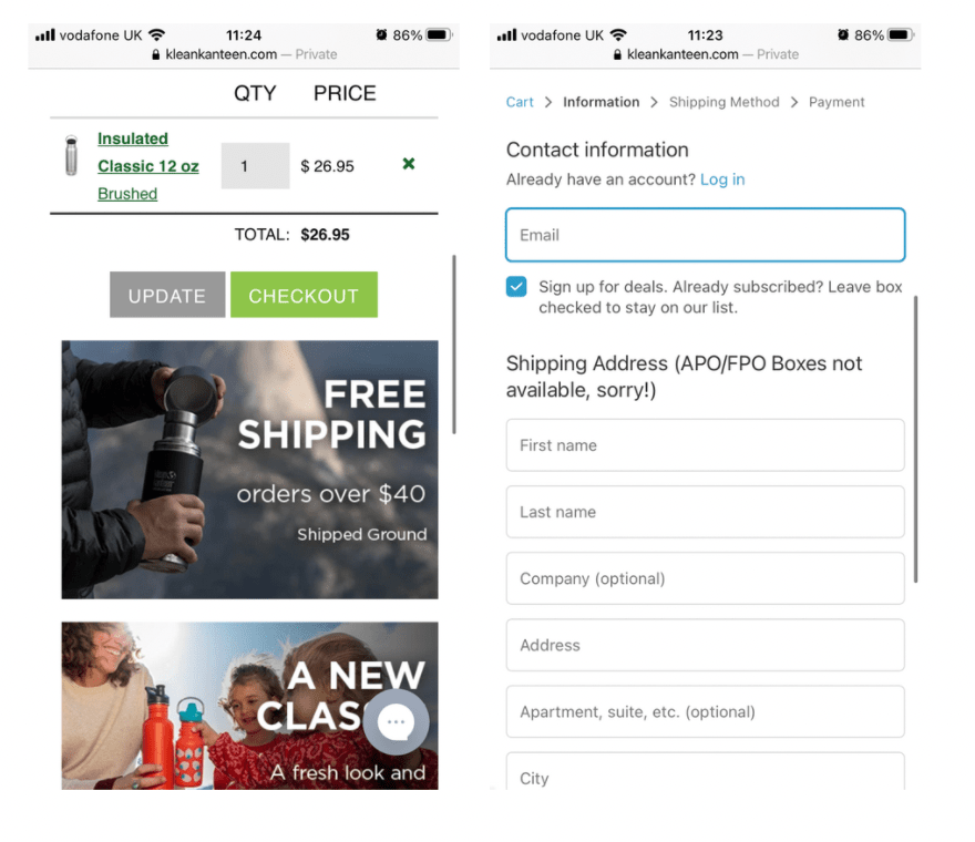
The mobile checkout experience now includes eye-catching “checkout” buttons, clear shipping information, and a guest checkout option.
Reduce your cart abandonment rate on mobile
Ready to improve your mobile conversion rates and capture the new wave of mobile shoppers? The Good’s Digital Experience Optimization Program™ identifies areas of improvement and helps you implement improvements to drive more sales and create a slick, friction-free buying process.

About the Author
Caroline Appert
Caroline Appert is the Director of Marketing at The Good. She has proven success in crafting marketing strategies and executing revenue-boosting campaigns for companies in a diverse set of industries.