
25 Ecommerce Checkout Process Best Practices that Convert
1 out of every 5 shoppers abandon cart due to a too long or complicated checkout process. Optimize your checkout process to turn more visitors into customers.

Your ecommerce checkout process is a key step in driving conversions. You’ve worked hard to attract visitors to your ecommerce website. You’ve put a ton of time and money into selecting and developing your products, making your marketing copy speak directly to your best prospects, and making the path to purchase clear and simple.
One thing remains.
If those visitors don’t make it through your checkout process to finalize the purchase, none of the rest really matters. The success of your ecommerce website rises and falls on how many sales you make, not on how many people you can attract to your site.
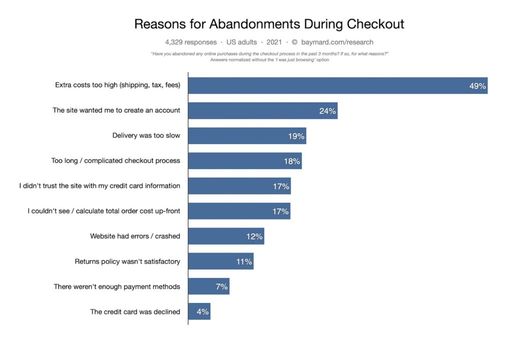
According to research from Baymard, average cart abandonment hovers around 70%. At the end of 2020, 1 out of every 5 shoppers abandoned cart due to a “too long / complicated checkout process.”
Can you see the opportunity here? How much money did your company invest last year on getting more traffic – both paid and organic? How much did you pay for website “improvements”? And how much went to specifically optimizing your online checkout process?
Not much, right?
In this article, we’ll show you how to turn more of your existing visitors into customers. We’re going to cover 25 checkout process optimization tactics you can put to work today. If you’ll do that, your cart abandonment rate will drop and sales will rise.
How often do you get them this close to buying, then lose the sale? That hurts.
What does the typical checkout process look like?
The checkout process encompasses the specific steps a consumer must take when completing an ecommerce purchase. The checkout process is the grand finale for an ecommerce website. It is where the prospect finalizes choices about the product, selects any add-ons, confirms shipping options, then provides payment.
No part of ecommerce stands alone. The visitor’s journey from awareness to interest, then on to desire and purchase, consists of a series of decisions visitors make based on the path you’ve provided. A failure anywhere on that journey means the loss of the sale. Dropping the ball during the checkout process is like a football team getting to the opposing team’s goal line, then failing to score. All of the effort it took to move that far goes unrewarded.
Checkout process design varies according to the strategy in play for each ecommerce business. We’re going to show you the top 25 practices we’ve found to be most effective.
The process typically follows this flow:
If you can boost your checkout completion rate by even five or ten percent, you can make a significant difference in your return on investment.
25 ways to score at checkout process design optimization
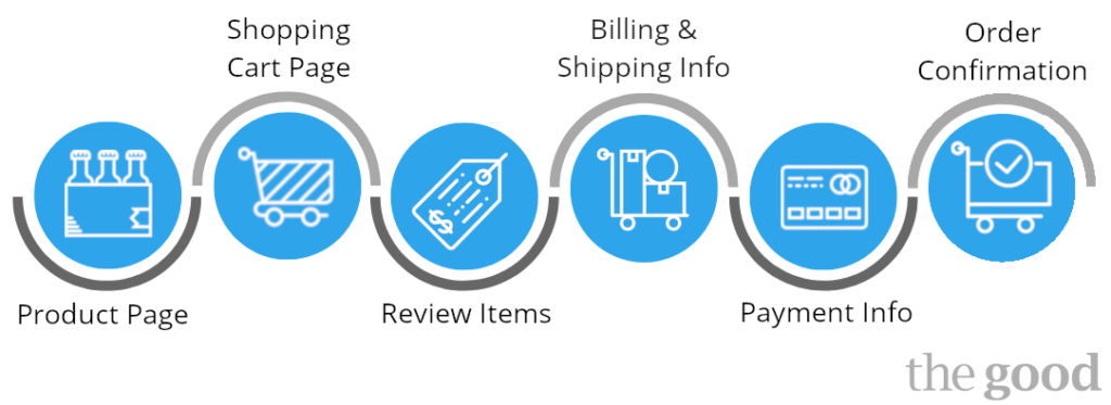
Much of checkout process optimization work is focused on eliminating distractions so shoppers can focus on finding and buying the item or items they’re searching for. It’s critical to make sure all necessary information is available and that the consumer understands the stages of the checkout process. Make it simple and make it easy. The checkout process begins at product selection and continues on to the confirmation email. To illustrate the concept, we’ll use an actual Office Depot order (file folders).
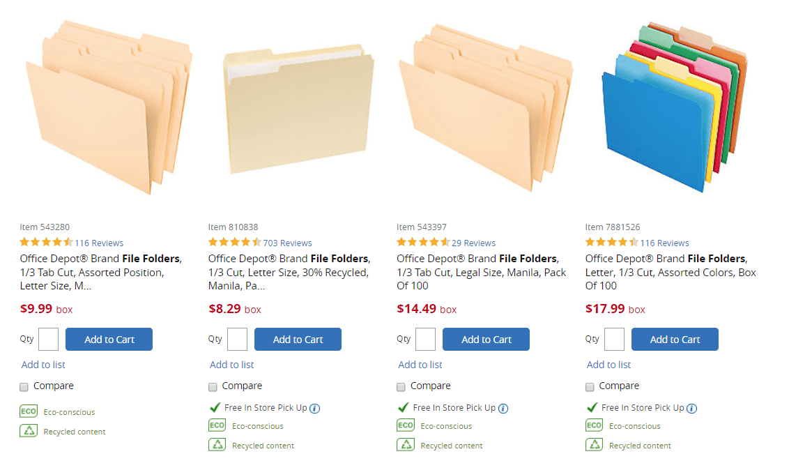
Office Depot provides links the shopper needs to review or get more info on the product, but notice which button stands out the most: Add to Cart.
Here are 25 key insights regarding the process as a whole:
1. Set expectations. Show visitors what to expect during checkout. Never make them guess. Confusion is your enemy; clarity is your best friend. Use simple graphics.
2. Show progress. Use a progress bar, accordion design feature, or other tool to show shoppers the steps they need to take to complete checkout and where they are in that process at every step along the way.
The Guide To Optimizing Your Checkout And Post-Purchase Experience
3. Don’t require shoppers to register before check out. Registration is a big source of friction on websites. Offer a guest checkout procedure so your users enjoy a smoother experience. And ideally only ask for this once they’ve completed the order.
4. Capture the buyer’s email early in the process. That will allow you to follow up with an email campaign aimed at saving the sale and building a tighter relationship with the prospect.
5. Keep the back button fully functional. Many people use the back button on their browser to ‘undo’ any actions they’ve taken on a site. If the back button does anything other than that, it could create additional friction.
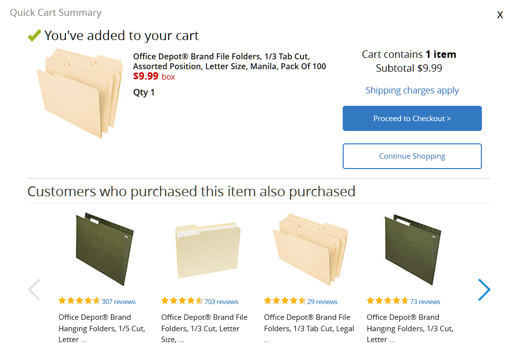
In the cart summary, I see there may be shipping charges. I also get options. The big blue button, though, leads me further down the path.
6. Keep customers on the same domain. Directing them away from one site to another causes disorientation and increases distrust.
7. Display trust signals throughout the checkout process. We usually recommend against putting credit card logos on the footer of every page of your site. Instead, we recommend including them and other trust signals on relevant pages of your checkout process.
8. Consistently remind visitors of your value. Highlight benefits like free shipping, easy returns, and your concern for their security while shopping.
9. Keep it simple. Reduce or remove the header and footer on checkout pages to help remove distractions.
10. Reduce alternative navigation at checkout. Be careful with this one though. This is most effective once you have already created a great checkout flow. If you do it before, consumers will feel trapped or lost and will simply leave altogether if they can’t easily return to the store.
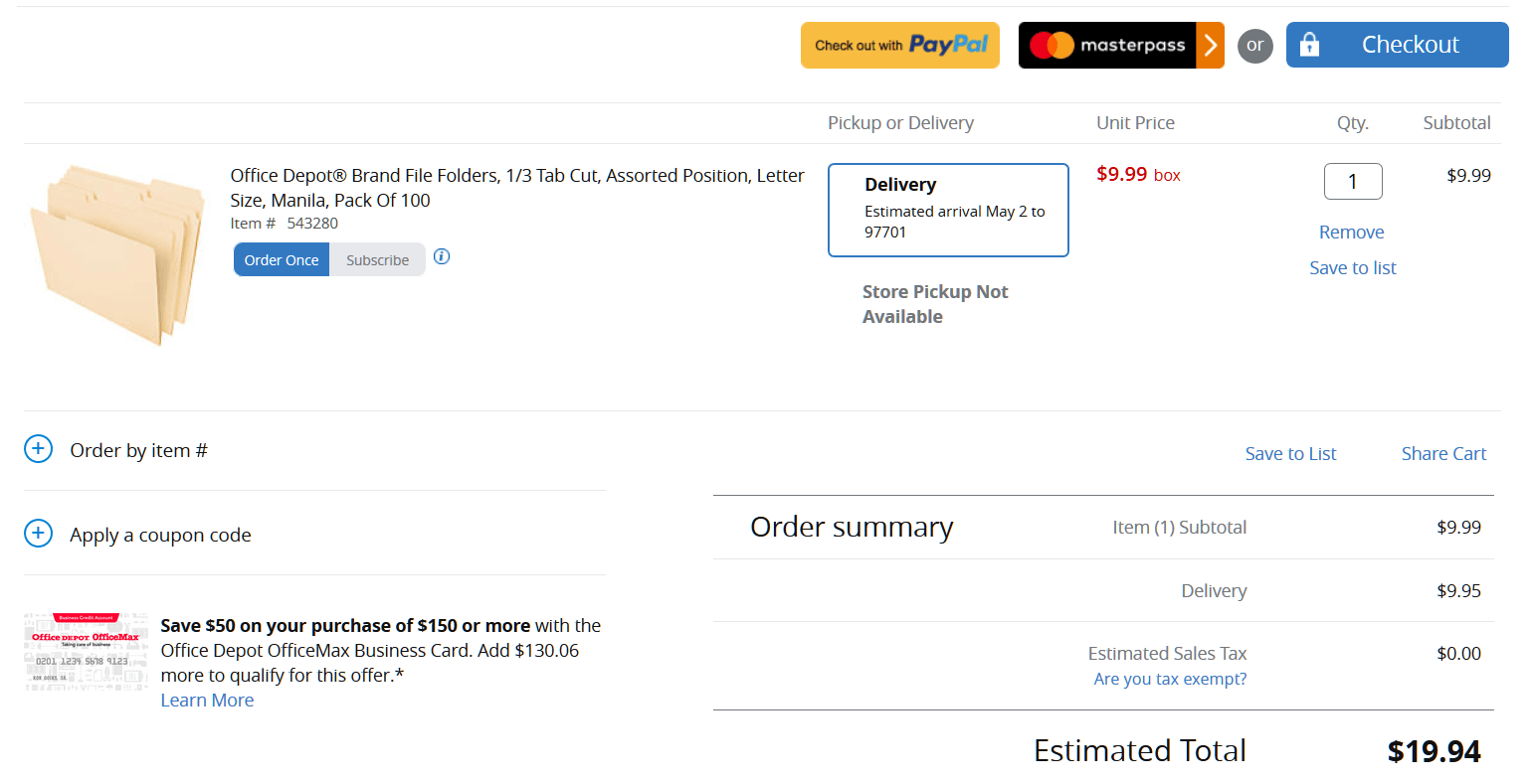
Ouch. The item isn’t at my store and shipping will almost double the price. Good thing they let me know. I missed the in-store pickup possibilities on the product selection page.
11. Provide real-time support (live chat). A little hand-holding can reassure prospects and help remove any lingering doubts.
12. Prevent shipping cost surprises. The easiest way to do this is to offer free shipping. If that’s not an option, consider a zip code/shipping calculator on the ‘Review’ page or flat rate shipping clearly stated on the product detail page.
13. Be transparent about inventory. Inform shoppers plainly about stock levels and delivery times.
14. Provide clear action items. Make “Add to Cart” the most obvious next action on every product detail page.
15. Display cart contents plainly and make it easy for shoppers to make changes to their selections.
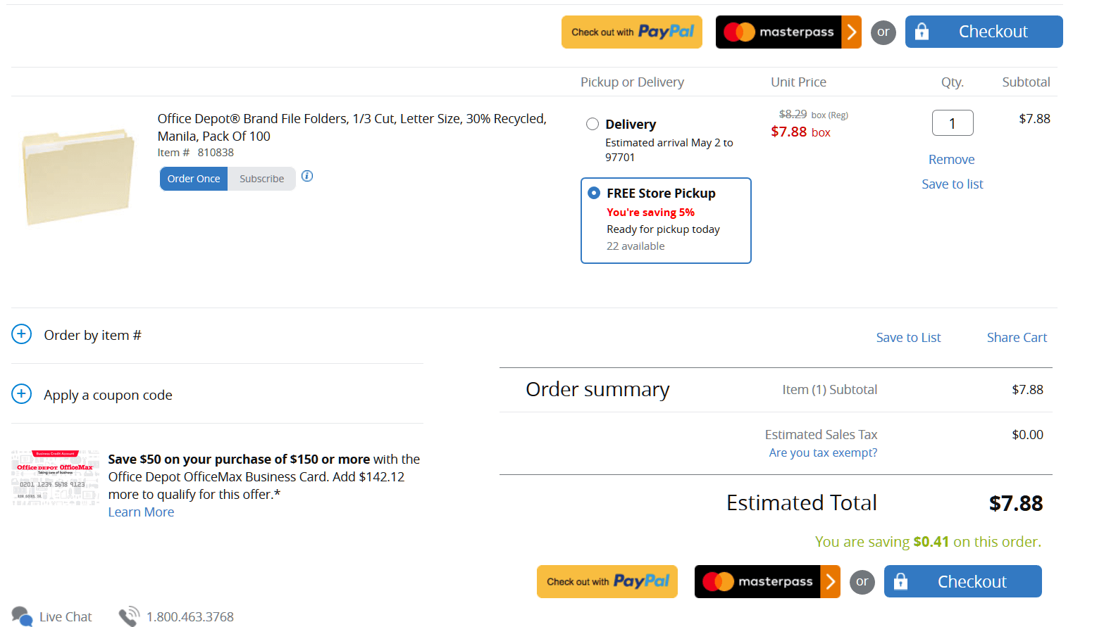
Much better. This item is on hand. I’ll even save 5% by ordering online. Note the payment options, coupon code possibility, and Live Chat options
16. Incentivize the purchase. Show complimentary items and coupon codes on the shopping cart review pages, but not anywhere else.
17. Give ample product detail. Provide photos, specifications, and links for the items in the cart.
18. Maximize efficiencies. Include the “Use billing address” option for shipping field to reduce extra input.
19. Use data validation and autocomplete to speed up the checkout process and reduce input errors.
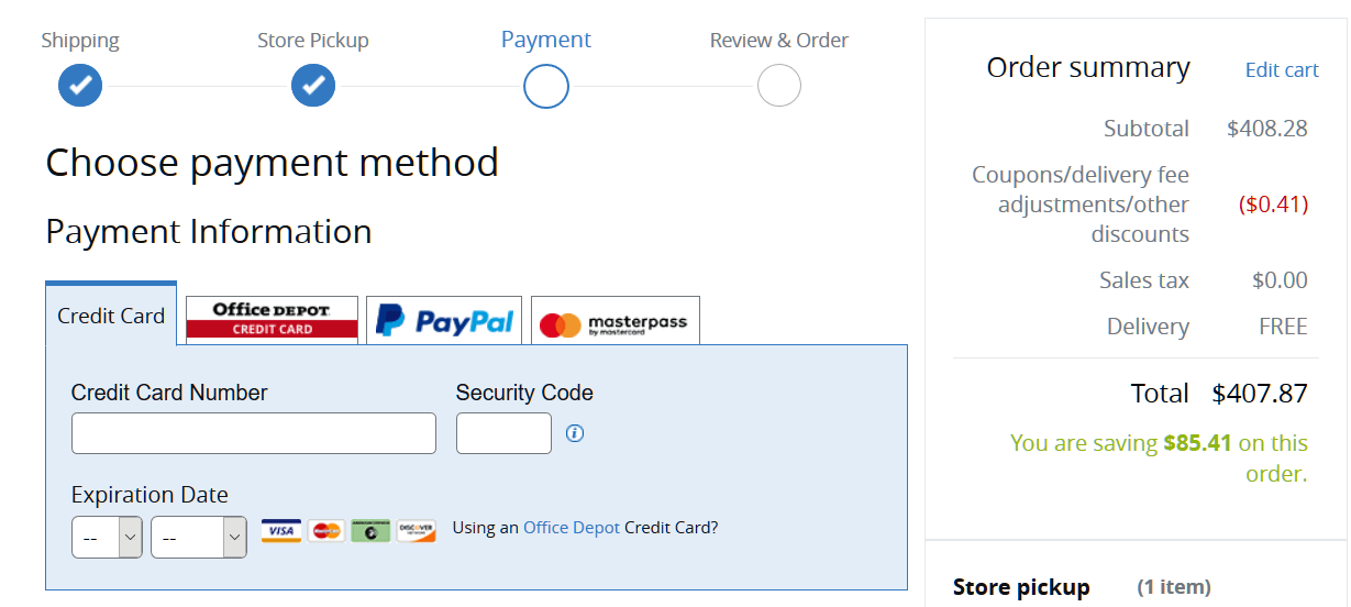
20. Provide payment options. What types of options do your best prospects want? Include each of those.
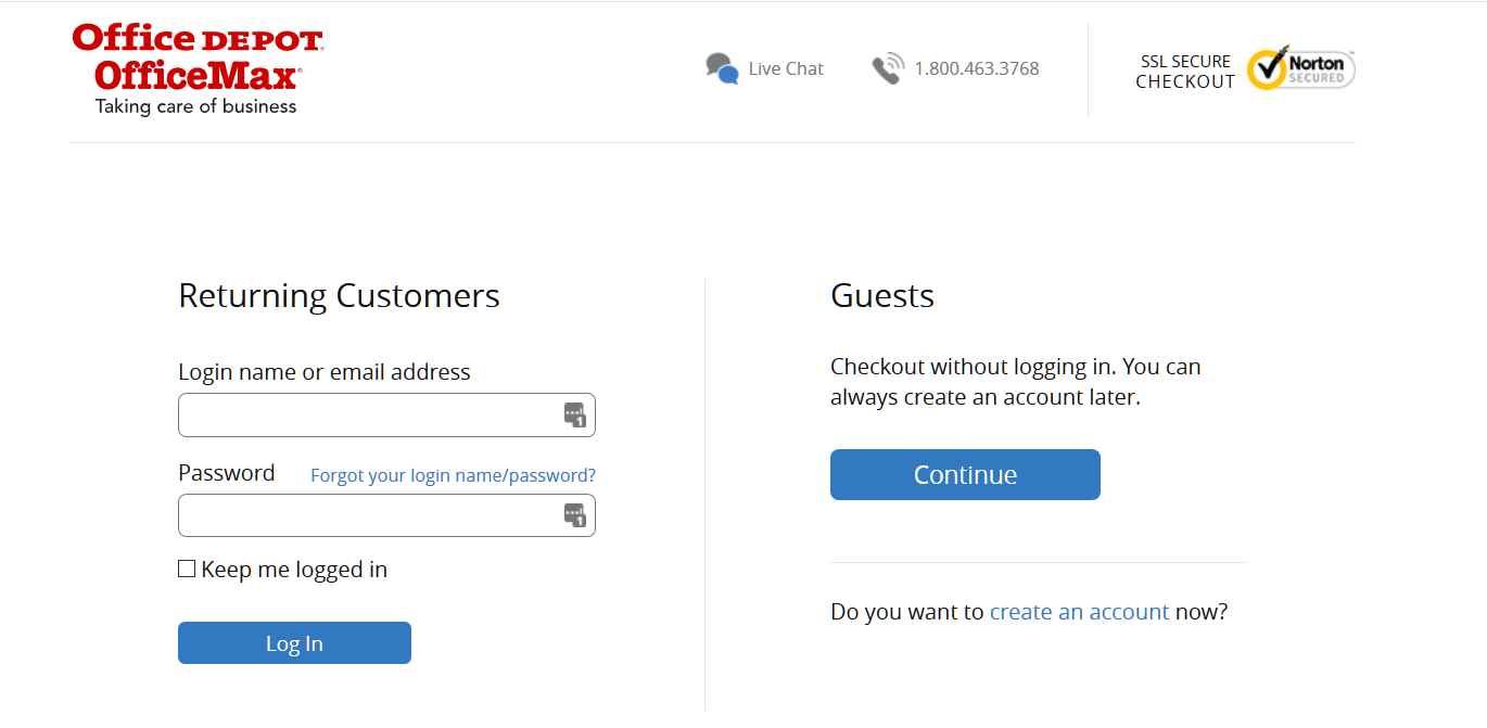
Ready to buy. I can log in, create an account, or check out as a guest.
21. Ask for card info last. Shoppers will be more inclined to complete this section after everything else is finalized.
22. Don’t be pushy. Offer account creation for guest checkouts on the Thank You page, not before. You already have the customer’s name, shipping address, and email address. All they really need to do is provide a password and opt in as a site member.
23. Follow up with a confirmation email to finalize the transaction.
24. Downplay coupons. If you bring too much attention to your coupon field, visitors will end up leaving your site to find coupons and fail to return.
25. Make next steps clear. Use color differentiation to make Next Step buttons stand out. Make the entire process absolutely simple to grasp and easy to perform (we can’t stress that principle enough).
Bonus Strategy: Keep the shopping cart open. Give shoppers a way to keep shopping during the checkout process without having to start the journey over again. If they want to add another item… let them!
How to effectively deal with cart abandonment
Even if you’ve implemented all 25 tips listed above into your checkout process, you’re likely still going to deal with a significant percentage of cart abandonment. Learning how to proactively deal with cart abandonment is almost as important as optimizing your checkout process and can help increase your conversions even further.
One of the most effective methods for re-capturing the attention of your prospects is through remarketing emails that specifically target customers who abandoned their cart. A report from SalesCycle showed that cart abandonment emails have a significantly higher open rate than regular marketing emails and newsletters (48 percent compared to 22.8 percent). In addition, the click-through rate (CTR) was higher for cart abandonment emails compared to regular marketing emails (6.5 percent to 3.4 percent).
It’s clear that customers respond positively to reminders of products they were previously interested in. If you aren’t already utilizing cart abandonment emails it’s time to start. Give the prospect a reason to come back to your site by reinforcing the most attractive aspects of the product and making it easy for them to return to the checkout process.
A company that has a great cart abandonment strategy is Warby Parker, who will send you an email reminder of what you left in the cart within 48 hours after abandoning.

This approach is effective because not only does it remind the prospect about the specific product they were interested in, but it highlights important details like “shipping and returns are both free”. They clearly position a call-to-action that takes you directly back to the checkout process, and they even provide a customer service number in case the prospect had any specific questions or hesitations about the product.
This is just one example of an effective method for dealing with cart abandonment. Cart abandonment is inevitable, but it doesn’t have to be the end of the interaction with your customer.
Online Checkout Process Design Is a Crucial Consideration
Your checkout process isn’t the only part of your path to sales that needs consistent optimization consideration, but it’s certainly one of the most crucial parts of the process that is often overlooked.
Optimization is an ongoing process. Develop ideas, make a change, test to see how it affects sales. Keep going. Eventually, you’ll discover that optimization can not only be fun and enlightening – it can pay off big in return on investment.
If you’re looking for better results from your website but don’t know where to start, get your free 5-Factors Scorecard™.
Enjoying this article?
Subscribe to our newsletter, Good Question, to get insights like this sent straight to your inbox every week.
About the Author
Jon MacDonald
Jon MacDonald is founder and President of The Good, a digital experience optimization firm that has achieved results for some of the largest companies including Adobe, Nike, Xerox, Verizon, Intel and more. Jon regularly contributes to publications like Entrepreneur and Inc.