The Fundamentals of Visual Design and Why You Need It
Visual design utilizes imagery and visual cues to improve the overall user experience. Learn its fundamental principles and see some best-in-class examples.

Humans are visual creatures. We taught ourselves to read and write, but we evolved to process the imagery of the world.
Nearly 50% of our brain is involved in visual processing – We can process images in just 13 milliseconds, which is 60,000 times faster than text.
This innate skill not only applies to our physical surroundings, but the digital products and websites we use. Raw text and plain links are boring and unengaging, even if they function well.
What’s more, we can use colors, shapes, and lines to provide visual cues that communicate specific functionality, which creates affordances that support a better and more efficient user experience.
Ultimately, we can use visual design and aesthetics to improve functionality.
In this article, we explain the fundamentals of visual design and why your site needs it, providing examples to help you incorporate these principles into your own user experience.
Our goal is to show you how to think about design strategically and objectively to improve your site’s user experience.
What is Visual Design?
Visual design is a combination of both graphic design and user experience (UX) design that uses aspects of the site, such as brand identity, internal consistency, and visually communicated goals, to provide a unified, cohesive experience to its users.
Basically, visual design is the use of aesthetics to support a system’s usability. That system could be a physical product, an app, or your ecommerce site.
A strong visual design doesn’t take away from the site’s content, usability, or conversion potential. Instead, it enhances these functions by creating an engaging and trustworthy experience for users.
Let’s look at a super basic example: The checkout button is just a link, but we always see it styled like a button. It’s typically displayed visually, rather than with just text. Which of these two links supports the user experience better?
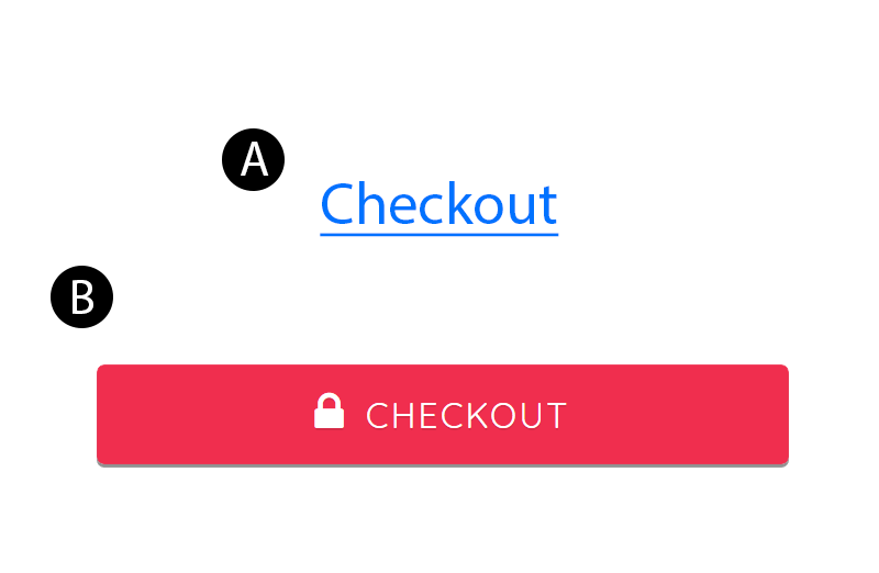
Option B is clearly more effective.
The colored background and space it occupies on the page make it stand out as a button. The lock icon assures users that clicking it is safe. The slight shadow and conventional design as a button communicate its functionality clearly, appealing to users’ affordances.
Our innate ability to quickly process these visual cues provides a more efficient user experience and minimizes the effort required to interact with a site, improving the overall experience and bringing users one step closer to conversion.
The Aesthetic-Usability Effect
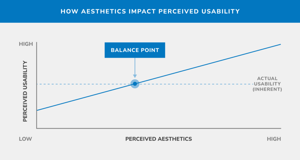
There’s a misconception that visual design has a minor effect on the overall user experience, but it actually plays an important role in positively impacting user perception and the overall experience. We can observe this impact through the aesthetic-usability effect.
The aesthetic-usability effect refers to our tendency to perceive attractive products as more usable. If something looks better, we tend to think it will work better, even if it isn’t as effective or efficient. Essentially, a positive emotional response to visual stimuli makes us tolerate small usability issues.
The aesthetic-usability effect was first studied in 1995 when researchers Masaaki Kurosu and Kaori Kashimura from the Hitachi Design Center tested dozens of variations of an ATM user interface. They asked the study participants to rate each UI design on two criteria: 1) ease of use and 2) aesthetic appeal.
The researchers found a strong correlation between the participants’ ratings of aesthetic appeal with perceived ease of use. The correlation between their ratings of aesthetic appeal with actual ease of use was much lower. Therefore, not only are users influenced by aesthetics to the point of overlooking usability challenges, they do so even when they are intentionally trying to evaluate the functionality of the system.
Naturally, there are limits to this effect. A pleasing design can make users overlook minor usability issues, but not substantial ones.
For instance, if your customers can’t find the products they need on your ecommerce site, no pretty layout or trendy color scheme will save the sale. But if you find the balance, you can make users perceive more usability than there actually is.
Source: https://uxdesign.cc/the-importance-of-clarity-in-ux-91052e0ad4e4
Ultimately, form and function need to work together. When interfaces and digital experiences struggle with usability issues, or when aesthetics are completely neglected for the sake of usability, the users tend to have a poor experience. The solution, therefore, is balance.
The 5 Principles of Visual Design
There are five basic principles of visual design. When used properly, they create a pleasing experience that keeps users engaged and helps them navigate the site to find what they need.
Visual designers apply these principles whenever they combine lines, shapes, colors, textures, typography, and layout.
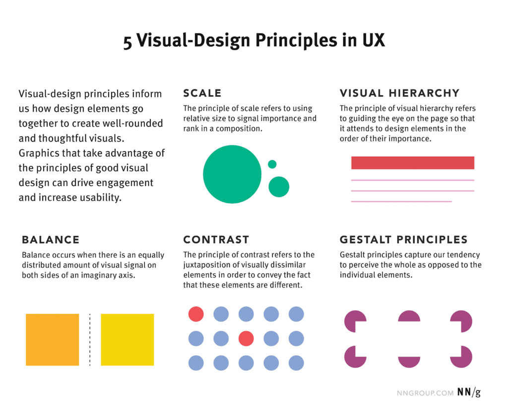
1. Scale
Designers use scale to establish the visual hierarchy of content on a page.
Scale uses the relative size of elements (such as text, icons, or CTAs) to indicate the importance and rank of the element in relation to other components on the site.
Proper use of scale can demonstrate how items relate to one another and create clear visual boundaries that help guide the user efficiently through the content on the site.
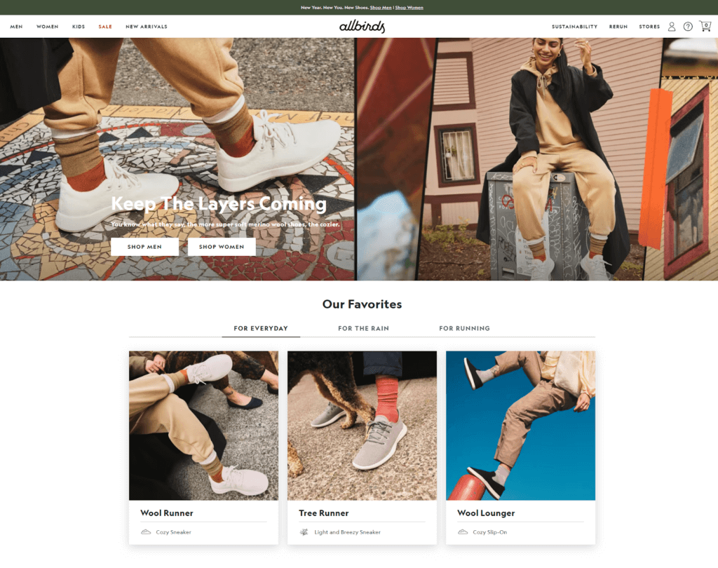
Notice how Allbirds makes their hero row full width and taller than subsequent rows. It draws the eye and directs you toward those options.
2. Visual Hierarchy
Visual hierarchy controls the delivery of the experience by guiding the users’ eyes sequentially down a page using elements on the site such as color, size, spacing, and organization of content.
Unclear page hierarchies with elements competing for visual attention can create clutter that makes a site feel overwhelming and difficult to navigate.
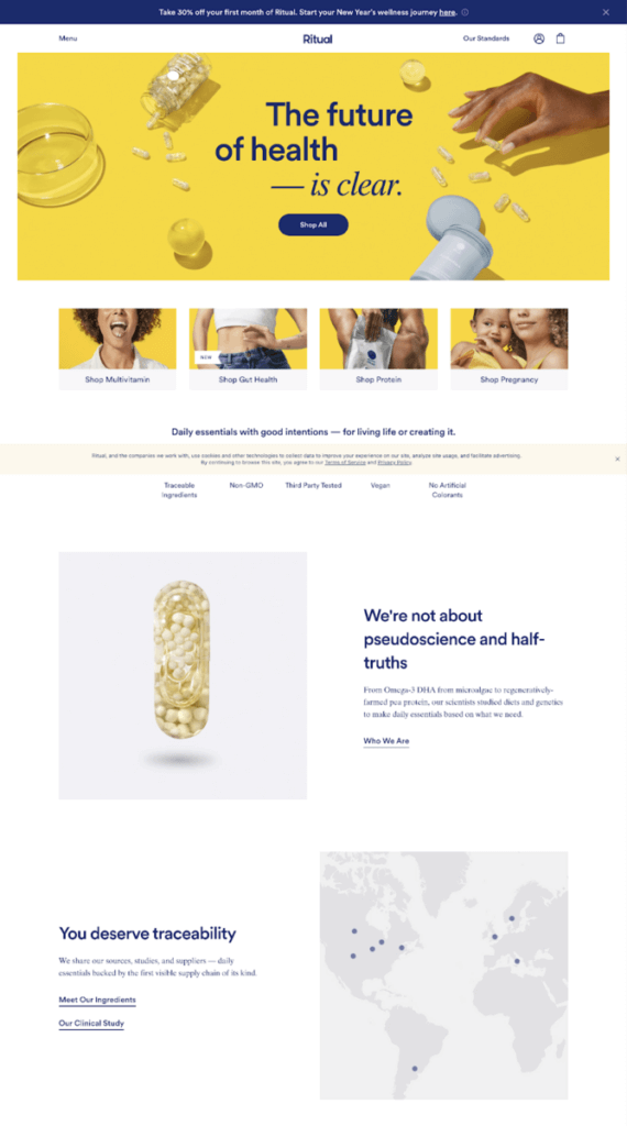
Ritual does a great job utilizing white space, layout, and scale to signify the most important content on its homepage.
The large text, both in the hero area and further down the page, directs the user’s attention, while the organization of the content follows the conventional left-to-right, down-the-page layout, typical of western reading patterns.
3. Balance
Achieving visual balance on a page requires the visual weight of elements on a site, such as imagery or text, to be equally distributed across an imaginary y-axis down the center of the page.
Balance can be symmetrical or asymmetrical. A page is considered symmetrical when there is the same or a similar amount of content on both sides of the axis, while an asymmetrical page contains the same amount of visual weight on both sides of the axis but with different elements, sometimes in different locations.
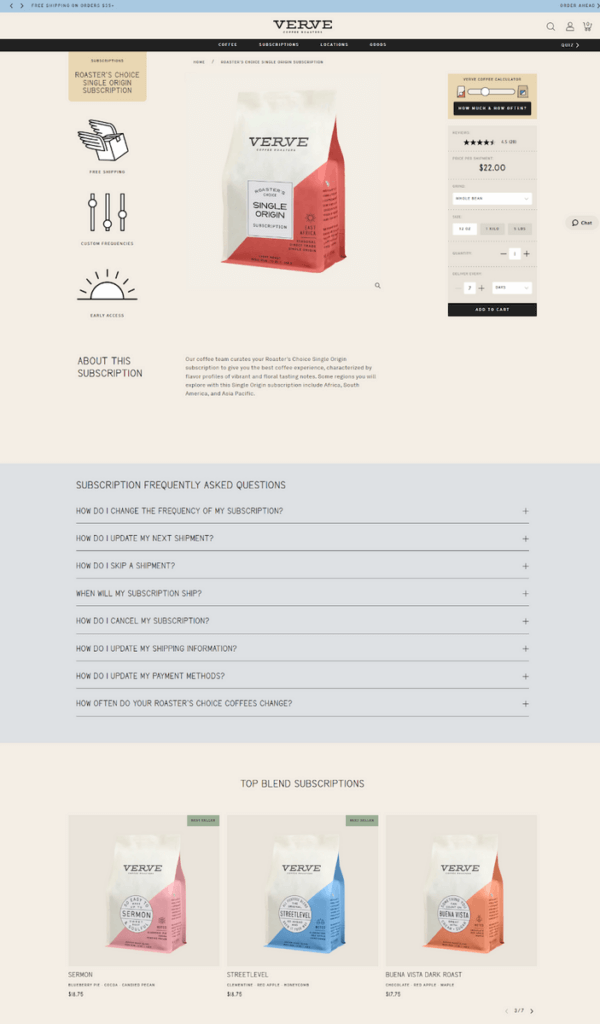
This Verve product details page is a great example of symmetrical balance. The product image in the center is winged by elements on the right and left. If you scroll a bit, the right-side add-to-cart widget scrolls with you, so there’s always even weight on that side.
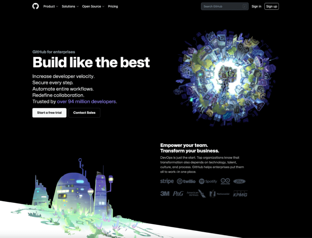
Github showcases asymmetrical balance on its site using heavy imagery on both corners of the page and bolder text to the right to maintain consistent visual weight on both sides of the imaginary y-axis of the page.
Enjoying this article?
Subscribe to our newsletter, Good Question, to get insights like this sent straight to your inbox every week.
4. Contrast
Designers use the principle of contrast to help users differentiate between elements on the page.
A greater visual contrast typically signifies a greater difference between site elements, whereas similar items are given similar characteristics or functionality. Items can contrast based on size, direction, color, and other characteristics.
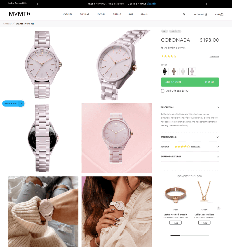
Notice the contrast on this MVMT page. The green add-to-cart button is impossible to miss. It’s more important than other elements.
5. Gestalt
Gestalt principles acknowledge our tendency to group similar elements together.
Our brains love patterns, so when we see similar items together, we perceive them as a whole unit, rather than individual elements.
These principles include similarity, continuation, closure, proximity, common region, figure-ground relationships, and symmetry & order.
For a basic example, check out the NBC logo. On their own, the colorful map pin-shaped icons don’t mean much. But when they are arranged just so, along with some clever whitespace, we see the NBC peacock.
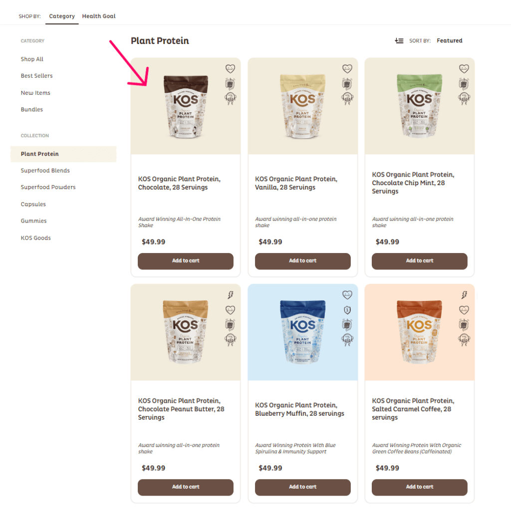
This KOS category page uses the common region Gestalt principle by enclosing each product within a container, helping you understand what’s related. Instead of seeing a title, a price, an image, and a button, you see a product listing.
The Role of Visual Design in User Experience
Visual design is a powerful tool you can use to support the user experience. Visual designers don’t just create eye candy.
They use their designs to make websites and interfaces simpler, more intuitive, and more accessible. Once usability is assured, they use design to impress your shoppers with your brand’s presence and style.
Any page of your site or screen of a digital product can be broken down into fundamental elements: type, lines, shapes, colors, textures, volume, and negative space.
Visual designers use these elements to direct us to important information, express functionality, and help us move forward toward a conversion.
To use design to support usability, you can follow the structure of the UX Design Pyramid. The pyramid is similar to Maslow’s Hierarchy of Needs in that each level serves as a foundation for the levels above it.
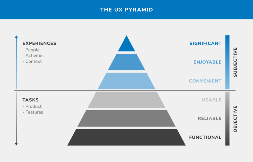
Source: https://syndicode.com/blog/the-ux-design-pyramid-with-the-user-needs/
- Functional – The design meets all of the requirements to work the site. The most important tasks are in high-value places. The clicks required to achieve the site’s purpose are as minimal as possible. The site has a low learning curve.
- Reliable – The site’s information is available, accurate, and consistent. It works properly on all browsers and devices. It works the same way every time.
- Usability – Users can easily find what they need. No one gets lost or confused. They can move toward their goals without much struggle or thought.
- Convenient – Users want to use the site because it’s easy. There are no barriers that make using your site difficult. Content appears exactly where it’s needed.
- Enjoyable – Users invest themselves in the site and want to share it with their friends. There are delightful features, such as high-resolution imagery, microcopy, error guidance, animations, tactic transitions, and more.
- Significant – The site becomes a tool users love. Pain points and obstacles have been reduced almost entirely. The site is personalized to their needs.
The bottom of the pyramid contains the fundamental requirements of a successful design. These elements must come first. After all, when a user visits your site, it’s paramount that they can complete a task.
Completing the task should be simple, predictable, and intuitive. Your users shouldn’t be forced to carry a large cognitive load just to shop at your store.
Aesthetic elements start to step in around step three.
Those design principles we explained can be used to make information easy to find. A well-designed menu and clear calls to action prevent people from getting lost.
As you get to the top of the pyramid, you’ll be working with aesthetics entirely to strengthen your brand presence, but at this point, the site should work.
What would happen if you skipped the usability steps and focused on aesthetics? A terrible user experience, most likely. Your site would look pretty, but fail to convert.
5 Best-In-Class Examples of Visual Design
Now that we’ve discussed visual design thoroughly, let’s look at some best-in-class examples. Use these to inspire your design work.
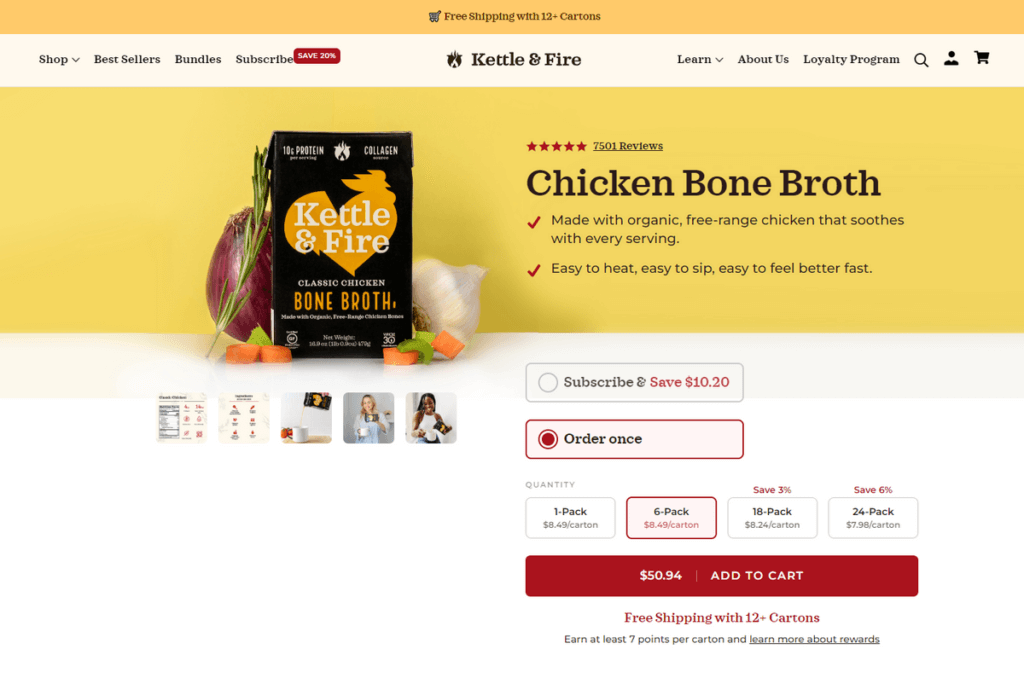
1. Kettle & Fire
This Kettle & Fire product page uses design to assist usability. Notice how the designer uses lines (containers), colors, and icons to indicate the options that are currently selected.
You can tell, at a glance, that clicking the add-to-cart button means ordering one 6-pack. The subscription option and other quantity options are clearly inactive. Furthermore, we can tell by their form, arrangement, and spacing that we can interact with them.
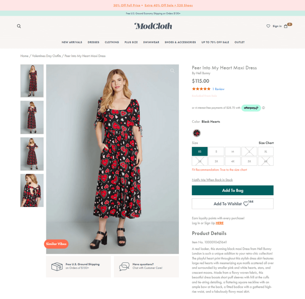
2. ModCloth
This is a fairly conventional product page, but let’s talk about why it’s great.
First, there’s a good use of scale. The image and call-to-action button are the most important, so they are the largest and most colorful. Less important elements (such as the “Earn loyalty points” copy) are gray, small, and out of the way.
Furthermore, the page is balanced and easy to look at. Your eyes are drawn to the main image first. The weight is about equal on both sides.
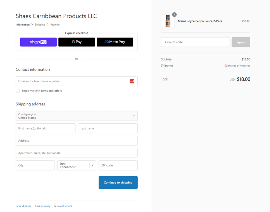
3. Shopify
Shopify had a unique challenge when creating its checkout page. It has to work with all of the brands they serve.
Their approach was to keep things minimal. They use balance to feature the checkout form from the shopping cart.
Everything is fairly nondescript except the “express checkout” buttons and the “continue shopping” button that use contrast to stand out on the page.
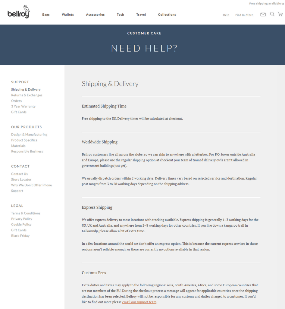
4. Bellroy
Informational pages are usually quite boring. Most ecommerce sites neglect to give them much thought. But Bellory was intentional with their design choices.
While the page is still somewhat boring, it functions well for its intended purpose.
The scale directs users efficiently to what they need on the page.
“Need help” is the first thing users see, letting them know where they are on the site. Next, a user’s eye is drawn to “shipping delivery” which lets them know what topic they are on.
Lastly, the headers for each section on the page are visible and scannable, helping a user quickly get the answers they are looking for.
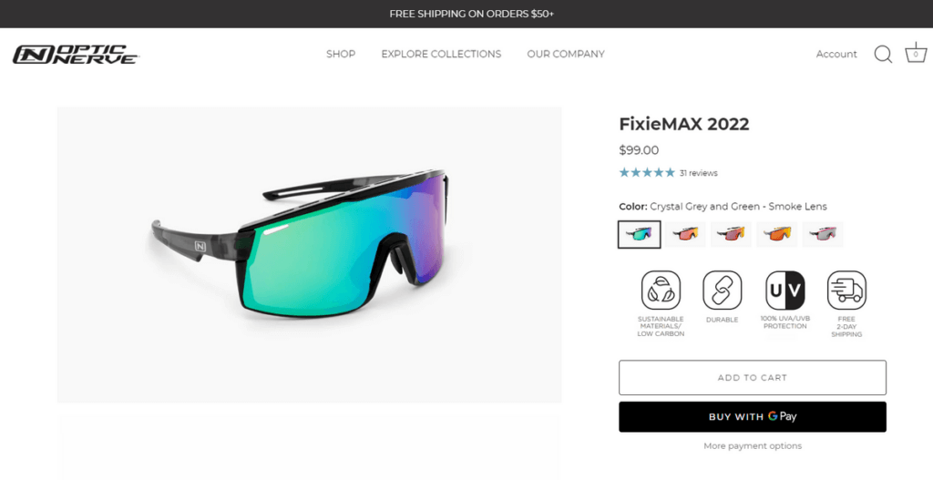
5. Optic Nerve
Optic Nerve knows its customers are buying for aesthetics, not just function. They care about the look and style of their sunglasses.
So instead of simply listing the color options or offering a drop-down selector, Optic Nerve uses thumbnails of the color options as selectors. This encourages exploration.
The brand also includes value-proposition icons below the thumbnails. This quickly tells users about the products’ many benefits in an easily scannable and visual manner.
Using Visual Design to Build a Better User Experience & Boost Conversions
Ultimately, when visual design is properly incorporated into a site, it can have a profound effect on the user experience.
But before you change the visual design of your ecommerce site, it’s important to think strategically and remember the pyramid we mentioned before.
The functional aspects of the site should be fully flushed out before visual aspects can be considered.
Once that is achieved, aesthetics can support usability and create a strong brand presence, which leads to higher conversions.
If you’re interested in having an expert take a look at the usability and design of your site, explore our Wireframe Audit.
Enjoying this article?
Subscribe to our newsletter, Good Question, to get insights like this sent straight to your inbox every week.
About the Author
Maria Balus
Maria is a UX Specialist at The Good. She uses her knowledge of user-centered design, evidence-based methods, and human behavior to provide research that inspires intuitive, functional design.