
Case Study: How To Convert First Time Visitors Like Bombas
Only 0.25% of new visitors to your site will buy on their first visit. This past weekend, we bought something on our first visit to a new-to-us site and lived to write the Case Study about our experience.

As a Conversion Strategist, I analyze and optimize ecommerce, lead generation and subscription service websites every day. I was intrigued by how effectively Bombas was able to convert a first time visitor like me into a customer on their ecommerce site, so of course it made sense that I wanted to analyze Bombas’ conversion experience at each step of the process.
Along with millions of others, I am a runner. I love running: any distance, any time, anywhere. So what I put on my feet matters to me and I’m willing to pay a premium price for better comfort. I’ve had a difficult finding a good pair of socks that I can wear on a run, in the gym, or simply for all day casual wear. I haven’t run any active Google queries for athletic socks but I’ve had in the back of my mind that I need to find a couple/three pairs of new athletic socks.
With that as my mindset, I saw a timely banner ad, got directed to an effective ecommerce site I’d never seen before, and converted into a new Bombas socks customer within the span of a few minutes.
So, how did they do it? And how did they do it so well?
Disclaimer: This Insight is 100% personal opinion, 0% sponsored content. I have no financial stake or connection to Bombas. They are not a client of The Good. I just liked their first-time customer experience and wanted to analyze it and share my findings.
Advertising
Grade: A
It is well-known that Google and Facebook have mastered the art of passive profiling to get eerily-accurate targeted ads to individuals–whether you like it or not. So I shouldn’t have been surprised to see an attractive ad for Bombas athletic socks in my Facebook feed over the weekend.
Normally, I suffer from banner blindness just like everyone else so I rarely ever notice banner ads, let alone click on them. But this ad caught my eye–it must have been the right time and the right place because I wanted to find some better athletic socks but hadn’t started searching.
The most effective advertising is subtle. I had already heard of Bombas from somewhere but I couldn’t place it. Maybe a barrage of ads bled into my subconscious over the last few months and I just finally noticed this one. Maybe I’d heard Daymond John mention them on Shark Tank. Whatever it was, I already had a positive opinion of the Bombas brand before I decided to click on the ad.
Landing Experience
Grade: B-
My state of mind after actually clicking on the Facebook ad was elated. Maybe I’d found the missing link to high-quality, performance athletic socks. That’s why I was disappointed when I was immediately presented with a pop-up modal to give out my email address and get 20% off:
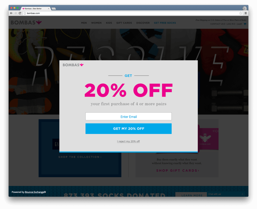
My feeling of elation was immediately replaced by disappointment. I had no connection with this brand yet and I hadn’t even explored their products. I wasn’t ready to make a larger commitment to them and subscribe for future solicitation if I wasn’t going to buy today. To make matters worse, I had to intentionally click on the wording “I reject my 20% off” with a concern that I may not be able to get this offer again if I did decide to buy later.
The saving grace to this experience was that I very clearly knew that there were discounts being offered to this site. A mental note that would come in handy later.
Homepage
Grade: A-

The main hero image with RESOLVE on it wasn’t doing anything for me. What am I resolving to do? I did like that there were clear calls to action: “Shop Men’s” and “Shop Women’s” with on-brand color coding for easy visual hierarchy that even matches the color schemes of the two touts below them.
But before I click on “Shop Men’s”, I wanted to see what lies below the fold.
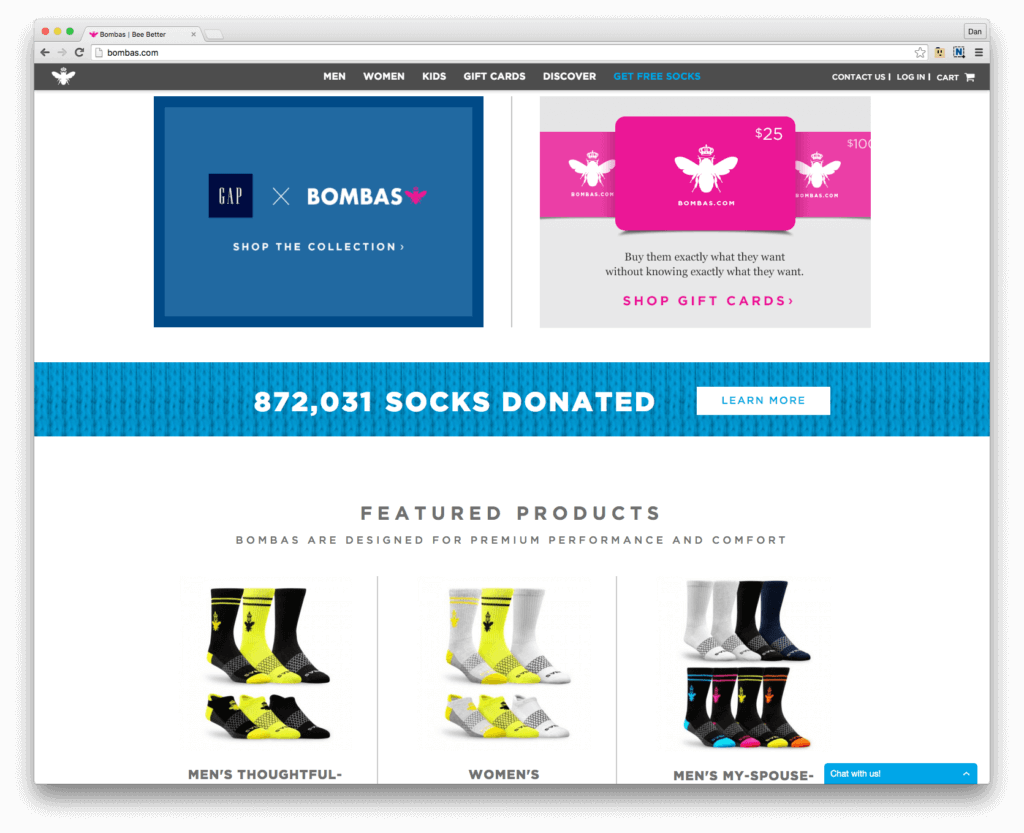
The Gap logo didn’t grab me since I don’t typically shop at The Gap but I could quickly connect Bombas to a major corporate brand. This was more effectively served as a form of social proof which gave me a little more comfort that Bombas was a reliable company. The Gift Cards promotional tout was completely irrelevant for me as a new visitor, it would’ve been more helpful to present me with a starter product or product advantages selling point.
The rolling count of “socks donated” was compelling enough to give me an impression that Bombas was committed to social responsibility. I wasn’t quite clear on what it meant at this point and I was here to shop for socks so I didn’t click on “Learn More”.
The sticky menu stays with me as I scroll down the page which makes me read it for the first time. Very simple, 1-2 word category names with no ambiguity whatsoever. This meets The Good’s best practices for great navigation.
Finally, as I scroll down the page, I start to see a hint at the products in the Featured Products section:
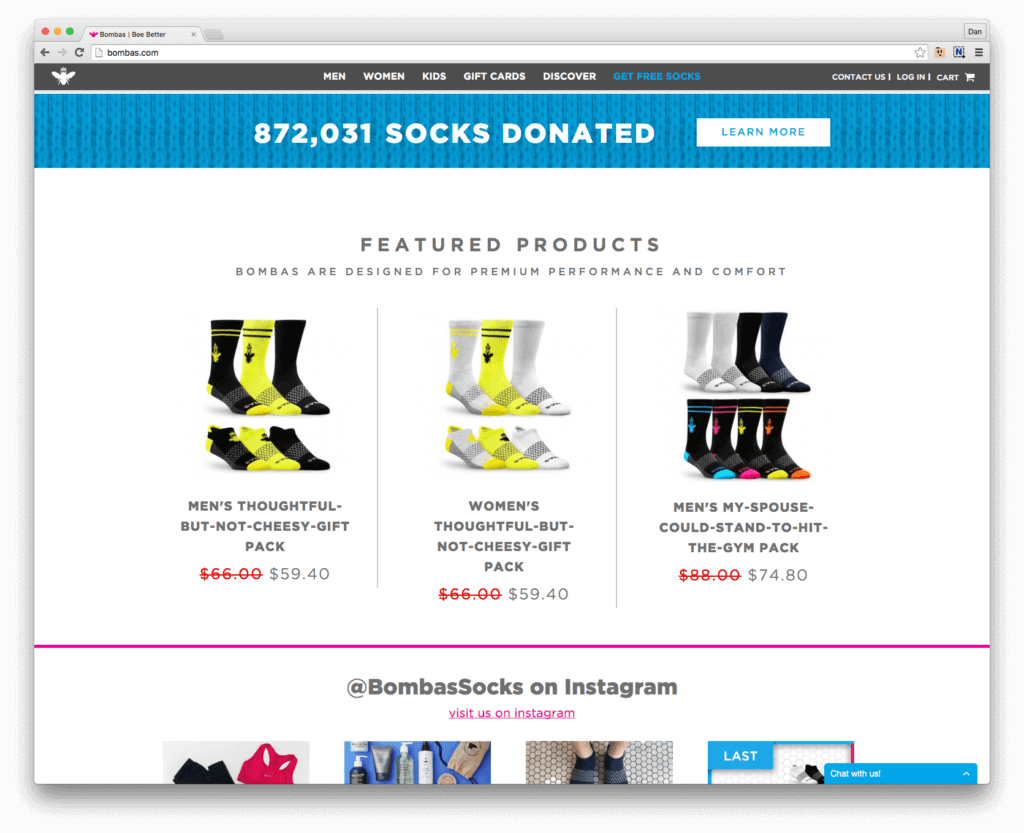
The bright colors of the products draw me in and the sale prices keep me locked on this section. Prices are high for socks but I’m looking for premium products and they’re offering me a sale price, it seems. I still don’t know if these are premium quality socks but I’m starting to feel that they are. The product names aren’t resonating with me since I’m not looking for a gift but the mix packs with discounts are intriguing.
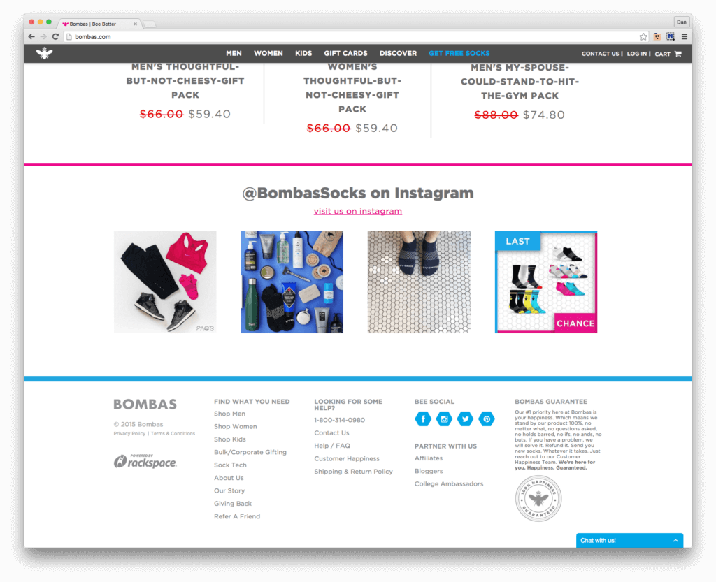
Below the products looks like an Instagram feed so I’ve likely reached the end of relevant content for this page.
Category Page
Grade: A-
By default, the most relevant link I’d seen on my customer journey so far was the “Shop Men’s” at the top of the homepage. Since I was at the bottom of the homepage, the sticky menu that trailed with me helpfully directed me back to the Men’s section without the need to scroll back to the hero image. It was also conveniently in the footer.
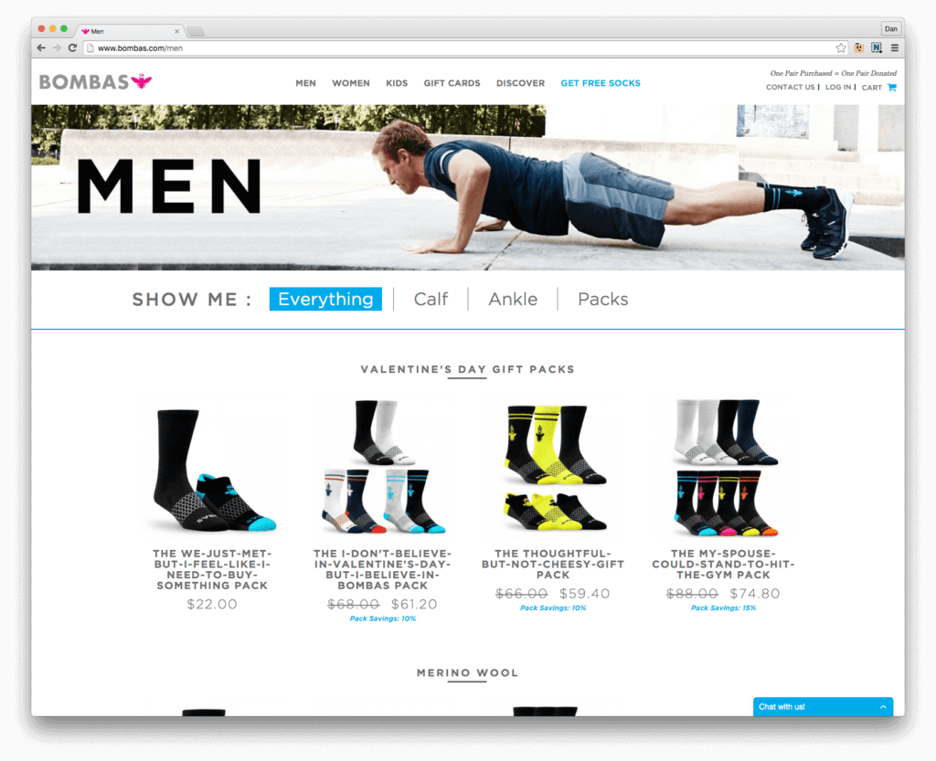
The Men’s hero image showed the exact product in an environmental use which was helpful. The filters were clear at the top and represented logical groupings: length (calf or ankle), packs (group discounts), and everything (all men’s socks). I wanted to see the full line of Men’s socks so I left the default filter set to “Everything” and scrolled down the page.
Enjoying this article?
Subscribe to our newsletter, Good Question, to get insights like this sent straight to your inbox every week.
The top row of products continued to draw me into the experience. The brand copy had a playful sense of humor which matched the playfulness of the product colors.
From there, the breadth of Men’s socks was more impressive than I expected:
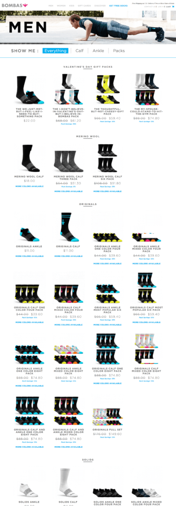
There was a wide range of colors, packs, lengths, and materials. I would’ve preferred to be presented with a simple “starter pack” since I was new to this brand and unsure where to start. The very first product on the page was doing just that but it didn’t stand out on the page:
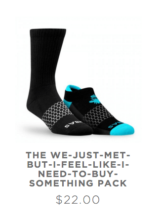
To recap, so far I’ve seen good site organization, good branding, and appealing product shots but how’s the quality of the products? After spending a few minutes browsing the variety and categories of socks, I went back to the starter “we just met but I feel like I need to buy something” pack to answer my question on product quality.
Product Detail Page
Grade: A
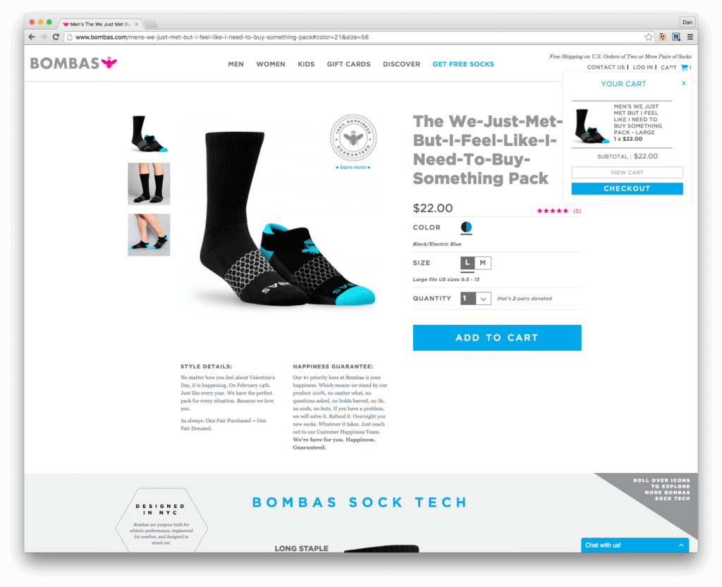
There’s a lot happening on the product detail page but it’s structured exactly how I needed it to be.
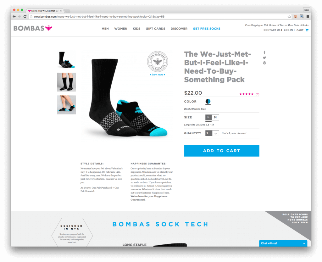
First, some good, high resolution images as standalone products as well as on a model showing use. There was a magnifying lens rollover so I could zoom in on the images.
Second, the color, size, and quantity selection fields were clear and helpful (e.g. – the size field was set to L with a description of what shoe sizes this matches to). The big, blue Add to Cart button was apparent and clear from any clutter.
Third, the copy explaining the style details and return policy were witty and helpful. I felt confident that if I did decide to buy that I could return it risk-free.
Peeking out just below the fold was my favorite single screen of my whole customer journey:
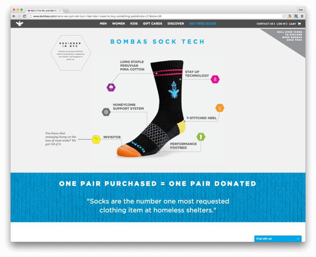
A very well-done interactive map of the 6 most engaging features of the product. This really made me feel confident that the product was high-quality and designed for my intended activities: running, exercise, and casual wear.
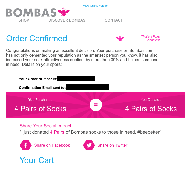
Also, the brand’s philanthropic value proposition becomes very clear at this point. For every pair of socks I purchase, Bombas will donate one pair to homeless shelters where they’ll be in put to good use as the #1 most requested clothing item.
But wait, there’s more.
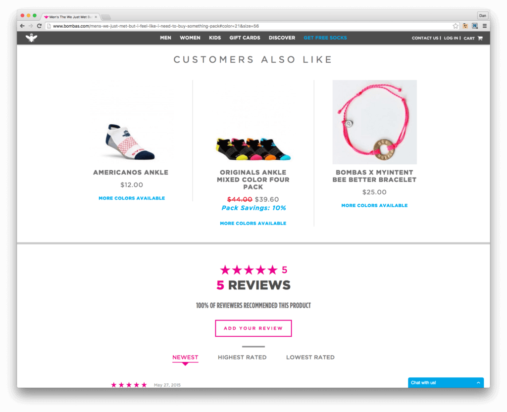
A list of products that Customers Also Like is displayed but seems oddly placed for me: sandwiched between the main selling points of the product and the customer reviews of the product.
I read on and find nothing but amazing 5-star reviews. Although I’d prefer to have a few so-so reviews just to feel confident that these aren’t staged reviews, the comments are specific enough to reassure me that these are likely real, happy customers.
Say no more, fellow customers, I’m sold.
Path to Purchase
Grade: B
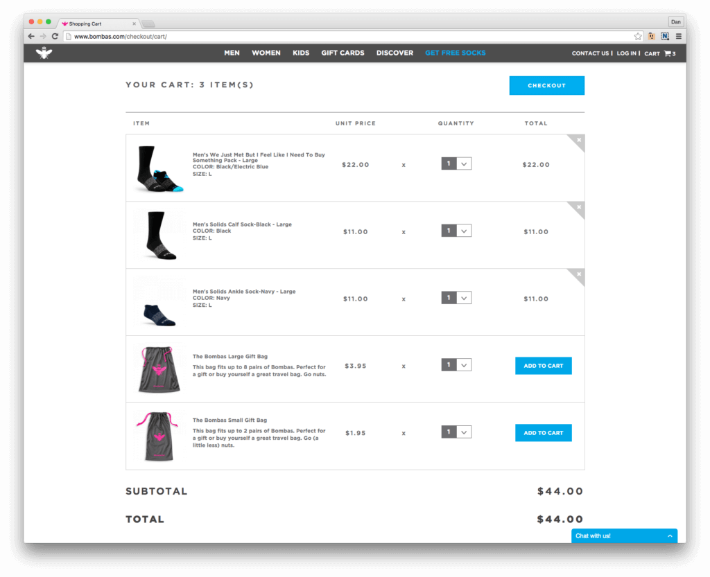
I return to the top of the product detail page and click on Add to Cart. I’m relieved to see immediate feedback on the page that my action was successful and I can continue to keep shopping if I choose to do so.
Since the cart alert was placed conveniently near a message that I can get free shipping with 2 or more pairs of socks, I chose to return to the Men’s category page and pick out 2 more pairs of socks that I liked earlier and added them to the cart as well.
There was a one-click Checkout function but I chose to look at my Cart. I was half-annoyed and half-impressed that suggested products were also sitting in my Cart. Undeterred, it was clear that the suggested items were just there for up-selling and not actually in my Cart.
Proceeding to Checkout, I would’ve preferred a “Checkout as Guest” option so I didn’t have to make an account. However, the selling points were solid and I was already sold on the brand so I didn’t mind registering.
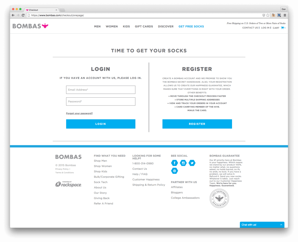
I dinged Bombas by a full letter grade for the next step.
The Checkout screen prompted me for a discount code and didn’t present me with the same 20% off that they offered me upon initial landing to the site. So, then I had to open a new incognito window and relaunch the Bombas homepage to get the 20% offer presented back to me again.
It was frustrating that Bombas didn’t just reward me with the 20% off on the first screen of the Checkout process when I elected to Register.
Post-Purchase Follow-Up
Grade: A-
I received an immediate Order Confirmation email with all of the pertinent details and more of the on-brand copy that I’ve become fond of.
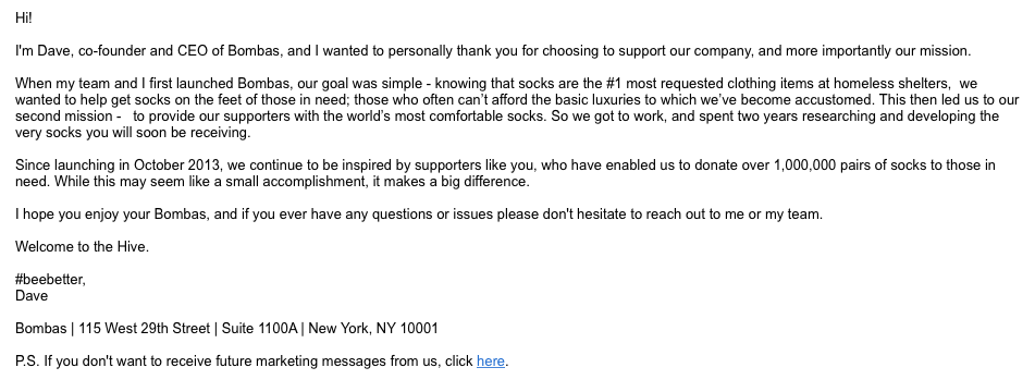
Then 20 minutes after I received the Order Confirmation, I also received an email from the CEO of Bombas congratulating me on my purchase. Needless to say, the email was obviously automated so it felt a little phony and unnecessary. However, it was harmless to my purchase path so no major ding for Bombas on this extra email.
Overall Customer Experience
Grade: A-
There were a few quirks and areas of improvement to be had throughout the Bombas customer experience. Bombas did a great job funnelling me into their product page and sold me while educating me about their brand without any distraction from the shopping path.
The key metric in all of this analysis is that they took me from a Facebook browser into a converted customer. The next step will be to see if the product lives up to the expectations they set and if I choose to become a repeat customer. We’ll leave that for another Insight and analysis.
The Good’s Conversion Growth Program™
If you want to analyze and optimize your customer experience but don’t have the time or team for this level of research, we’re here to help. Email hello@thegood.com or fill out the form below to start on the path to increased sales by obtaining your Stuck Score™.
About the Author
Dan Weinsoft
Dan Weinsoft is the former Director of Conversion and UX Strategy at The Good. Dan and the team at The Good made a practice of forming key strategies to boost online ecommerce and lead generation performance using testing, optimization, and data-backed insights.