
The Secret to Great Site Navigation: Embrace Simplicity
When it comes to navigation, avoid the urge to be clever and you’ll find profitable returns.

Customers on your ecommerce site are on there for a specific reason: to shop. They’re laser-focused on this task and they need you to present them with the easiest way to find what they want to buy.
The challenge comes when you attempt to use unconventional categories and terms on your site in an effort to show creativity to your customers or stand out from your competition. When you do this, you increase the amount of effort customers put into finding their desired items and you raise their frustration levels. When they get too frustrated trying to find what they’re looking for, they take their business elsewhere, leaving you with nothing but a lower conversion rate.
Getting clever vs being boring
Made up or thematic words increase the amount of thinking that your customers have to employ to shop. The customers are not there to be entertained by a logic puzzle. When your customers are on your site, you do not want them to spend their attention thinking about anything other than what they came there to buy.
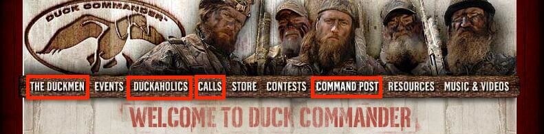
Below is an example of the Duck Commander ecommerce site with a themed navigation around duck hunting. Although Duck Commander has chosen a theme which is appropriate for their duck hunter audience, several of the navigation choices give little context to the links. New customers may have to explore multiple pages before they can locate the duck call or apparel they’re looking to purchase.
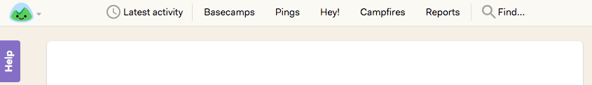
In an extreme example, below is an ill-advised thematic categorization. Basecamp is trying a camping-themed navigation for the new release of their project management tool which, as a service, has nothing to do with camping. Without any context to the navigation, users have to learn by trial-and-error clicking or by taking a time-intensive tutorial to understand the difference between a Ping, a Hey!, and a Campfire.
Sometimes, it’s better to just be boring and use conventions that customers already understand so they can quickly find what they’re looking for, rather than be challenged by the riddle of your witty navigation structure.
Below is a good example of a simple product categorization that Urban Originals used to keep in common conventions while still maintaining the high-quality design of their brand. With intuitive category names like bags, clutches, and wallets, customers have very little difficulty finding page to shop for the products they want.

Jargon must be banned
The industry terms that we often use do not always translate to our customers. Don’t let your site reflect the people who built it; your site’s primary users are your customers, not you. The site should be organized around the way your customers already understand your products, instead of the way your company is structured.
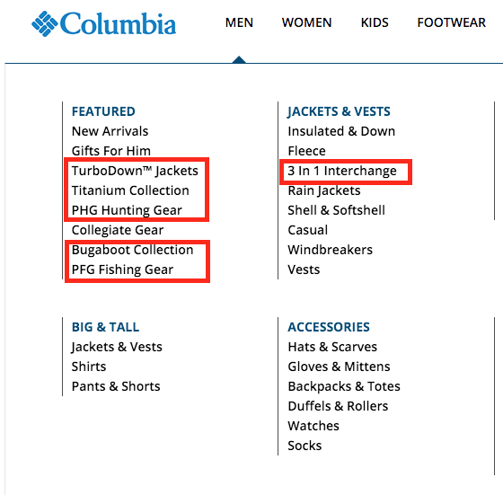
Below is an example of a company’s internal jargon seeping through into their main product categorization. Other than employees and long-term loyal customers, most customers will have a difficult time understanding what these categories are without trial-and-error clicking.
Keep it simple
The goal with every navigable element you create is to find 1-3 simple and compelling words to describe what the customer will see when they click on the link or category.
The objective in this is to provide understanding, because your site’s purpose is to sell, not to entertain and delight. If the labels on your site are clear, easy to understand, and compelling, you’ll have greater success in converting your browsing shoppers into customers.
If you want to add simplicity throughout your customer experience but don’t have the time or team for this level of research, we’re here to help. Email hello [at] thegood.com or fill out the form below to start on the path to increased sales.
About the Author
Dan Weinsoft
Dan Weinsoft is the former Director of Conversion and UX Strategy at The Good. Dan and the team at The Good made a practice of forming key strategies to boost online ecommerce and lead generation performance using testing, optimization, and data-backed insights.