
The Good, the Bad, and the Questionable – June 2020
In this Insight series we look at some of the best (and worst) online experiences our team has encountered.

It’s no secret that the best user experiences go unnoticed.
Great UX design helps guide users to an end goal (usually completing a purchase) and takes into consideration the individual needs and behaviors of the audience that’s being served.
At The Good, we enjoy spotting and appreciating examples of good user-experience design that we see on ecommerce websites, while also pointing out examples of poor designs we can learn from.
In this Insight, we’ll be looking at some of the best and worst user experiences that members of our strategy team have identified recently. We’ll also be including several questionable design elements that may or may not be worth testing on your own ecommerce site. This is the first part in a new monthly Insight series we’re calling, The Good, the Bad, and the Questionable.
Disclaimer: This is by no means a way for our team to bash unsuspecting ecommerce websites. It’s simply an outlet for us to recognize great UX design when we see it, as well as provide helpful feedback for sites that may have missed the mark. That’s all!
Now let’s dive in…
The Good Experiences
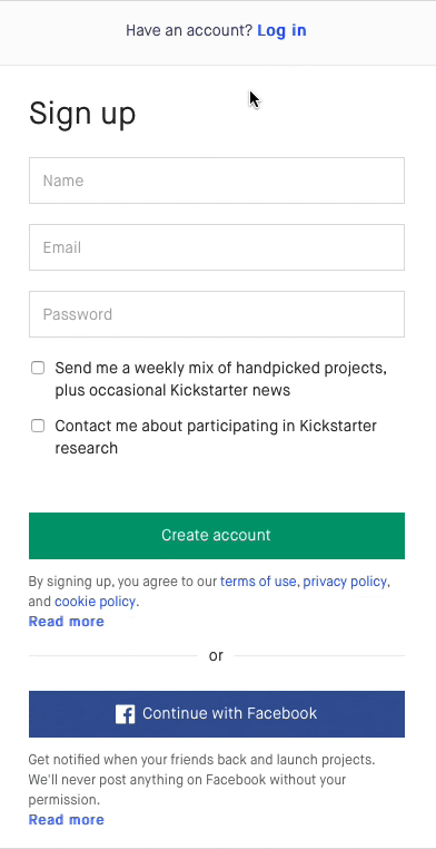
Kickstarter’s responsive form design
Form design is easily one of the most important (yet overlooked) aspects of a website’s user experience. A well-designed form shows users that your brand is helpful, considerate, and most important, trustworthy.
In our own experiences with form design, we’ve found that the fewer fields you can include, the higher conversion rate you’ll see for that form.
Kickstarter came up with a clever way to include confirmation fields on their account sign-up form without making them visible to users until after they start filling out the form (see below).
The first time you land on their account sign-up page, you’re met with a very simple three-field form. Rather than displaying confirmation fields before a user even interacts with the form, they gradually appear as you’re inputting your information.
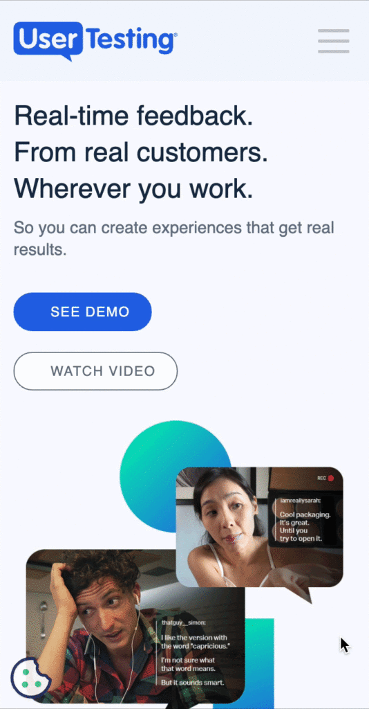
UserTesting’s cookie notification
By now everyone is probably at least a little tired of seeing cookie notifications on every new website they visit.
A unique and unobtrusive method for alerting users about cookies can be found on the Usertesting website, where they use a literal cookie icon to motivate users to read the privacy agreement. This slight change to the user interface makes the browsing experience more enjoyable while also encouraging users to learn exactly how their data is being used.
On average, just 34 percent of consumers say they trust the brands they regularly buy from. Making your terms of use/privacy policy transparent is a highly effective and straightforward method to increase customer trust.
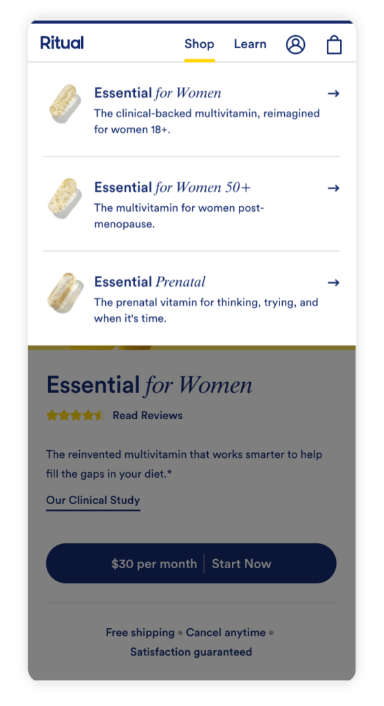
Ritual’s navigation menu
Website navigation can make or break your visitors’ experience. The easier and more engaging your navigation experience is, the more time users will spend on your site and the easier it will be for them to find what they’re looking for.
Ritual – a vitamin subscription service – utilizes a very simple but effective navigation menu that uses images and a brief product description to direct users to the specific item they’re seeking (see below). This shortens the path to purchase by eliminating the product category page and creates a highly intentional browsing experience.
Upon landing on the homepage, users are able to quickly understand the brand’s unique selling proposition, identify which product they need, and navigate to the product detail page to purchase.
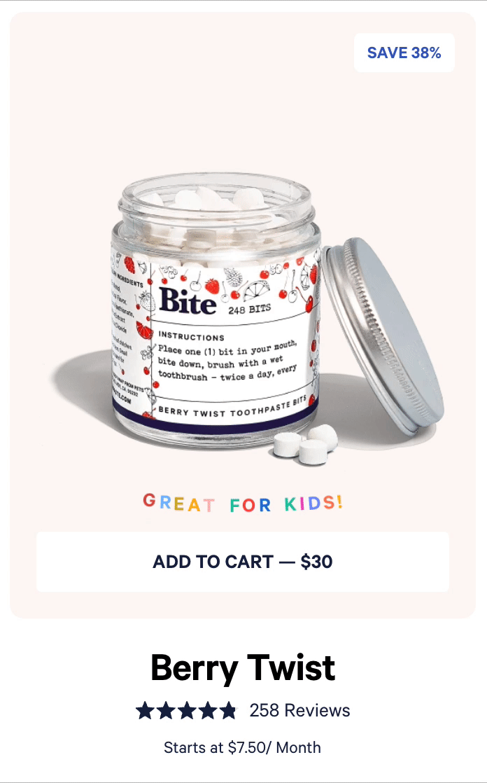
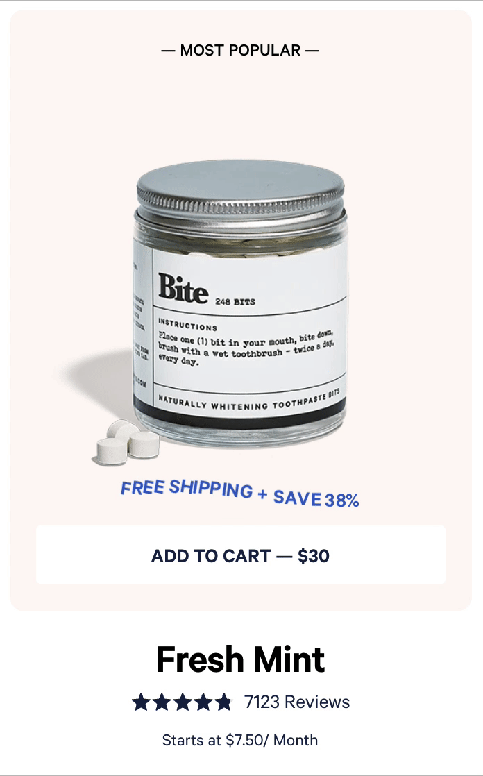
Bite Toothpaste Bits’ category page design
Our team is always looking for interesting and creative ways to improve category pages. A well-designed category page can have a direct impact on conversions by encouraging visitors to click through to individual product pages and purchase.
Bite Toothpaste Bits has implemented some creative methods of adding value to their product listings by calling-out benefits on their category page. Tags like “Free Shipping + Save 38%” and “Great for Kids” are instant value-adds to each item (see below).
Additionally, they display the average review rating for each product and point-out what items are best-sellers to elevate their social proof.
The “Bad” Experiences
Wolf Gordon’s Form Design
As previously mentioned, form design can make or break your conversion rate. If your sign-up form seems too cumbersome or intrusive, your conversion rate will suffer. If it seems quick, easy, and secure to fill out, then your conversion rate will climb.
An example of a form that will quickly overwhelm users can be found on the Wolf Gordon account sign-up page (see below). Overwhelming visitors with a 14-field form is a surefire way to kill conversions and hinder your conversion rate.
Not indicating which form fields are required is another friction point for users. Are users required to fill out every field to complete the form?
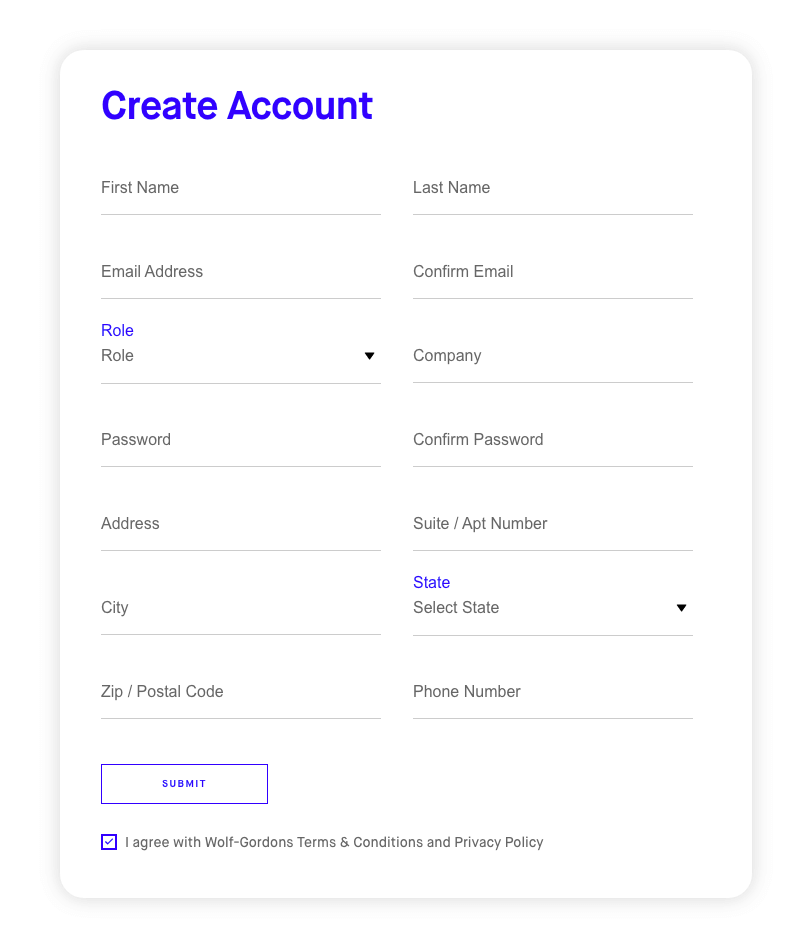
The last and most significant problem on this form is the lack of transparency. Users are required to submit personal information (address, phone number), and yet there’s no messaging that indicates what will happen with that information once it’s submitted. They have the standard “I agree with the terms & conditions” check box at the bottom of the form, but nothing explicitly tells users why this information is necessary to sign-up for an account, and what their information will be used for.
Enjoying this article?
Subscribe to our newsletter, Good Question, to get insights like this sent straight to your inbox every week.
This is guaranteed to be a conversion killer. Users need to know that they can trust your brand to keep their personal information secure.
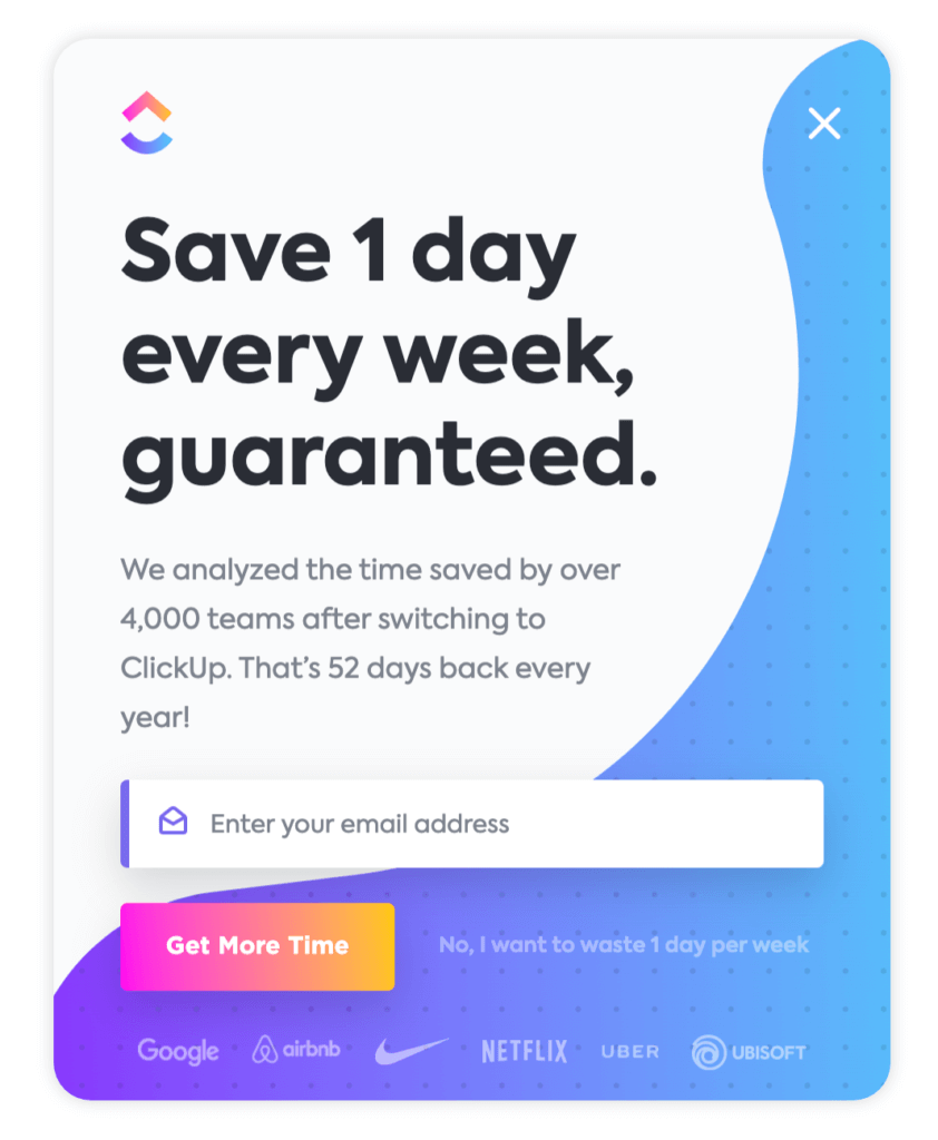
ClickUp’s “confirmshaming” popup
Exit-intent pop-ups are designed to be a final attempt to convert a prospect before they bounce from your site. Although they can be extremely effective at capturing emails, they can also create a frustrating user experience.
There are two big mistakes you can make when designing an exit intent popup:
1) Not providing a compelling reason for users to give you their email, and
2) “Confirmshaming” users who don’t want to engage with the popup.
ClickUp checks both of these boxes with their exit intent popup (see below). The first mistake here was not providing a specific reason users should submit their email address. The CTA “Get More Time” is on-brand and enticing, but isn’t an effective motivator to get users to submit their email.
The second mistake made with this popup is using the practice of “confirmshaming” to guilt users into filling out the form. To close the popup you have to select “No, I want to waste 1 day per week” which is a totally unnecessary and ineffective way to get users to give you their email address. This ensures that users leave your website with a negative perception of your brand.
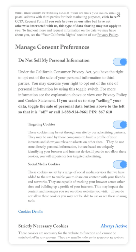
The New Yorker’s cookie settings
Unless you’re a UX designer, you’re probably not familiar with the concept of dark patterns in website design. A dark pattern is a user interface that’s been carefully designed to trick users into completing a desired action. It’s a technique used by many companies to encourage users to do something they otherwise wouldn’t do.
We recently noticed a dark pattern when browsing The New Yorker’s mobile website. They made some changes to their privacy policy recently that made it very difficult for users to manage their consent preferences.
If you don’t want The New Yorker storing and potentially sharing your personal information, you’re required to turn OFF “Do Not Sell My Personal Information” (see below).
This is a shady tactic that’ll likely result in a loss of trust from their core audience.
Is it legal? Technically, yes. But is it ethical? Not in the slightest.
The Questionable Experiences
In addition to highlighting some of the best and worst user experiences we’ve seen in the last month, we also wanted to look at some of the most unique and interesting UX design work we’ve come across.
The experiences below fall under “Questionable” because we can’t confirm that they’re winning or losing designs, but they could be valuable ideas to test on your website.
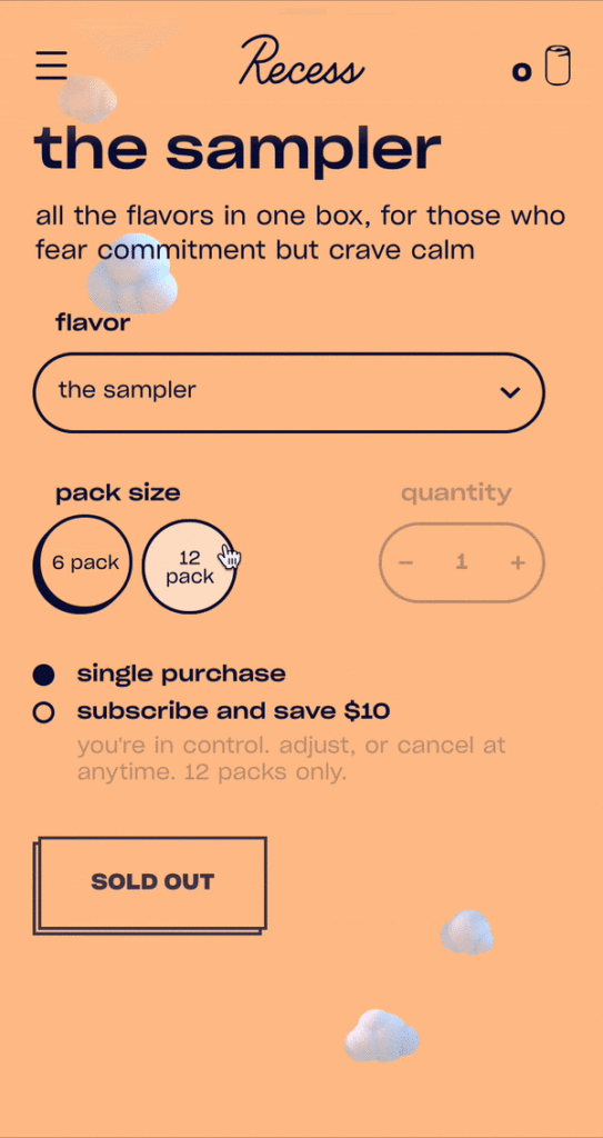
Recess’s subscription service
The subscription-based business model is becoming an increasingly attractive method for ecommerce brands to improve retention and build lasting relationships with their customers.
Here’s the problem: getting users to actually sign-up for your subscription service and stay on it can be a lot more work than you’d expect.
Recess – the CDB-infused seltzer water brand – devised a creative solution to this problem by making a simple addition to their product detail page. Rather than only allowing users to purchase individual quantities of a product, they provide the option to Subscribe and select the frequency users would like to receive the product (see below).
To increase the purchase motivation they mention that their subscription plan will save $10 on the regular price of the product, and that you’re able to adjust or cancel the subscription at any time.
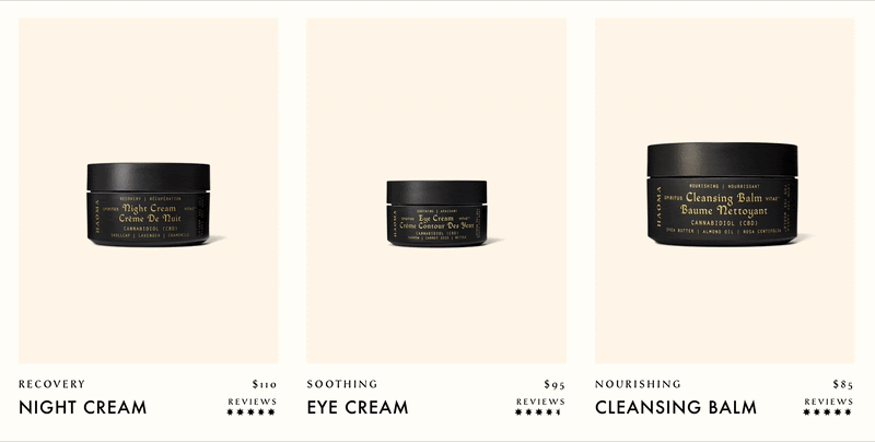
Haoma’s video hover effect
Haoma – a boutique skincare brand – has a really unique approach to the “hover effect” commonly seen on ecommerce category pages. When you move your cursor over a product, a video starts playing in the background to help draw you in and encourage clicking-through to the product detail page.
While this feature likely doesn’t have a significant impact on the conversion rate, it’s possible that it could affect adds-to-cart and encourage more engagement with the Quick Add button. It’s an interesting test to consider if you’re struggling with a high drop-off rate on your category pages.
Start Testing on Your Website
The goal of this Insight is to help inspire ecommerce business owners to start testing on their websites. A key piece to developing expertise in conversion optimization involves observing what other businesses are doing on their sites and keeping up with the ever-changing trends of UX design.
Interested in receiving personalized feedback on your website from a CRO expert? Sign-up for a free landing page teardown and we’ll take a close look at your website and identify the key friction points that might be hindering your site’s conversion rate.
About the Author
Jon MacDonald
Jon MacDonald is founder and President of The Good, a digital experience optimization firm that has achieved results for some of the largest companies including Adobe, Nike, Xerox, Verizon, Intel and more. Jon regularly contributes to publications like Entrepreneur and Inc.