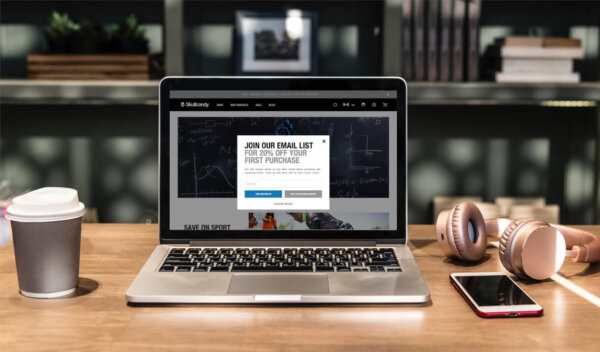
Designing a Winning Exit Intent Popup in 2019
This insight focuses on how to create an exit intent pop-up that captivates your target audience, as well as the benefits that they can have for your site’s conversion rate.

The use of pop-ups on ecommerce websites has long been debated by digital marketers and UX designers alike. Some claim they can have a significant impact on conversions while others see them as an unnecessary (and irritating) aspect of the customer experience that needs to disappear.
There’s no shortage of case studies claiming sizable gains in revenue through the use of pop-ups, but oftentimes those case studies tend to omit the negative implications that pop-ups can have on the overall user experience of a site.
In most cases, we recommend that you stay away from pop-ups that detract from the shopping experience, but in the case of exit intent pop-ups, we actually recommend them. Through experience we’ve found that exit intent pop-ups can work to reduce cart abandonment and increase conversions site-wide.
In this Insight, we’ll take a closer look at what makes exit intent pop-ups successful, and how you can use them to increase conversions and improve the key performance indicators (KPIs) of your ecommerce website.
How does exit intent technology work and is it actually effective?
| Exit-intent pop-ups are designed to be a final attempt to convert a prospect before they bounce from your site. When a user begins display signs that they might leave your site, an exit intent pop-up will appear with one final offer that will hopefully prevent them from bouncing. |
Exit intent pop-ups can be triggered by a variety of different actions. Typically they’re activated when a user navigates their cursor outside of the browsing window (signaling that they’re ready to close the browser or return to the SERP), but other triggers can include time spent on a page, or entering a specific area on a site that has a high bounce rate (shopping cart/checkout page).
One example would be if your potential customer has an item in their cart but has yet to decide if they’re going to follow through with the purchase. This is a great opportunity to display an exit pop-up with a discount offer if they opt-in to your newsletter. Not only does this increase the customer’s motivation to purchase, but it provides you with their email address that you can later use in a retargeting campaign.
While you shouldn’t expect your conversion rate to skyrocket by implementing an exit intent pop-up, you can expect somewhere between a 5-10% increase, depending on your industry and the certain types of products you’re selling.
The truth is, exit pop-ups will never be an end-all solution to cart abandonment or a low conversion rate, but they can certainly help.
Principles to follow that will help you develop winning exit intent pop-ups
We put together a list of general principles you should follow to help get the most out of your exit intent pop-ups. As with any list of best practices, it’s important to consider that not all of these may work for your particular audience or brand. You’ll need to determine what your customers respond positively to and design your pop-up around those parameters.
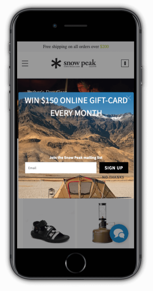
1. Create an incentive to finish the order on the spot – You’ll need to create an overwhelmingly persuasive offer to keep visitors from abandoning their cart. Figure out what motivates your customers to purchase and structure your offer around that. If you’re using the exit pop-up on your checkout page, considering offering customers a discount code if they provide their email address. Snow Peak has a pretty unique exit pop-up that promotes a $150 gift card giveaway that runs each month. This approach could also be successfully applied to product giveaways.
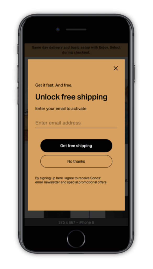
2. Build your email list – Collect the email addresses of your prospects by offering an incentive to subscribe. If a visitor is coming back to your site for a second or third time but still isn’t convinced enough to purchase, use an exit pop-up that says something along the lines of, “We missed you! If you’d like to receive updates about new products or upcoming sales, opt-in to our mailing list.” With this approach you can still use their email for a retargeting campaign in the future. Sonos uses a creative approach to building their email list with an exit popup that promises free shipping if you provide them with your email address.
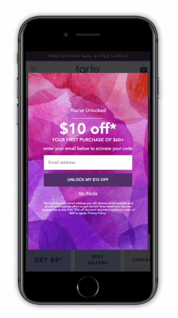
3. Contrast is important – Use colors and text that will stand out to the visitor. The purpose of this pop-up is to catch the attention of a user and stop them from leaving your site, so make it visually striking. At the same time, it’s also important that the style and design of your exit pop-up aligns with your brand. This may seem like an obvious one, but you’d be surprised how many ecommerce businesses use pop-ups that are completely different than the style and aesthetic of their site. Tarte has a striking exit pop-up on their site that uses bright, contrasting colors to help grab the attention of their customers. Not only is this pop-up eye-catching, but it aligns with their unique branding.
4. Avoid using negative messaging – Don’t be the website with the obnoxious pop-up that degrades users for declining an offer. This approach (commonly referred to as “confirm-shaming”) creates a negative connotation with your brand, and definitely won’t motivate a potential customer to purchase from your site.
5. A/B test different designs – After you’ve developed a few of what you think are winning popups, try A/B testing your designs. Chances are good that you won’t get the messaging perfect on your first try, so try experimenting with different offers, wording, CTA placement, and featured images to see what your customers will respond to.

Winning Exit Intent Pop-up Examples
Here at The Good, we’ve designed dozens of exit pop-ups for clients that needed some help in reducing cart abandonment on their site. Here are a few examples of pop-ups we’ve designed and implemented that had a direct impact on the client’s conversion rate.
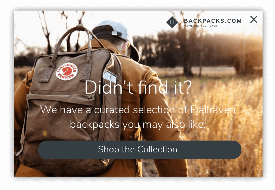
Backpacks.com – This is a company that acquires a lot of paid traffic, but many of the site visitors are unfamiliar with their brand and what makes them unique. We found that most users coming through paid search had a specific product in mind – so when they landed on a product page and it wasn’t the exact item they were looking for, they would bounce.
We added an exit intent pop-up inviting users to shop a curated selection of related products from the brand they were interested in, and saw a surprising increase in their click-through-rate (CTR) that reached as high as 15 percent. Considering the CTR of most exit pop-ups, this was a highly successful test.
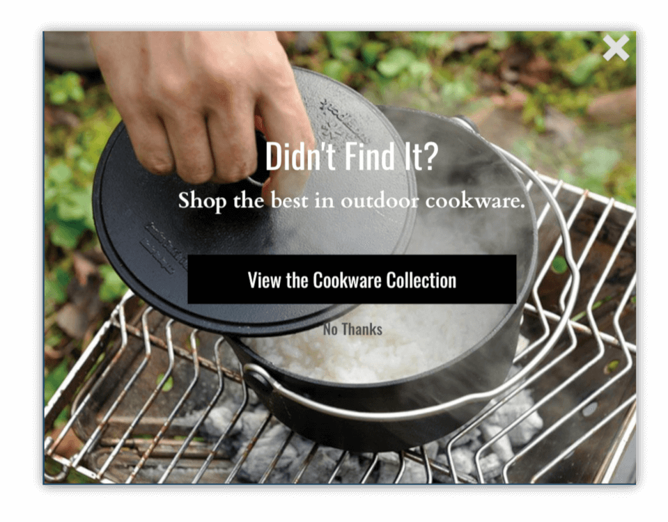
Snow Peak – A critical element of the exit intent pop-up is meeting users where they’re at in the customer journey. This means that if someone is shopping in a specific category of products, tailor the pop-up to mimic some of the content they were just viewing on the site. For this outdoor camping company we had success through drilling down on specific categories like “titanium” and “cookware”.
Allowing the exit pop-up to be an extension of their shopping experience within the category can make it feel less intrusive and might help the visitor find something they would have missed otherwise (especially for sites with a broader selection of products and categories).
The imagery is another important element to focus on when designing your exit popup – thinking about the persona of the user on the page and what benefit they are likely looking for from the products should try to be reflected in the imagery (this example is a more utilitarian photo which spoke better to Snow Peak’s audience).
Exit Intent Pop-Ups Will Help Improve Your Conversion Rate
Here’s the bottom line: Exit intent pop-ups will have a positive impact on cart abandonment and your overall conversion rate. The key to creating a great pop-up is knowing your target audience and understanding what motivates them to purchase. If you can hit your site visitors at the right time with the right messaging, you have the potential to decrease the likelihood of cart abandonment, and increase conversions.
The biggest takeaway here is that you don’t want to be obnoxious with your exit pop-up usage. Create an offer that your customers can’t turn down and develop value-rich copy that fits with that offer. It all really comes down to experimentation, and your ability and willingness to test multiple pop-up ideas/combinations before you land on one that works with your brand and audience.
About the Author
Rudy Klobas
Rudy Klobas is a former Content Marketer at The Good. He regularly works to produce insightful, informative content and copywriting designed to help digital leaders improve the user experience.