
Dark Patterns: The Ultimate Conversion Blocker for Ecommerce Websites
Dark patterns are a surefire way to kill conversions on your ecommerce website. In this Insight, we’ll be taking a closer look at why that is.

If you’re a UX designer (or a well-informed ecommerce manager) you’re probably already well aware of the negative connotations attributed to dark pattern design. But for those that are unfamiliar, we wrote this Insight to explain why dark patterns are damaging to the usability and credibility of ecommerce websites.
The term refers to shady practices used on websites and apps to make people take actions that don’t benefit them. It can be tempting to implement dark patterns in your ecommerce store, believing that they’ll result in more revenue.
But it’s a bad idea.
Dark patterns erode trust. They’re manipulative and seek to take advantage of those using your website. Using them puts you in the category of the shady used car salesman who does everything he can to get you to buy.
In this Insight, we’ll be showing you:
- Dark patterns that are commonly used on ecommerce websites
- How to avoid using dark pattern design on your own website
What Are Dark Patterns?
The term “dark patterns” was coined by Harry Brignull in 2010 to describe deceptive user interfaces in apps and websites. They are intentionally designed to trick or manipulate users into doing something they don’t want to do.
A simple example would be two buttons side-by-side, one green and one red. The green button says, “No” and the red button says, “Yes”. Putting green over the word, “No” makes people more likely to click it when they mean to click, “Yes”.
In many cases, dark patterns are nothing more than cheap tactics designed to take advantage of attention lapses. It’s an intentionally deceptive user interface design strategy that creates bad experiences for people.
If you want to build authentic relationships with your customers so that they keep coming back to you again and again, you should work hard to avoid dark patterns.
What Are The Types Of Dark Patterns?
Let’s look at some of the most common types of dark patterns, along with some much better alternatives.
Confirmshaming
Confirmshaming attempts to leverage shame to motivate users to take action. For example, many ecommerce websites use pop-ups where the opt-out option is worded so that the user feels guilty or foolish if they don’t comply.
For example, Dailylook tries to shame users into providing their email address in exchange for a discount code. The implication is that if you don’t get the discount then you obviously don’t care about looking good.
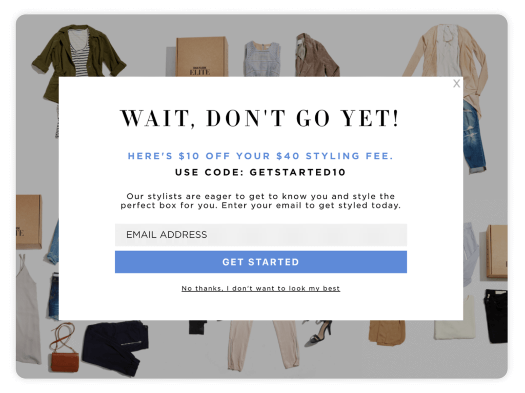
Alternative: Think about how shame actually feels. Not good, right? Do you really want your customers associating your brand with that negative feeling? Rather than relying on confirmshaming to build your email list, focus on A/B testing different messaging on your pop-up to determine what your audience responds positively to.
Bait-and-Switch
With bait-and-switch, a product or service is promoted as being either totally free or drastically reduced in price. However, when people try to get the product they discover that it’s unavailable or only available in very small quantities. Customers are then given the option of buying something that costs more or is of lesser quality. This is a tactic that might seem harmless from a designer’s perspective, but it’s almost guaranteed to have a negative impact on the customer journey and will erode any trust that you’ve worked to build with your audience.
Alternative: Instead of attempting to lure people to your website with artificially low prices, focus on optimizing your product detail pages to highlight the key differentiating features of your products. Rather than luring visitors to your site with unrealistic expectations, amplify what makes your product great, and your target audience will take notice.
Forced Continuity
You’ve probably signed up for a free trial of something, forgotten to cancel it, and then automatically been billed when the trial expired. That’s forced continuity. You’re not given an opportunity or reminder to opt out of the trial, and it’s often exceedingly difficult to cancel before you’re charged for the premium subscription.
Unfortunately, this dark pattern is used everywhere, including Amazon Prime. In the worst cases, companies will sometimes go as far as to make users contact their customer support team to cancel a membership.
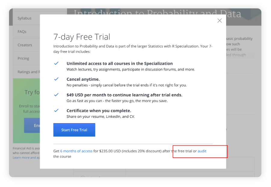
Here’s an example of both bait-and-switch and forced continuity from Coursera. They offer the ability to “audit” online courses for free but the only way to get it is to read the fine print at the very bottom and click the link. So most users end up signing up for a free trial, which requires a credit card. As soon as the trial is over, they’re billed $49.99/month.
Alternative: If your business relies on a free trial to interest and nurture potential customers, don’t rely on forced continuity to increase your subscription numbers. It’s a deceitful way to treat customers and it’ll only hurt your brand reputation in the long-term. Instead, utilize a win-back email sequence to help retarget the users that did sign-up for your free trial.
Enjoying this article?
Subscribe to our newsletter, Good Question, to get insights like this sent straight to your inbox every week.
Roach Motel
The roach motel dark pattern makes it relatively easy for a user to get into a situation but very difficult for them to get out of it. Often, there are negative consequences for backing out, which makes users less inclined to do it.
Skype is a prime example of using this tactic to keep users signed-up for their services. If you’ve ever tried to cancel or deactivate your account with Skype, it’s nearly impossible. The only way to cancel your account with Skype is by contacting their customer service team and it can take up to two weeks to process your request to delete your account and remove your name from the directory.
Alternative: The problem with using this technique is that it creates ill will between your company and your customers. A quick look at Skype support forums shows complaint after complaint from customers who are upset about the hurdles they had to go through to cancel.
If you must have cancellation penalties to offset the costs of churn, be upfront about those penalties from the very beginning. Make sure that your customers understand what they’re getting into so that you don’t surprise them when they try to cancel their subscription. It’ll make your company appear more trustworthy and will likely have a positive impact on conversions.
Hidden Costs
Few things are more maddening than going through a multi-step checkout process, only to discover at the very end that there are additional charges, such as taxes or delivery fees. Hidden costs almost always make customers feel frustrated and can result in abandoned carts.
In his article “The User Experience Of Flower Websites”, Jeff Sauro draws attention to the problem of hidden costs on many well-known flower websites. When customers encounter these surprise charges, their overall satisfaction levels drop significantly, making them less likely to buy from these companies in the future.
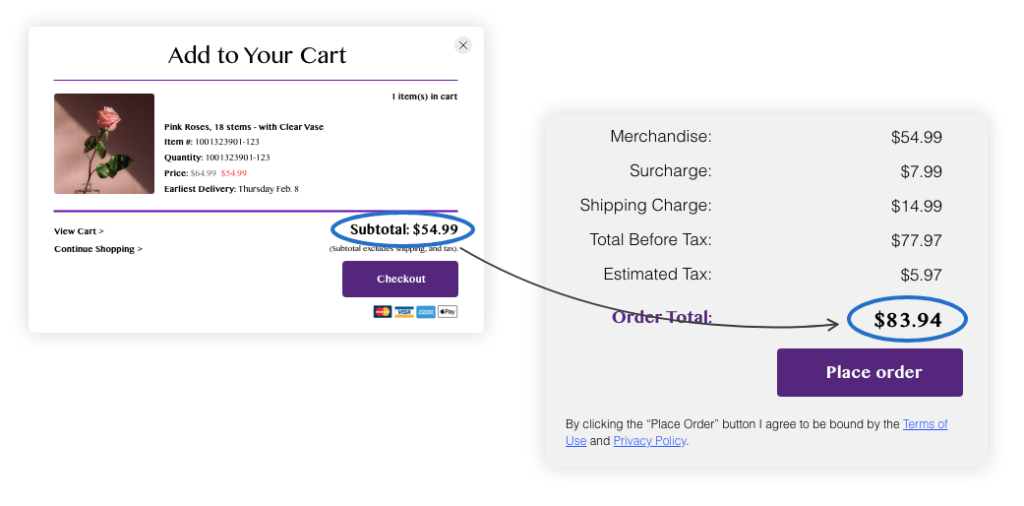
Alternative: Be clear and upfront about all the costs that make up the final price. Don’t surprise customers with additional shipping charges or unexpected fees or you’ll end up dealing with increased cart abandonment. 56% of consumers will abandon their cart if they’re presented with unforeseen charges and fees at checkout.
Price Comparison Prevention
With this dark pattern, users are prevented from comparing prices between different products or services. The thinking is that if customers can’t see the prices, they can be more easily pushed toward buying specific items (like those with the highest profit margins). Of course, the reality is that this practice leaves customers frustrated and may lead them to shop where they actually can compare prices.
LinkedIn is an example of keeping users from comparing their premium plans against each other. To see the individual price tiers, you have to navigate to a separate page on their site. While this isn’t necessarily tricking users into completing an undesirable action, it’s forcing them to jump through an extra hoop to properly compare the price of each premium tier.
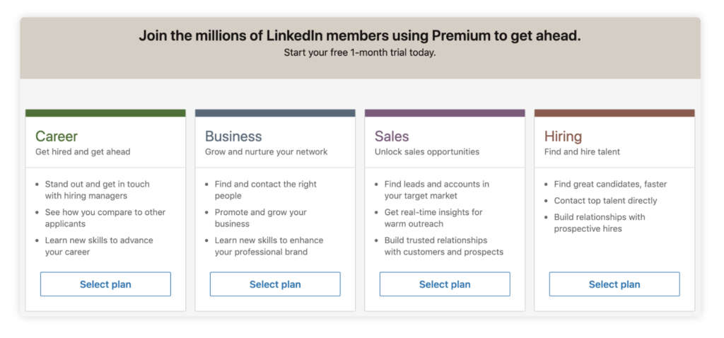
Alternative: Make it simple for customers to compare product prices on your site. This will make budget-conscious shoppers happy and provide a much better overall user experience for your customers.
Sneak Into Basket
In years past, some ecommerce websites would automatically add products into users carts, forcing them to manually remove them if they didn’t want them. As you can imagine, this practice greatly annoyed consumers and isn’t used all that much anymore. However, some websites will manipulate users into adding something they don’t want by pre-selecting an option for them.
Romwe is guilty of this, automatically pre-selecting “Shipping Insurance” when you go to checkout. If you don’t uncheck it, it will be added to your order.
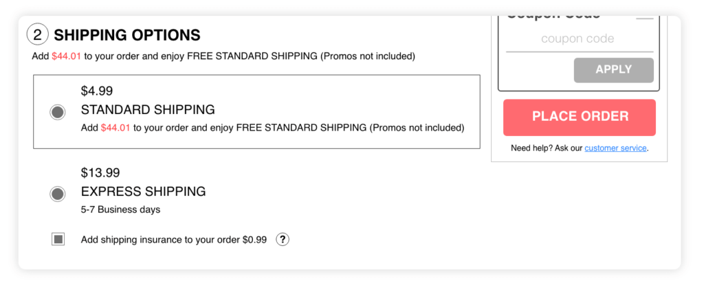
Alternative: This should be an obvious one. Adding additional items or fees to your customers’ cart is an inexcusable dark pattern that immediately obliterates any credibility and trust that you’ve established with your audience. There are plenty of alternatives to tricking your visitors into buying additional items to increase your average order value. One of the simplest ways to do this is by implementing a free shipping threshold so users are encouraged to add additional items to their cart to qualify for free shipping.
Don’t Go To The Dark Side
Using dark patterns is a poor strategy for increasing your website’s conversion rate. Yes, you may be able to generate some sales with them but you’ll be hurting the reputation of your business in the long-term. When customers feel like they’ve been tricked or manipulated, they won’t shop with you again. Your customer lifetime value will fall and there’s a good chance those upset customers will tell their friends about their negative experience.
Rather than using deception in an attempt to increase your conversion rates, try harnessing your website data to make incremental improvements to your website. The strategies used in conversion rate optimization will allow you to create real, authentic relationships with your customers and increase your revenue at the same time.
If you’re seeking help to get your conversion rates up without resorting to shady tactics, consider scheduling a landing page teardown where a member of our strategy team will provide you with several actionable recommendations you can use to start improving your website experience right away.
About the Author
Rudy Klobas
Rudy Klobas is a former Content Marketer at The Good. He regularly works to produce insightful, informative content and copywriting designed to help digital leaders improve the user experience.