
The Complete Guide to B2B Website Design (with Examples and Tips)
Don’t let a poorly-designed website keep you from driving conversions. Level up your B2B website design and improve customer experience.
It would be a grave mistake to treat your B2B customers the same as you would a B2C customer.
B2B buyers are less impulsive. They ask more questions and perform more research. Additionally, they spend more time considering their options and testing potential solutions. They also expect you to spend more time answering questions that relate to their specific circumstances.
According to Gartner, the typical B2B customer is actually a group of six to 10 people who all gather information independently. Together, they must create consensus before making the purchase (which may require the sign-off of additional stakeholders). This is why 77% of B2B customers describe making a purchase as “very complex or difficult.”
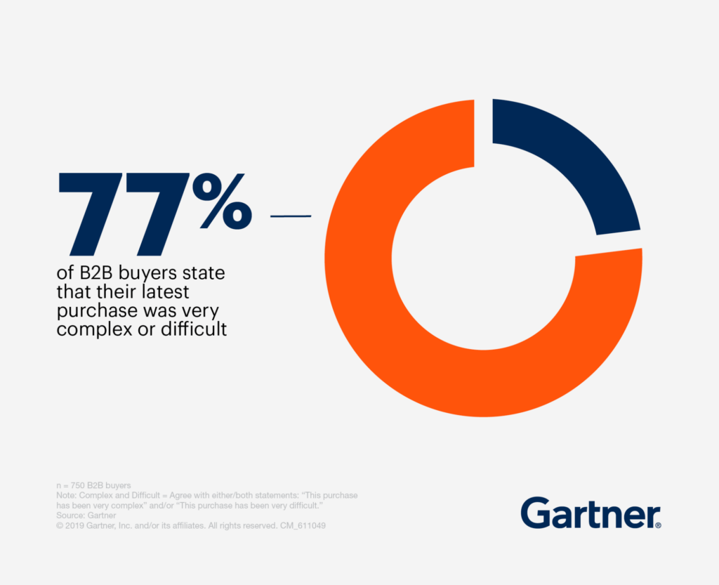
Why is it so challenging? When we break it out, we can see the dozens of steps that B2B customers have to make before they can actually buy. This process takes far more time and nurturing than a typical B2C transaction.
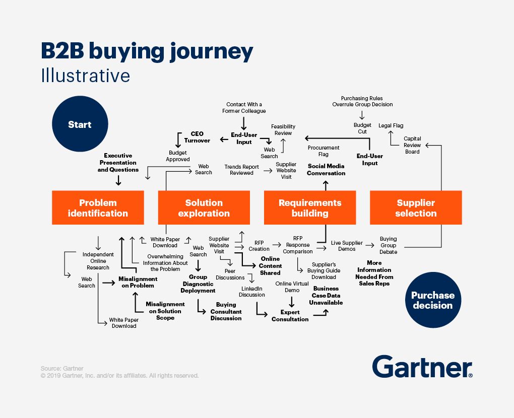
All of this means that traditional B2C website design practices aren’t sufficient to meet the needs of B2B customers. If your customers are businesses, you must treat them as such by implementing good B2B website design techniques.
In this article, we help you understand what B2B website design means and how to implement it on your site. We also share some B2B website examples for inspiration.
What is B2B Website Design?
Before we dive into improving your B2B website, let’s make sure we’re on the same page.
B2B website design refers to the creation of websites specifically intended for businesses to conduct transactions with other businesses. This type of website design aims to provide a professional and reliable image of the company, while also offering a user-friendly and efficient experience for customers.
B2B websites typically include features such as product catalogs, order management systems, account management tools, and secure payment processing. The design of these websites also takes into account the target audience, which is often business professionals who are seeking specific products or services.
The parallel of B2B website design is B2C website design. There’s a lot of overlap, but you have to make some special considerations when designing a business-to-business site.
How Do I Create a Good B2B Website?
Often, our B2B clients point to an existing site they like and say, “Make ours like that.”
Unfortunately, websites aren’t one-size-fits-all. Your site must fit your brand and your primary audience. Drawing inspiration from the most successful B2B websites in your industry is bound to happen, but replicating their messaging and website design can only take you so far.
That said, there are some things all lead-generation or ecommerce websites have in common. Both should cover the fundamental bases of effective ecommerce website design. That’s not an arbitrary or subjective opinion. Study after study confirms that website effectiveness (i.e., conversions generated) is directly related to website design.
For instance, we know that visitors need a reason to stay on your site. If you don’t prove your value within a few seconds, most will leave, and few will give you a second chance.
We also know that nearly 70% of consumers say that page speed impacts their willingness to buy from an online retailer. The highest conversion rates occur on pages with load times between 0-2 seconds.
And we know that extra fees at checkout, forced account creation, and slow product delivery are always bad ideas.
Accordingly, B2B website design factors that can draw visitors in and get them to stay long enough to evaluate your offer(s) include considerations like these:
- Your site must load quickly. Every second of delay sends more potential customers or clients to your competition. Not only that, but the faster the load time of your website, the lower your bounce rate will go. The lower the bounce rate of your website, the higher you’ll rank on Google compared to other sites with longer load times.
- Your user interface must be simple and easy to figure out. Visitors have a low tolerance for complexity when browsing. Studies have shown that visually complex websites are rated as “less beautiful” than websites with simpler, straightforward design. The simpler the design, the better the experience is going to be for your customers.
- Your content must attract the right visitors and give those in your desired audience a reason to dig deeper. Focusing your content to meet the needs of your target audience will avoid attracting unqualified leads to your website. Revisit your buyer personas to identify what your customers value, then focus on amplifying that value.
- You must provide a clear path for a frictionless buyer’s journey. Menus and page links must be apparent, but not too complex or overwhelming. The search function of your site must be easy to operate. Eliminating all of the pain points of your website will provide for a better user experience and will have a positive effect on conversions.
- You must provide personalization for your visitors. Creating a personalized experience for your customers will ensure a memorable experience on your website. Technology like chatbots is becoming a highly effective method for B2B companies to add personality to their customer experience and guide site visitors through the sales funnel.
- Your products or services must be clearly described. The more you allow your visitors to virtually experience and interact with your offers, the higher your conversion rate.
- It only takes someone about half a second to form their initial opinion of you, so make your site glaringly obvious to your visitors, including who your site is for, what your site offers that person, and what they should do next to gain the benefits you promise.
B2B lead-generation and ecommerce websites live or die based on user experience (UX). Your products may be exceptional and your offers extraordinary, but if nobody sees them, your business will starve.
Just like their brick-and-mortar counterparts, websites must draw visitors and convert them into paying customers. Website design that isn’t aligned with user intent isn’t guaranteed to not convert.
Enjoying this article?
Subscribe to our newsletter, Good Question, to get insights like this sent straight to your inbox every week.
Differences between B2C and B2B website design practices
While B2B and B2C website design practices hold much in common, there are some differences. Those differences center on the needs and preferences of the audience. Here are the most typical differentiators:
- The B2B journey from awareness to interest to purchase tends to be a longer path than that of the B2C journey. Consequently, B2B sites will necessarily need to provide more in-depth information (white papers, for instance) and access to staff.
- B2B products and services often come at a considerably higher price point than the products and services on B2C sites. Here, again, the buying journey isn’t likely to be short. The purchase will normally require individual configurations, and the final price will often require negotiations.
- B2C websites typically want to build quick interest and secure the sale during the visit. B2B sites are more focused on developing the relationship than on getting the sale. B2B business normally isn’t consummated on the site, whereas B2C is.
In order to account for those differences, B2B websites require designers to take off the B2C hat and don the B2B hat.
10 Best-In-Class B2B Website Examples
Now that you understand the fundamentals of building a business-to-business site, let’s look at some B2B website examples. Use this as inspiration for your site.
1. Pixelgrade
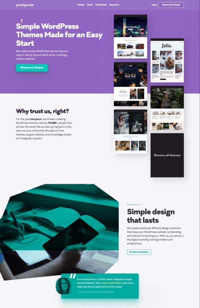
Why we like it: Pixelgrade is upfront and transparent about its mission: providing uncomplicated WordPress themes that enable users to swiftly establish their websites. They don’t clutter their message with unnecessary details. Instead, they succinctly express their value proposition and provide a convenient CTA for browsing their theme collection. We also like the social proof they sprinkle throughout the site.
2. Avery Dennison
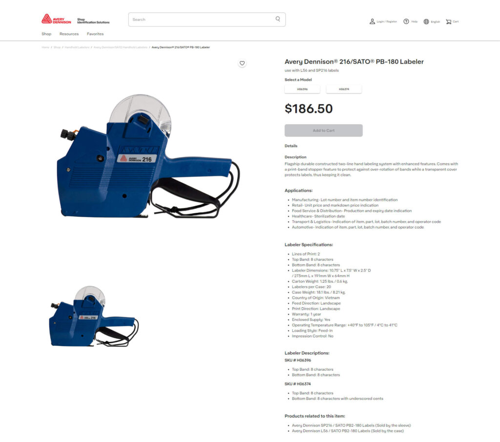
Why we like it: Avery Dennison sells tools and equipment for the retail industry. Their product pages use large, colorful images that clearly show their products from multiple angles. They also offer a generous amount of information for each product, which helps B2B buyers decide if the product meets their unique needs.
3. Square
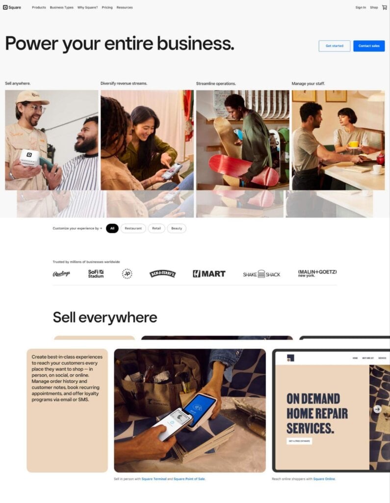
Why we like it: Square uses clear language that speaks to businesses directly. Phrases like “Power your business,” “sell everywhere,” and “diversify revenue streams” are music to the ears of anyone who wants to grow their business. It’s aspirational but achievable.
Square’s site also has an exceptional modern appearance. It’s clear that the brand is backed by talented designers who know how to build a quality product.
4. HireLevel
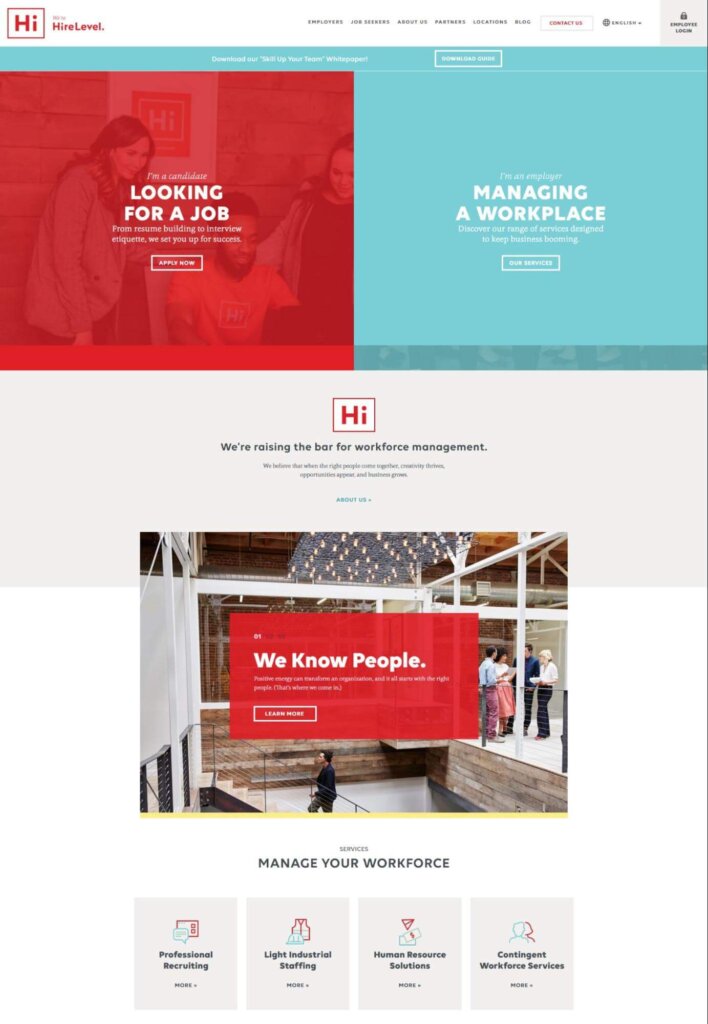
Why we like it: We love that HireLevel’s homepage makes a clear distinction between B2C and B2B customers. B2B customers can feel confident they are in the right place. On the employers’ page, there are more simple options for visitors to make to keep them moving toward their goals. HireLevel also offers a “Skill Up Your Team” whitepaper that B2B customers would appreciate, as well as live chat.
5. Intellum
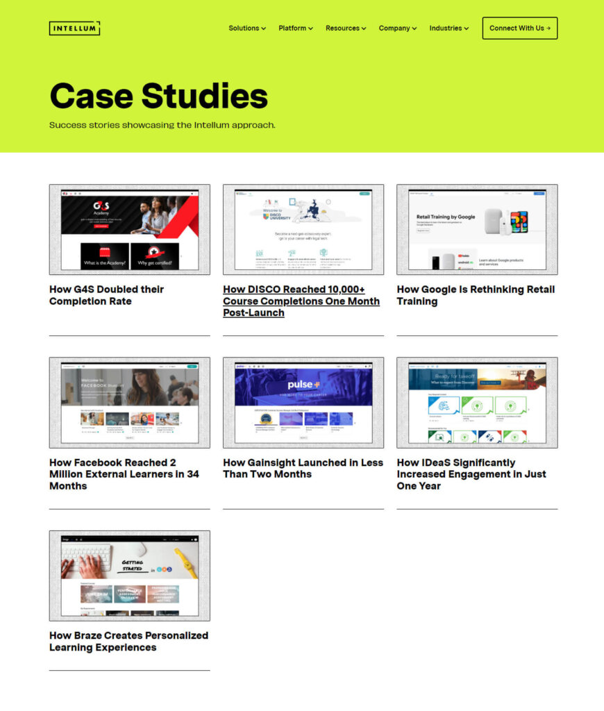
Why we like this: Intellum smartly includes a case studies page as part of their B2B website design. B2B customers are far more likely to read case studies than B2C customers. Case studies explain – in detail – how the brand helps its customers, thereby demonstrating competence and success. We especially love their titles which put the results front and center, such as “How Facebook Reached 2 Million External Learners in 34 Months.”
6. Good Start Packaging
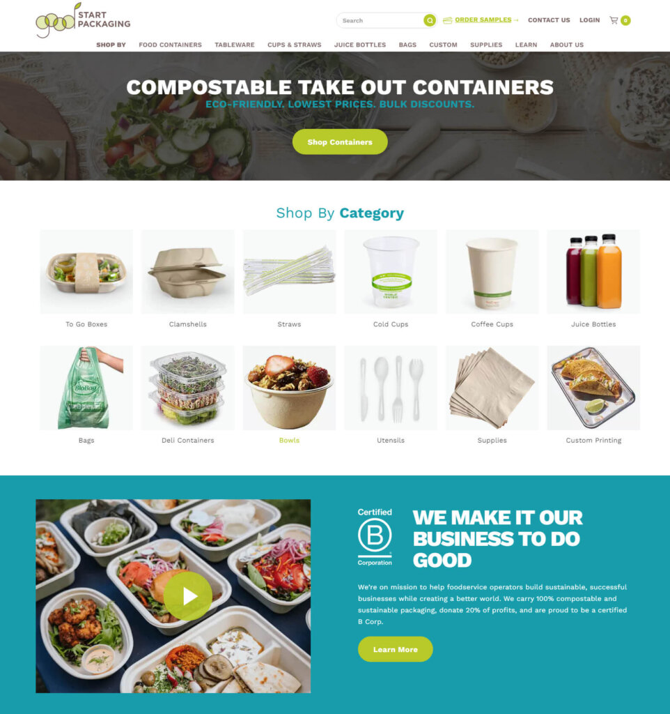
Why we like it: Good Start Packaging knows exactly who they’re speaking to: business owners who care about eco-friendly products. The colors and imagery all represent environmentalism and sustainability. Their mission clearly explains how their business aligns with their customers.
Furthermore, Good Start Packaging creates a good user experience by using pictures for their categories. It’s quite simple to find exactly what you’re looking for.
7. Cobalt Robotics
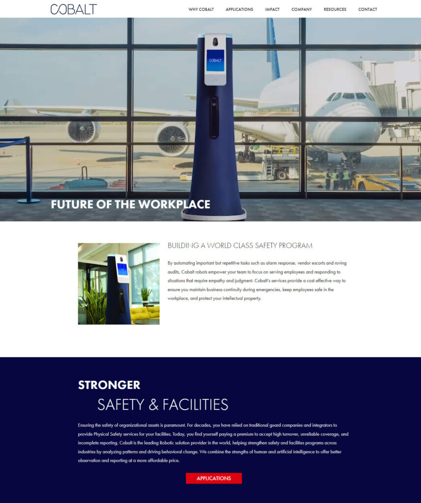
Why we like it: Cobalt’s website knows their customer well. They include lots of high-quality photos of their robots in commercial spaces. They speak about facilities, safety, automation, and liability – topics their customers care about deeply.
8. IBM
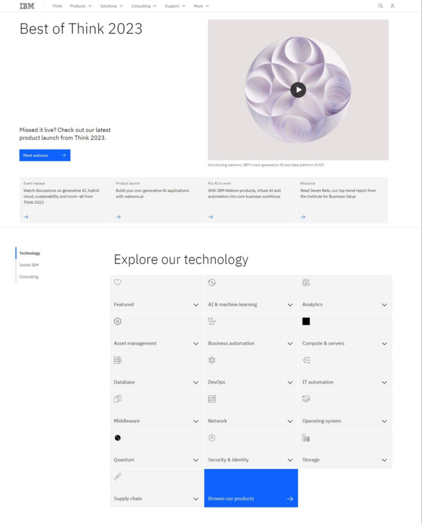
Why we like it: A diverse company like IBM obviously has a lot of pages, so clear navigation is critical. IBM has been thoughtful about this. Their dropdown menus are comprehensive, but use a clear hierarchy that’s easy to navigate. Below the hero row, an expandable grid helps you navigate technology options.
9. Bentobox
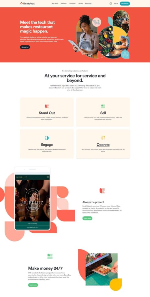
Why we like it: Bentobox uses excellent copy throughout its site. Phrases like “commission-free ordering,” “ticket and merchandise sales,” “back of the house,” and “make money 24/7” are enticing for restaurant owners and managers. The Bentobox site is also full of social proof, case studies, and opportunities to demo the product for free.
10. Mailchimp
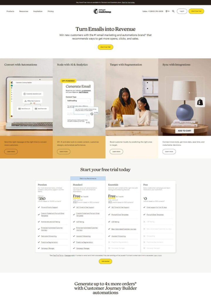
Why we like it: “Turn emails into revenue” is a beautiful piece of copy. It’s clear and speaks directly to the B2B customers’ needs. “Generate up to 4x more orders” is also smart copywriting.
Additionally, Mailchimp puts its pricing table right up front on the home page, which is an unusual location for SaaS businesses. They know that their price-sensitive customers need to know about cost first before they bother learning anything else.
B2B Website Design Best Practices (And How to Go Beyond Them)
We want to be very careful with the phrase “best practices.”
Best practices are for beginners. They’re a good place to start, but at a certain point, you have to move beyond them to level up your business. We like to think of best practices as a launch pad. They’ll get you moving, but eventually, you have to make your own way.
So while you can use best practices to start optimizing your B2B site, you should immediately dive into a system of data collection and experimentation.
That said, here are some B2B website design best practices to get you started.
1. Allow yourself to use some industry jargon
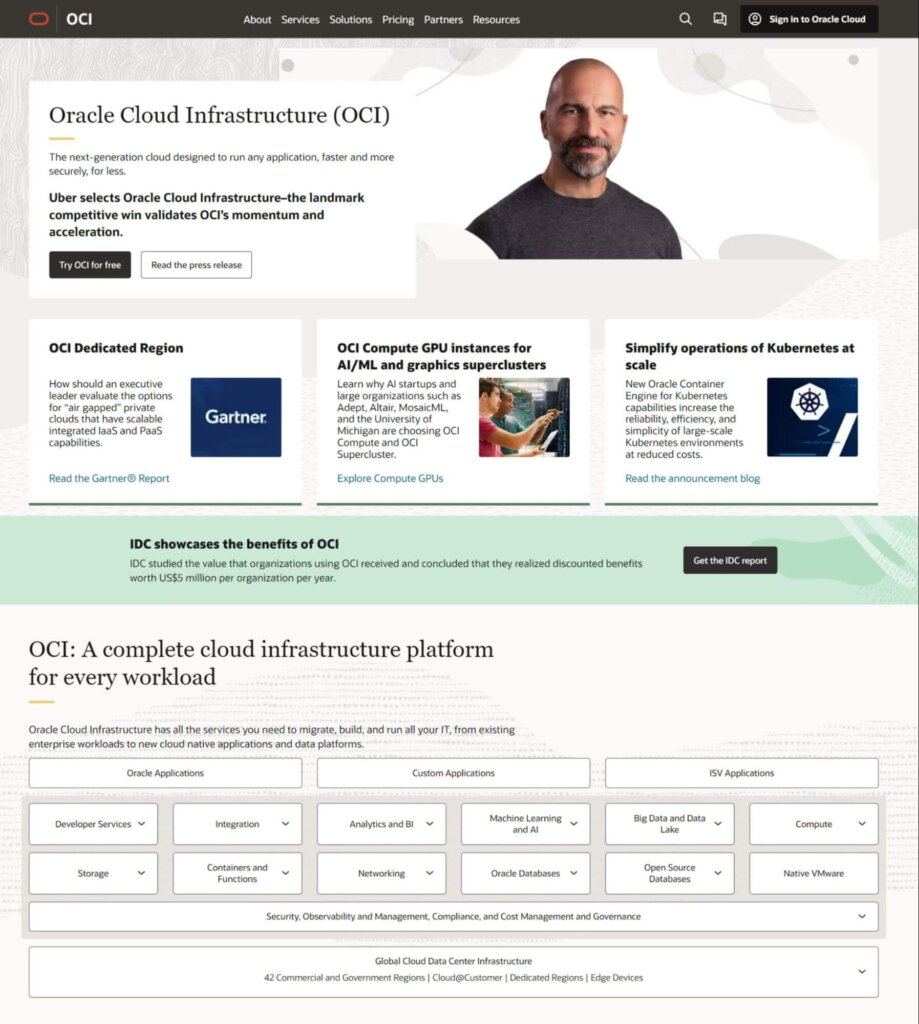
B2B website copy can often include technical language that B2C websites couldn’t get away with. Stakeholders within the industry are normally more jargon-savvy than consumers. You won’t have to explain yourself as much to industry insiders. Technical specifications that may confuse B2C consumers may be required data for your B2B customers.
Oracle’s site is a great example. Notice all of the industry-specific words and phrases they use that the average person probably won’t understand.
2. Adopt a more professional tone and appearance
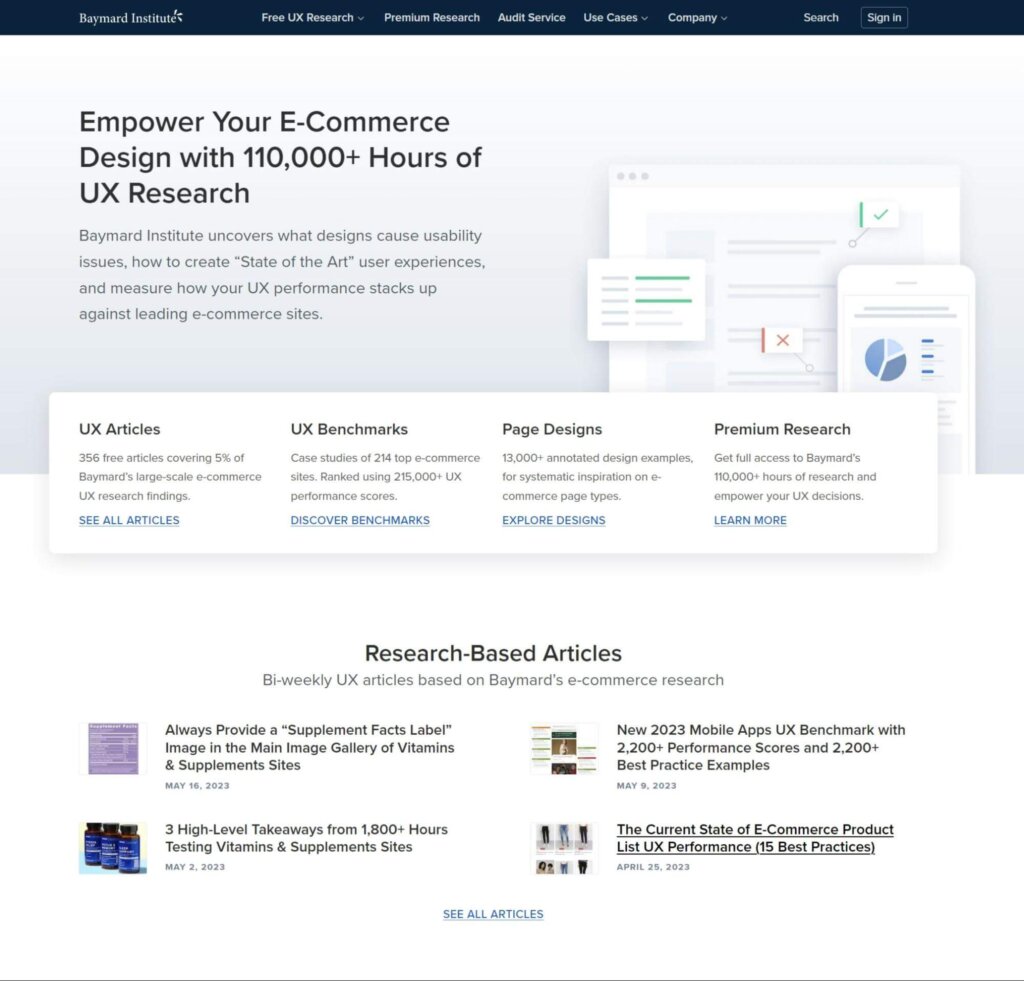
B2C websites can be more personable and light because they want to be liked and talked about by consumers. B2B websites, however, should have a professional appearance that implies credibility and respect within the industry.
Baymard Institute, an independent web research agency, uses a clean and professional style. If they started using unnecessary design elements, their customers would wonder if the content of their research was equally silly.
3. Provide the right content and messaging
One of the best-kept secrets of digital marketing (and a concept that many website managers struggle to accept) is that the idea isn’t to draw the most traffic; it’s, it’s to draw the right traffic.
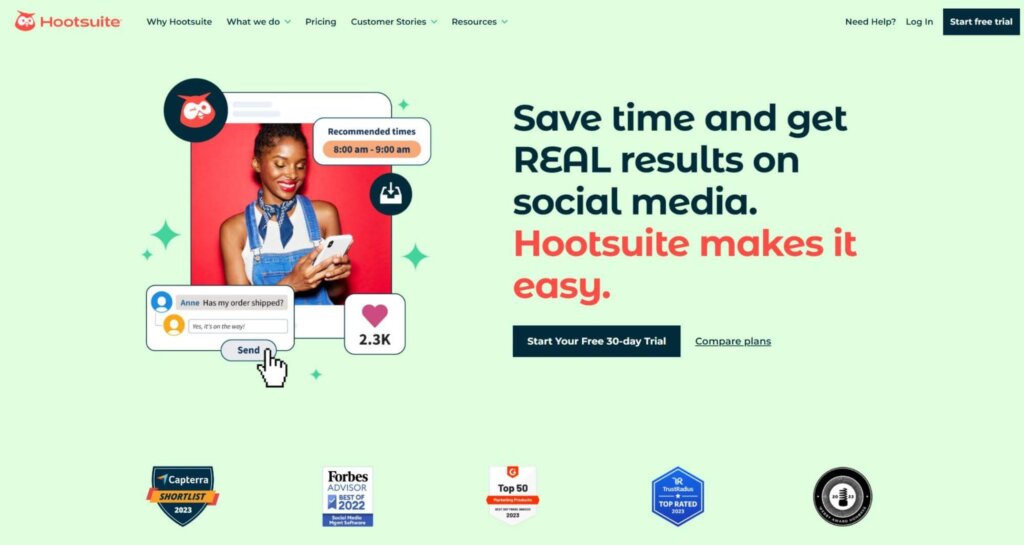
To do that, you must deliver the type of content and messaging your most-desired customers or clients find relevant. Then design the sales path to lead those prospects from point to point while building desire and interest along the way. Focusing your content to meet the needs of your target customers will ensure an optimal customer experience and improve your on-site conversions.
Hootsuite knows that its customers want to save time and get results with social media marketing. They use crystal-clear copy to align the platform with their customer.
4. Your marketing should be deeper and more value-adding
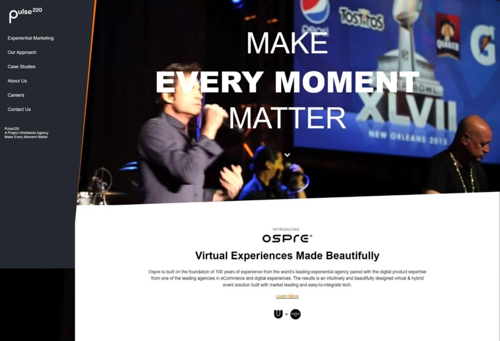
Marketing content for a B2B website should focus more on providing insights and solutions in order to generate leads, usually in the form of white papers, case studies, networking events, webinars, sales calls, product demonstrations, and other premium content. Blogging and social media posting usually isn’taren’t sufficient.
Pulse 220 knows that their customers want to see case studies right away, so they put it as the third item in their primary menu. That’s prime placement.
5. Prepare for numerous extended conversations, often live
Whereas B2B sales typically take place entirely virtually, the B2B sales funnel is usually a slower process that involves more than one person in the purchase decision. These needs tend to create more touchpoints.
It’s important to make yourself available to your B2B customers. Provide a public email box and assign someone to monitor it. Install live chat on your site and respond to inquiries right away. Consider moving customers into a more direct sales process with a higher level of touch.
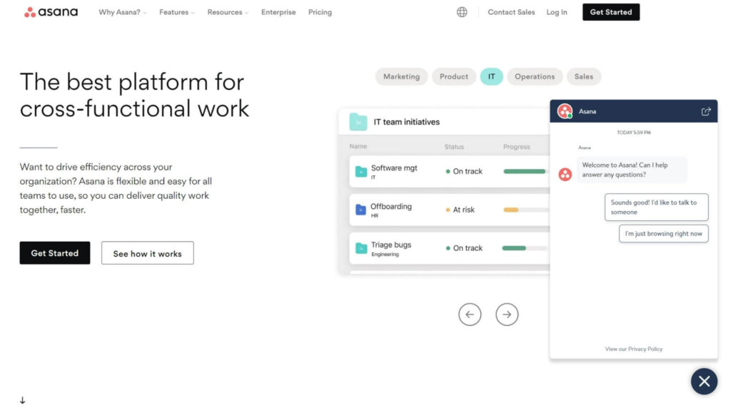
Asana knows that their customers often have questions about the platform before they’re ready to buy, which is why a live chat widget is available on every page.
6. Use lead generation to continue the conversation
As we mentioned, B2B sales cycles are typically longer than B2C cycles. You’ll need to create multiple touchpoints beyond your website, usually in the form of an email. Create as many opportunities as possible to collect email addresses. Then, craft targeted email content that establishes you as an authority figure and helps potential customers solve their problems.
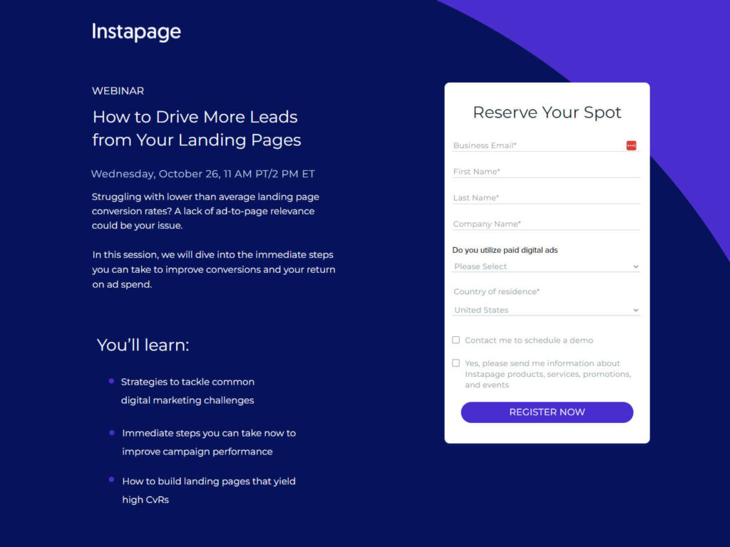
Instapage is a great example. They use webinars to convert buyers, but those email addresses aren’t discarded after the event. They nurture their subscribers over time and work to convince them that Instapage is the right solution for their needs.
7. Proactively overcome their problems
When B2B customers arrive on your site, they will come with problems. For instance, a potential customer might say, “Whatever product I buy must allow multiple users.” Instead of letting them wonder, put those answers front and center.
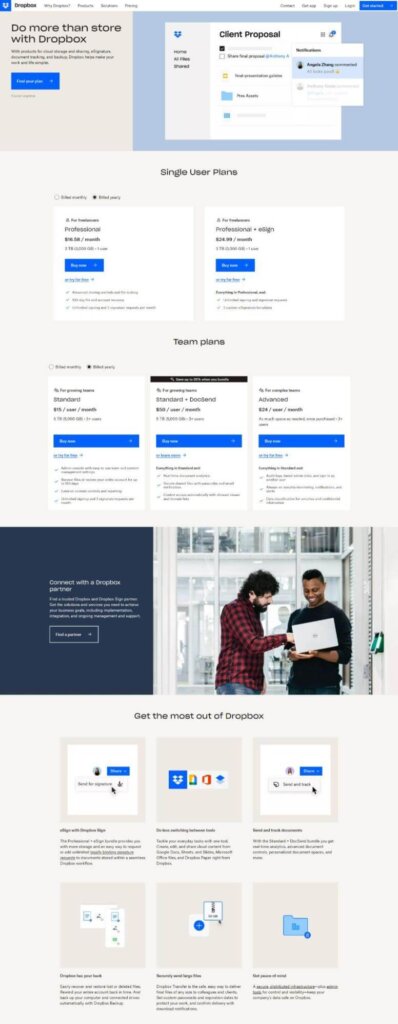
Dropbox does a great job overcoming objections with its homepage copy. They explain all the other things Dropbox can do besides storing files, like sharing, tracking, and signatures. A little farther down, they list what else Dropbox can do, which proactively answers any question that starts with, “Is Dropbox able to…?”
8. Create a culture of testing and experimentation
This final tip is the most important. This is how you go beyond best practices.
Part of your B2B website design program should include a process to test and improve the site based on data and methodical experimentation. This is how you get from best practices to a truly optimized website that meets your customers’ needs.
Most importantly, this type of data-based decision-making must be baked into your culture. Running a test here or there isn’t sufficient. Testing should be a part of your overall process; an expectation with every endeavor.
B2B Website Design FAQs
B2B website design is a big topic, so you may still have concerns. Here are some common questions we see about B2B website design.
How is B2B website design different from B2C website design?
B2B website design focuses on professionalism, industry expertise, and establishing trust between businesses. It prioritizes informational content, case studies, and client testimonials. B2B websites often have complex navigation structures and offer personalized experiences, account-based features, and integration with business systems.
In contrast, B2C website design emphasizes visual appeal, product displays, seamless checkout processes, and consumer-oriented marketing techniques for immediate purchases.
What are the key elements of a successful B2B website design?
The key elements of a successful B2B website design include the following:
- A clear and intuitive navigation structure
- Professional and visually appealing design
- Strategic use of relevant and informative content
- Prominent calls-to-action for lead generation
- Showcasing of products or services
- Social proof through testimonials or case studies
- Seamless integration with business systems
- Mobile responsiveness for accessibility across devices.
How can I optimize my B2B website for lead generation and conversion?
To optimize your B2B website for lead generation and conversion, focus on clear and prominent call-to-action buttons, strategically placed lead capture forms, compelling content offers or incentives, personalized and targeted messaging, social proof through testimonials or case studies, and analytics to track conversion rates. Regularly test and refine your website design and content to improve lead generation and maximize conversions.
What role does content play in B2B website design?
Content plays a crucial role in B2B website design by providing valuable information, educating visitors, establishing industry expertise, and building trust with potential customers.
High-quality content, such as blog posts, whitepapers, case studies, and guides, helps attract and engage the target audience. It showcases the value of your products or services, answers common questions, addresses pain points, and encourages visitors to take the desired action.
How can I measure the success and performance of my B2B website?
Start by tracking website traffic, user engagement, and conversion rates using web analytics. Monitor metrics such as click-through rates, time on page, bounce rates, and form submissions. Implement event tracking and goal tracking to assess specific actions or conversions. Conduct A/B testing, analyze heatmaps, and gather feedback to continually optimize and improve your website’s performance.
Are there any emerging trends or technologies in B2B website design that I should be aware of?
Yes, there are several emerging trends and technologies in B2B website design.
- Personalization will continue to be important, with dynamic content and personalized user experiences based on individual preferences.
- Artificial Intelligence (AI) and machine learning are being used for chatbots, virtual assistants, and predictive analytics to enhance customer interactions.
- Progressive Web Apps (PWAs) offer faster, app-like experiences on mobile devices.
- Voice search optimization is gaining prominence as more users rely on voice assistants.
- Augmented Reality (AR) and Virtual Reality (VR) are being explored to enhance product visualization and immersive experiences.
The Good Could Be Your Secret Weapon for B2B Website Design
Best practices are a starting point, but they won’t get you far. In fact, if you limit yourself to best practices, you’ll leave a lot of money on the table.
The Good can help you move beyond best practices and optimize your site for a customer experience that converts and retains. Powered by over a decade of industry-leading optimization, research, and strategy, we have the rare balance of data-driven strategy and beautiful design skills to improve the user experience and drive conversions.
How does it work? We start by studying your site and your users to determine why they aren’t converting. Then, we build a roadmap and testing program to fix it.
Don’t let your B2B website suffer the meager performance of best practices. If you embrace methodical experimentation and data-based decision-making, you’ll build a B2B machine that generates revenue effortlessly.
Now It’s Your Turn
We harness user insights and unlock digital improvements beyond your conversion rate.
Let’s talk about putting digital experience optimization to work for you.

About the Author
Jon MacDonald
Jon MacDonald is founder and President of The Good, a digital experience optimization firm that has achieved results for some of the largest companies including Adobe, Nike, Xerox, Verizon, Intel and more. Jon regularly contributes to publications like Entrepreneur and Inc.