
5 Tests We Would Run On (Almost) Any Ecommerce Site
Want to improve your conversion rate and customer experience? We’re sharing 5 of our favorite tests that repeatedly deliver insights.

This might hurt to hear, but it doesn’t matter how great your products are if your website visitors can’t quickly find what they need.
A minor inconvenience or delay in the user experience can make the difference between someone completing a purchase or losing interest and leaving.
While it can be a challenge to come up with the right areas for optimization, after a decade-plus in the business, we’ve identified patterns across our clients. There are specific areas of ecommerce websites that when optimized, consistently deliver results. And there are a few tests that we’ve had success with time and time again.
Our team analyzed our vault of patterns and these are 5 of our favorite data-backed tests to help you gather insights on your customers and increase conversions.
Let’s dive in and explore the test ideas we would run on (almost) any ecommerce site!
Test Idea #1: Quality Tiles
The Test Idea: Replace product tiles on the category page with “quality tiles” that feature different brand messaging.
Why We Love It: Testing product tiles with different key messages (brand values, free shipping, etc) teaches the brand what its customers care about… and increases conversions.
The Quality Tiles Test In Action
One of our clients, Beckett Simonon, an online leather goods retailer, needed a long-term optimization program to guarantee sustainable improvements to their sitewide conversion rates.
To identify potential conversion blockers, we analyzed Beckett Simonon’s website analytics and user experience flow through usability testing and heat maps to uncover lucrative conversion opportunities.
Our research revealed that users:
- Relied heavily on product images to decide on purchases
- Didn’t understand Beckett Simonon’s differentiated value
Our team hypothesized that focusing the company’s messaging throughout key image-driven moments would help users understand their product’s unique values, like ethical responsibility.
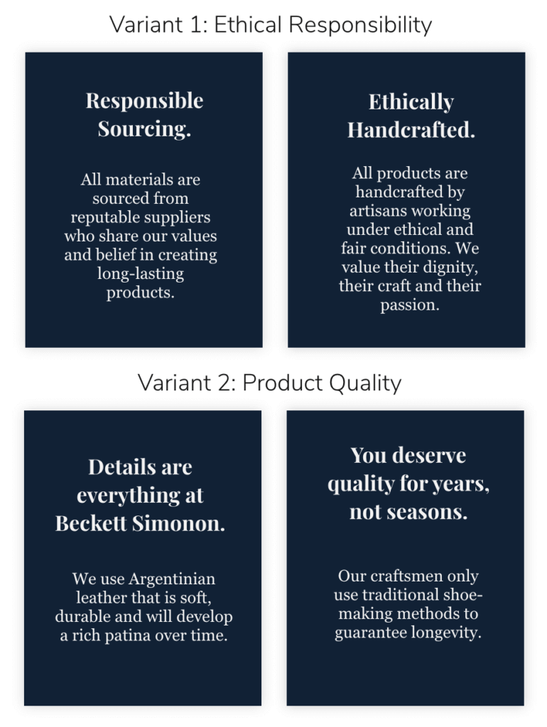
So, we A/B tested different messaging, Variant 1 focusing on the company’s ethical responsibility practices and Variant 2, focusing on the company’s enduring product quality.
We tested the product tile variations on the Category page. Below you can see the control with their original product imagery and the variant with our quality tiles.
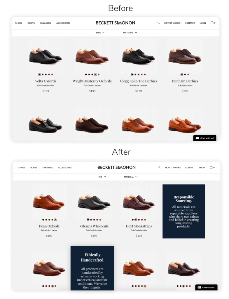
Variant 2 includes language surrounding the company’s sustainability efforts, like ethical labor conditions and reputable suppliers.
We found that the Ethical Responsibility test variant produced a 5% higher conversion rate than the control, resulting in a return on investment of 237%!
Why It Works
Emphasizing sustainability aligns customers with Beckett Simonon’s values. It connects shoppers to the brand.
Other companies might offer high-quality leather boots but may not source their products from suppliers who care about the environment as Beckett Simonon does.
The test taught the brand what the customers care about and gave customers the extra confidence they needed to make a purchase.
A quality tile test could offer similar results for your brand.
If customers linger on your category pages but never commit to the purchase, try a quality tile test to reveal what your customers care about and how you can deliver that message through the shopping journey.
Test out various messages like:
- Your brand’s values
- Your USP (unique selling proposition)
- Special offers like free shipping
Test Idea #2: Categories In Your Navigation
The Test Idea: Add popular product categories as the items in your navigation.
Why We Love It: There is almost always a way to test something in the navigation and optimize for a better customer experience. Putting categories front and center reduces friction and propels visitors through the sales funnel.
The Category Navigation Test In Action
One client came to us with a menu listing items in their header navigation like Shop, Connect, Discover, Rewards, etc. On top of that, the Shop drop-down listed product categorization with labels like Collections and Themes.
This categorization wasn’t clear enough for new visitors. We had the opportunity to raise awareness of the product catalog by surfacing top categories in the persistent menu navigation.
So, we tested adding top product categories into the top-level menu navigation for better browsing opportunities, product catalog awareness, and increased transactions.
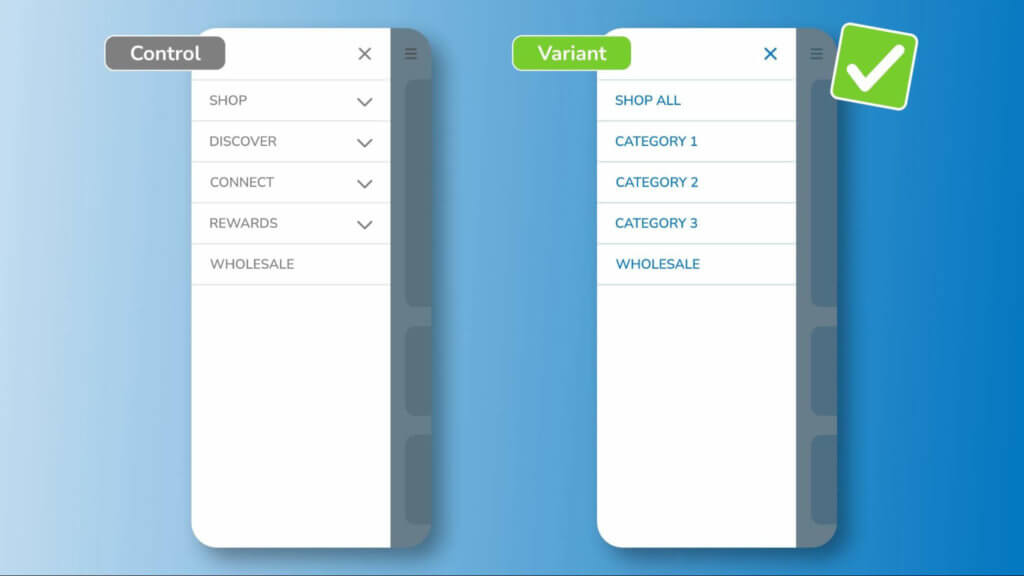
Our variant increased conversion rates over the control, resulting in over $100,000 of revenue gains.
Why It Works
Clear categorization helps visitors easily find the product they want. That means a quicker time between landing on the website and making a purchase decision… and a better customer experience.
Test by using your original navigation menu as the control and your categories for the variant. If you’re unsure which categories to feature in your top-level navigation bar, use Google Analytics to find your top categories and most-visited web pages.
An easily navigable website encourages visitors to explore various product category pages, ultimately reducing any friction along the way.
Enjoying this article?
Subscribe to our newsletter, Good Question, to get insights like this sent straight to your inbox every week.
Test Idea #3: The Etsy Test
The Test Idea: Feature similar products or “other customers also viewed” items to inspire on-site comparison and decrease abandonment.
Why We Love It: Offering your customers alternatives keeps them interacting and engaging with your website, instead of going to a competitor for comparison shopping.
The Etsy Test In Action
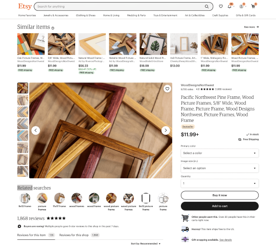
Etsy displays similar products above the fold, encouraging shoppers to stay on-site even if the product they clicked wasn’t what they needed or wanted.
They also add the product prices below the image if customers want to shop for the best deal on similar products.
Why It Works
This test is excellent for brands that run a lot of Google Shopping ads. Most people who land on a site from a Google product listing will be comparison shopping. They know the product they are looking for, but don’t necessarily know or care about the brand.
This means the standard practice of surfacing add-ons on the product page to increase average order value won’t be relevant to their needs.
Instead, it aims to keep people on-site by surfacing appealing alternatives to the product they are already viewing. Let them comparison shop the products on your site rather than comparing your brand to other Google Shopping listings.
Etsy displays similar items above the fold to encourage shoppers to stay on-site even if the product they landed on wasn’t quite the right fit.
Test Idea #4: Instructional Search
The Test Idea: Test a friendly, instructional search prompt.
Why We Love It: Instructional search encourages intentional browsing, improves UX, and boosts conversions.
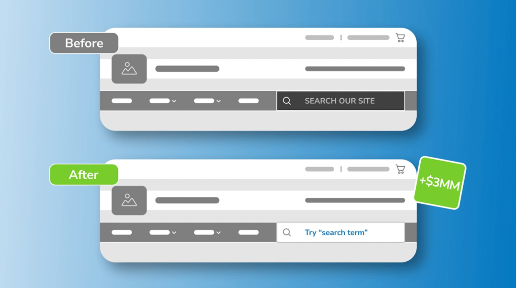
The Instructional Search Test In Action
During research for one client, user tests and session recordings revealed that customers primarily navigate through the search bar. We also found that customers only engage with select menu categories.
Our team hypothesized that adding friendly microcopy and enhancing search bar visibility would encourage the use of search and in turn, increase transactions.
We put it to the test. We visually emphasizedthe search bar with a white background and updated the language to “Try ‘search term.’”
It delivered over $3,000,000 in revenue gains.
Why It Works
According to Comprend, 59% of web visitors frequently use a website’s internal search navigation, and 15% would rather use the search function than the hierarchical menu.
You don’t want your customers to zombie scroll through endless products to find what they need. Internal search encourages customers to easily locate what they need.
If you run this test on your site, you could try:
- Adding friendly microcopy to your search bar (include a key product or category for inspiration)
- Exposing the search bar on mobile
- Adding a white or light background to the search bar
Test Idea #5: The Buy Box
The Test Idea: Dig into the content in the buy box area to find areas for optimization. Test the buy box layout, product descriptions, or reviews.
Why We Love It: When you optimize the buy box, you improve how quickly and easily customers can understand your product… and make a purchase.
The Buy Box Test In Action
For one client heat maps and session recordings showed how customers interact with the mobile product pages. Users struggled to see product images, which led to a lack of engagement with other elements in the buy box.
We decided to test out a new layout. Instead of placing the product image first, we prioritized the product name and description, placing the product image below.
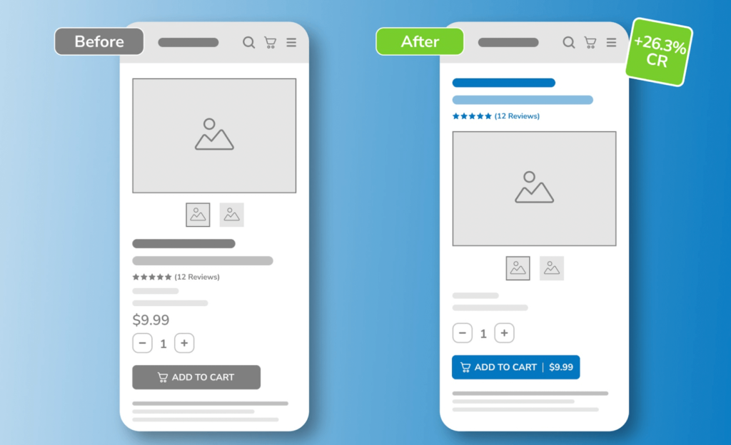
Decluttering and reorganizing their buy box resulted in a 26% increase in conversions.
Why It Works
Moving around the content in the buy box helps us understand where and what the customer needs to see to make a purchase decision.
Putting key product information above the fold, especially on mobile, removes any guesswork for the customer.
If customers are getting stuck on the product page, test variations of your buy box layout to optimize the user experience. And remember, oftentimes less is more, so don’t be shy about testing our reductions in the amount of content or text you feature.
The ultimate goal is to optimize everything on your product page, but the buy box can be a great place to start.
Understand Your Customer & Boost Conversions With 5 Of Our Favorite Tests
In this article, we unlocked our secret vault of test ideas to help inspire your optimization efforts.
While every website is different, these are 5 of the tests we’d run on almost any site to learn more about the user and deliver a better customer experience.
- Replace product tiles on the category page with “quality tiles” that feature different messaging to educate customers about your brand.
- Test categories in the homepage navigation to reduce hangouts on your website, propelling customers further down the funnel.
- Optimize content in the buy box area to improve how quickly and easily customers can understand your product and complete a purchase.
- Test a friendly, instructional desktop search prompt to encourage intentional browsing and improve UX.
- Try the Etsy test to cross-sell similar products and encourage customers to comparison shop on your website.
If you don’t have time to optimize your own site, we’re here to help.
Our services dive deep into your site to uncover areas for improved customer experience opportunities and opportunities to maximize conversions.
About the Author
Natalie Thomas
Natalie Thomas is the Director of Digital Experience & UX Strategy at The Good. She works alongside ecommerce and product marketing leaders every day to produce sustainable, long term growth strategies.