
Creating the Ultimate Above the Fold Strategy – And Why It Matters
A complete guide to what above the fold content is, why it still matters, and exactly how to optimize yours for better conversion rates.

Key Takeaways
By the end of this article, you should have the knowledge and resources to “check the box” in these areas…
- Above the fold content continues to be crucial to website success, but the way you should approach it has changed as the internet has changed.
- It should ideally entice users to go further into your website by clicking on the CTA or scrolling down to the rest of your homepage, and eliminate anything that distracts from that mission.
- There’s no one-size-fits-all method to creating great above the fold design, but there are strategies and examples that can help you determine what will work for you—followed by plenty of testing to validate your changes.
Is focusing on your above the fold content an outdated marketing practice?
Some marketers would argue the point.
In our opinion, as long as you approach your content and optimization in the right way, it’s some of the most valuable real estate on your website.
Your above the fold content should draw users into your website, enticing them to explore the page and the site as a whole further. But this goal is challenging these days thanks to the rise of responsive design and the decline of readers’ attention spans.
Coming up with the right strategy to optimize your above the fold content isn’t easy, but it’s powerful—it’s the beginning of a user’s journey through your website. And this guide will take you through everything you need to know about above the fold design, content, strategy, and even some examples for inspiration.
What is above the fold?
The term “above the fold” comes from the heyday of the physical newspaper. Since they were sold folded in half, potential readers could only see the top half of the front page of the paper before they bought it—the portion above the fold.
That part of the paper needed to be catchy and compelling so people would be tempted to buy it after just a glance. Publishers learned to add eye-catching images and intriguing headlines to make their papers a must-buy.
On today’s websites, of course, there’s no actual fold. But in the early days of the web, the above the fold content was predictable as screen sizes and device resolution were pretty standard.
Businesses tended to put as much information as possible above the fold because users weren’t accustomed to scrolling. The top of websites was crammed full, and often a bit overwhelming.
Does above the fold vs below the fold still matter?
These days, the importance and strategy of above the fold content has shifted. Your website users scroll effortlessly—in fact they expect to scroll—so you shouldn’t cram everything in at the top of your site.
And the rise of browsing on smartphones and tablets has come with the rise of responsive design. What content appears above the fold looks a little, or sometimes a lot, different for everyone depending on how they’re viewing your site.
It’s hard to predict how your users will experience your above the fold content because you won’t know exactly what they’ll see, unlike in the paper.
But that doesn’t mean above the fold content doesn’t matter anymore. The top of your page is still the first thing visitors to your website will see, and so it needs to be appealing and engaging so they continue scrolling instead of clicking away.
How can you ensure your above the fold design is smart and strategic? We’ve got some ideas for you.
Above the fold design strategies
The most effective way to design your above the fold content is considering your page holistically, instead of looking at the sections individually.
Your above the fold section should draw in users with an enticing story and graphics and take them on a journey through to the content they need and want—no matter where exactly the fold hits on their screen.
Optimizing your homepage
First, conduct what we like to call the “5-Second Test” on your homepage—when a user arrives on your site, can they understand what you do and who is a good fit for your product in five seconds or less?
Since most of those five seconds will be spent on your above the fold content, this is a good test for where you are right now.
Review your user experience
You should also test what that initial above the fold user experience is like: are you bombarding your visitors with popups, ads, and email signup offers before they’ve had a chance to view your site? While they might grow your email list, they deliver a terrible user experience and distract from the main goal of your site: convert visitors into buyers.
Optimizing your above the fold navigation means simplifying as well. Can users find where they want to go with just a glance? This isn’t the place to add in lots of links to information about your company—keep it focused on getting users where they want to go to buy your products.
Remove distracting images and carousels
One key thing not to do on your homepage above the fold—include an image carousel. You can click that link for the details but in short, they convert very, very poorly and so we really don’t recommend including them.
Videos that take up too much space, or take too long to load, also shouldn’t go above the fold. They’re distracting and are better suited to a little lower on the page. You can point to them in the above the fold section and offer users a tempting hint about the content to come with an arrow or header, which gives the video time to load and encourages users to scroll.
Above the fold SEO
Paying attention to SEO above the fold is important as well.
You mostly want to avoid making the user experience negative to avoid a decrease in traffic from Google. Their algorithms penalize websites where there are so many ads above the fold that the actual site content only appears when people scroll, so ensure your ad experience doesn’t interfere with your content.
It also means including clear headers and calls to action so your site users can navigate with ease, and fast load speeds so visitors don’t get impatient and bounce.
Desktop and mobile considerations
The switch from desktop to mobile browsing has made designing a great above the fold experience more complicated. Mobile devices come in a range of sizes, and they present websites in portrait mode instead of the traditional landscape. The smaller screen also means that there’s less room for your above the fold content.
Responsive web design is a must, of course—it ensures your website loads content according to the size and resolution of the screen, no matter where people are accessing your site from.
Above all, prioritize the kind of content that draws users in and gets them scrolling to the rest of the page. What will appeal most to your ideal customers? Put that up front, and draw them in to read and view the rest. (Easier said than done, we know!)
Enjoying this article?
Subscribe to our newsletter, Good Question, to get insights like this sent straight to your inbox every week.
Winning above the fold website examples
If creating your own above the fold content sounds just a bit overwhelming with all of these elements to think about, just check out these examples of great above the fold design for inspiration.
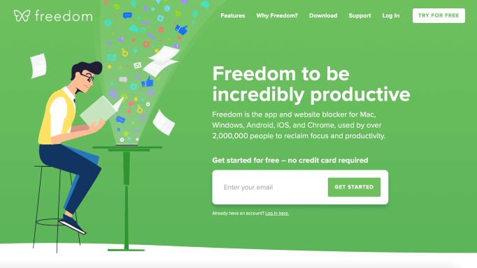
1. Freedom
Freedom is an app and website blocker designed to free you from digital distractions, and so that’s exactly what their above the fold design relays. It’s clean, easy to understand, and includes a CTA to sign up for free right away.
That immediate CTA works for them because they don’t need long to communicate their value proposition. And their site users have likely already done some research to find them, so Freedom gets right to the point with a free signup offer.
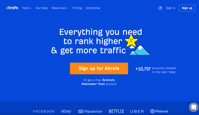
2. Ahrefs
Ahrefs also includes a CTA in their above the fold content with two options—a free account or a paid one. But for visitors who aren’t ready to buy right away, they cleverly put a few of the logos of their clients at the bottom of the fold, encouraging users to scroll to see more.
And once you start scrolling they take you through their beautifully designed homepage with clear, engaging descriptions of what they do as well as multimedia elements.
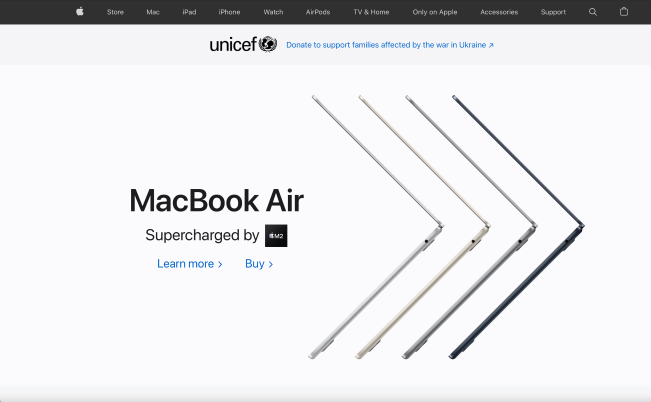
3. Apple
Apple’s above the fold content calls back to the minimalist design that is the brand’s hallmark—there’s just a few navigation items up top and then an enticing image of their newest product. They know that many of their site users are looking for the most updated products they offer, so they feature that right away.
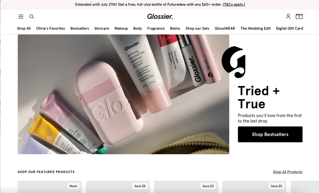
4. Glossier
The millennial beauty brand’s above the fold content highlights their best-selling products right away, which is great for any visitors who are newer to the brand or aren’t sure what they want to purchase.
For the shoppers who have already decided what they need, they can go right to the clear navigation options at the top to find exactly the products they want. The above the fold design serves both new and returning customers, and encourages everyone to scroll with a peek at the products below.
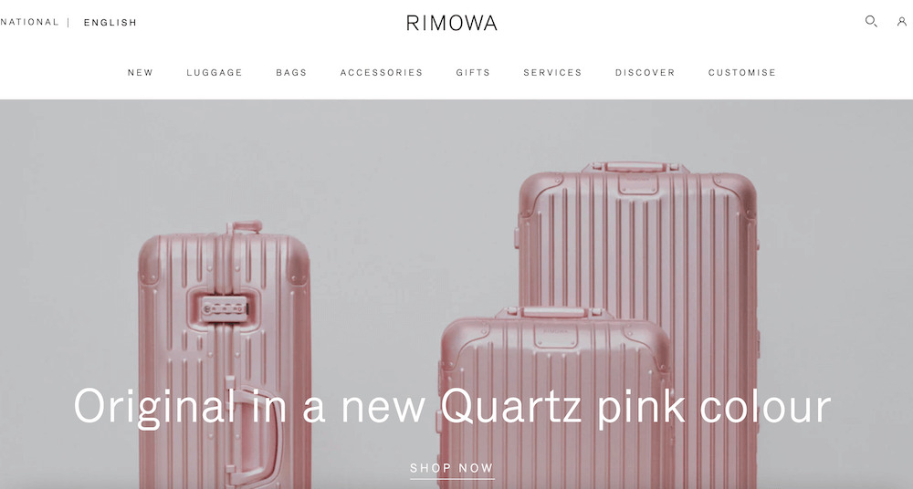
5. Rimowa
The upscale luggage brand has a chic and simple above the fold design—just navigation to their product categories and an appealing hero image with a link. Many websites include images that are too busy or slow-loading videos which can overwhelm first-time visitors, but their content starts out clean and clear, just like their branding.
6. Demostack
Demostack is software designed to make selling your own software easy, so it’s no surprise that they have an above the fold design that’s great at selling. It describes what they do in just a few words with a fun but understated animation.
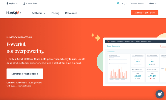
7. Hubspot
Just like their headline states, Hubspot’s above the fold design is powerful but not overpowering. They’ve distilled the main reasons people come to their site: to check out their products, view their prices, see their resources, or try it out.
And from those use cases, they have very simple navigation options above the fold. It ensures people can find what they need without getting lost in the many options Hubspot offers, with great copywriting to boot.
Above the fold is crucial, but don’t underestimate below the fold content
It’s easy to get too focused on your above the fold content—because it is vitally important to your website experience. But it must be balanced with the rest of the content on your homepage.
Think of it as a holistic experience and a journey. Your homepage should take your website visitors through everything they could want from your business right off the bat. That includes simple and direct navigation options so they can explore and find what they need, images or video that reflects your brand without distracting, and an enticement to explore.
Optimizing above the fold is important, but don’t forget about optimizing your below the fold content and your footer as well. Check out our complete (and free!) guidelines on how to run your own CRO to see how your homepage performs from top to bottom.
And our Landing Page Optimization Rubric can help you optimize your above the fold content as well as everything below it for a seamless page flow that increases your conversion rates.
Above the fold content is just one piece of the puzzle, so don’t forget to ensure every part fits seamlessly together for the best results.
Start with user testing, and consider an expert opinion
How can you be sure you’ve landed on the right above the fold design that works with the rest of your homepage?
Once you’ve implemented your optimizations, test them carefully on real users to find out if they’re working. Be sure you’re testing on both existing customers and people who aren’t familiar with your company.
Check how they navigate through the page—are they clicking your CTA, scrolling aimlessly, or struggling to navigate to what they came to find? Are they getting bored and bouncing too soon, or getting stuck on a different path than the one you wanted them to take?
If you’re not getting the results you had hoped for, try again until you land on the right solution. You won’t get it right every time, but with a willingness to test and learn you’ll find the best way forward with certainty.
If you’re not sure what to tackle first, or your previous efforts at optimization haven’t worked as well as you hoped, it might be time to bring in a professional. Getting experienced outside eyes on your homepage can help you determine what’s working and where you’re going wrong so you can build the most effective page possible for your business.
Want an expert to help you optimize your above the fold content? Consider a Digital Experience Optimization Program™. We’ll tell you exactly what’s going wrong and how to fix it so you get real results fast.
Enjoying this article?
Subscribe to our newsletter, Good Question, to get insights like this sent straight to your inbox every week.
About the Author
Jon MacDonald
Jon MacDonald is founder and President of The Good, a digital experience optimization firm that has achieved results for some of the largest companies including Adobe, Nike, Xerox, Verizon, Intel and more. Jon regularly contributes to publications like Entrepreneur and Inc.