
Why Optimizing Your Website Footer is More Important Than You Think
The website footer is one of the most overlooked areas of a company’s website. Learn why it deserves more attention and how to optimize it.

The website footer can easily be one of the most ignored components of your web design.
For web designers, the bottom of the page may seem like the last place you’d consider running a test, but you’re missing out on a big opportunity for optimization if you decide to neglect it.
As strategists, we look at the footer as an important extension of the top navigation. The best footers will act as a safety net for your website visitors and help conversion rates by acting as a strong roadmap to the rest of your site. This is true on your desktop experience, but it’s even truer for mobile experiences.
The best footers will act as a safety net for your website visitors and help conversion rates by acting as a strong roadmap to the rest of your site. Share on XWhy optimizing your website footer matters
In our experience, users go to the footer for three key reasons – jobs, trust signifiers, and last-ditch navigation when they are lost. For example, when we’ve watched session recordings from website visitors, we’ll often notice users scrolling to the bottom of your home page multiple times, only to realize that an item they were looking for (careers, for example) was located on the header and not the footer.
Missed opportunities like this and others can lead to users getting lost and then leaving the site. And if users are getting lost on your home page, it’s a glaring sign that it may be time to start testing new footer designs.
Now you may be thinking: Is it really worth my time and energy to run tests on my website footer? Shouldn’t we be focusing on what’s “above the fold”?
The truth is, a great website footer will help your visitors navigate your site and will lead to a greater ecommerce experience.
For example, an A/B test of a luxury handbag website performed by Smart Insights saw a sales conversion increase of 27 percent and a 16 percent improvement in revenue per visitor due to the simple redesign of the website footer. In addition, a study conducted by ChartBeat revealed that 66 percent of user engagement actually occurred “below the fold”.
Here’s the deal: Investing time in creating a “fat footer” may be one of the simplest and most effective methods for boosting conversions, and it won’t even take that much of your time to do.
In this article, we’ll cover:
- How to decide if you should optimize your footer
- Eight characteristics of a good website footer (with examples)
Should I optimize my current website footer?
Utilizing tools like heatmaps and user session recordings is a great place to start identifying problem areas with your footer and determining what you’re going to test first. If you see little to no activity in your website’s footer, this typically means that either visitors just aren’t making it to the bottom of your website, or you’re not including anything of value in your footer.
A common mistake that companies make when designing the header and footer of their website it that they include identical information in both places on the site. This redundancy fails to provide any additional information or value for users.
The question is: How should you differentiate these two areas?
The main differentiator between the header and footer is that the header should be a condensed roadmap of the most valuable pages on your site. The footer acts more like a “safety net” where your site visitors end up if they’re experiencing difficulty navigating the site.
As shown in the example below, the header features the key points on the site that visitors may want to access when they first reach your landing page (product offering, about us, contact, etc). The footer is used to offer additional details about the company that you may want to exclude from the header, such as your terms of service or privacy policy.

Header
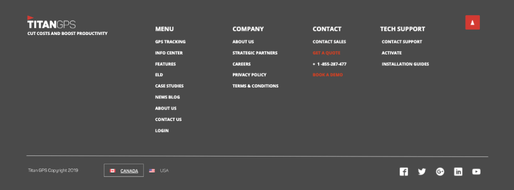
Footer
Another common mistake made when designing a footer is over-optimizing. While it may be tempting to pack as many keywords in your footer as possible, Google’s SEO ranking algorithm will pick up on this and it may have a negative effect on your site ranking.
So how much is too much?
A good practice when optimizing your footer for SEO is to only include keywords or phrases that will add value to your brand or encourage visitors to take action.
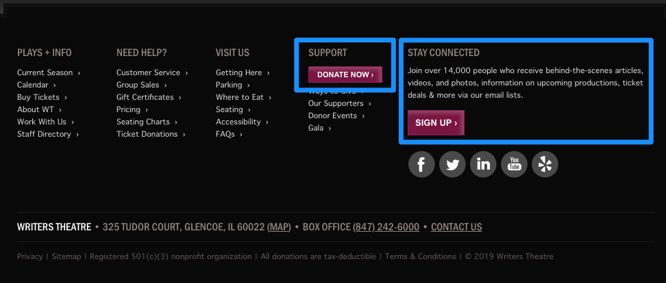
An example of this can be found on the Writers Theatre website, where they’ve clearly integrated two call-to-action buttons prompting visitors to either sign up for their newsletter or donate. This approach adds value to both the user and brand while avoiding keyword stuffing.
Next, it’s time to start looking at how to begin optimizing the space in your footer. We’ve compiled a list of eight key ingredients of an effective footer that your website will immediately benefit from.
Key Characteristics of Effective Website Footers
Here are eight key characteristics of good website footer design. This is the most important information to include in your footer:
Enjoying this article?
Subscribe to our newsletter, Good Question, to get insights like this sent straight to your inbox every week.
- Logo
- Navigation
- Contact details
- Support
- Copyright, terms of service, privacy policy
- Company info (i.e. Careers)
- Social media icons
- Call-to-action
Optional feature: Security and certification logos
Let’s dig into each of these characteristics a little more.
1. Logo and brand imagery
As a general rule, just like your top navigation, you’ll want to use your brand imagery in your footer navigation. This is a great opportunity to associate your logo with the value of your brand once again at the end of the page.
2. Clear and effective site navigation
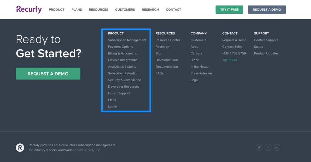
The footer can be a great place to provide visitors with details about your product offering. On the Recurly website, their footer links act as a robust extension of their main navigation; this helps visitors navigate the site and learn more about each service area that the company specializes in. This tactic supports the idea of the footer being a “safety net” for visitors who may not know exactly what they’re looking for on the site.
3. Highly visible contact information
Including contact details are important for building trust with your target audience and showing evidence that you’re a real business. To build trust, consider including details such as a phone number, physical address, or hours of operation.
4. Easily accessible support in the website footer
Visitors will often use your footer when they have questions before or after a purchase. Beyond your contact information, include links to other supporting resources like a help center or any other online support. If you have a large catalog of helpful content, including an on-site search engine box can help here.
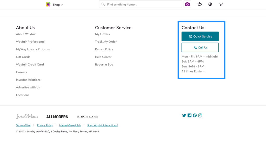
Wayfair’s footer provides simple options for contacting their customer service department without making their customers jump to another page on the site. This approach is especially useful for ecommerce retailers that need a space to highlight their customer service options, such as order tracking, return policies, or a customer service line.
5. The often-overlooked copyright notice, privacy policy, and terms of service
Three easily missed elements of the footer that every website should have are a copyright notice and links to your privacy policy and terms of service. Not only are you legally required to have this information available on your site, but it adds credibility to your brand—and you should seize every opportunity you have to build trust with your customers.
Heap Analytics has a simple and effective approach to including this information in their footer. Providing this information is a clear and effective way to add credibility to your website, and it doesn’t take very much time to add.

6. Highlight important company info
Your footer is also a great place to highlight specific company info like an about us page, careers, events, press, reviews, a full inventory of your product offerings or categories, and any relevant business associations.
7. Clearly positioned website footer social media icons
While some companies may opt to clearly position links to their social media buttons in the header of their landing page, taking this approach may inadvertently increase your bounce rate by encouraging visitors to jump to your social accounts before checking out what your site has to offer.
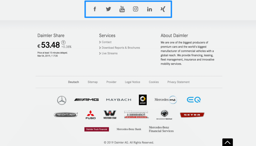
Seventy-two percent of websites include social icons in their footer, so it’s becoming standard practice for ecommerce website design However the reason to include them isn’t because everyone else is doing it, it’s because they act as social proof that you are an established brand.
Daimler does a great job of this on their website by including social links at the top of their footer. This design ensures that visitors will need to scroll through your entire landing page before jumping to another page.
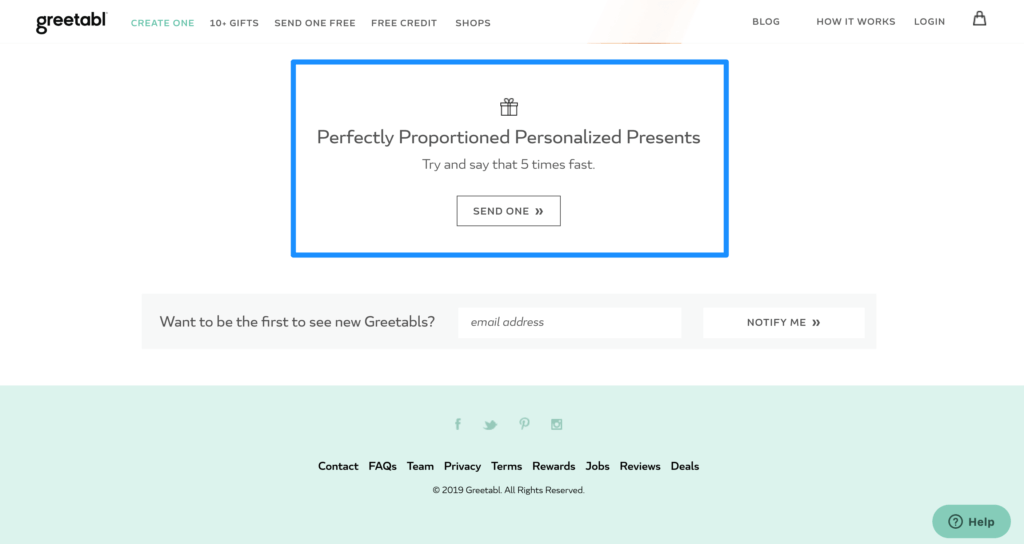
8. Call-to-action that adds value
Inserting a call-to-action at the bottom of your website is a great way to add value to your landing page without going into too much detail. A clear call-to-action that encourages visitors to take action (email signup form, request a demo, free trial, consultation, etc) is a great way to keep visitors engaged and will have a positive impact on lead generation. It’s also a clever way to drive business since you’re catching the folks who’ve made it all the way to the bottom of your page.
Greetabl employs this simple one-click call-to-action approach on their site to prompt visitors to try out their services.
9. Security and certification logos that establish trust (optional)
Another way to build credibility and trust with customers is to add any certifications or security logos that may be relevant to your business. An example of this can be found on the Sparx IT Solutions website, where they have DMCA (Digital Millennium Copyright Act) and GDPR (General Data Protection Regulation) compliance symbols clearly visible. This is especially relevant to companies that store highly sensitive client information, where additional security is required.
Be careful though. The thing with security logos is that it’s not about technical security, it’s about perceived security. If you include too many, it can sometimes inject doubt and reduce trust. Most visitors can’t tell the difference between security logos except for the big wigs like “BBB”. A good rule of thumb is only to include the logos that would inject trust in this particular stage of the customer journey.

Don’t Overlook the Website Footer
Here’s the bottom line: It’s time for you to invest time in optimizing your website’s footer. Not only will it provide for better customer experiences on your site, but it may generate leads, lift your organic search results ranking, and improve conversions.
It’s easy to put optimizing the footer at the bottom of your to-do list, but don’t overlook the impact that a well-designed footer can have on your overall customer experience. Surprisingly, this narrow space holds a lot of opportunity for improvement and can provide a lot of value for your site.
About the Author
Riche Jean-Bart
Riche Jean-Bart is a former Strategist at The Good. With a Masters in applied psychological research and a knack for heatmap analysis, Riche brings key insights to testing and optimization processes.