
25 Ecommerce Product Filters With UX Design Strategies
Effective product filters are the fastest way to get your consumers from the home page to the product detail page. Here's how to get started.

Ecommerce product filters are key tools to help your visitors discover products that meet their needs. But poorly optimized filters can drive visitors away from your site instead of securing more sales.
At The Good, we’re often amazed to discover product filters working against the business, not for it. The incredible part is that while fixing the problem takes focus and planning, it’s not all that difficult and can produce powerful results.
In fact, when smart filter design is in place, the user experience (UX) is pleasant and helpful. And if you carry more than a few items or product categories, filtered navigation is essential to helping your visitors narrow their product search.
In this article, we are going to explain the importance of using product filters, offer some filter design strategies, and show you how we helped one brand earn a 5.97% lift in conversions by optimizing their filters. If you’re an ecommerce manager or similar, this topic is essential reading.
Get more of our ecommerce growth and optimization insights by signing up for our weekly emails.
Why Use Product Filters?
Product filters help visitors quickly sort through your product collection to zone in on products they need. Think of filters like tightly-focused, super-helpful search engines that guide visitors deeper into your product catalog. If a customer wants a red T-shirt, for instance, a proper filter would let them view a collection of products that meet the attributes of “T-shirt” and “red.”
But filters don’t just help visitors find products they already know they want. Filters are a key component of product discoverability, which is visitors’ ability to browse, research, and choose products in a seamless, friction-less manner. This makes them an integral to marketing as well as to sales.
Let’s check out the definition of findability vs discoverability from Nielsen Norman Group:
“Findability: Users can easily find content or functionality that they assume is present in a website.
Discoverability: Users encounter new content or functionality that they were not aware of previously.”
So filters serve both of these key purposes. Users can both discover products they didn’t know they were interested in AND find what they are looking for depending on how they hope to use the site.
(The site search bar is another critical piece of product discoverability.)
What happens if your product filters are poorly optimized? Some visitors will fail to find products that meet their needs and leave your store. Ultimately, this will reduce your conversion rate and disrupt your bottom line.
Sadly, most ecommerce sites fail to use product filters well. According to research by the Baymard Institute, only 16% of major ecommerce sites provide a good filtering experience. 42% of those sites don’t have category-specific filter types for their main product categories and 20% lack thematic filters (season, style, etc.) despite selling products with obvious thematic qualities.
Look at Apple’s site, for instance. The homepage filtering at the bottom is rather plain and user-unfriendly. Would you say one of the world’s premier tech firms fails with filters?

Ecommerce Product Filter Types
How should you set up your product filters? It’s important to keep in mind that product filtering is contextual. The right combination of filters depends on your product catalog, visitor preferences, and other factors. Your combination of filters will be unique to your store.
For instance, if you sell lawnmowers, it makes sense to offer a filter for “yard size.” But that filter wouldn’t be appropriate on an ecommerce site that only sells pool toys. So to a certain extent, you’ll need to decide which product filters are right for your store.
That said, there are some common product filters that are appropriate on most e-commerce sites. These are the best filters for most stores:
- Brand (but not if everything you sell is from the same brand)
- Price
- User ratings
- Color
- Material
- Size
- Theme (e.g. season or occasion)
- Popularity
- Promotion (e.g. new, featured, or on sale)
Note: Those are just filters examples. You may not need them all.
One quick side point: The terms “filter” and “facet” are often used interchangeably, but it’s worth understanding the difference. “Filter” means to exclude items that don’t meet a criteria. Technically, if you select the “gaming PC” filter, you’re filtering out everything except gaming PCs.
“Facet” extends the idea of filters into something more complex that describes aspects of an object. Selecting several facets will return a list of results that meet all of those criteria. So if you select “gaming PC,” “1 TB storage,” and “Intel processor,” you’ll get a list of computers that have those three qualities.
Epicurious.com uses faceted navigation to let visitors combine filters. This search will return recipes for healthy dinner salads. This type of filtering is common and provides the best user experience.

Learn more: See Filters vs. Facets: Definitions by the Nielsen Norman Group.
Product Filter Design Strategies (With 25 Filter Examples)
Whether prospects searching your ecommerce site know exactly what they’re looking for or need some guidance, attention to these strategies will help make sure their experience on your site is geared towards helping them buy. We’ll also provide UX filter examples to illustrate the points given.
1. Keep your product filters simple
This is the number one rule for product filter design. The easier they are to identify and operate, the better your visitors will like them. Use filters that are reasonable and intuitive. Don’t create extra filters just to have more. It’s fine if you only need three or four.
2. Think before you start
Ecommerce filter design work can get complicated in a hurry. Plan yours carefully before you begin. Time invested here can pay off big in the development phase.
For instance, Zalora knows that sunglass buyers care about shape more than any other attribute, so they provide a filter to sort by shape and make it prominent in the filter menu.

3. Test as you develop
A filtering system that makes sense to the design team may not play well in front of a live audience. Test early and test often. The sooner you catch problems, the easier they are to solve.
Learn more: Read our full guides on User Testing and A/B testing to learn how to measure the effects of your website and conversion rate changes.
4. Consider your products from the viewpoint of your customers
What information do your customers need in order to make a wise purchasing decision? What do your customers desire? Do they favor certain colors over others? Do you see seasonal jumps in certain product attributes?
Solicit help from your staff, specifically customer service representatives, and your audience to prepare an exhaustive list of product attributes. Leverage your data as much as possible to discover what your customers care about.
5. Use the words your customers use to describe your products
Avoid industry jargon and branding terms. Your ecommerce product filters should be absolutely practical and common sense. Don’t make customers struggle to find exactly what they’re looking for.

Behind The Click
Learn how to use the hidden psychological forces that shape online behavior to craft digital journeys that delight, engage, and convert.
Disney wants an age range filter for their massive collection of toys. They could list age groups (1-3, 4-6, etc.), but they know that assigning toys to rigid categories isn’t helpful and their customers tend to think in terms of “toddlers” and “kids.” So those are the words they use.

6. Include product specification
If a detail is important enough to be mentioned in the product description, it could serve as a filter. Price, brand, RAM, and internal storage are all key pieces of information that are definitely mentioned in the product descriptions of these phones, so they make perfect filters.

7. Look for higher-level groups of attributes for busy categories
Items might be grouped around themes or use cases. These are called thematic filters and they help visitors quickly hone in on the desired product, especially when they’re in the early stages of their buying journey and don’t know exactly what they need. Macy’s does this well by letting you filter dresses by occasion.

8. Make filters stand out from the rest of the page
Visitors may not wish to use the filter immediately, but the user experience is enhanced just by making the option available. This can be achieved by placing your menu of products filters at an even level with other objects on your category pages.

9. Different products require different filter configurations
Your product filters should be different depending on the items they’re filtering. For instance, you wouldn’t need a filter for “screen size” on a category page of skateboards. The best filters are designed in groups around product categories so only appropriate filters are displayed.

10. Give visual confirmation of active product filters
Make sure the visitor receives visual confirmation that your ecommerce filter navigation is active. For optimum user experience, the current filter state (waiting for input, working, and output delivered) should be readily apparent.
Zappos distinguishes their active filters from their inactive filters with color. The “X” to cancel the filter is another indicator.

11. Test filter placement with your audience
Many companies find the left side of the page best for ecommerce product filters. Others get better results on the right. You won’t know for sure until you test placement on your own ecommerce site. Never stop testing.
In this product filters example, note how Mastercraft has studied their information hierarchy from a UX perspective. Visitors can begin with a search, or they can choose from a top-level category that then drops down and opens up to further selections to get where they want to go quickly.

12. Don’t overwhelm the visitor
Don’t list all available filters if the options will overwhelm the visitor. Instead, use grouping in the displayed filter list to help shoppers keep moving along the sales path. Macy’s does it well again here. The filter groups (size, fabric, and color) are collapsible. The visitor only interacts with the groups that matter to them.

13. Consider using different filters for mobile and desktop
In some cases, it makes sense to offer different filters on mobile and desktop devices. For instance, you may want a stripped-down version for your mobile site that doesn’t include rarely-used options. Here again, testing will tell you when you are on target.
Learn more: Follow these 15 tactics to optimize your mobile experience and increase sales.
14. Optimize for filter speed as well as for practicality
Page speed is always a critical factor. You lose 1% in online revenue for every millisecond your site delays in loading. Your product filters should sort and display the results quickly.
Learn more: Read our guide on page speed optimization to learn why speed matters and how to boost yours.
Leverage data from filters to help you better understand the desires of your customers.
15. Use promoted filters to help users quickly navigate to popular sub-categories
High-traffic filters may serve visitors better by being moved up to a higher level in the scheme. This helps the visitor quickly focus on what they need. In this product filters example, ScotteVest opts for image-based filtering on the homepage.

Apple also does this well. Their top-level navigation helps the visitor get quickly to the category of choice. Navigation is often the first type of filtering.

16. Use filters to beat your competition
Jump ahead of the competition by providing exceptional filtering as a user experience (UX) feature. Most ecommerce websites get a failing grade when it comes to the filtering experience.
First, audit your competition carefully. How do they use product filters? Do they make any critical mistakes? Do they filter products in a way you never considered before? Then implement the filters that make the most sense for your brand.
17. Use product filters on sites of all sizes
Always use filters on ecommerce sites with large product catalogs, but consider a filter even for stores without extensive product offerings. Anything you do to improve UX is good for your business.
For example, makeup brands like Epionce often have a limited selection of products, but they still have some categories for by concern like “dryness” and “anti-aging.”

18. Limit over-filtering by indicating product quantity on the filter
Displaying the number of products in a filter helps the customer understand the size of that category and whether they should apply additional filters to make their search easier.
Home Depot includes quantities on each of its filters. When you select a filter, the new page contains updated quantities based on your current filters.

19. Allow filtering by product reviews
People really care about product reviews. This is a form of social proof and can draw purchases based on the feedback of others alone. So it deserves its own filter.
Home Depot does a great job here, as well. Their review filter lets you choose your bottom number. The results display everything above that threshold.

20. Make it as easy for searchers to remove filters as it is to add them
If a customer isn’t happy with the results of their filter combination, they may want to remove some filters to “open up” the sort. Give them a simple way to remove individual product filters.
In this product filters example, notice how House of Fraser turns each filter into a button that can be toggled off by clicking the “X.”

21. Hide filter options that will return zero results
You definitely don’t want visitors to arrive on empty pages. If a filter won’t produce any results, it shouldn’t be an option. This means your product filters plugin, tool, or add-on should Work alongside your inventory management system. If a product’s inventory is zero, the associated filter should be hidden.
22. Allow visitors to apply multiple filter values of the same type
Just because a visitor applies a filter doesn’t mean they know exactly what they want. If they want to look at green and blue jackets, let them. Don’t force them to select one or the other. Notice how Zappos lets you filter by multiple shoe sizes.

23. Show applied filters in the original location and in an overview
Make it easy for the user to find all the current ecommerce product filters by listing them as an overview and in the filters menu. This gives them complete control over their experience.

24. Don’t allow scrolling in product filters
Including a huge list makes for poor usability. Many visitors will dismiss it and move on to a site with less overwhelming navigation. Truncate your product filters and provide an expansion option. If a user wants to see the complete list, let them expand it with a selector.
25. Order filters by importance, not alphabetically
Here again, choose your filtering plan according to the setup that will be most convenient for your customers. In this product filters example, Amazon offers filters that are relevant to that specific search query. If a customer searches for something, you can safely assume it’s important. (Also note the “See All 16 Departments” arrow to limit excessive options and cut down on confusion.)

Increase ROI with Product Filters like Fully
We’ve given you a big list of actionable strategies to make your product filters more effective, but what does this look like in a practical sense? To help you understand, we’d like to walk you through a case study of how we helped one brand improve their conversion rate with smart product filters.
Fully is a direct-to-consumer brand that makes and sells office furniture They are known for their highly customizable products, such as the Jarvis standing desk.
The work-from-home boom of 2020 put Fully in a unique position. Demand for their products was high. The lead time on their popular standing desk was longer than usual, but the Fully team didn’t want to miss out on sales. They needed a way to display their in-stock products so as to encourage customers to buy something if they weren’t willing to wait for the desk.
All-in all, our job was to improve the browsing experience on Fully’s site to make other product categories more visible, thereby increasing the conversion rate and average order value.
We audited Fully’s analytics to identify conversion barriers, drop-off points in the customer journey, and where customers were coming from. We learned that there was room to improve exit rates from category pages and the add-to-cart rate on product pages.
Using heatmaps, we learned that customers like to engage with the filters located on category pages, particularly in regards to the different types of desks. This told us that customers who were unfamiliar with the brand didn’t understand the differences between the categories.
In order to improve Fully’s browsing experience on product category pages, we redesigned the product filtering system. We simplified the categories to help users navigate to specific types of desks. We also added functionality to filter by product materials and parts. Here’s the before and after.
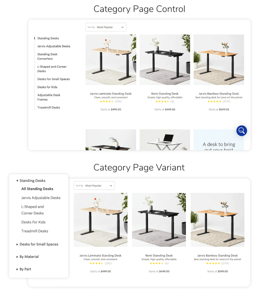
This approach increased visibility for lesser-known products and gave users a focused way to navigate the site. The result was a 5.97% boost to the conversion rate on both desktop and mobile sites. The change produced a 75:1 return on investment for the client.
We Can Help with the Best UX Practices for Filtering
How did you do? Are you currently using many (or any) of the strategies in our list?
If you have a ways to go, don’t worry, you’re in good company. Like we said, only 16% of brands are providing a strong product filtering experience. And even if you already offer good filters, there’s always room for improvement.
But remember, you’re not improving these filters for the filters sake. Every one of these improvements means that you’re eliminating friction and making it a little easier for your consumers to purchase from you.
In short, the more you work to include these strategies, you’ll not only work your way into that 16% but you’ll also provide a killer user experience for your visitors and most importantly, you’ll drive even more conversions.
Not sure where to start? We know it’s frustrating to spend your money on traffic, but your revenue doesn’t change. At The Good, we help online businesses like yours remove all the barriers to conversion. Get in touch.
Enjoying this article?
Subscribe to our newsletter, Good Question, to get insights like this sent straight to your inbox every week.
About the Author
Natalie Thomas
Natalie Thomas is the Director of Digital Experience & UX Strategy at The Good. She works alongside ecommerce and product marketing leaders every day to produce sustainable, long term growth strategies.