
How To Create Urgency In SaaS Trials: 8 Lessons From 30 Real User Journeys
We signed up for 30 SaaS free trials and lived inside them for 30 days each, tracking every countdown banner, upgrade nudge, and cancellation flow along the way. Here's what actually built trust and what quietly burned it.

You’ve felt it before, even if you never stopped to name it.
A banner ticking down the days left on a trial. A cancel button that suddenly sprouts a “wait, before you go” offer. An email that opens by listing exactly what you’re about to lose.
Some of it made you want to upgrade on the spot. Some of it made you want to cancel just to make the nagging stop.
That’s the strange thing about urgency: the exact same tactic–a countdown, a loss-framed warning, a surprise extension–can push someone toward the upgrade button or straight out the door, and the difference rarely comes down to the tactic itself. It comes down to small choices most product and lifecycle teams never stop to examine.
This contradiction became clear to us during a research exercise our team did. We enrolled in 30 SaaS trials, from Airtable to Zapier, and documented the full journey: welcome emails, onboarding flows, in-app banners, sales outreach, and what happened the moment someone tried to cancel.
Here are nine lessons on urgency, pulled directly from what we saw work and what we saw backfire.
1. Countdown timers work, until the cadence turns them into noise
Nearly every trial in our research used some version of a countdown, and the tactic itself isn’t the problem. Pendo’s persistent trial-countdown reminder was flagged by our researcher as a positive, calling it a constant, transparent reminder of time left. Maze did something similar by framing its trial as “30 days or 3 studies, whichever comes first” and kept a running counter visible in the nav.
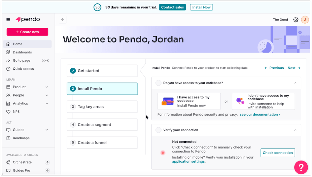
The difference shows up in volume and timing. Beehiiv sent a near-daily countdown email for 26 of the 30 trial days (13, 12, 11, 10, 9, 7 days left, each ending in an “upgrade now” button). Airtable stayed quiet for 12 days, then compressed its entire urgency campaign into a 48-hour blitz: a banner, then a tooltip, then a header countdown pill, then “expires in 17 hours.” Monday, by comparison, ran a single restrained banner (“You have 8 days left on your trial. Upgrade Now”) with no modal interruptions at all, a notably lighter touch for the category.
The lesson is to pick one cadence and hold it, rather than escalating quietly until the last 48 hours do all the work.
2. Auto-converting trials can be a trust risk without proper notification to the user
Trials that quietly required a card upfront, or that auto-converted to a paid plan unless someone actively canceled, showed up at multiple companies.
Airtable’s upgrade modal headlined “$20 → $0,” then immediately captured a payment method and disclosed the real charge date buried in smaller text. Notion showed a card-required “$24 to $0” trial with a bold, high-contrast button next to a barely visible “Continue for free” option. Pitch’s trial converted automatically to a $300 annual charge unless the user proactively canceled.
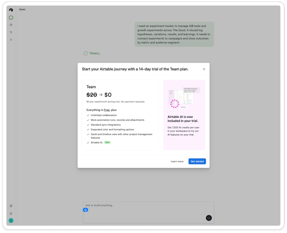
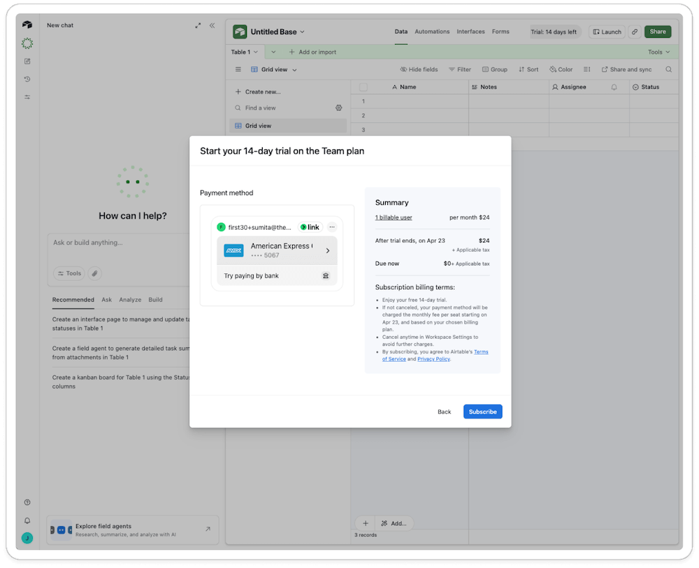
The instinct to anchor on the free number is natural. But if a user has to hunt for the actual price and the actual charge date, the “free” framing stops feeling generous and starts feeling like a setup.
Miro handled this better with a “How the trial works” panel showing three dated milestones (start, reminder, charge) up front, even though the trial still ended in an auto-charge.
If a trial requires a card or auto-converts to paid, disclose it as clearly as the free price itself, before the card gets captured, not after. A milestone panel shown at signup costs a company nothing to build and buys back the trust that a buried confirmation-email disclosure spends.
3. The best save mechanic is an extension nobody has to fight for
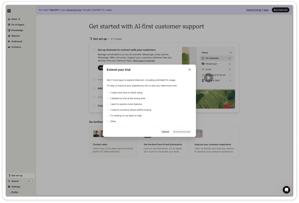
Intercom’s approach to trial extensions was a standout in our research. With one day left, a banner offered to extend the trial by seven days, simply by selecting a reason from a short list. No card. No sales call.
Clay did something similar with an unsolicited offer of 14 extra days and 500 bonus credits, no charge attached, though it did route users back through the full onboarding survey afterward.
Monday’s version told a different story. Its “extend your trial for 30 more free days” offer required entering a card or PayPal account first, turning a no-card trial into a card-on-file relationship under the banner of a gift. That’s worth noting because Monday’s own signup promise was “no credit card needed.” A parallel win-back email from the same company promised “7 days to be exact” for what appeared to be the same offer, two different numbers for one extension.
If you choose to implement an extension tactic, make sure it’s transparent and has consistent messaging. It’s ok to change what you offer, but if you do, frame it as something other than an extension of the same experience users are already getting.
4. Real usage is a stronger urgency signal than a calendar countdown
Most urgency tactics in our research lived in emails and banners, tied to a date on the calendar. Maze took an additional approach that we mentioned earlier and tied its trial to usage instead of time alone: 30 days or 3 studies, whichever came first.
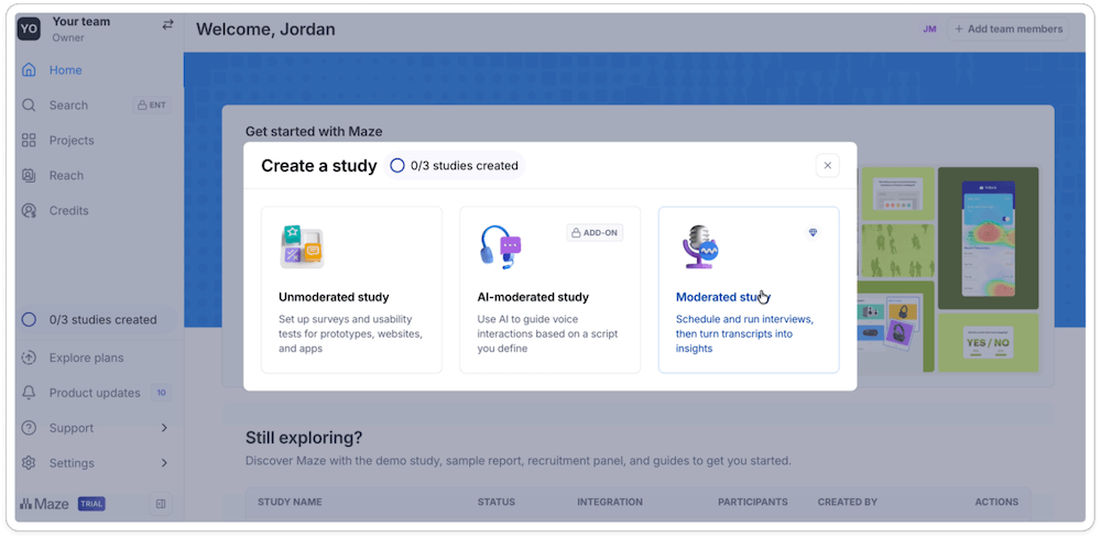
That structure has real potential. A trial user who runs three studies in the first week has already found the product’s core value, and that’s a far better moment to prompt an upgrade than an arbitrary day-14 email. Fast, heavy usage during a trial is one of the clearest upgrade signals a company can get.
The lesson is to build urgency around what someone actually does with the product, not just the day they signed up. A user who hits a real usage milestone quickly is telling you they’re ready to buy. That’s worth acting on with a well-timed, confident upgrade prompt, not something to hide behind a generic trial-end email three weeks later.
The one caveat: usage-based urgency only works if the usage is real. Maze’s own trial counted simple exploration against the limit. Give new users a sandbox or a tutorial project that doesn’t count against their usage, then let the meter start once they’re doing genuine work. That way, hitting the limit fast becomes a signal worth celebrating, both for the user and for the sales team about to reach out.
5. Email volume can create urgency, but only if coordinated across teams
Individually, most of the emails we saw made sense: a welcome note, a feature tip, a countdown reminder, a win-back offer. Added together, the picture changes.
Beehiiv sent 26 emails across 30 days. ClickUp sent 13 or more in just 14 days, including daily overdue-task digests. Zapier sent 12 across 25 days. None of those totals come from one bad decision. Each is the sum of separate flows, onboarding series, lifecycle nudges, billing reminders, sales alerts, built and optimized by different teams, each reasonable on its own.
Our team almost never flagged high email volume as a problem while reviewing any single message. It only became visible as a fatigue risk once someone counted every email a single trial user received and looked at the total.
The takeaway for any SaaS team: total email volume over the trial or the first 30 days deserves to be tracked and owned as its own number, separate from how any individual campaign performs.
6. Sales outreach timing can build trust or break it in a single message
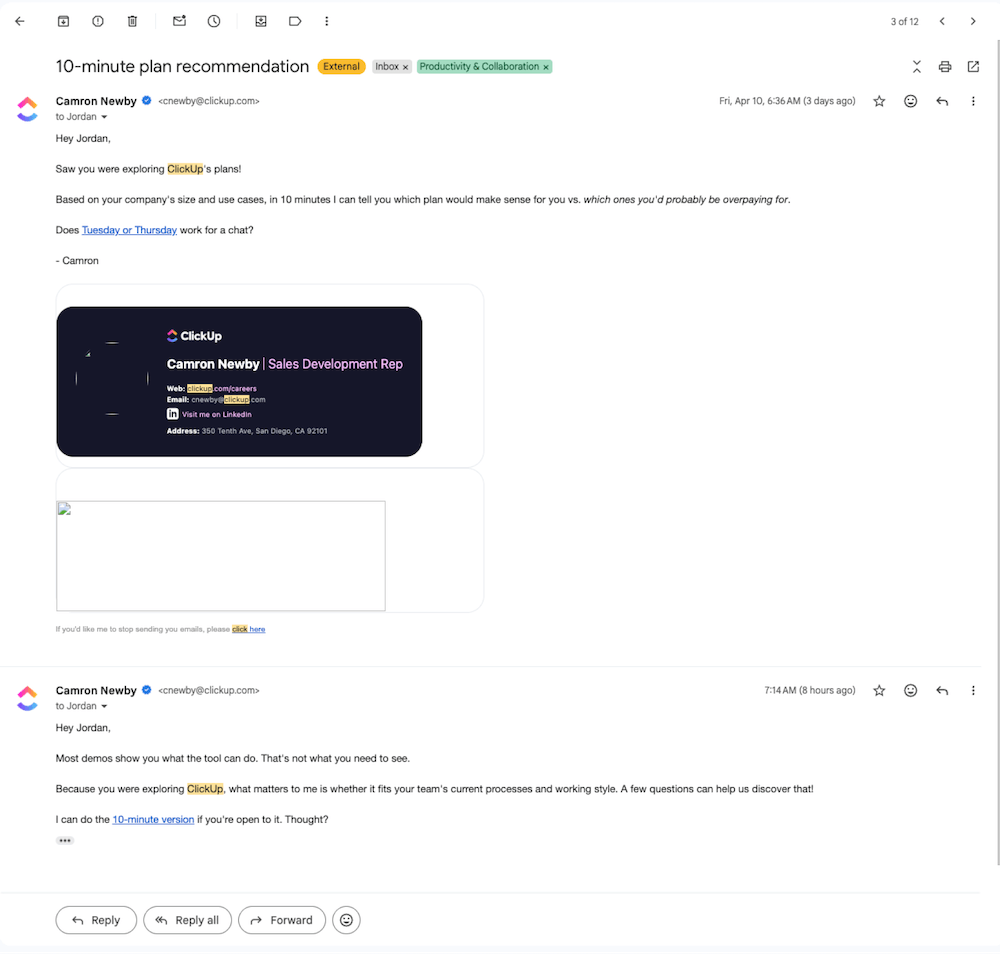
A named Sr. Business Development Rep followed up on a self-serve, free ClickUp signup by day 5, and Pendo layered SDR outreach on top of its countdown messaging within days of signup too.
Pitch went the other direction: its most consultative offer, including trial extensions, arrived on day 17, three days after its 14-day trial had already ended. That’s not very helpful.
The strongest counterexamples came from Monday and Notion, both of which offered a free 1-on-1 expert consultation in-flow rather than through a cold follow-up, and Help Scout, which sent a personal day-zero email from a named account exec.
Time human outreach to the trial’s actual decision points, not to a generic day count. Reach out before someone has had a chance to see any value, and it reads as a cold pitch. Reach out after the trial has already ended, and it reads as an afterthought, however consultative the offer is.
The gestures that landed, Monday and Notion’s in-flow consultations, Help Scout’s day-zero note, worked because they showed up exactly when the user could still act on them, offered by a named person instead of a queue.
7. Stacking discounts undercuts the price you’re trying to anchor
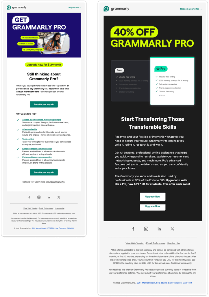
Grammarly’s simultaneous “50% off,” “$12/month,” and “40% off for students” messaging was logged by our researcher as a nice-to-have, not a problem. But taken together, three different framings of the same discount can quietly signal that the sticker price was never real to begin with, which makes any future full-price ask harder to justify.
Clay’s trial-expiry email compounded this by presenting a dual-pricing choice under a deadline: stick with a $800/month legacy plan or switch to a new $495/month plan, decide before the trial ends. That’s a lot of math to ask someone to do under a countdown.
Zapier showed a milder version of the same tension, with a “$19.99/mo” banner figure sitting next to an actual “$49/mo” price on its Professional plan card. Anchoring works when there’s one number to anchor to.
The learning is to pick one price and one framing. Then hold it everywhere a trial user might encounter it, in banners, emails, and checkout alike.
A countdown is supposed to speed up a decision the user has already mentally made. If they have to stop and do math first, to figure out which number is real or which plan actually applies to them, the deadline stops creating urgency and starts creating doubt about the price itself.
8. Transparency is the highest-converting form of urgency
A final consistent positive pattern in our research wasn’t a clever tactic at all. It was plain disclosure.
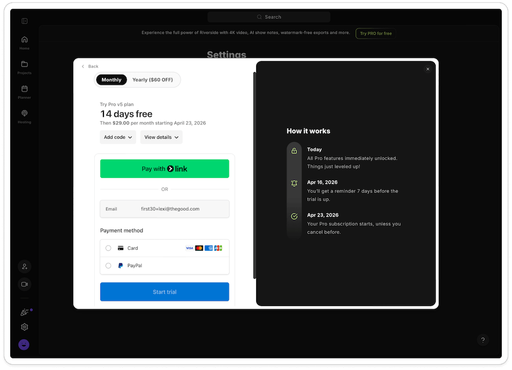
Riverside laid out a “now, 7-day reminder, 14-day billing” timeline up front, and then honored it exactly; the day-10 reminder arrived exactly on schedule. Calendly sent a mid-trial progress report stating exactly where the user stood: days left, actions taken, which premium features remained available. Content Square’s reverse-trial banner disclosed its 15-day window clearly enough that our researcher called it out as unusually transparent for the category.
Zapier, Toggl, and 1Password stood out as the “honest pressure” benchmark across the entire research set: no card required, no silent auto-upgrade, exact end dates disclosed.
1Password went a step further, freezing accounts to read-only at trial’s end rather than locking users out entirely, a rare and low-friction way to end a trial.
Our learning was to state the trial’s terms once, in plain language, up front, then hold to them exactly as promised. A user who trusts that what they were told is what will actually happen tends to decide faster and with less resentment than one working off a countdown they suspect is exaggerated or hiding something. Disclosure does the persuading that pressure tactics can only fake.
Urgency is a lever, not a strategy
Persistent upgrade surfaces showed up at nearly every company from day one. Even so, it took stepping back and comparing all 30 journeys side by side to notice just how constant those prompts had become.
In other words, urgency has become so normalized in SaaS trial design to encourage conversion that it’s easy to stop noticing it, even while documenting it.
That’s worth sitting with if you’re designing your own trial experience. Countdown banners, loss-framed cancellation copy, and stacked discounts can all move the needle in the short term. But not if there are so many of them that they turn into noise.
Getting your trial’s urgency right
The first 30 days of a product experience are where trust gets built or spent, and it rarely gets a second chance.
At The Good, we help SaaS companies audit the entire arc of that experience, from the first welcome email to the cancellation flow, and find the moments where urgency is helping conversion versus quietly working against it.
If you want an expert, third-party read on your own trial journey the way we gave these 30 companies, let’s talk.
About the Author
Maggie Paveza
Maggie Paveza is a Strategist at The Good. She has years of experience in UX research and Human-Computer Interaction, and acts as an expert on the team in the area of user research.