
How to Turn Your SaaS Pricing Page Into a First 30 Days Conversion Tool
Trial users don't make one decision about your pricing page. They make several, checking back three, four, even five times over their first 30 days. Here's how to structure, price, and time that page so each visit moves them closer to converting instead of further away.

A trial user’s relationship with your pricing page isn’t a single moment. It’s a conversation that plays out across their entire trial.
Once when they’re comparing you to competitors before they’ve even signed up, again when a feature limit stops them mid-task, and once more when the trial clock is running out and they’re deciding whether the last month was worth paying for.
The good news is that this is a controllable, high-leverage lever. Here are five ways to actually use it that way.
Why timing changes what your pricing page needs to say
In our years of optimization work, we’ve found that most pricing pages are written for one visitor, the person seeing it for the first time.
But by the time someone’s mid-trial, that page needs to answer a completely different question.
Early on, a prospect is still evaluating whether you’re a serious option at all. They want clarity. What do the tiers actually include, and does this look like a company that will still be here in a year?
Mid-trial, someone hits a wall, a seat limit, a feature gate, a usage cap, and comes back to the page looking for a fast, specific answer. What exactly do I get if I upgrade right now?
Near the end, they’re doing a final gut check, comparing what they got out of the trial against what they’d be paying going forward, and they’re unusually sensitive to anything that feels inconsistent with what they remember seeing before.
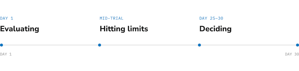
One page. Three jobs. The tactics below are built around serving all three without contradicting yourself between visits.
1. Build the page to survive a third look, not just win the first one
Most pricing-page advice optimizes for a single glance: bold CTA, clear tiers, done. That’s necessary, but it’s not sufficient for a page people are going to study more than once.
The fix is to load the page with things that hold up under repeated scrutiny rather than things that just look good in a screenshot: a real plan-comparison table, specific security and trust signals, and pricing that doesn’t require a sales call to understand.
PandaDoc is a clear example of this done well: four clearly tiered plans (including a permanent free eSign tier), a full comparison table, per-document pricing, security assurances, and G2, Capterra, and Trustpilot ratings, all visible directly on the page.
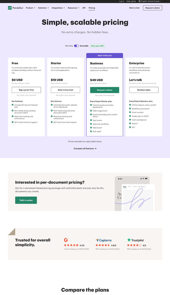
Its checkout carries that same clarity forward into a short, three-step flow that shows exact seat counts, monthly and annual totals, and the precise charge date before anyone commits.
That matters because trial abandonment is common and fast. Roughly 80% of free-trial users never convert to a paying plan according to benchmark data by Evan Bailyn, and over half of downloaded apps get uninstalled within their first 30 days according to AppsFlyer.
Almost every one of those users looked at the pricing page at least once before they left. A page built to reassure on the second and third look gives you more chances to change that outcome than a page optimized only for the first.
2. Keep the number the same everywhere it shows up
If your pricing page says one thing and your trial banner, an email, or your checkout screen says another, you’re not running multiple offers. You’re teaching users not to trust any of the numbers you show them.
Grammarly is a useful cautionary example here: at various points, its pricing communications have run several discount framings at once, a straight percentage off, a flat monthly rate, a student discount, an annual-savings callout, all live simultaneously.
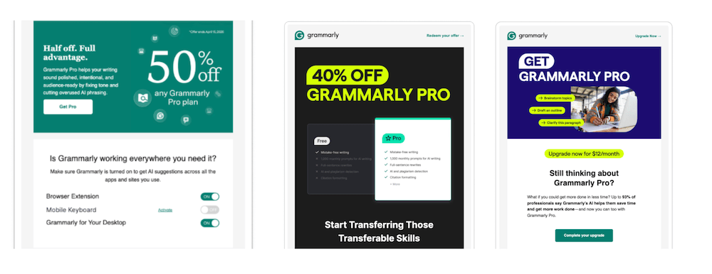
Whether that reflects deliberate testing or simply layered campaigns that never got reconciled, the effect on a user checking the page for the second time is the same: the price stops feeling like a fact and starts feeling like a moving target.
The fix is ownership and consistency. Pick one framing per offer, keep it synced across every surface a trial user might see it: banner, page, checkout, email, and audit it the way you’d audit a bug. This is also where anchoring bias, one of the best-documented forces in pricing psychology, cuts against you if you’re careless. The first price a user sees becomes their reference point for every price after it, so a moving target doesn’t just confuse people; it resets their anchor every time.
3. Time your pricing asks to where the user actually is
The same pricing message can be the right move on Day 20 and the wrong one on Day 1. Getting the sequencing wrong is often a bigger problem than anything written on the page itself.
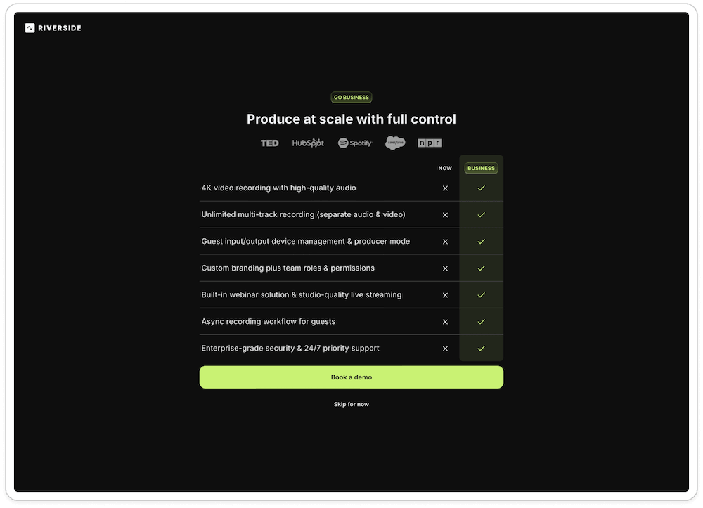
Both failure modes show up in the wild. Riverside pitches its Business tier, complete with a full feature-comparison table and a “book a demo” CTA, to brand-new, self-serve signups before they’ve created a single item, pricing pressure with nothing yet to anchor it to.
Calendly has run into the opposite risk with a feature-promotion email invites a user to build a workflow, only to inform them, right after they click “save,” that their Teams trial has ended and they’ll need to upgrade to keep it, a paywall landing at the exact moment of highest invested effort and highest potential frustration.
Miro and Airtable illustrate a related issue worth avoiding: essentially no upgrade or pricing pressure for the first two weeks, followed by a compressed cluster of prompts landing almost entirely within a 24- to 48-hour window near the end.
Giving people room to build habits before asking them to pay is a reasonable instinct, but concentrating an entire pricing push into a trial’s final hours means it’s competing with deadline anxiety instead of genuine product enthusiasm. Spreading gentle, well-timed touchpoints across the trial, the way PandaDoc sustains lighter reminders over time rather than one hard-sell spike, tends to land better than either extreme.
4. Cut the comprehension tax
Every extra screen, tab, or slider between a user and a clear price is a small tax on their patience, and trial users pay that tax multiple times if they’re checking back.
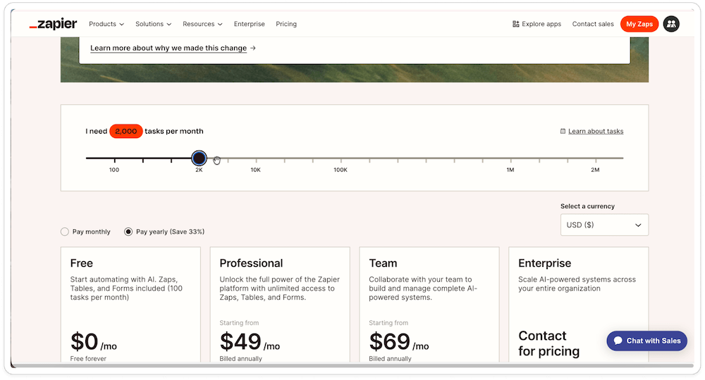
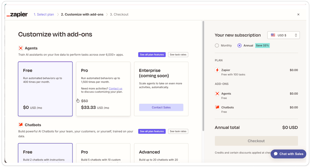
Zapier and Typeform both illustrate this cost in practice. Zapier splits its plans across multiple tabs, layers in a usage-volume slider and an add-on configurator, and shows a trial banner price that doesn’t clearly reconcile with the plan card price underneath, meaning a prospect can click through six or more separate pricing and billing screens without ever landing on a clear number.
Typeform shows an even more direct version of the pattern: pricing and checkout sequences that repeat several times across a single 30-day trial, including a plan-review screen later followed by a billing page that shows the account back on its free plan.
The fix draws directly from choice architecture. Limit the number of decisions a page asks someone to make at once, recommend a specific tier rather than presenting three neutral options, and make sure the price a user sees in a banner or email matches the price they see when they click through. None of that requires new features, just fewer places for the story to fall out of sync with itself.
5. Audit what you can’t see yourself
There’s consistently a gap between how much pricing pressure a product actually creates and how much of it a careful observer would consciously register. Persistent pricing and upgrade surfaces are often present from Day 1 of a trial, well before the experience would register as “pushy.”
That gap is the real argument for measuring this rather than trusting instinct alone. A team’s mental model of how often users see its pricing page is usually off, and almost always in the direction of underestimating it.
Before changing anything on the page itself, it’s worth counting how many places pricing information actually appears across a real trial, on which days, and whether the story stays consistent across all of them.
Align the page with what’s actually behind the paywall
One tactic underneath all of the above is that your pricing page can only tell a coherent story if your feature-gating strategy already is one. If a plan’s advertised value doesn’t match what a user experiences once they hit a limit, no amount of pricing-page polish fixes that gap.
This is where freemium pricing and feature-gating decisions come in ahead of pricing-page copy. Running a verb-scoring exercise against your own product, mapping which core actions are gated at which tier, can surface mismatches between what your pricing page promises and what your product actually delivers before a trial user finds them for you.
Frequently asked questions
How often do trial users actually revisit a SaaS pricing page?
More often than most teams assume. Pricing pages tend to get checked multiple times across a single trial, especially right before a usage limit, a plan decision, or the trial’s end.
What’s the fastest way to improve a pricing page for trial conversion?
Start with consistency, not redesign. Confirm the price shown in your trial banner, emails, and checkout all match the price on the page itself, and remove any default settings, like pre-selected annual billing, that only make sense from your side of the transaction.
Should pricing pressure increase as a trial nears its end?
It can, but avoid saving all of it for the final 24 to 48 hours. A back-loaded blitz competes with deadline anxiety rather than genuine enthusiasm; spreading lighter, well-timed touchpoints across the trial tends to build more trust than concentrating pressure at the finish line.
What should a SaaS pricing page include for free trial users?
At minimum, clearly labeled tiers, a transparent feature-and-price breakdown, and pricing that’s framed identically across every channel a trial user might encounter: banner, email, and checkout. Trust signals like ratings, security certifications, and a real plan-comparison table help the page hold up on a second or third visit, not just the first.
When should a SaaS company first show pricing to a free trial user?
Not before they’ve experienced real value. An enterprise-tier pitch or a hard upgrade ask shown to a brand-new signup who hasn’t created anything yet tends to read as premature, and it can undermine trust before the trial has really started.
What are the most common mistakes SaaS companies make with their free trial pricing page?
The recurring ones are inconsistent pricing across banners, emails, and checkout; annual billing pre-selected by default, especially right after a downgrade; plan comparisons complex enough to require six or more screens to understand; and saving all upgrade pressure for the final 24 to 48 hours of the trial instead of spacing it out.
Does pricing page consistency actually affect trial-to-paid conversion rates?
Yes. Running several discount framings at once, or showing a different price in a banner than at checkout, teaches users that the number in front of them isn’t stable, which undermines trust in the price more than the price itself usually does. Keeping pricing identical across every touchpoint protects the anchor a user forms the first time they see it.
Make your pricing page work every day of the trial, not just the last one
The SaaS companies that convert trial users treat their pricing page as infrastructure that has to hold up across a month of comparing, reconsidering, and checking back in. Teams have to build, price, and time it accordingly.
Start by mapping your own trial funnel. How many times would a real user see pricing information, on which days, and does the story stay the same each time? That audit alone tends to surface most of the fixes above.
If you’d like a second set of eyes on that audit, The Good’s Digital Experience Optimization Program is built for exactly this kind of trial-to-paid conversion work, mapping the entire first 30 days of the trial experience, pricing page included, to find where trust is being built or quietly lost. Get in touch, and let’s take a look at what your trial users are actually seeing.
About the Author
Caroline Appert
Caroline Appert is the Director of Marketing at The Good. She has proven success in crafting marketing strategies and executing revenue-boosting campaigns for companies in a diverse set of industries.