13 Examples of Effective SaaS Pricing Pages That Drive Conversions
Discover the key components of successful SaaS pricing pages and get inspired by our curated selection of 13 successful examples.

Without an optimized pricing page, you might be leaving money on the checkout page.
A pricing page is where you onboard potential customers to learn about your different plans and pricing options and decide what fits their needs best.
However, you need a fully optimized page that effectively communicates your SaaS product’s value, or else they may leave it to a competitor with a clearer value prop.
Whether you’re a SaaS startup or a mature business looking to improve your pricing page conversion rates, we’ll provide you with valuable insights to help you maximize revenue.
What You Need to Include On Your SaaS Pricing Page
Your pricing page should encourage users to go from indecision to certainty. The best pricing pages have clear, customer-friendly language, simple layouts, and are free from any misleading marketing tactics.
At a minimum, pricing pages should include:
- A value-driven headline: Highlights your SaaS’s unique value proposition, enticing potential customers to learn more.
- Brand-consistent pricing tier names: Clearly labeled pricing tiers that align with your brand and reflect each plan’s different features and capabilities.
- Transparent pricing ranges: Outlines each plan’s features, limitations, and pricing.
- FAQs: Addresses common questions about your SaaS product and pricing, such as billing, cancellation policies, and refunds.
Additional options include:
- Upselling the annual plan: Encouraging customers to sign up for an annual plan by offering a discount or additional benefits as well as making this the pricing tier default.
- Freemium models: Offering a free plan with limited features to attract potential customers and provide a low-risk way to try out your product.
- Testimonials: Showcasing client reviews helps establish trust and social proof.
- Currency conversion: Providing pricing in multiple currencies for customers in different regions to improve accessibility and reduce confusion.
Clear pricing pages also save your Customer Success team time by addressing common inquiries and allowing them to focus on more complex issues.
Now that you understand the key elements of a conversion-focused SaaS pricing page, let’s examine examples of successful SaaS pricing pages.
13 Best SaaS Pricing Page Examples
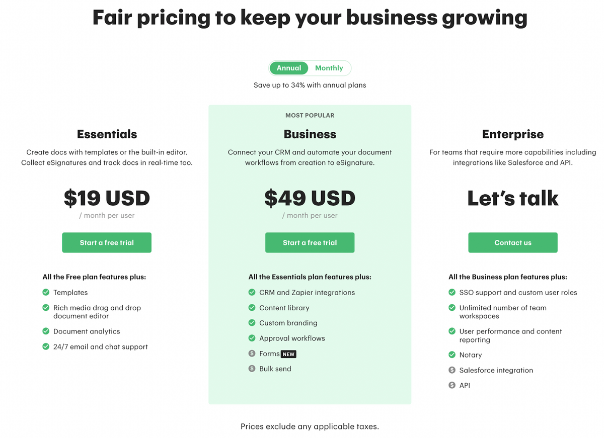
#1 Clearscope: Clean and Simple
Clearscope, a content optimization tool, keeps it simple on its pricing page (in fact, they boast about this on the pricing page).
From the start, Clearscope simplifies the purchase process even with its basic pricing plan names (Essentials, Business, Enterprise), with a brief description of each so customers know which to choose for their use case.
The plan pricing is bold, with vibrant CTAs encouraging customers to click, and highlights key features of each plan so customers can easily compare them.
Below the plans, Clearscope offers a “Meet Our Customers” section for social proof and a comprehensive FAQs section to provide additional information for potential customers.
How This Page Increases Conversions
- Clearscope’s pricing page provides clear information on plan features and benefits
- Easy for customers to choose the right fit and reduce decision paralysis
- No minimum contracts or penalties add to the flexibility of Clearscope’s plans
- Ability to upgrade or downgrade plans
- Emphasis on customer success, including free training and priority support
#2 UserInput.io: Tailored to Use Cases
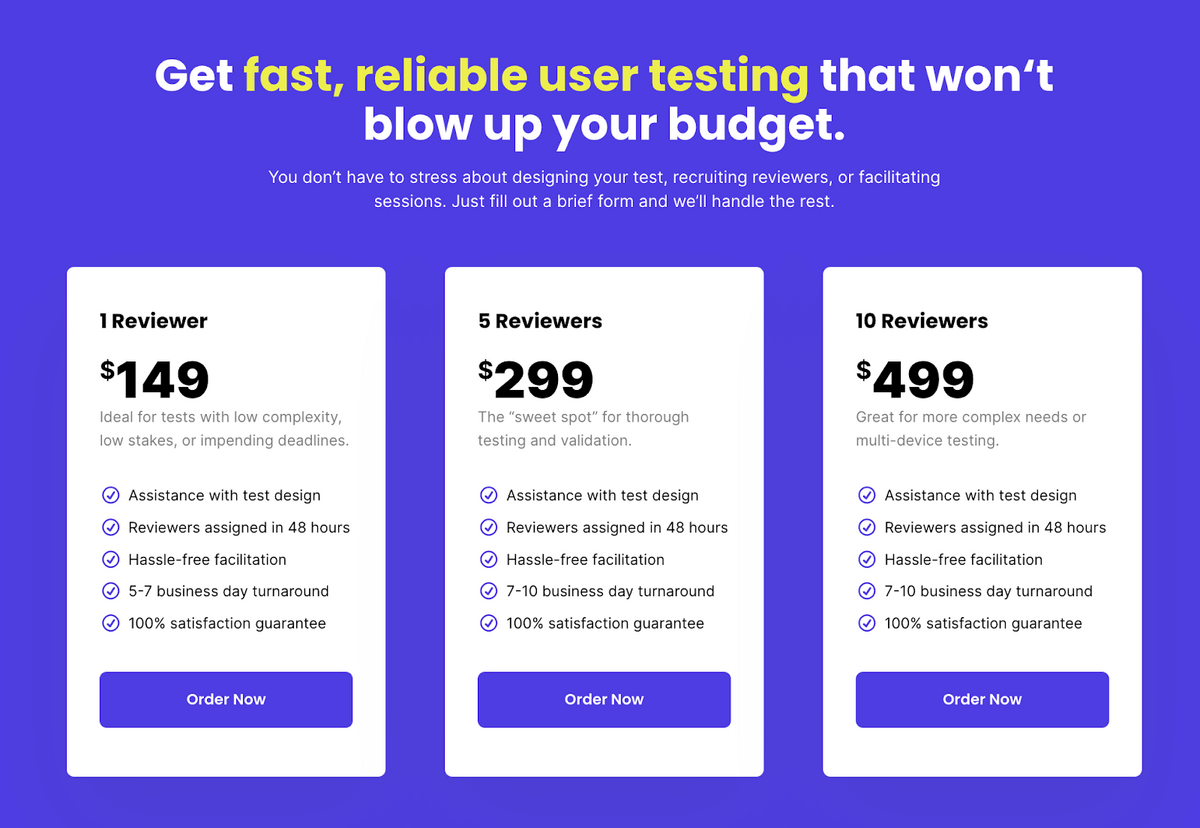
UserInput.io provides user research and feedback services to help businesses and individuals improve their products and user experiences.
UserInput takes a non-traditional approach to its pricing page. Instead of a typical pricing page, UserInput tailors each pricing page to the services it offers (Customer Feedback, User Testing, and Audits) so customers can easily find the service they want, read about it, and feel compelled to purchase the service.
This works because each use case offers different pricing and services, and if UserInput combined all the plans on a single pricing page, customers might need clarification and leave frustrated with too many options.
Within each page, UserInput bolds the price, includes subheadings with a brief service description, and outlines every included plan feature.
How This Page Increases Conversions
- A clear headline calling out the pain point
- A list of benefits for each feature
- Clear pricing information
- Customer testimonials
- Money-back guarantee to build trust with potential customers
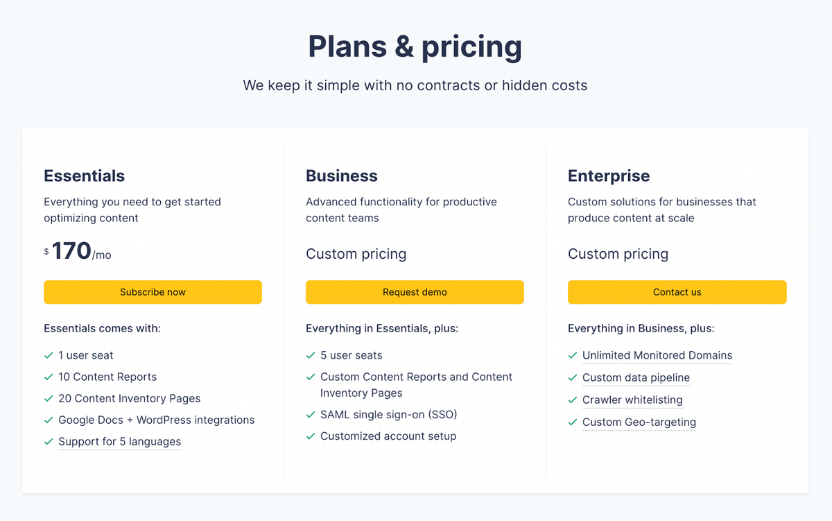
#3 PandaDoc: Plan Transparent
PandaDoc, a document signing competitor to DocuSign, leads with the transparency model. This page isn’t just clear; it’s aesthetic with its forest green glow.
PandaDoc goes above and beyond, not only by offering extremely transparent pricing, features, and use cases for each plan but by adding a section comparing each plan’s more advanced features so customers know everything that’s included in any plan.
The layout is simple and clean, quickly guiding the user down the page.
How This Page Increases Conversions
- Clear and detailed information about the features and benefits of each pricing plan
- Toggler for annual plan and monthly plan so users can choose between the two
- Pricing plans with different levels of features and pricing, providing customers with options
- Customer testimonials
- Option to try PandaDoc for free to encourage potential customers to test the product and see its value before purchasing
#4 FreshBooks: Comprehensive Plan Options
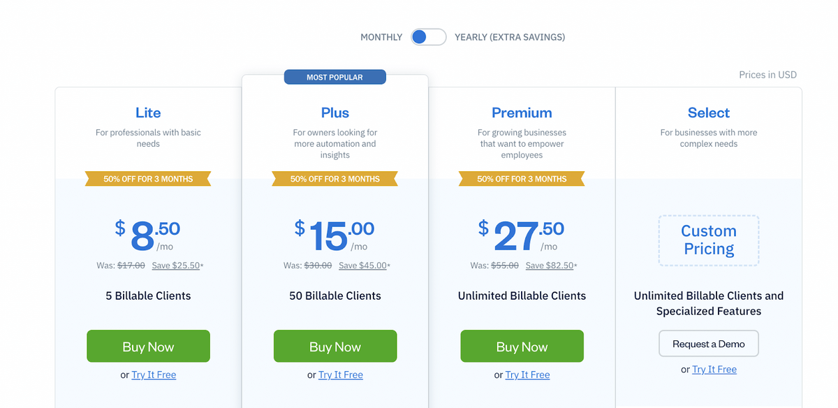
FreshBooks, an accounting software, offers a features-rich pricing page. After reading its page, customers should know exactly what plan suits their needs.
First, it provides the essentials: plan name, use case, price per plan, how many billable clients per plan, and a large green CTA with an option underneath to try the plan for free.
FreshBooks presents each plan in its own column, clearly highlighting its features, pricing, and savings.
If users want more information, FreshBooks goes the extra mile by providing everything included in every plan, with a plan comparison chart below, helping customers understand the differences between the plans and choose the one that best fits their needs.
How This Page Increases Conversions
- Clear and easy-to-understand pricing structure, with four basic plans that are designed for different customer types
- Offers a 50% discount for the first three months, which is a great incentive for customers to sign up
- The plan comparison chart helps customers easily compare the features of each plan side-by-side
- Offers add-ons that customers can choose to add to their plan for an additional fee
- Includes trust signals such as the 30-day money-back guarantee, SSL encryption, and customer support
#5 MailChimp: Organized and Efficient
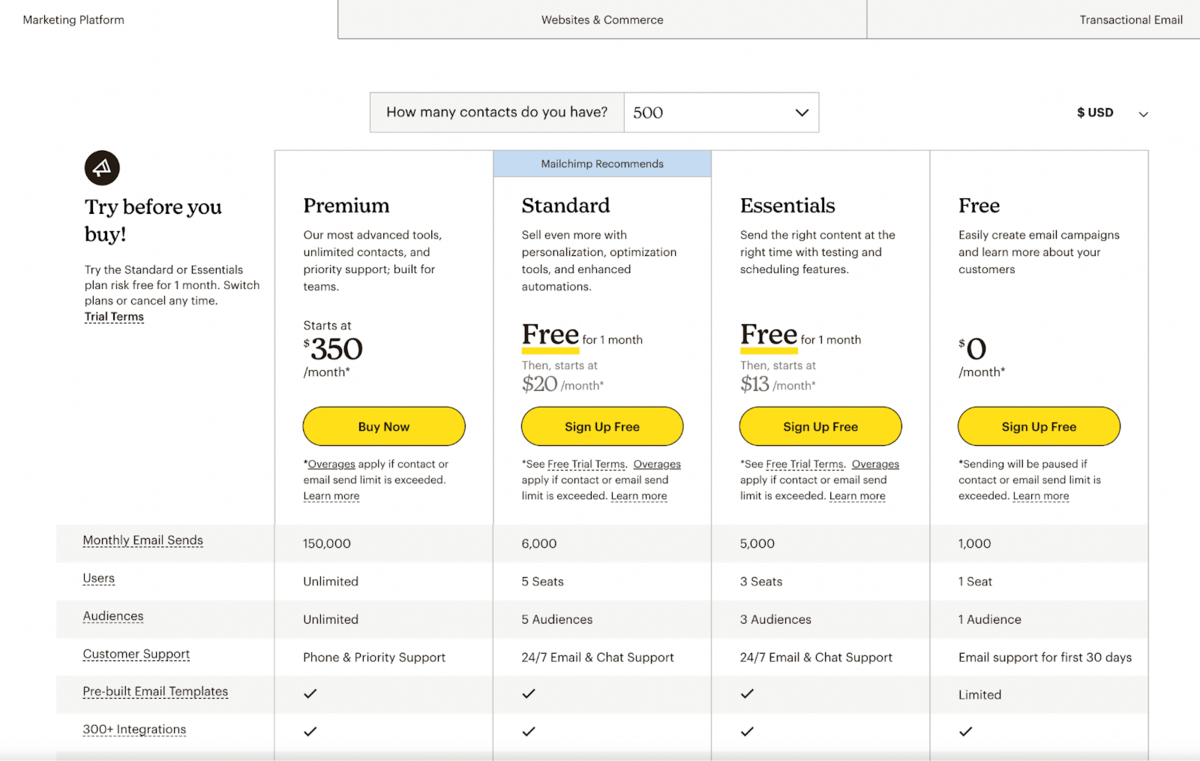
Mailchimp, an email marketing platform, follows UserInput’s method of separating each pricing table by use case. However, MailChimp doesn’t use separate landing pages, but rather uses toggle options so users can select what they want.
Cleverly, Mailchimp includes an option where users can select how many contacts they have per month in a dropdown. This calculator provides correct price estimates for how much users will pay monthly for any plan.
Then, it lists comprehensive features available in each plan, including email sends, users, audiences, customer support, pre-built templates, and more. So if customers need or want a specific feature, it’s easy to find without inquiring with the customer service team.
How This Page Increases Conversions
- A dropdown menu allows customers to select how many emails they need, which gives them the pricing immediately
- Mailchimp offers a 15% discount to nonprofits and charities, showing that the company is committed to supporting social causes
- Offers a free trial for its paid plans, allowing users to test out the features before committing to a plan
- No hidden fees or complicated pricing structures
- Social proof through its various award icons at the bottom of the page
#6 Frase.io: Clear and Flexible
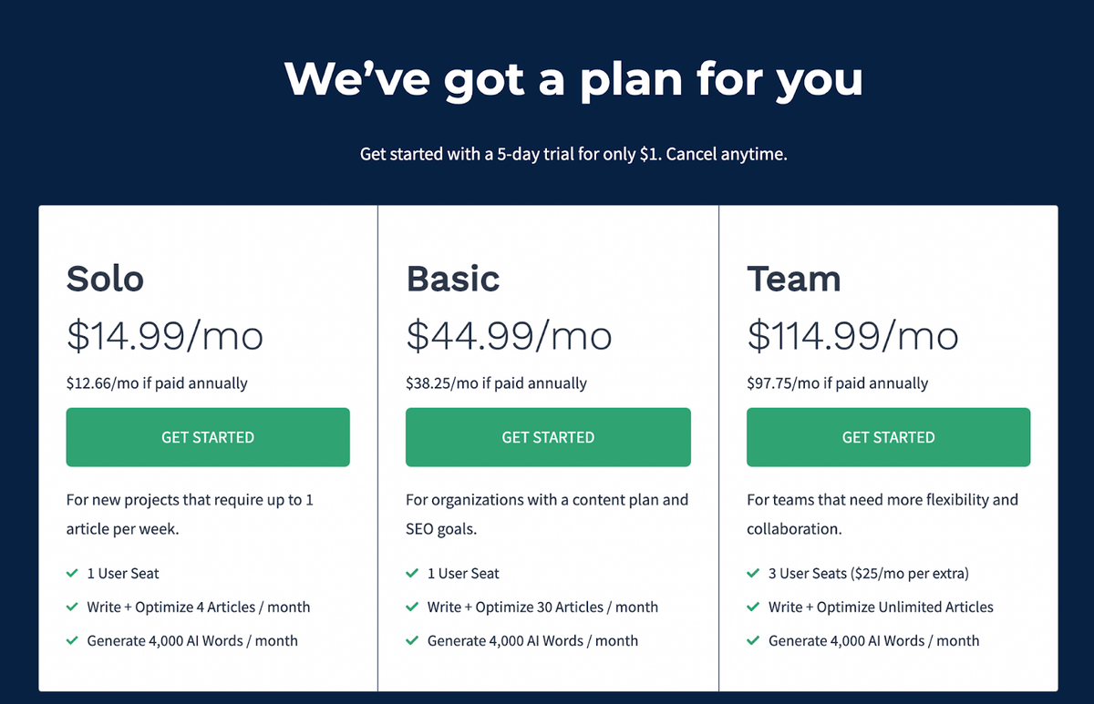
Frase.io, another content optimization tool, and direct competitor to Clearscope, presents a straightforward pricing breakdown.
It’s a clean page, free of extra fluff that gets in the way of the user experience. For example, each plan’s name corresponds to its use case, Solo, Basic, and Team. So, if customers want Frase for their team, they know to select Team. Or, a freelancer can select the Solo plan.
Frase also outlines what’s included in every plan using brand-consistent icons and briefly defines each feature.
How This Page Increases Conversions
- Offers multiple pricing plans that cater to different types of users
- Offers a free 5-day trial for only $1, which allows visitors to test out the product without committing to a long-term subscription
- Presents clear and concise information about each pricing plan and the pricing options available, including annual options
- Includes a “Pro Add-On” section, which offers additional premium plan features for an additional $35/month and is presented as an easy way for users to upgrade to a more comprehensive plan with additional benefits
- Includes a section outlining the benefits of using Frase, including the AI writer and automated content briefs, which are included in every plan
- Offers a “Got a Question?” section, which allows visitors to ask questions about the product and clarify any doubts they may have before committing to a plan
Enjoying this article?
Subscribe to our newsletter, Good Question, to get insights like this sent straight to your inbox every week.
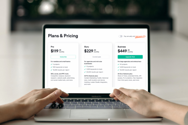
#7 Semrush: Feature-Focused
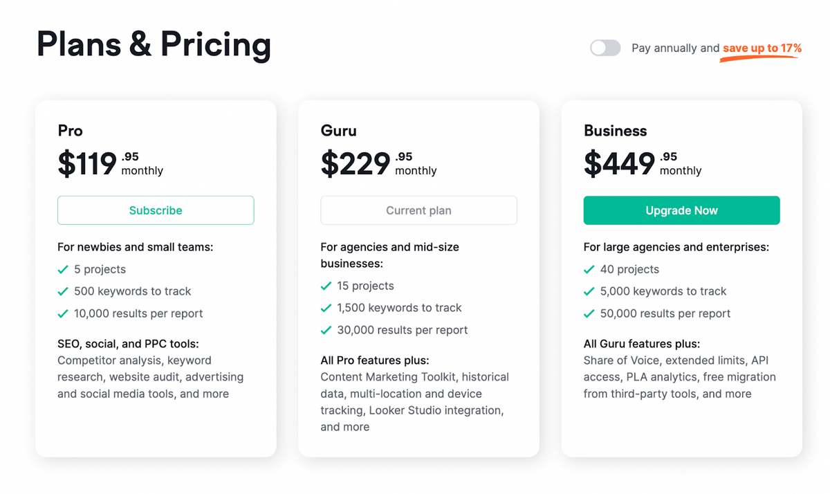
Semrush, a search engine optimization tool, has a pretty straightforward pricing page.
One intriguing feature is the “Pay annually” toggle on the top left, encouraging users to save 17% by highlighting it in orange.
Customers who want a more thorough breakdown of each plan’s key features can scroll to see what is included in each.
Semrush adds social proof by providing a carousel of testimonials at the bottom from industry leaders at top-rate companies like Wix.
How This Page Increases Conversions
- Clearly outlines the different plans available, the key features included in each plan, and the pricing for each plan
- Includes testimonials from satisfied customers, which can help build trust and credibility with potential customers
- Offers a 7-day money-back guarantee, which can help alleviate concerns and encourage potential customers to try the service
- Offers a range of plans to suit different needs and budgets, including the ability to add additional users or create a custom plan.
#8 Slack: Benefit-Packed Features
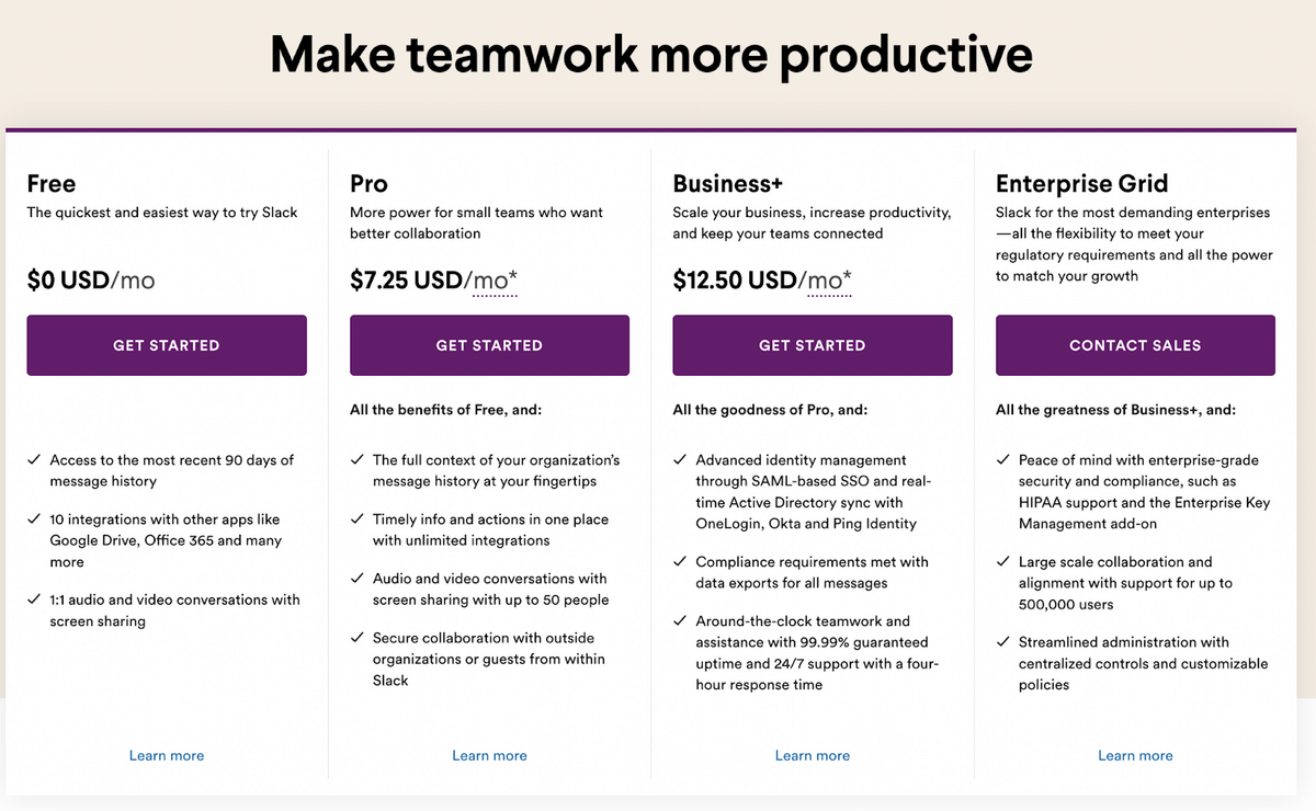
Slack, a communication and collaboration platform, leads with a strong value prop “make teamwork more productive.”
Instead of a list of technical features, each plan offers a benefit. For example, “Timely info and actions in one place with unlimited integrations,” “Compliance requirements met with data exports for all messages,” tie features into how they help customers solve common problems.
Further down on the page, Slack has a detailed comparison chart, followed by an option for government officials called GovSlack that complies the U.S. government.
Right below that, Slack has a small callout highlighting their enterprise security efforts, showcasing their commitment to ensuring customer security.
How This Page Increases Conversions
- Clearly lists the different pricing tiers and what features are included in each tier
- Feature comparison chart that allows users to compare the different pricing tiers side by side
- Prominent call to action buttons for each pricing tier, making it easy for users to sign up for the plan they want
- Highlights Slack’s enterprise-grade security and compliance features, which can help reassure potential customers concerned about security and data privacy
- Includes information about GovSlack, a version of Slack explicitly designed for government agencies and their external partners
#9 Airtable: Intuitive Design
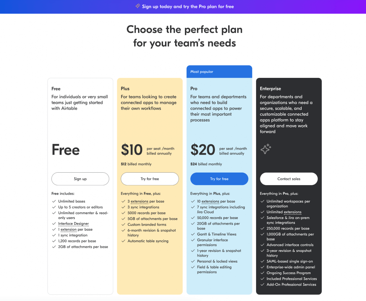
Airtable, a low-code platform for creating and sharing relational databases, offers a hierarchical design that encourages users to upgrade to the “Most popular” pro plan found in the blue color.
Assigning different colors to the different plan tiers also helps draw the eye to the brighter colors. It tricks a prospect’s brain into ignoring the free plan as the white background blends in with the site’s background.
It also shows logos of big-name clients that use its services: Expedia, Medium, Levis, Time, and Buzzfeed. How’s that for social proof?
Then, it follows the traditional pricing page format with a detailed comparison chart and frequently asked questions.
How This Page Increases Conversions
- Clear and organized list of features and pricing plans for different types of users
- Highlights most popular plan and offers a free trial
- Provides detailed information about features, benefits, and support for each plan
- Comparison table and list of frequently asked questions to help customers make an informed decision
- Includes customer testimonials and mentions the number of companies that use Airtable to build trust and credibility
- Designed to make it easy for customers to understand the product and pricing plans
- Visually appealing and easy to navigate, with brightly colored CTAs draw the eye to the most expensive plan
- Encourages customers to sign up for paid subscription plans
#10 Figma: Use Case Toggler
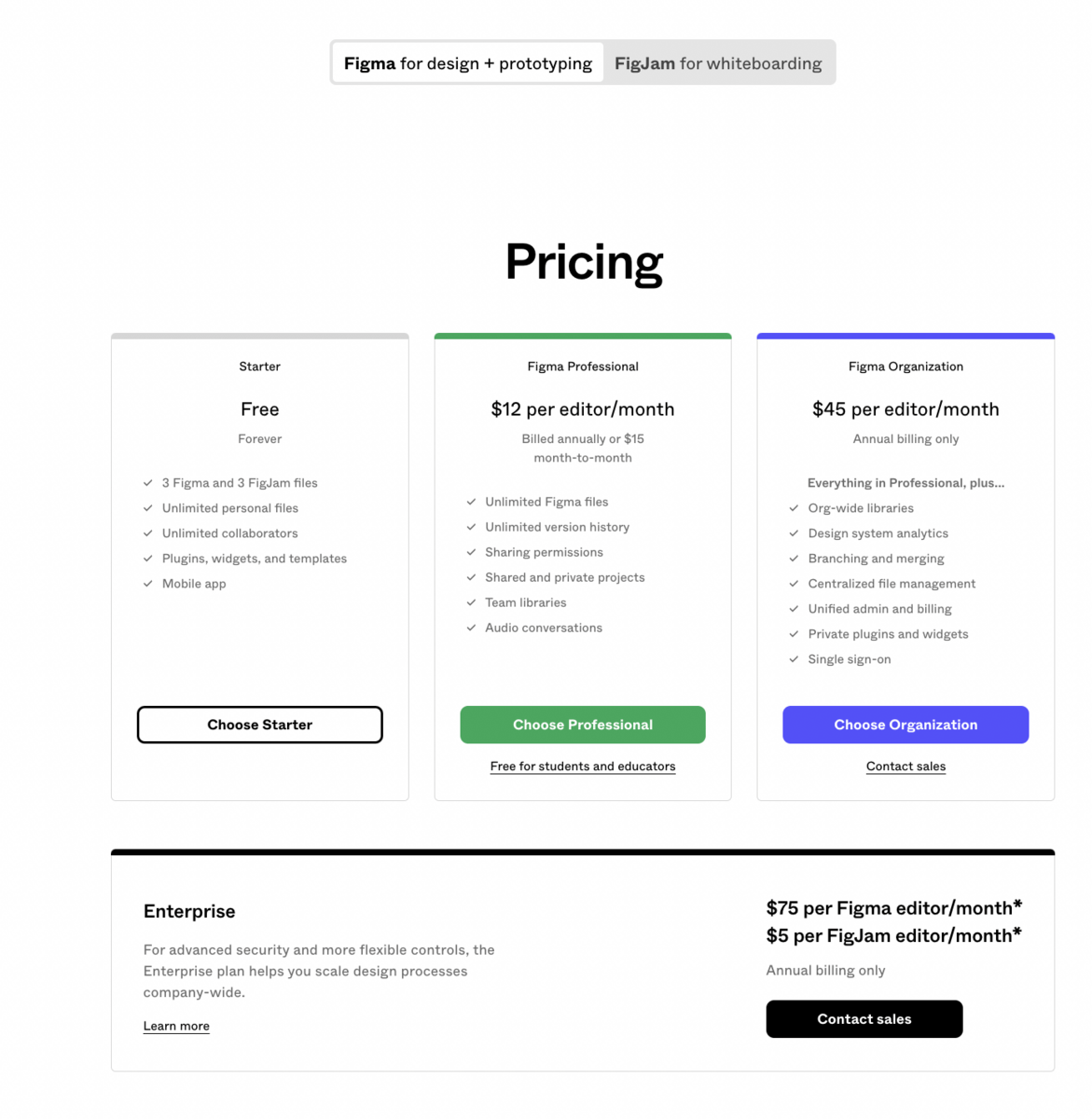
Figma, a prototyping tool for designers and developers, organizes its pricing page by using a use case toggles: Figma for design + prototyping and FigJam for whiteboarding.
Otherwise, it’s a classic example of a successful pricing page with simple plan names, different billing cycles, clear call-to-action buttons, and an upgrade to Enterprise below.
Similar to the Airtable pricing page, the CTAs for the paid plans are brightly colored compared to the plain white free plan, encouraging the eye to go for the most expensive plan.
How This Page Increases Conversions
- Highlights the most popular plan and offers a free trial for customers to test the product before committing to a paid plan
- Provides detailed information about the features and benefits of each plan, including the number of users, files, collaborators, and integrations, as well as the level of support and services provided
- Offers a comparison table of the different plans and a breakdown of associated costs, making it easy for customers to compare and choose the best plan for their team
- Includes a list of frequently asked questions to help customers make an informed decision and provides dedicated onboarding planning and support for Enterprise-level service customers
- Mentions discounts for schools, classrooms, and non-profit organizations, which may incentivize these groups to try Figma
#11 Miro: Leading with Social Proof
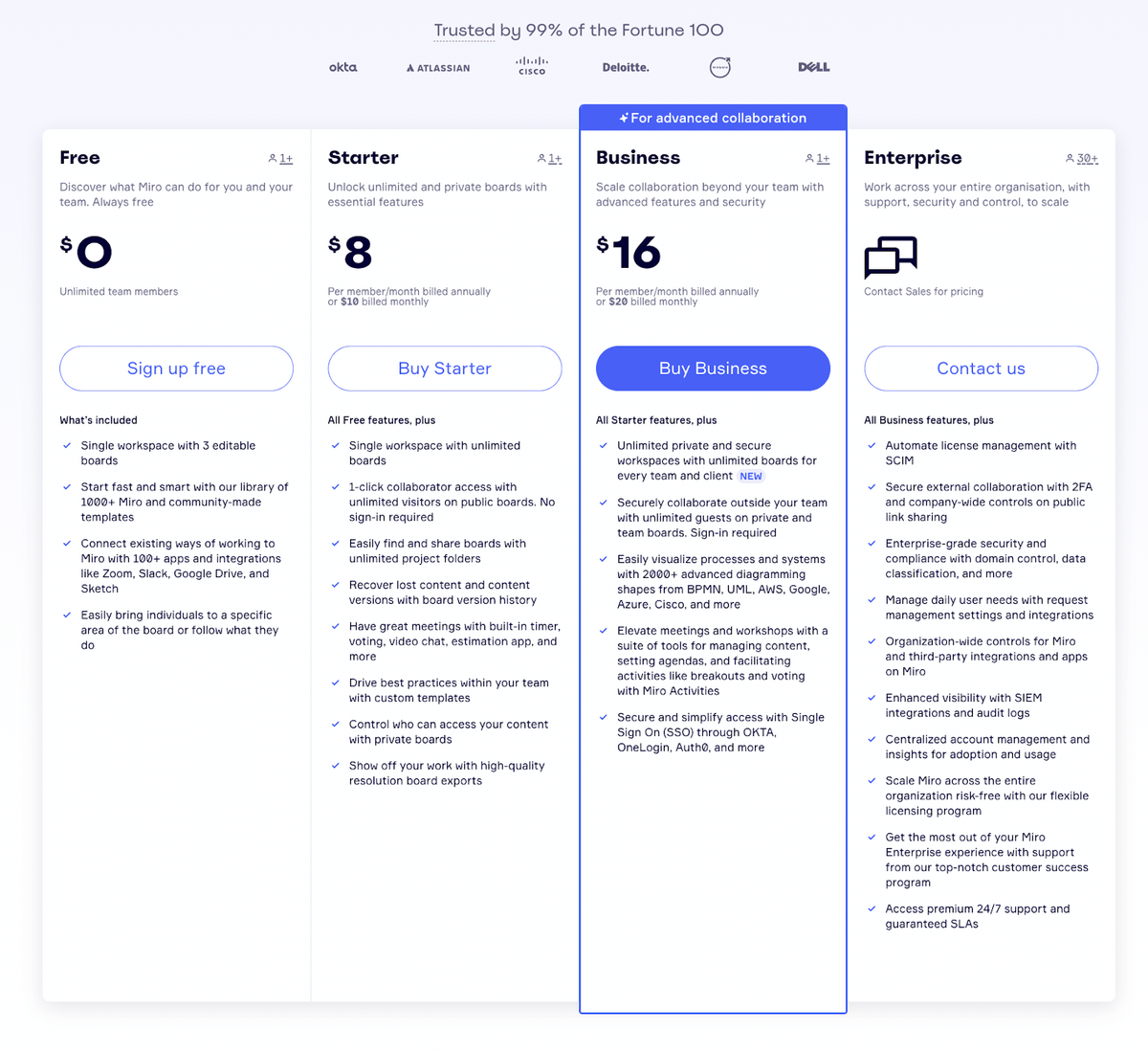
Miro, a visual collaboration platform, starts its detailed pricing page off with social proof by saying it’s trusted by 99% of Fortune 100 companies, further backing it up with the logos.
Once again, it draws the eye to the more expensive Business plan by outlining it in bright blue and changing the CTA button color to blue.
Each plan’s features are clearly called out in the pricing plan boxes, but those who want more detailed information can scroll down to compare plans.
Similar to the Slack example, for security-conscious individuals (who isn’t these days?) Miro highlights its security and compliance by displaying security certifications like SOC 2 Type II and ISO/IEC Security.
How This Page Increases Conversions
- Highlighting that Miro is trusted by 99% of the Fortune 100
- Offering a free plan that allows users to try Miro before committing to a paid plan
- Showing the benefits of upgrading to a paid plan, such as unlocking more features and increased security
- Offering different payment options, including monthly and annual subscriptions, to provide flexibility for users
- Providing education support for staff and students of educational institutions
- Displaying security certifications
- Including an FAQ section
#12 Coda.io: Customizable Billing Calculator
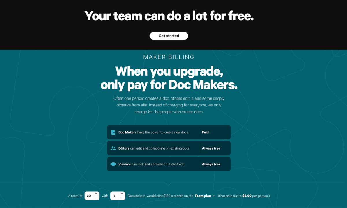
Coda.io, a collaborative productivity tool, offers a billing calculator to prospects when they first land on the pricing page.
They can choose between team size, number of Doc Makers on the team, and the plan they’re most interested in. This gives people an idea of the plan’s cost before scrolling down to the actual pricing plan chart below.
The calculator feature also may save their sales team from answering pricing questions so they can spend their energy on more important tasks like winning customers back.
After the calculator, this page follows the standard plan layout with pricing boxes, then a comparison chart, and an FAQs section below.
How This Page Increases Conversions
- The tiered pricing model allows customers to only pay for the features they need
- Coda uses the concept of “Doc Makers” to differentiate between users who create documents and those who collaborate and edit them
- Coda offers a “Free” pricing plan to encourage users to try out the product
- Coda provides detailed information on Packs included in each pricing tier, which are pre-built integrations with third-party tools
#13 ChargeBee: Currency Toggler
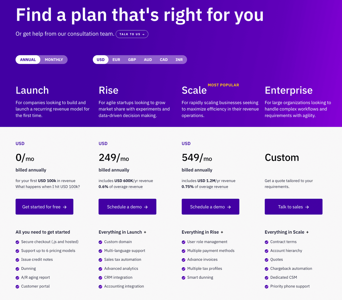
ChargeBee, a recurring billing software, presents pricing options in an elegant and uniform design through toggle switches.
Visitors can choose their billing cycle (annual, monthly) and their country’s currency. This is especially important for SaaS companies with many global clients because they can see plan pricing without using a currency calculator.
Below the pricing chart, ChargeBee specifically tailors a section to its target audience (early-stage startups) and encourages them to explore the additional benefits they offer by placing a callout below the pricing chart.
Then, they continue to target common customer pain points like churn reduction, failed payments, and time management, further convincing users why they should use ChargeBee.
How This Page Increases Conversions
- Offers a variety of pricing plans that cater to different business needs and sizes
- The pricing page provides clear and transparent pricing information
- Visitors can toggle between different billing cycles and currencies, which enhances their user experience
- Calls out to early-stage startups, encouraging them to learn more about what they offer specifically for this audience.
Create Your Conversion-Focused SaaS Pricing Page
Hopefully, these 13 SaaS pricing pages inspire you to plan out your own creative page to package your product.
Your pricing page should provide clear, customer-friendly language and a simple pricing layout free of misleading marketing tactics.
The essential pricing page design components:
- a value-driven headline
- brand-consistent pricing tier names
- transparent price tiers
- an FAQs section
Additional options include upselling annual plans, offering freemium plan options, showcasing testimonials, product demonstration videos, and providing pricing in multiple currencies.
Take inspiration from these examples, but always consider your own unique value proposition, target market, and business model.
Want to stop guessing how your customers view your brand?
About the Author
Jon MacDonald
Jon MacDonald is founder and President of The Good, a digital experience optimization firm that has achieved results for some of the largest companies including Adobe, Nike, Xerox, Verizon, Intel and more. Jon regularly contributes to publications like Entrepreneur and Inc.