
10 SaaS Free Trial Mistakes We Found During An Analysis Of 30 Real Tools
We signed up for 30 SaaS tools and lived inside each trial for 30 days straight. Here are the free trial mistakes that showed up again and again, and the handful of things almost nobody gets right.

Trial-to-paid conversion benchmarks are everywhere. A quick search turns up dozens of reports on what a “good” conversion rate looks like by industry, trial model, and company stage.
What’s much harder to find is a real picture of what those trial experiences actually feel like from the inside, day by day, email by email, all the way through to the moment someone tries to cancel or upgrade.
Getting that picture takes real work. It means signing up for dozens of competitors as a genuine user, living inside each product for a full month, and documenting everything from onboarding screens to win-back emails without skipping the unglamorous parts.
Most teams don’t have the bandwidth to do that for a meaningful set of competitors. So we did it for you.
The research behind the findings
We signed up for 30 SaaS tools across six categories, from analytics and user research tools to sales automation and documentation platforms, and lived inside each trial as the same user persona for a full 30 days.
An overview of the tools analyzed
| Category | Tool | What They Do | Trial / Pricing Model | Publicly Estimated ARR | Publicly Estimated MAU | Why We Reviewed |
|---|---|---|---|---|---|---|
| Productivity & Collaboration | Notion | Docs, wiki, project management | Freemium with 30 day trial | ~$250M+ | ~20–30M MAU | Classic PLG where user activation in first 30 determines everything. Blank-page-syndrome is the defining onboarding challenge. Complex product with many use cases. |
| Productivity & Collaboration | Coda | Docs-meets-spreadsheet platform | Freemium | ~$30–50M | ~1M+ users | Blank-page-syndrome is the defining challenge (like Notion). Users who don’t build something meaningful in 30 days rarely convert. |
| Productivity & Collaboration | Airtable | Database/spreadsheet hybrid | Freemium with 14 day trial | ~$500M+ | ~2M+ users | Complex product where activation is the hardest challenge. Significant gap between marketing promise and product experience. |
| Productivity & Collaboration | ClickUp | Project management (feature-rich) | Freemium with 14 day trial | ~$250M+ | ~10M+ registered users | Feature-rich product where onboarding complexity is a known pain point. Time-to-value is critical. Moving upmarket to enterprise while maintaining PLG motion. |
| Productivity & Collaboration | Monday.com | Work management, templates-driven | Freemium with 14 day trial | ~$1.2B | ~225K+ customers | Template-driven onboarding means the first experience is critical. Multiple products (Work Management, CRM, Dev, Service) each need distinct onboarding optimization. |
| Productivity & Collaboration | Miro | Whiteboarding & collaboration | Freemium with 14 day trial | ~$250M+ | ~100M+ users (claimed) | Collaborative by nature. First 30 determines whether users become habitual collaborators or churn. Expanding use cases beyond whiteboarding creates new onboarding paths. |
| Analytics & User Research | Pendo | Product analytics & in-app onboarding | Freemium | ~$200M+ | ~3.5K+ customers | Ironic fit — sells onboarding tools but needs its own onboarding optimized. Proving value in 30 days is critical for their own business. |
| Analytics & User Research | Amplitude | Product analytics (funnels, retention) | Freemium | ~$300M+ | ~2.6K+ customers | Ironic fit — helps companies optimize product experience but needs to optimize its own First 30. Analytics tools are notoriously hard to activate. |
| Analytics & User Research | ContentSquare | Behavior analytics (heatmaps, recordings) | Freemium with 15 day trial | ~$50–70M | ~1M+ websites | Ironic fit: helps companies understand user behavior but needs its own First 30 optimized. First heatmap is the activation event. |
| Analytics & User Research | Mixpanel | Product analytics (events, funnels) | Freemium | ~$60–80M | ~8K+ customers | Notoriously hard to activate — getting data flowing and first insight generated in 30 days is critical. Another ironic fit. |
| Analytics & User Research | Maze | User testing & research platform | Freemium with 30 day trial | ~$25–40M | ~80K+ teams | First test launched is the activation event. If product teams don’t run their first test in 30 days, they churn. Research tools have complex setup. |
| Creative & Content | Gamma | AI-native presentations, docs, websites | Freemium | ~$50M | ~50M+ users | AI-native builder. 50M+ users with low conversion = massive First 30 opportunity. Instant time-to-value via AI generation, but converting free users into paying teams is the challenge. |
| Creative & Content | Descript | AI video/podcast editing | Freemium | ~$40–60M | ~3M+ users | Complex product where first-project-completed is the activation metric. AI features need demonstration in first session. Multiple use cases create onboarding complexity. |
| Creative & Content | Pitch | Collaborative presentation software | Freemium with 14 day trial | ~$20–30M | ~500K+ users | First deck created collaboratively is the activation event. Team adoption is critical. Must overcome habit of Google Slides/PPT in 30 days. |
| Creative & Content | Beehiiv | Newsletter platform for creators/businesses | Freemium with 14 day trial | ~$25–40M | ~500K+ users | First newsletter sent is the activation event. Stickiness depends on users migrating their audience in the first 30 days. Once migrated, switching costs are high. |
| Creative & Content | Riverside.fm | Remote podcast/video recording | Freemium with 14 day trial | ~$20–30M | ~200K+ users | First recording completed is the activation event. Must demonstrate quality advantage over Zoom in first session. |
| Creative & Content | Webflow | Website builder (no-code) | Freemium | ~$200M+ | ~3.5M+ users | Powerful but complex tool. Time-to-first-publish is the key activation metric. Enterprise expansion (Optimize, Localization) creates new First 30 needs. |
| Communication & Workflow | Calendly | Scheduling & calendar automation | Freemium | ~$276M | ~20M+ users | Classic PLG viral loop. First scheduling link converts users to advocates (or not). Simple product with nuanced activation challenges. Enterprise expansion creates new needs. |
| Communication & Workflow | Help Scout | Shared inbox & customer support platform | Freemium with 14 day trial | ~$36M | ~12K+ customers across 140+ countries | Team adoption in the first 14 days is make-or-break, mirroring Front’s core challenge. If a support team doesn’t rewire their email habits during the trial, they churn. The new usage-based pricing model (contacts helped, not seats) also creates an interesting and relatively novel conversion dynamic worth documenting. |
| Communication & Workflow | Superhuman | Premium email client | Freemium | ~$30–50M | ~1M+ users | 7-day trial = users must develop the Superhuman habit fast or they don’t convert at the $30/mo price point. Habit formation IS the First 30 challenge. |
| Communication & Workflow | Intercom | Customer messaging & AI chat (Fin) | Freemium with 14 day trial + 7 day extension | ~$300M+ | ~25K+ companies | Rebounding growth driven by AI (Fin). New AI product requires entirely new onboarding and activation patterns. Existing onboarding is likely outdated — great entry point. |
| Communication & Workflow | Toggl | Time tracking & project planning | Freemium with 30 day trial | ~$50–70M | ~5M+ users | First timer started is the activation event. Multi-product (Track + Plan) creates multiple onboarding paths. Bootstrapped = lean. |
| Communication & Workflow | Grammarly | AI writing assistant | Freemium with 7 day trial | ~$300M+ | ~40M DAU; ~70M+ MAU | Free tier creates massive top-of-funnel. First 30 days determine whether users develop the habit and see enough value to pay. Converting free to Grammarly Business is the core challenge. |
| Sales, Automation, & Documentation | Zapier | Workflow automation | Freemium with 14 day trial | ~$300M+ | ~7M+ users | First automation (‘Zap’) is the critical activation event. Users who don’t build one in 30 days rarely convert. Infinite use cases make onboarding the biggest challenge. |
| Sales, Automation, & Documentation | Clay | Data enrichment & outreach | Freemium with 14 day trial | ~$50–80M | ~100K+ users | First enrichment workflow is the activation event. Complex tool with steep learning curve — users who don’t build a working workflow in 30 days rarely convert. |
| Sales, Automation, & Documentation | Typeform | Form builder with trial mode | Freemium | ~$100M+ | ~500K+ users | First form creation is the activation event. Viral sharing exposes new users. Moving into enterprise and data workflows. Simple product with nuanced First 30 challenge. |
| Sales, Automation, & Documentation | PandaDoc | Documents & e-signatures | Freemium with 14 day trial | ~$100M+ | ~60K+ companies | Free e-sig wedge competing with DocuSign. First document sent is critical activation moment. Free-to-paid conversion across tiers is the core business challenge. |
| Sales, Automation, & Documentation | Scribe | Auto-generates step-by-step guides | Freemium | ~$25–40M | ~1M+ users | First Scribe created is the activation event. Viral sharing drives team adoption. Free-to-paid team conversion is the core challenge. |
| Sales, Automation, & Documentation | Tango | Auto-captures workflows as guides | Freemium | ~$20–30M | ~500K+ users | First Tango created is the activation event. Viral sharing within orgs drives team adoption. Converting free users to paid team plans is the core challenge. Competes with Scribe. |
| Sales, Automation, & Documentation | 1Password | Password management & security | 14 day trial, then paid accounts only | ~$400M+ | ~150K+ business customers | Team rollout in first 30 days is critical. If employees don’t adopt in first month, the product fails. High-stakes onboarding with organizational change management challenges. |
For our research, every touchpoint was documented as it happened, not reconstructed from memory afterward.
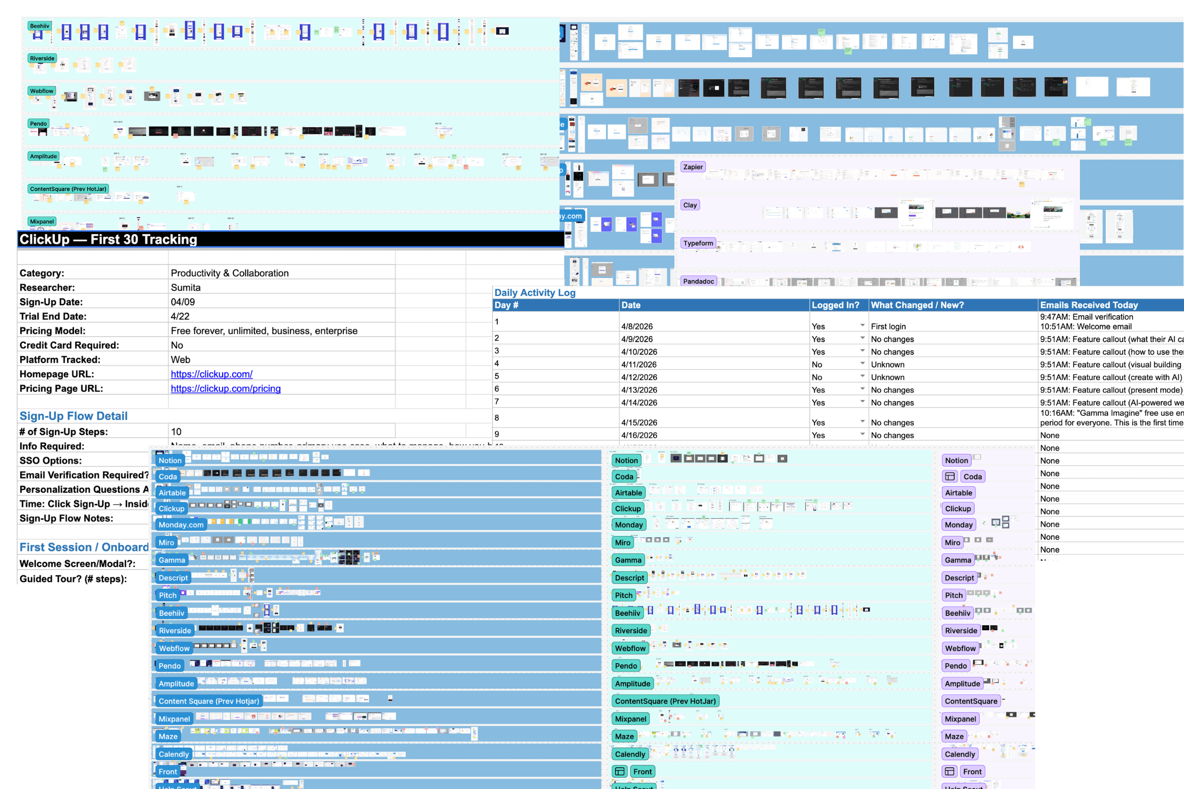
We tracked each product experience across four layers:
- Sign-up and first session: number of steps to create an account, whether a card was required, and what the onboarding experience actually asked a new user to do first
- Communication: every email, in-app message, and notification sent over the full 30 days, logged by day, sender, and purpose
- Upgrade and monetization: every paywall, upgrade prompt, and trial countdown encountered, along with how pricing was presented at the moment of conversion
- Trial end and cancellation: what happened when the trial expired or the user tried to leave, and what, if anything, arrived afterward to win them back
Once the 30-day windows closed, our researchers reviewed the full set together and then ran the same screenshots through an independent AI heuristic review to see where a second, unbiased read agreed with our human observations and where it diverged.
What came out of it wasn’t a scoreboard. It was a map of where good free trial design clusters, where the same mistakes repeat no matter the category, and where the fix is sitting in plain sight.
Ten patterns showed up often enough to be worth naming. A few of them may look uncomfortably familiar.
Mistake #1: building trust erosion into the trial model itself
We mapped every trial in the set against one simple question: does it ask for a credit card up front? The answer sorted products into a clear trust hierarchy.
On the honest end, we found trials from Zapier, Toggl, 1Password, Clay, and Content Square.
- Zapier never requires a card and never auto-upgrades without a deliberate action from the user.
- Toggl states exact trial end dates rather than vague windows.
- 1Password freezes a lapsed trial into a read-only state rather than charging the card on file.
- Clay unprompted adds bonus credits at downgrade.
- Content Square runs a reverse-trial model that avoids the credit-card-at-signup problem entirely.
On the other end, Airtable visually anchors a “$20 to $0” price before auto-converting to $24 a month, a moment we flagged internally as the single biggest risk to trust in the entire review.
Miro and Notion both require a card upfront for trials that auto-charge without an extra confirmation step, and Pitch’s checkout defaults to $300 in annual billing rather than a lower monthly option. Intercom and PandaDoc go further, hard-locking accounts at trial end rather than downgrading gracefully.
None of this is illegal, and most of it is defensible in isolation. But no-card, transparent-date trial design is rare enough in this data set that it functions as a genuine differentiator. Companies doing it honestly have a story worth telling louder than they currently are.
Mistake #2: running a personalization survey that changes nothing afterward
Nearly every product we reviewed asks some version of a setup survey: role, use case, team size, four to nine screens deep. The mistake is running that survey and then failing to let anything downstream reflect the answers.
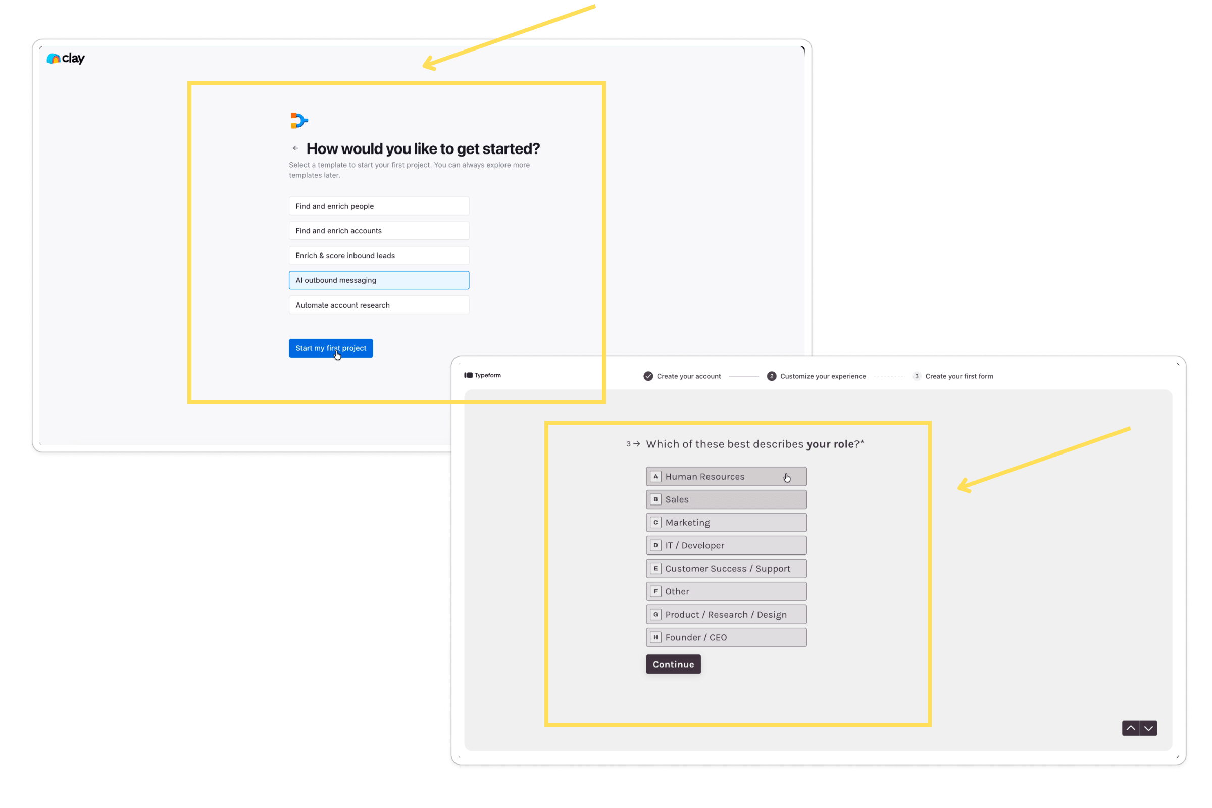
Where it paid off, it paid off clearly. Webflow’s dashboard was genuinely shaped by the survey response. PandaDoc auto-branded the workspace and routed straight to matched templates. Clay used the same answers to route template selection, and Zapier’s home screen recommended specific apps based on the stated use case.
Where it didn’t pay off, the survey became pure friction. Maze, Mixpanel, Miro, Pitch, Riverside, Grammarly, Tango, and Descript all ran comparable surveys with no visible personalization afterward, and Descript and Gamma both made the survey a mandatory modal with no visible exit or progress indicator, the only clearly negative reaction our researchers logged for this entire pattern.
Mistake #3: shipping an empty product and hoping the user fills it in
Some products can’t demonstrate value until the user hands over their own content or data first. A CRM needs contacts. A project tool needs tasks. An analytics platform needs a connected data source. The mistake is leaving that setup work entirely on the trial user, with nothing to see or evaluate until it’s done. Plenty of people won’t invest the time to configure a product before they’ve decided it’s worth their attention, so they leave before ever experiencing what it can actually do.
In our research, this showed up hardest in analytics platforms, where the entire product is built around data the user has to connect before anything renders.
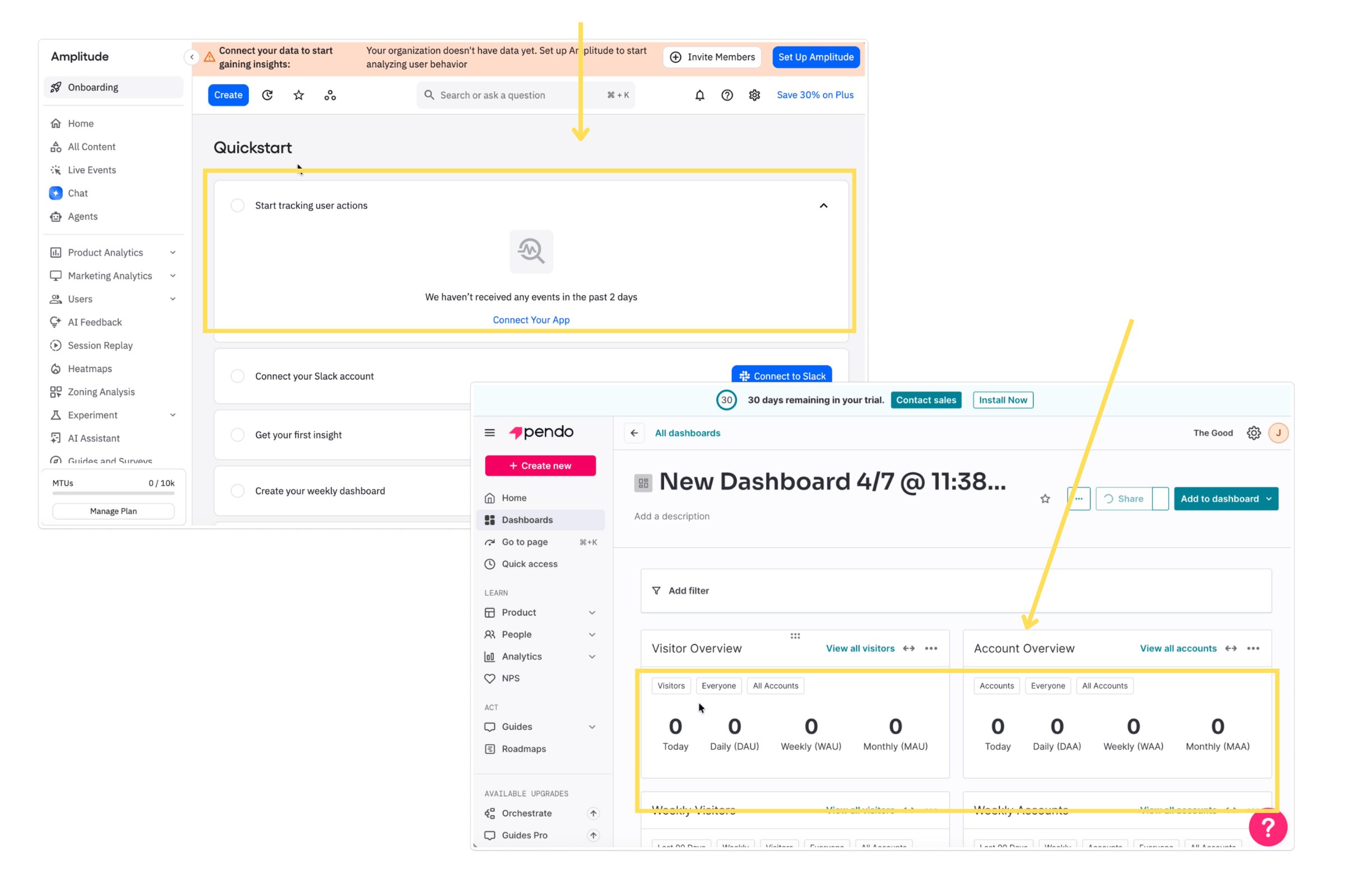
Amplitude’s dashboard looked identical on day 28 as it had on day 1, still displaying a “connect your data” banner. Mixpanel showed a zero-state dashboard for 21 straight days. Pendo’s every analytics surface stayed at zero until a technical SDK installation was completed, a barrier steep enough that it was flagged as the single biggest activation risk visible in that product’s entire journey. Content Square’s KPIs stayed zeroed behind a tag-install gate, and the researcher’s documented journey stopped at day 3 as a direct result.
Milder versions of the same mistake showed up at Toggl and Maze, as lifecycle emails linking into empty reports, or a demo project that technically existed but sat two clicks deeper than a new user would naturally look.
This is an easily fixable finding. Surface sample or demo data the moment someone lands, before asking them to connect anything real. It’s a low-effort change with a direct line to activation, and it was flagged as a clear opportunity in more than one of the journeys we tracked.
Mistake #4: letting AI-guided onboarding sit unused
This is the strongest positive signal in the entire study, which makes it worth naming as a mistake by omission. Products that used a conversational, workspace-aware AI assistant during onboarding consistently outperformed the ones using static tutorials or generic checklists.
The best examples interviewed the new user and built something real from their answers rather than dropping them into a blank canvas.
- Airtable’s Omni interviewed the new user and built a sample-filled base directly from their responses.
- Clay’s Sculptor asked clarifying questions and narrated its own configuration steps in real time.
- ClickUp’s AI assistant commented directly on the user’s actual workspace rather than pointing to a generic tutorial.
- Notion’s agent built a working first project and database on the spot.
- Gamma generated a full draft deck before ever asking the user to edit anything.
- Zapier’s Copilot surfaced app-aware template rows tailored to tools the user had already connected.
It wasn’t foolproof. Miro’s Sidekick deflected an onboarding question straight to documentation instead of answering it, and Amplitude’s in-product AI chat routed a user to a broken page. But the overall pattern held: conversational, workspace-aware AI onboarding is quietly becoming the strongest activation lever available, and a lot of products still haven’t turned it on.
Mistake #5: treating email volume as the problem, not email relevance
It’s tempting to assume fewer emails means a better trial experience. Our data says that’s the wrong question entirely.
Beehiiv sent 26 emails across 30 days, more than any other product in the set. Scribe sent roughly 22. Zapier sent 12 over 25 days. Gamma packed 9 to 10 emails into just the first 8 days. Volume alone told us nothing about how the sequence actually felt to a new user.
What separated the sequences researchers rated highly from the ones that felt exhausting wasn’t count. It was whether each email connected to something the user had just done or was about to lose. A 26-email cadence tied tightly to in-product behavior can read as helpful. A 12-email cadence sent on autopilot can read as noise.
The fix isn’t a number. It’s asking, for every email in the sequence, whether it’s earning its place based on what the user just did or is about to miss.
Mistake #6: picking one monetization moment and overusing it
We saw two distinct postures toward showing users a paywall, and both can go wrong in the same way: leaning on a single moment instead of pacing pressure across the trial.
Some products front-load it. Beehiiv paywalls the dashboard before a new user has done anything at all. Tango surfaces two upgrade modals back to back right after a user’s first meaningful moment of success in the product, undercutting it almost immediately. Descript surfaces pricing inside the onboarding flow itself, and Superhuman includes an upsell in the very first email a new user receives.
Others back-load it instead, holding everything until the final days. Airtable runs a 48-hour countdown blitz as the trial nears its end. Miro places five separate upgrade touchpoints all on day 14. ClickUp builds toward a hard access cliff on day 13 or 14.
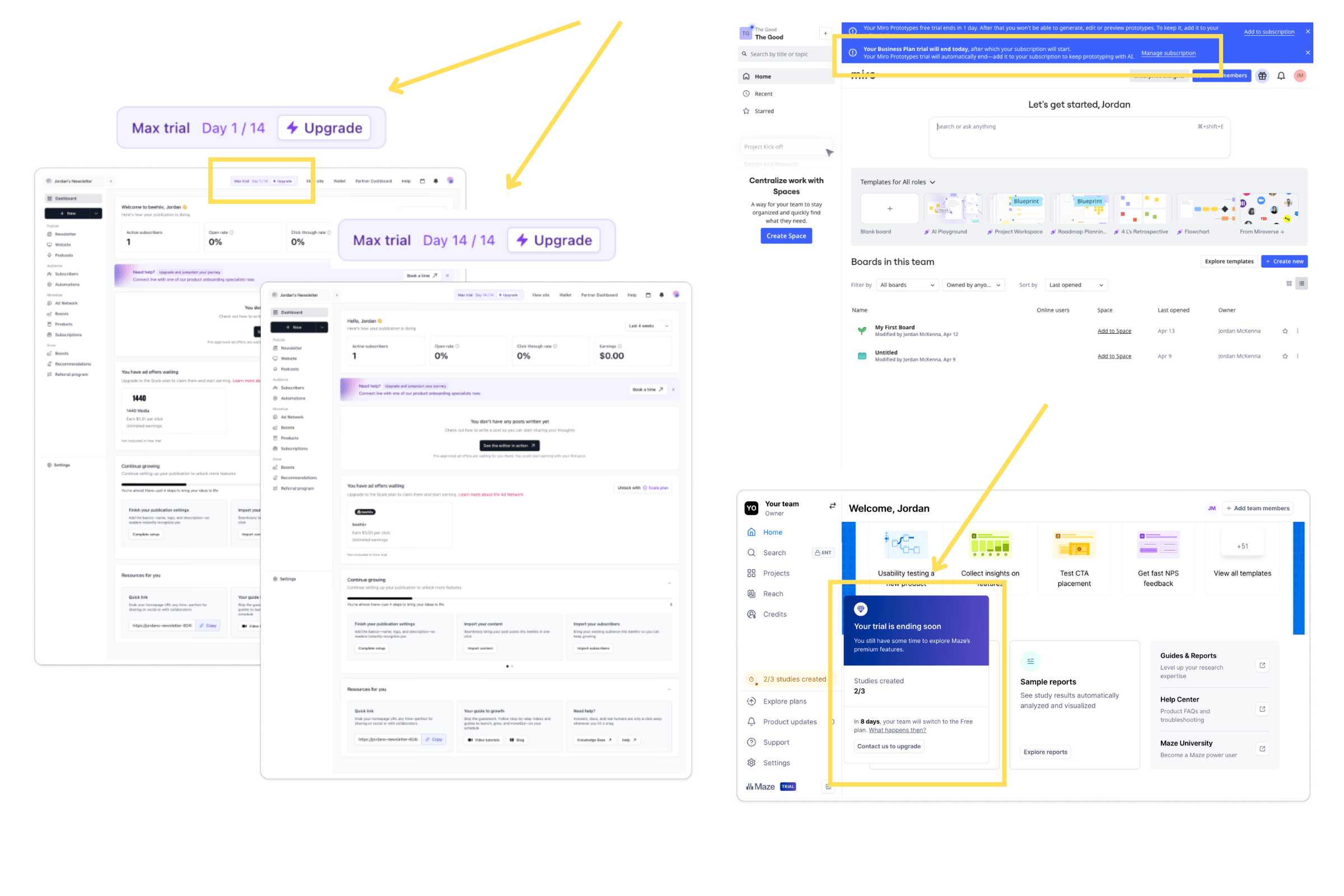
Neither posture was universally worse. But we noticed something else worth flagging: our human researchers only logged a formal “upgrade touchpoint” on a small fraction of the products reviewed, even though the independent AI review found persistent monetization surfaces at most of them from day one.
Trained observers under-notice ambient pressure once it’s been normalized into the interface. If your own team can’t see it anymore, a new trial user almost certainly can.
Mistake #7: reaching out with a human at the wrong moment
Sales contact during a trial isn’t inherently a problem. Timing is what determines whether it reads as helpful or intrusive.
Where it worked, it was opt-in and tied to something the user asked for. Monday and Notion both offer a bookable, free expert session inside the flow. Help Scout’s day-zero email comes from a named account executive rather than a no-reply address. Intercom’s in-product assistant and Zapier’s behavior-triggered nudge both read as helpful rather than intrusive.
Where it didn’t work, ClickUp’s outbound rep reached out within the first five days of an uninvited signup. Pendo followed an outbound touch with a weekend email on a free signup. And Pitch’s live help sessions were scheduled to land after the trial window had already closed, help arriving too late to actually help.
Mistake #8: running a trial extension that quietly breaks its own promise
A handful of products handled trial extensions in ways genuinely worth studying, and Intercom got it especially right: letting users self-serve an extra week simply by answering a short survey question, no sales call required, the single most distinctive save mechanic recorded in the entire study. Miro also offered two extra weeks the moment a user attempted to cancel, no questions asked.
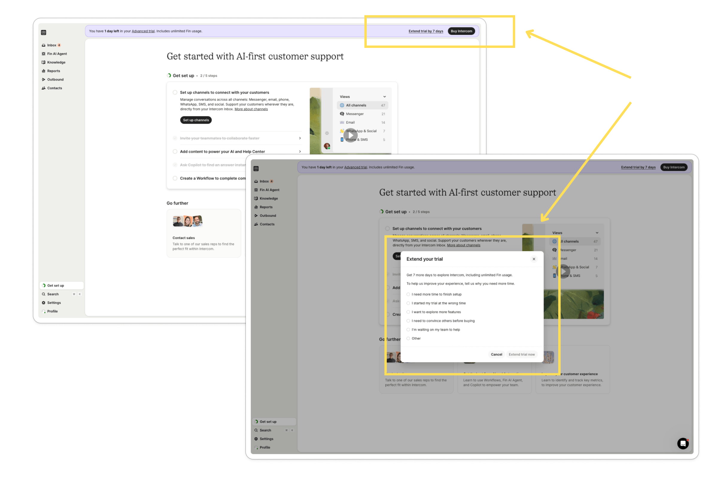
Not every extension held up under scrutiny, though. Monday’s 30-day extension is framed as free but actually requires entering payment details, directly contradicting a shorter, card-free window promised in its own trial email. That kind of inconsistency does more damage to trust than offering no extension at all, because it’s a promise broken in writing.
Mistake #9: making cancellation harder than signup
If there’s one finding where our human researchers and the independent AI review landed on the same conclusion without prompting each other, it’s this one.
How a product handles the exit says as much about it as how it handles the entrance, and most products handle the exit without much thought.
We saw a full spectrum of approaches.
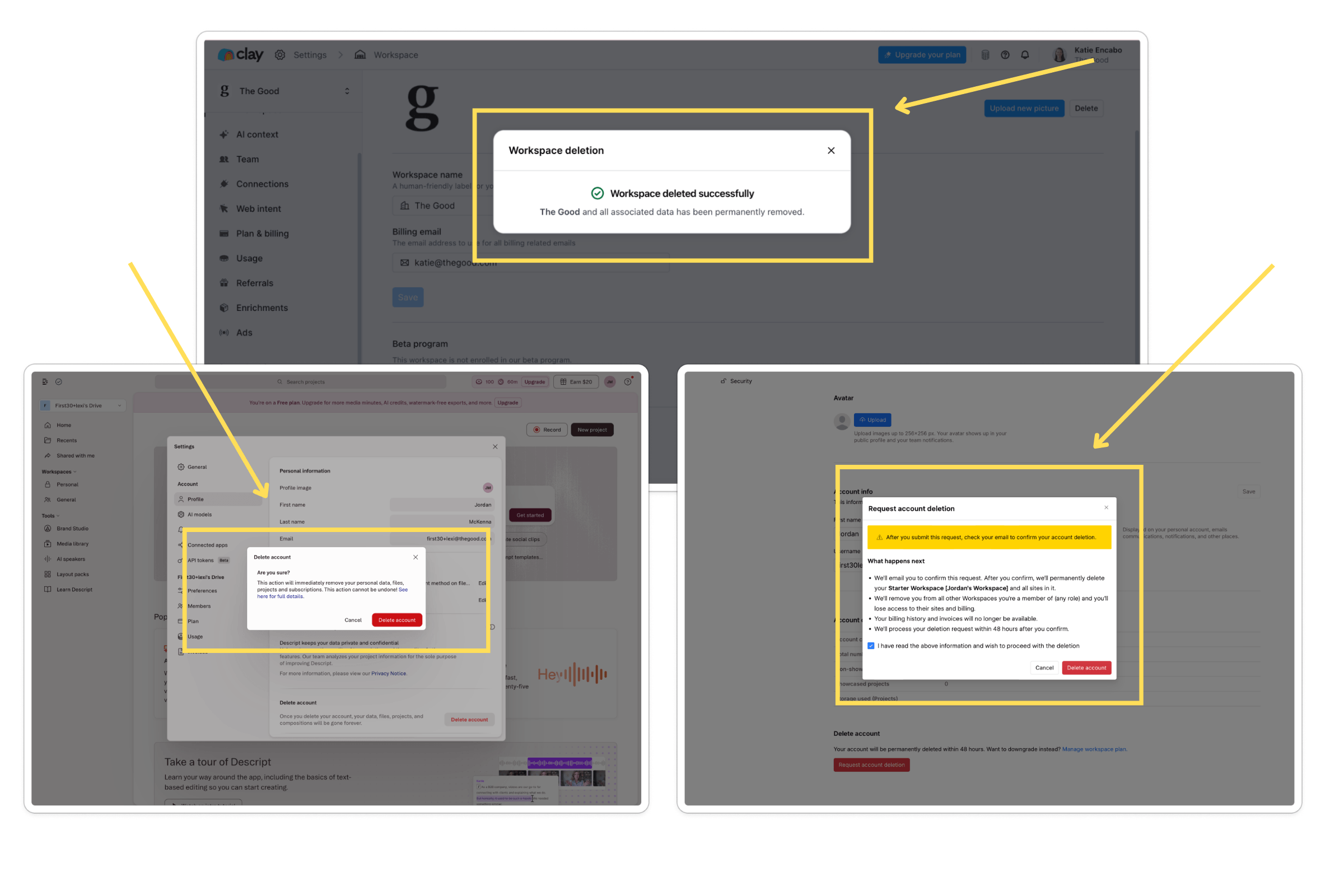
At the difficult end, Amplitude offered no self-serve way to cancel or delete an account at all, routing every request through a support ticket instead.
Pendo went further still: closing a free account required a severity-ranked support ticket, a support engineer gaining direct access to the user’s own subscription settings, and a follow-up email from a “Sr. Technical Support Engineer” asking the user to reconfirm they actually wanted to leave.
Maze and PandaDoc followed a similar support-ticket-only model, and in PandaDoc’s case, our researcher couldn’t find any cancellation path at all after actively searching billing and account settings.
In the middle sat friction that didn’t look intentional, but still slowed people down. Typeform inserted an MFA or email-code detour before account deletion. Webflow required a 48-hour waiting period for any deletion request. Beehiiv’s settings were only reachable by typing a URL directly into the address bar, with no visible link to it anywhere in the navigation.
Then there was a cleaner but quieter failure mode. Descript, Gamma, Pitch, Riverside, and Content Square all let a user leave easily, but gave no confirmation that it worked. No on-screen message. No closing email. The user is left assuming it worked and hoping they’re right.
And at the far end, Miro’s cancellation flow warned that it would trigger a $25 charge for unpaid invoices, then the cancellation itself failed with an error message when the user tried to proceed anyway. That moment was the single worst experience recorded across all 30 journeys.
“Hard to cancel” isn’t one problem. It’s at least four different problems, and each one needs a different fix.
Mistake #10: staying quiet about where the trial actually stands
The clearest, most consistently well-received pattern across the entire study was simple: when a product tells a user plainly where they stand in the trial, people notice, and they appreciate it.
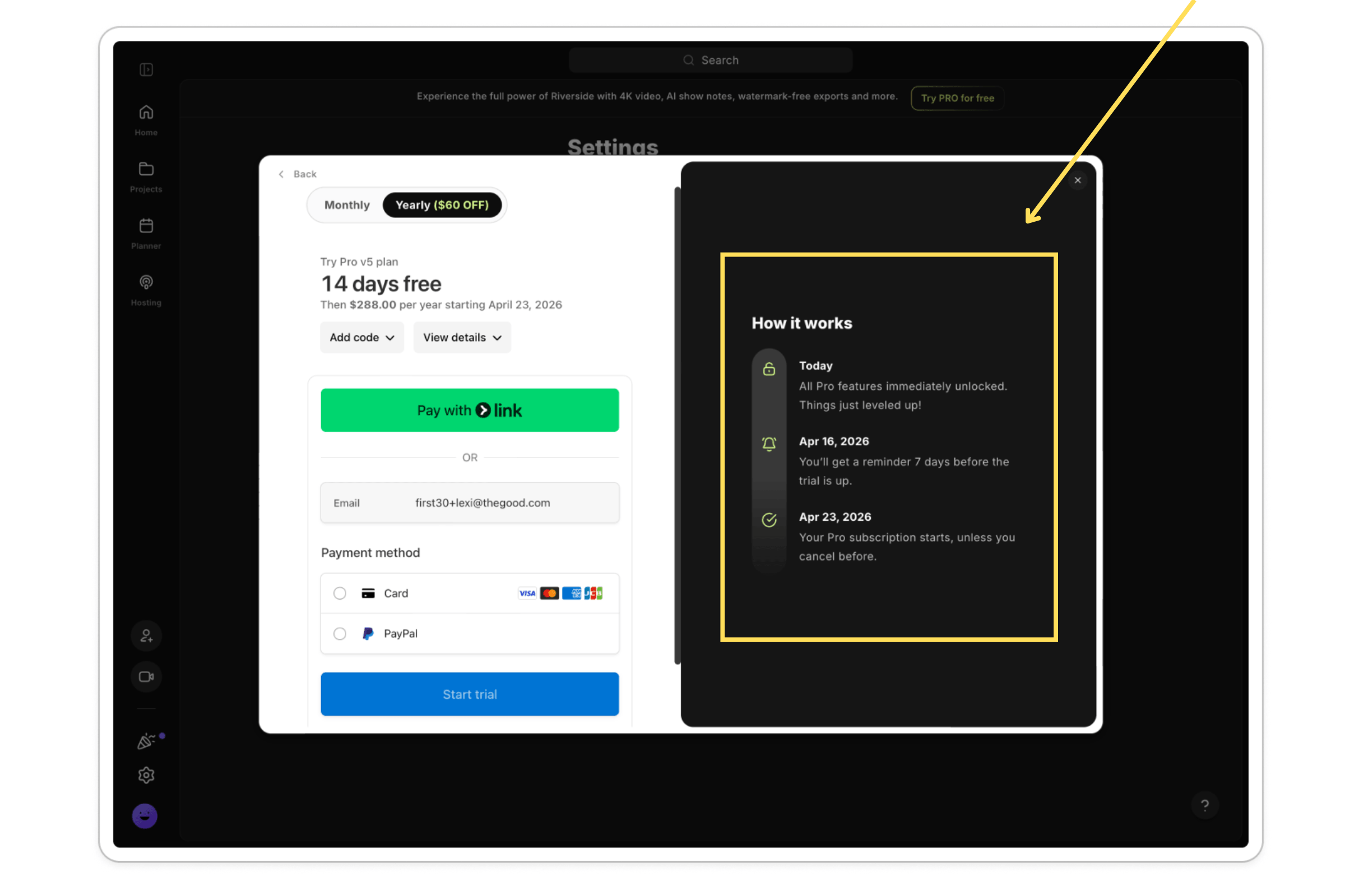
Pendo’s persistent countdown, Maze’s studies-remaining counter, Calendly’s progress-report email, Toggl’s exact stated dates, and Content Square’s reverse-trial banner all drew positive marks.
Riverside went a step further and proved its own transparency was real: it disclosed a specific day-10 billing reminder, and that reminder arrived on the exact day it promised. That kind of small, verified follow-through does more trust-building work than almost any other single touchpoint we recorded.
What this means for the first 30 days of your product experience
None of these mistakes require a product rebuild. These are likely decisions made once, early, and never revisited: an email cadence set up two years ago, a cancellation flow nobody has tested since launch, a personalization survey that was supposed to connect to something and never did.
That’s exactly the territory our First 30 methodology was built to map. The days between signup and the trial-to-paid decision aren’t a checklist of onboarding tasks. They’re a single, connected arc, one where a broken cancellation flow on day 30 can undo good onboarding work from day one, and where a quiet upgrade nudge on day 3 can matter more than a loud one on day 29.
If any of these ten patterns sound familiar in your own product, that’s the most useful signal you’ll get all week. The First 30 exists to help teams find out for certain and fix what’s actually costing them conversions instead of guessing.
Want a clear look at where your own trial experience is losing users? Talk to The Good about a First 30 audit and see exactly which of these patterns are showing up in your product and what fixing them would look like.
Frequently asked questions on improving the SaaS trial experience
What is the most common SaaS free trial mistake?
Across the 30 products we reviewed, the most frequent mistake wasn’t a single dramatic failure. It was collecting a signup survey and never using the answers. Eight of the products we tracked asked about role, use case, or team size at signup, then showed no visible personalization anywhere downstream, more products than any other single pattern in the study. It’s a low-stakes mistake on its own, but it adds up to a lot of wasted first impressions and missed opportunities to prove value early.
Do SaaS free trials need a credit card to be effective?
Not necessarily. The most trusted trials in our research never required a card upfront and were transparent about exact trial end dates. Requiring a card can increase paid conversion in isolation, but it also increases the risk of trust-damaging moments like unexpected auto-charges.
Does sending fewer trial emails improve experience?
No. Email volume didn’t predict how well a cadence was received in our research. Products sending over 20 emails in 30 days were rated well when each email tied to real user behavior, while lower-volume sequences sent on a fixed schedule felt less relevant.
How can SaaS companies make free trial onboarding feel more personal without overwhelming new users?
The products that got this right in our research shared one habit: they used what a new user told them early, whether through a signup survey or an AI assistant asking a few questions, to shape what came next. A dashboard that reflected the stated use case, a workspace that came pre-branded, and templates that matched the role selected at signup. The products that got it wrong asked the same questions and then changed nothing, turning a survey meant to help into pure friction.
When should a SaaS product show its first upgrade prompt?
There’s no single correct day, but timing matters more than frequency. Products that front-load upgrade pressure before a user reaches any real value, or that stack multiple prompts back to back right after a meaningful moment, undercut the experience. Products that pace pressure across the trial and tie it to specific milestones are better received.
Should a free trial show users a countdown timer?
Yes. Of all the patterns in our research, trial transparency, showing users exactly where they stand in a countdown, credit balance, or billing timeline, was the most consistently well-received, with no notable downside. The strongest version of this pattern also delivers on any stated reminder dates exactly as promised.
About the Author
Caroline Appert
Caroline Appert is the Director of Marketing at The Good. She has proven success in crafting marketing strategies and executing revenue-boosting campaigns for companies in a diverse set of industries.