
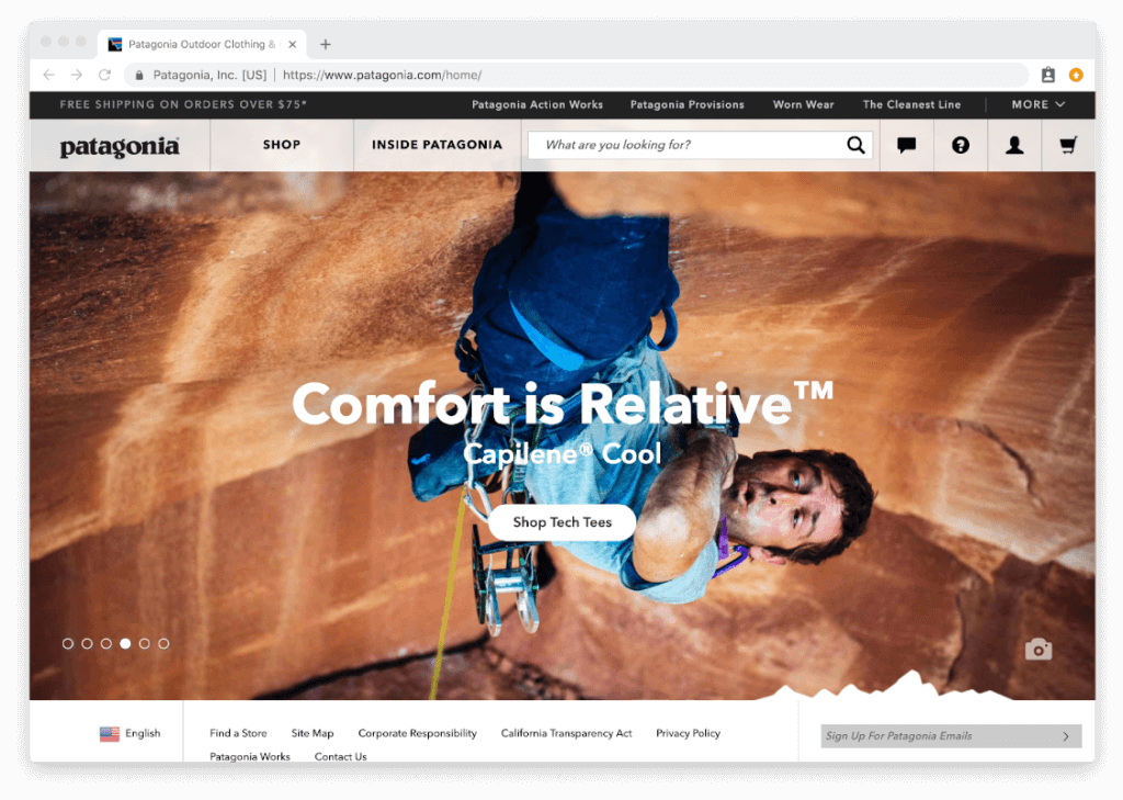
Why Image Carousels Are Almost Always A Bad Idea
This insight takes a closer look at why image carousels are so ineffective at converting site visitors, and what you can do instead to help improve the user experience of your ecommerce store.

On the surface, it seems like a great idea. A rotating image carousel placed above the fold on your ecommerce site, highlighting your latest products and deals. Surely, customers can’t resist such a glorious collection of your latest and greatest. Surely, the conversion rate on such a carousel must be high. Surely, the carousel must be a big driver of sales.
Unfortunately, the answer to all of those questions is a resounding, “No.”
In fact, research by Notre Dame showed that a staggeringly low 1% of site visitors click on non-rotating image carousels (carousels that don’t change automatically). Additionally, 84% of those clicks are on the first slide, meaning all the remaining slides combined receive a paltry 16% of the clicks.
The numbers aren’t much better for “fancy” carousels that rotate on their own. Auto-rotating carousels receive a bit more attention, but again, the first slide dominates, receiving 40% of all clicks. The second and third positions receive 18% and 11% fewer clicks.
While it may seem like a good idea to use a carousel, the numbers simply don’t back it up. The click-through-rate (CTR) on carousels is abysmally low, with the lion’s share of clicks being gobbled up by the first slide.
Simply put, if you’re using a carousel, you’re wasting incredibly valuable above-the-fold real estate.
Of course, all these statistics raise a critical question: why are image carousels so ineffective?
After all, they seem like an appealing solution for displaying products from a visual design perspective. They look slick and attractive. So why do they perform so poorly? And what are better alternatives to a carousel?
In this Insight, we’ll take a closer look at:
- The exact nature of carousels
- Why carousels are so ineffective
- Better alternatives to using carousels
Let’s dive in.
What Is An Image Carousel?
First, let’s make sure we’re on the same page regarding exactly what an ecommerce carousel is. There’s often confusion around the topic, and they’re called by different names such as “sliders” or “content modules”. In the design community, all three terms are interchangeable and mean essentially the same thing.
There are two common types of carousels that we see ecommerce websites using:
- Static image carousels: These carousels may feature a number of products but they stay on the first image until manually prompted to move to the next one. In other words, you need to click on the carousel to get it to move to the next image.
- Auto-rotating image carousels: This type of carousel automatically cycles between images without any prompting from the user.
So why do major ecommerce brands use carousels if they perform so poorly? There are three relatively simple reasons that can explain it.
First and foremost, they believe that showing off more products will lead to more conversions. The companies believe that customers will see one of the products highlighted in the carousel and be moved to purchase it. It’s the whole, “More is better,” mentality.
Second, there’s also an “everyone is doing it” mentality surrounding carousels. When companies see their competitors implementing carousels on their websites, they assume that it must be working for them, so they follow suit.
Third, different departments and managers often want to get their particular message across on the homepage. Using a carousel allows all the interested parties to get a piece of the above-the-fold real estate.
The honest truth about image carousel is that they’re effective at being able to tell people in Marketing and Senior management that their most recent idea is now being featured on the home page. Aside from that, they’re valueless for the user and are often skipped over because they appear as advertisements.
And yet despite evidence to the contrary, many ecommerce companies continue to implement carousels.
Why Don’t Image Carousels Work?
There are several key reasons why image carousels aren’t effective at converting site visitors. Let’s take a closer look at the rationale behind why a consumer chooses not to interact with them.
Banner Blindness
Users are constantly bombarded with banner advertisements. If you open up almost any well-known informational website (Forbes, Entrepreneur, Mashable, etc.), you are immediately confronted by multiple advertisements and banners. In order to consume any of the content, you need to spend several moments closing the banners.
This constant assault on the senses has led consumers to start ignoring banners altogether, and the reality is that carousels are nothing more than a glorified banner. It’s common for users to completely ignore the carousel and look below it to find the products they’re seeking.
Adam Fellows put it this way in a discussion on UX Stack Exchange:
Almost all of the testing I’ve managed has proven content delivered via carousels to be missed by users. Few interact with them and many comment that they look like adverts and so we’ve witnessed the banner blindness concept in full effect. In terms of space-saving and content promotion, a lot of competing messages get delivered in a single position that can lead to focus being lost.
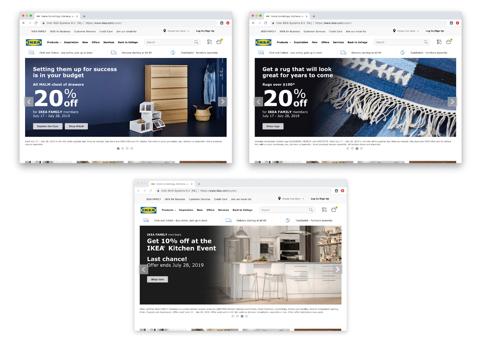
Here’s an example from IKEA, rotating between three separate carousel images and three completely different offers:
Loss of Control
When a user visits a website, they want to feel like they are in control of the browsing experience. A carousel, with its images rotating every five seconds, makes users feel like they’re no longer in control.
Products and deals are automatically sliding past, and if a user happens to be interested in one of them, they have to act fast before the offer disappears. This perceived loss of control can be particularly frustrating for those who have difficulty with motor skills.
Joshua Porter made a great point about this when discussing UX design:
Enjoying this article?
Subscribe to our newsletter, Good Question, to get insights like this sent straight to your inbox every week.
Humans are most comfortable when they feel in control of themselves and their environment. Thoughtless software takes away that comfort by forcing people into unplanned interactions, confusing pathways, and surprising outcomes.
Carousels most certainly create unplanned interactions, confusing pathways, and surprising outcomes.
Image carousels force users into unplanned interactions, confusing pathways, and surprising outcomes #UXdesign #UserExperience Share on XPoor Readability and User Experience
With their quickly shifting images, auto-rotating carousels can be particularly difficult to read for those from other countries or who are vision-impaired. When you consider that a large majority of shoppers are browsing on mobile devices, readability becomes an even greater issue.
Another thing to consider is that almost all carousels include a CTA with a button — but that button often shifts locations between slides. Even if it doesn’t, it still moves around when the carousel rotates, which is very frustrating for the user. Forcing your users to chase around a moving CTA-button is clearly not going to have a positive impact on your conversion rate.
Herd Mentality
It’s true that when they were first introduced, ecommerce carousels may have been more effective simply due to their novelty. However, as more and more companies hopped on the carousel bandwagon, they became less and less effective. Users became used to them and started ignoring them altogether (also add mega-navigation menus, company history, social media feeds, sponsored athletes doing cool things, and email pop-ups to the list as well).
Overwhelmed By Choice
It’s a well-established marketing principle that when you’re trying to get users to take action, one of the worst things you can do is present them with too many options. The abundance of options often leads to users feeling overwhelmed, resulting in them taking no action at all.
And yet, this is exactly what carousels do. They add multiple options to the homepage, which scatters the focus of the user. Instead of taking action, they ignore the banner altogether.
Not Relevant
Most carousels highlight between four to six products or deals. The odds that those products and deals are relevant to a user are very small. The result is that the user skims right past the carousel and on to something else.
…the chances that the information being displayed in the carousel matches what the visitor is looking for is slim. So, in that case, the carousel becomes a very large banner that gets ignored. In test after test, the first thing the visitor does when coming to a page with a large carousel is scroll right past it and start looking for triggers that will move them forward with their task.
Alternatives To Image Carousels
If carousels are so ineffective, what should you use above-the-fold on your ecommerce site?
Top Selling Products Or Top Content
The best alternative to a slider image carousel is to feature your top-selling products or your most important content. Instead of confusing your users by flashing them multiple offers, show them the most popular products that people are already seeking out your site for.
The same thing applies to original content that your business is creating. If you have a particular article or video that is performing exceptionally well, showcase that in the above-the-fold region.
Think of it this way: you want to give users what they’re searching for. By highlighting your most popular products and content above-the-fold, there’s a much greater chance that users will interact with it as opposed to suggesting random, unrelated offers to them.
Brand’s Main Value Proposition
Another effective alternative to using an auto-rotating image carousel is including your company’s main value proposition. This is especially relevant if you’re in a niche or specialized industry where consumers may not immediately understand the value that your company provides. The sooner you can convey your unique value proposition to your customers, the more likely they’ll want to purchase from you.
Current Promotions
Instead of featuring multiple sales, products, discount codes, and deals, highlight your latest sale or campaign above-the-fold. For example, if you’re having a site-wide holiday sale, ensure that your visitors know about it.
This is a great example from Men’s Warehouse of how to highlight your current sales promotion (see below). They use one, static offer that remains the same no matter how long you stay on the page.

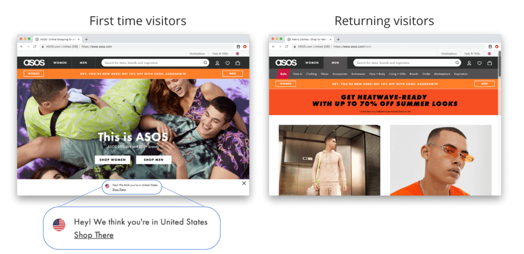
Personalization
The more you can personalize a user’s experience, the more positive it will be. Look for unique ways to personalize the experience of those visiting your site. For example, if someone returns to your site, show them a different hero image. If you can show them a hero image related to a page they’ve previously visited, even better.
As we noted above, the problem with most carousels is that they’re simply not relevant to users. By personalizing the above-the-fold content, you make your content much more relevant.
Here’s an effective example from ASOS. They utilize personalization on their homepage by detecting what country you’re browsing from. They also cookie what style of clothing your view on your first visit (men’s, women’s, etc) and will re-redirect you to that category when you revisit their site.
Whatever you do, don’t use an image carousel.
It may be tempting to include a carousel on your homepage, but resist the urge. The research clearly shows that even though carousels may be useful for showing off a large amount of content in a single space, they almost always hurt your conversion rate.
And if that image carousel auto-rotates? You are simply hurting your user experience and conversion rate even more.
Instead, focus on highlighting your most popular products or content in the space normally reserved for a carousel. You’ll find your overall conversion rate much higher.
Looking for a better way to design your homepage? If you currently use an image slider on your site, it’s time to update your UX and give your customers what they want, instead of what you think they want.
About the Author
Jon MacDonald
Jon MacDonald is founder and President of The Good, a digital experience optimization firm that has achieved results for some of the largest companies including Adobe, Nike, Xerox, Verizon, Intel and more. Jon regularly contributes to publications like Entrepreneur and Inc.