
15 Product Landing Page Examples to Inspire Your Optimization Process
These product landing page examples will give you the inspiration and techniques to increase your ecommerce conversions.
In ecommerce, everything comes into play when you’re optimizing your website to improve conversion rates. Details like your site speed, money-back guarantees, and the footer are crucial.
I know it because we live this every single day here.
You’d be surprised by how many times businesses stagnate just because their product landing pages are too generic and bring no value to the prospect.
Now, your online store could be making more sales if it followed the strategies we’ve seen repeatedly from highly successful businesses. And to illustrate them, I’ve brought 15 product landing page examples.
What is a product landing page?
A landing page is designed to convert visitors into leads. It often takes the prospect from being aware of a problem to knowing its solution and how to solve it. Perhaps that solution is encouraging them to give you their email address in return for useful content.
These are pretty isolated pages with no links or distractions whatsoever, so the lead generation rates can be as high as possible.
On the other hand, when we talk about product landing pages—for ecommerce, specifically—we refer to any page whose purpose is to convert interested shoppers into paying customers for one specific product.
The difference between a regular product page and a product landing page is that the latter is visited from external marketing channels such as Facebook ads, emails, YouTube, social media, and so on.
Product landing pages are designed to be “landed on” and read from top to bottom considering that the visitor is going to be especially interested in your product. A regular product page is designed to be navigated from a category page with a shopping mindset (where the prospect is actively looking for a product and considering different options).
How sophisticated your landing page is depends on how unique and expensive your offer is. For example, a regular low-priced tape won’t require the same persuasive selling work as a highly-priced cleaning robot. We’ll dive into more specific product landing page examples below.
What is a good conversion rate for your ecommerce landing page?
Not knowing how your conversion rate stacks up against competitors can make you feel lost.
Often, people will tell you that a good conversion rate hovers around 3-5%.
- From a study from WordStream, the median conversion rate from landing pages across all industries is around 2.35%.
- This Unbounce report showed that the median conversion rate from ecommerce landing pages in 2021 is 5.2%.
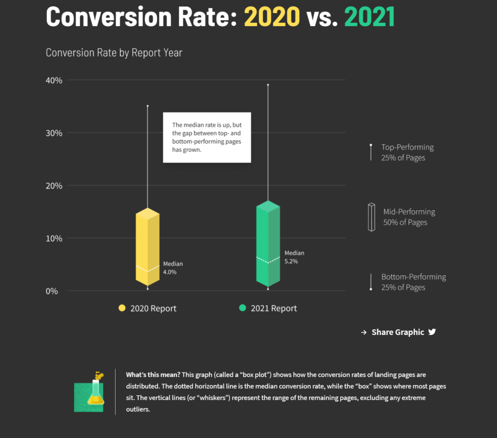
The results are pretty different, so you might be wondering: what’s closest to the real average?
But, that’s not the right question to ask.
The same conversion rate can be highly profitable for one business while completely terrible for its competition.
Conversion rates aren’t a competition against other brands—but against yourself.
It doesn’t matter what your conversion is right now. The best conversion rate is one that’s higher than yours and constantly improving.
This is why one of the only ways to achieve optimization success is by implementing a recurrent program where you’re regularly testing your product landing pages for constant improvement.
15 of the best product landing page examples from winning online stores
The best way to understand the elements of a great product landing page is by studying other marketers’ work.
Here, we’ll go through 15 different product landing page examples that have one or two details that make them stand out from the rest.
1. Harry’s
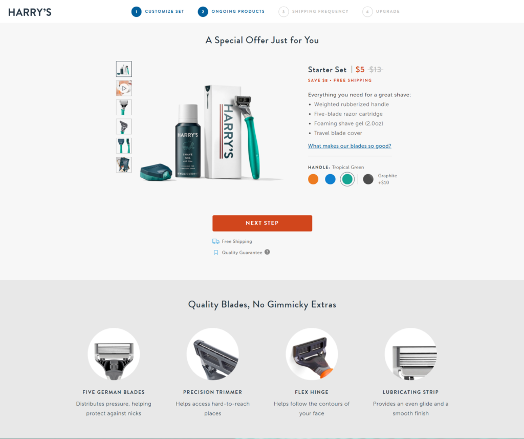
When landing on this page, the first detail that stands out is the offering of a complete bundle for less than half of the regular price. That alone could be irresistible to the right prospect.
As a shopper, you might think that bundles like this are made with low-quality products as a quick money grab. But their message clearly says “no gimmicky extras,” which tries to address this objection by stating that the bundle includes just what you need for a quality shave.
Plus, it subtly upsells a blade with a graphite color scheme for those who are OK with spending a little bit more for a more elegant shaving blade.
2. H&M
H&M’s product pages aren’t fancy or unique.
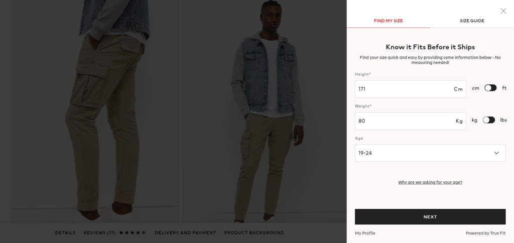
But, they do address the one question that every person shopping for clothes online has: “Will this fit me well?”
That’s why they include a simple quiz where you share sizing details and get an answer to that exact question. The message “know it fits before it ships” says everything.
3. Casper
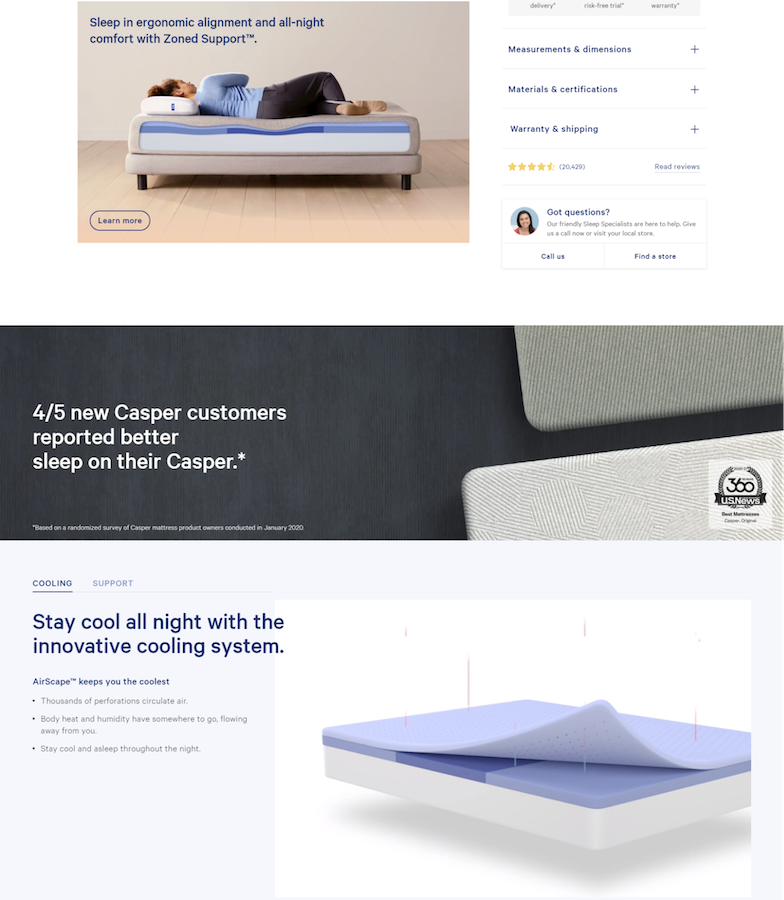
Casper is nailing it with its longer-than-usual product pages.
The copy is the first thing that makes it great. It isn’t selling just mattresses, it’s selling better sleep health—a subtle but impactful difference.
A lot is going on when it comes to having a good sleep, and Casper does a great job explaining how their mattress can help you achieve high-quality sleep with persuasive copy and attractive illustrations.
What’s more, they make use of a statistic from their customer base to appeal to the rational part of their prospect’s brain—making it easy to believe that their product will legitimately improve your sleep health.
Considering how comprehensive the landing page is, it could easily be promoted with paid social ads and search ads. The product page also has plenty of messages you can test. For example, the statistic, the cooling system, and its support.
4. Burrow
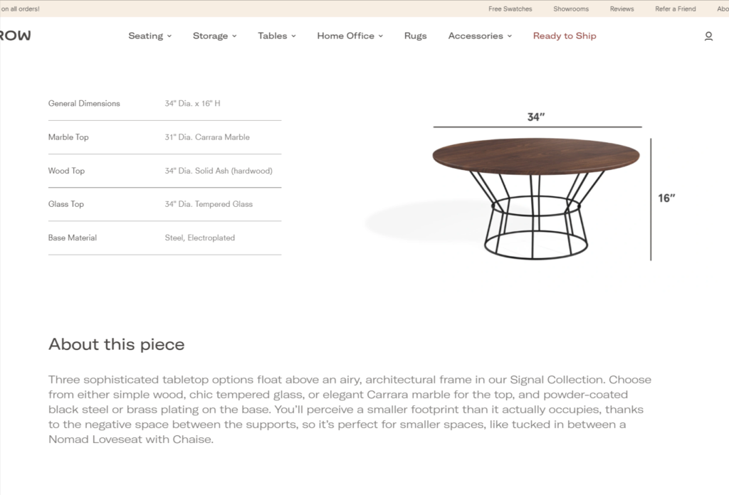
Burrow goes the extra mile with their product pages by illustrating their furniture’s dimensions and features with high-quality photos and even GIFs.
More than that, they include different pairing recommendations in case you don’t know how to make it fit in your home—which is a perfect way to assist your prospects with their purchase decisions.
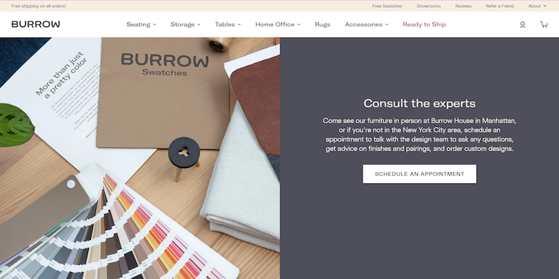
Plus, instead of pushing you to add their products to their shopping cart, Burrow offers a free furniture consultation for those who are looking for professional advice to decorate their home, adding significant value to those undecided potential customers.
5. Oura Ring
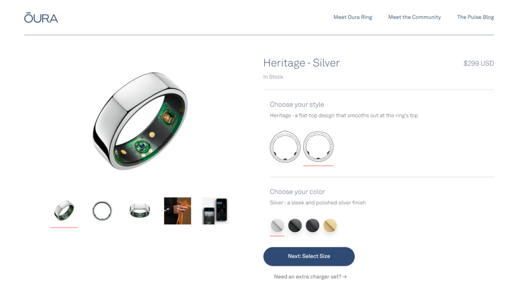
The Oura ring is a simple ring that tracks the quality of your sleep overnight and gives you a full report once you wake up. It syncs with your phone, so you don’t need anything else to track your data.
What makes its landing page great is how it positions the ring as the ultimate solution to improve and understand your sleep—showcasing how your life with an Oura ring would be if you keep track of how your body works.
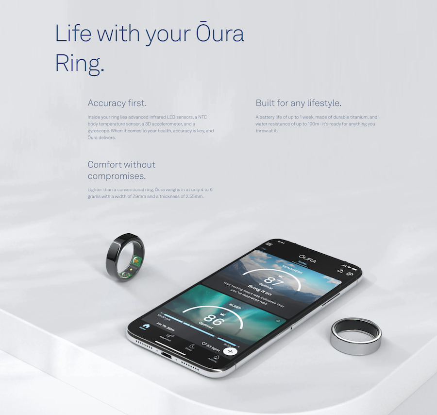
In short: the page is not only selling a ring. It sells a new lifestyle where you’re in control of your habits.
6. ILIA
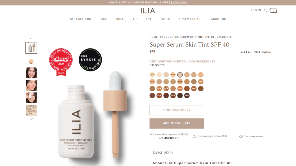
ILIA’s product pages are all well designed.
But what actually makes them remarkable is how their product descriptions are so well done and structured, covering almost every doubt you might have in your head. While the product landing page design manages to include all that information in a way that still incorporates white space and doesn’t overwhelm the eyes.
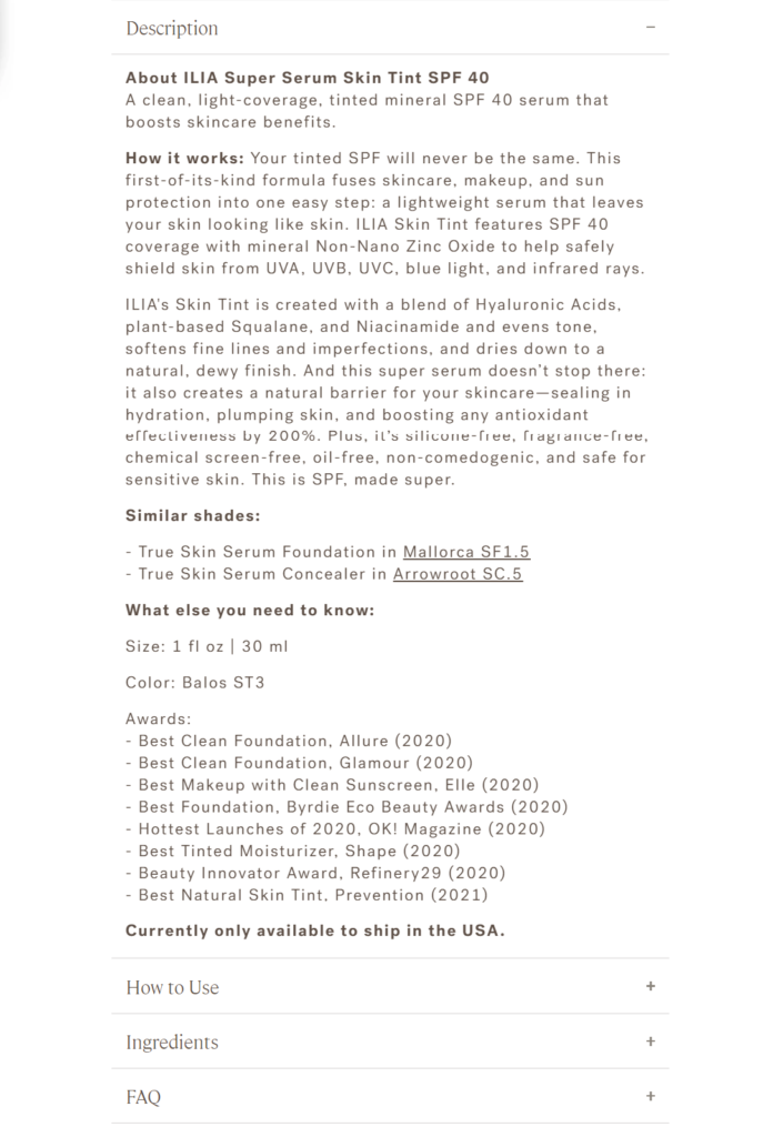
These product landing page examples include tons of information that helps build trust such as:
- How the product works.
- How to use the product.
- Similar products.
- Awards they’ve won with the product.
- An extensive FAQ.
ILIA is a perfect example of how far you can go with your product descriptions. Powerful copy can convince visitors coming from emails or ads why the product is the right fit for them.
7. Aurate
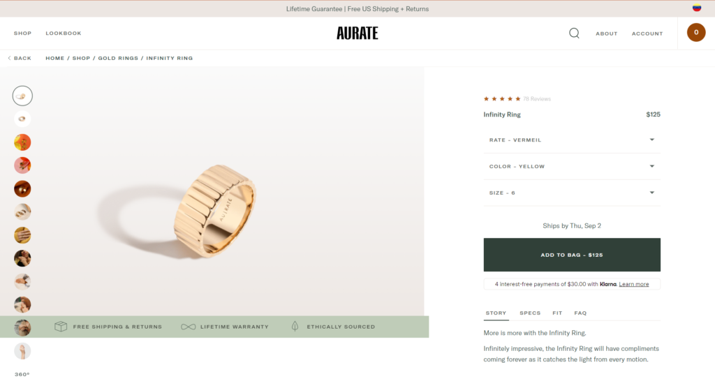
Aurate is another example of how the right messaging can position a simple product as a compelling offer.
The high-quality images alone show how appealing the ring can look. But that’s not everything, their main selling point isn’t just about beautiful jewelry.
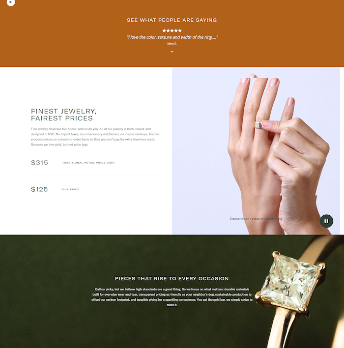
These rings are ethically sourced, meaning that they’re made with sustainable materials. And as a result, their pricing is “fairest” compared to traditional jewelry stores.
What’s more, despite being in an industry where the more expensive items are generally seen as “better,” their product page does a great job positioning the ring as a less-costly option without making it look “cheap” or “low-quality.”
8. R.Riveter
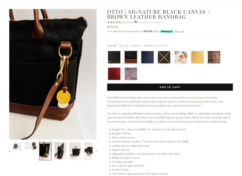
Riveter product pages look pretty impressive at first sight, yet not too fancy.
But if you take a closer look and scroll a little bit, you’ll notice how inspiring their product descriptions are.
The copy is a perfect example of storytelling. It starts with the product’s journey from the manufacturer to your home while presenting the handbag’s most attractive features.
But it doesn’t end there. It expands the story with how the brand created the name and how to properly maintain to the handbag’s leather.
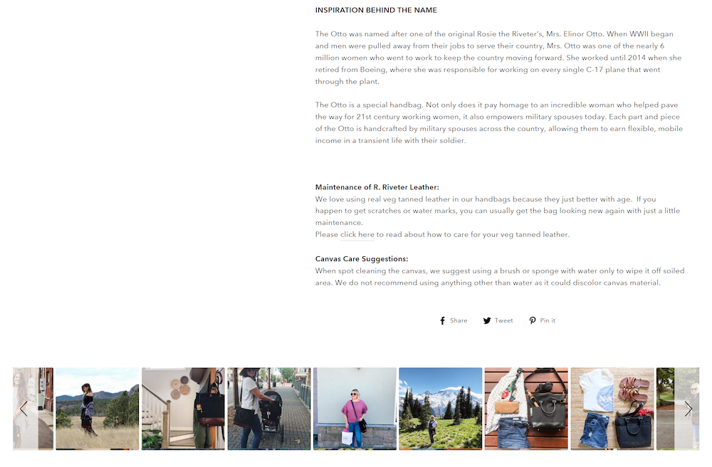
What’s more, Riveter adds tons of user-generated content they’ve collected from their social media target audience. This touch showcases how the handbag looks on real-life customers.
9. Reel
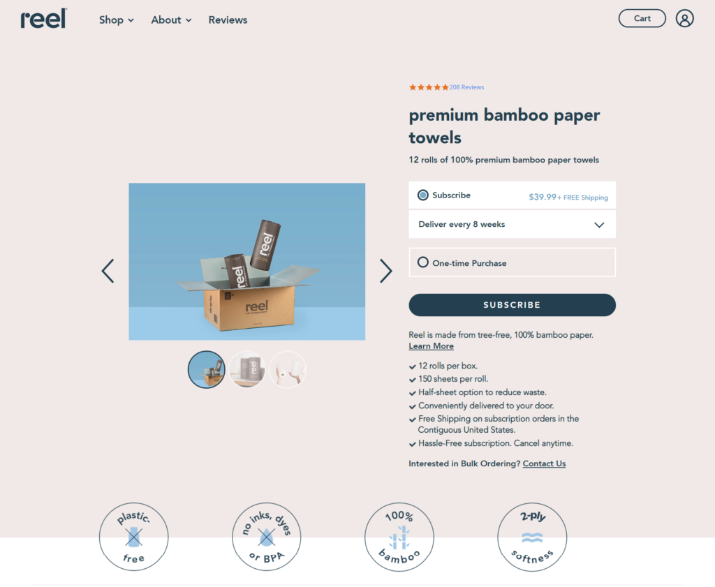
Reel is all about sustainable and environment-friendly products. They encourage you to commit to their cause by paying a subscription that sends you paper towels every eight weeks.
Their landing page is not selling paper towels. They sell the rewarding feeling of contributing to a greener planet. So their copy covers this idea as its main selling point all over the product page.
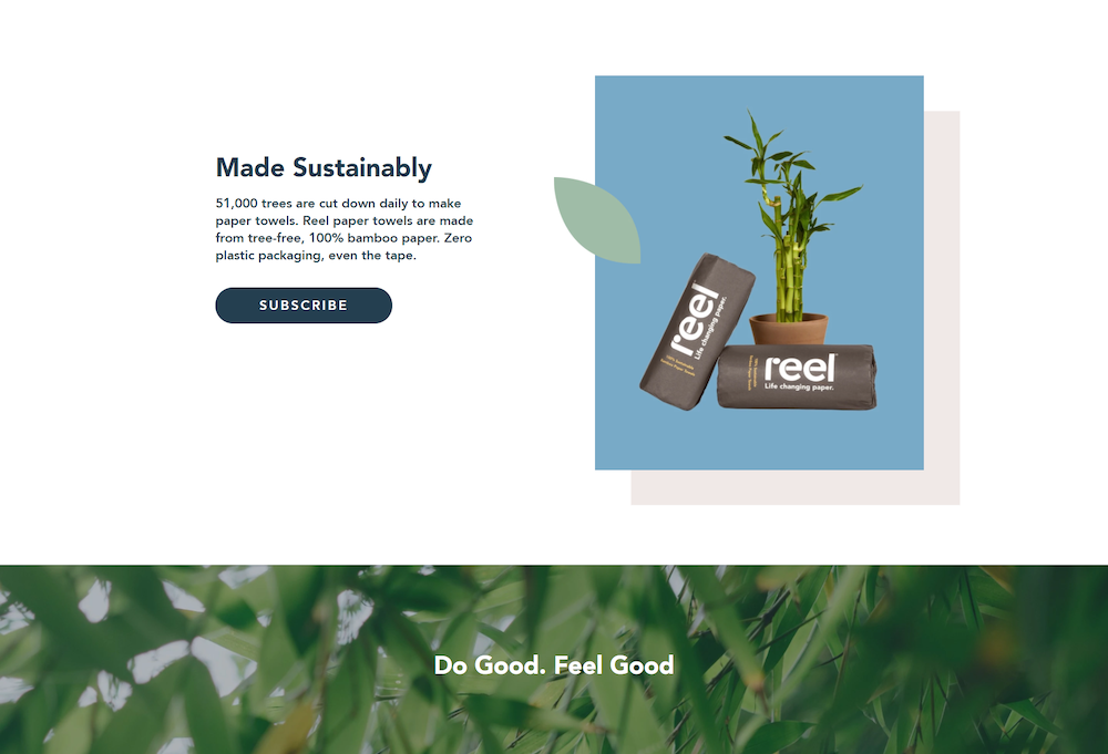
Reel is an excellent example of how a meaningful mission or idea can totally change how you sell utterly simple products such as paper towels.
Meaningful missions make an impactful message to promote your landing page on more organic channels such as Reddit communities, Twitter, and email lists.
Enjoying this article?
Subscribe to our newsletter to get more just like it, sent straight to your inbox every week.
10. Industrie Africa
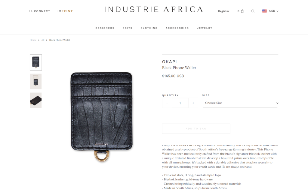
Industrie Africa’s niche covers everything related to African fashion and jewelry, which is already impressive.
Their product pages don’t look too out of the ordinary until you scroll down and read the designer’s story.
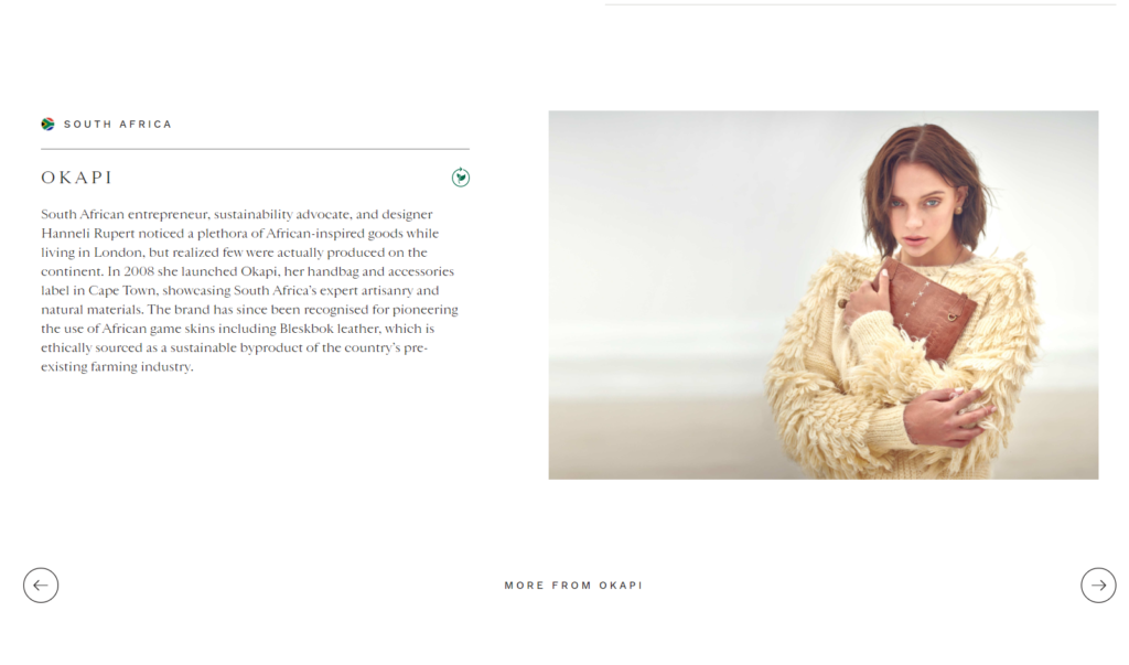
It turns out. All product pages include the story of their respective designer and let you browse through their creations and connect with their values.
This tactic is fascinating because—suddenly—you’re no longer shopping for African clothes but becoming part of a greater narrative. It adds meaningful value to a product.
Stories make sense on video ads, social content, and long-form emails. So you could promote this product page to attract traffic that’s already compelled by the storytelling.
11. Canopy
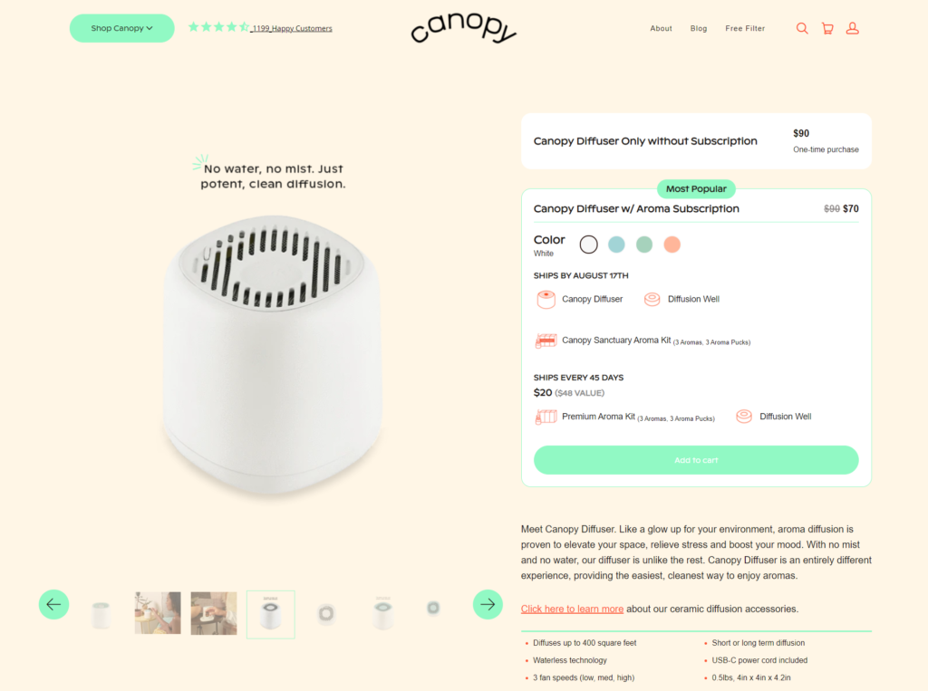
Canopy’s product landing page examples are pretty smart. They sell you a unique diffuser at a discount while upselling a subscription. The subscription would complement your diffuser with an aroma kit on your doorstep every 45 days.
You see, you can’t do anything with the diffuser without buying the aromas regularly. So the subscription makes perfect sense. You don’t have to remember to actively re-purchase the kit again and again, it will be sent automatically.
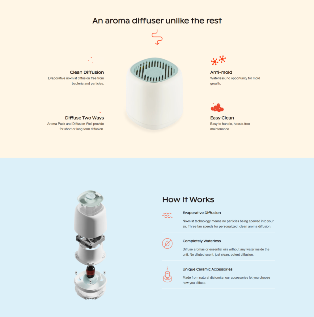
The landing page gets even better when showing how the product works without water, the minimal maintenance it requires, and the benefits of aroma diffusion in your home—making it seem like a no-brainer offer.
12. Jimmy Joy
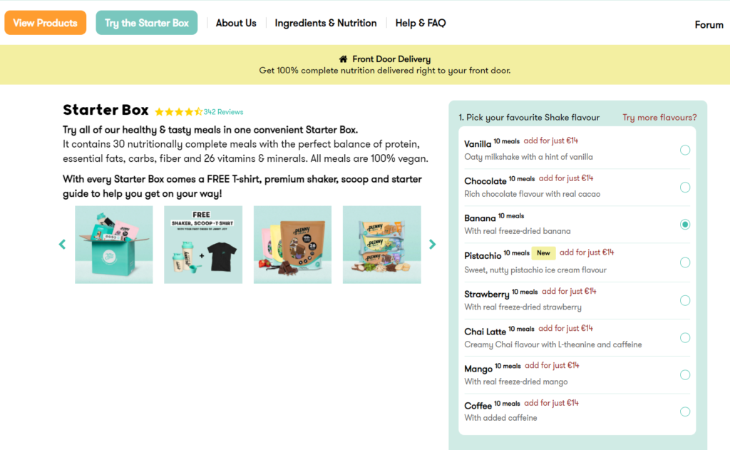
Jimmy Joy’s vegan boxes come with enough food for 30 healthy meals. And they let you personalize your kit to your likings in case you don’t like a specific food.
The hook on their landing page is that they’re not just selling vegan food. They craft a balanced vegan diet for you without having to worry about missing any essential nutrients.
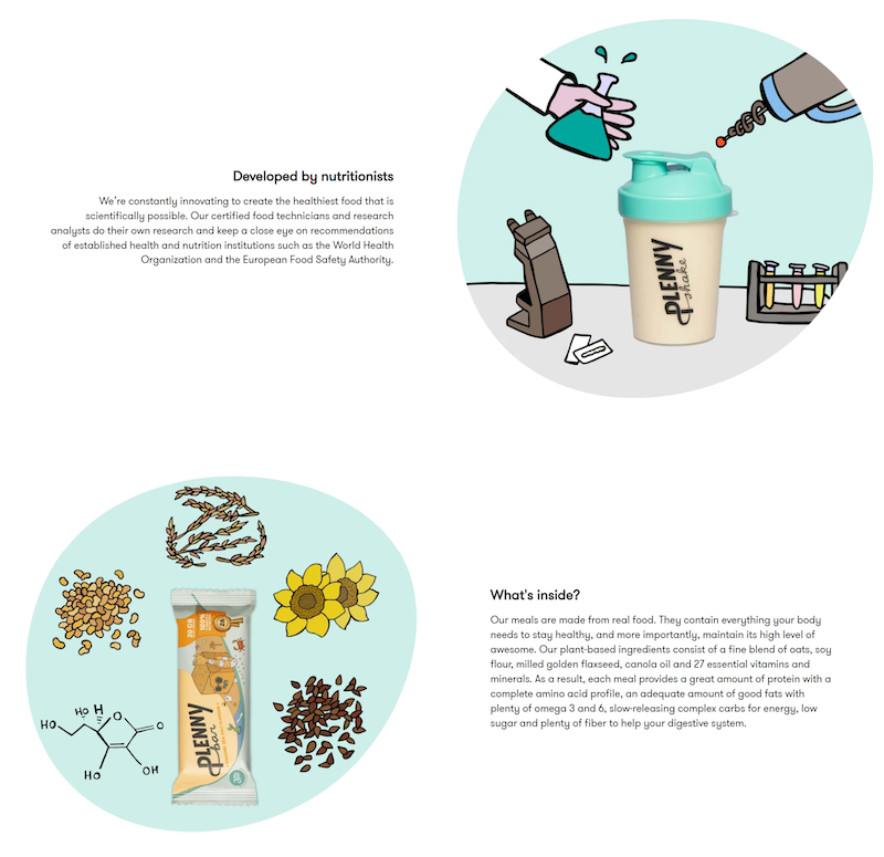
The product page does an excellent job addressing common concerns, explaining that professional nutritionists design their packages and that their products are made with 100% natural and environment-friendly food.
13. Allbirds
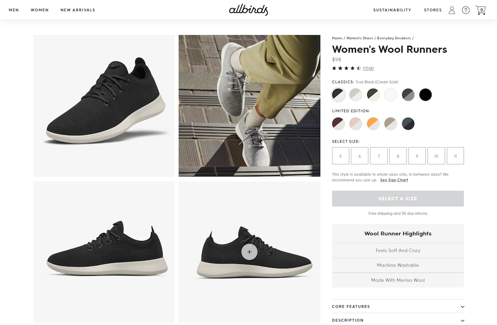
Allbirds sell attractive and durable shoes for all genders.
The first thing that stands out is that they don’t show the pictures in carousels like most product pages do. They instead show all images in cascade while including videos and GIFs to the mix.
However, that’s not their selling point. Allbird’s products all use recycled plastic to reduce the accumulation of waste on the planet, so that’s where the copy focuses.
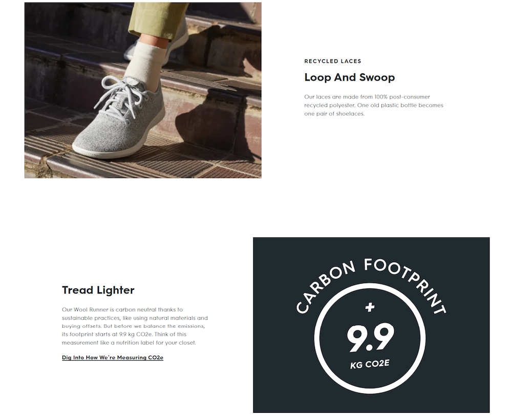
It expands on how they’re managing to reduce their carbon footprint thanks to their use of sustainable materials (you can even check how they measure their CO2 emissions if you’re skeptical).
Overall, the product page goal isn’t just to make you buy a product but to contribute to a more significant cause. Which makes it easier to promote organically on social media and relevant online communities.
14. Beardbrand
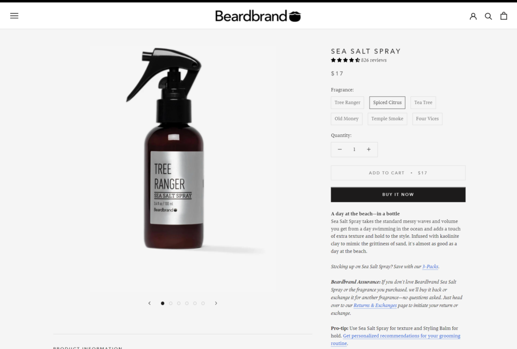
Beardbrand is men’s way-to-go shop to find high-quality grooming products for beards and hair.
The elegant design of their product page isn’t all they’ve got. Beardbrand is another excellent example of how to write a great product description by breaking it down with multiple headers (instead of a massive block of text).
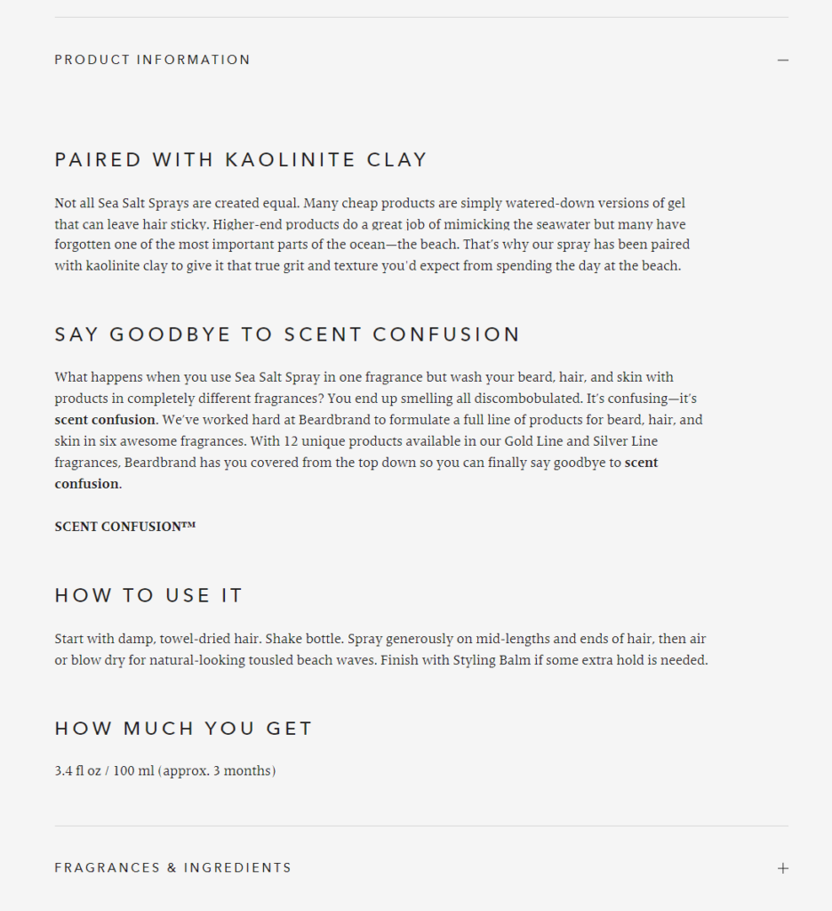
Their product pages only include information that’s highly relevant for the interested shopper, such as:
- Tips for using the product correctly.
- A money-back guarantee.
- A guide on how to use the product.
- A unique value proposition. In this example case, the “kaolinite clay” gives a unique texture to the hair.
- Introducing you to the concept of “scent confusion” and telling you how their product deals with it.
All of these elements make this landing page great for Facebook ad campaigns. Persuading a highly-targeted audience to try it and eliminate “scent confusion”.
Beardbrand shows that it’s not about including every single feature of your product but addressing only what your target customers care about.
15. Cocokind
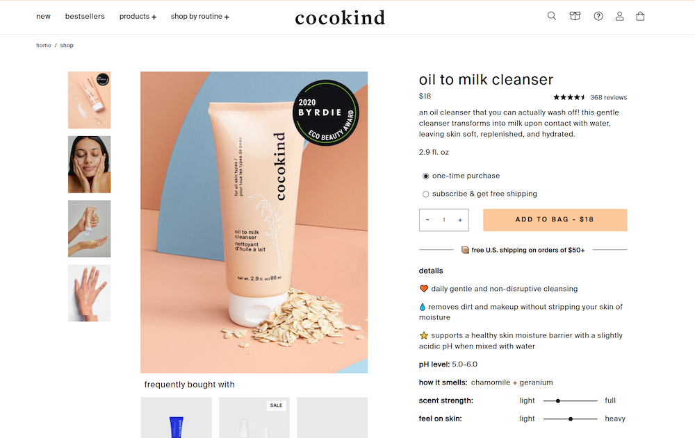
Cocokind product pages have a pretty appealing design that perfectly resembles their brand identity.
The subtle details in the product description—such as the simple graphics, one-sentence paragraphs, and emojis—make it very easy for the target customer to read through and have a decent understanding of the product.
However, when scrolling down from the top of the page, you’ll find a lot more information about the product, such as its formula, sustainability, and a thorough guide on how to use the oil cleanser—while including stuff like a suggested routine and how to recycle it.
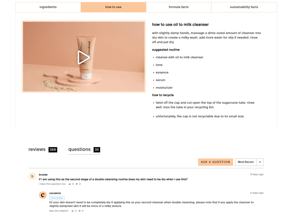
If you still have doubts after reading all that, you can even ask a question just like on Amazon, which is a pretty organic way to address customer’s concerns in case of allergies or mixing with other products.
5 essential principles that make a high-converting landing page
After looking at several examples, you might be getting tons of ideas to use on your own business.
But don’t rush. Make sure you’re following the essential principles that made the examples successful in the first place.
Here’s a summary of some of the principles that we see on high-performing product landing pages when working with our clients.
1. Focus on great customer experience
We believe good customer experience drives conversions.
Any small mistake can drive shoppers away from your site, but top-notch customer experience ensures that the customer’s first impression of your brand is positive.
When optimizing your product pages for higher conversions, start by finding out what’s confusing or misleading for your visitors and fix it as soon as possible—the sales will improve by themselves as a result of a clean experience.
Some tips to improve your customer experience:
- Site speed matters. Not only for SEO but for your conversion rates. Test your page loading speed on any speed testing tool and fix all the bottlenecks.
- Optimize your website navigation. Details like your site searches, drop-down menus, and product filters do impact your conversions.
- Make use of usability tests. Watch how visitors interact with your web page and optimize it for them.
- Add interactivity elements. Allowing your visitors to customize their experience will engage them with you and inevitably increase conversions.
We have a whole section in our blog dedicated to improving your user experience, so check it out if you want to start your optimization efforts on the right foot.
2. Write product page copy that works
On every landing page, the copy is what makes the sale.
Even when it comes to visual industries like fashion or make-up, the copy is what’s going to address all your prospect’s problems, desires, and goals.
This means: you should constantly be testing the copy.
However, compelling copy isn’t created from thin air. To craft copy that converts, you must follow a logical flow that makes your visitors believe what they have to believe in order to buy.
Here are some of the fundamental elements of high-converting product landing page copy:
- A unique selling proposition (USP). Tell your prospects why your product is unique and different from the competition. It will instantly make you stand out above the rest.
- A well-defined target customer. Determine who’s the kind of person that buys from you regularly. What do they do? What do they think? Your copy won’t be as effective if it doesn’t hit their particularities.
- Addresses your customer’s objections. Assemble all the objections that your potential customers might have and answer them in your copy. FAQs are great options as well.
- Storytelling. If your products have an interesting background, don’t hesitate to include their story in your product pages. Stories add emotional value that no other copywriting formula could achieve otherwise.
- A strong call-to-action (CTA). You can tweak your CTA button with something more impactful than “add to cart”—especially when you sell more sophisticated products.
Learn how to write a compelling product description so you can keep optimizing your product landing pages progressively.
3. Build up social proof and trust elements
Do you know product reviews and customer testimonials impact the purchase decision of nearly 95% of online shoppers?
You see, purchases aren’t a one-step process. In your customer’s head, a lot is going on when choosing the right products for their needs.
Social proof on your landing page gives customers a sense of security and builds their trust with your brand.
But social proof has many forms and shapes. Here are the most impactful trust-building elements to include in your product landing page:
- Statistics that demonstrate the capabilities of your product.
- Customer reviews and testimonials from satisfied clients.
- Awards you’ve won thanks to your products.
- Endorsements from influencers and industry experts.
- Money-back guarantees to remove any risk out of the equation.
- User-generated content from real-life customers showcasing your product on social media.
Building an upfront relationship with your prospects is a sure-fire way to improve your overall customer’s lifetime value—and increase your conversions.
4. Show compelling visuals and design
Words can only say so much. And this is where visuals play a crucial role.
Since shoppers can’t touch the products when browsing your website, your only option is to display high-quality images and videos.
It can be overwhelming to optimize your visuals for conversions. So here are some of the most predominant elements of a good page design:
- A branded design that resembles your brand’s values and core identity.
- High-quality product images showcasing its most essential features and qualities.
- Engaging illustrations and animations that put your product in motion.
- Video demonstrations of how your product works and how to use it.
- A clean UI that doesn’t overwhelm the prospect and makes purchasing as easy as possible.
In short: tell with visuals what you can’t say with words. A high-quality page will mean high-quality products for your prospects.
5. Make A/B testing a regular habit
More than our belief, it’s a fact: Having an optimization program is not a competitive advantage. It’s the norm.
If you’re not consistently improving your conversion rate with A/B testing, you’re going to be surpassed by your competition.
You see, real optimization isn’t a set-and-forget checklist you follow. It is a process that you must continuously feed like an ad campaign or your finances—it’s a core business function.
Hence, you must implement an A/B testing program as part of your key processes.
To improve constantly, you must make tests actionable. What did you learn about your customers that could be addressed in your copy? Which image should be displayed first? What templates should you try now? Always try to learn a new lesson on each iteration.
When you successfully implement this. You’ll see your business grow steadily.
Speak with the experts
We’ve seen through these product landing page examples that PDPs can take all forms and shapes, as long as they’re carefully centered on their ideal customer.
But nailing a landing page that resonates perfectly with your perfect client isn’t easy.
What you must do is simple: keep optimizing. And we can help you do just that.

About the Author
James Sowers
James Sowers is the former Director of The Good Ventures. He has more than a decade of experience helping software and ecommerce companies accelerate their growth and improve their customer experience.