
Your Guide to Increasing Conversions with Heatmaps, Scroll Maps, and Click Maps
Understanding and leveraging heatmaps, scroll maps, and click maps is a crucial step in improving your conversion rate. We’re covering all three in this article.

Conversions don’t just happen.
People look and read and click before buying.
They need to shop or look around and build trust in who you are and what you have to offer.
Low conversions, then, are a byproduct of all this other ‘stuff’ that leads up to the point of truth. To fix that problem, you often have to go back to the source and run through these same footsteps.
It’s not easy. But it’s not impossible, either. Especially because your site visitors are already telling you what they want.
They’re leaving a ‘digital paper trail’ if you know where to look.
The trick is using tools like heatmaps, scroll maps, and click maps to understand what they’re telling you. Here’s how to do it.
Heatmaps, scroll maps, and click maps help you understand what your visitors are telling you. Share on X
Heatmaps: How to Figure Out Where People are Paying Attention
People don’t read online. They scan.
This was confirmed by Nielsen years ago during an eye-tracking study, where they literally tracked the points on a page that consumed the most attention.
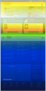
The infamous “F”-shaped pattern shows that people tend to start on the far left-hand side, slowly scanning to the right before dropping down back to the left to repeat. The end result is that some places on the page get the lion’s share of attention, while others are almost ignored completely.

The above example is a heatmap. It’s showing you where attention and focus are centered. And it can be used to help you understand why some design element is either helping or hurting conversions ultimately.
Here’s a simple example.
Visual cues are used online to help point out (literally, in some cases) something somebody should be looking at. An arrow is a perfect example. But even a person’s eye-line sight can do it, too.
For example, the use of the hero image as a visual cue helps increase focus on the important aspects of a landing page:

When the baby is facing forward, the reader is distracted by the cute baby’s face, rather than focusing on the title and important landing page text.
BUT, when the baby is turned sideways, pointing a visual cue towards the title and text, we see a different result:

The primary element on this landing page is explanatory text and the product logo next to the product. You want people to click it and purchase it.
So calling extra attention to it, with even a basic image change, can work wonders for focusing attention.
Sounds easy enough, right?
Except if you don’t do it right, your design can actually backfire; sabotaging the very goal that you’re trying to accomplish.
For example, in that first image, their design focus and image choice portrayed the wrong visual cues, leading users to become distracted and skim past the important information priming them to convert.
Without the use of heat maps in this example, the company would be losing out on invaluable CRO data.
This is a simplified example, but the point remains.
Now that you know how heatmaps work, where can you run one for your site?
Hotjar is one of the most accessible tools out there, Hotjar helps you see what visitors see (via heatmaps), record real visitor behavior on your site, and survey visitors based on what they do.
Harnessing the power of AI for quick and accurate data, VisualEyes is a powerful tool that simulates eye-tracking studies and preference tests. You receive in-depth insights in just a few seconds. If you’re interested in learning more, check out the video below all about interpreting Attention Maps from VisualEyes.
Now, let’s continue analyzing page consumption with the help of a scroll map.
Enjoying this article?
Subscribe to our newsletter, Good Question, to get insights like this sent straight to your inbox every week.
Scroll Maps: How to Uncover if People are Consuming Your Content
We just learned that cool blue is not a good thing with heatmaps.
And the same applies to scroll maps, which show how far down on a page someone is scrolling.
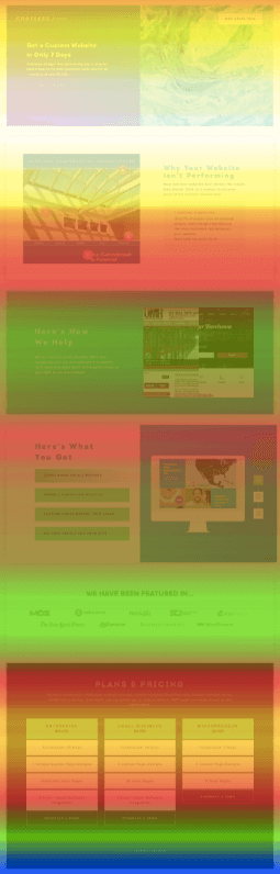
Let’s start with a bad example to show you how this works:
Whoa. That’s a whole lot of blue. This basic scroll map is telling us that nobody goes below the fold. Like, NOBODY.
And that could be a problem. Here’s why.
Back when Basecamp was still 37Signals, they ran a simple split test: long-form landing page vs. a short one.
Initially, the long-form page won out.

But then they iterated a few times and wound up with a short-form variation that beat out the long one.

So what gives?
Many times, the answer to the great ‘long vs. short’ debate goes back to visitor awareness. So each might be appropriate, depending on your audience.
Some call this traffic temperature. So if you’re targeting cold traffic with a PPC ad, those people might need a longer, in-depth page that’s persuasive. Whereas warm traffic from your email (who already knows all about you and what you have to offer) might just want a short, to-the-point page.
Page consumption (i.e. how far down a page someone is scrolling) can indicate if they’re receptive to what you’re offering. If someone’s not going below the fold, and you’ve got low conversions, it’s telling you that something’s not adding up on this page.
The offer needs to change. The messaging and value prop an overhaul. The design is distracting instead of motivating. Or maybe some combination of all three.
Especially if you are abiding by the ‘traffic temperature’ idea.
For example, here’s a scroll map for a landing page that was being sent cold traffic from ads. What do you notice?
Almost the entire page is hot. That’s a good sign! It means people care. They’re reading and engaging with what you’ve got.
The way you verify that is by next looking at where someone’s actually clicking (or interacting) with the page.
Knowing scroll depth can help you optimize your pages. It can tell you whether your visitors are really reading your articles or seeing everything you want them to see.
Adding this as a research method during website analysis could be the most important marketing decision you make all year.
If you’re ready to get started, we put together a step-by-step method for the tactical use of scroll maps.
Click Maps: How to Determine if People are Close to Converting
Customer surveys are helpful to a point.
But they often lack the kind of insight you get by actually watching what people are doing (instead of what they’re saying or reporting on after the fact).
Click Maps offer no room to hide.
They show where someone is clicking on your page, which reveals whether someone is truly interested and perfectly understands what they’re looking at.
For example, rotating carousel sliders tank most conversion studies that compare the number of leads generated from a page with a slider, to those without.
Why?
Primarily because less than 1% of visitors ever click on them.
But, how would you even know if you couldn’t test it with a click map?
Harrison Jones put together an in-depth analysis that looked at this ‘click percentage’ (or the number of people who saw a carousel slider and clicked on it) for Search Engine Land:

In other words, the data showed that no matter which purpose you thought that carousel slider served (whether that’s branding, thought leadership, or promoting your service), this design feature fails to do it’s job (i.e. get people to click) across the board.
This is just one example, of course. A notorious one that commonly sinks conversions will look like this on your website:

What’s missing? Clicks!
There should be something on that page. People should be clicking on those images in order to view each client’s work. But they’re not. So it should be of no surprise that web inquiries from these pages are equally dismal.
Now contrast and compare that to this page:

Fairly straightforward, right? Most of the action on this page is centered on your primary CTA.
That’s a good sign! It means the design is doing its job (of converting visitors).
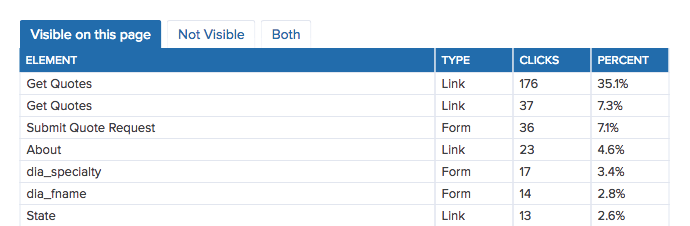
Another way to analyze this is by looking at the click distribution on a page. In an ideal world, the majority of people on a page are interacting with your CTAs (whether that’s a Buy Now button, Quantity field, etc.).
Click distribution breaks down how many visitors (as a percentage out of 100%) are clicking on those individual elements.
Yet another click map variation is looking at where someone’s mouse moves around on your page. Here’s a perfect example from HotJar:

This tool allows you to see how and where someone is moving their cursor. And you can analyze individual web sessions to segment out issues.
For example, what does the user behavior of a converter look like, compared to non-converters?
Was someone close to checking out, only to bail at the last second? Why?
Maybe they were an international customer who couldn’t use your default payment gateway. Baby clothes e-tailer, Spearmint LOVE, increased checkout conversions 44% just by adding PayPal as an alternative payment option.
Nowhere else would you get this kind of insight. Except by watching their actual behavior and interactions with your site.
So now you can see it — literally. And change it.
Heatmaps, Scroll Maps, And Click Maps In Action
So what does this all mean for a brand? How can heatmaps, scroll maps, and click maps drive meaningful business improvements?
Let’s use IDX as an example. This privacy protection service offers easy and robust protection from identity threats.
During an engagement with The Good, our teams worked together to gather important data on the IDX site to help inform smart website improvements. One of our key methods was to measure content effectiveness with heatmaps, scroll maps, and click maps.

Following the research and in-depth strategy sessions, we established some key test improvements for the IDX site to help them meet their goals. Guided by research partially informed by heatmaps, scroll maps, and click maps, IDX increased enrollment by +20% and saw immediate ROI for ad traffic.
Data-driven Websites Have The Best Design
Design should always be aesthetically beautiful.
But that’s just table stakes. Appearance, in this case, really is skin (or screen) deep.
The true hallmark of good design is how it works.
Whether or not it’s doing its job of transforming more strangers into loyal customers. It’s not always easy to tell, though. It’s tough to know whether or not that’s actually happening.
Heatmaps, scroll maps, and click maps can help. Using them together can tell you exactly what people are doing on your website. So you can see – plain as day – if your landing page is pulling its own weight (or not).
They’ll tell you where people are looking. Whether they’re reading or not. And how interested they potentially are in what you have to offer.
All of which have to happen – need to happen – prior to becoming a new customer.If you’re ready to start informing business decisions with important research but aren’t sure how to get going, check out our Conversion Growth Assessment™.
Interested in learning the laws of optimization?
Opting In To Optimization is a set of principles that will help digital leaders capitalize on unprecedented market demand and build sustainable, thriving businesses.
About the Author
Jon MacDonald
Jon MacDonald is founder and President of The Good, a digital experience optimization firm that has achieved results for some of the largest companies including Adobe, Nike, Xerox, Verizon, Intel and more. Jon regularly contributes to publications like Entrepreneur and Inc.