
How to Personalize User Onboarding Without Introducing Friction
Personalizing onboarding sounds simple: ask a few questions, then use the answers to shape what comes next. Across 30 SaaS products, only a handful actually pull it off. Here's what separates them from the rest.

The top 10% of SaaS products activate day-one signups at roughly four times the rate of the median product. Something in that first session is doing dramatically more work for some companies than others. The onboarding survey, the handful of questions almost every product asks before showing a new user anything real, is one of the first places that gap opens up.
Ask two or three questions, then use the answers to shape everything that follows. That’s the ideal outcome for onboarding surveys in SaaS. But in practice, most of them don’t deliver on it.
In reviewing the first 30 days of the SaaS trial experience for 30 companies, we saw that question count and quality barely predict whether personalization actually lands. Only roughly a quarter of the products we reviewed show survey answers visibly changing what the user sees next.
The other three quarters ask comparable, sometimes longer, questions and deliver the same generic dashboard regardless of the answer. Counterintuitively, the products with the shortest survey in the set produced the clearest payoff, and one of the longest produced none at all.
Below are the highlights with examples, including what actually separates onboarding personalization that works from a form that wastes a user’s time.
1. The shortest survey can win
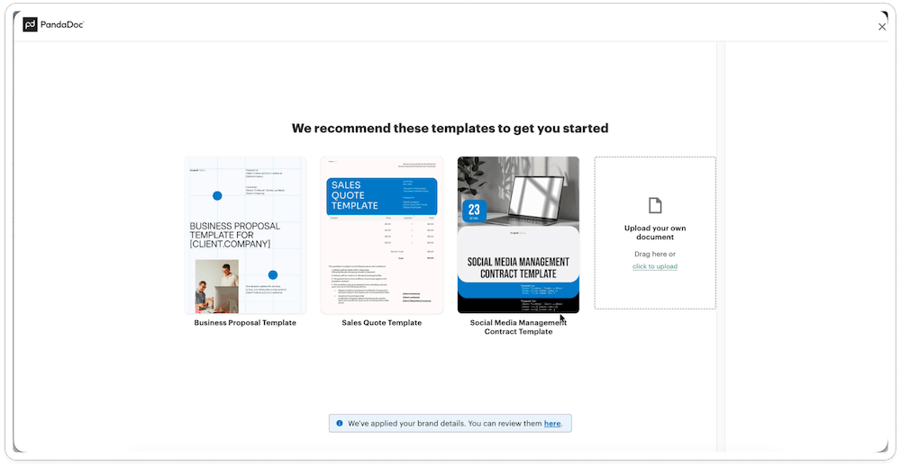
PandaDoc asks two questions during onboarding and produces a strong personalization payoff compared to other products in the category.
The first question alone does real work: it routes people describing “occasional” use toward a free plan and people describing a “repeatable process” toward a trial, an honest bit of segmentation that sets fair expectations before the trial clock even starts.
From there, the personalization is immediate and visible. Branded loading screens tell users their workspace is being customized. Template recommendations match the stated use case. Logo and brand colors are pulled automatically from the company’s domain.
Compare that to ClickUp, which asks around nine questions across modal after modal (use case, team size, how the user heard about them, phone number, tools used), or Scribe, which asks six or more questions before the account even exists. Neither produces a confirmed downstream payoff. More questions don’t buy more personalization. They just buy more friction.
That doesn’t mean every one of those questions is wasted on the business side. The problem comes when a product frames that question as “let’s personalize your experience” and then nothing about the experience actually changes.
The takeaway: cut the fat from your onboarding survey wherever you can. For each question, name what it’s actually for, a plan recommendation, a template, a default view, or a sales and analytics need on your side. Then be sure you aren’t misleading by calling a lead-routing question personalization.
2. Show the payoff within seconds, not sessions
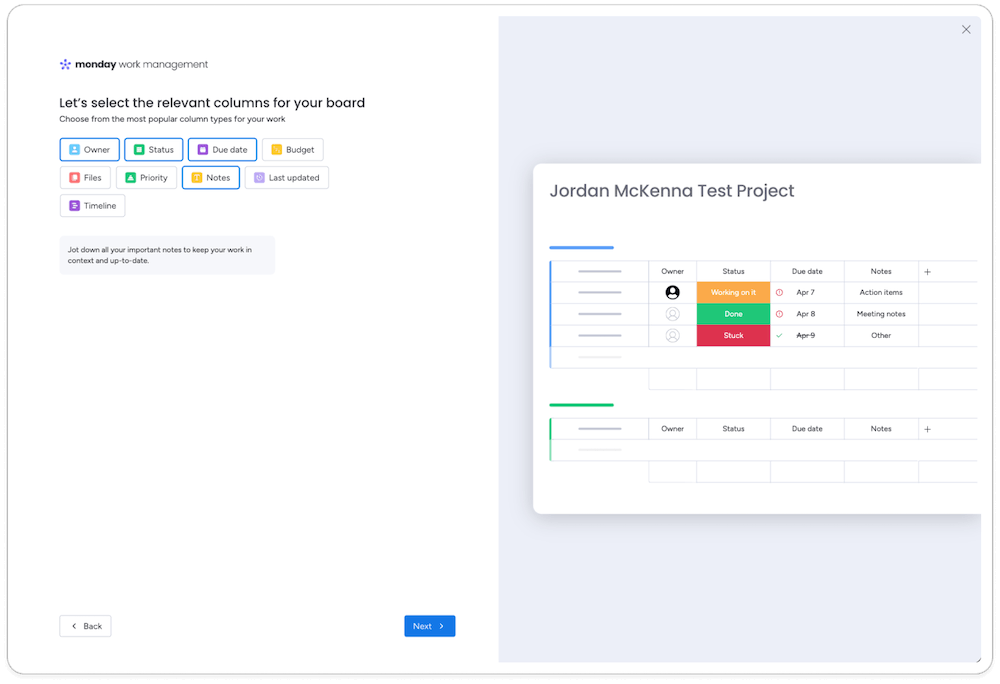
Monday runs a clear live-preview mechanic. As users answer questions about columns, dashboard widgets, and view layout, the product renders a live preview of their own named project in real time. Describe yourself as running an agency juggling multiple clients, and the dashboard visibly adapts to that exact scenario before the survey is even finished.
Webflow does something similar with its post-survey dashboard: agency-flavored checklist items and workspace promos that match what a user just described. Clay’s final survey question routes directly into a working, populated table built from the user’s own answers.
In each case, the user doesn’t have to take it on faith that their answers mattered. They see it happen.
The takeaway: a visible payoff gives users a reason to keep going. When people can see their answer change something in real time, they’re more inclined to finish the next step, and the one after that, instead of dropping off partway through the funnel.
3. Infer before you ask
PandaDoc’s auto-applied branding points at a broader principle: some of the best personalization doesn’t require a question at all. Company domain, email address, and existing integrations already carry information most products ask for anyway. If you can infer it, don’t make the user type it.
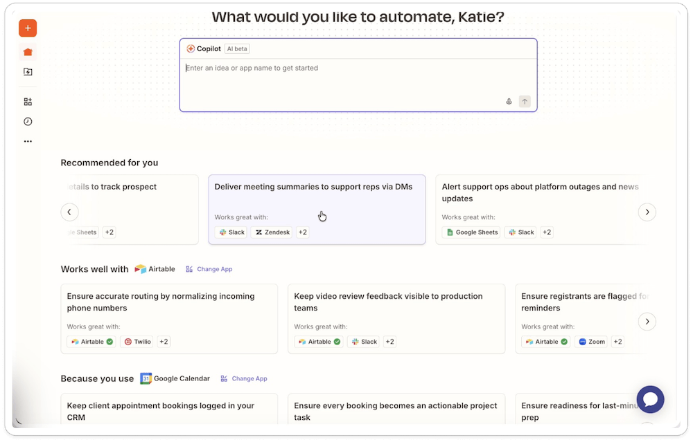
Zapier leans into this from a different angle. Instead of a quiz, its Copilot home greets returning users by name and recommends templates based on apps it has already detected in their account (“works well with Airtable,” “because you use Google Calendar”). No survey friction at all, just inference from real usage.
The takeaway: before your team writes a new onboarding question, check whether the answer already exists in a domain, an email address, a connected account, or existing usage data. Every field you can infer is one less thing standing between signup and value, and one less reason a first automation, project, or workflow never gets finished.
4. Separate attribution questions from personalization
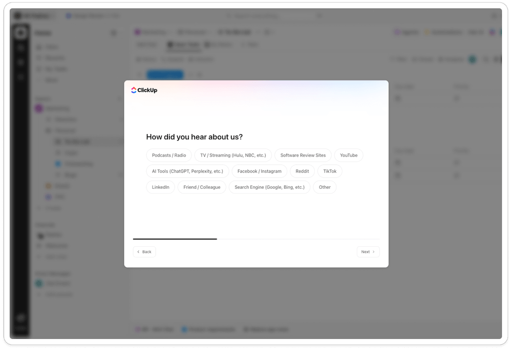
“How did you hear about us?” shows up in first-run flows across at least a third of the products we reviewed, including Beehiiv, ClickUp, Monday, Riverside, Tango, Clay, Scribe, and Gamma. It’s a legitimate marketing question. It is not a personalization question, and it rarely does the user any favors to answer it before they’ve seen the product do anything.
If your team needs attribution data, collect it somewhere that doesn’t cost the user a step between signup and value: a post-signup email, an optional field, an analytics-side lookup. Bundling it into the “personalize your experience” flow borrows the language of tailoring for a question that serves the marketing team, not the new user.
The takeaway: audit your onboarding survey and pull out any question that exists for marketing attribution, sales qualification, or internal reporting. Move it to an email, an optional profile field, or an analytics lookup, and keep the personalization flow limited to questions that change what the user sees next.
5. Never trap someone in a survey with no visible end
Descript and Gamma both present a mandatory personalization modal immediately after signup, with no way to exit and no indication of how many questions are coming. Descript compounds it by following the modal with a four-tier pricing chooser before the user has touched the product at all.
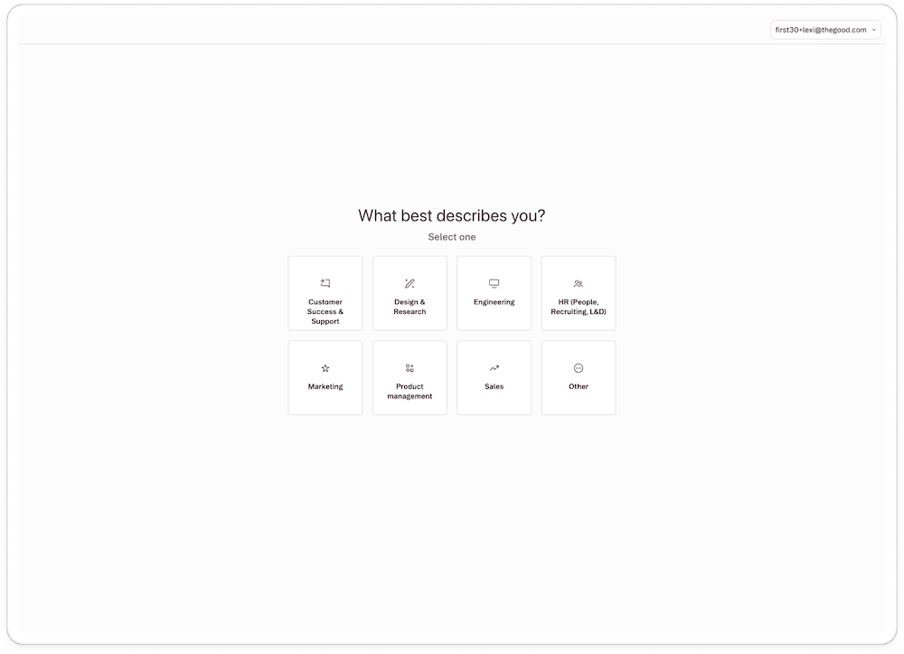
A progress indicator (“question 2 of 3”) and a visible way to skip or exit cost almost nothing to build, and they remove most of the frustration a locked, open-ended flow creates. If a personalization survey is worth asking, it’s worth telling the user how long it will take.
The takeaway: add a visible progress indicator and a skip or exit option to any mandatory onboarding step, and hold pricing until after the user has touched the product. Both are cheap fixes for a problem that otherwise costs real signups.
6. Consider skipping the formal quiz altogether
Notion never runs a traditional multi-question survey. Instead, an AI agent builds the user’s own project hub live, in front of them, as a first task, no quiz required.
Tango tells a similar story from an unexpected angle. Its formal four-question survey performs no better than the other decorative ones in this list, complete with its own “how did you hear about us” attribution question.
But the standout personalization moment in Tango’s onboarding comes from somewhere else entirely: an interactive “playground” that captures the user’s actions and automatically generates their first real guide, complete with a small celebratory animation. The lesson isn’t that surveys are inherently bad. It’s that a well-designed first action can personalize more convincingly than a well-designed question.
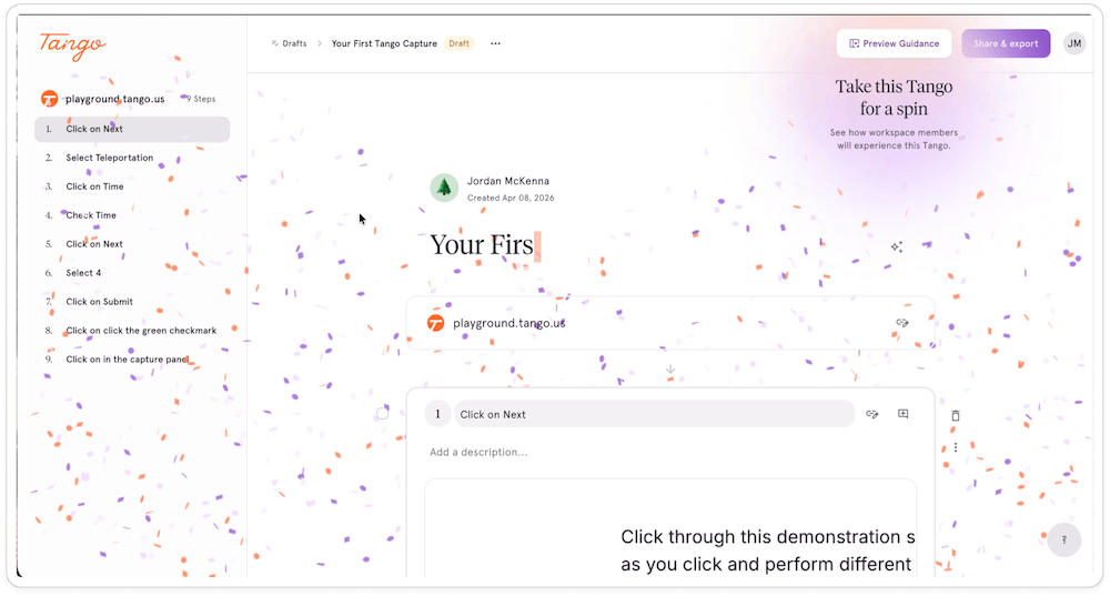
The takeaway: before adding another survey screen, consider prototyping a first action instead, one that uses the user’s own input to build something real. If it can deliver the same personalization without asking a question, build that instead of the quiz.
7. Don’t make a returning user repeat the interrogation
Clay’s survey has five questions that feed directly into a working, populated table. But when a user accepts a trial extension partway through, Clay serves the exact same five-question survey again in full.
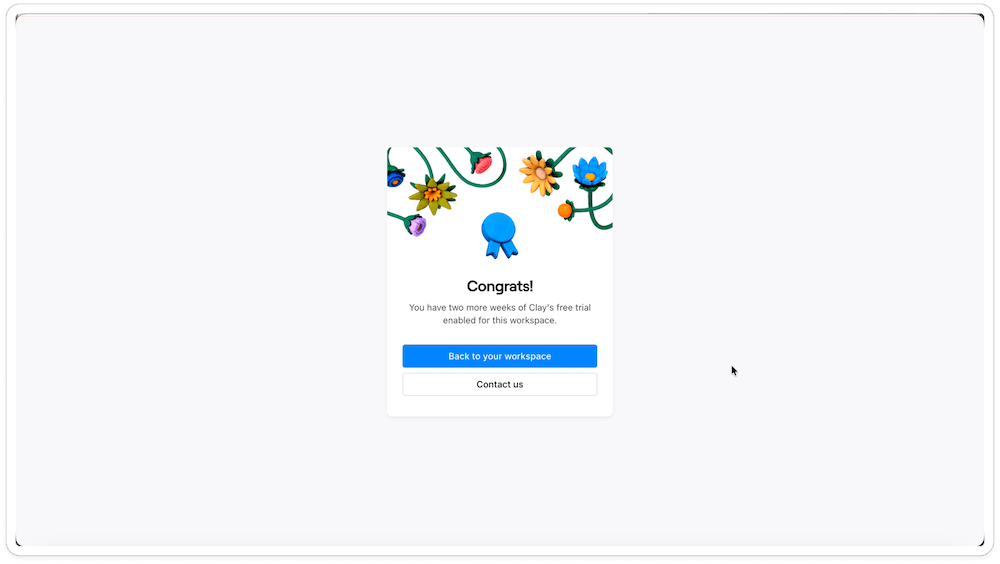
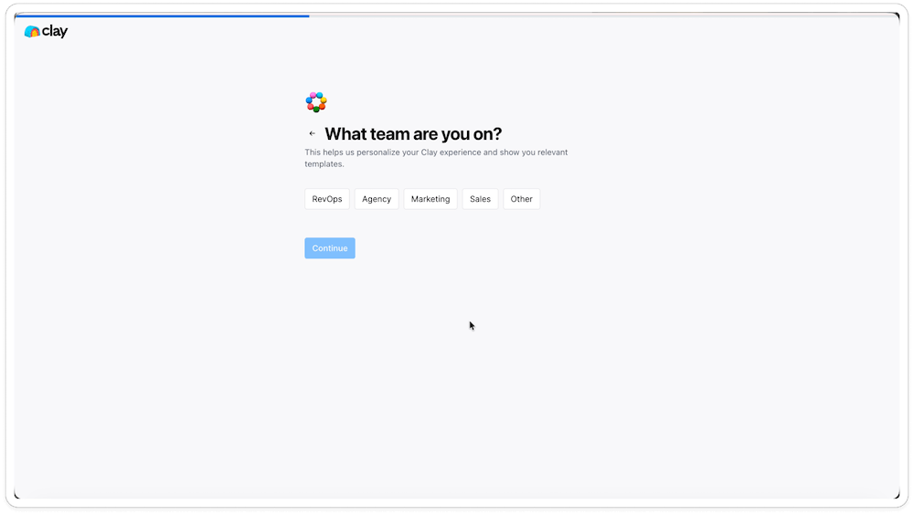
For someone who already has tables built and a workspace in use, repeating the questionnaire doesn’t feel like personalization. It feels like the system has forgotten who they are, which undercuts the very story the first survey worked hard to tell.
If you’re going to invest in getting personalization right the first time, invest just as much in remembering it. A returning user should never be asked to re-answer a question your product already knows.
The takeaway: store survey answers against the account, not just the session, and check every re-entry point (trial extensions, plan changes, reactivations) for a survey that fires again by default. Fix the ones that do before you invest in a better first-run experience.
8. Sequence value before price, always
A handful of products let a sales or pricing moment interrupt personalization before the user has reached any real value.
Riverside inserts a Business-tier “book a demo” pitch in the middle of its five-question survey. Descript’s mandatory modal feeds straight into a four-tier pricing page before any product use. Toggl’s otherwise minimal-feeling signup includes a direct sales-qualification question (“Would you like us to contact you for a product demo?”) ahead of the product itself.
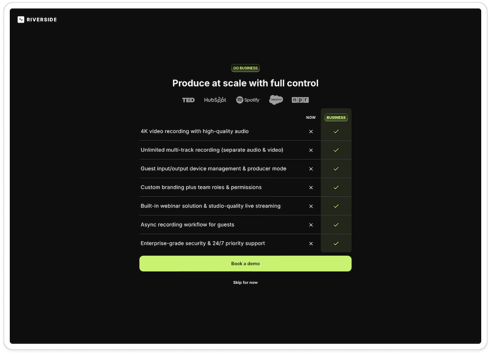
None of these are unreasonable business questions to ask eventually. The issue is sequencing. A user who hasn’t yet seen what a product does for them isn’t in a position to evaluate a plan, a demo, or a sales conversation, and asking too early reads as a company more interested in the deal than in whether the product fits.
The takeaway: map every sales, pricing, or demo prompt in your onboarding flow against the moment a user first reaches real product value. Anything that lands before that moment should move after it.
Personalize the moment, not just the form
The pattern that holds across all the SaaS experiences we’ve reviewed or optimized is that a personalized user onboarding isn’t just about how many questions you ask. It’s about whether the answer visibly, immediately changes what the user sees, builds, or is shown next. Two questions with a real payoff beat nine questions with none.
If you’re not sure whether your own onboarding survey is encouraging user engagement or preventing it, that’s exactly the kind of question worth answering with research rather than assumption.
The Good works with SaaS teams to uncover where users get stuck in their first sessions, roadmap the changes that actually front-load value, and test those changes with real trial users before betting a launch on them.
See how we help SaaS companies improve onboarding to learn what that could look like for your product.
About the Author
Maggie Paveza
Maggie Paveza is a Strategist at The Good. She has years of experience in UX research and Human-Computer Interaction, and acts as an expert on the team in the area of user research.