
Optimizing Paywall Strategy for Digital Media (and How We Boosted The Economist’s Subscriptions by 5%)
Convincing users to pay for content can be challenging. We share tips and best-in-class examples to help you optimize your paywall strategy.

In the lifecycle of a customer journey, paywalls are just one component of a healthy and holistic acquisition strategy.
And while we know that digital publishers likely have their hands full with optimizing everything—from landing pages to headlines all the way through to cancellation journeys—paywalls are still one of the most important touch points in a customer lifecycle and a key way that online publications monetize their content.
But in the age of unlimited free content, convincing users to pay for access can be challenging. In this article:
- We define paywall delivery methods
- We show you some best-in-class examples
- We then outline our formula to optimize your paywall design
- We also show you how we created big gains in The Economist’s paywall strategy
What is a Paywall?
A paywall is a system used by online publishers to monetize their digital content and generate revenue. They restrict access to content, such as articles or videos, unless the user pays a fee or subscribes to a service.
In other words, an online paywall is a barrier that prevents users from accessing content until they have paid for it or completed some other action, such as registering an account or signing up for a free trial.
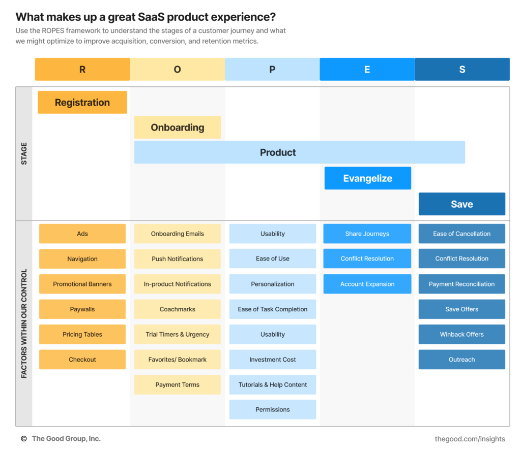
How Paywall Strategy Fits Into a Great SaaS Product Experience
There are plenty of elements within our control when it comes to optimizing a SaaS product experience. As mentioned above, paywalls are just one component of your strategy.
Below you can see how paywalls fit in the ‘Registration’ phase of the user experience and get a better understanding of all the elements we could optimize to improve acquisition, conversion, and retention metrics in digital media.
Registration Walls vs Hard Paywalls (With Examples)
Now, let’s get into the specifics. Paywalls can be implemented in a variety of ways, but there are two main types of paywalls:
Hard Paywalls ask users to subscribe to access content and prevent the user from reading any further until they have subscribed. They may include incentives like free trials, discounts, or special promotions.
Registration Walls prevent the user from reading any further until they have registered. They ask users to give a few simple details like an email address in order to continue reading. Offers vary, but registration walls typically offer a few free articles per month or week to users who register.
Note: Registration walls are sometimes referred to as “soft paywalls” because the nature of the barrier isn’t quite as firm. We recognize that “paywall” is a bit of a misnomer, but it’s easier to say, so it stuck. While we like saving a few syllables here and there, for the sake of clarity, we’ll keep referring to these as Registration Walls throughout this article.
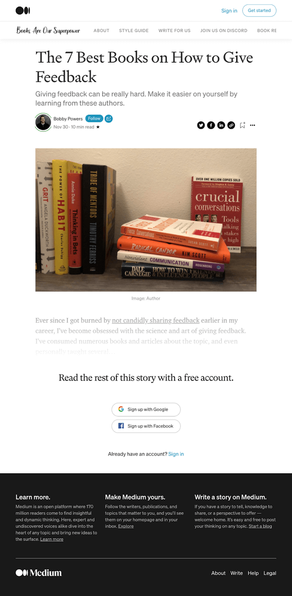
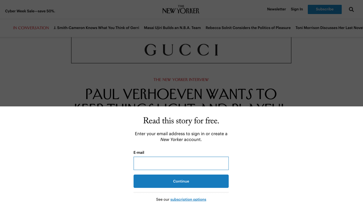
Registration Wall Examples
Registration walls keep it simple. They simply ask the user to exchange minimal information (sometimes only an email address) for article access. They occasionally grant other privileges like commenting and bookmarking, but their main offer tends to be the article itself, not the deeper features like bookmarking.
Let’s look at a few examples of Registration Walls.
Medium keeps its registration wall as simple as it gets: one line of text and two single sign-on (SSO) options. They don’t spend a lot of time convincing users here because they aren’t asking for a lot of effort from users to register.
The New Yorker doesn’t bother with SSO. The simple but directional headline clearly relays the benefit to the reader and asks for minimal effort to continue—a single email field.
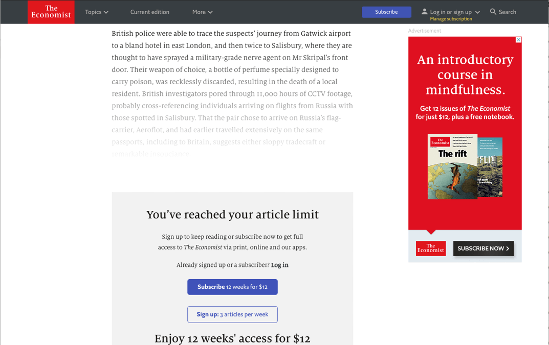
Hard Paywall Examples
Hard paywalls are true paywalls. The ones that actually generate revenue. Users can’t close out of or circumvent them by submitting only their email address. A hard paywall asks users to subscribe. It typically offers details like pricing, benefits, incentives, and a call to action.
Hard paywalls are typically seen on article pages where user intent is highest to continue. In some cases, a dynamic paywall is used to gate some types of content but not others.
What’s important about a hard paywall is that it blocks the remainder of the page. A traditional popup that can be dismissed won’t do. A hard paywall, by nature, must obscure the bulk of an article. Let’s look at a few ways that can be done:
An inline paywall is embedded in the page and moves as the user scrolls. In this example from The Economist, they used an inline paywall to obscure the remainder of the article after the first paragraph.
A sticky banner at the bottom of the screen is another common paywall format. Here the New York Times includes key subscription details in their sticky banner.
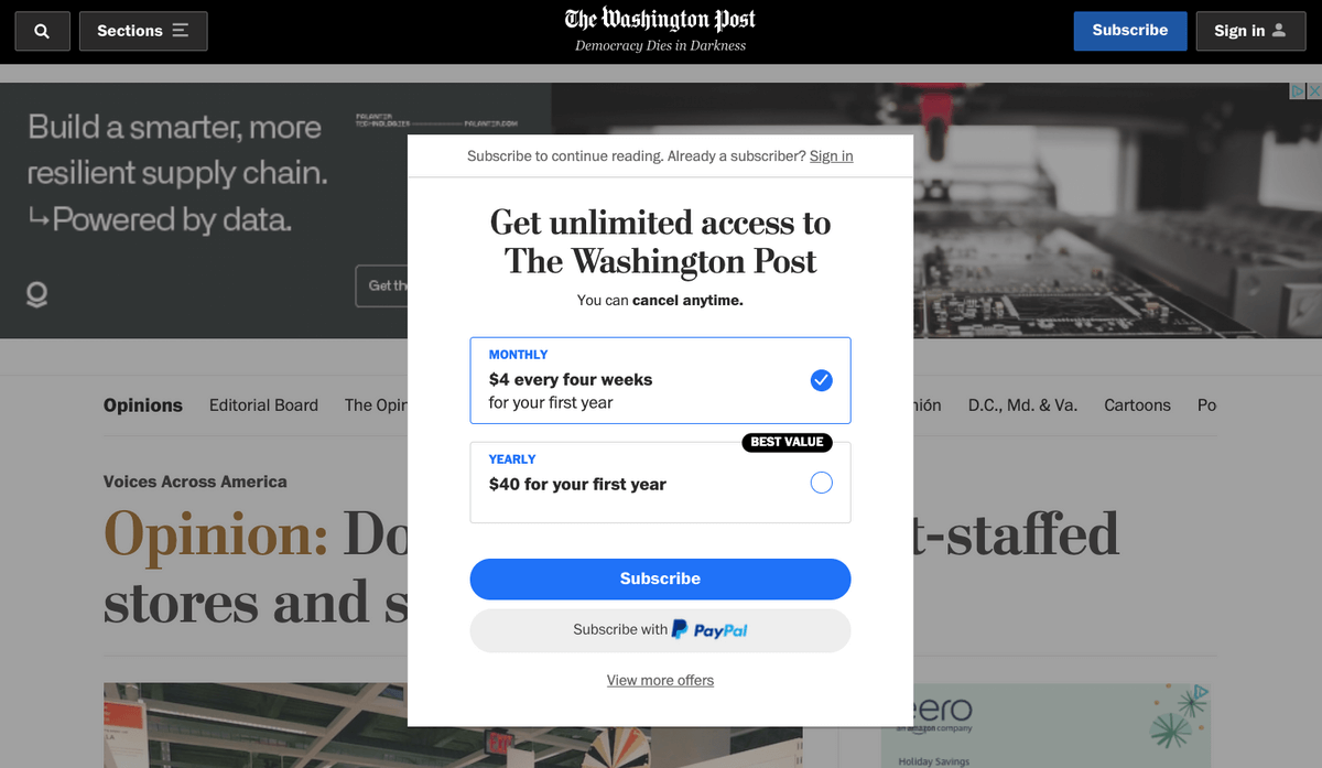
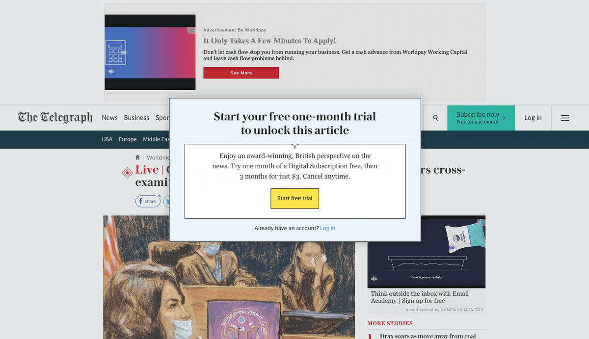
An overlay, as seen in the Washington Post, obscures article content with a lightbox or popup. Note that this one can’t be closed in any way but by subscribing.
Solving the Challenge of Negative Sentiment
While paywalls are often a publisher’s primary mechanism for acquiring subscribers, they can also be a source of frustration for users who are accustomed to free online content. This dance between maximizing conversion volume and minimizing damage to reader sentiment can feel tedious. But the SOLID framework is designed to help you turn cold readers into subscribers.
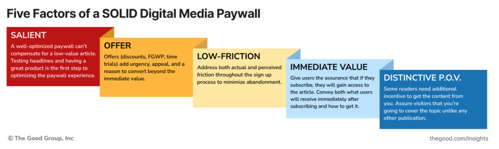
The best paywalls have five key elements, for which we use the mnemonic SOLID:
S — Salient
Paywalls typically get the most visibility and engagement where user intent is highest: on articles and news content pages (as opposed to the home page or category pages). The article is the valuable content the user came to the site for, so this is the first piece of the conversion puzzle; the content has to be so valuable, so important, and so relevant that users are willing to push through barriers to get it.
All this is to say, a well-optimized paywall can’t compensate for a low-value article. The article needs to be worth reading. Users need a compelling reason to push past the barrier you’re presenting, so testing headlines and having a great product is the first step to optimizing the paywall experience. In one word, make sure your content is salient.
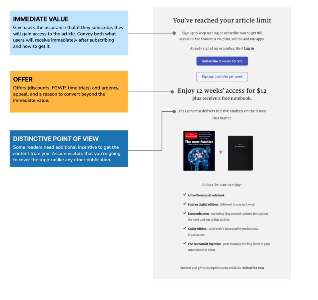
O — Offer
Offers are typically given in the form of discounts (as with the 4 weeks for $1 example from the New York Times above), but they can be anything from a free tote bag to entries into a raffle.
Offers add urgency, appeal, and a reason to convert beyond the immediate value. They can get users who might normally abandon at the first sight of a paywall to consider subscribing.
L — Low Friction
Most web designers know that the more fields, steps, and instructions you add to a form, the more you can expect users to abandon. But are you sure you know what “easy” really means to your users?
Minimizing form fields is sure to make your form easier to use, but it doesn’t address how effortful a user perceives the signup process to be.
💡 Perceived effort is the user’s impression of how complicated the process will be, and a high perceived effort level can cause users to abandon when they feel they don’t want to invest the time or effort required. As a result, we not only need to concern ourselves with the signup process being easy, but we also want the experience to appear easy.
To minimize perceived effort and create a low friction experience, you may want to abate concerns by communicating that the whole process will be 1) simple and 2) quick:
- Use phrases like “sign up in minutes” to reassure users that you respect their time and will get them back to the article quickly
- Show a minimal number of steps and fields from the initial screen, so users can get quick, visual confirmation that the signup process will go quickly
- If you offer a free trial, you may want to let users know that you’ll remind them before their trial ends so they know they won’t forget to cancel (if that’s their intent)
- Use phrases like “cancel any time” and so users know they can back out if they aren’t happy
I — Immediate Value
While we’re giving you the kindling to level-up your paywall game, we would be remiss if we didn’t mention one foundational element to a paywall: make sure you convey the immediate value users will receive by subscribing.
It’s great to have enticing offers, a low-friction form, and the best articles, but users are here for one reason: they want to learn something. Be sure to give them not just an offer, but the assurance that if they subscribe, they will gain access to the article.
Great paywalls will always contain some reference (either in the main header or in the subheading) to:
- What users will receive immediately after subscribing and
- How to get it
Consider these examples:
- Subscribe to continue reading (Washington Post)
- Read the rest of this story with a free account (Medium)
- Sign up to keep reading (The Economist)
💡 If you’re unfamiliar, the Jobs to be Done framework is a great foundation for understanding how to talk to your visitors about what matters to them, rather than what matters to your company.
D — Distinctive Point of View
Especially if you’re dealing with trending headlines, you may worry that you’re losing potential subscribers due to the prevalence of competing articles on the subject. After all, a determined user could probably search for and find another article on the same subject that isn’t locked behind a paywall. It only takes a few seconds.
For those users, they may need some additional incentive to get the content from you. Assure visitors that you’re going to cover the topic, unlike any other publication. That way, they aren’t just paying for the toplines; they’re getting additional context and a distinctive point of view that makes headlines more meaningful.
Here are some examples of language that hint at the publication’s unique perspective:
- “Fiercely independent journalism.” - The Atlantic
- “Award-winning, British perspective.” - The Telegraph
- “Incisive analysis on issues that matter.” - The Economist
Enjoying this article?
Subscribe to our newsletter, Good Question, to get insights like this sent straight to your inbox every week.
Paywall content hierarchy example
Here’s an example of a paywall offer that includes key elements. This is The Economist’s paywall before working with The Good. (We’ll show you our improvements in just a minute.)
How to Optimize an Online Media Paywall Experience
Now that you understand how a paywall works and how they are structured, you are probably wondering how to optimize your paywall strategy.
We can apply a strategic, optimization-focused approach to paywalls just like any other element of your site. Define goals, craft hypotheses, and run experiments. Let’s walk through the process, using our work with The Economist as a case study in the process.
Step 1: Define goals & constraints
Before starting any website optimization initiative, it's important to set your goals and acknowledge your constraints. This will help you determine whether your changes push the needle in the right direction.
In the case of our work with The Economist, their goal was to improve their in-line paywall conversion rate by 3%.
The Economist also had two constraints that limited our testing. First, we couldn’t change the mechanism. We couldn’t switch to an overlay or sticky banner because they already had other elements in those places. We also couldn’t adjust the timing of the offer.
Second, we had to keep advertising revenues intact. Since The Economist earns revenue through ads, which require page views and dwell time, we couldn’t make any changes that increased the bounce rate or prevented users from exploring more pages (and seeing ads).
Step 2: Conduct the research & create a problem statement
Before designing tests, the next step is the research phase. At The Good, we make use of a number of data collection and analysis tools. We recommend having at least a few of these generative research methods in your tool kit:
- Data Analysis
- Heatmap Analysis
- Heuristic Analysis
- Moderated Usability Testing
- Over-the-shoulder observation
- Customer Service Interviews
- Competitive Analysis
Step 3: Define a problem statement
After exploring your data, the next step is to define the problem using a problem statement. A problem statement summarizes the problem we’re trying to solve. It usually takes one of these two forms:
- Users [are doing x], indicating [problem].
- The paywall [does what], causing [problem].
In the case of The Economist, we saw a clear pattern of user behavior that we turned into three problem statements. They are similar but slightly different.
- Users are not scrolling far enough on the page to see the value proposition, offer, or additional benefits, indicating the paywall is too tall.
- Users fail to scroll much past “You’ve reached your article limit,” indicating they may not know how to proceed.
- The paywall text may fade too early, causing confusion and abandonment before users can see calls to action.
Step 4: Craft a hypothesis
The problem statement only describes what’s happening now. To guide experimentation, we need a hypothesis. A hypothesis is a testable, tentative explanation or prediction about a phenomenon, based on what we already know. We came up with two:
- Shortened vertical height and directive messaging on the paywall will increase conversions to subscriptions.
- Updates to the paywall including a shorter text fade, solution-oriented header, and layout changes will increase starts and decrease bounce rate.
Step 5: Design your experiment(s)
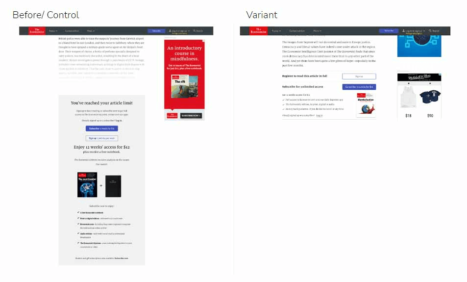
Once you have your hypothesis, the final step is to design experiments that meet the criteria in your hypothesis. One of the benefits of running tests on a major publication is that there is plenty of traffic to test multiple variations of the paywall. In the case of The Economist, we tested five variants.
Here is the desktop variant that performed the best:
And here’s the same variant on mobile:
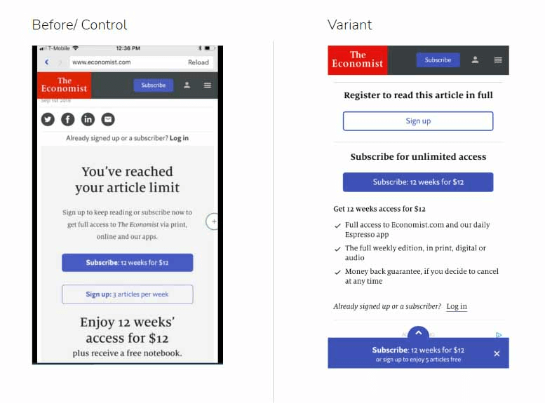
Why was this variant more effective than the original paywall?
- It’s significantly shorter, so users are more likely to see it as they scroll.
- It’s more action-oriented. Instead of “You’ve reached your article limit,” it tells the user exactly what to do to bypass the limitation.
- It has the additional benefit of “unlimited access.”
- The secondary call to action increased registrations. More registrations lead to more subscription conversions down the road.
The Results of Optimizing the Paywall Experience
The results of our work with The Economist were significant. We achieved a 5% increase in subscription starts and a decrease in bounce rate with a neutral impact on advertising revenue.
Basically, we gave The Economist everything they wanted and more.
“Through (working with The Good), we were able to increase conversions to paid subscriptions by 5% without compromising our ad revenue, which was a significant return on investment and a huge win for our organization.”
David Humber, Marketing Director of The Economist
You can read more about the project in our case study of The Economist.
We saw similar results when we worked on The Telegraph’s paywall model, including a 30% reduction in same-day subscription cancellations, improved subscriber quality and acquisition rates, and increased paywall conversions. Read our case study of The Telegraph.
You can see similar results on your paywall strategy with the help of our Digital Experience Optimization Program™. This end-to-end review of your buyer journey helps you uncover the best opportunities to improve your sales performance and grow your revenue.
Our program starts with an audit that goes beyond surface-level metrics to provide the most thorough review of your website possible and prepare a conversion rate improvement plan that is tailored to your business and paywall strategy.
We bring decades of collective optimization experience working with globally-recognized brands. Let our team put together a detailed report that outlines your strengths and opportunities to boost conversions and sales.
About the Author
Natalie Thomas
Natalie Thomas is the Director of Digital Experience & UX Strategy at The Good. She works alongside ecommerce and product marketing leaders every day to produce sustainable, long term growth strategies.