
Iterative Testing that Drove Results for Our Clients
You don’t always need to redesign your whole website to get results. Here are six winning tests that show how research and iterative optimization can improve your ecommerce experience.

People often think that big changes equal big results.
We can see how misconceptions about CRO might lead to this kind of thinking.
Over our decade-plus doing digital experience optimization, we’ve run thousands of tests. And this is what we discovered: small, continual improvements can have just as much impact as those big changes.
In fact, it might actually produce better results for you.
Think about it like this: a website redesign is like burning down your house to rebuild a new one. You do it all at once and can’t learn from mistakes and improve along the way.
Iterative testing is like renovating room by room. You can still live in your house (or in the case of your website, you can still make sales), but at the end of the experience you end up with what feels and looks like a completely new home.
Don’t get me wrong. Sometimes, a website redesign is completely necessary. But, if that’s not in your budget or isn’t the right journey for your brand right now, you can still improve the ecommerce experience.
Let’s take a look at some of the winning tests from our vault and see how small but iterative tests led to better user experiences.
By creating a shopping-focused customer experience, these optimizations created directional guidance for customers to move down the funnel, eventually leading to an increase in purchases.
Sticky Elements Increase the Visibility of CTAs, Leading to More Purchases
Sticky or fixed elements keep CTAs, like the add to cart button, visible even if customers are scrolling down the page.
It hovers on the top or bottom portion of the screen, and it is readily clickable when the customer makes their purchase decision.
Let’s take a look at how these sticky elements helped two brands.
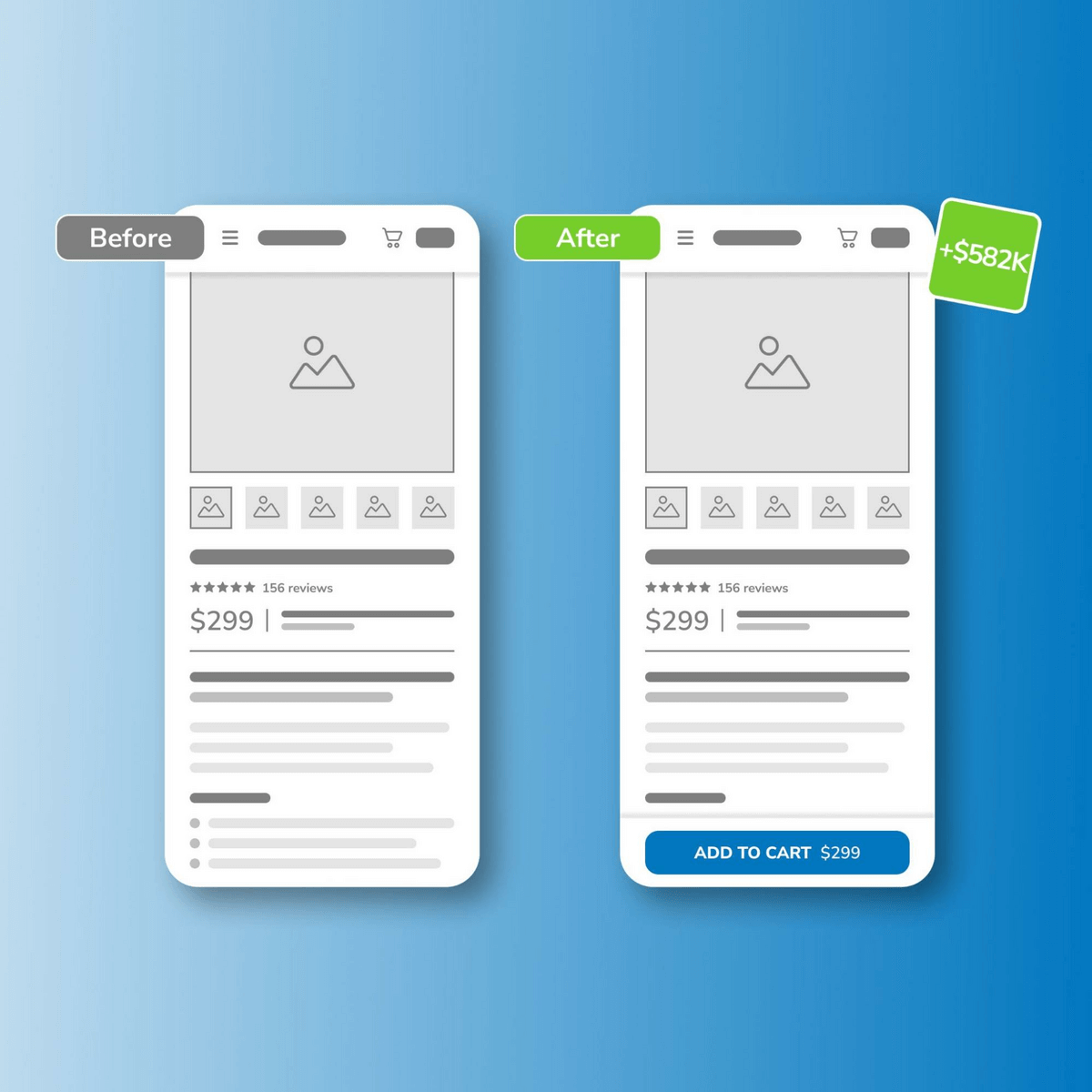
Dynamically Updated Price in Sticky Add to Cart Button Leads to Over $580K in Annualized Revenue Gains
During user testing for one client, our researchers noticed that there was no clear way for shoppers to keep track of how customizing their product was impacting the price. There was lots of unnecessary scrolling between the customization elements and the price.
The team hypothesized that adding a sticky element for the dynamic price would increase transactions.
In the test, the control kept the original layout of the product page, and the variant included a sticky add-to-cart. Every time the shopper customized their product, the price would update dynamically.
The variant won, and we could predict that when implemented, it would generate over $580k in annualized revenue gains.
The dynamic sticky add-to-cart button lets users make a more informed purchase decision without the hassle, in turn improving the likelihood that they would convert.
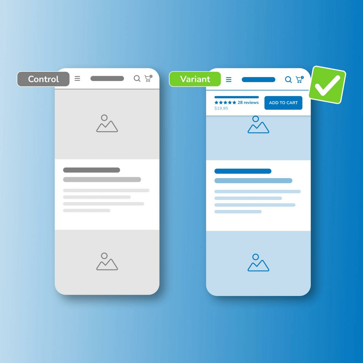
Sticky Add to Cart Button Generates $90K in Annualized Revenue Gains And Improves Purchasing Action
There was a similar case for another brand, where customers had a higher likelihood of experiencing “scroll fatigue.”
Customers became frustrated with scrolling up and down the page to view relevant content, prompting them to leave the page.
In this instance, our client had a complicated, FDA-regulated product with a very long product detail page (PDP).
Our team hypothesized that using a sticky add-to-cart button on product pages would improve the visibility of purchasing actions and increase engagement.
The variant produced a 4.09% lift over the control.
How to Conduct Customer Research to Improve Customer Experience
Visual Content on Product Detail Pages Impacts Customer Purchase Decision
Numbers don’t lie. And the numbers tell us that customers are visual creatures.
JustUno found that 93% of consumers consider visual appearance a key factor in making a purchase decision. Likewise, Etsy survey results revealed that 90% of consumers consider “high-quality” images to be very important.
While product copy is crucial in the creation of a PDP, the visual content improves the overall customer experience.
Here are some iterative tests that show just how important visual content is.
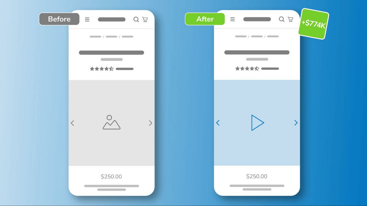
Switching from Product Image to Product Video Results in +$770K
Because customers can’t visit your brick-and-mortar store, they rely on the images to get a better understanding of what the product looks like.
We like to remind the brands we work with that people go to their ecommerce store to solve a pain or a need. This means they are more likely to engage with products that make their lives easier. Our team then wanted to see whether rich content, such as videos, would encourage more conversions.
Videos would give site visitors more visual information about the look and feel of a product. Videos would also allow people to see the product in-situ, giving them more information and, ultimately, more confidence to make the purchase.
This proved true, as adding a video to the PDP of our client resulted in improved conversions that, if implemented, would result in over $770K in annualized revenue gains.
Exposing Images Leads to Increased Interest and Boosts Revenue by Almost Half a Million
Everyone is familiar with the old saying that “a picture is worth a thousand words.”
So, what’s better than having one high-quality image for your PDP? For this client– exposing a slew of them.
In reviewing mouse movement and click maps, our team found that customers engaged with carousel images in the PDP. However, our team hypothesized that exposing the images would make it easier and more engaging for customers to find what they were looking for.
In the winning variant, we made the images visible on the PDP as soon as customers landed on the page. This meant they didn’t have to click through the carousel to see each image individually. Rather, all images were already on the page, and the customers could click on the one they wanted to enlarge.
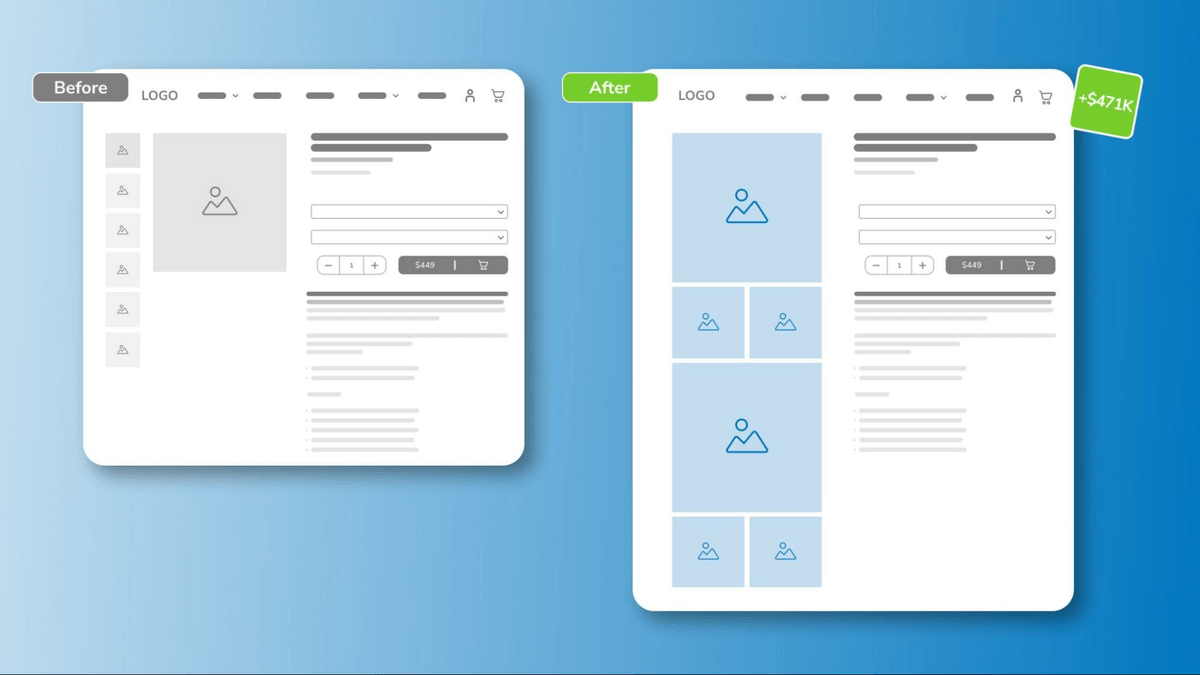
The images showed potential customers the products in use and magnified important product features.
Shopping-Focused Navigation Helps Guide Customers to Make a Purchase
The primary role of navigation is to direct customers. Think of it like a guide map, giving customers clear directions to their destination.
When customers arrive at your site unsure of what to do or where to start, the main menu will show them the way.
You can accomplish this by optimizing the menu options and ensuring they make shopping as easy as possible for the customer.
Here’s what that looked like for a few of our clients:
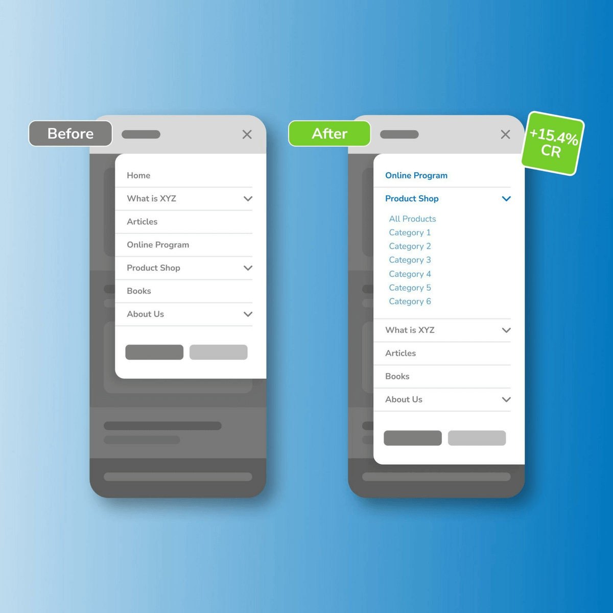
Reordering Mobile Menu Results Improves Conversions by +15%
Typically, when looking at a menu, people tend to focus on the two ends.
If you have a horizontal menu, more likely than not, customers will recall the first and the last menu options. On a vertical menu, however, things are different. Based on movement maps, customers concentrate their attention on the top of a vertical menu.
This means that all the other options below become less significant to the customer.
Our team then hypothesized that by moving the most important menu item to the top, brands could direct customers to that particular page or product.
In the variant of the test, our team placed the key product at the top of the navigation. In the control, it remained as the fourth option. The results showed that when moved to the top of the navigation, there was an increase in KPIs.
The variant converted 15.38% higher than the control. This showed that updating the visual hierarchy of navigation links better directed site visitors to the program and shopping opportunities the client wanted. Consequently, it increased signups and product purchases as a result.
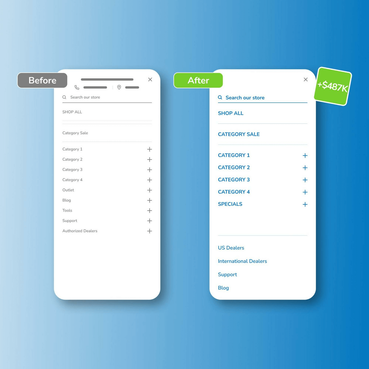
Decluttering Navigation Produces Annualized Revenue Increase of $480K by Allowing Customers to Shop Without Distractions
Sometimes less is more.
This proved to be the case for one of our clients. The desktop navigation of the site contained different category pages. The featured categories allowed customers to see what products were available and ready for purchase. However, there were other menu options that were more educational and less shopping-focused.
Heatmaps showed that site visitors did not engage with the non-shopping navigation items. Therefore, our team focused on the menu items that were ecommerce-focused.
The test simplified the navigation by moving the non-shopping items to the bottom of the menu and keeping the featured categories at the top of the hierarchy. This improved the directional guidance and overall purchase experience, which increased annualized revenue by $480K.
Small but Steady Wins the Conversion Race
This review these iterative tests underscores the significance of gradual enhancements. Small, iterative changes hold the potential to revolutionize your brand’s digital experience and increase your conversions.
To be more specific, these winning tests and iterations have taught us that:
- Sticky elements, like the add-to-cart button, prevent customers from experiencing scroll fatigue and provide a more informed purchase journey.
- Visual content gives more information and context to the customers, underlining the importance of visual appeal in customer purchase decisions.
- Optimizing navigation menus acts as a guiding force, helping customers navigate seamlessly through the online shopping experience.
Ultimately, these tests have one thing in common: the customers.
The focus wasn’t on the brand but rather on the needs of the customers. By understanding where the customers got stuck on their journey, we were able to improve the customer experience.
More than running tests, we want to help companies be more user-centered. Leverage research-backed recommendations and data to build a better digital experience for your customers. Get in touch with us.
Enjoying this article?
Subscribe to our newsletter, Good Question, to get insights like this sent straight to your inbox every week.
About the Author
Jon MacDonald
Jon MacDonald is founder and President of The Good, a digital experience optimization firm that has achieved results for some of the largest companies including Adobe, Nike, Xerox, Verizon, Intel and more. Jon regularly contributes to publications like Entrepreneur and Inc.