
How To Run Your Own CRO Audit & Why It’s A Must-Have Growth Practice For Ecommerce
A step-by-step process to DIY a CRO audit on the homepage, category page, and product page of your ecommerce website; and 15 reasons you should start today.

Note: This article will teach you how to conduct a CRO audit, step by step. If you’d rather have an expert take care of that for you and go deeper into the sales funnel, you may want to consider a Digital Experience Optimization Audit™.
I’m willing to bet that you look at your ecommerce site almost every day – and you’re probably making updates, additions, or changes on a regular basis as you work towards your business goals.
When you work on something every day, it’s easy to lose sight of what the cumulative effect of all those small changes is on your broader customer experience.
Here’s an example:
Have you ever seen a picture of someone you interact with daily – maybe a pet, or your kids, or even yourself – and thought, “Man…when did they get so big! When did they get so grey?”
What we’re talking about is a similar concept. Small changes over time can really add up, and the only way to prevent things from getting out of control is to regularly step back and take a look at the bigger picture.
We tell our clients, “It’s hard to read the label from inside the jar.”
With conversion audits, you force yourself to step outside of the jar and see your customer’s purchasing experience for what it truly is, not what you’ve been hoping to create over the last few months or years.
So, how do you get outside of the jar? With a conversion audit.
In this article we’ll cover:
- What a CRO audit is and how to get started
- Step-by-step how to audit your homepage, category page, and product page
- Why a CRO audit is a crucial growth practice
What is a conversion rate optimization audit?
A conversion audit considers the complete data-backed conversion status across an ecommerce website, then provides a detailed report on the findings.
It’s a 360-degree assessment of your path to sales and the stuck points keeping you from getting more conversions.
A proper audit should be the foundation of the conversion process. During an audit, you should be catching any data collection bugs, correcting any analytics issues, and then collecting a wide breadth of data to inform insights across your website experience – including but not limited to Google Analytics, user testing and a/b testing results, heat map results, click map results, and such.
Start by changing your environment
Before you even get started with your CRO audit, we recommend looking at your site in a physically different way than you’re used to. This will help you get ‘outside the jar’ like I mentioned above.
This typically means using a different browser, device, or workspace then you’re used to. Most of the time that small physical change is enough to give you a fresh perspective.
When you review your site with “fresh eyes,” you’ll begin to notice the areas where you can make improvements to things like website copy, imagery, or interactive elements like buttons or form fields to create a better purchase experience for your customers.
And a better purchasing experience almost always leads to higher conversions and more revenue.
Now, you’re ready to get started. Let’s talk through exactly how you should audit the three most important pages of your site – the homepage, the category page, and the product page.
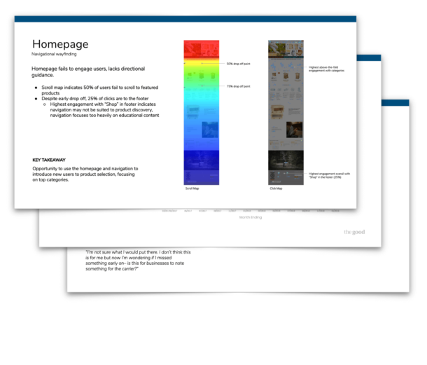
How to conduct a CRO audit on your homepage
Unless you’re funneling a bunch of money into targeted ad campaigns, your homepage is probably the most visited page on your site. That means it’s probably the area where you stand to gain the most by making small, but significant improvements.
Your homepage has just two tasks: help prospective customers research their options and equip them to painlessly purchase the one that’s right for them.
If you make those as simple as possible, your conversion rate will increase, you’ll bring in more revenue, and customer satisfaction will improve. Everybody wins.
So, how do you run a conversion audit on your homepage? We like to focus on four key areas.
#1 – First Impressions
They say you only get one chance at a first impression, and more often than not it’s your homepage that makes this first impression for you.
We like to start a CRO audit on the homepage by running what we call the “5-Second Test.” When someone lands on your site, can they understand within the first five seconds exactly what you do and who is a good fit for your products?
NOTE: This is probably an area where you, your team, and even your immediate friends and family are too familiar with the company to be objective. We recommend branching outside of that close network, or buying a few folks a coffee at Starbucks to get their unfiltered opinion.
Another aspect of first impressions is Site Speed. Does your site load quickly and without bugs or errors? Does it look and perform the same on phones and tablets? What about on spotty wifi connections like those in coffee shops or hotels?
Finally, are you using interruptive elements like pop-ups or full-screen CTAs? These elements might improve lead generation or grow opt-in subscribers to your email list, but they can be conversion killers.
Imagine if you walked into a retail store and a salesperson jumped out in front of you and asked for your email address in exchange for a 10% off coupon. Cringey, right?
If you really want to keep your pop-ups, we always recommend triggering them by something like time on page, scroll depth, or exit intent instead of bombarding users with a discount promotion right away that increases bounce rate for the sake of email marketing.
#2 – Navigation
Next, let’s talk about your site navigation.
In general, we recommend keeping the number of elements in your primary navigation to five or less.
Our research shows that using high-level categories like Tops, Bottoms, Shoes, and Accessories paired with a sub-navigation to list out individual product types performs much better than “catchall” terms like “Shop All” or “All Products.”
Also, contrary to what your marketing team might suggest, this isn’t the best place for cultural items like About Us, Our Mission, Press/Media Coverage, or a company Blog.
In most cases, your customer has already encountered these messages through an ad, a product review, or a social media post, so you’ve already won them over. It’s time to stop marketing and start selling.
There are plenty of opportunities to weave your brand story into headlines, product copy, and CTAs, so it’s best if we reserve our navigation for shopping links.
Ultimately, you want your navigation to be clear, concise, easy to use, and, most importantly, oriented around your customer’s natural preferences for browsing your product catalog.
Soludos, quality crafted shoes and accessories brand, does this well on their website featuring women, men, and clothing as headers, with dropdown categories that offer more details.

#3 – Hero Section
Next, let’s take a look at your hero section.
This is more valuable real estate that marketing teams love to fight for – and for good reason! Our eye-tracking heatmaps show that the hero headline and CTA get the most attention from your website visitors.
Unfortunately, most brands use this space to promote their latest product launch or their current marketing campaign. This isn’t necessarily a bad choice, especially around high traffic times like seasonal events (think “Back to School”) or holidays.
However, unless a significant portion of your traffic is repeat purchasers who already know your brand and products, you’re probably not maximizing the value of this space.
Instead, consider using a more evergreen headline and supporting imagery that clearly communicates who you are, your value proposition, and the breadth of your product offerings.
Remember that “5-second test” we discussed earlier? This is the best place to check the box for helping potential customers understand what you offer and who you serve.
Finally, if you have a button in your hero section – which you should – make sure to use a relevant call to action for your target audience.
Many stores I review use generic CTAs like “Shop Now” that drop visitors onto a page with a collection of literally every item in their catalog. That’s not guiding anyone down an intentional purchasing path.
Instead, test a more direct CTA like “Shop All Pants” that tells the visitor exactly what to expect and, ideally, aligns closely with the images and headline that are also presented in the hero section.
#4 – Footer
Finally, let’s talk about how to maximize the value of your website footer as you conduct your CRO audit.
This one is pretty simple, but I like to say that just because something is common sense, doesn’t mean it’s common practice.
For starters, you want to make sure that you have a section in your footer specifically for product navigation. A handful of high level categories is plenty to help shoppers move forward without having to scroll all the way back up to your primary navigation.
Next, you’ll probably want to have a column for “utility links.” Things like shipping and return policies, privacy policies, terms and conditions, or FAQs.
After that, you’ll probably want to include a column for “company links,” where you can put pages like About Us, Press/Media Coverage, Careers, Referral/Rewards Programs, or your company blog – those items that shouldn’t live in your main navigation, but likely do today.
And finally, in the bottom right corner you’ll want to have a section for contact information. This should start with your logo and be followed by what I like to call the “trust tri fecta.” It includes listing a physical address, an email address, and a phone number. Those three items are generally all it takes to convince site visitors that you’re a reputable company and give them the confidence to make a purchasing decision.
Now, I know we covered a lot of material there, but as I said before, the homepage is one of the most-visited and highest potential pages on your site, so it’s really important that we get things right.
Now, let’s take a look at the next step in the buyer journey – the category page.
Interested in learning the laws of optimization?
Opting In To Optimization is a set of principles that will help digital leaders capitalize on unprecedented market demand and build sustainable, thriving businesses.
How to conduct an ecommerce CRO audit on your category page
Now that we’ve reviewed our homepage, let’s take a look at the next step in the buyer journey…
Some customers will come to your site already knowing what they want. Maybe they saw a Facebook ad or a product review from one of your affiliate partners.
But in general, new-to-file customers land on your site and want to explore at the category level. They’re not sure exactly what model of shoe is right for them, but they know that they need to replace their running shoes to help get ready for their next race.
So, much like the homepage, your category page only has two jobs:
- Present your products in an organized and intuitive way
- Help shoppers find what they are looking for to solve pain points or improve their life
In other words, your category page should be helpful, but unassuming. The goal is to equip visitors to quickly find a product that meets their needs, then get out of the way and let them further explore the details of that product.
How do you accomplish those tasks? By making sure that your category page includes a handful of key elements. Here’s what to look for during the CRO audit of your category page.
#1 – Information Structure
This is one area where there isn’t a whole lot of debate. A category page should flow something like this:
First, you’ll want a hero section that clearly displays the category name and a brief description of what is included in the category. This helps the user confirm that they’re in the right place based on the link they just clicked.
Next, you’ll want some kind of internal page navigation that allows users to sort the results by a handful of criteria that are helpful and intuitive to them.
Finally, you’ll want to display the individual products that exist within the category and meet all of the criteria that the user has selected.
That’s it. That’s the foundational formula for a high-performing category page.
If you’ve got that covered, great job! Now it’s time to move forward to more advanced topics.
#2 – Filtering, Sorting, and Discoverability
Unless you have a small product catalog, you’re probably going to need a system that allows users to filter and/or sort your products by specific criteria.
This is where many brands default to off-the-shelf options made available through their website theme. Things like brand, price, size, and color are great, but they’re just table stakes.
Take a moment to think about what’s really important to your customers when they’re making a buying decision.
Do they care about things like what materials a product is made of?
Do they need to include or exclude certain ingredients, because of a dietary preference or food allergy?
Do they want to quickly find options for specific use cases, like cold weather running vs. hot weather running?
It’s hard to make specific recommendations here, because every business and customer base is unique, but try to consider what’s most important to your customer when they are evaluating options and give them the ability to target or sort their search results that way.
#3 – Language and Copywriting
Similarly, when putting together the naming conventions for your categories and search criteria, always consider the language that your customer uses, not just your team or other people in your industry.
This is especially important for product lines that have a lot of technical components or specifications internally, but might not be viewed in the same way by the end-user.
For example, you might naturally sort a category of laptops by what type of processor is included, how many gigabytes of storage it has, or the pixel density of the monitor.
But, if the end-user is a grandmother who is trying to buy a graduation gift for grandson, she might not understand any of that technical jargon.
Instead, she might prefer to see things like “lots of storage for music and videos,” or “enough processing power to do schoolwork and play games.”
Do you see how this copy converts the technical aspects of the product into real-world examples that are more intuitive for the end-user?
It may seem insignificant, but investing the time to better understand your customers and speak their language, not just yours, can make meaningful improvements to conversion rates. On top of that, it will likely improve your online marketing and digital marketing in general.
#4 – Clearly Visible Decision-Making Criteria
Finally, you’ll want to make sure that all of the most important decision-making criteria are clearly visible on the individual product listings.
This is an area where we do a lot of testing, but in general you want to see these key elements, if they apply to your product line:
- Product Image – These should clearly display the active product and provide options for viewing additional variants or colorways
- Product Name – This should be clear and descriptive. Your copywriter is amazing, but they don’t get any extra points from consumers for being clever here.
- Price – If you have an active discount, always include the original price with a strikethrough, the discounted, and the % or $ off to help quantify the savings.
- Reviews – If you have a lot of reviews, it can be great to show a star rating here.
- Call To Action – Buttons generally perform better than text, and you should probably avoid “Add to Cart” in favor of something like “View Details” or “Buy Now.”
If you can check the box on each of these items, chances are your category page is in a good place.
Remember, the only goal of the category page is to get the visitor to the right product page. When you’re ready, let’s move on to talk about how to optimize your product pages during a CRO audit and convert more of those visitors into customers.
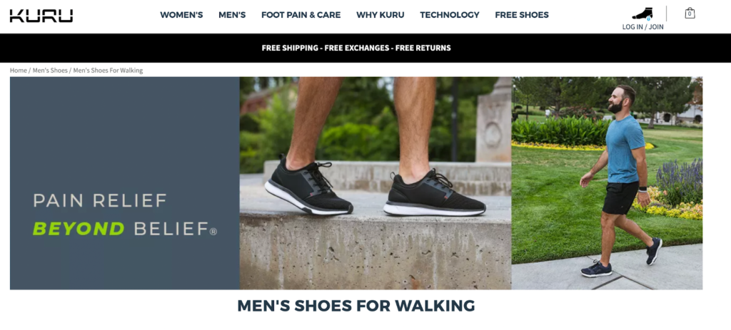
Check out Kuru Footwear men’s walking shoes for an example of a brand with a winning category page.
How to conduct a CRO audit on your product page to improve user experience
Alright, so we’ve successfully reviewed the homepage and the category page. Up until now, our only goal has been to move the customer one step further in their buying journey.
Now that they’ve made it to a product detail page, or PDP, the goal has changed and the stakes are higher. We’re trying to earn their business, and every decision we make on this page can make the difference between a completed purchase and an abandoned shopping cart.
To maximize the number of page visits that convert into customers, our product page needs to accomplish three tasks:
- Answer Customer Questions – Up until this point, our customers have the basic information they need to make a decision, but they might have specific questions that still haven’t been addressed.
Things like, “What’s the texture of the material like?” or “How will this look in my room…will it be too big/small?” or “How hard is this to clean?” are all reasons that customers will go looking for something else if they aren’t addressed. - Alleviate Objections or Concerns – It’s common for customers to come to your site with pre-existing objections or concerns about your product. These are usually things like, “I’m not sure I’ll be able to put this together” or “This is kind of pricey. Is it really worth spending that much?”
- Establish Trust and Build Confidence – Customers will also wonder if they can trust your brand. They will worry about things arriving on time or whether the product has the quality and performance that they’re hoping for. Without this trust, they won’t make a purchase.
So, how can you make sure that your product page completes all three of these objectives? Here are three areas you’ll want to review, and what to look for…
#1 – Above The Fold
This is the area that customers see immediately after landing on your PDP, but before they do any scrolling. It typically includes product imagery, the product name, pricing, a brief description, customization options, and an Add to Cart button.
Here are a few things we look for when auditing above the fold on product pages:
- Are there big, beautiful images that show the product in detail? Do they also show the product in use, so that customers can imagine how it would fit into their life?
- If the product has multiple variants, like different colors, is there a way to quickly navigate between them, and are the product photos updated to reflect the active selection?
- If there is a discounted price, are we displaying the former price with a strikethrough in addition to the discounted price and the % or $ off?
- Are we emphasizing the most compelling reassurances we offer, like free shipping, free returns, expedited delivery, or money back guarantees?
- If we don’t offer free shipping, and we haven’t explicitly stated it yet, we strongly recommend listing the estimated timeline and cost of shipping here. Any surprises deeper in the checkout process typically result in abandoned carts.
#2 – Product Descriptions
This area is a great opportunity to inject some of that brand personality, but don’t lose sight of the primary goal of the PDP – to address customer questions and concerns.
Storytelling is great, but we also want to include elements like size charts, product specifications, and details about care and maintenance or compatibility with other products, as appropriate.
In general, we like to see a product description section that looks something like this:
- An engaging, descriptive headline: Something that clearly describes the product, but also entices the visitor to keep reading.
- Benefits-focused paragraph: Expand on the headline above, going deeper into how the customer stands to benefit from buying your product.
- Key benefits list: This is the place for lots of bulleted lists that lay out product details and specifications in a way that is easy for the reader to scan and interpret.
- Objection-busting statements: Try to predict what excuses customers are making in their head, and knock them down one by one, ideally with facts or success stories.
#3 – Social Proof & Reassurances
One of the best ways to overcome objections is through social proof and reassurances. These are tactics that are specifically designed to get people who are on the fence to open their wallet and make the purchase.
We generally like to see social proof elements in three key places:
- Above the fold – For example, showing a 4.5 star product score or a free shipping guarantee above the fold generally improves the “Add to Cart” conversion rate.
- At the end of the product description – This is a great place to highlight customer testimonials or press coverage to build consumer confidence.
- Near any purchasing CTAs – If you have payment fields or transactional CTAs on your product page, it can be a good idea to combine them with security certification badges or lock icons.
We could spend an entire hour of product page design and optimization, but if you make sure that your PDP is completing these three objectives – answering questions, addressing objections, and providing social proof or reassurances – you’ll have a strong foundation to build your optimization program on top of.
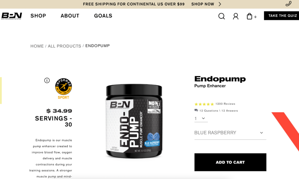
Bare Performance Nutrition, trusted source of performance and health supplements, is a great example of a website with optimized product pages that work well for their customers and brand. Explore their product pages on their website and compare them to the checklist we just went through to see how they implement many of the tactics that increase conversions and help them meet conversion goals.
Why a CRO audit is a must-have growth practice
Whew, that may seem like a lot, but I promise it’s worth the effort. Just take a look at this non-exhaustive list of benefits you can expect from a strong CRO audit.
- Help clean up your data and discover errors. For example, a common mistake that skews data is not filtering out internal traffic from the observed results. The many times each day your marketing staff accesses your website should not be counted along with visits from prospects. Unless those visits are properly filtered, you’ll have an erroneous view of what’s actually happening.
- Establish a baseline for your optimization process. Let’s say you’re driving from your office to a vendor’s office, and you want to know how far one is from the other. To do that, you need to record the beginning mileage or set the trip odometer to zero. Otherwise, checking mileage on our arrival at the vendor’s location won’t be of any value. In the same way, it’s imperative to record accurate, trustworthy metrics before beginning the CRO optimization process. Otherwise, you won’t be able to verify that your CRO work is actually helping your business.
- Allow you to understand what’s going well, and what could be improved. It’s never a good idea to throw the baby out with the bath water. You want to know what to keep and what to change. The true CRO website audit shines a spotlight on performance.
- Provide insight into trends by channel, device, region, season, and more. CRO professionals will bring in analytics data to inform the optimization process. That data will be broken down into the components vital to your ecommerce success.
- Enable you to identify behavioral characteristics of your best prospects. Learning about your visitors is central to a winning optimization strategy. The more you know about their problems and desires, the better you can serve them.
- Help you develop countless ideas for tests. Not only will you learn where your stuck points are, you’ll get the information you need to develop potential solutions to free up the flow and get more prospects down the path to the checkout process. Proper testing procedures will prove or disprove those theories.
- Enable you to reduce risk in business decisions. Experienced marketers are prone to make gut decisions, but flying by the seat of your pants can be risky. We provide counsel to clients to support those sixth-sense perceptions with hard, proven data. Once the two are working in concert, amazing things can happen.
- Allow you to identify unknown waste. The Pareto principle says that 20 percent of your efforts bring in 80 percent of your revenue. Wouldn’t it be great to know which is which? It’s easy to major in the minors. I’ve seen ecommerce VPs pouring money into a marketing problem that is inconsequential while ignoring the things that could bring them a huge return on investment. Don’t be that person.
- Chart an effective roadmap for the best course forward. When driving somewhere you’ve never been before, you’d be wise to consult a map before leaving. True CRO audits produce a map you can use to turn more visits into sales.
- Reduce internal tension by creating consensus among stakeholders. Everyone has an opinion, but the audit provides facts which those opinions can be evaluated against. Throw in testing, and you have hard data to prove or disprove any theory. It’s easy to argue against an opinion, but difficult to argue against the facts.
- Are the answer to “You can’t manage what you don’t measure.” When your optimization process audit strategy is in full swing, you’ll be able to answer naysayers with “I do measure. Not only that, but I measure the right things. How about you?”
- Smooth out the trail to turn visits into dollars. Leveraged correctly, a CRO audit can multiply your conversion rate to increase revenue without the time and expense needed to increase traffic.
- Keep you afloat in a competitive niche. If the competition is savvy about conversion rate optimization and you’re not…your chances of winning the battle are slim.
- Work hand-in-hand with your pay-per-click (PPC) advertising campaigns. The effectiveness of your PPC efforts is influenced by the landing page the ads point to. If that page has been through an optimization process, results will multiply accordingly.
- Give you peace of mind. You no longer must rely on instincts and guesses. You can justify your decisions with a full array of data to back those decisions up. You can enter sales and marketing meetings with greater confidence.
Embark on an optimization process to boost sales
There’s no shortcut to success in the hyper-competitive world of ecommerce. Take a deep look at your data, do the hard work of uncovering the truth, then back up your wisdom, experience, and gut-level inclinations with data-driven nuggets of insight.
A genuine optimization process is well worth the time and investment, but I understand you may not be able to take it on yourself.
If your team is looking for an elevated version of a DIY CRO audit, The Good is here to help. We focus on optimizing website experiences and the Digital Experience Optimization Audit™ could be the perfect fit for your brand.
Interested in learning the laws of optimization?
Opting In To Optimization is a set of principles that will help digital leaders capitalize on unprecedented market demand and build sustainable, thriving businesses.
About the Author
Jon MacDonald
Jon MacDonald is founder and President of The Good, a digital experience optimization firm that has achieved results for some of the largest companies including Adobe, Nike, Xerox, Verizon, Intel and more. Jon regularly contributes to publications like Entrepreneur and Inc.