
Website Navigation: 10 Conversion Tips & Winning Examples
The more user-friendly your navigation is, the more time users will spend on your site. Here's how you can give them the best experience.
Website navigation can make or break your visitors’ experience. Attempting to navigate a website without a logical, well-defined structure is like being dropped in the middle of a complex maze with no map and no frame of reference. It’s overwhelming, frustrating, and all-around unpleasant — not exactly the user experience you’re hoping for.
This means your store’s navigation is one of the important elements of your site. It affects your search engine rankings, lead generation, brand perception, accessibility, and usability.
Most importantly, your website navigation affects your conversions.
You see, your navigation is more than just a collection of internal links to get from one page to another on your ecommerce store. It also helps your users understand the relationship between different pages.
According to analyst Nathaniel Davis, navigation is the very tip of your site’s information architecture (IA) iceberg. Beneath the water is the massive part of the iceberg that no one sees: research, strategy, management, classification schemes, and more.
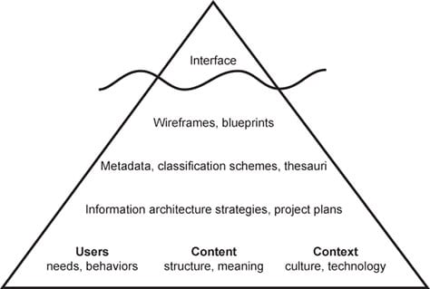
All of that goes into building an ecommerce site, but the user only sees what’s visible: your navigation, which is typically represented as a list of text links, some icons, and a search box. It’s how they interact with all of the planning and care you put into the rest of your site. It also helps them connect with that content and use it to meet their needs.
Types of Website Navigation Structure
Before we dive into the best practices, let’s break down the different types of website navigation. You aren’t bound to these options, but these are the general types you see all over the web. It’s generally best to stick to these formats, so users know what to expect.
Horizontal Navigation Bar
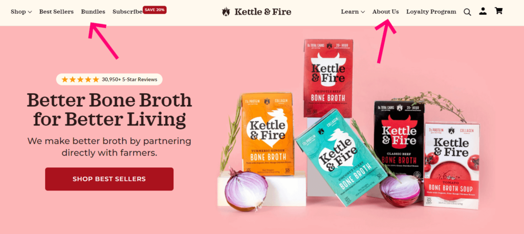
The header navigation bar is the most common type of website navigation. These top-level links are displayed horizontally, side by side, in the header. They usually include the most important pages of the site; the pages you know users will need access to early.
Dropdown Navigation Menu
Dropdown menus are tiers of navigation that keep your content and products organized. The most important links are used as top-level navigation. When a user clicks or hovers over a link, a menu expands with more links. There could be several tiers of dropdown menus.
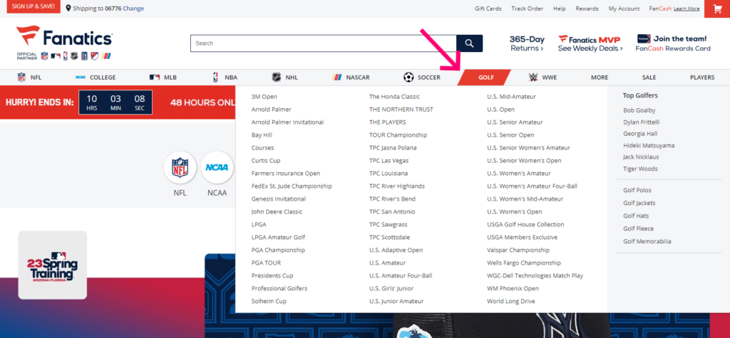
These are best for content-rich sites that need to give users plenty of paths to find the content and products they need. Smart organization prevents your site from becoming cluttered and gives your users a feeling of moving forward.
Hamburger Navigation Menu
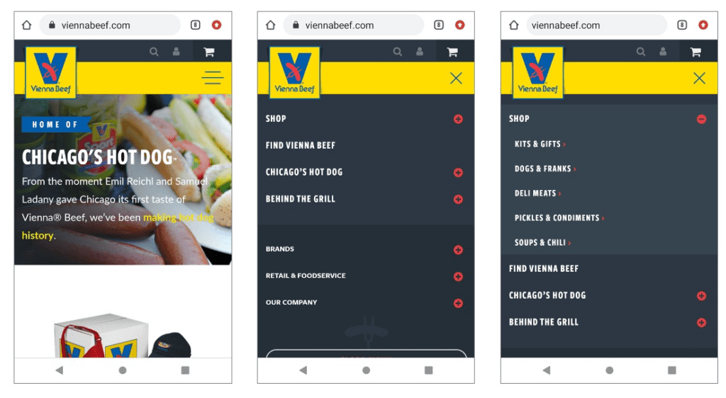
You see a lot of this menu on mobile sites and apps. Instead of listing any of the top-level links on the page, everything is hidden behind the button. Tapping the icon reveals the menu. Tapping a menu item expands the menu further, revealing additional options.
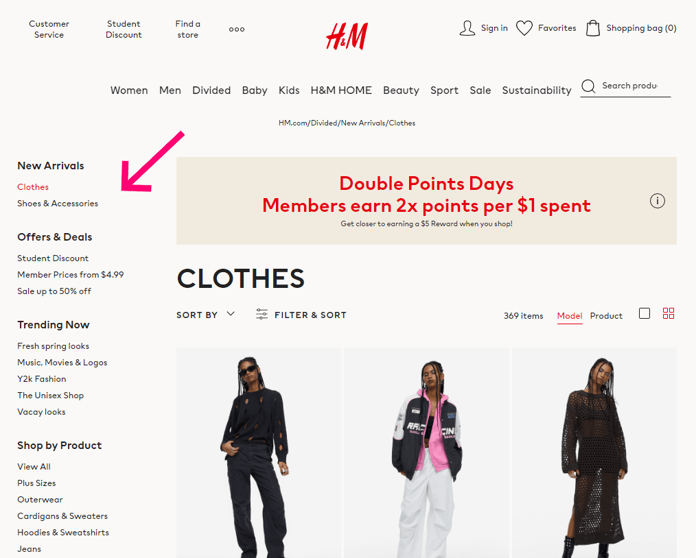
Vertical Sidebar Navigation Menu
A vertical sidebar menu is a list of links stacked on top of each other, positioned on either side of the page. This format is typically better for sites that have too much top-level navigation for a horizontal menu. The downside is that they eat up a lot of page real estate.
Sidebar navigation is also useful on interior pages where users need more specific options and internal linking to facilitate their shopping experience.
Footer Navigation Menu
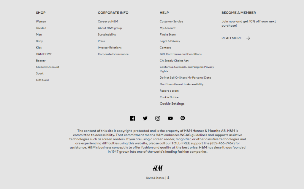
The footer navigation is a “catch-all” spot. It typically contains links to most pages on the site (though individual blog posts and product pages aren’t usually included). While you shouldn’t cram a link to everything into your footer menu, it’s smart to offer lots of options.
Website Navigation Tips and Examples
There’s no “one size fits all” way to design your website navigation. You simply need to design your navigation in a way that appeals to your specific customer. This requires customer research, designing experiments, and testing your results.
As always, we recommend centering your design process around your user. What you want or your team wants doesn’t really matter. Nor should you expect your website navigation to look identical to other retailers or even your competitors.
If you aren’t sure where to start, we can help. We’ve come up with this collection of best practices that will help you help your users find their way.
1. Reduce Your Top-Level Navigation Links to Seven
Your ecommerce store has a lot of pages, but they don’t all belong in your website navigation. Your first step is to choose the pages that will serve as your primary navigation.
How many items should be in your navigation? Your results will vary, but we think 3-5 is the right number for two reasons:
First, fewer items in your website nav are good for your search engine optimization. Your home page has the most “authority,” as far as Google is concerned. Authority flows to your interior pages through links, but only partially.
If your home page has 50 nav links and 25 other links, that home page authority gets divided by 75. But if you cut that number down, each page gets a bigger slice of the authority pie, thereby increasing the chances of those pages being ranked higher.
Second, fewer links in your nav are good for visitors. More information to process means a bigger cognitive load on your users. After seven items, people stop reading and start scanning, which means they potentially miss information that could be important to them.v placement.
2. Choose the Order of Your Menu Items Strategically
If I asked you to buy 12 things from the grocery store, chances are you’d come back with the first two items, the last two items, and maybe one of the middle items. That’s thanks to the serial position effect, which shows people have the greatest recall for the first and last items in a list.
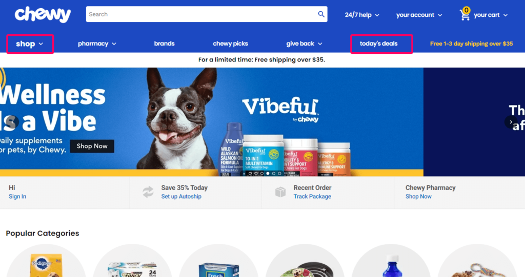
You can take advantage of this effect in your navigation design. To drive visitors to your most important links, place them at the beginning and end of your menu. For instance, if you know that your customers are bargain-hunters, it would make sense to put a link to your “clearance” category as the first navigation link.
Notice how the first and last links in Chewy’s menu are the most important, whereas the middle links are those that are less important or items a customer would specifically look for.
This can be challenging if you have a large product line with lots of categories. Should a furniture store put “bedroom” before “dining room?” Should a fitness store put “protein powder” before “supplements”? Use the card sorting and user flow review techniques we explained above to decide what your customers care about the most.
3. Optimize Your Mobile Website’s Navigation
Having a mobile-responsive navigation menu is essential to any ecommerce website. Consumers expect the mobile user experience of a website to be as good, if not better than, the desktop experience. Provide your website visitors with a responsive, optimized navigation bar, and you’re guaranteed to see an improvement in your mobile conversion rate.
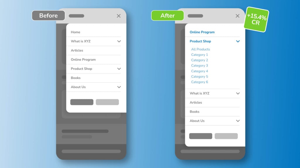
Most mobile menus lack visual hierarchy, which is an important part of visual design that helps users identify where to go next. Users can suffer from indecision without the guidance of a directional, well-organized menu.
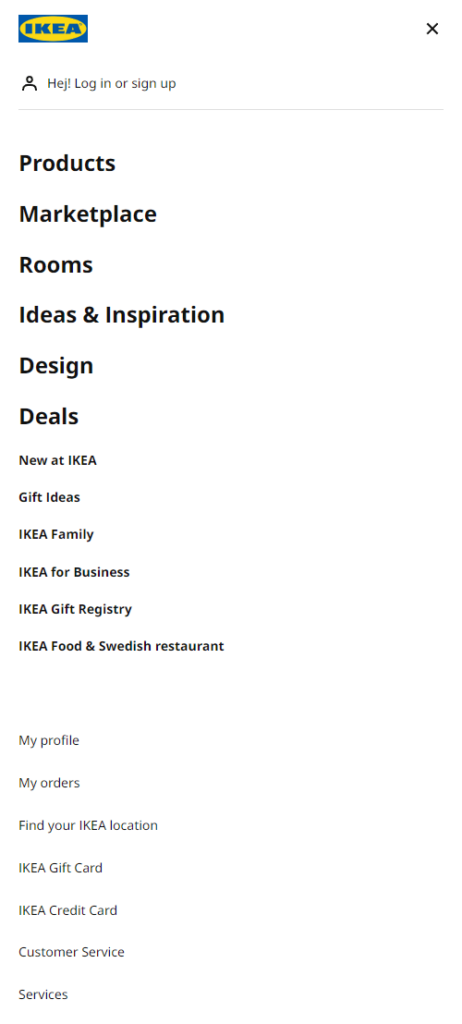
Separate your shopping-focused links from other kinds of content in the navigation. This can increase directional guidance, decrease distractions, and provide a frictionless experience for your users.
Ikea does this well by separating their shopping-focused links from other links using font size and weight.
In fact, we were able to boost conversions by 15% for one client by giving their mobile menu some visual hierarchy. With the help of movement maps, we noticed that our client’s users showed a lot of attention to top-level navigation. Unfortunately, these top-level links pointed to non-shopping pages, such as Home, About Us, Articles, etc.
Reorganizing the links sent more traffic to key pages, which increased sign-ups and product purchases. Here’s the before and after:
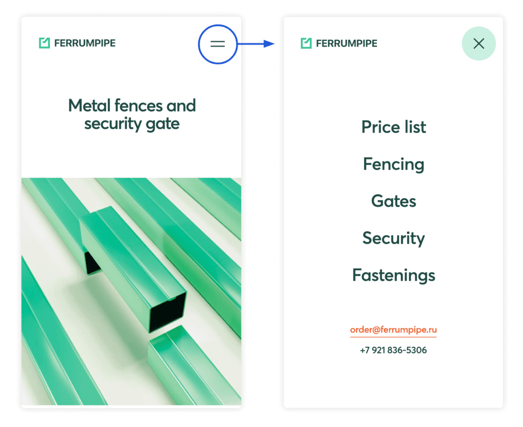
Furthermore, consider simplifying the navigation bar for your mobile site. The more unnecessary options you provide for visitors, the more convoluted the user experience will become.
Ferrum Pipe has a very effective mobile menu that, while very simple, conveys to users: 1) what they sell, and 2) how to get in contact with them. It’s really as simple as that. Any inessential information you might want to provide users can (and should) be moved to your website’s footer.
Enjoying this article?
Subscribe to our newsletter, Good Question, to get insights like this sent straight to your inbox every week.
4. Replace the Drop-Down Menus in Your Website Navigation
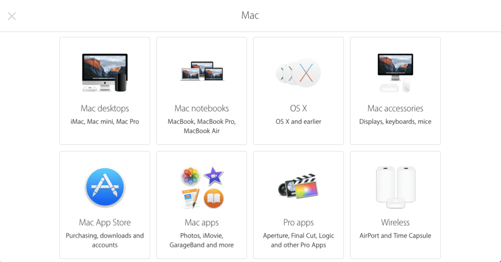
When the options in your drop-down menu are fairly complex, unfamiliar, or extensive, consider replacing it with a detailed page. Usability research shows drop-down menus are annoying. Plus, you’ll need to sacrifice valuable info to make everything fit.
Apple has used this strategy to help customers navigate their support menu. Rather than cramming all of the support options into a drop-down menu, they opted to create an entire page that has each product category they offer. The accompanying visuals make finding the right option a simple task.
5. Make Site Search Frictionless
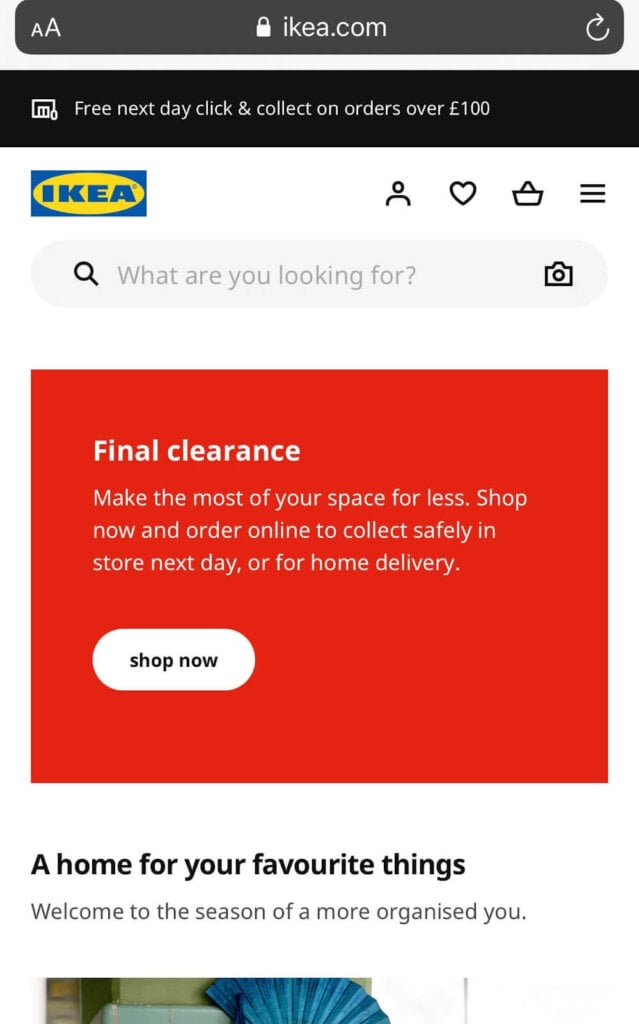
People who run a site search convert approximately two times more often than people who don’t. It makes sense: Visitors who use the search box typically have the intent to buy or act. Plus, they’re much more likely to find what they’re looking for.
IKEA is a great example of a company that relies heavily on its site search capability. Stores that carry thousands of SKUs in a variety of product categories need a prominently displayed search bar, so their customers can find exactly what they’re looking for. You can see on the mobile version of their website that they stick with a very minimal design: a hamburger menu button, a shopping cart button, and a search bar.
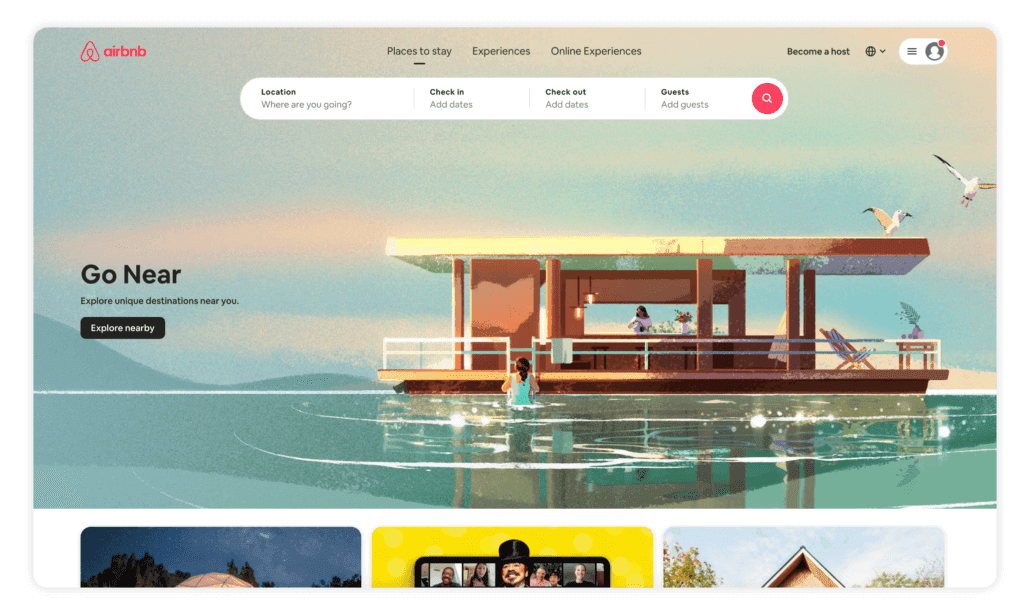
Airbnb is another great example of how you can highlight the search function in your navigation menu. On their website, the search bar is the first element to load on the homepage, and it’s prominently displayed at the top of the screen to encourage visitors to interact with it. If site search is an essential component of the user experience of your site, make sure that the search bar is prominently displayed for visitors to see.
6. Provide Context for Your Users
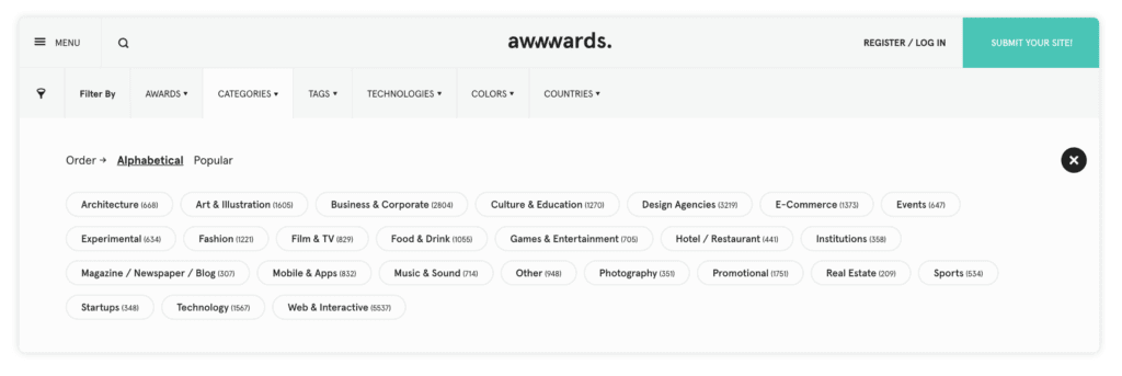
To help visitors find the right page without expending a single click, include clues within your drop-down menu. A clue could be a handy icon, a visual, or another helpful piece of information.
For instance, the “Category” tab on Awwwards doesn’t just display the various categories—it also tells you how many entries are in each one. Want to browse websites by hue? Each choice in the “Color” menu is helpfully color-coded.
Swiss Gear has an interesting approach to designing a nested navigation menu. For their top-level product categories, they include a small picture of each sub-category to provide some context as to what you’ll see in that sub-category. For example, in the “1900 Collection” sub-category, they provide a small image to give the customer a sample of what that product line looks like.
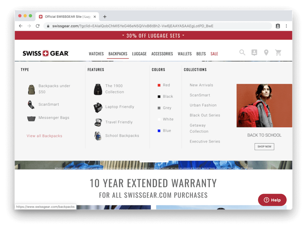
This tactic works especially well if you have a multitude of product categories that are very specific to your industry. Using confusing jargon in your navigation menu is the worst thing you could do, but if it’s an essential component of your website, you should at least provide your users with visual indicators to help them understand.
7. Create Separate Website Navigation Menus for Different Audiences
It’s always tricky to design an interface that caters equally to two distinct groups. To make sure each one can find what they need — without having to dig through irrelevant content — divide your links into two.
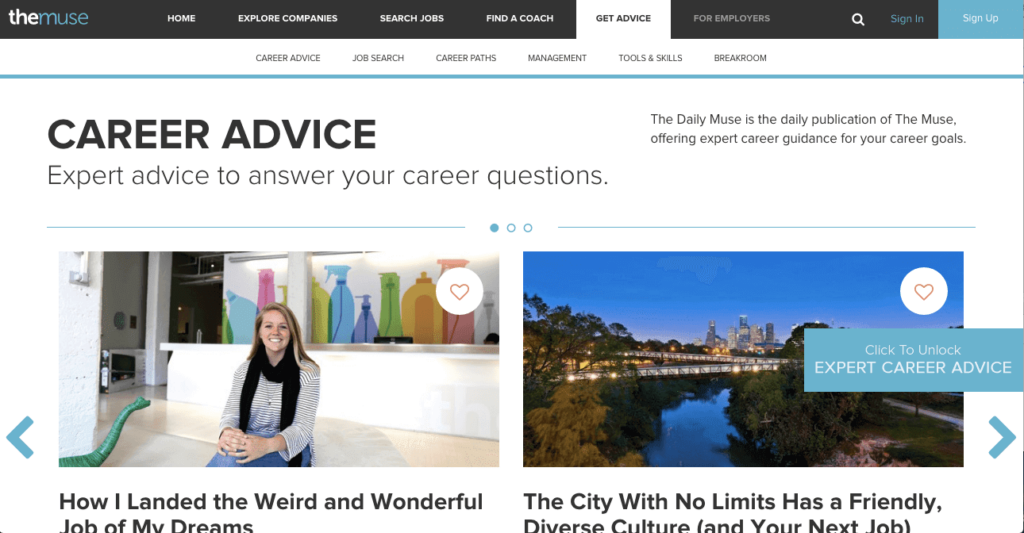
The Muse, for instance, has two audiences: job-seekers and employers. The first four links in the top nav bar target job-seekers, while the fifth redirects companies to their own section of the site. The link is gray, not white, to indicate that it’s different from the others.
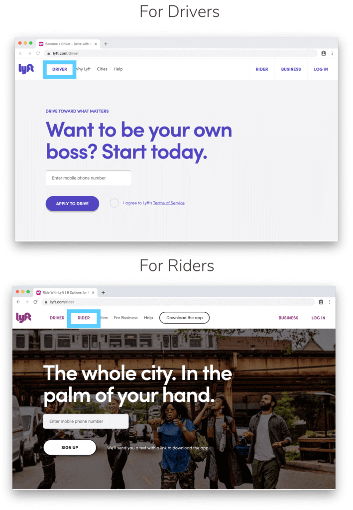
Lyft uses the same concept on its homepage. Instead of having a traditional nested navigation menu layout, they created separate menus and homepages for each category of users. Depending on which section of the website you’re on, you’ll see different main menu items.
8. Create a Comprehensive Footer
Navigational fatigue is a real thing — and when your site has a complex hierarchy, users quickly get tired of expanding sub-menu upon sub-menu.
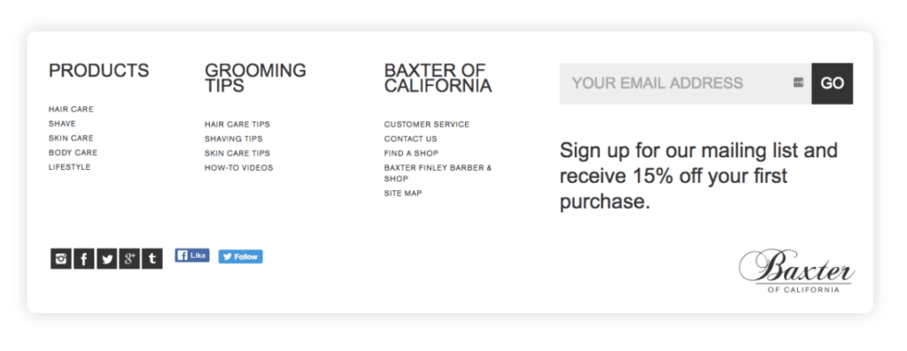
Mega footers are an optimal solution. They provide navigation links to all the important pages on your site, so people can quickly jump to exactly what they’re looking for. Including a mega-footer on your site can positively impact your site’s bounce rate and overall conversion rate. Take a look at Baxter’s footer to get an idea.
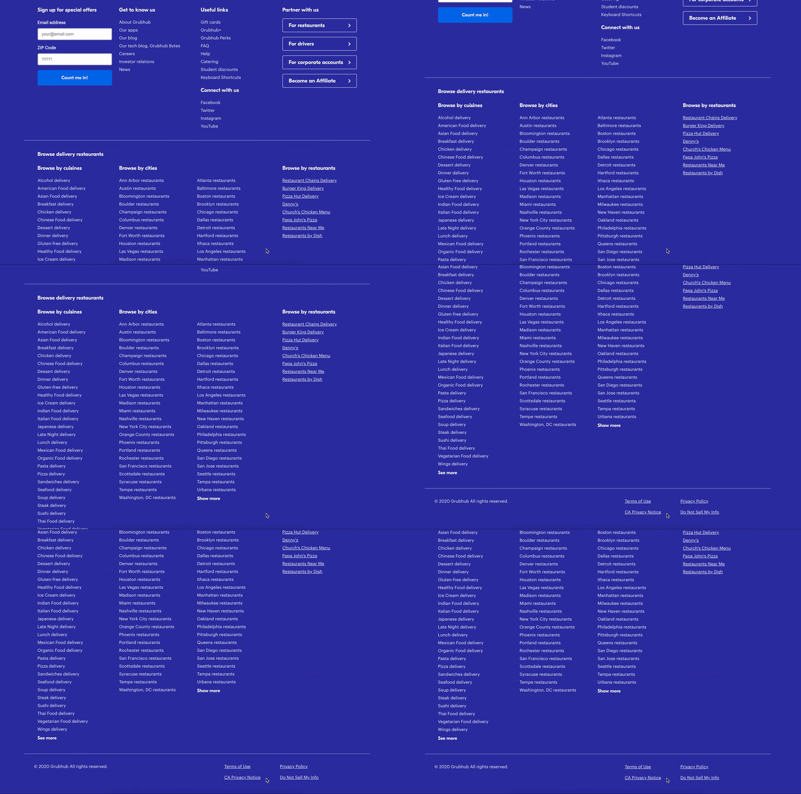
A mega footer can also be a great place to incorporate important keywords to improve your Google search engine result page (SERP) rankings. Take inspiration from GrubHub’s mega footer. If you’re trying to rank for a number of specific locations, including them in your footer will help your local SEO without you having to list them in your main menu.
9. Re-List Child Categories in Other Top-Level Categories
Common UX wisdom dictates that you shouldn’t repeat content. However, navigation is one of the few exceptions to this rule. If one or more of your pages naturally fit into two categories, you should list them in both.
REI’s menu illustrates why. Someone who is interested in buying a backpack might look under “Travel,” or she might look under “Camping” — whichever she clicks, you want her to find the backpack page.
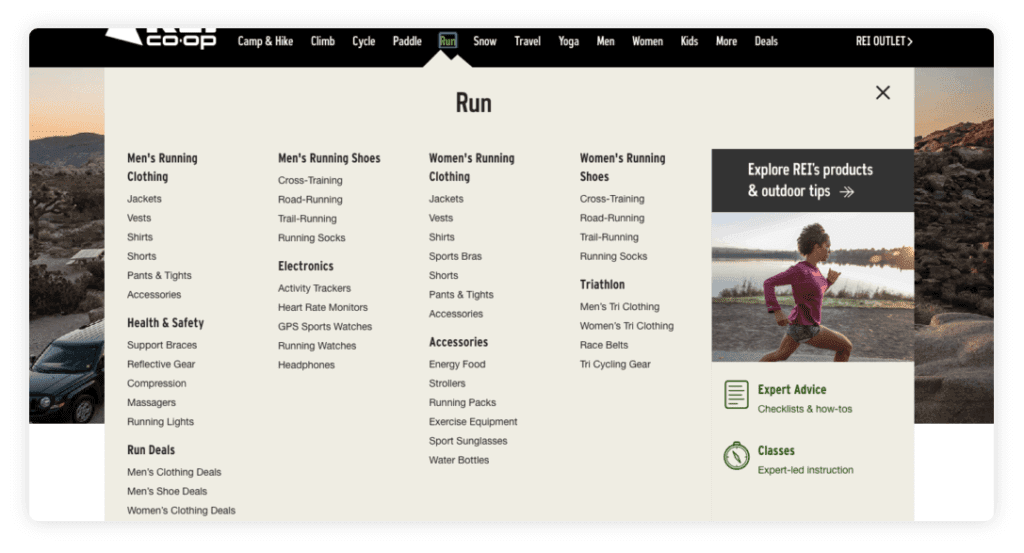
In that example, both navigation choices probably seem obvious. But you’ve probably noticed users often confound your expectations. Usability testing definitely comes into play here. Watch how visitors try to find their way to specific pages and look out for common trends.
Of course, you don’t want to go too far in the other direction and start listing every link under multiple headings. If people are always having trouble identifying the appropriate categories, your labels are probably misleading or incorrect.
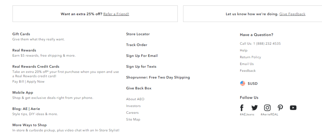
10. Remove Those Social Media Icons from Your Header
If you invest a lot of time and money into social media, it’s tempting to make those links prominent in your navigation. In fact, 13% of websites do just that.
But here’s the issue: Each of those links is actually a colorful exit sign, sending your traffic to places with thousands of distractions. If you lose your visitors to social media, you won’t get them back.
Where should you put these links? Your footer is the most reasonable place. Consider using simple text links, not using colorful icons that attract attention. If someone wants to reach your Facebook page, they’ll find the link.
American Eagle does this well. The social icons are present but left in the footer. They also use a neutral color that doesn’t stand out.
Bonus: Add a Call-to-Action to Your Header
If there’s one page of your site you really want users to visit, consider turning that menu item into a call-to-action. You can make it more visually prominent by giving it a contrasting background color. Make sure to use descriptive, action-oriented words, such as “Get Started,” “Browse Products,” or “Take the Quiz.”
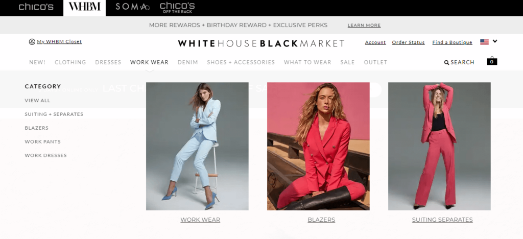
Furthermore, you can create a mega menu with soft calls-to-actions in your website navigation by displaying your primary categories as larger items. This increases directness to your most important product categories, quickly communicates what’s offered on your site, and helps users discover what else your brand has to offer.
Notice how White House Black Market uses a mega menu to list their sub-items on the left but directs you to three specific categories with large and colorful images.
Website Navigation FAQs
We’ve given you a lot of information about your website navigation items, but you may want to learn more. Here are some common questions people ask about website navigation menus.
What is website navigation?
Website navigation refers to the process of browsing and moving through a website using links and menus. It’s how users interact with a website to find the information they need.
Navigation can be simple or complex, depending on the size and complexity of the website, and can include different types of menus, buttons, and links. Good website navigation is essential for improving the user experience and making it easy for users to find what they’re looking for on a website.
What is a navigation menu?
A website navigation menu is a collection of links or buttons that help users navigate a website. It’s typically located at the top or side of a webpage and provides a hierarchical structure of a website.
Navigation menus make it easy for users to find important pages and sections and can include dropdowns or submenus for additional options. A good navigation menu is essential for a positive user experience on a website.
What is the purpose of website navigation?
The purpose of website navigation is to help users easily and efficiently find the information they need on a website. Navigation menus provide a clear and organized structure to a website, allowing users to move from page to page with ease.
Good website navigation enhances user experience, increases engagement, and ultimately helps achieve the website’s goals, whether that’s selling products, providing information, or encouraging visitors to take action.
What are the benefits of good website navigation?
Good website navigation can provide several benefits, including improved user experience, increased engagement, and better website performance. It helps users find what they need quickly and easily, reducing frustration and improving their overall perception of the website.
Effective navigation can also increase the time users spend on the website, decrease bounce rates, and improve conversion rates. Good navigation can also improve the website’s accessibility and usability, making it more inclusive for all users.
What is sub-navigation on a website?
Sub-navigation refers to a secondary set of links or menus within a website that helps users to navigate to more specific pages or sections. It usually appears in a dropdown menu format or as a list of links on a sidebar. Sub-navigation helps to organize a website’s content and makes it easier for users to find what they are looking for.
Make Your Website Navigation Seamless
The more user-friendly your navigation experience is, the more time users will spend on your site. Don’t abandon them in a maze — hand them a map.
At The Good, we’re experienced in optimizing web navigation menus.
If you’re interested in testing and improving your site’s navigation menu, get in touch.
Enjoying this article?
Subscribe to our newsletter, Good Question, to get insights like this sent straight to your inbox every week.

About the Author
Jon MacDonald
Jon MacDonald is founder and President of The Good, a digital experience optimization firm that has achieved results for some of the largest companies including Adobe, Nike, Xerox, Verizon, Intel and more. Jon regularly contributes to publications like Entrepreneur and Inc.