
50+ Innovative Ecommerce A/B Testing Ideas (with Examples)
When it comes to conversion rate optimization (CRO), the more things you can identify on your site to A/B test, the better.
As Nick Gavronsky, Head of Product at Trade Coffee shared with us:
“Testing is fundamental to learning. The more you test, the more you’re going to learn about the psychology of your users, and what ultimately drives the outcomes you are trying to achieve. We test almost every change we make in our core funnels at Trade, and have learned so much about how our customers behave and how they convert.”
Even for the most seasoned CRO experts, it can be difficult to continuously generate great testing ideas for your site, so we decided to create a “master-list” of every test you may want to consider.
The purpose of this list is to provide you with simple A/B testing ideas that you can quickly start implementing to improve the conversion rate of your website. The following list is comprised of tests that we utilize on a daily-basis as a part of our conversion rate optimization and data-validated redesign services.
Use the filters below to sort through the complete list of A/B tests.
Looking for ways to improve the fillable forms on your site? Sign-up for our insight emails to receive weekly tips on how to optimize the design of your ecommerce site.
Select where on your site you'd like to test:
Show our recommended tests:
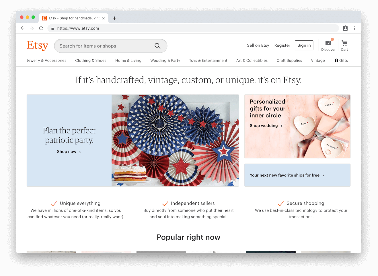
Change search bar appearance
Make the search bar of your site as visible and intuitive as you can. Test the placement, size, and text on your search bar. For example, Etsy uses a large search field that’s placed directly next to their logo on the homepage, encouraging users to utilize search to find the specific product or shop they’re seeking.
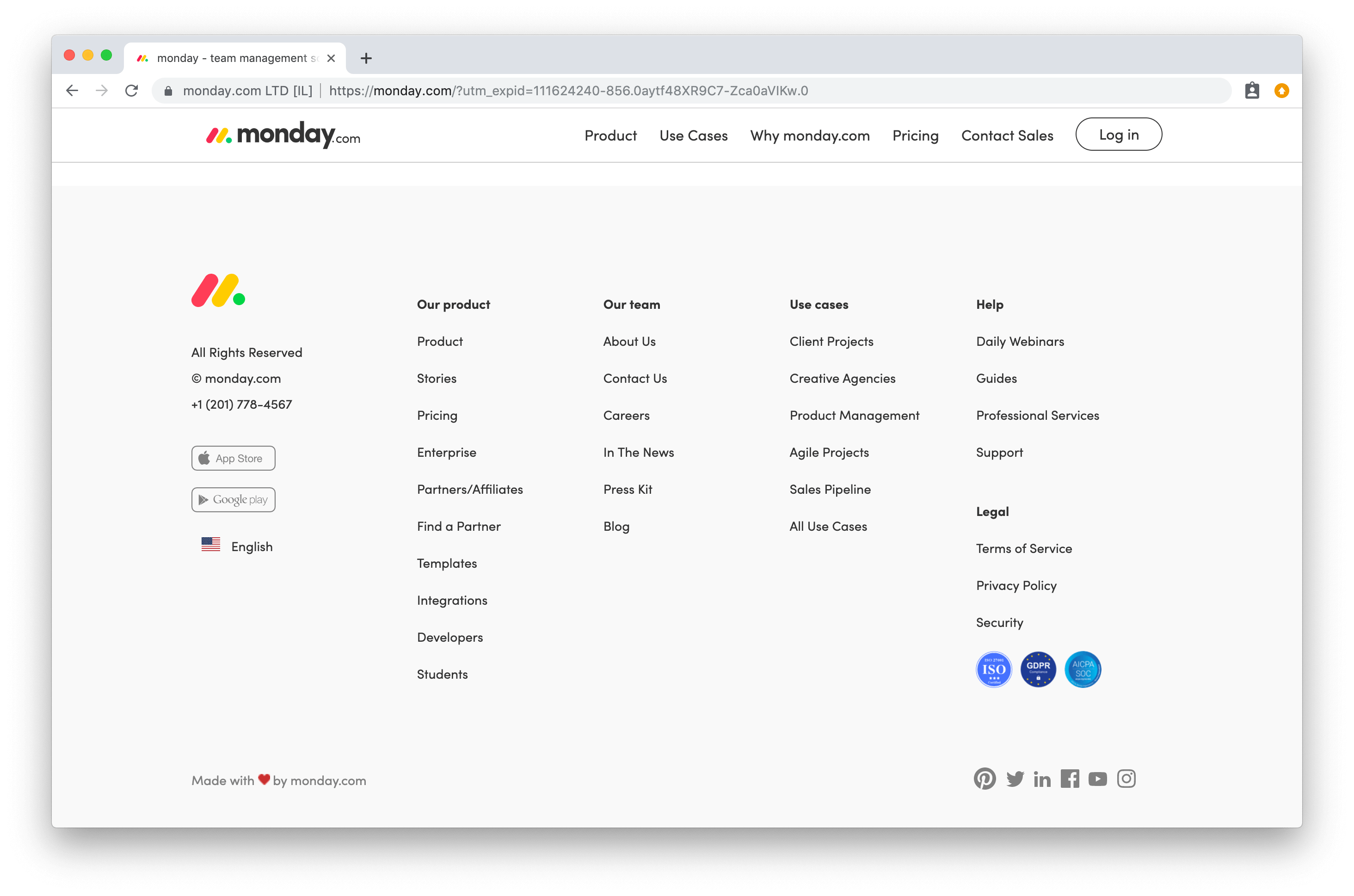
Include key information in the site footer
The website footer is a commonly overlooked aspect of a company’s website. While it may seem like the last thing on your list in terms of optimizing your website for conversions, having a functional and well-designed footer can help reduce your bounce rate and improve the overall customer experience of your site. Include more key information from your main menu in the footer to help customers find what they’re looking for. You can also try implementing trust badges or even contact details (office address, phone number, hours of operation). Monday has a great mega-footer that acts as a roadmap for their entire site.
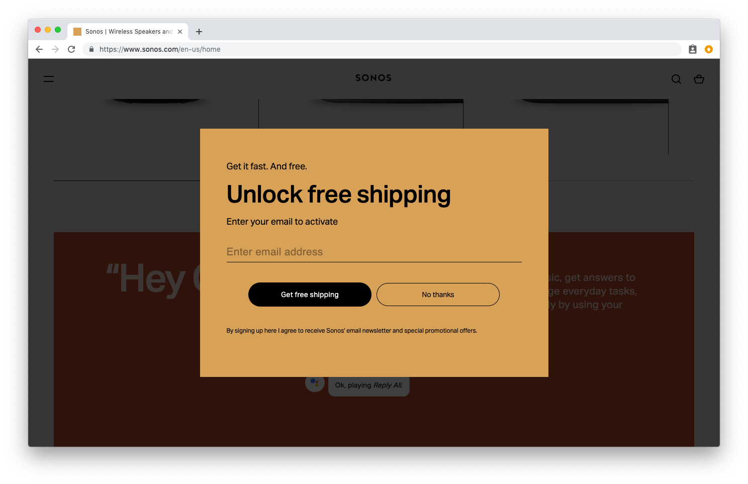
Experiment with different email signup incentives
It seems like every ecommerce website has an offer email signup offer that goes along the lines of, “sign-up and receive 10% off on your next order”. It may be worthwhile to test different offers such as a giveaway, or the ability to receive exclusive discounts and announcements. Sonos has a really unique email sign-up tactic that makes free shipping “unlockable” if you provide them with your email address.
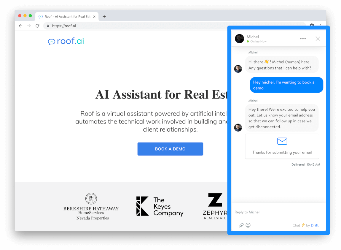
Implement a Chatbot
Chatbots are almost an essential part of every ecommerce website nowadays, especially in the B2B space. If you’re unable to give your customers 24/7 support, a chatbot is an excellent solution to that problem and can give you some helpful insight into where your customers are getting stuck in the purchase path. Roof.ai has a great chatbot implemented on their site that makes you feel like you’re talking to an actual human. Chatbots have proved to be an effective method for improving the overall customer experience on your site, and they’re relatively inexpensive to implement.
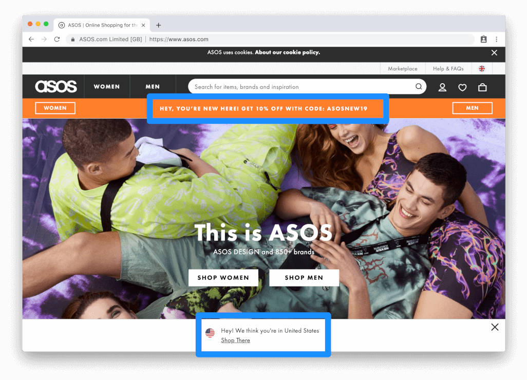
Use personalization for custom offers
The more personalized you can make your shopping experience, the better your site will be at converting users. Utilize cookies and geo-location targeting to remember the customer’s product preferences, their location in the world, and even their first name if they’ve given it to you. For example, the online apparel retailer, ASOS, automatically redirects the homepage to the men’s apparel category since that was what I last viewed on their site. They also identify your geo-location to show you relevant brands and shops that are available in your country.
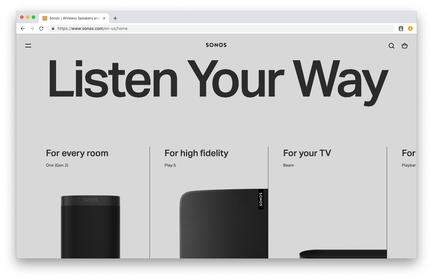
Font size and line height
Improve the readability of your content by testing different font sizes and line heights. It may seem like an unnecessary thing to spend time testing on, but it’s important to make sure the copy on your site is easily skimmable. If the text on your homepage is small and crowded, your customers most likely aren’t going to take the time to read it. A good example of a company optimizing their site for readability is Sonos. They opted for an ultra minimal website design and layout, but it doesn’t detract from the user-experience in any way.
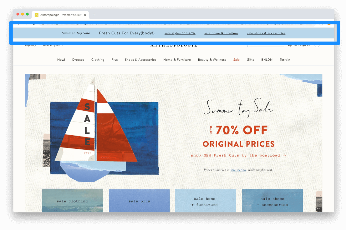
Add a sitewide banner
Test a sitewide banner on your site to highlight any sales or promotional offers you’re currently running. A banner can be a simple and very effective method for increasing conversions on your site and getting the most benefit from your sales promotions. Anthropologie has a sitewide banner that promotes their latest sales. In the example below you can see how their banner is used to promote multiple seasonal sales across their entire site.
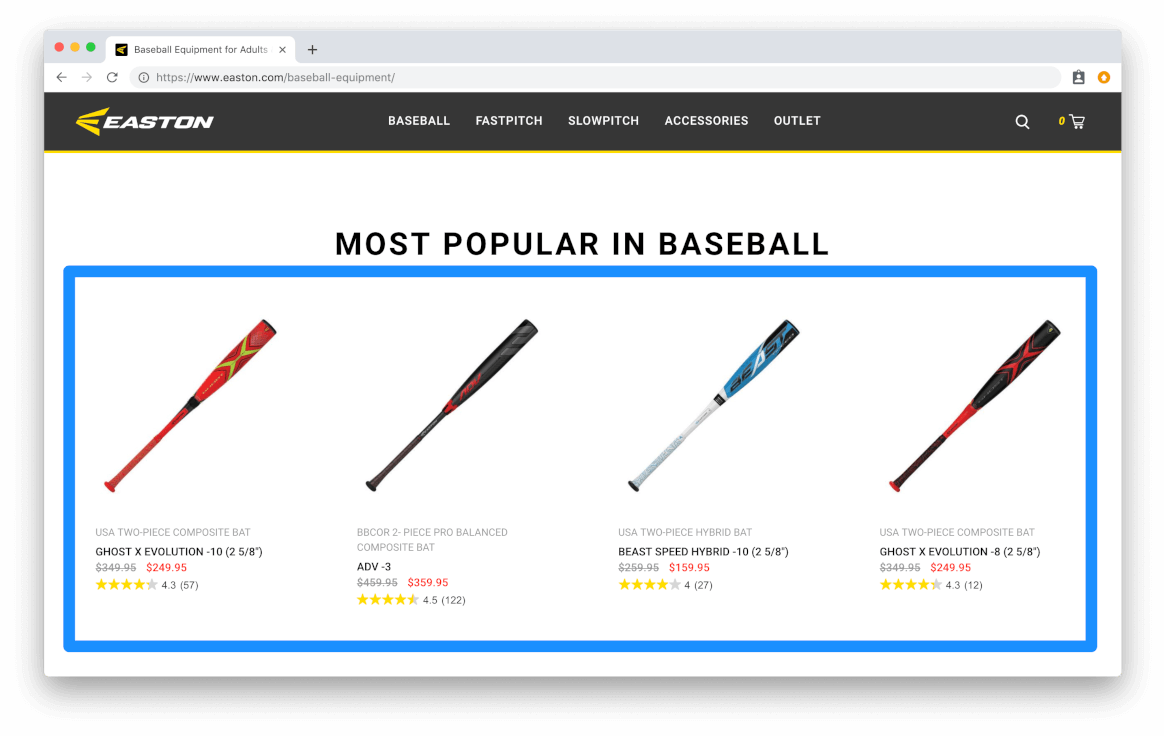
Prominently display your top selling products
Most ecommerce websites have a handful of products that they can recognize as “best-sellers”. You should make these products as visible as possible on your homepage to make the buyer’s journey as convenient and seamless as possible. Easton uses this tactic on their homepage to highlight their top-selling bats. This also gives them the opportunity to highlight any sales or price-drops which is another surefire method for increasing sales (notice the price slashes in the example below).
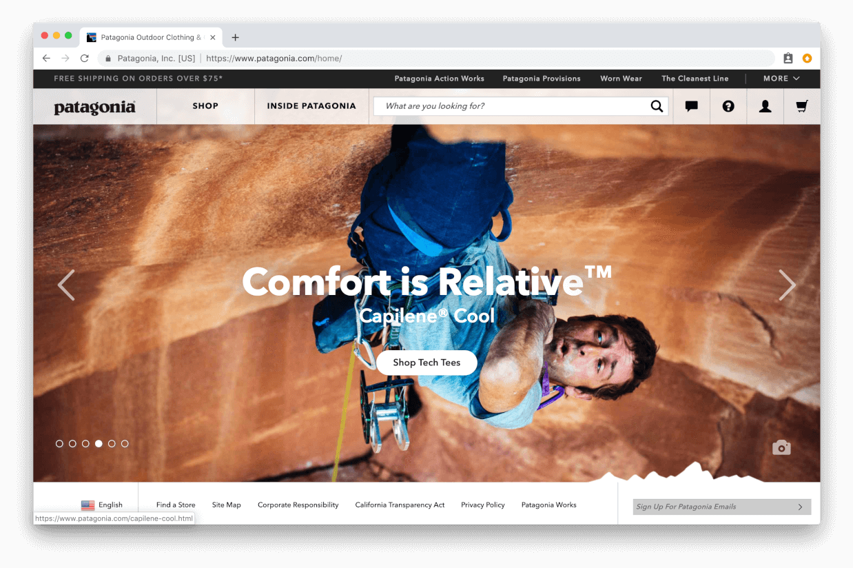
Pause (or remove) your homepage image carousel
Judging by the popularity of image carousels, you’d think they'd be incredibly effective at boosting sales and helping increase conversions sitewide. The problem is, that’s just not the case. Image carousels have been proven many times to be ineffective at converting customers, especially for ecommerce websites. If you have a rotating image carousel on your site, try choosing the best performing hero image and featuring that front-and-center. Patagonia’s homepage uses a single hero image in combination with a CTA that directs you to their latest product line.
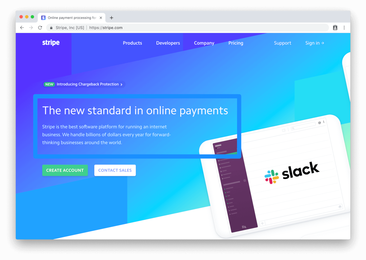
Try different variations of your brand’s value proposition
The value proposition of your business is the interaction that visitors have with your brand when they visit your site. This applies especially to B2B websites who’s service or product may not be as obvious and apparent as online clothing retailer for example. Test different variations of your value proposition to see if the messaging you’re using is connecting with your target audience, or if it’s going over their head. Stripe has a great value proposition on their site that most likely went through many different variations before becoming what it is today. They simply state what they do, and why they're the best at it.
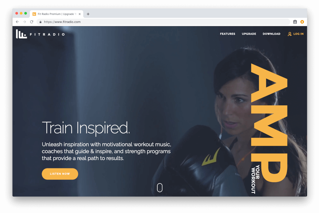
Optimize images and videos for web use
There are a variety of factors that come into play when it comes to site speed, but one of the common culprits for a slow site is using images and videos that haven’t been optimized for web use. While it seems like common sense to resize high-resolution pictures and video that you’re using on your site, many ecommerce companies continue to use large-format image and video files, resulting in page weight that exceeds 10-15MBs in size (average page weight should be no more than 2MB per page). Site speed can affect your SERP ranking, and plays a major role in the overall user experience of your site, so it’s important you optimize all the assets on your site to load as quickly as possible. Fit Radio uses a high-resolution video background on their site without compromising speed by loading the video last instead of first.
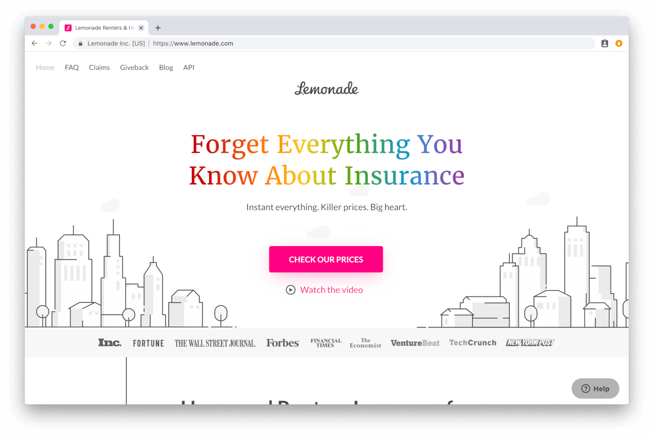
Size, style, placement, and messaging of your call-to-action
If you’re using a CTA on your homepage, there are a variety of great tests you can run to optimize its ability to convert visitors. Button color, placement, and text are the three main tests you should run on your CTA. It may seem like a relatively insignificant thing to test on, but you’d be surprised how changing the color and text on a button can increase (or decrease) it’s effectiveness. Lemonade has a great CTA on their homepage that uses a contrasting color to stand out.
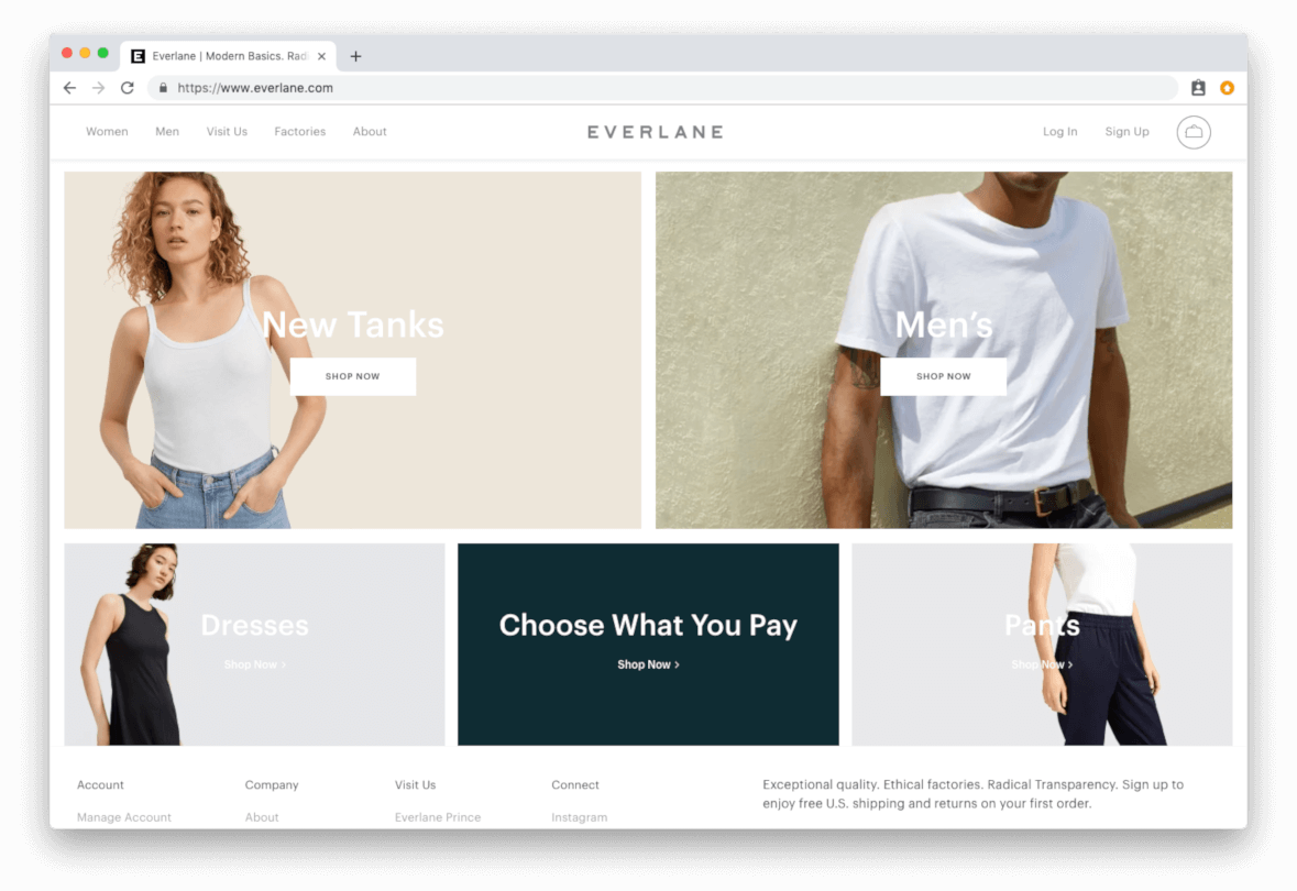
Feature top product categories versus individual products
Highlight your top product categories is another effective method of optimizing your website’s homepage. If you’re a larger ecommerce store with lots of SKUs and product categories, it may be helpful to direct your visitors to the most popular categories as soon as they reach your homepage. Most apparel retailers opt to display top product categories instead of top products since they often carry such a wide variety of items (see Everlane example below).
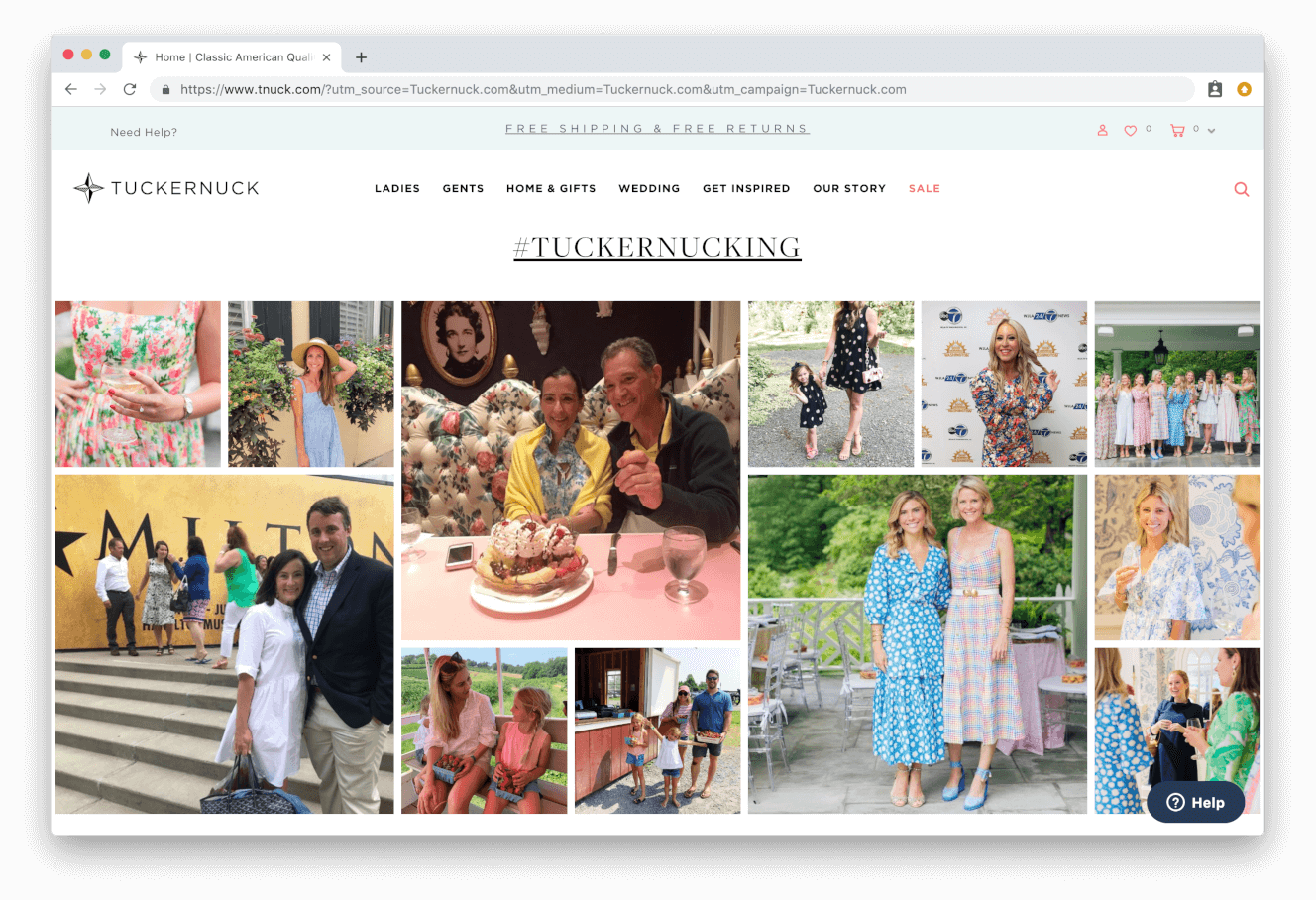
Boost your social proof with User-Generated Content
Utilizing social proof on the homepage of your site is a surefire way to build credibility and trust with potential customers. Highlighting testimonials from reputable brands and past customers is a great way to show off the quality and satisfaction people get from your products/services. Tuckernuck cleverly uses user-generated content on their homepage to show-off customers that have tagged their Instagram photos with #Tuckernucking.
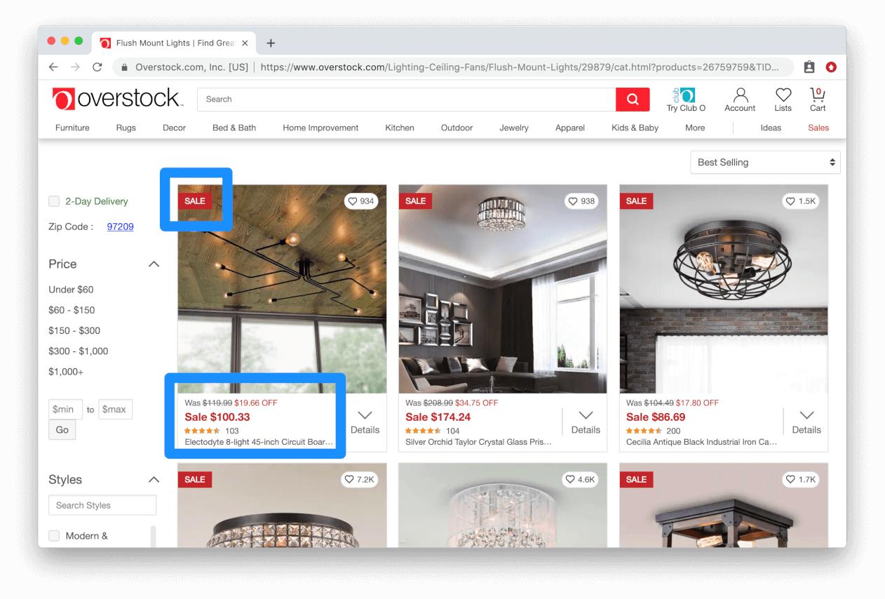
Emphasize discounted items
Direct users’ focus to discounts by striking through the previous price and positioning it next to the discounted one. Be sure to add the percentage of the discount to draw attention to the savings the user could potentially receive. Overstock uses sales discounts as a primary approach to selling products, which is why they always emphasize the savings you’re receiving with each purchase. You can see in the example below how they strike-through the original price, show the discount percentage, and then show the new reduced price in bright red.
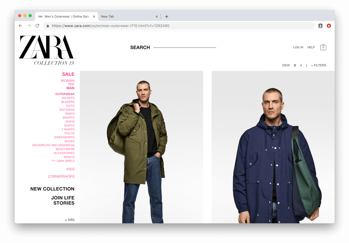
Use highest quality images possible
Use high-quality images on your category pages to make your products look as good as possible. Experiment with how you display your product images. Should you show a lifestyle on your product category page, or an isolated picture of the product against a white background? It’s entirely dependent on what products you’re selling, and what your customers prefer to see. Test different image types to see what your customers positively respond to. Zara takes this to the extreme by using extra-large images on their product category pages. What specific image size you should utilize on your site is determined by the products you’re selling.
Note: If you’re using multiple high resolution images (file sizes larger than 700-800KB) it will significantly slow down the load speed of your product page, so be careful with the images you use.
Experiment with category naming conventions
Test different naming conventions for your selection of product categories. This applies especially to ecommerce businesses selling specialized products where there may not be a defined category for every product. For example, if a company that sold mainly sports and outdoor products had a large selection of camping chairs in their catalog, should they be categorized under “outdoor equipment” or “camping equipment”. Experiment with different product category names to help eliminate confusion for the customer and provide for the smoothest shopping experience possible.
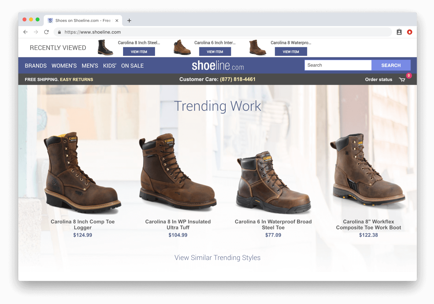
Use personalization to display relevant categories
Cookie the visitors on your site so you remember what products they prefer. If a user was browsing raincoats the previous time they were on your site, offer for them to pick up where they left and display your latest selection of raincoats. With every aspect of personalization you apply to the customer experience, the better your site will be at converting visitors. Shoeline is a great example of utilizing personalization on the category page by highlighting the last product category you were last viewing on their site.
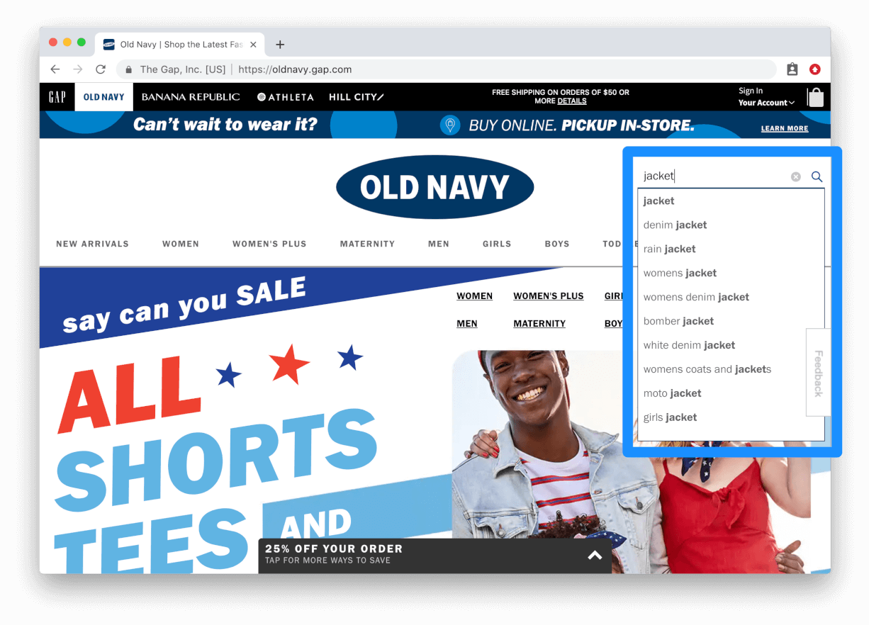
Add autofill options to your product search
Adding autofill to your search function will save time for the customer and make your site more efficient at returning relevant results. This shouldn’t even be considered a test; if your site’s search function doesn’t utilize autofill, it’s time for you to implement because it will dramatically improve your UX. Old Navy uses autofill to help suggest relevant products that may be associated with what product you’re searching for. This may seem like a simple test, but many ecommerce websites don’t provide this essential search function and it’s hurting their conversion rate.
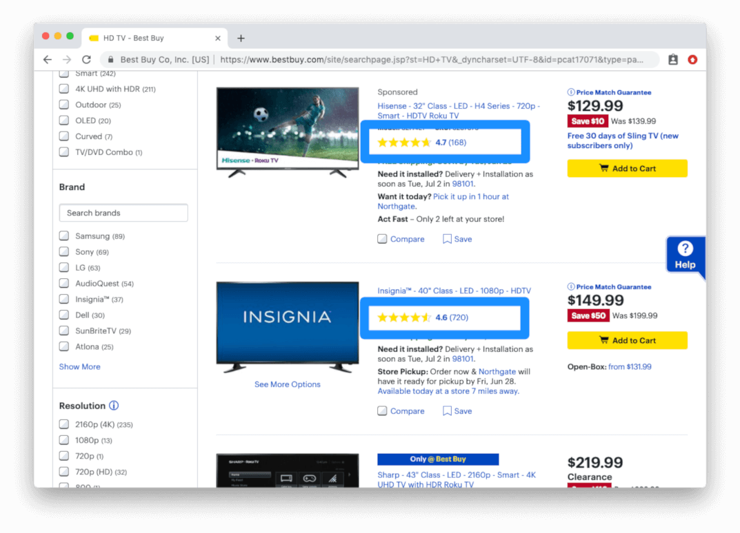
Make customer reviews highly visible
Below each product image on your category page, try displaying reviews for the product to increase purchase motivation. If 500 customers purchased that product in the past and they all gave it a shining review, harness the power of those reviews to help improve your conversion rate.
Lifestyle images vs. product images
Users are naturally more drawn to images with people in them. Try featuring images of people using your products instead of an isolated view of the product. Depending on what you’re selling, you may be surprised by the impact this will have on your conversion rate.
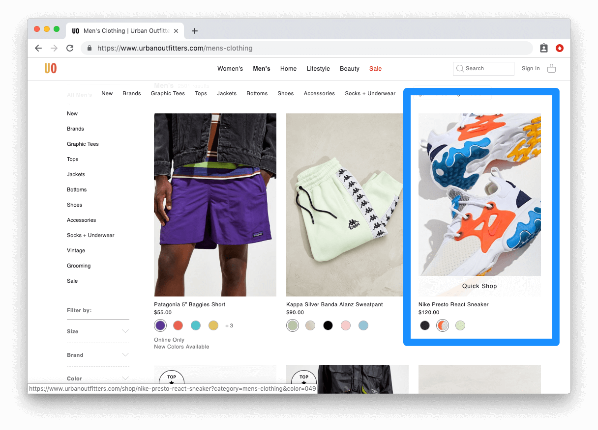
Hover effects for product thumbnails
An underutilized feature on product category pages is the hover effect for product thumbnails. When a customer moves their cursor over a product they’re drawn to, you should provide them with helpful information about the product such as price, colors available, sizing options, etc. Urban Outfitters uses the hover effect on their product pages to provide you with an alternative image of the product, and a “quick shop” options that allows you to view a condensed version of the product page as a popup on the product category page.
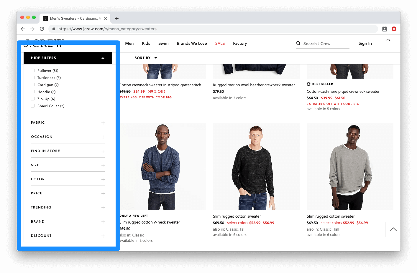
Filtering and sorting options
Try testing sticky side filters so customers can easily assess filters even as they scroll through the product category page. Test different groupings of filter options. Give users the option to sort products based on price, alphabetical order, recency, etc. The more filtering options you can provide customers with, the better. J Crew uses sticky filters that follow you as you scroll down the product category page. The filtering menu is also easily collapsible if you prefer to not see the filters.
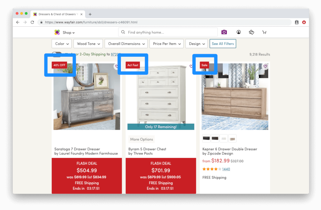
Include tags on product preview images
Emphasize “New” or “Best Seller” for added guidance. Add callouts on items that may be on sale as well. Callouts contribute additional value to existing products and increase visitors motivation to purchase. Wayfair uses bright red tags heavily on their site to indicate discounts and price drops on selected items. This is a really quick and effective method for increasing the success of your product category page.
Display customer reviews higher up on the page
Customer reviews have been proven to increase trust with your brand and they validate potential customers’ decision to purchase. If your reviews are buried at the bottom of your page a majority of your customers are likely not even scrolling down to read them.
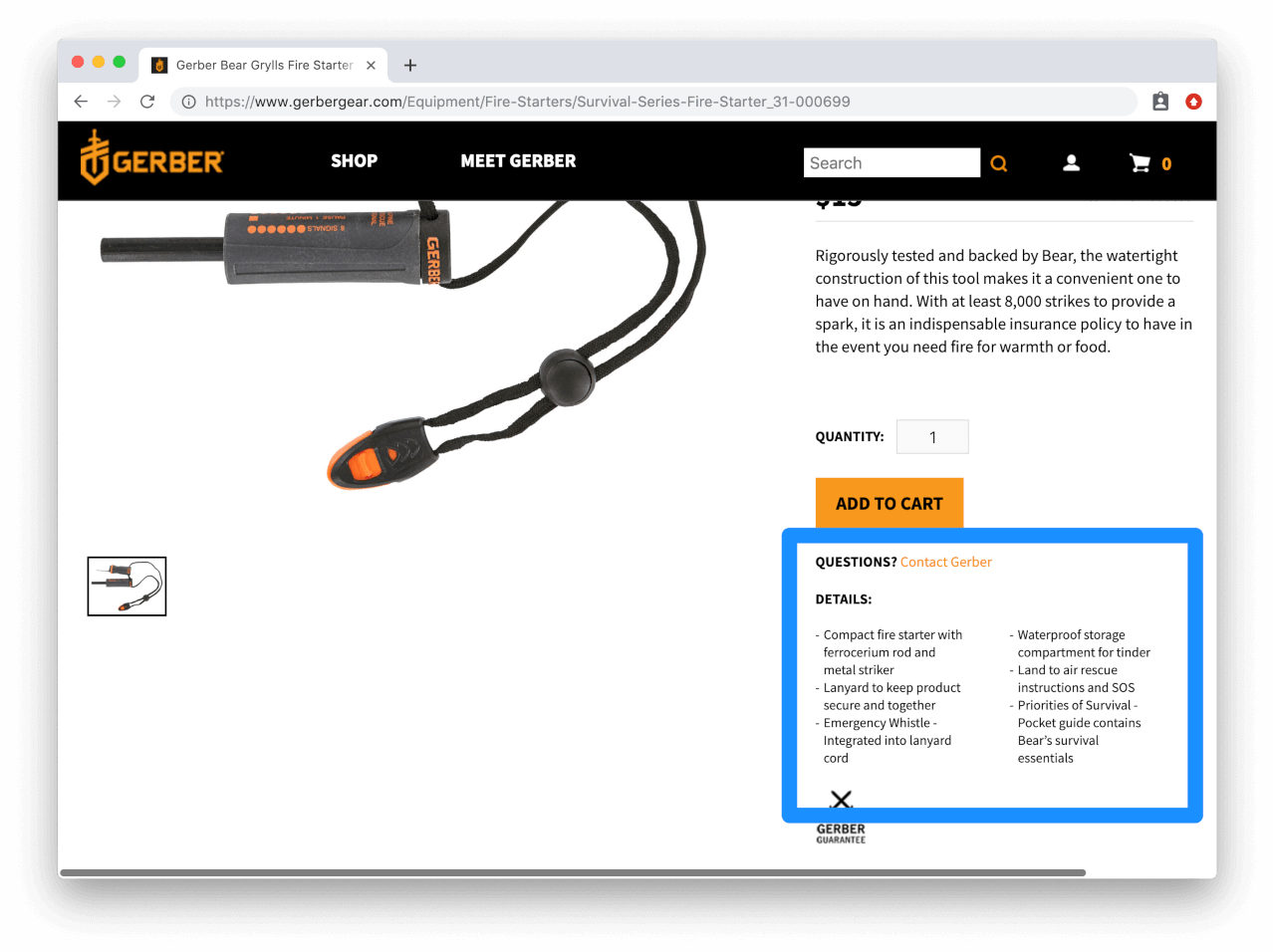
Test different feature and benefit callouts
Test out different features and benefits of your products on your product detail pages. Your customers may respond more positively to specific features of the product that they find attractive, but you won’t be able to identify which features those are if you don’t test them. Gerber calls-out very specific features that would only be of interest to their target customers.
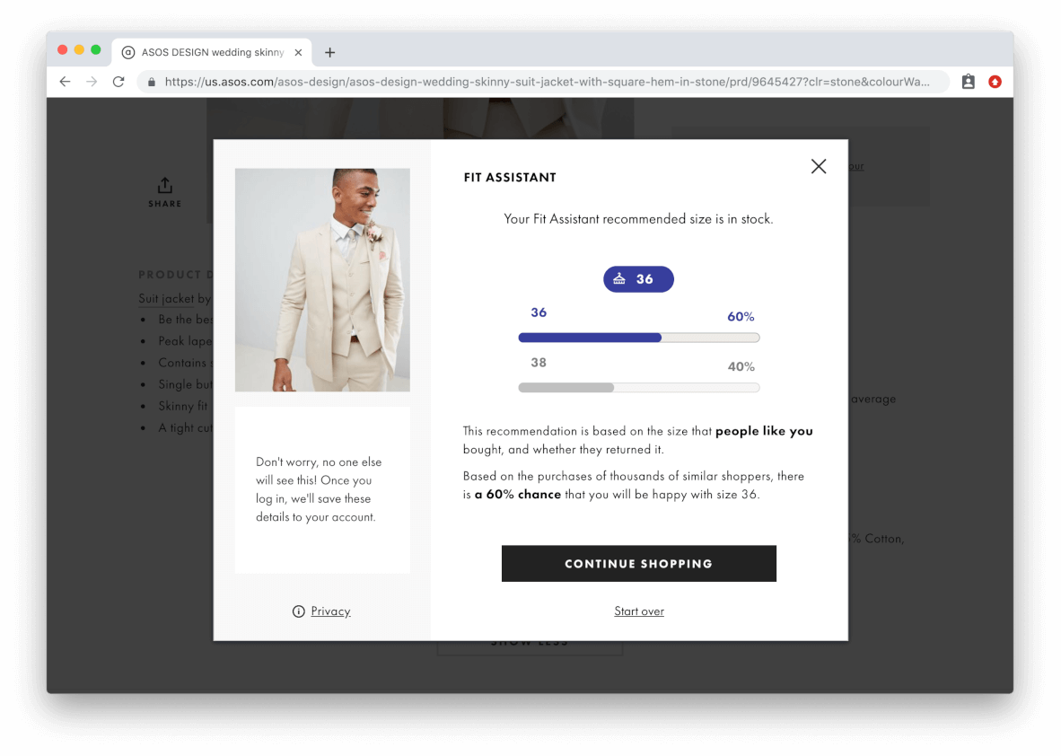
Show product sizing charts on the page
If you’re in the apparel or footwear industry, it’s important to have a sizing chart easily accessible to your visitors. If your sizing chart is currently located on a separate page, try including it someone on the actual product detail page. You may assume this is a given for any ecommerce store selling clothing or footwear, but you’d be surprised how many businesses completely forego this important aspect of the buying experience. ASOS has an excellent, step-by-step method for sizing their products. All you do is list your height, weight, age, and build and it will tell you what size you should purchase.
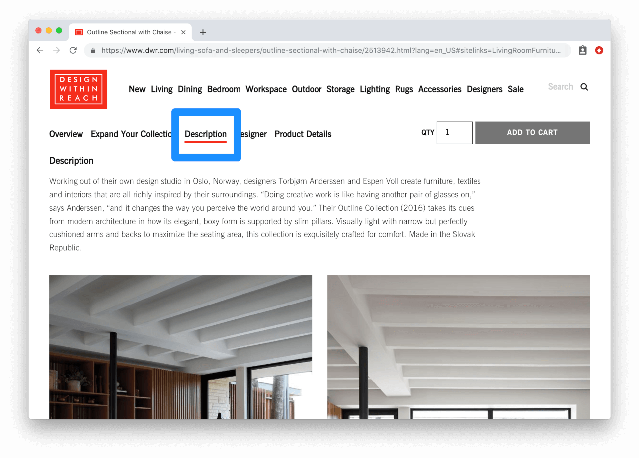
Modify lengths of product description copy
Depending on the products you’re selling, you may want to modify the length of product descriptions and specifications to be more or less wordy. Focus on using bullet points to help break-up the features of the product and make it as readable and skimmable as possible. Design Within Reach opts for an in-depth product description that provides detailed information about the material the furniture is made from, and the designer who created the piece. The higher priced the product, typically the more in-depth the product description will need to be.
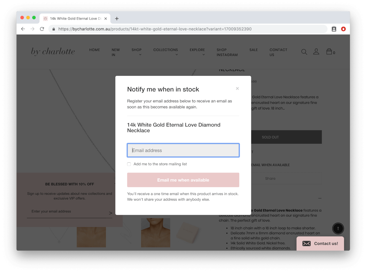
Provide back-in-stock inventory signup options
If your product is in high-demand and you’re currently out-of-stock, provide users with an option to get an alert when the item is back-in-stock. The point is to not turn customers away empty handed from your website. This can also be a good way to collect customer email addresses. Back-in-stock notifications are especially important if sell small-batch products, or if your store is just starting out and inventory is limited. By Charlotte, a luxury jewelry retailer, has a simple back-in-stock notification button on any sold out product page. You simply enter your email and they’ll email you once the product inventory is replenished.
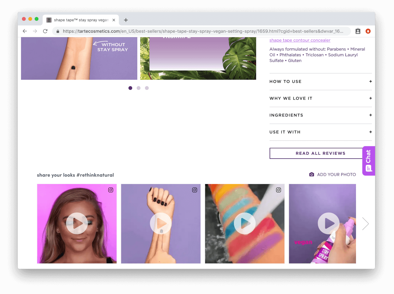
Increase your social proof by utilizing user-generated content
Moving beyond reviews, give users the ability to share Instagram posts of themselves wearing your products. By showing potential customers how satisfied your customers are with that product increases their motivation to purchase. Tarte leverages user-generated content on their product pages by showing Instagram posts that hashtag the product. Customers are then motivated to share the products on social media for the opportunity to get featured, and the brands benefits from the free promotion.
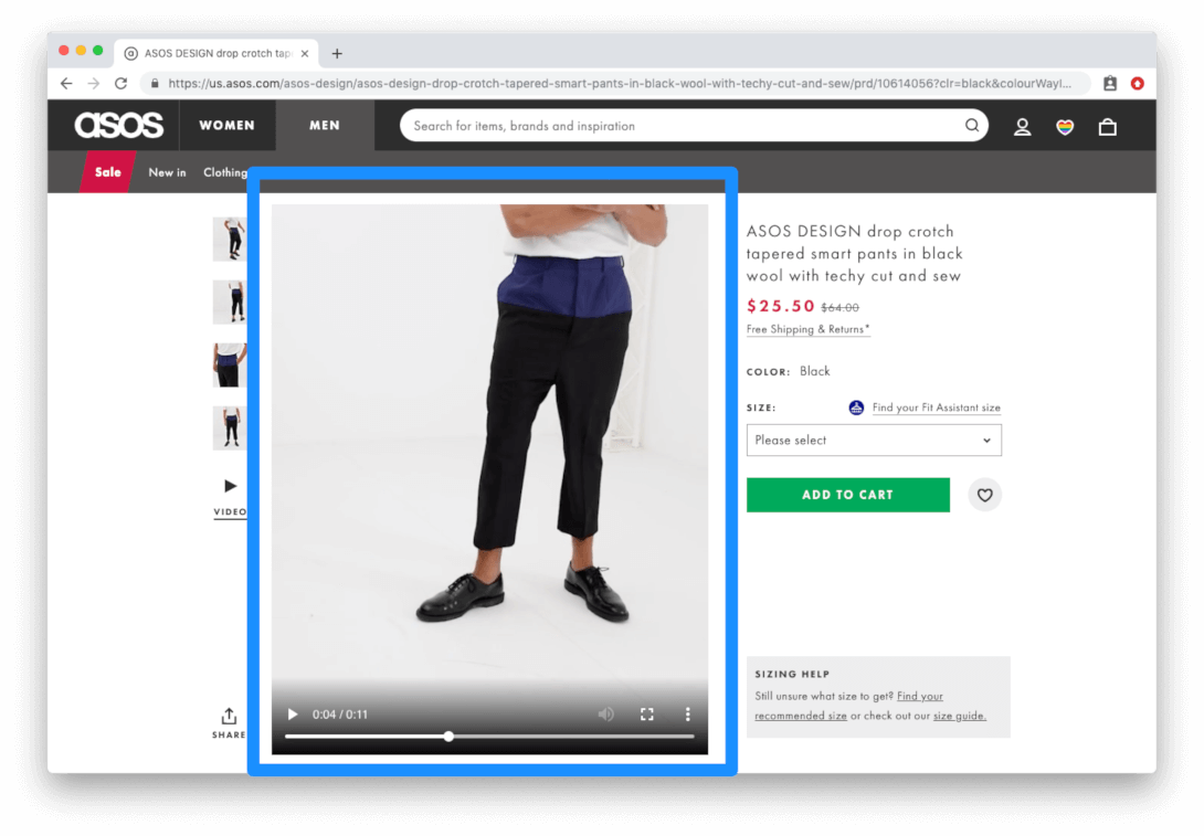
Test product videos and 360° videos
Product videos are quickly becoming a necessary element to include on your product detail page. Customers expect to be able to see what the product looks like beyond the 3-4 images you provide for them, so product videos can be an excellent way for you to provide your customers with a more detailed view of a product. ASOS was one of the first companies to capitalize on 360° product videos. For every single one of their product pages, they provide four high-resolution images and a video that shows a person modeling the item you’re viewing.
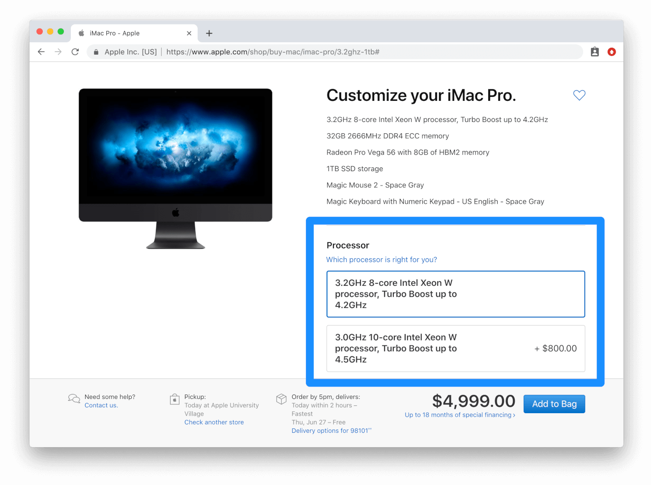
Try upselling before cross-selling
Instead of suggesting complementary products to your customers, try upselling higher priced products. Research has shown that displaying slightly higher priced products is much more effective than offering customers “Recommended products” that other customers have purchased. Apple are experts at upselling products by giving customers the ability to customize/upgrade the product they want to purchase.
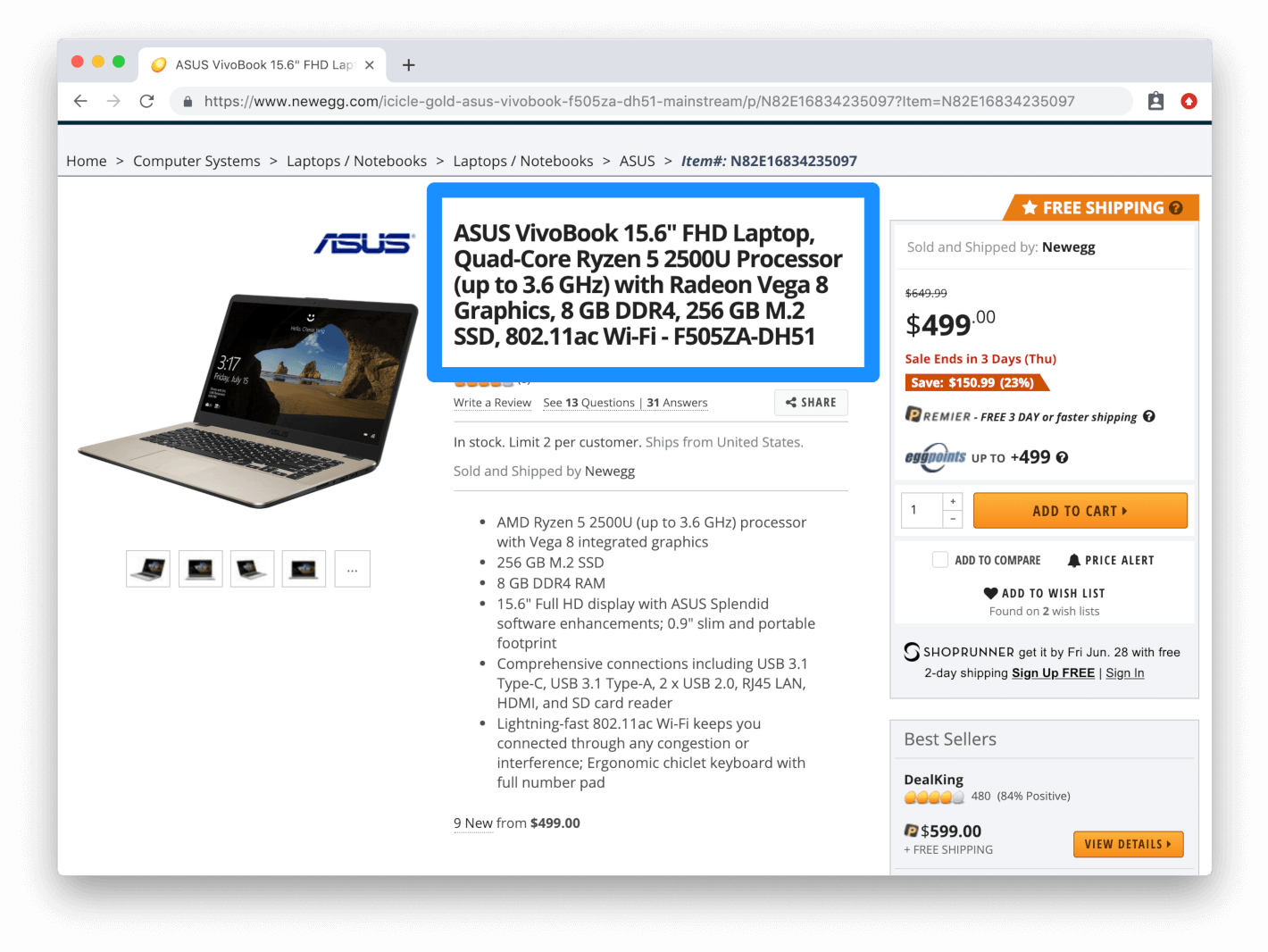
Use specific product naming conventions
Test how you’re naming products in your ecommerce store. The more detailed you can get with the name of your product, the more likely it will show up in search results. Newegg utilizes ultra-specific product names to help customers find exactly what they're looking for.
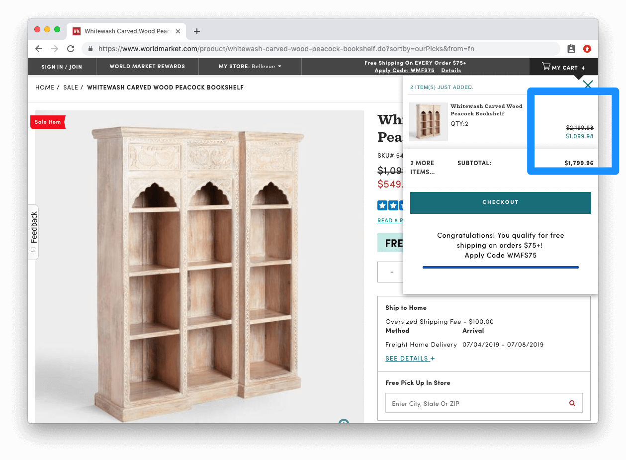
Emphasize sale price
In your mini-cart, have a price breakdown that includes any sales and discounts that may apply to the customer’s order. You should be taking every opportunity you have to highlight the savings your customer is receiving. The more they’re reminded of the deal they’re getting, the less likely they’ll be to bounce. World Market does this with their mini-cart, and they even let you know if you qualify for free shipping.
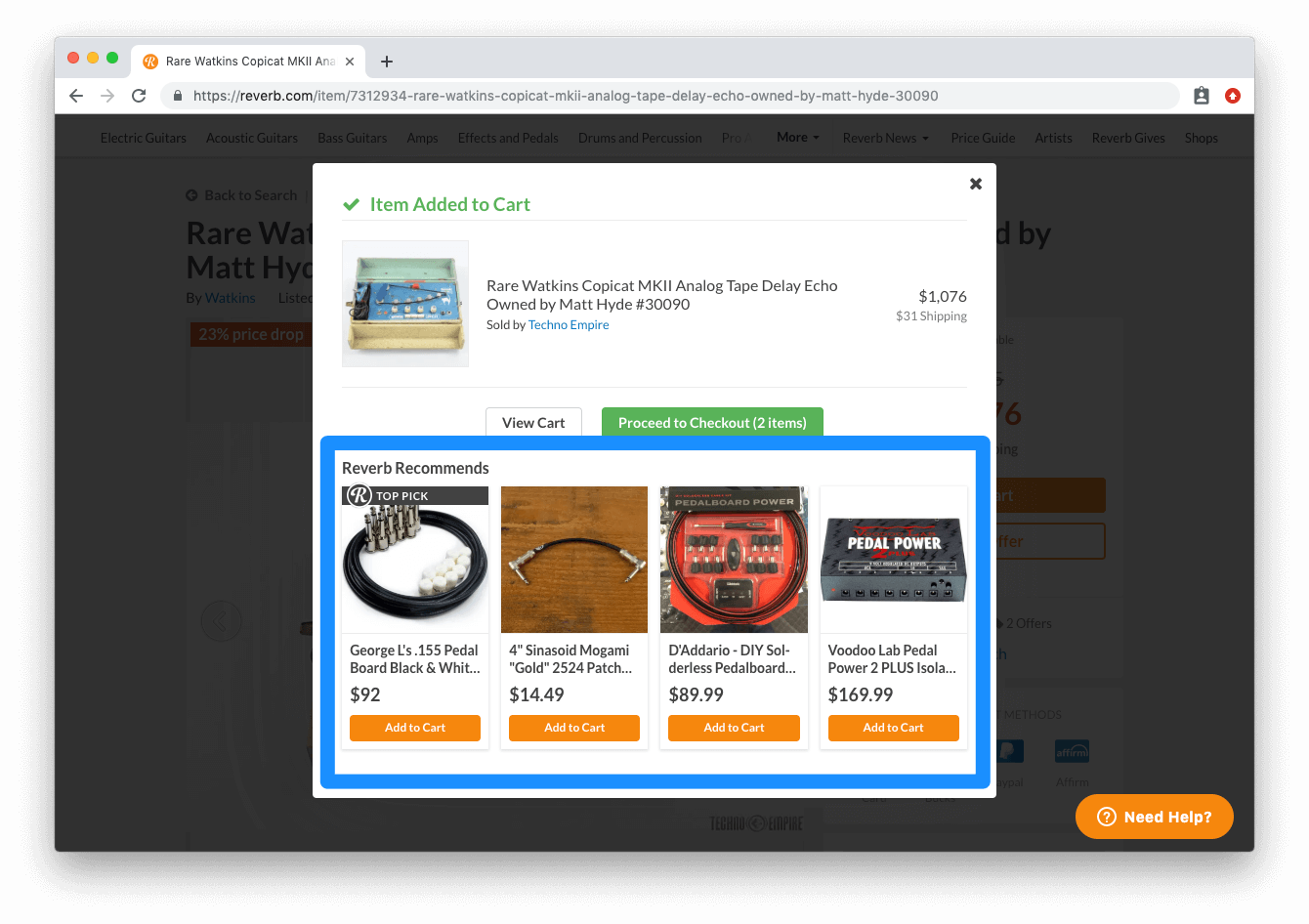
Cross-sell complementary products
The mini-cart can be a great place for you to cross-sell products that will complement whatever the customer had just added to their cart. In the mini-cart, try displaying relevant complementary products that the customer can quickly add to their cart before they move on to checkout. Reverb utilizes this tactic on their mini-cart by recommending products that they frequently see other customers purchase together.
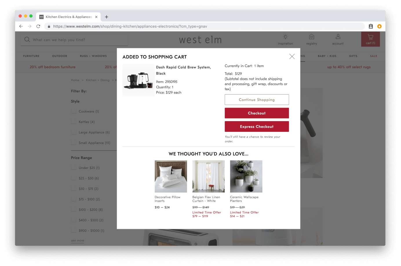
Emphasize product image or name
When a customer adds an item to their cart, make sure you show them a thumbnail picture and complete title of the product. Giving the customer a visual reminder of the product helps them complete the purchase and reduces cart abandonment. West Elm has an effective mini-cart that has all the necessary elements you’d expect to see: product image, detailed name, quantity, cost, “continue to checkout” button.
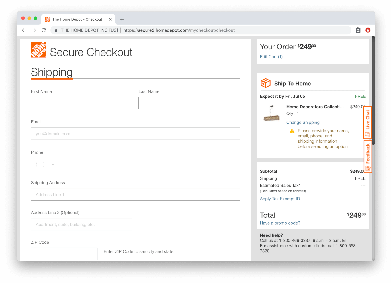
Implement a single page checkout
Try shortening the path to purchase as much as possible for your customers. If you currently have a multi-step checkout process, it may be beneficial to test out the single-page checkout option. It’s a simple test to implement and it could drastically reduce cart abandonment. Home Depot has a great single-page checkout process that also allows users to check-out as a guest with one click.
Try defaulting to guest checkout
If a customer doesn’t have an account on your site, don’t make them register to be able to checkout. If the customer doesn’t have a cookie that alerts your site they’re a registered user, you should default the user to guest checkout.
Implement trust badges
Security badges are always a great way to add trust and credibility to your checkout page. Try testing different security badges and where they’re placed on the page. eBay uses a trust badge on their checkout page from Norton, which is a highly reputable security company. Using a trust badge on your checkout page is a simple and useful method for giving customers that added bit of security with their purchase.
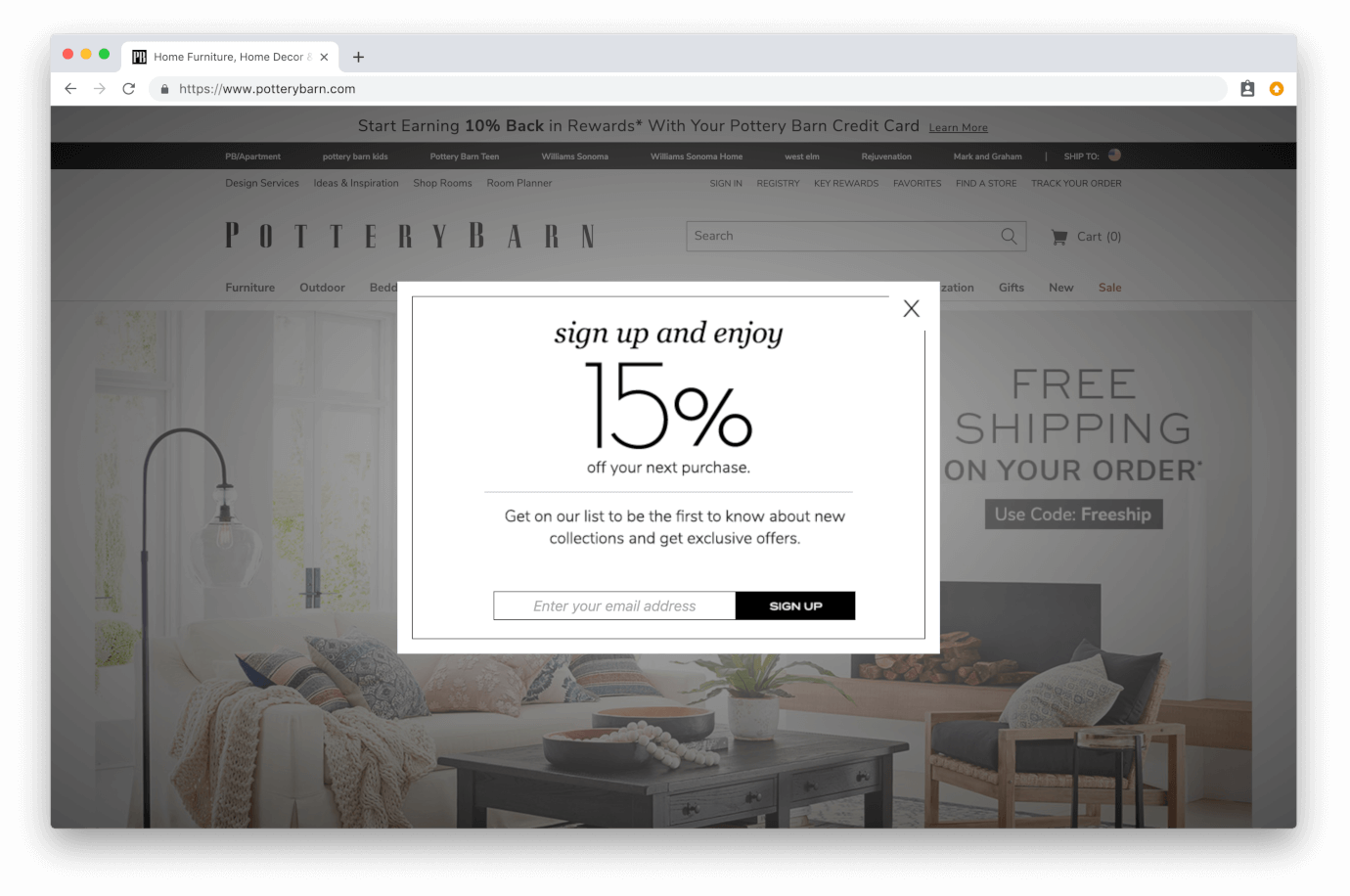
Present an exit intent popup
Create a popup that’s triggered by specific actions. Common exit popup triggers are: 1. If the customer moves their cursor outside of the browser window 2. If a customer’s spent more than 15 seconds on the checkout page. Pottery Barn uses an exit popup offering 15% off your next purchase when you move your cursor outside of the browser window.
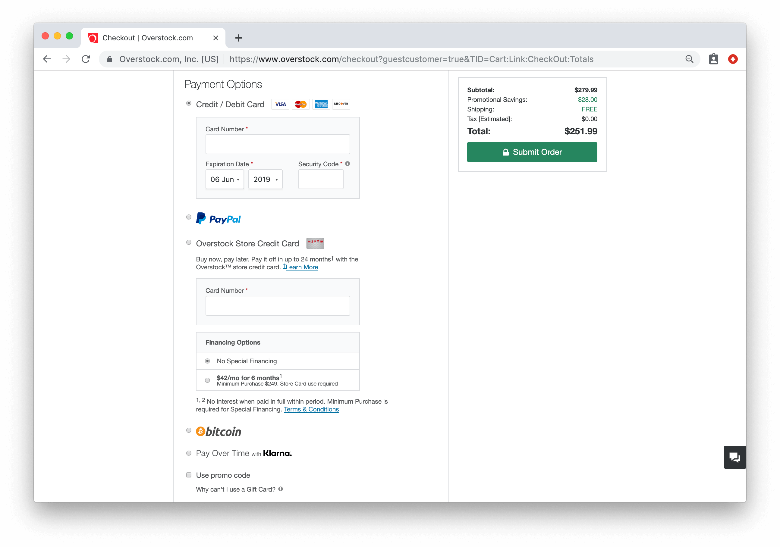
Implement multiple payment methods
Having diverse payment methods is becoming more and more necessary for ecommerce stores. You should be offering your customers two to three payment methods, minimum. Overstock is a great example of an ecommerce retailer that accepts just about every form of digital currency: Credit/debit card, Paypal, Google Pay, Bitcoin, and Klarna.
Remove or hide your coupon code field
Showing the coupon code field may actually be hurting your site’s conversion rate. Why? Because the natural consumer response to seeing that empty field is to open a new tab and search Google for a discount code that may be existing in some dark corner of the internet. This is bad news for you, not because they might actually find a code (it’s likely they won’t), but because it takes customers away from your site. If a customer can’t find a usable code, they may lose motivation to purchase.
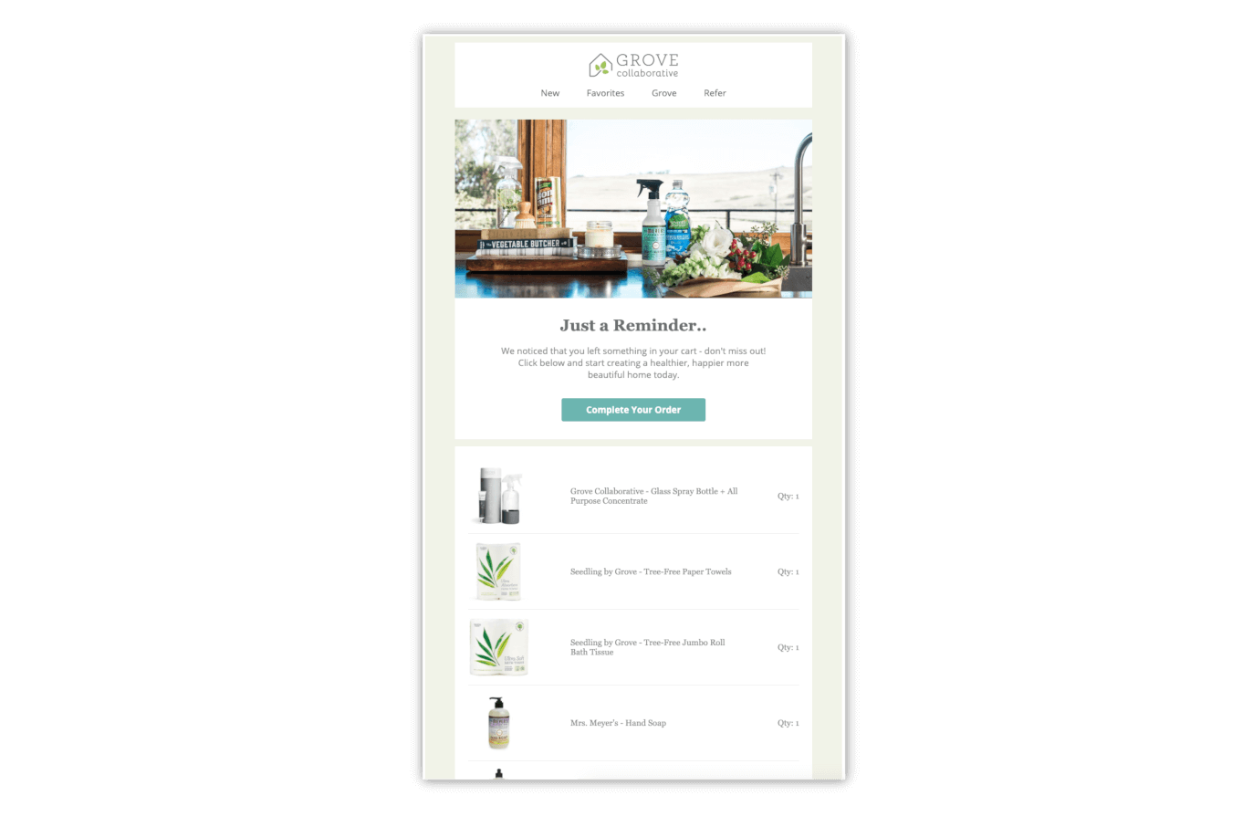
Use remarketing / abandonment cart emails to increase return visits
If your website visitors accept to use browser cookies, use that opportunity to remarket similar items to them in the future. If you collected the visitors email before they bounced, you should try a cart abandonment email campaign to help recapture those sales. Grove uses cart abandonment emails very effectively, but sending you an email reminder 24 hours after leaving their site. They make it simple just click the CTA in the email and immediately be taken to the checkout page on their site.
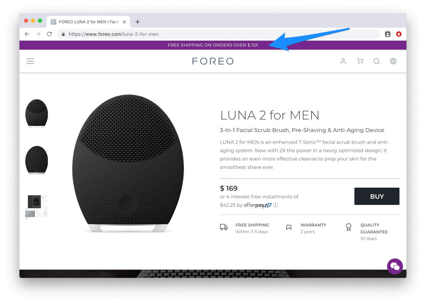
Free shipping information (if you offer free shipping)
80% of consumers stated that free shipping would make them more likely to purchase, so if you do offer free shipping, make sure your customers know about it! Experiment with making the “free shipping” text stand out more by using a contrasting font color or larger font size. If you require a minimum order amount to quality for free shipping, use a free shipping indicator. Foreo uses a sitewide banner on their site to notify customers of their $50 minimum to receive free shipping.
Remove the cart page altogether and skip straight to checkout
Test removing your cart page altogether to make the purchase path as direct and streamlined as possible. When a customer wants to purchase an item, you should provide them with two options: continue shopping, or checkout. If you do opt to remove your cart page, make sure to implement a mini-cart on your site so customers do have the opportunity to see items in their cart before moving on to checkout.
Redesign your navigational menu
Should the menu be the same as on your desktop platform, or simplified? Typically, your mobile app should have a simplified navigational menu that streamlines the mobile experience. Users on your mobile site will most likely have even less patience than users on your desktop site, so test removing items that aren't a necessary element of the customer experience.

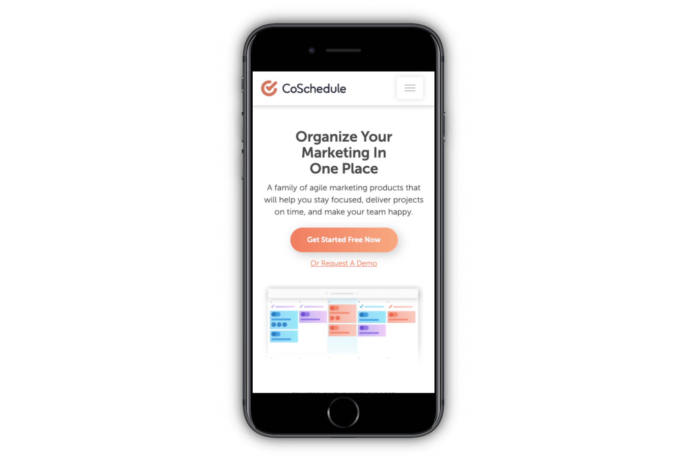
Experiment with your above-the-fold content
This is especially important for mobile users. If they aren’t engaged the minute they reach your mobile homepage, they’re likely bounce. Optimize your mobile site to have an engaging offer presented above the fold like the example from CoSchedule shown below. CoSchedule’s mobile landing page keeps it simple and efficient, starting with their value proposition followed by a main-CTA and a preview image of their product.
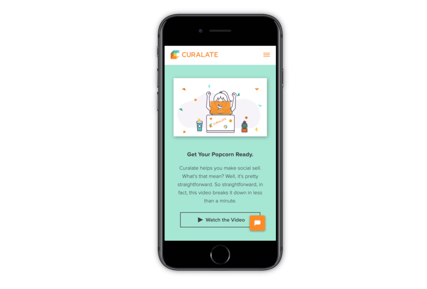
Use images/videos to convey your unique selling proposition
The more you can use visual aids to get your USP through to users, the faster you’ll be able to convert them. Investing in creating branded images or a video for your homepage isn’t the easiest or most cost efficient test to implement, but it will have a significant impact on your overall user-experience. Curalate utilizes a combination of both branded images and a video on their site to help explain to visitors the value in their service offering.
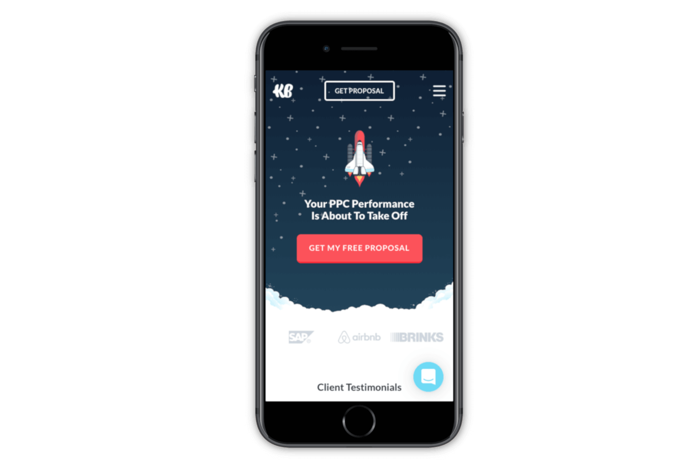
Test the length of your headlines/sub-headlines
Your mobile should have a simple, 1-line headline that users can skim quickly. Using the same copy you display on your desktop site may not have the same impact on customers that are visiting from mobile. Be as direct as possible so your users aren't having to slog through paragraphs of text. Klientboost has a very responsive mobile site that uses as little text as possible to get their point across. The above-the-fold content on their mobile site has one line of text, a CTA, and three logos of past clients.
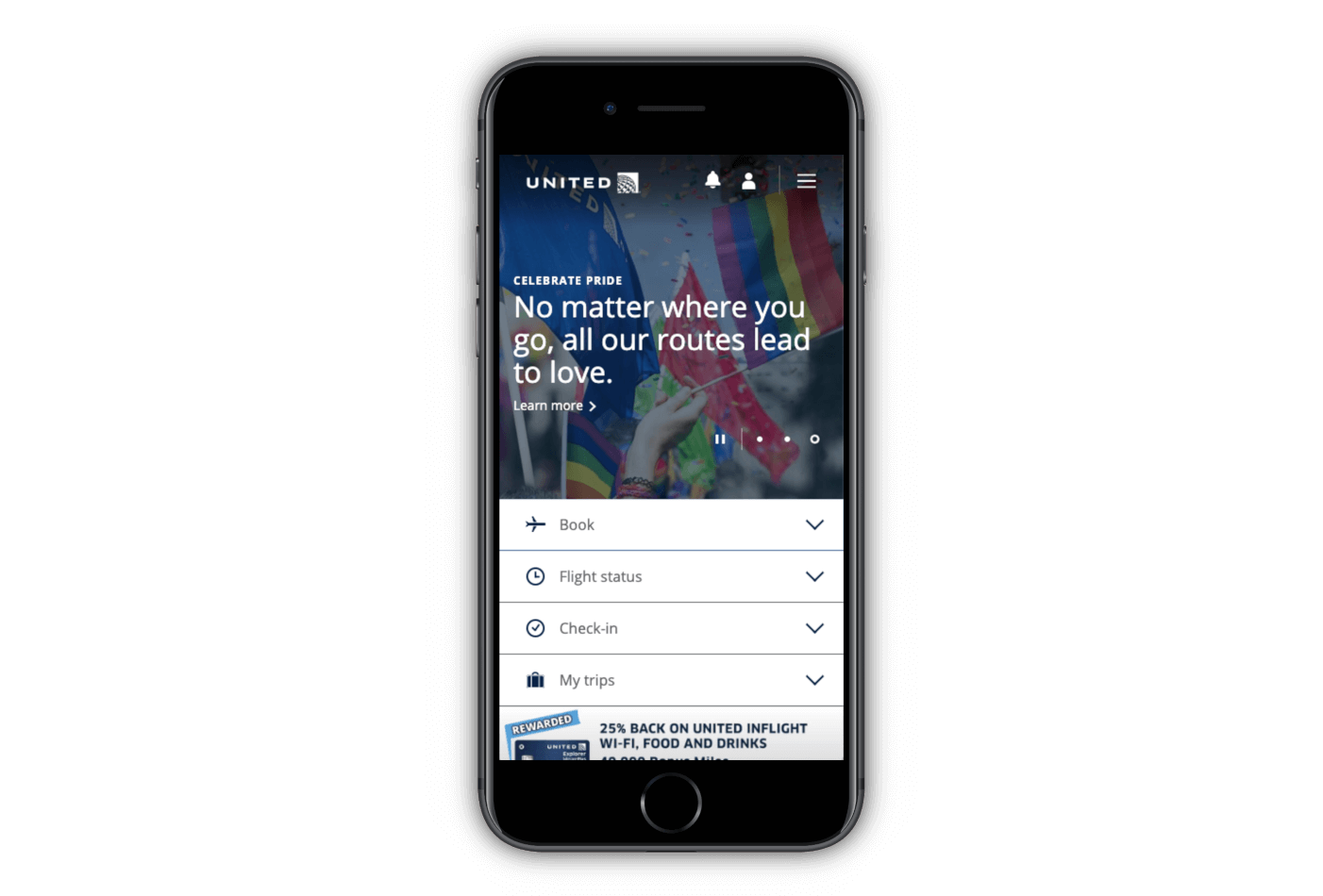
Experiment with icons
Should you use icons and images to help navigate users throughout your site? Navigational menus that use a combination of both icons and text have shown to be the most successful at improving the overall usability of mobile sites. Try testing a few variations of your homepage and navigational menu with and without using icons and see how your customers respond. It may seem like an insignificant test, but you'd be surprised how much impact this slight change can have on your UX. United mobile site is a great example of how to properly utilize icons in combination with text to help users navigate with ease.
A/B testing everything on your site
We hope this exhaustive list has made it clear how A/B testing can (and should) be applied to every aspect of your ecommerce site. The slightest change on your site can cause unimaginable ripples across your conversion and abandonment rates, so why not invest some of your time and resources into testing? If you find that you’ve outgrown your internal testing program and need an expert to help you reach your goal, contact The Good for a free landing page assessment where we’ll pinpoint specific points on your site that need optimizing.About the Author
Rudy Klobas
Rudy Klobas is a former Content Marketer at The Good. He regularly works to produce insightful, informative content and copywriting designed to help digital leaders improve the user experience.