
Before Redesigning Your Website, Try This (Our Proven Framework for Wireframe Design Briefs)
Wireframing provides a blueprint for your website. Without it, you waste resources on a design that doesn't convert or satisfy users.

Building a successful website is like building a house; you need a blueprint before constructing.
Wireframe design is your website’s blueprint, providing an overview of a website’s page structure, layout, information architecture, user flow, and functionality. Without it, you might waste precious marketing spend on a design that neither converts nor leaves your users satisfied.
If not cautiously approached, a redesign can exacerbate your current customer challenges. While your redesign may look great, it may lack the functionality and usability that lead to sales.
So, in this article, we’ll review the basics of wireframe planning and how we conduct data-driven redesigns as a part of the Digital Experience Optimization Program™ here at The Good. We’ll also provide examples to see how we’ve helped past clients succeed in a redesign.
What is a Wireframe?
A wireframe is an illustration of an application or website page. It is a simple (often greyscale) visualization.
Wireframes outline components of the page (like text, images, navigation, etc) in a hierarchical format. They are an early blueprint that UX designers can then validate against user needs and business goals before committing to a final design.

Wireframes typically consist of a basic content layout with boxes and lines representing different parts of a webpage, like the body content or header image, with little or no details like color, typography, or graphics.
Creating wireframes doesn’t require any fancy design skills, as the goal of wireframing is to work out the form and function of your pages early in the project, before getting concerned with strictly visual design.
Some stakeholders in your company may encourage you to skip the wireframing stage, calling it an unnecessary waste of time. But it’s the opposite; wireframing gives you something lean to validate early—before your company wastes resources.
What are the Types of Wireframes?
There are three main types of wireframes fidelity. The type used depends on your project’s requirements:
- Low-fidelity: Basic design concepts of a website’s layout using only lines, boxes, and simple shapes to indicate elemental placements. Often used in the earliest design process stage.
- Mid-fidelity: More detailed representations with elements like text content, basic images, and some colors for key actions. Used to refine the website’s structure and layout, test user flows, and gather feedback from stakeholders and users about design elements.
- High-fidelity: Very detailed, polished design with rich features like realistic images, typography, and even colors. Closely resembles the final design.
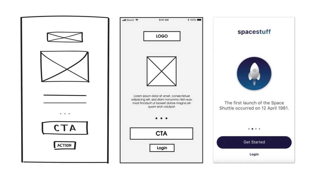
When starting a new project, a low-fidelity wireframe can be as simple as an idea jotted down with pen and paper. As the ideas progress, mid-fidelity wireframes will help you shore up the general layout of the website’s elements and give you something tangible to test and evaluate.
We love mid-fidelity wireframes for the evaluation stage because they don’t have the distracting color and content of a full-blown design. Stakeholders can focus on what the page is trying to accomplish rather than how beautiful or convincing it is.
Enjoying this article?
Subscribe to our newsletter, Good Question, to get insights like this sent straight to your inbox every week.
Wireframe Design Process
Pre-Planning: Know Your Users
Before you get started wireframing, you should know who your users are, where they are coming from, and what stands between their desire and fulfillment. That means doing your due diligence through user experience (UX) research.
More than simple behavior metrics, UX research provides designers with valuable insights into the target audience’s behavior, preferences, and needs. Through one or more of the methods below, you should define user challenges, understand roadblocks to conversion, and define the ideas your users hold that are preventing them from successfully converting.
- Surveys
- Interviews
- Competitor analysis
- Heatmap Analysis
- Usability Testing
- Heuristic Analysis
- Competitive Analysis
With the knowledge you gather from UX research, you can serve site visitors with the right information at the right time. This is a crucial insight to have as you plan out your website blueprint and will help you in the next step of the redesign process…setting goals.
Set Project Goals
In ecomm, there’s usually a lot of talk about “goals,” but the meaning can be slightly ambiguous. For us, the biggest distinction we make is that business goals are not the same as user goals. When we discuss outcomes, our team is careful to draw an important distinction between what users care about, and what outcomes we hope to achieve for the business. Sometimes those work in tandem, but they can also create a tension to overcome.
The power of a redesign project is that it has the potential to help both businesses and users achieve their goals. A successful redesign takes into account both of these stakeholder groups, and outlining project goals is your chance to state the various parties’ priorities in one go.
Because we address key metrics separately, we tend to use these goals as aspirational objectives. For that reason, you don’t need to be strict about HOW your goals are framed. For example, you can include things like “grow topline revenue” but also consider less measurable outcomes like “be the first choice for coffee snobs globally.”
Think of these as overarching guiding principles. Outlining the redesign goals should help you keep the finish line in perspective.
Examples of goals include:
- Improving user experience
- Simplifying navigation
- Unifying design language
- Improving site speed
- Decreasing checkout abandonment
- Increasing sales
A helpful tool in coming up with goals or objectives is to put together some “how might we…?” statements.
You could say something like, “how might we guide users from the product page back to the category page?” or “how might we provide enough information on the product page that they don’t want to navigate back to the category page?”
You can also create “how might we…?” statements that are less tactical and more theoretical. For example “how might we show products as valuable instead of expensive?”
These statements help your team stay focused on the opportunities rather than defining solutions.
If you aren’t sure of your goals, The Good can help you identify objectives and develop a project strategy.
Getting Started With a Wireframe Design Strategic Brief
Along with pre-project user research and setting goals, successful wireframe designs need a strategic brief for each page. Briefs come before the design stage and should include the following (I’ll get into each of these elements in more detail, in just a minute).
- Goals: keep the goals for your project top of mind by including desired outcomes in your brief
- Background: using the pre-planning step of getting to know your users, establish relevant context
- Key Metrics: detail how you plan to measure desired outcomes
- Constraints and Requirements: limitations or restrictions that impact the design
- Minimum Experience Standards: define how we want our visitors to experience and understand the website
With a brief, stakeholders stay aligned on the most important elements of the project. They connect your plan to your purpose and keep the team user-focused. And a good brief helps everyone understand what your wireframes will accomplish before you spend time designing.
Now, let’s dive into each element of a wireframe design strategic brief.
Background
A good brief should start with a few can’t-miss items.
- Page title: This is self-explanatory. Include the page title in your brief so you don’t get it mixed up with others.
- Key data points: What data points did you find in your research that should be kept top of mind as you redesign? For example, “80% of visitors on this page are on mobile” or “traffic to this page is via paid ads.”
- Use cases: Similar to key data points, what user experiences did you learn about in research that should be kept top of mind as you redesign? For example, “users are in an exploratory state when they reach this page.”
At this point, you’ve already done the pre-planning step of getting to know your users, so you should already know the relevant data and use cases that will guide the project.
If you are building a great brief, this section should also cover established challenges to help your designer narrow in on the current pain points your users experience on this page.
What do you want these wireframes to address? For example, if you find that during user testing, users often struggle to navigate back to the category page, you’re going to want to note that as an established challenge.
You might also find less tangible blockers in the path to purchase. Maybe users are comparison shopping on your site and notice that your products are much more expensive than other companies. If you note this as an established challenge, you can begin to address it in the design and messaging.
Key Measurables
Without key measurables, your company won’t know if you’ve achieved what you sought to do.
When deciding on your key measurables, ask your team to fill in the blank. “We will know our redesign is successful if ___________.”
Those answers become the inspiration for your measurable metrics.
As you set key measurables, also consider the problems your pages or website currently faces.
For example, are you having issues with the conversion rates? Bounce rates? How fast do your pages load? Are there hang-ups in the checkout process?
By aligning your key measurables with your site’s issues, you can ensure that your redesign is focused on solving those specific problems and achieving real results.
Constraints and Requirements
Next, you’ll decide what your website must and should not do by establishing constraints and requirements.
Constraints refer to any limitations or restrictions impacting the design process, like technical limitations, budget, or timeline.
Requirements are the design spec features, functions, and content the wireframe must include to meet the project’s needs. There could also be legal requirements like avoiding certain words or graphics in the design.
Simply put, constraints are the things we can’t do; requirements are things we have to do.
Taking the time to map these out before a redesign forces companies to align on which tightly held opinions are actually lines in the sand. It also gives us a place to make sure we’re learning from our own past mistakes, and not making the same mistakes twice.
Example Constraint: We were supporting a redesign for a brand that had several sister brands. While their team was very open to ideas and iterations on the menu, we weren’t allowed to touch the utility area that linked to other sister websites. This ensured that any user navigating between the sister sites had a consistent experience.
Example Requirement: The SEO team might know that when you changed your categories from “Dress Shoes” to “Men’s” last year, the organic rankings took a dip. So a requirement might be featuring “Dress Shoes” in the main navigation.
Minimum Experience Standards
Minimum experience standards cover what the redesigned web page HAS to do.
Irrespective of the design, these are the things we promise to users as a minimum. You can accomplish them in a number of ways, but they must be accomplished.
They are sort of like boundaries we can draw around our project. Inside the boundaries are the things the web page needs to do; outside, the boundaries are the things the website can’t do.
Minimum experience standards aren’t always measurable, and they aren’t the same as goals or constraints. They are commitments to users and what we want our users to understand.
They can take the form of functional elements (ex: letting users know that they can subscribe) or motivational elements (letting them know the benefits of subscribing).
The functional elements cover areas of a site that are essential to ensuring users’ can accomplish their goals. And the motivational elements help keep your users on a path to accomplishing those goals.
We like to frame all of our minimum experience standards as something a user needs to experience. So instead of “the category page needs to include a color filter” we would say, “the user should be able to sort by color.”
This nuance in the language is what makes a true MES. The way that a user sorts by color is up to our design team, but they need to be able to do it.
Wireframe Design Strategic Brief Outline
To recap: for each page of your website that you plan to redesign, create a brief that includes:
- Goals
- Background
- Key Metrics
- Constraints and Requirements
- Minimum Experience Standards
Improve Your Design Process with Wireframes
Wireframing provides a blueprint for your website. It visualizes the website’s layout, structure, functionality, and content, enabling designers to plan website components before sinking time and money into the final product.
The wireframe design is an excellent option for all-sized businesses as it reduces the risks of unexpected declines in conversions and user experience during development.
We reviewed the basics of wireframe planning and how The Good begins a data-driven redesign. With a user-centric approach and primary research, we can create a website that looks great, performs optimally, and drives your desired business outcomes, whether you have an ecommerce website or you’re designing digital products.
Start a redesign via the Digital Experience Optimization Program™ and ensure your site aligns with customer personas, conversion best practices, and real user feedback.
Enjoying this article?
Subscribe to our newsletter, Good Question, to get insights like this sent straight to your inbox every week.
About the Author
Natalie Thomas
Natalie Thomas is the Director of Digital Experience & UX Strategy at The Good. She works alongside ecommerce and product marketing leaders every day to produce sustainable, long term growth strategies.