
How to Create a Great Product Comparison Page to Boost Conversions
Product comparison pages on your ecommerce site deliver a better customer experience and boost conversions. Here's how to make yours great.

Today’s consumers take an active role in the buying process.
Instead of sitting back and waiting for brands to come to them, they’ll conduct their own research to find the best item. Who wants to wait around when there’s a whole world at our fingertips?
Despite the active role consumers play in their shopping fate, there are still a set of steps they go through when buying a product:
- Awareness: when a consumer is just becoming aware they need a product to solve a specific problem
- Consideration: when a consumer knows what product they need to buy and is weighing up their options
- Decision: the moment a customer chooses a brand and a product to invest in
The final stages of the sales cycle pit similar products against each other as shoppers try to identify the right fit – which one fits their budget? Does it come with all the features they need? Does it look how they want it to?
Creating a product comparison page that highlights the differences between similar products helps consumers quickly figure out the best product for them. This speeds up the sales process and guides them to checkout quicker – it’s a win-win situation for everyone.
What is product comparison in ecommerce?
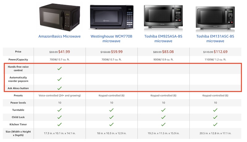
Have you ever tried to buy something like a microwave, a vacuum, or a new phone and struggled to differentiate between the options available? Maybe one microwave has 800W power but another has far more heating options. Being able to compare each option side-by-side gives a visual view of the key deciding factors that build trust.
This is exactly what a product comparison is in ecommerce. It essentially lists out the features and benefits of a couple of different products on the same page.
Potential customers can quickly see which features each microwave comes with thanks to the handy green ticks in the chart above. If they were specifically looking for a microwave that could connect to Alexa, automatically reorder popcorn, and had hands-free voice control, there’s a very clear winner.
The main elements a product comparison includes are:
- Product description and details: what are the specifications and how do they differ from other similar products? For example, one vacuum might be cordless and smaller than another.
- Product features: what add-ons does the product have that others don’t? For example, one vacuum might have six different heads that can be used for different cleaning purposes.
- Product benefits: how will the product make life easier for the consumer and how does this differ from other similar products? For example, one vacuum might have a head specifically for pet fur that leaves homes completely hairless.
Product comparison slots in at the consideration stage of the sales cycle, helping shoppers identify the best-fit product for them in a quick glance and, therefore, boosting conversions.
Product comparison: best strategies for best results
How you present your product comparison page will depend on the type of product you’re selling and the kind of people you’re selling to (we’ll dig into that in a moment). However, there are some simple strategies to keep in mind so you match customer expectations:
- Include images: display images of the products you’re comparing so customers know exactly which items you’re talking about
- Make it visual: as well as product photos, include illustrations and other visual elements to maintain reader attention
- Stick to less than five products: don’t overwhelm shoppers with tons of products; instead, stick to 2-5 for best results
- Consider shopper interests: bring the features that are most important to your customers to the top of the chart
- Keep it simple: keep text to a minimum and avoid listing complicated features that will confuse customers
- Include social proof: add ratings and customer reviews to your chart so shoppers can see how previous buyers felt about the product
How to use research to build a product comparison chart
Product comparison charts might seem like an easy addition to your site or product pages, but there can be a lot of work that goes in to get them right. It’s not just a case of listing size and color and hoping for the best. Instead, you need to dig into customer preferences and each product’s unique selling point.
1. Study the products
First things first, you need to really get to know the products you’re comparing. It’s not just about their dimensions and design, it’s also about the hidden features and the benefits they bring customers.
The basic information you should look to include is:
- Product dimensions (all angles if possible)
- Color options
- Specific information regarding the product (i.e. voltage for electrical items or wattage for microwaves)
- Extras and add-ons that come with the product
- Price
- Materials or ingredients used
Once you have the basic product details, what are the benefits of those details? Frame the nitty-gritty details using a customer-centric mindset.
2. Find the unique selling point
What makes each product you’re comparing different from the next? Most products will have a unique selling point, even if it’s something as simple as their color options. When studying the products, keep an eye out for what makes them different.
There are a few key ways you can identify the USP of a product:
- Read customer reviews to see what’s mentioned the most
- Compare prices to see if the USP is the low price
- Identify what a product has that other similar items don’t have
- Look for special features, like a unique material
- Understand the main benefits
- The purpose of a product and its main uses
- Any additional “pros”, like sustainability or a smaller size
You should find a way to include the USP in your product comparison page to elevate it above other products you’re comparing it to. If you’re simply comparing your own products, highlighting the USP can help customers determine which product is best for them based on their own unique needs.
3. Understand your customers
Most importantly, your product comparison page or chart should reflect the needs of your customers. This means gaining a deep understanding of what exactly it is that they’re looking for in a product like yours.
Customer research can begin before you’ve even developed your products and it can help you refine and improve them moving forward. But, for now, knowing the kinds of features and benefits your customers value the most is crucial so that you can include the right information on your product comparison pages.
You can find out what your customers want through:
- Surveys and questionnaires: ask customers what their favorite thing is about a product and encourage them to share their priorities with you via a short customer survey or questionnaire sent via email.
- Customer reviews: collect reviews from customers and dig into their responses to identify what they liked and disliked about a product. The things they liked can easily become key features and benefits to include in your product comparison chart
- Forums: discover what topics customers are talking about on relevant forums to determine what features they might like the most.
- Competitor analysis: check out the information your competitors use on their product comparison pages as they are likely to have a similar customer base
- Social listening: scout out features and benefits that shoppers are talking about on social media in relation to your product or products like yours from other vendors
- Customer support: ask your customer support team to share feedback from customers – what did they like? What did they struggle with? What were they pleasantly surprised about?
4. Build your product comparison chart
With this information you’ve collected, you can start to put your product comparison chart together with a heavy focus on what your customers want. Tapping into their needs and interests will ensure you’re putting relevant details into the chart so they can make a quick decision – which, as a result, will boost conversions.
Try to prioritize the information you include and break the chart up into sections so it’s easily scannable. You might have sections for:
- Dimensions
- Materials
- Features
- Benefits
Keeping it structured like this will help shoppers quickly scan the information that’s most important to them.
If you’re looking for other product detail page insights, our YouTube channel is full of useful videos. Check out Top Ecommerce Product Detail Page Design Elements: Part 1 & Part 2 to get started.
6 product comparison examples that boost conversions
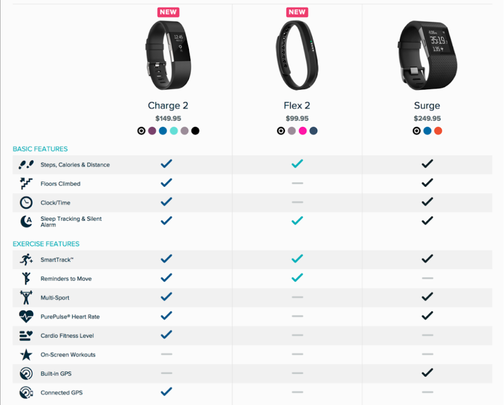
1. Fitbit
Fitbit uses a colorful, visual chart to showcase the different features of its products. The table also displays the product price and uses eye-catching ticks to give shoppers quick information.
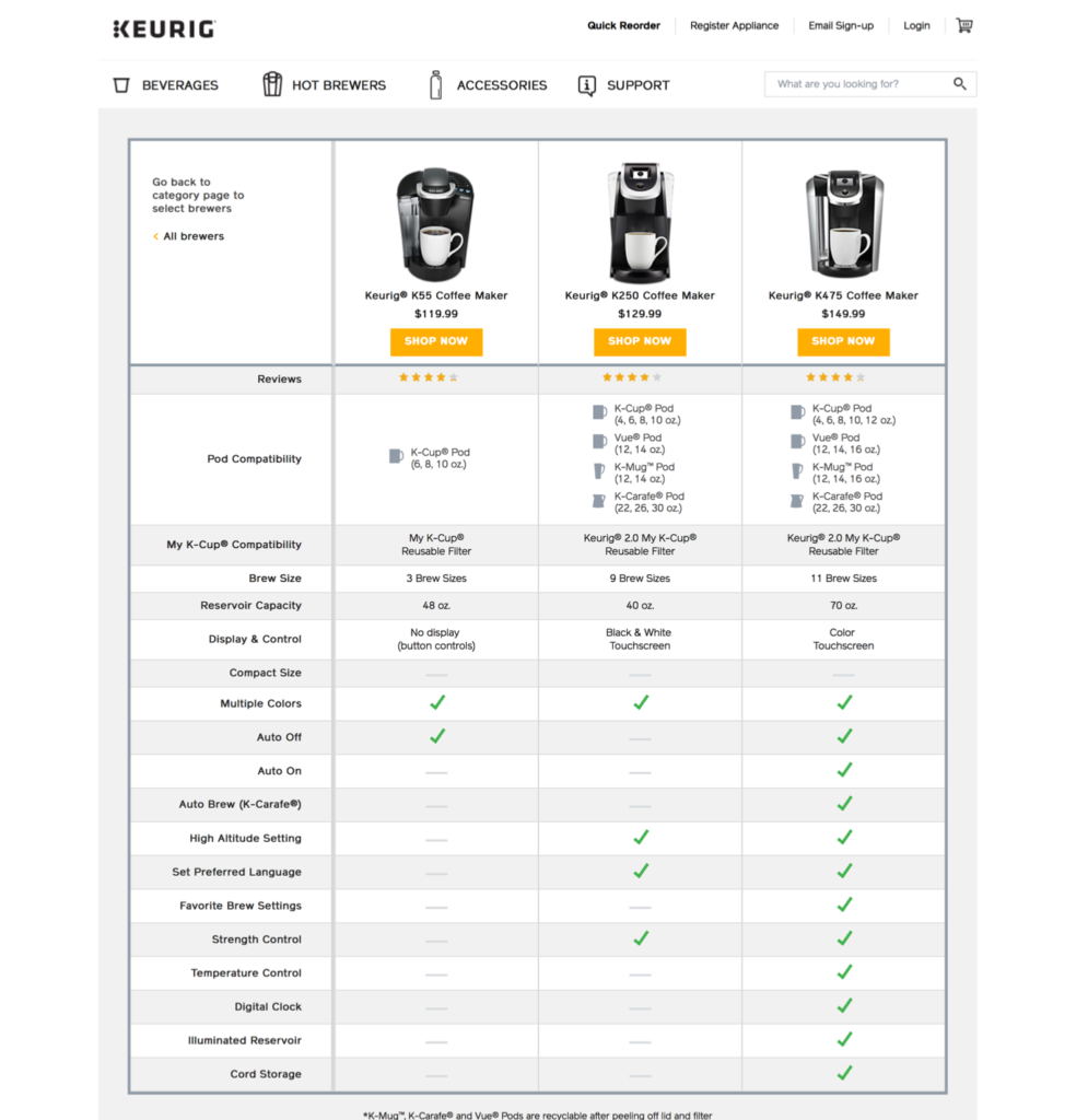
2. Keurig
Like Fitbit, Keurig uses images to illustrate its comparison chart and sticks to just three options to compare.
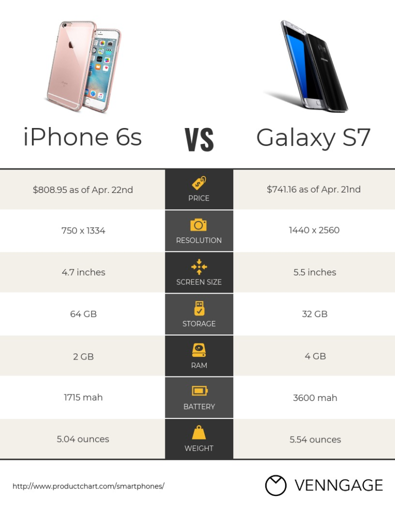
3. iPhone vs Samsung
This chart pits two of the most popular phones against each other in a head-to-head comparison. It uses visuals and simple information to give customers a neutral look into the best option for them.
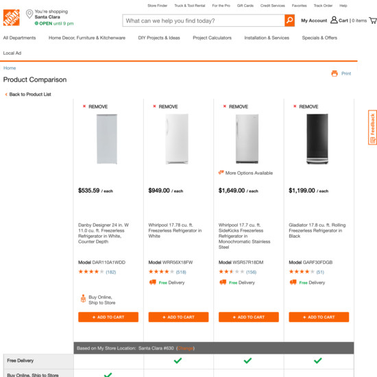
4. Home Depot
As well as a comparison chart, Home Depot’s product comparison tool also includes customer ratings and reviews for an extra layer of information.
Everything You Need To Know About Building A Product Page That Converts
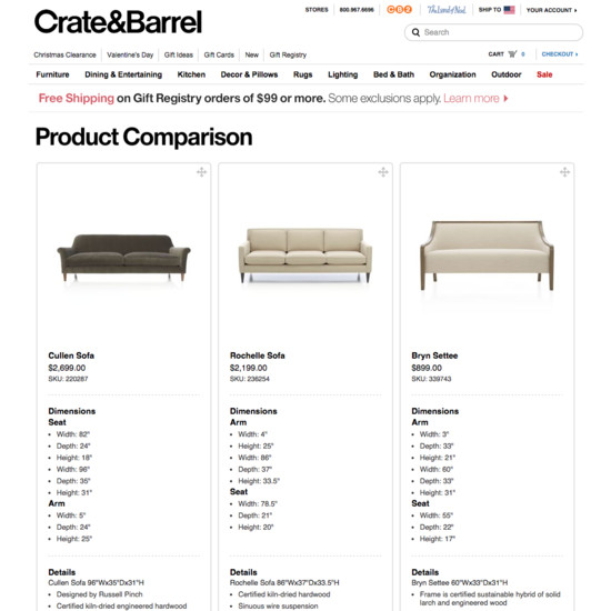
5. Crate & Barrel
Crate & Barrel does things a bit differently by listing out the details and dimensions of each product rather than using tick boxes in a chart.
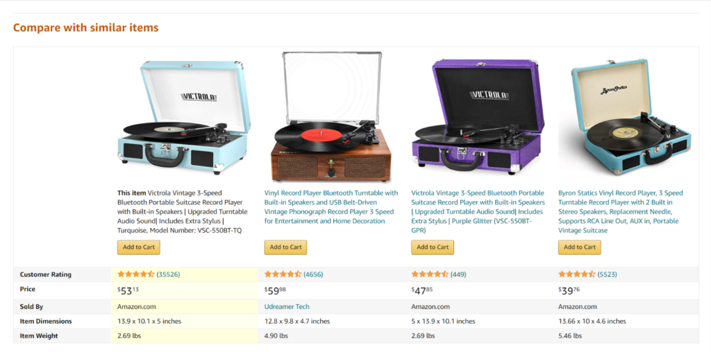
6. Amazon
Amazon’s product comparison tool is shown on product pages and displays relevant items. Customers are able to quickly understand whether the product page they’re on is the right one for them or if there’s a better option out there without having to go back to the search function.
Create a product comparison template
Putting together an in-depth product comparison can be time-consuming. You have a lot of details to delve into and, if you’re comparing more than two products, it can quickly become a long-winded process. To ease up some time, create a product comparison template that you can use each time you want to compare products.
This template should incorporate the key information your customers want to know and include prompts you can fill out when studying similar products.
Your product comparison template might look something like this with a checkbox for each feature or benefit:
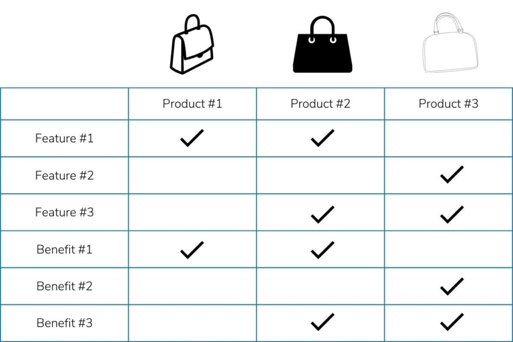
This comparison feature lets shoppers get all the information they need at a quick glance. It includes the product name in the headers and product details, including important specs, so that customers are able
Make product comparison easy for customers
Product comparison tables form an important part of the sales cycle. Instead of opening hundreds of tabs and flicking between them all, give customers the information they need all in one place. Product comparison pages are a great way to highlight the features and benefits of each product and ensure customers are making the right choice for them.
When creating a product comparison chart, do your research. Study the products you’re going to include to identify what makes them different, dig into what your customers actually want to know about the products, and create a template that you can work from.
If you’re looking for guidance on how to implement product comparisons, and other conversion boosting elements to your ecommerce site, you should consider a Digital Experience Optimization Program™.
Enjoying this article?
Subscribe to our newsletter, Good Question, to get insights like this sent straight to your inbox every week.
About the Author
James Sowers
James Sowers is the former Director of The Good Ventures. He has more than a decade of experience helping software and ecommerce companies accelerate their growth and improve their customer experience.