
9 Examples of Inspiring Loading Page Designs
Even with an optimized website, you'll have moments when it takes longer to load. Optimize the customer experience with these loading page design tips and examples.

Key Takeaways
By the end of this article, you should have the knowledge and resources to “check the box” in these areas…
- Your loading page design offers an opportunity to reinforce your value proposition, strengthen brand awareness, and have a little fun as well.
- You can also use loading messages to educate your viewers on new app or product features because you have a captive audience.
- Loading screen designs that show progress, like skeleton screens or loading bars, make the load time seem faster to users, which can decrease drop-offs.
Your website loading page is pretty useful – it tells your site users that yes, your site is really loading normally. But it’s also probably at least a little bit boring.
And while there’s nothing terrible about a boring loading screen – boring still works – it does mean you’re wasting valuable space, particularly in your mobile experience. Your loading page offers a unique opportunity to offer your visitors a little entertainment and even some meaningful teaching moments.
Loading pages: an overview
Loading pages have been part of websites from the very beginning because they serve an important purpose – telling your website visitor that your site is, in fact, loading. The classic example is a little loading spinner graphic.
Seeing one of these reassures your site users that the content they’re looking for is actually loading, not frozen or broken, and that makes their wait more tolerable. That’s fine, but in a world where space on mobile screens is very limited and you have a lot to communicate, you could (and should) aim for more.
“More”, in this case, can take a couple of different forms. You can optimize your current loading screen with content that’s fun, relevant, and/or educational to keep visitors from getting impatient. And you can even make your loading page time longer than it needs to be to enhance the user experience (yes, you read that right!).
What load pages mean for conversion rates
Your website probably takes at least a few milliseconds to load. That’s normal, and customers and site users know and expect it. But they get concerned when it seems like nothing is happening after a click – is the link broken, the site down, or something else going wrong?
Website conversion rates drop by an average of 4.42% with each additional second of loading time, between 0-5 seconds. And half of online shoppers expect a page to load in 3 seconds or less, which doesn’t leave you with a lot of room for error.
By assuring them that all is well and the site is loading normally – and potentially giving them a little entertainment too – your loading screen can help you hold onto more visitors and improve the overall user experience.
But if you’re using that space in a more thoughtful way, with the user experience and a content strategy in mind, your loading page can actually take your website experience to the next level.
9 examples of loading page designs
These examples are proof that loading screen messages don’t need to be space-fillers.
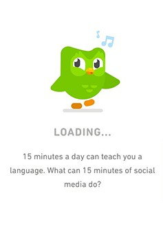
1. Duolingo
Duolingo is probably the best-known example of a fun, fact-filled loading screen. Their highly recognizable owl mascot, Duo, pops up as the app loads with facts, reminders, and encouragement for users.
It turns the load time into an opportunity to strengthen brand awareness and retention, instead of simply starting at a loading spinner. (And it’s pretty adorable as well.)
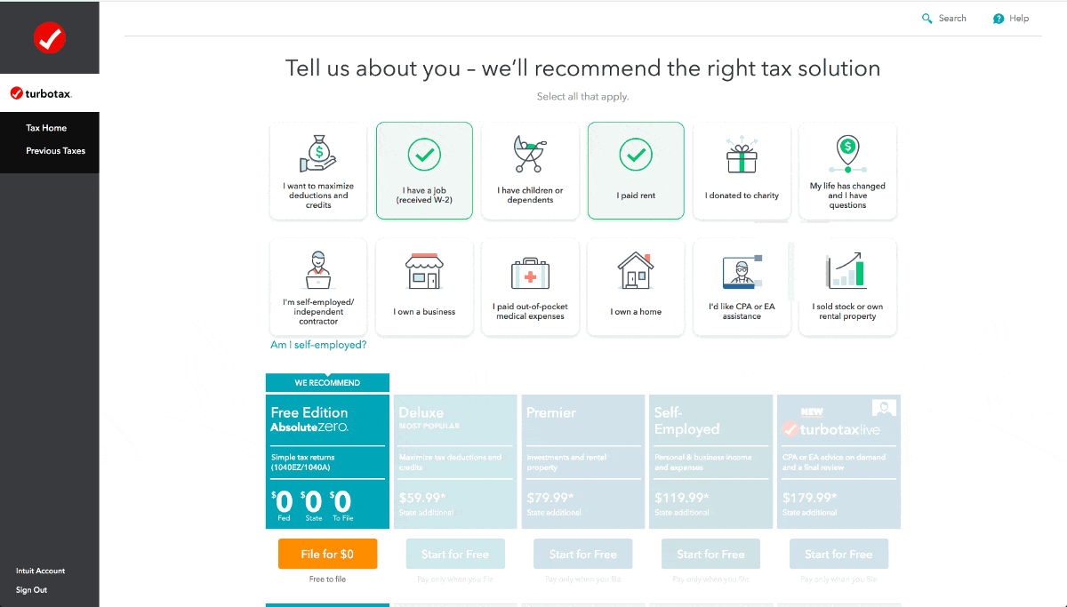
2. TurboTax
TurboTax has a highly sophisticated backend, and they can truly calculate what users owe, or are owed, in a flash. But they found that their users didn’t really believe that TurboTax was processing all of their data that quickly – they got suspicious that their information wouldn’t be accurate, because the loading was too fast to believe.
So they did something that seems counter-intuitive – they slowed down their loading time, and added a loading animation that “shows” the data processing happening. This reassures their users that everything in their tax returns is accurate.
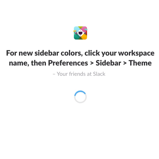
3. Slack
Slack is all about connecting people, and their loading screen is no exception. Users can add quotes for their teams to see as they load the app on desktop or mobile, adding some whimsy, inspiration, or just humor to the loading experience.
And if there are no quotes added by the team, Slack often pops helpful tips for users into their loading screen. It gives the user help to get the most out of Slack while they’re waiting to get to work. And teaching users how to get more value out of the app within the app experience itself is good for retention and the overall UX.
Enjoying this article?
Subscribe to our newsletter, Good Question, to get insights like this sent straight to your inbox every week.
4. WhatsApp
The communication platform WhatsApp’s main selling point is their encrypted messaging – it promises a safe and secure experience for users. Their website app loading UI emphasizes these features to visitors while they wait for the page to fully load.
Their clean, simple loading animation also shows what is happening while the page is loading and includes a progress bar, reassuring users that everything is working normally on the site.
WhatsApp shows that loading pages don’t need to have a mascot – they should align with your company’s branding and feel like a clear extension of your brand.

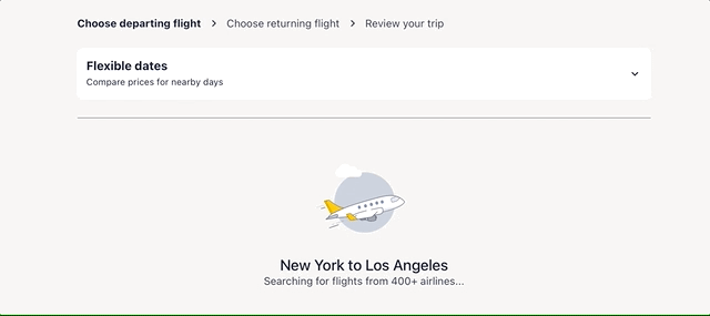
5. Expedia
But adorable animations also work, depending on the brand. Travel book site Expedia opts for a cute loading animation – the plane floating by fluffy clouds pops up when users conduct a new search for a flight on the platform.
This animation serves several purposes. It fits in with Expedia’s brand and feels welcoming and friendly, and reminds users that Expedia is helping them take to the skies for their next trip. It also provides some entertainment while the flight results are loading.
6. Calm
The Calm meditation app uses a loading message that aligns very well with their brand – it encourages users to take a deep breath while the mobile app loads. It helps their visitors to get a little centered and slow down while the app gets ready.
And it uses a skeleton screen to load the soothing nature background chosen by the user before the content, taking you on a little calming journey. They also use an interesting spinner while the skeleton screen loads, instead of the classic wheel.

7. Tinder
Tinder’s loading screen also reassures the mobile app user that the wait time is happening for a reason – the app is looking for new matches in the area.
Their loading animation, with the pulsing image, resembles a radar screen, reinforcing that fresh matches nearby are being loaded.

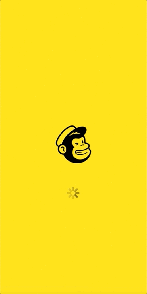
8. Mailchimp
Mailchimp’s mobile app loading screen takes full advantage of the loading time to inform users about improvements to the app, like their new Survey Reports feature. If they had stuck with the loading spinner, the load time would seem much longer – but instead, they’ve taken advantage of that load time to promote new features to their users who benefit from them.
It can be challenging to find a way to keep busy users up to date with info about new features they will find useful, but load screens give you access to a captive audience of people who are currently using your product.
9. Airbnb
Airbnb keeps it simple with their loading UI – a skeleton screen showing what the mobile app or website will look like when it’s fully loaded. Using a skeleton screen loading page like this helps the load time to seem faster, because users can see the progress as it happens. It reassures them that they’ll quickly have access to the features they need.

You can view some beautiful and creative examples of loading animations in this video as well.
These examples of loading screen messages and animations are far from an exhaustive list, but they should give you some inspiration for your own designs. As you can see, there are many possible varieties of loading page designs – it’s all about finding the option that works for your unique company and customers.
UX design strategies
But while the examples are all varied, they do share some common UX design strategies that will help you build a better loading page.
Avoid spinning screens
The endless spinner of a page, app, or site that refuses to load is an experience we’ve all had – and it’s frustrating. You can’t tell if it’s just a slow loading site, or an issue with the page, or with your own internet connection – all you know is that the page you want isn’t appearing with any real speed.
That’s not to say there’s no place for a spinner in your loading page design – Calm and Mailchimp both use them in the previous examples. But the key here is including other design elements so users aren’t looking at only the spinner. They’re being educated or given a preview of the app experience as well, and that added context helps avoid frustration.
Make loading progress clear
At their core, loading screens are there to tell users that the page is loading steadily and successfully. Of course, focusing on building a super-fast site or app is important, but having some load time is normal and even beneficial, as TurboTax demonstrates.
Skeleton screens and loading animations both show users that progress is happening, decreasing the likelihood they’ll abandon the page at the loading stage. You could also use progress bars or animations to accomplish the same task. Showing some sort of loading helps your users to focus on the progress, not the time it takes for your site or app to load.
Incorporate helpful information
You probably have plenty of information to share with your customers and site users – about promos, updates, features, and more. But getting that info to them, in a way they’ll actually see and absorb, is challenging.
Loading screens can be a perfect way to deliver quick bits of information. You have a captive audience of current users – what could be better? Just be sure to keep the info short and to the point, as your load time is (hopefully) quite short and you don’t want to overwhelm or irritate visitors.
Show, don’t tell
It might seem tempting to have a loading message that tells users the page is loading to keep them informed. But that can be distracting and ineffective – show them with an animation instead. The Tinder example above accomplishes this with the radar-like animation – no words needed.
Of course, you can use a few words if that strengthens the message you want to deliver. The WhatsApp website loading page is a good example of how to combine an animation with a few effective words. The mistake is to rely on words alone – images and animations are more entertaining and engaging.
Stick to your own brand
No matter how much you love another company’s loading page design, copying it without taking your own branding into account is always a mistake. Your loading screen should reflect your company’s brand and what your users expect from your app or site.
In fact, your loading screen can serve to strengthen certain aspects of your branding and value proposition – Calm and WhatsApp’s pages illustrate this effectively.
Optimizing your loading page design
Loading screens can be boring or frustrating – but they don’t need to be. They can provide a way to strengthen your branding, educate your customers, and improve your website or app user experience. Taking inspiration from the examples above and making them your own – with some testing and tailoring over time – will help you create a great experience for all your visitors and users.
Want more helpful tutorials and explainers delivered to your inbox? Sign up for our Insights newsletter!
Enjoying this article?
Subscribe to our newsletter, Good Question, to get insights like this sent straight to your inbox every week.
About the Author
Caroline Appert
Caroline Appert is the Director of Marketing at The Good. She has proven success in crafting marketing strategies and executing revenue-boosting campaigns for companies in a diverse set of industries.