
How To Read A Heatmap Like An Expert Researcher: Patterns To Look Out For
In this guide, we show you how to read a heatmap like an expert so you can stop guessing and start making informed, high-impact changes to your website.

Wondering why users leave your site without converting?
You may have a gut-instinct answer to the question. You might even have ideas for how to tweak design, rewrite headlines, or add new features in an attempt to get users to stick around. But guesswork isn’t a strategy.
Expert researchers don’t guess. They use data, and one of their most powerful tools is the heatmap.
When used correctly, heatmaps reveal where users hesitate, what grabs their attention, and where they drop off—all critical insights for optimizing conversions. But the real magic isn’t simply generating a heatmap; it’s knowing how to read it.
In this guide, we’ll break down how to read a heatmap like an expert so you can stop guessing and start making informed, high-impact changes to your website.
Intro to heatmap analysis
Heatmap analysis shows real data points that represent actual human behavior. And when those behaviors form visibly discernable patterns, we use these patterns to form hypotheses about user wants and needs.
Heatmaps can help answer questions about user behavior and uncover sticking points in the customer journey.
Like footprints in the sand, heatmaps show us where users have been. And we use that information to infer and imply intent.
Types of heatmaps
At The Good, we primarily use three types of heatmaps: Click maps, movement maps, and scroll maps.
These types of heatmaps provide insights that answer critical UX and conversion questions, such as:
- Are users seeing my key content?
- What elements are they engaging with?
- Where are they paying the most attention?
By analyzing these patterns, we can pinpoint where users get stuck, what’s drawing their attention, and where they drop off—and take action to improve the experience.
Scroll Maps
Scroll maps visually depict typical scroll depth on any web page. Key insights you can glean from scroll maps:
- Where users drop off (high exit points may signal a false bottom)
- Whether important content is being seen
- If users are scanning or engaged
Tools typically use scales to show you the portion of users who scroll to different parts of your page. Red or “Hot” areas of your Heatmap indicate that all or almost all your users have seen this part of the page. As you move down the page, the colors will get “colder” according to the percentage of users who scroll down to that point.
The lines on the page below indicate where 25%, 50%, and 75% of users dropped off, meaning they left the page or clicked on something, therefore not scrolling further.
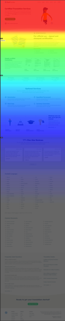
While shallow scrolling is not inherently negative, it may indicate lost user attention or that a page does not look scrollable.
The same goes for deeper scroll depths. It is not inherently positive or negative to see a deeper scroll depth. Depending on the surrounding context, deeper scroll depth may indicate that users are failing to find meaningful content higher on the page, and therefore go looking by scrolling down.
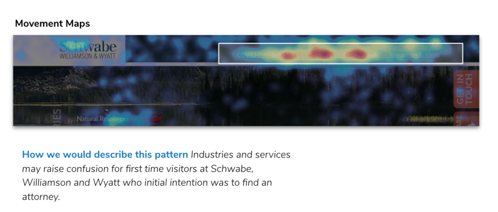
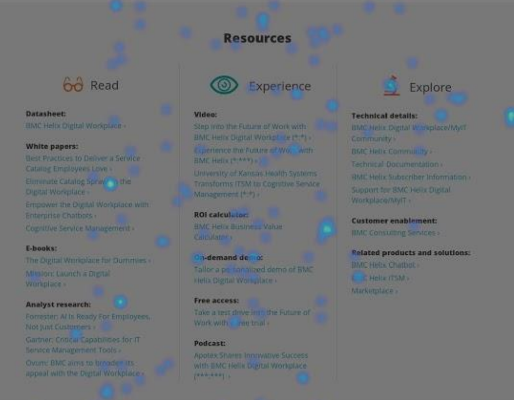
Movement Maps
Movement maps show where users have hovered their mouse on a page. They are valuable because they show us where the majority of user attention is focused. Movement maps can show:
- What content users are reading or skimming
- Where their attention is most concentrated
- Whether key information is being overlooked
Movement maps help us infer what content is most valuable to users during the decision-making process.
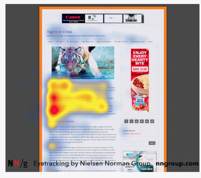
Reading movement maps is similar to reading eye-tracking heat maps. For many users, their mouse movement follows their gaze, so knowing where mouse movement occurs tells us what content users are reading or paying attention to.
Based on our experience, concentrated left-to-right movement over text generally indicates intentional reading, since many mouse movements tend to follow the user’s eyes.
In this example, we see side-to-side movement over FAQs, indicating users are reading each question to determine which one may reveal helpful information about the services being offered. We looked at movement clusters in the FAQs, which when paired with data about the most highly clicked FAQ items helped us determine what questions users needed answered to have the confidence to purchase services.
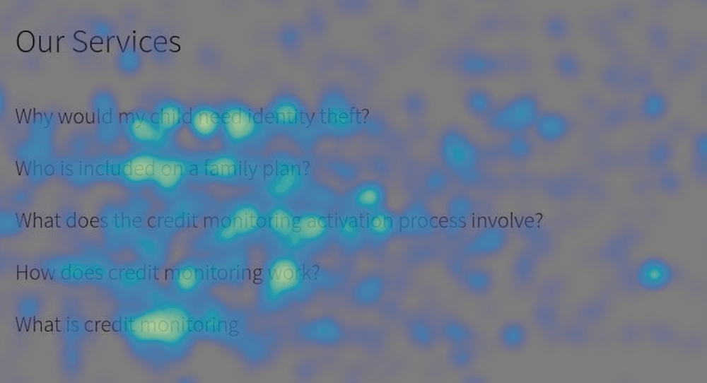
In contrast, up-and-down movement may indicate areas that users are simply skimming rather than intently reading. Take this example: seeing vertical movement patterns indicated to us that users may be scanning the resources available (rather than reading). User testers told us that the content did not look worthwhile, so those two bits of data together told us this area needed some fresh content and a redesign.

Click Maps
Click maps show us what elements users click on most commonly. Click maps can uncover insights including:
- What elements drive engagement (or get ignored)
- If users are clicking on non-clickable elements (indicating confusion)
- Which navigation links or CTAs attract the most interest
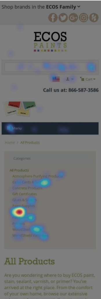
Hot spots, shown in red, have the highest concentration of clicks. Transparent blue spots represent a low density of clicks.
In the click map below, we see a list of “All Products” with one notable hot spot in the middle of the menu. What, you may wonder, is in the middle of the list that is drawing so many clicks?
The answer is in the name: Paints. Here we see an example of a company with a clear specialty and a large portion of their sales going to one category. Yet, when we saw this heatmap we realized they were making the user work hard to find these most popular products by burying them in the middle of the list.
Enjoying this article?
Subscribe to our newsletter, Good Question, to get insights like this sent straight to your inbox.
18 Heatmap patterns to look out for
To get the most value out of heatmaps, researchers have to analyze how different heatmap elements interact, compare trends across pages, and validate findings with other data sources like session recordings or analytics.
In this section, we’ll walk through the most common heatmap patterns, what they look like, and what they reveal about user behavior so you can start making smarter, data-backed decisions.
The Spot Specific Pattern
Where it appears: Click map
What it looks like: Highly concentrated heat activity on an individual spot in a sea of text.
What it means: Users might have a specific interest related to a need. They could also be clicking on a non-clickable element within a paragraph or looking for information that is slightly buried within other text. It may be an indicator that you need to rearrange a menu or better highlight certain features of a product.
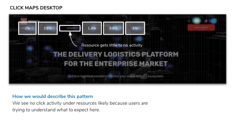
Gapped Patterns
Where it appears: Click map
What it looks like: In a list of items, there is one that gets no heat activity.
What it means: It usually means that a user doesn’t know what to expect if they were to click here, or they are simply disinterested.
Primacy vs Recency Pattern
Where it appears: Click map
What it looks like: Concentrated click activity on the first and last items in a list.
What it means: Typical of menus, users often engage most with the first and last item in any list. Named after the psychological phenomenon where users are best at recalling the first and last words in any list.
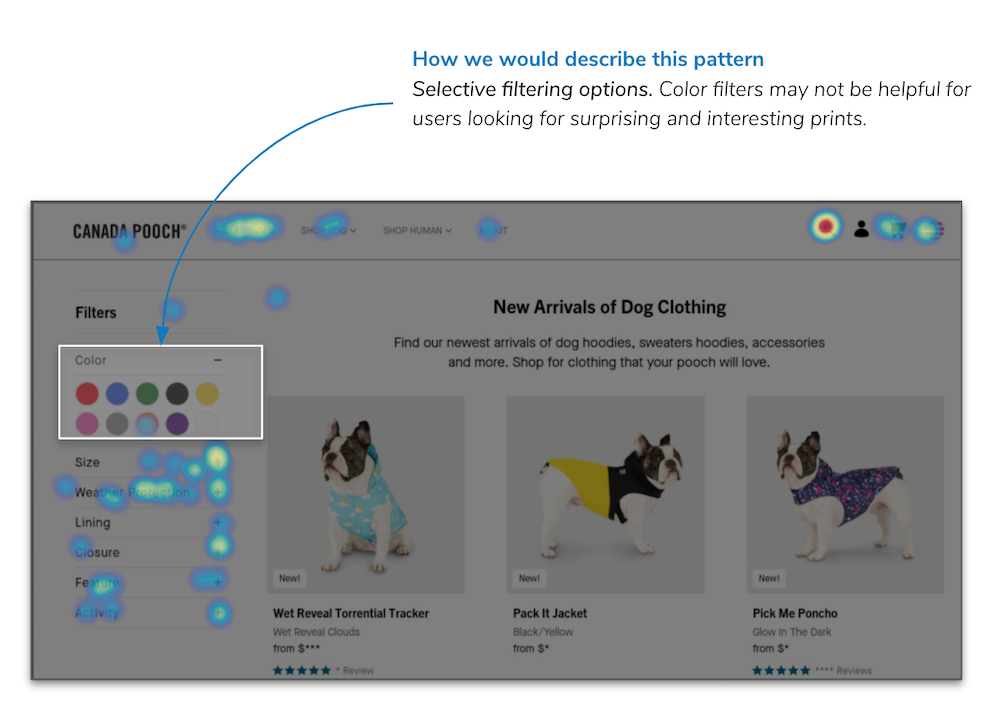
Filter Hot Spots
Where it appears: Click map
What it looks like: Concentrated clicks on certain areas of a filter, and a lack of clicks on other areas of a filter.
What it means: Users generally rely heavily on certain filters and less on others. Knowing what filters are helpful to users might tell us how we should rearrange filters or give us context for what users care about in their products.
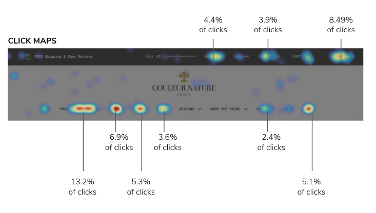
Consistent Browsing Pattern
Where it appears: Click map
What it looks like: Strong click patterns across products on category pages.
What it means: This tells us that users are interested in a variety of products on the category page and are clicking on various product pages.
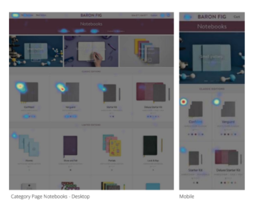
Spotted Browsing Pattern
Where it appears: Click map
What it looks like: Strong amount of clicks on only a few product images on category pages.
What it means: This tells us that users are most interested in specific products. These might be flagship products (as in this example).
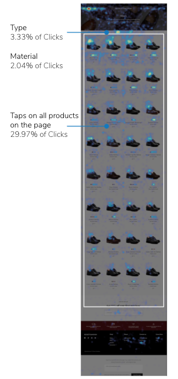
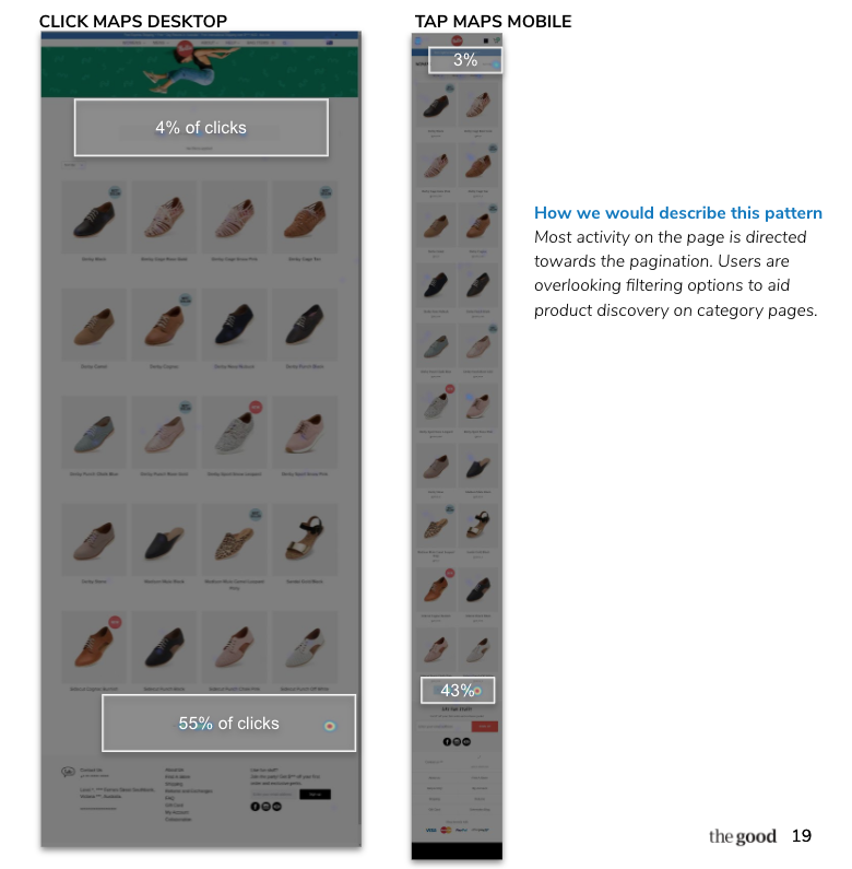
Strong Pagination Pattern
Where it appears: Click map
What it looks like: Concentrated activity on the pagination with little activity on filters or product tiles.
What it means: Users might not have very intentional browsing behavior, and instead of engaging with product tiles and narrowing down their search, they are simply going from page to page to see all products.
Click Indecision
Where it appears: Movement map
What it looks like: Horizontal heat patterns found in the middle of two clickable elements, usually between 2 or more different elements positioned next to each other. Can be found on a menu navigation or even dual CTAs.
What it means: Users are hovering between clickable elements. They might be experiencing a bit of uncertainty in their browsing experience. They’re not sure where to click because both options are similar in nature or unclear.
F-Shaped Reading
Where it appears: Movement map
What it looks like: Concentrations of heat in the shape of an F on the page. The direction begins with the user tracing the page from top to bottom and then from left to right.
What it means: Users are assessing the content on the page but they are not necessarily reading it.
Commitment Reading
Where it appears: Movement map
What it looks like: Blocks of heat activity usually on content pages or chunks of text.
What it means: Users are high-intent and they’re learners. These patterns show strong interest in the information displayed and intentional reading.
Layer Cake Pattern
Where it appears: Movement map
What it looks like: Users read headlines but overlook the associated subtext.
What it means: They are interested in the content but are reviewing the page at a high level.
The downside of this pattern is that users could be missing content related to their needs or diminish the influence of the content’s intended purpose to promote a desired course of action.
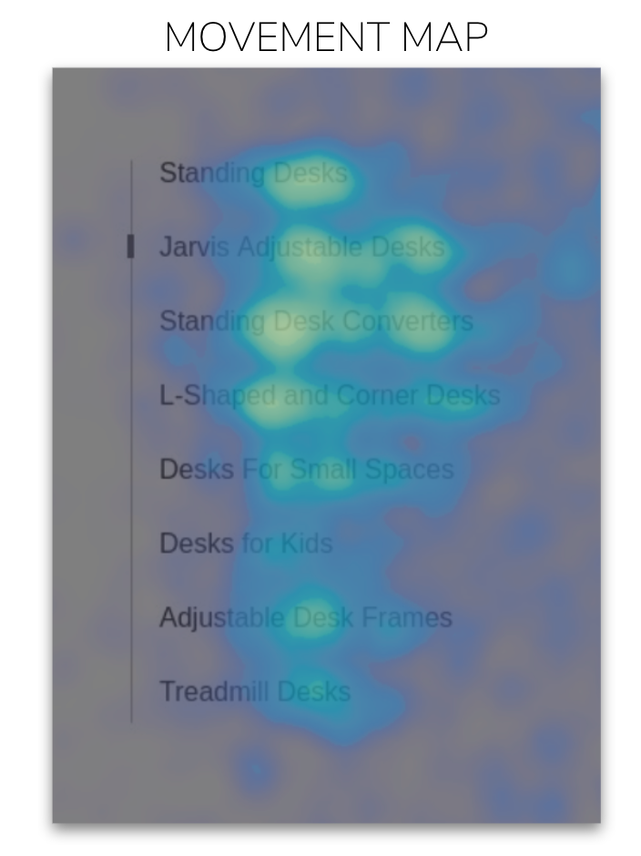
Scrolling Pattern
Where it appears: Movement map
What it looks like: A vertical heat pattern that travels down the page. On low-traffic pages, this might be represented by dots that align in a vertical fashion, as with the example here.
What it means: This signifies that users are scrolling down the page, without necessarily reading the content. They might be looking for something that they are not finding, or the content might be arranged in a fashion that is best for scanning. If this is paired with truly little click engagement, we might assume that the content is not very valuable.
Truncated Scanning
Where it appears: Movement map
What it looks like: Users skip a consistently repeated word in a text.
What it means: Users are reading content faster, likely because the content is repetitive and it’s easy to recall the skipped word.
Dropdown Residue
Where it appears: Movement map
What it looks like: A spotted heat residue in a rectangular fashion positioned below the top navigation.
What it means: This is residual activity of users strongly considering items in the drop-down menu or some drop-down element on the page. Residue will be concentrated in the areas where users are actually scanning and considering the content.
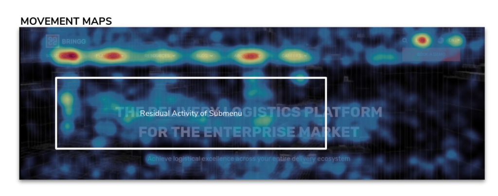
Image Hover
Where it appears: Movement map
What it looks like: Heat activity around images on a page. Could be on a category page or rows of photos.
What it means: Imagery is dynamic–a secondary image shows when the users hover over the primary image. The user is hovering around the image to see the second photo.
Content Avoidance
Where it appears: Movement map
What it looks like: The inverse of the image-specific pattern, content avoidance happens when people explicitly avoid an area with their mouse, almost creating a frame.
What it means: This might mean that users perceive this as an ad and are intentionally avoiding it, or have “banner blindness” and simply don’t see the content as relevant to their visit.
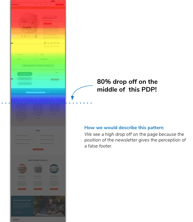
False Bottom
Where it appears: Scroll map
What it looks like: On scroll maps, there is a high drop-off on the page (drop-off is above the halfway mark on the page).
What it means: Users might perceive that they’ve reached the end of the page. This is extremely common when email signups are in the middle of a page (see example right) and when there is a strong color contrast, full-bleed section early in the page. These things signal the footer is coming, so they often make users think they’ve seen everything they need to see.
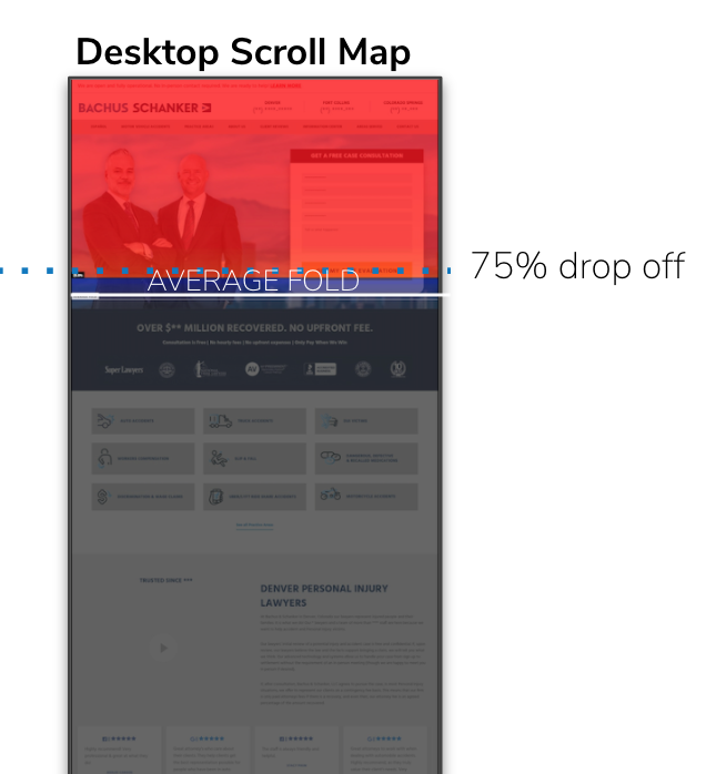
Halted Pattern
Where it appears: Scroll map
What it looks like: Drop-off is right above the fold, and nearly no users scroll below it.
What it means: Either most users are finding something to click on above the fold, there is a high bounce/abandon rate, or there is a false bottom. It could also be some combination of the three.
What is the best tool for heat mapping?
Not all heatmaps are created equal. The best heat mapping tool is the one that provides clear, actionable insights without adding unnecessary complexity.
For most teams, Hotjar will be a great go-to solution. It’s lightweight, easy to set up, and provides a suite of heatmaps—including click maps, scroll maps, and movement maps—that help you understand user behavior at a glance.
Why Hotjar?
- Comprehensive Behavior Tracking: Hotjar captures how users interact with your site—where they click, how far they scroll, and what elements they hover over.
- Fast Insights, No Heavy Lifting: Unlike enterprise tools that require complex setup, Hotjar makes it easy to get started and see results quickly.
- Paired with Session Recordings: Heatmaps alone tell part of the story; Hotjar lets you connect heatmap insights to real visitor session recordings for deeper analysis.
While it’s our top pick, if Hotjar isn’t the right fit, another good option is Microsoft Clarity.
Turning heatmap data into actionable strategies
Reading a heatmap like an expert researcher isn’t just about spotting red and blue zones—it’s about understanding the “why” behind user behavior and knowing what to do next.
But if you don’t have the time or resources to build a research team, you don’t have to go it alone. At The Good, we specialize in turning heatmap data into clear, actionable strategies that drive real results.
Want to skip the learning curve and get expert insights now? Let’s talk.
About the Author
Maggie Paveza
Maggie Paveza is a Strategist at The Good. She has years of experience in UX research and Human-Computer Interaction, and acts as an expert on the team in the area of user research.