5-Minute Website Assessment Based on 16+ Years of Optimization Data
Revenue Opportunities Hidden in
Wilco Farm Stores's User Experience
3 Free Data-Backed Website Optimization Opportunities
We analyzed Wilco Farm Stores's digital experience using our proprietary database of 2,000+ tests, 10,000+ research data points, proprietary frameworks, and initial research methods. Now we've identified $2.9M in potential revenue improvements.
Our Methodology

To create this analysis, we:
- Analyzed your website's user experience patterns
- Compared against 200+ similar Retail - Farm & Pet Supply companies in our database
- Applied our DXO Heuristics framework
- Generated real-time heatmap data
- Cross-referenced with test results from past clients facing similar challenges
How we calculate revenue projections
Revenue projections are calculated using public estimates of your annual revenue, the conversion contribution of each page type, historical lift percentages from our database of thousands of experiments, and a confidence multiplier based on evidence strength. Total projected impact is capped at a percent of annual revenue to ensure conservative estimates.
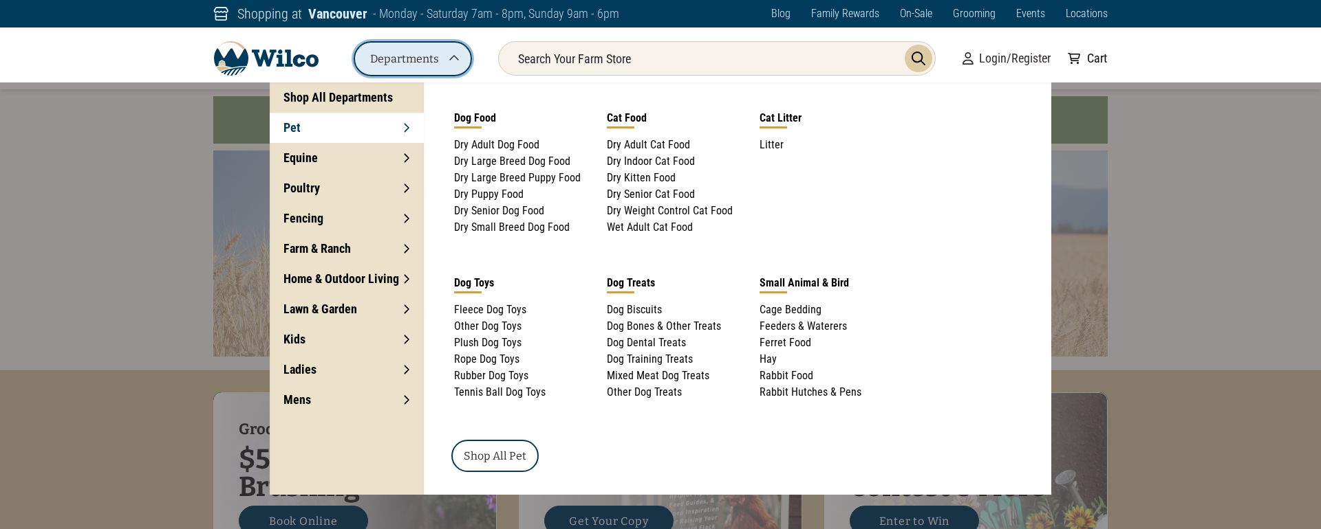
Where Wilco Farm Stores's Visitors Are Actually Looking
We used AI-powered attention prediction to understand how visitors perceive your page at first glance. Red areas indicate where visitors focus their attention most.
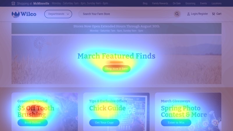
Main navigation mega-menu
The heatmap shows intense red/orange attention concentrated on the expanded department navigation menu, particularly the pet supplies categories
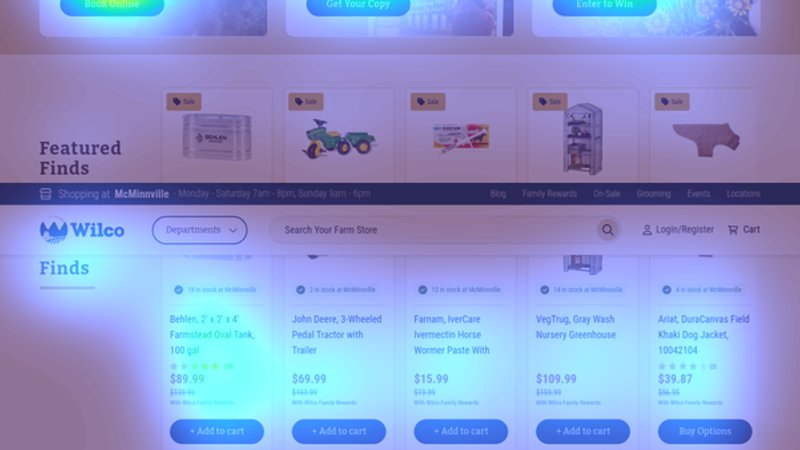
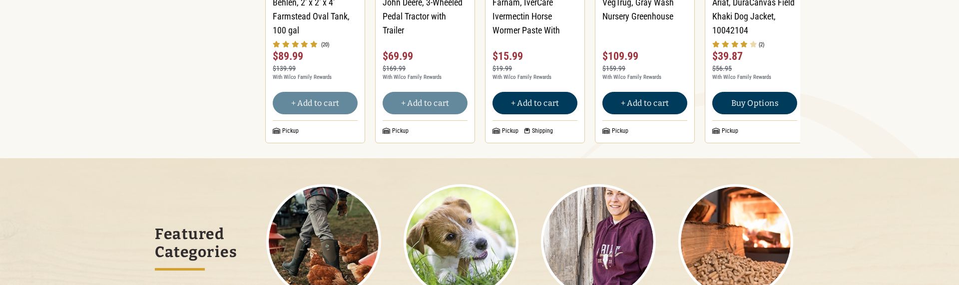
Product grid with pricing
The heatmap shows scattered yellow/green attention across product prices and 'Add to cart' buttons, with no clear focal point
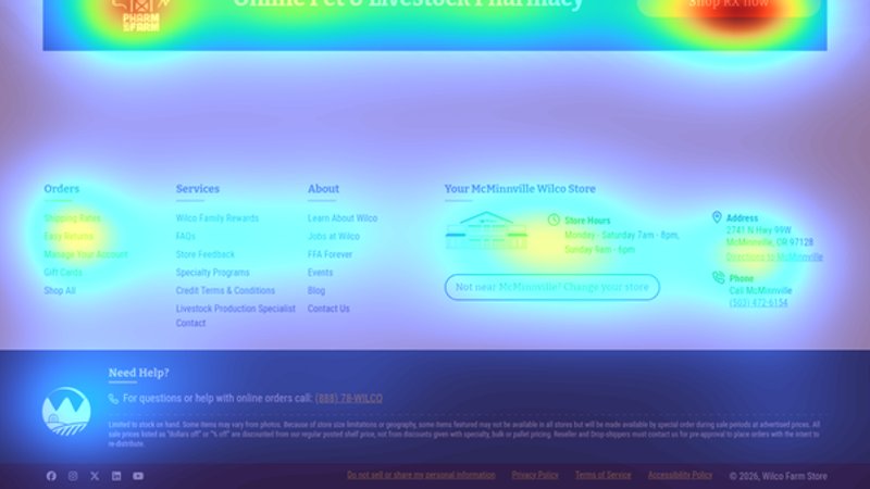
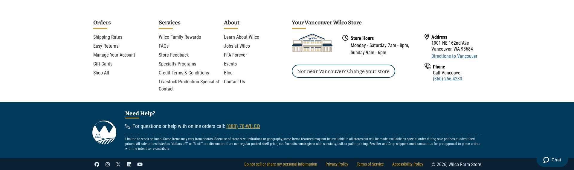
Store location and hours footer
The heatmap shows minimal attention (blue/no color) on store hours and location information in the footer, despite its importance for local shopping
3 Critical Issues Affecting Wilco Farm Stores's Conversions
Issue: Simplify Mega-Menu Navigation with Visual Category Groups
The heatmap shows intense attention (red/orange) concentrated on the expanded department navigation menu, indicating users are spending excessive time trying to find products instead of converting
Issue: Enhance Product Grid with Decision-Making Badges
Scattered yellow/green attention across product prices and CTAs indicates user hesitation and difficulty making purchase decisions
Issue: Create Persistent Store Location Banner
Critical store hours and location information receives minimal attention (blue/no color) in the footer, missing opportunities for local shopping conversion
3 Specific Changes That Could Increase Revenue by $2.9M
Recommendation 1: Simplify Mega-Menu Navigation with Visual Category Groups
The heatmap shows intense attention (red/orange) concentrated on the expanded department navigation menu, indicating users are spending excessive time trying to find products instead of converting
Restructure the mega-menu to show visual category cards with images alongside simplified category lists. Group related categories (e.g., 'Dog Essentials', 'Cat Care') and add featured product recommendations within each dropdown
Reducing navigation complexity while adding visual product discovery will decrease time spent searching and increase direct product engagement. Similar implementations have shown increased click-through to product pages
Recommendation 2: Enhance Product Grid with Decision-Making Badges
Scattered yellow/green attention across product prices and CTAs indicates user hesitation and difficulty making purchase decisions
Add prominent decision-making badges ('Best Seller', 'Staff Pick', 'Best Value') above prices and highlight Wilco Family Rewards savings with color-coded comparison pricing
Clear social proof and value indicators reduce decision paralysis and encourage confident purchasing. Similar badge implementations typically increase add-to-cart rates
Recommendation 3: Create Persistent Store Location Banner
Critical store hours and location information receives minimal attention (blue/no color) in the footer, missing opportunities for local shopping conversion
Add a persistent banner below the header showing nearest store location, current open/closed status, and prominent 'Shop In-Store Today' CTA
Making local availability immediately visible capitalizes on immediate purchase intent and drives both online and in-store conversions
Combined Impact: Here's What Wilco Farm Stores Could Achieve
A conservative projection based on our methodology
Breakdown by Change
- Simplify Mega-Menu Navigation with Visual Category Groups $85.0K/mo
- Enhance Product Grid with Decision-Making Badges $70.0K/mo
- Create Persistent Store Location Banner $85.0K/mo
How Wilco Farm Stores Would Work With The Good
Our approach lets your team validate our methods before a larger digital experience investment.
Discovery & Baseline
Deep-dive into your analytics and user behavior
Goal Setting
Define success metrics and KPIs
Sprint Planning
Prioritize tests by impact and effort
A/B Testing
Execute, measure, and iterate
Ready to Capture That $2.9M in Revenue?
This is an initial AI-driven assessment to illustrate revenue potential. The next step is a comprehensive optimization program built for you. Every optimization program starts with a digital experience audit. During the audit our team of experts:
- Conducts in-depth user research and analytics review
- Performs heuristic evaluation of your complete funnel
- Identifies the biggest conversion barriers and opportunities in your digital experience
- Creates a prioritized roadmap based on impact and effort
Why Wilco Farm Stores Should Trust This Analysis
16+ Years Optimization Work
We've optimized hundreds of millions in revenue through our optimization programs.
Fortune 500 Clients
Worked with leading companies including Nike, Adobe, and Xerox.
Data-Driven Methodology
Our analysis is based on thousands of successful A/B tests across industries.