5-Minute Website Assessment Based on 16+ Years of Optimization Data
Revenue Opportunities Hidden in
Zenni Optical's User Experience
3 Free Data-Backed Website Optimization Opportunities
We analyzed Zenni Optical's digital experience using our proprietary database of 2,000+ tests, 10,000+ research data points, proprietary frameworks, and initial research methods. Now we've identified $13.8M in potential revenue improvements.
Our Methodology

To create this analysis, we:
- Analyzed your website's user experience patterns
- Compared against 200+ similar E-commerce - Eyewear/Optical Retail companies in our database
- Applied our DXO Heuristics framework
- Generated real-time heatmap data
- Cross-referenced with test results from past clients facing similar challenges
How we calculate revenue projections
Revenue projections are calculated using public estimates of your annual revenue, the conversion contribution of each page type, historical lift percentages from our database of thousands of experiments, and a confidence multiplier based on evidence strength. Total projected impact is capped at a percent of annual revenue to ensure conservative estimates.
Where Zenni Optical's Visitors Are Actually Looking
We used AI-powered attention prediction to understand how visitors perceive your page at first glance. Red areas indicate where visitors focus their attention most.
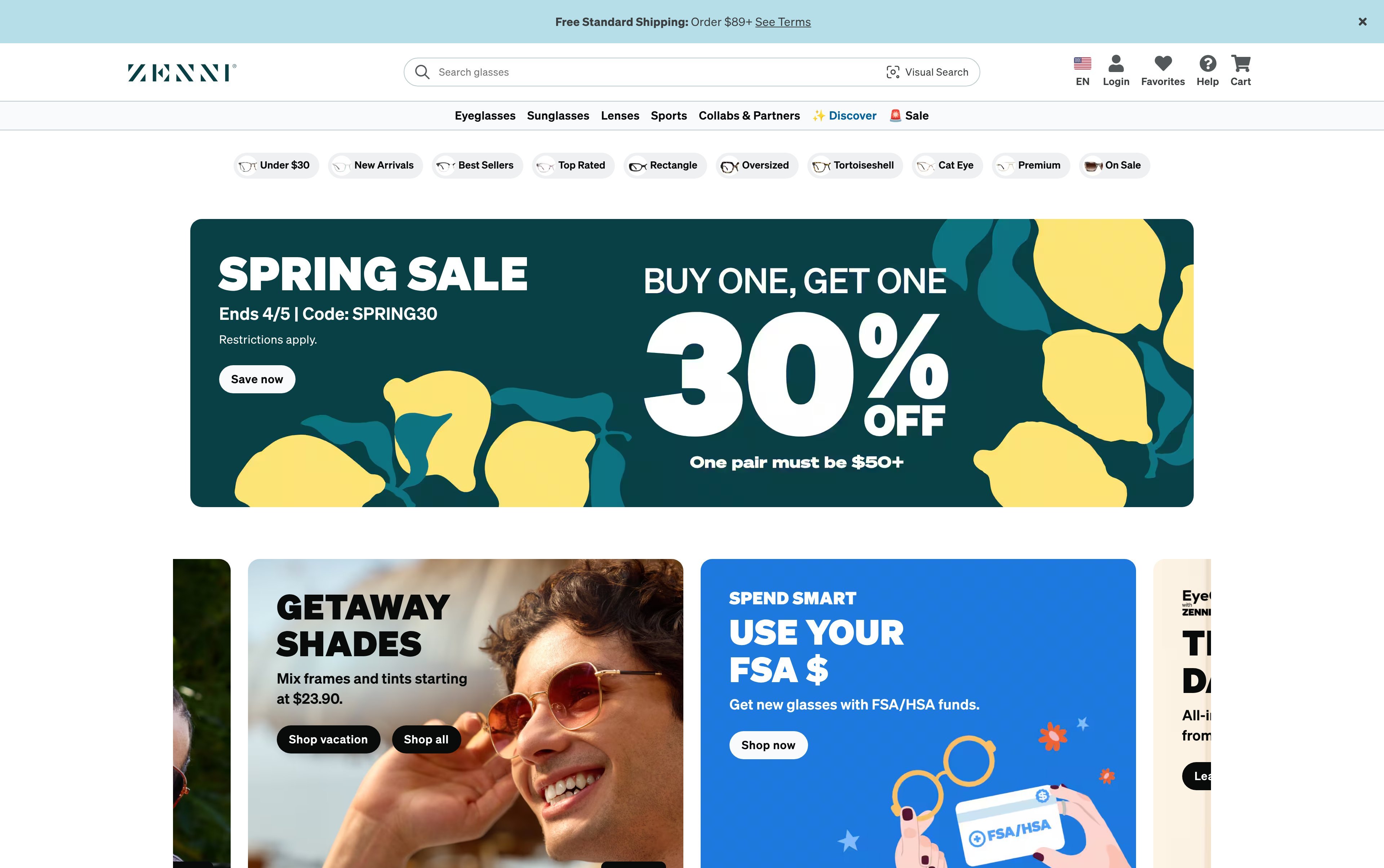
Hero banner with 'EYEWEAR FOR EVERYONE®' headline and promotional message
The heatmap shows intense red/orange attention on the mega navigation menu items (Eyeglasses, Sunglasses, Lenses, Sports) with moderate yellow heat on the promotional banner 'Buy one, get one 30% off with SPRING30', but the hero headline 'EYEWEAR FOR EVERYONE®' receives only scattered green attention, indicating users are focused on navigation rather than the value proposition
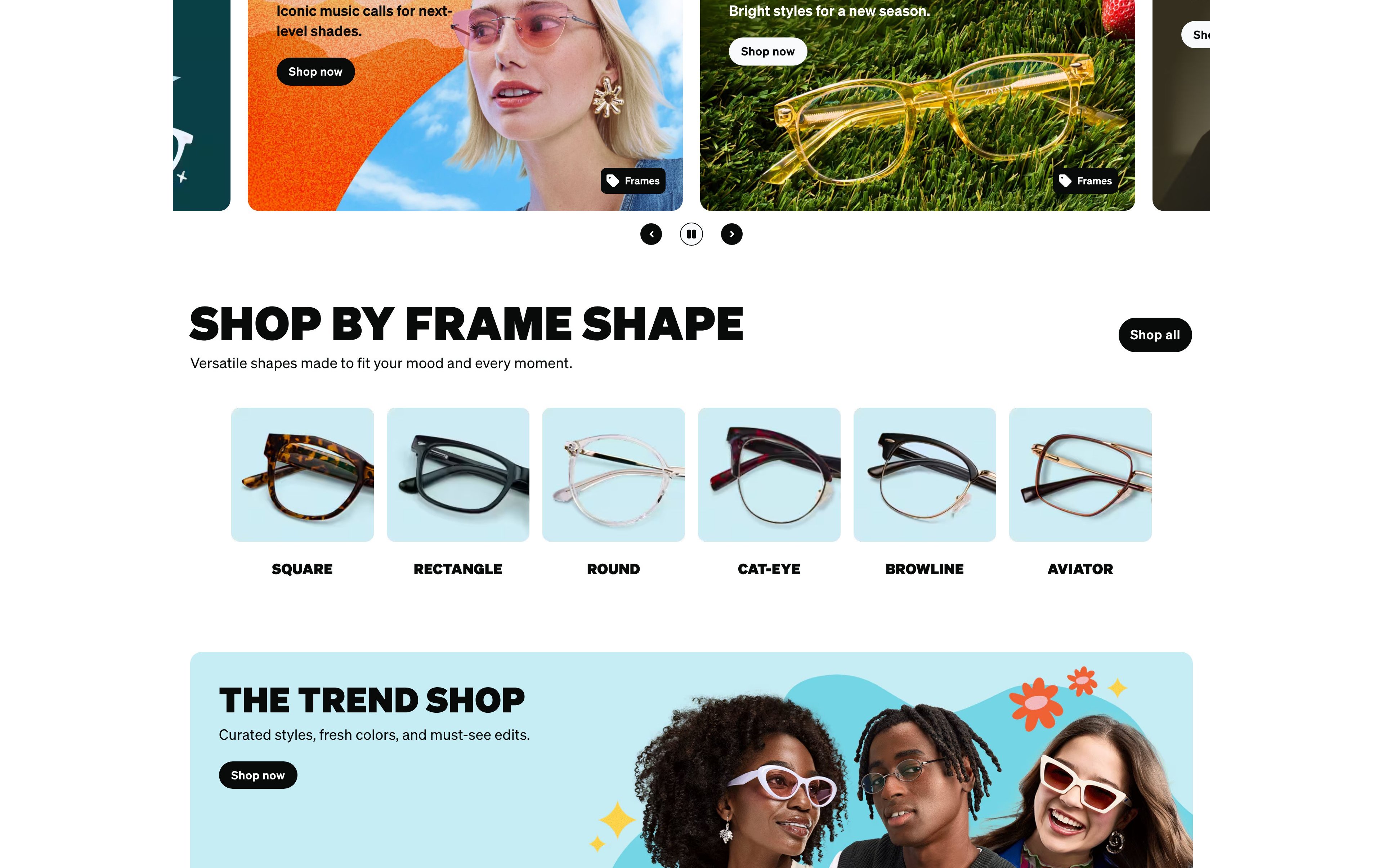
Product category grid with 'SHOP BY FRAME SHAPE' section showing frame style thumbnails
The heatmap shows predominantly blue/green coloring across the frame shape category tiles (Rectangle, Round, Cat-Eye, Aviator, etc.), indicating users have largely abandoned scrolling by this point, with only faint yellow heat on a few frame thumbnails
Customer testimonials section with review quotes and star ratings below lifestyle product imagery
The heatmap shows solid blue with no color heat across what appears to be a customer reviews and testimonials section, indicating zero user attention on this critical social proof content that could overcome purchase hesitation for first-time eyewear buyers
3 Critical Issues Affecting Zenni Optical's Conversions
Issue: Elevate Promotional Offer Above Navigation to Capture Attention Before Users Browse
The hero section's 'EYEWEAR FOR EVERYONE®' headline and 'Buy one, get one 30% off' banner are being overshadowed by the mega navigation menu. Users immediately focus on navigation items (Eyeglasses, Sunglasses, Lenses) rather than engaging with the brand's value proposition and current promotion. This navigation-first behavior means users enter product browsing without being primed on Zenni's unique affordability positioning or time-sensitive offer, increasing comparison shopping and reducing purchase intent.
Issue: Move Frame Shape Discovery Tool to Prime Position and Add Interactive Face Shape Quiz
The 'SHOP BY FRAME SHAPE' category grid—featuring Rectangle, Round, Cat-Eye, Aviator, and other frame styles—is receiving almost no user attention in its current mid-page position. This critical product discovery tool that helps users find frames matching their face shape and style preferences is essentially invisible, forcing users to rely solely on top navigation for browsing. Without this guided discovery experience, users face decision paralysis from Zenni's vast catalog and are less likely to find frames that actually suit them.
Issue: Integrate Social Proof Throughout Upper Page Sections to Build Trust Before Users Exit
Customer testimonials, review quotes, and star ratings—critical trust signals for an online-only eyewear retailer—are positioned so far down the page that they receive zero user attention. For first-time buyers who cannot try frames in person, these reviews validate product quality, fit accuracy, and customer satisfaction. Without seeing this social proof, users lack the confidence needed to commit to a purchase and are more likely to abandon to comparison shop with competitors who have physical retail locations.
3 Specific Changes That Could Increase Revenue by $13.8M
Recommendation 1: Elevate Promotional Offer Above Navigation to Capture Attention Before Users Browse
The hero section's 'EYEWEAR FOR EVERYONE®' headline and 'Buy one, get one 30% off' banner are being overshadowed by the mega navigation menu. Users immediately focus on navigation items (Eyeglasses, Sunglasses, Lenses) rather than engaging with the brand's value proposition and current promotion. This navigation-first behavior means users enter product browsing without being primed on Zenni's unique affordability positioning or time-sensitive offer, increasing comparison shopping and reducing purchase intent.
Restructure the hero section to lead with the promotional offer in a visually dominant treatment—large, high-contrast CTA button ('Shop BOGO 30% Off') positioned center-stage above the fold. Add a benefit-driven subheadline immediately under 'EYEWEAR FOR EVERYONE®' that communicates core value: 'Prescription glasses from $6.95 | 365-day guarantee | 50,000+ 5-star reviews'. Reduce the visual weight of the mega menu by using a collapsed hamburger or slim horizontal nav until user interaction, ensuring the hero message captures attention first. This primes users with the value proposition before they navigate, setting expectations that Zenni offers both affordability and quality.
This addresses a critical priming violation—users need to understand what makes Zenni different before browsing. In our tests, above-the-fold optimization like this averages 9.8% lift by ensuring users see key value propositions and offers before taking action. By establishing the brand promise and promotional urgency upfront, we reduce comparison shopping behavior and increase the likelihood users will engage with the current sale rather than immediately jumping to category browsing.
Recommendation 2: Move Frame Shape Discovery Tool to Prime Position and Add Interactive Face Shape Quiz
The 'SHOP BY FRAME SHAPE' category grid—featuring Rectangle, Round, Cat-Eye, Aviator, and other frame styles—is receiving almost no user attention in its current mid-page position. This critical product discovery tool that helps users find frames matching their face shape and style preferences is essentially invisible, forcing users to rely solely on top navigation for browsing. Without this guided discovery experience, users face decision paralysis from Zenni's vast catalog and are less likely to find frames that actually suit them.
Relocate the 'SHOP BY FRAME SHAPE' section immediately below the hero section to ensure visibility within the first scroll. Add a compelling, benefit-focused headline: 'Find Your Perfect Frame Shape in 30 Seconds'. Introduce an interactive face shape quiz CTA ('Take the Face Shape Quiz') positioned prominently before the category grid, using an engaging visual (illustrated face shapes or animated quiz preview) to drive clicks. This creates a guided discovery path that helps users narrow down options based on their specific needs rather than browsing aimlessly through thousands of frames.
This addresses a guidance violation—users can't discover what they need if critical navigation tools are buried below the fold. In our tests, navigation structure improvements like this average 9.4% lift by reducing decision paralysis and helping users find relevant products faster. For an eyewear retailer with thousands of SKUs, guided discovery based on face shape is essential for conversion. By positioning this tool prominently and adding an interactive quiz element, we transform passive browsing into an engaging, personalized experience that increases confidence in frame selection.
Recommendation 3: Integrate Social Proof Throughout Upper Page Sections to Build Trust Before Users Exit
Customer testimonials, review quotes, and star ratings—critical trust signals for an online-only eyewear retailer—are positioned so far down the page that they receive zero user attention. For first-time buyers who cannot try frames in person, these reviews validate product quality, fit accuracy, and customer satisfaction. Without seeing this social proof, users lack the confidence needed to commit to a purchase and are more likely to abandon to comparison shop with competitors who have physical retail locations.
Distribute social proof throughout the upper sections of the homepage rather than isolating it at the bottom. Add a prominent trust badge with aggregate rating ('★★★★★ 4.8 from 50,000+ reviews | 2M+ glasses sold') directly below the hero CTA to establish credibility immediately. Create a scrolling customer review carousel in the mid-page area (around 5000px) featuring authentic customer photos wearing Zenni frames alongside their testimonials—emphasizing fit, quality, and value. Add review snippet callouts on frame shape category cards showing frame-specific ratings and review counts to provide social proof at the point of category selection.
This addresses a trust violation—online eyewear buyers need social proof early in their journey to overcome purchase hesitation. In our tests, trust signals and social proof improvements average 4.8% lift by reducing comparison shopping behavior and building confidence in product quality. For Zenni, where customers can't try frames in-store, reviews are especially critical. By surfacing this content in visible positions throughout the page, we provide continuous reassurance that validates the purchase decision at multiple touchpoints, reducing abandonment and increasing conversion confidence.
Combined Impact: Here's What Zenni Optical Could Achieve
A conservative projection based on our methodology
Breakdown by Change
- Elevate Promotional Offer Above Navigation to Capture Attention Before Users Browse $382.5K/mo
- Move Frame Shape Discovery Tool to Prime Position and Add Interactive Face Shape Quiz $382.5K/mo
- Integrate Social Proof Throughout Upper Page Sections to Build Trust Before Users Exit $382.5K/mo
How Zenni Optical Would Work With The Good
Our approach lets your team validate our methods before a larger digital experience investment.
Discovery & Baseline
Deep-dive into your analytics and user behavior
Goal Setting
Define success metrics and KPIs
Sprint Planning
Prioritize tests by impact and effort
A/B Testing
Execute, measure, and iterate
Ready to Capture That $13.8M in Revenue?
This is an initial AI-driven assessment to illustrate revenue potential. The next step is a comprehensive optimization program built for you. Every optimization program starts with a digital experience audit. During the audit our team of experts:
- Conducts in-depth user research and analytics review
- Performs heuristic evaluation of your complete funnel
- Identifies the biggest conversion barriers and opportunities in your digital experience
- Creates a prioritized roadmap based on impact and effort
Why Zenni Optical Should Trust This Analysis
16+ Years Optimization Work
We've optimized hundreds of millions in revenue through our optimization programs.
Fortune 500 Clients
Worked with leading companies including Nike, Adobe, and Xerox.
Data-Driven Methodology
Our analysis is based on thousands of successful A/B tests across industries.