5-Minute Website Assessment Based on 16+ Years of Optimization Data
Revenue Opportunities Hidden in
REI Co-op's User Experience
3 Free Data-Backed Website Optimization Opportunities
We analyzed REI Co-op's digital experience using our proprietary database of 2,000+ tests, 10,000+ research data points, proprietary frameworks, and initial research methods. Now we've identified $100.8M in potential revenue improvements.
Our Methodology

To create this analysis, we:
- Analyzed your website's user experience patterns
- Compared against 200+ similar Outdoor Retail & E-commerce companies in our database
- Applied our DXO Heuristics framework
- Generated real-time heatmap data
- Cross-referenced with test results from past clients facing similar challenges
How we calculate revenue projections
Revenue projections are calculated using public estimates of your annual revenue, the conversion contribution of each page type, historical lift percentages from our database of thousands of experiments, and a confidence multiplier based on evidence strength. Total projected impact is capped at a percent of annual revenue to ensure conservative estimates.
Where REI Co-op's Visitors Are Actually Looking
We used AI-powered attention prediction to understand how visitors perceive your page at first glance. Red areas indicate where visitors focus their attention most.
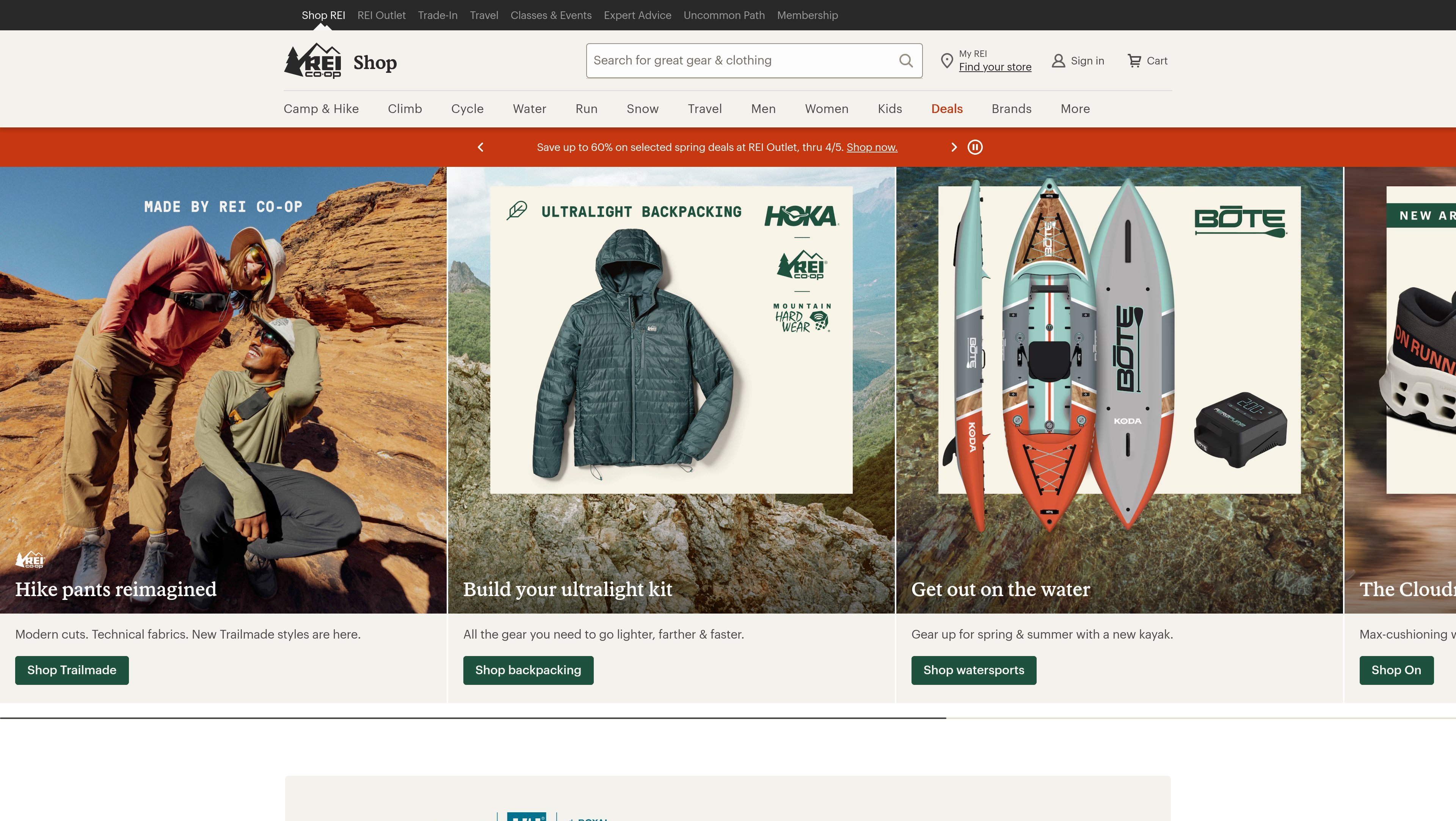
Hero carousel with outdoor lifestyle imagery and 'Hike pants reimagined' messaging
The hero carousel receives intense red/orange attention across the full-width lifestyle image, but the heatmap shows scattered attention patterns with no clear focal point directing users to actionable next steps. Heat is distributed across the image rather than concentrated on any CTA or product category entry point.
Product category grid featuring 'Build your ultralight kit' and 'Get out on the water' promotional cards
The heatmap shows moderate yellow/green attention on the product category cards in the middle section, with heat concentrated on product images rather than category titles or CTAs. The promotional messaging 'Build your ultralight kit' and 'Get out on the water' receives minimal orange heat, indicating users are scanning images but not engaging with the value propositions.
REI Co-op Membership benefits section with '$30 bonus card' offer and member rewards messaging
The heatmap shows solid blue/green coloring with virtually no red or orange heat across the membership benefits section near the bottom of the page. The '$30 bonus card' incentive, annual dividend messaging, and member-exclusive pricing that could overcome purchase hesitation receive zero attention. Users are abandoning the page before discovering these powerful conversion motivators.
3 Critical Issues Affecting REI Co-op's Conversions
Issue: Add High-Contrast CTA and Benefit-Driven Headline to Hero Carousel
The hero carousel's 'Hike pants reimagined' message generates strong visual engagement, but users don't know what action to take next. The heatmap shows intense attention scattered across the lifestyle image with no focal point on conversion elements. Without a clear call-to-action, engaged users leave the page without entering the shopping funnel.
Issue: Lead with Benefit-Driven Headlines and Visual Authority Badges on Category Cards
The product category cards showing 'Build your ultralight kit' and 'Get out on the water' receive only moderate attention, with heat concentrated on images rather than messaging. Users scan visually but don't understand the value proposition or feel motivated to click through to curated collections that could increase basket size.
Issue: Surface Membership Benefits with Scroll-Triggered Sticky Banner and In-Card Callouts
The REI Co-op membership section with the '$30 bonus card' offer, 10% annual dividend, and member-exclusive pricing receives virtually zero attention according to the heatmap. These powerful incentives that differentiate REI from competitors are buried at the bottom of the page where users never see them, resulting in lost membership sign-ups and missed opportunities to convert price-sensitive shoppers.
3 Specific Changes That Could Increase Revenue by $100.8M
Recommendation 1: Add High-Contrast CTA and Benefit-Driven Headline to Hero Carousel
The hero carousel's 'Hike pants reimagined' message generates strong visual engagement, but users don't know what action to take next. The heatmap shows intense attention scattered across the lifestyle image with no focal point on conversion elements. Without a clear call-to-action, engaged users leave the page without entering the shopping funnel.
Overlay a prominent CTA button in the lower-third center of the hero image using REI's signature green color with high-contrast white text reading 'Shop Hike Pants.' Add a secondary benefit-driven headline above the button: 'Engineered for comfort on every trail' to prime user expectations. Ensure the button is at least 200px wide with 16px+ font size for mobile visibility.
Navigation and above-the-fold optimizations like this consistently deliver strong results—in our tests, navigation improvements average 9.4% lift and above-the-fold changes average 9.8% lift. By concentrating scattered attention onto a single, clear conversion path, we transform passive browsing into active product discovery. The benefit-driven headline addresses the 'priming' heuristic by setting clear expectations before the click.
Recommendation 2: Lead with Benefit-Driven Headlines and Visual Authority Badges on Category Cards
The product category cards showing 'Build your ultralight kit' and 'Get out on the water' receive only moderate attention, with heat concentrated on images rather than messaging. Users scan visually but don't understand the value proposition or feel motivated to click through to curated collections that could increase basket size.
Redesign category card headlines to lead with concrete benefits: change 'Build your ultralight kit' to 'Save 15% on Complete Ultralight Kits' and 'Get out on the water' to 'Best-Selling Kayaking Gear.' Add visual authority badges like '5-Star Rated' or 'Staff Picks' in the top-right corner of each card. Replace text links with full 44px-height buttons using action verbs: 'Shop Ultralight Gear' instead of generic 'Shop Now.'
Homepage content blocks and category exposure improvements average 9.5% lift in our test database, while trust signals like authority badges add an additional 4.8% lift. By making benefits direct and visible, we reduce cognitive load and help users quickly identify collections that match their needs. The larger, action-oriented CTAs improve discoverability and clickability, especially on mobile devices.

Recommendation 3: Surface Membership Benefits with Scroll-Triggered Sticky Banner and In-Card Callouts
The REI Co-op membership section with the '$30 bonus card' offer, 10% annual dividend, and member-exclusive pricing receives virtually zero attention according to the heatmap. These powerful incentives that differentiate REI from competitors are buried at the bottom of the page where users never see them, resulting in lost membership sign-ups and missed opportunities to convert price-sensitive shoppers.
Create a scroll-triggered sticky banner that appears after 3 seconds of page activity, positioned at the top of the viewport with a green background and white text: 'Join REI Co-op: Get a $30 bonus card + 10% back on purchases.' Include a high-contrast 'Join Now' button. Additionally, add membership value callouts directly within product category cards in the middle section: 'Members save an extra 10%' with a one-click 'Join & Save' micro-CTA.
Incentive visibility is critical for conversion—our test data shows incentive optimizations can drive significant lift when properly surfaced. By relocating the $30 bonus offer into a persistent banner and embedding member savings directly into product browsing contexts, we intercept users at high-intent moments. This addresses both the 'incentives' heuristic (making motivators visible) and creates urgency by showing immediate savings opportunities before users leave the site.
Combined Impact: Here's What REI Co-op Could Achieve
A conservative projection based on our methodology
Breakdown by Change
- Add High-Contrast CTA and Benefit-Driven Headline to Hero Carousel $3.0M/mo
- Lead with Benefit-Driven Headlines and Visual Authority Badges on Category Cards $3.0M/mo
- Surface Membership Benefits with Scroll-Triggered Sticky Banner and In-Card Callouts $2.4M/mo
How REI Co-op Would Work With The Good
Our approach lets your team validate our methods before a larger digital experience investment.
Discovery & Baseline
Deep-dive into your analytics and user behavior
Goal Setting
Define success metrics and KPIs
Sprint Planning
Prioritize tests by impact and effort
A/B Testing
Execute, measure, and iterate
Ready to Capture That $100.8M in Revenue?
This is an initial AI-driven assessment to illustrate revenue potential. The next step is a comprehensive optimization program built for you. Every optimization program starts with a digital experience audit. During the audit our team of experts:
- Conducts in-depth user research and analytics review
- Performs heuristic evaluation of your complete funnel
- Identifies the biggest conversion barriers and opportunities in your digital experience
- Creates a prioritized roadmap based on impact and effort
Why REI Co-op Should Trust This Analysis
16+ Years Optimization Work
We've optimized hundreds of millions in revenue through our optimization programs.
Fortune 500 Clients
Worked with leading companies including Nike, Adobe, and Xerox.
Data-Driven Methodology
Our analysis is based on thousands of successful A/B tests across industries.