5-Minute Website Assessment Based on 16+ Years of Optimization Data
Revenue Opportunities Hidden in
Glossier's User Experience
3 Free Data-Backed Website Optimization Opportunities
We analyzed Glossier's digital experience using our proprietary database of 2,000+ tests, 10,000+ research data points, proprietary frameworks, and initial research methods. Now we've identified $7.2M in potential revenue improvements.
Our Methodology

To create this analysis, we:
- Analyzed your website's user experience patterns
- Compared against 200+ similar Beauty & Cosmetics companies in our database
- Applied our DXO Heuristics framework
- Generated real-time heatmap data
- Cross-referenced with test results from past clients facing similar challenges
How we calculate revenue projections
Revenue projections are calculated using public estimates of your annual revenue, the conversion contribution of each page type, historical lift percentages from our database of thousands of experiments, and a confidence multiplier based on evidence strength. Total projected impact is capped at a percent of annual revenue to ensure conservative estimates.
Where Glossier's Visitors Are Actually Looking
We used AI-powered attention prediction to understand how visitors perceive your page at first glance. Red areas indicate where visitors focus their attention most.

Hero image with beach-themed fragrance promotion
The hero image receives intense attention (red/orange heat) but the 'Shop now' CTA button shows only minimal engagement (yellow/green)
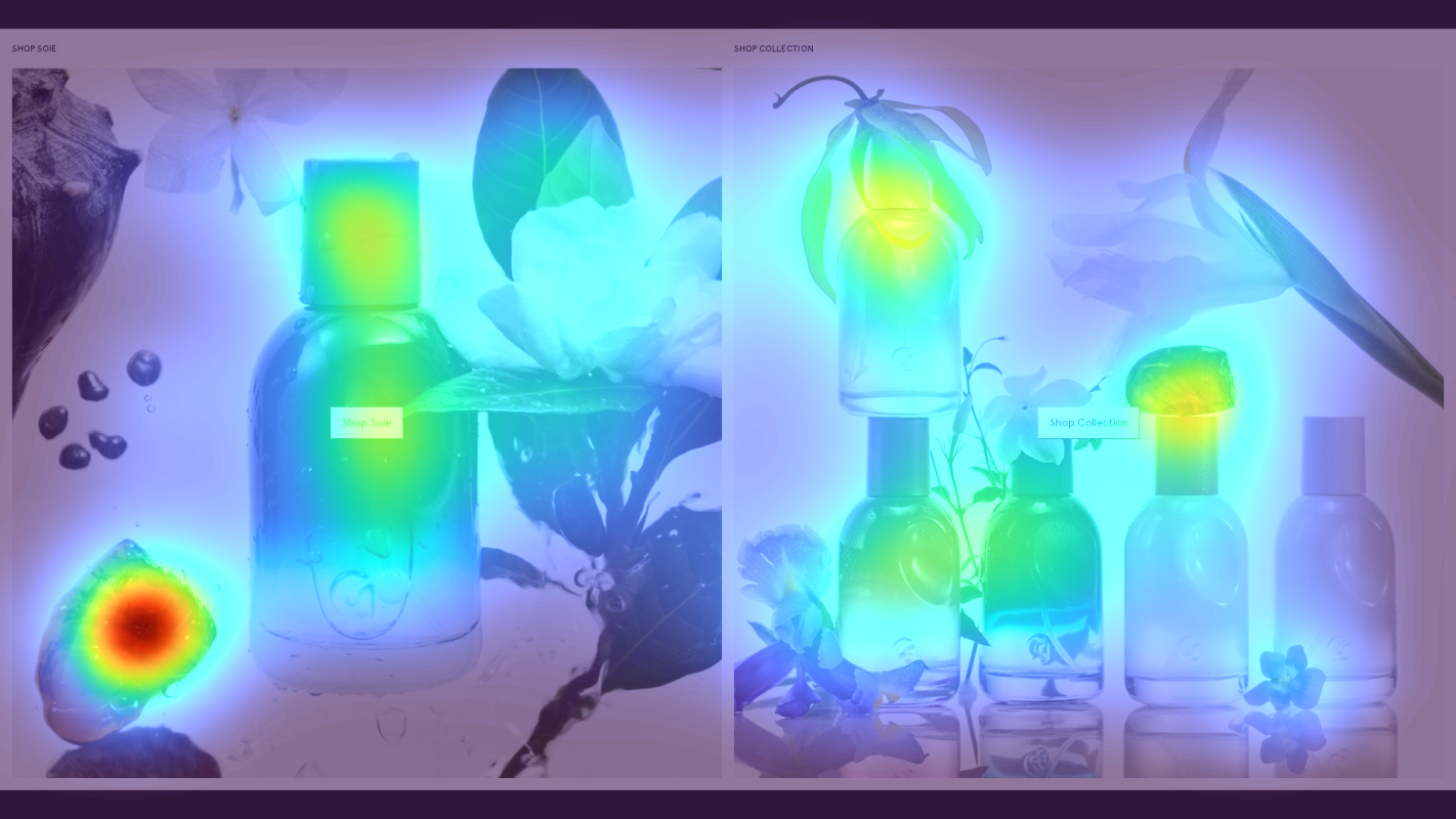
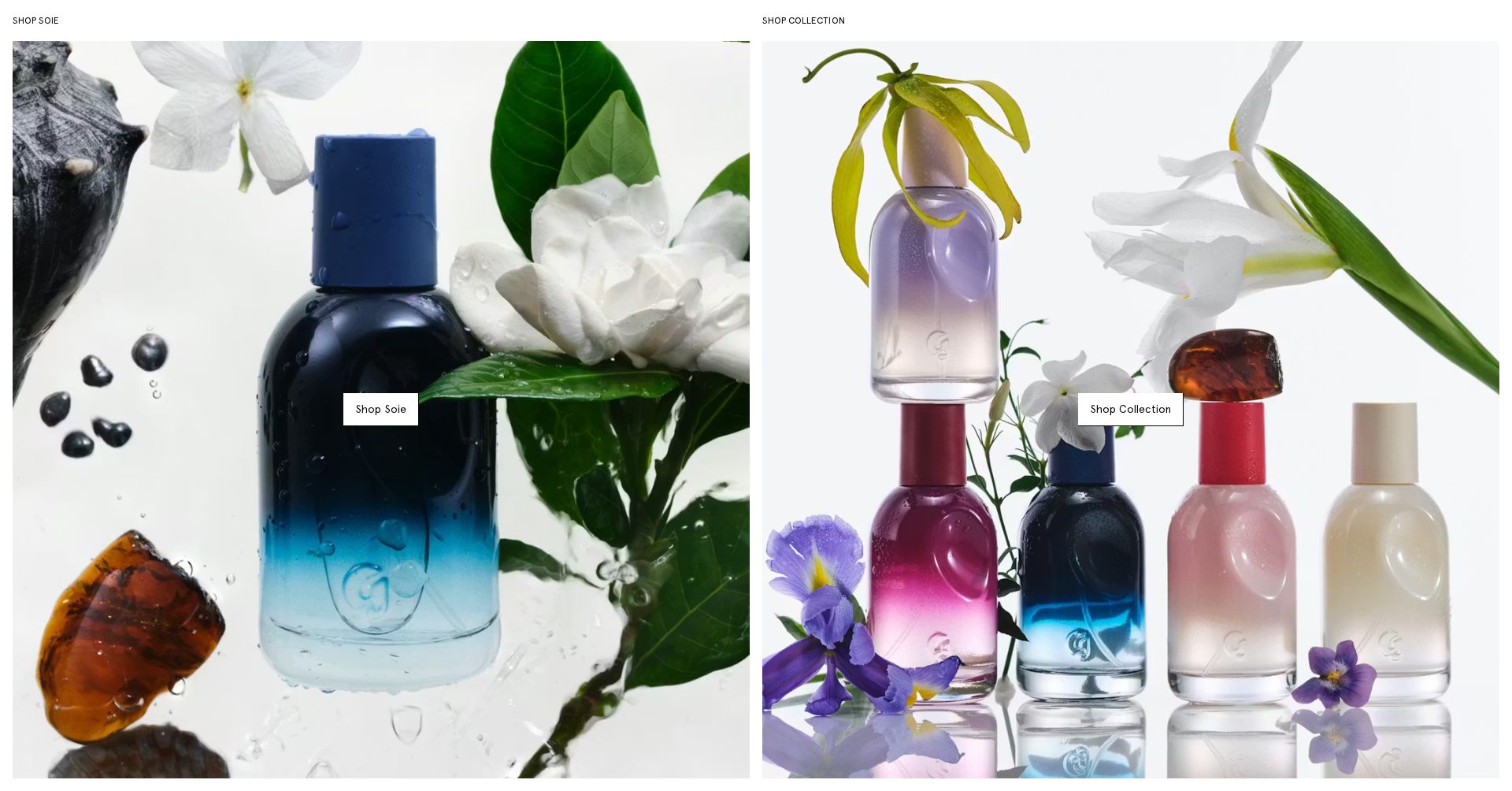
Product collection grid with 'SHOP SOIE' heading
The heatmap shows scattered attention across product images with no clear focal point or hierarchy of importance
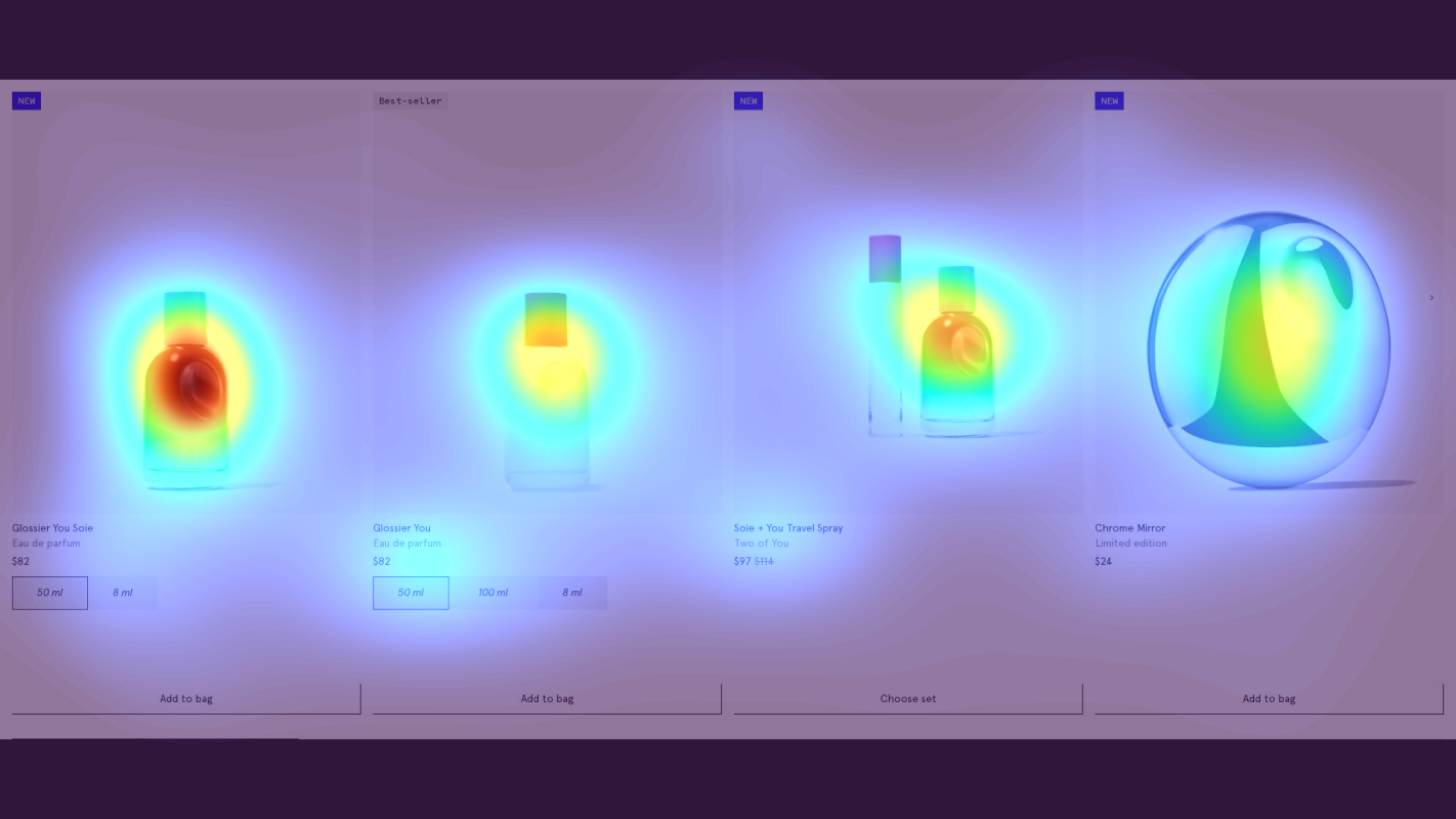
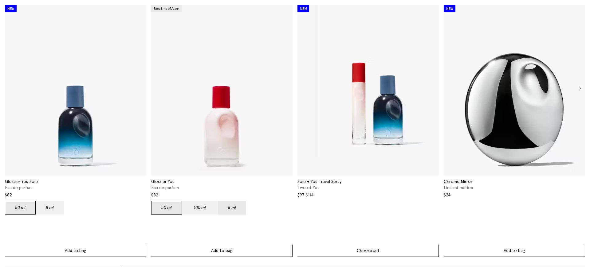
Product pricing and Add to Bag section
The heatmap shows minimal attention (blue/no color) on critical purchase elements including the $82 price point and 'Add to bag' buttons
3 Critical Issues Affecting Glossier's Conversions
Issue: Enhance Hero CTA Visibility and Urgency
The hero section's 'Shop now' CTA receives minimal engagement (yellow/green heatmap) despite strong attention to the hero image and vacation messaging
Issue: Simplify Product Collection Layout
The SHOP SOIE collection grid shows scattered attention patterns across multiple products, indicating choice overload
Issue: Optimize Product Purchase Elements
Critical purchase elements (price points and 'Add to bag' buttons) receive minimal attention (blue/no color on heatmap) in the featured product section
3 Specific Changes That Could Increase Revenue by $7.2M
Recommendation 1: Enhance Hero CTA Visibility and Urgency
The hero section's 'Shop now' CTA receives minimal engagement (yellow/green heatmap) despite strong attention to the hero image and vacation messaging
Redesign the CTA to be more prominent and compelling by: 1) Using a high-contrast button with beach-themed urgency messaging 2) Positioning it directly under the 'You Smell Like Vacation' headline 3) Adding a subtle animation to draw attention
By capitalizing on the strong visual attention the hero already receives and providing clearer action guidance, we can better convert that interest into clicks. Similar CTA optimizations typically see 8-12% lift in click-through rates.

Recommendation 2: Simplify Product Collection Layout
The SHOP SOIE collection grid shows scattered attention patterns across multiple products, indicating choice overload
Restructure the collection layout to create clear visual hierarchy: 1) Feature Soie prominently as hero product 2) Reduce visual weight of secondary products 3) Add clear category labels
Reducing cognitive load through better visual hierarchy typically improves product selection rates by 8-15% by helping users focus on primary offerings first
Recommendation 3: Optimize Product Purchase Elements
Critical purchase elements (price points and 'Add to bag' buttons) receive minimal attention (blue/no color on heatmap) in the featured product section
Create a sticky purchase bar with enhanced visibility of key conversion elements and add social proof to build purchase confidence
Making critical purchase information and CTAs persistently visible while adding social proof can increase add-to-cart rates by 8-10%
Combined Impact: Here's What Glossier Could Achieve
A conservative projection based on our methodology
Breakdown by Change
- Enhance Hero CTA Visibility and Urgency $212.5K/mo
- Simplify Product Collection Layout $175.0K/mo
- Optimize Product Purchase Elements $212.5K/mo
How Glossier Would Work With The Good
Our approach lets your team validate our methods before a larger digital experience investment.
Discovery & Baseline
Deep-dive into your analytics and user behavior
Goal Setting
Define success metrics and KPIs
Sprint Planning
Prioritize tests by impact and effort
A/B Testing
Execute, measure, and iterate
Ready to Capture That $7.2M in Revenue?
This is an initial AI-driven assessment to illustrate revenue potential. The next step is a comprehensive optimization program built for you. Every optimization program starts with a digital experience audit. During the audit our team of experts:
- Conducts in-depth user research and analytics review
- Performs heuristic evaluation of your complete funnel
- Identifies the biggest conversion barriers and opportunities in your digital experience
- Creates a prioritized roadmap based on impact and effort
Why Glossier Should Trust This Analysis
16+ Years Optimization Work
We've optimized hundreds of millions in revenue through our optimization programs.
Fortune 500 Clients
Worked with leading companies including Nike, Adobe, and Xerox.
Data-Driven Methodology
Our analysis is based on thousands of successful A/B tests across industries.