5-Minute Website Assessment Based on 16+ Years of Optimization Data
Revenue Opportunities Hidden in
Bryr Studio's User Experience
3 Free Data-Backed Website Optimization Opportunities
We analyzed Bryr Studio's digital experience using our proprietary database of 2,000+ tests, 10,000+ research data points, proprietary frameworks, and initial research methods. Now we've identified $57.6K in potential revenue improvements.
Our Methodology

To create this analysis, we:
- Analyzed your website's user experience patterns
- Compared against 200+ similar Footwear Manufacturing & E-commerce companies in our database
- Applied our DXO Heuristics framework
- Generated real-time heatmap data
- Cross-referenced with test results from past clients facing similar challenges
How we calculate revenue projections
Revenue projections are calculated using public estimates of your annual revenue, the conversion contribution of each page type, historical lift percentages from our database of thousands of experiments, and a confidence multiplier based on evidence strength. Total projected impact is capped at a percent of annual revenue to ensure conservative estimates.
Where Bryr Studio's Visitors Are Actually Looking
We used AI-powered attention prediction to understand how visitors perceive your page at first glance. Red areas indicate where visitors focus their attention most.
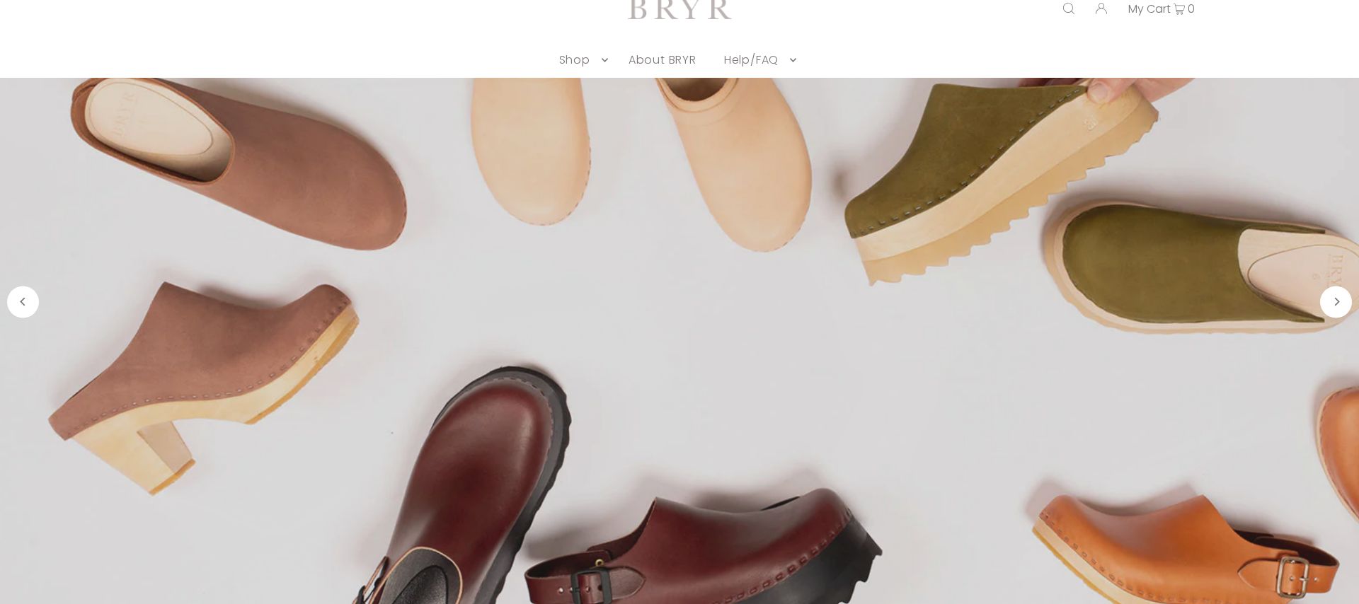
Hero banner with 'Handmade in San Francisco' messaging
The hero message receives intense attention (red/orange heat) but the 'Shop the Collection' CTA below shows only minimal engagement (yellow/green)
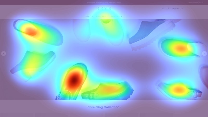
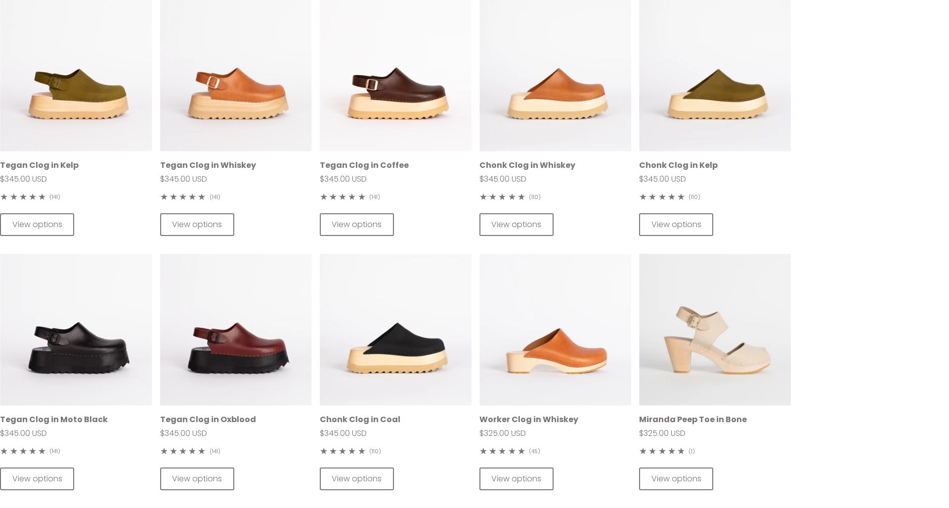
Product grid showing Tegan and Chonk clogs
The heatmap shows scattered attention across multiple product cards with price points receiving minimal focus
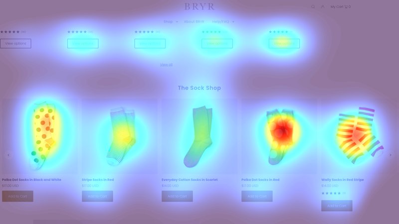
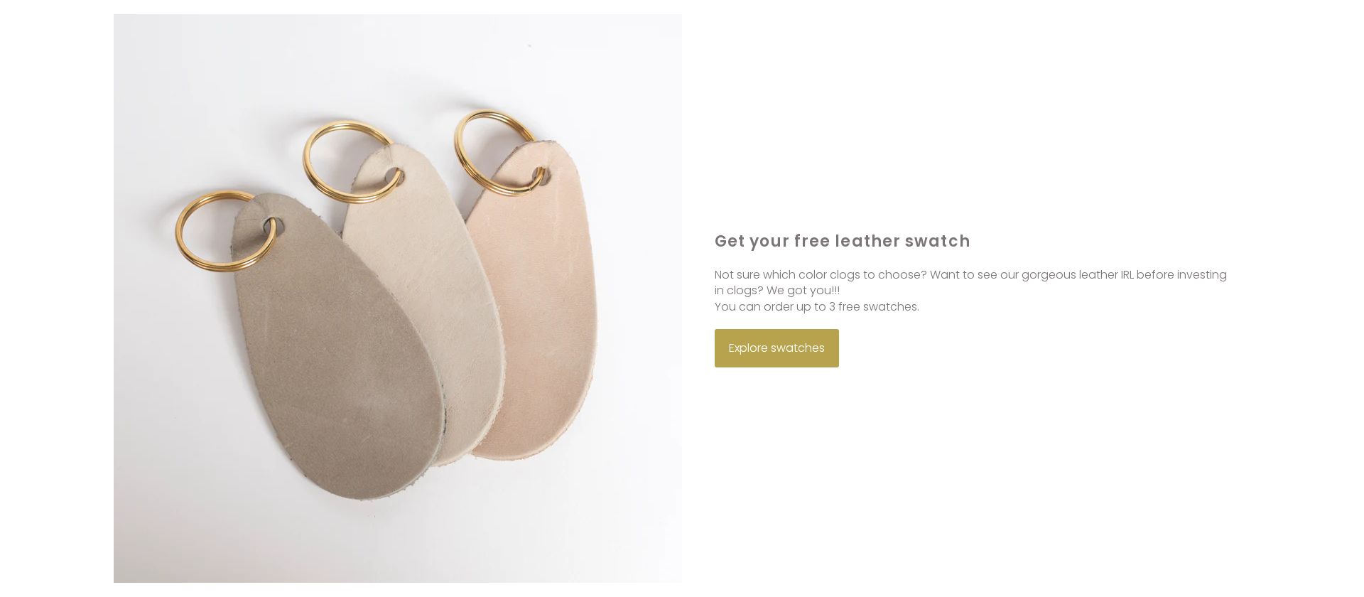
Free leather swatch offer section
The free swatch offer - a key confidence-building tool for high-value purchases - receives almost no attention (solid blue/no color in heatmap)
3 Critical Issues Affecting Bryr Studio's Conversions
Issue: Enhance Hero CTA Visibility & Direction
The hero banner's 'Handmade in San Francisco' message receives high attention (red/orange heat), but users aren't converting this interest into shopping action, with minimal engagement on the 'Shop the Collection' CTA (yellow/green heat)
Issue: Simplify Product Grid with Clear Differentiators
Heatmap shows scattered attention across multiple product cards in the Tegan/Chonk collection, with users struggling to differentiate between similar $345 options
Issue: Elevate Free Swatch Offer Visibility
The free leather swatch offer receives almost no attention (solid blue in heatmap) despite being a valuable tool for overcoming purchase hesitation on $345 items
3 Specific Changes That Could Increase Revenue by $57.6K
Recommendation 1: Enhance Hero CTA Visibility & Direction
The hero banner's 'Handmade in San Francisco' message receives high attention (red/orange heat), but users aren't converting this interest into shopping action, with minimal engagement on the 'Shop the Collection' CTA (yellow/green heat)
Redesign the hero section to create a stronger visual hierarchy and clearer path to action by adding directional cues and an enhanced CTA design
Creating a clear visual path from brand story to action will help convert high initial engagement into shopping behavior
Recommendation 2: Simplify Product Grid with Clear Differentiators
Heatmap shows scattered attention across multiple product cards in the Tegan/Chonk collection, with users struggling to differentiate between similar $345 options
Restructure the product grid to highlight key styles and add clear differentiators above price points
Reducing choice paralysis and highlighting product benefits will help users make faster purchase decisions
Recommendation 3: Elevate Free Swatch Offer Visibility
The free leather swatch offer receives almost no attention (solid blue in heatmap) despite being a valuable tool for overcoming purchase hesitation on $345 items
Transform the swatch offer into a prominent, visually appealing conversion tool
Making the swatch offer more visible and appealing will help overcome price hesitation for expensive purchases
Combined Impact: Here's What Bryr Studio Could Achieve
A conservative projection based on our methodology
Breakdown by Change
- Enhance Hero CTA Visibility & Direction $1.7K/mo
- Simplify Product Grid with Clear Differentiators $1.4K/mo
- Elevate Free Swatch Offer Visibility $1.7K/mo
How Bryr Studio Would Work With The Good
Our approach lets your team validate our methods before a larger digital experience investment.
Discovery & Baseline
Deep-dive into your analytics and user behavior
Goal Setting
Define success metrics and KPIs
Sprint Planning
Prioritize tests by impact and effort
A/B Testing
Execute, measure, and iterate
Ready to Capture That $57.6K in Revenue?
This is an initial AI-driven assessment to illustrate revenue potential. The next step is a comprehensive optimization program built for you. Every optimization program starts with a digital experience audit. During the audit our team of experts:
- Conducts in-depth user research and analytics review
- Performs heuristic evaluation of your complete funnel
- Identifies the biggest conversion barriers and opportunities in your digital experience
- Creates a prioritized roadmap based on impact and effort
Why Bryr Studio Should Trust This Analysis
16+ Years Optimization Work
We've optimized hundreds of millions in revenue through our optimization programs.
Fortune 500 Clients
Worked with leading companies including Nike, Adobe, and Xerox.
Data-Driven Methodology
Our analysis is based on thousands of successful A/B tests across industries.