
Nine Principles for Optimizing Your Thank You Page
The post purchase thank you page is an often overlooked aspect of the buyer’s journey. This Insight delivers actionable steps you can follow to start optimizing your thank you page for conversions.

Are you overlooking or underutilizing your ecommerce thank you page? Many ecommerce companies do, and it’s a costly mistake to make.
Let’s face it: A sizable chunk of your marketing budget goes towards customer acquisition and retention—so why not direct some of that attention to thank you page conversion optimization? It can be a relatively quick and inexpensive way to boost your marketing efforts and keep your customers engaged post-purchase.
Most ecommerce sites consider the thank you page as a quick way to let the customer or prospect know to check their email for a purchase confirmation, download link, or even a webinar RSVP. What a lot of ecommerce businesses fail to recognize is that the thank you page can (and should) contain so much more. It’s a perfect place to include a call-to-action with a sincere note of gratitude, promote related products, or refer the visitor to other content they may be interested in.
Note: You really don’t have to actually say “thank you” on a thank you page. More on that soon.
In this article, we’ll look at why the thank you page is a necessary component to include on your site, as well as nine best practices you should consider when developing your own thank you page. We’ll also take a look at four examples of highly effective thank you pages and what makes each of them so great. Each example highlights several of the best practice principles you can leverage to get more conversions on your ecommerce site.
Are Thank You Pages Really That Important?
After a prospect takes action on your website, the last interaction you’ll most likely have with them before they bounce is on your thank you page. It’s at this moment in the customer journey when the prospect is most primed to take action. Whether your thank you page enables customers to share a purchase on social media, add a related product to their shopping cart, or provide feedback on their buying experience, the page needs to be engaging so you can capitalize on your customers’ interest in your products or brand.
If your thank you page is a simple two-line message that thanks the prospect for their interest and directs them to a download link, that’s fine, but know that you’re missing out on a great opportunity to nurture them further along in the customer journey.
Best Practices for Highly Effective Thank You Pages
We’ve compiled a list of nine best practices that you should follow when designing your thank you page. It’s important to remember that every website is different—what may work to improve conversions for one ecommerce site may not work for another—so be prepared to test a few different versions of your thank you page before settling on the one that has the best outcome.
1. Always be selling: The thank you page on your site is an ideal spot to include more calls-to-action (CTAs). The customer is already primed for action if they’ve made it to your thank you page, so it would make sense to try and upsell the same product for a bulk discount, or even suggest a subscription. For example, if the customer just purchased a line of skincare products, you could offer an automatic renewal option that ships the same products to the customer each month without them having to place a new order.
2. Cross-sell with recommended products: Customers who buy flashlights may also need batteries, extra bulbs, or maybe even a tent. If the customer just bought something from your site, they’re primed to spend more if they see something that compliments their original purchase. Don’t be pushy or obnoxious, though. Be helpful and your customers will appreciate you for it.
3. Promote your original content: This doesn’t apply to every ecommerce brand, but for those that publish original content online via a blog or similar platform, the thank you page is a great place to promote that. The longer you can keep your customers engaged on your site, the better.
4. Provide a social share option: Social mentions help build brand awareness and can attract more prospects to your ecommerce website. Any time you can motivate a customer to share their purchase via social media, you’re getting free promotion and social proof for your brand.
5. Provide referral sharing options: Did you know that 92 percent of people trust recommendations from friends and family over any other type of advertising? If you aren’t already, you should be providing your customers with an option to share their purchase directly with friends through referrals. Referrals are different from social media sharing in that you’re directly asking for the customer to share their purchase with a friend. If they do choose to refer the product they bought to someone, provide them with a pre-written email that they can send instantly and a discount code that both parties can use on their next purchase.
6. Establish trust and credibility: The thank you page can be a great place to include testimonials and user-generated content (UGC) to establish trust with the customer. This may also motivate customers to share their own positive shopping experience with others.
7. Build your email list: If the prospect is interested enough in what your business has to offer, you should be providing them with a way to get more information from you. You’d be surprised by how effective a newsletter sign-up CTA on your thank you page can be (see example below).

Even if you already have the prospect’s email address, those who choose to opt-in to your mailing list are raising a hand to tell you they want to know more.
8. Ask for feedback on the buying experience: Include a short survey to collect feedback and insight on the customer’s buying experience. This is a great opportunity to find out if your customers were satisfied with their overall experience and to identify areas that need improvement.
9. A/B test your changes: Whichever improvements you decide to implement on your thank you page, it’s important to remember that there’s no one-size-fits-all approach to optimizing your customer experience. One ecommerce site may have a winning thank you page that consistently generates repeat customers, but that same page may not work as well for another brand with a different target audience. To get the best results from your thank you page, try testing a combination of ideas until you find which ones make your target audience responds positively.
Before you start implementing these principles into the thank you page of your own site, it can be helpful to look at what your industry peers are doing so you get an idea of where to start.
Ecommerce Thank You Pages to Draw Inspiration From
We compiled a handful of examples of winning thank you pages to provide you with some inspiration before you dive into optimizing your own. By learning from the best, you stand a better chance of getting it right the first time. There’s a central concept behind each example: Any time you have a logical and legitimate opportunity to ask your best prospects to take action, don’t hesitate. Do it.
Note: We’re not advising you to copy+paste these pages, but we’re definitely encouraging you to draw inspiration from the principles they illustrate and incorporate those tactics into your own thank you page.
Example 1: Hubspot covers all the bases
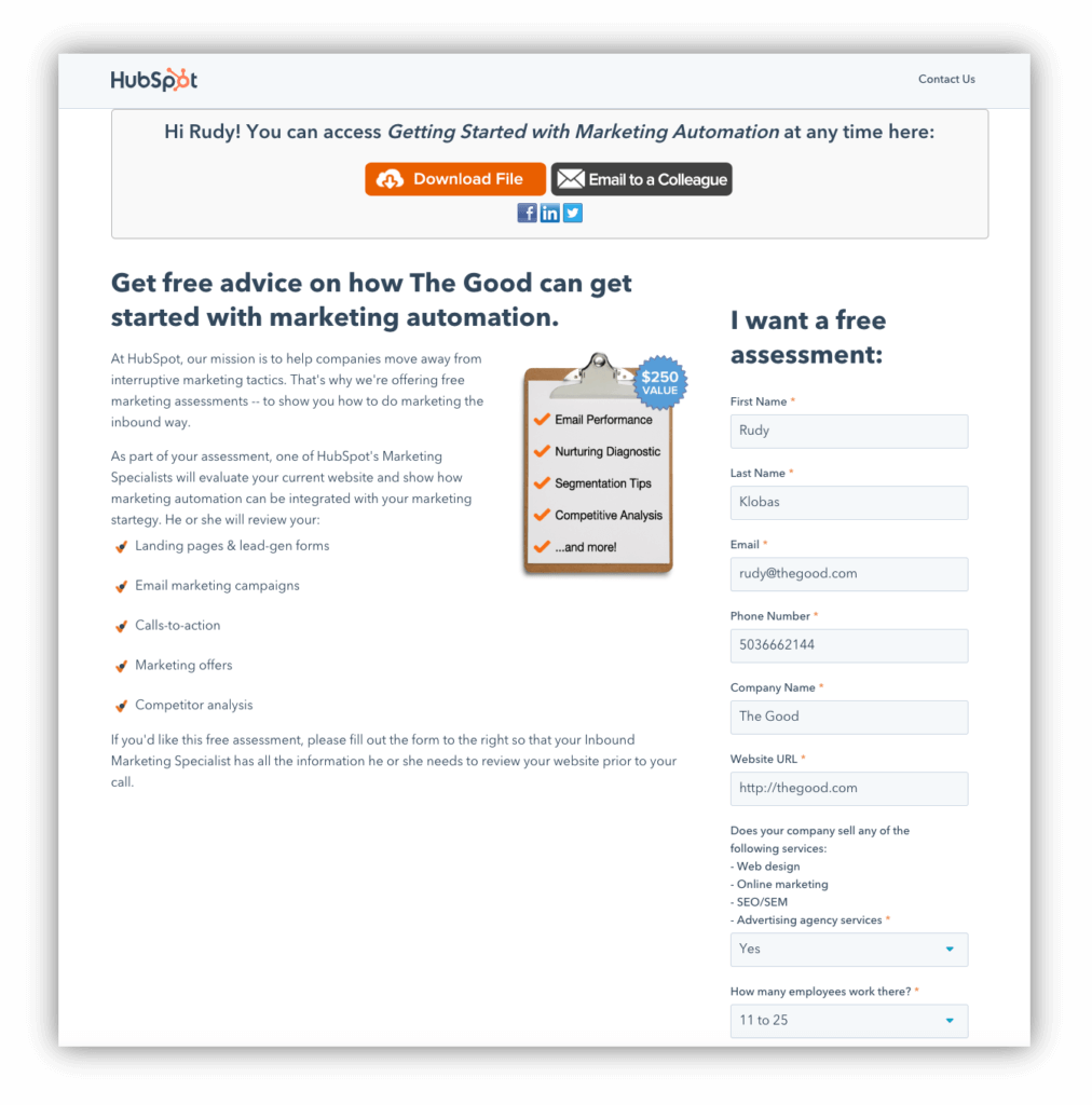
The HubSpot page shown above is an example of how you can set up a thank you page that doesn’t actually say “thank you.” After all, you’re getting a free book in exchange for your email address.
Notice that the CTAs begin right off the bat. Right beside the Download File link is another button inviting you to Email a Colleague. Below that are social media icons, and below those is another section promoting the HubSpot Sales Blog. This may seem like overkill, but as long as everything you incorporate on the thank you page is a value-add for your customers, feel free to include it.
Many companies settle for the leads they get from giving away the book. Not HubSpot, though. Marketers there have learned you typically only get what you aren’t afraid to ask for.
Example 2: Less is more for Optimizely
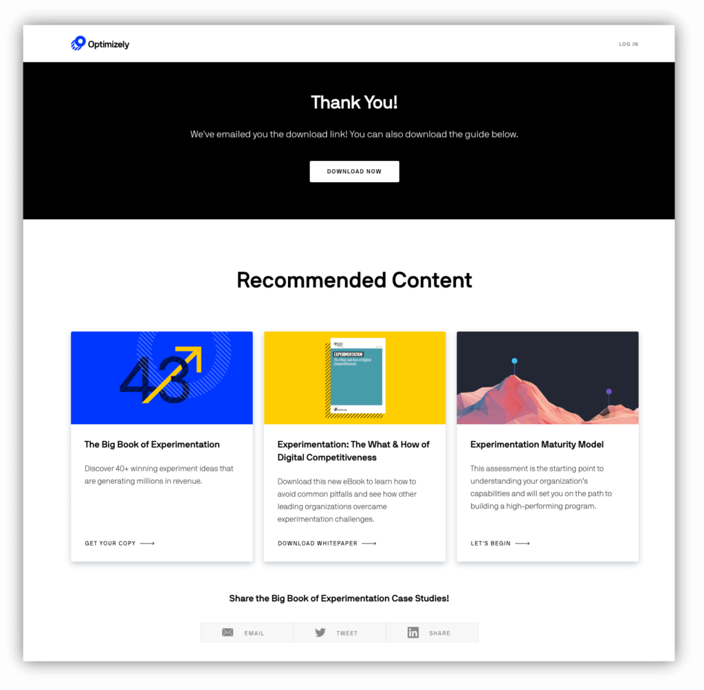
Optimizely uses a simple but effective approach for their thank you page. When a prospect requests a download of one of their PDF guides, Optimizely sends an email of the document to the prospect’s inbox; however, they also include a download button on the thank you page so the prospect can access the file immediately.
Below the main header is a Recommended Content section where visitors are offered related content that they may also be interested in. The more relevant content you can push to your customer, the better chance you’ll be able to nurture them further along in the sales funnel.
At the bottom of the page, Optimizely includes social media icons to share the content you’re downloading. As you’ve probably noticed already, social sharing icons are an essential component to have on your thank you page. Never miss out on the chance for free promotion!
Example 3: Salesforce keeps it short and to the point
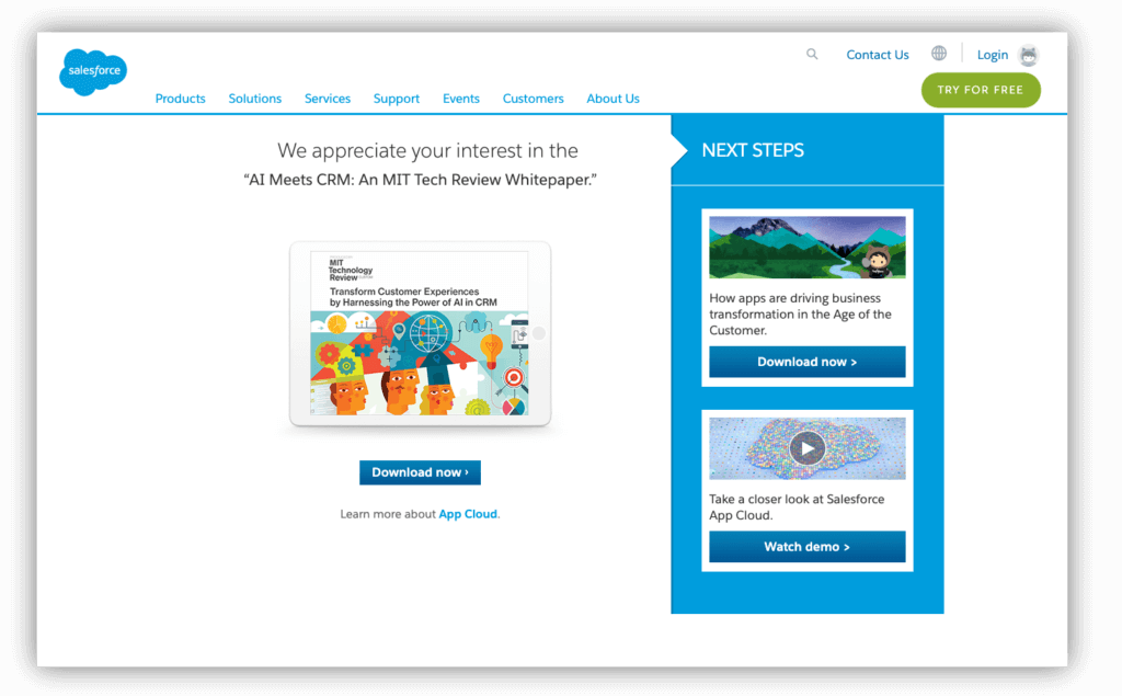
Salesforce takes simplicity to another level with its thank you page. Similar to Optimizely, Salesforce includes multiple options for downloading the requested resources, but excludes the social sharing element on their thank you page.
To the right of the Download Now button, Salesforce suggests another resource and then provides something that could move a prospect to customer status quickly—a demo session with a Salesforce staffer. If the prospect is already in the Consideration phase of the sales funnel, watching a product demo could be what pushes them to the Purchase phase.
This is a minimal approach to thank you page design, and while it’s effective for Salesforce (and most B2B companies), it may not be as effective for an ecommerce site selling consumer products.
Example 4: Amazon nails it
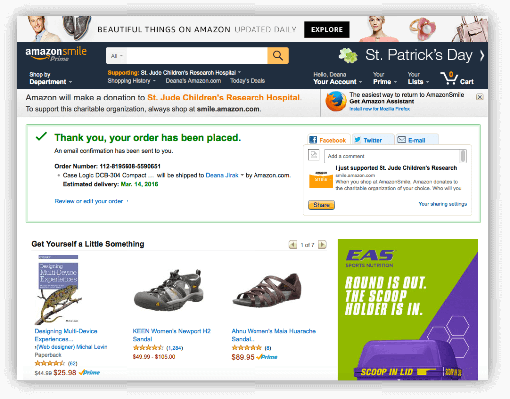
Amazon presents a great illustration of the “always be selling” concept. After thanking the customer for the order and providing an ego-bait sharing CTA of “I just bought …,” Amazon immediately presents a plethora of related products. This approach seems overwhelming, but they must be doing something right if their conversion rate for Prime customers is an astounding 74 percent.
Note that the thank you page is styled like any other sales page on Amazon. Rather than take customers out of the store to a typical thank you page, Amazon keeps them in the store and encourages them to shop some more—without missing a beat.
HubSpot, Salesforce, Optimizely, and Amazon—four heavy hitters that know how to use the thank you page to turn prospects into buyers and buyers into repeat customers. We hope these examples provide you with enough inspiration to start optimizing your own thank you page.
Amazon leverages design to encourage sales from the thank you page. Share on XEcommerce Thank You Pages: Don’t Waste the Opportunity
Once your ecommerce website visitor has completed certain tasks (joined your mailing list, bought something from you, downloaded an ebook, etc.), you have an opportunity to express your appreciation for the interaction and offer them even more. “Would you like fries with that?” is a good example of a simple statement that has earned fast food restaurants millions (probably billions) of extra dollars.
By adding CTAs to your thank you page, you’re positioning your ecommerce website or email marketing campaign to maximize conversions and generate more sales. If your ecommerce business is looking to invest in optimizing your conversion rate, thank you pages are one aspect of the customer experience you shouldn’t ignore.
Having trouble coming up with improvements to test on your site? Redesigning any page on your ecommerce site can prove to be a challenge, especially if you don’t have the in-house expertise, so why not leave the heavy-lifting to the experts? Request a free landing page assessment, where we’ll pinpoint problem areas on your site and help you understand where to focus your optimization efforts.
Resources:
- How to Get More From Your Transactional Emails
- The Good’s Thank You Page (With Site Assessment Offer)
- How to Create an Effective A/B Test Hypothesis
About the Author
David Hoos
David Hoos is the former Director of Marketing at The Good and a trusted advisor to marketing experts.