
How to Write the Perfect Email Signup Text (Using Data)
Just because something works for one brand doesn’t mean it will work for another.

We’ve all seen it before. The humble email newsletter signup form placed in the footer of a landing page or article that prompts visitors to input their email address if they want to be added to the newsletter mailing list. It’s a tried and true method for bolstering your mailing list and pushing your content out to more people.
The problem is, writing an effective newsletter call to action (CTA) on your site is a surprisingly difficult task. Oftentimes you’ll start by following the best practices for newsletter signup forms and researching what’s worked for other companies. This is a good starting point, especially when designing the first iteration of your CTA. It’s easy to find lists of what has worked well for someone else. It’s even easy to find test-backed, tried-and-true winners. But what you can’t search for on Google is whether or not those winning headlines and CTAs will work for your brand.
It’s important to provide a user experience that’s unique to your brand and tailored to your customers. Searching for “the most effective email signup CTAs” is a fine way to find ideas, but the only way to accurately determine the perfect copy for your newsletter signup form is to test different versions. In this Insight we cover tests and results of email signup forms for three different brands.
Testing the email signup form of three brands
Let’s look at the simple email newsletter signup box that’s common to so many site footers. You know, the email box with a headline and a button:
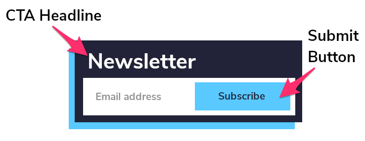
What we’ve found is that the CTA headline and the copy used in the form have an effect on the likelihood that a site visitor will actually fill out the form.
We ran tests on the same combinations of elements across three brands in the same industry, experimenting with:
- The call-to-action headline
- The copy on the submit button
The variations for the headline were:
- (Original) — whatever the brand was already using
- (Sign Up) — “Sign up for exclusive email offers”
- (Get) — “Get exclusive email offers”
The variations for the button were:
- (Original) — whatever the brand was already using
- “Sign Up”
- “Submit”
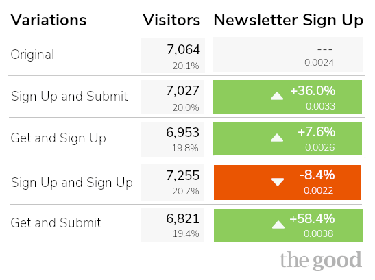
Take a look at the impact these changes had on each brand below. The solid color boxes indicate statistically conclusive results of 99% or greater.
Brand #1: A Good 58% Lift
Almost every combination created some lift in sign ups. Only the “Sign up for exclusive email offers” and “Sign Up” button combo dropped sign ups by about -8%. The absolute winner was the headline “Get exclusive email offers” and “Submit” button combo.
Based on these very promising results, we set up the same test of newsletter signup copy for two additional brands of a similar size within the same industry as the first brand. You’ll be surprised to see how different and unexpected the results were for these brands.
Enjoying this article?
Subscribe to our newsletter, Good Question, to get insights like this sent straight to your inbox every week.
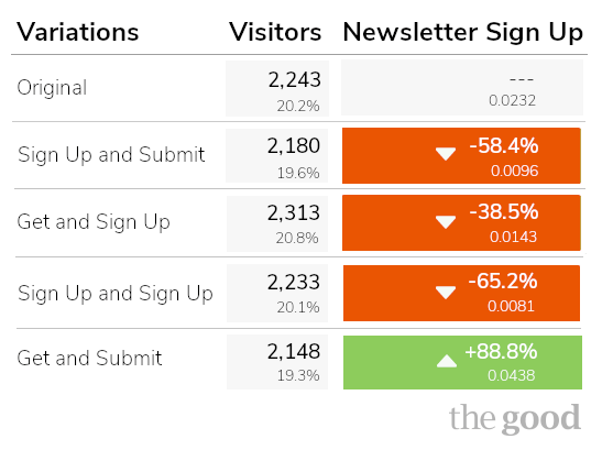
Brand #2: Same Winner, Different Losers
The tests for this brand showed a decline across the board, with the singular and surprising exception of the “Get exclusive email offers” and “Submit” button combo boosting signups by +88%. The same headline with the “Sign Up” call to action on the button decreased sign-ups by -38%.
Compared to Brand #1, these results are unexpected but actionable.
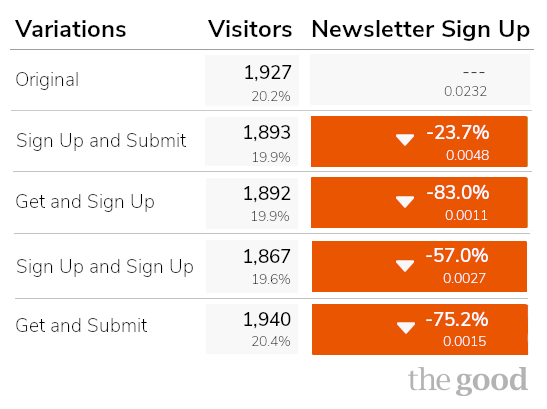
Brand #3: Same Industry, Very Different Results
After two very strong showings from the same set of headline and button combinations, we were pretty confident that we’d see similar results from the same experiment with a third brand. You can imagine our surprise when we found that every variation performed worse than the original, three of them with 99.99% statistical significance. Ouch.
Results like these are not uncommon, but they highlight just how important it is to test site changes rather than just agreeing on them internally and never following up after launch. Changes that work for one brand’s website may not work for your own, which is why it’s important to always be testing.
One more variable that we didn’t include in these tests is button color. If you search for the “best button color to increase conversions” red will come up a lot as the popular choice. This doesn’t mean you should just make all your important buttons red. Just as each of the brands listed above saw wildly different email sign ups based simply on headline and button copy changes, your results will vary.
Whichever color schema that ends up working best for your website really depends on the color palette that’s unique to your brand’s site.
A best practice with color changes is to test making a button more noticeable as a point of action. Sometimes that means simply making it a different color than everything else on the page. If your whole brand motif is centered on red, going with the popular advice to use red for buttons won’t really help you. If it blends in, people are less likely to notice it.
A better way to improve email signups
If you’ve been relying on the results of someone else’s tests, or simply internal stakeholder consensus to make decisions on your site, we’d like to propose a new approach:
- Start with the research and best practices
- Customize everything for your brand
- Test each version with your customers
- Launch the winners that your customers choose
The most important lesson to take from the results of these tests is that there is no single “right” answer as to what will increase conversions and create the best user experience on your site. Making site changes based on best practices is great, but ultimately the only one who can choose the best version of a site feature is your customer.
It can be a daunting task, running multiple tests of different copy for your newsletter signup. While it’s tempting to rely on best practices or whatever’s working for your competition, it’s important to never pass on any opportunity you have to optimize your user experience. A simple A/B test of a couple different lines of copy can make a world of difference.
Don’t be afraid of an experiment “failing.” The possibility for something to perform better or worse than an existing element is built into the testing and iteration process. In fact, it’s the only way to guarantee better results in the future.
About the Author
James Sowers
James Sowers is the former Director of The Good Ventures. He has more than a decade of experience helping software and ecommerce companies accelerate their growth and improve their customer experience.