
The Hierarchy of Conversion Optimization: Q&A With Natalie Thomas
The roadmap for improved conversions and website optimization starts with a framework called the hierarchy of conversions. Developed at The Good, the framework helps our expert strategists determine potential impact of the changes made to a website.

Our Director of UX and CRO Strategy, Natalie Thomas, built a model around the hierarchy of conversion optimization and discussed it with the team at Trends.co for a feature. The idea was so good, we want to share the raw conversation with our readers.
How does our team of expert conversion optimization strategists build a roadmap for clients?
Lots of research, planning, and a deep understanding of each website’s unique opportunities for improved conversions.
One framework we use, created by our Director of CRO and UX Strategy Natalie Thomas, is called The Hierarchy of Conversion Optimization.
In this article, we sat down with Natalie for a candid Q&A on what the framework is and how to use it.
A Conversation With Natalie Thomas on the Hierarchy of Conversion Levers
Tell me about the framework – what is it for and how is it structured?
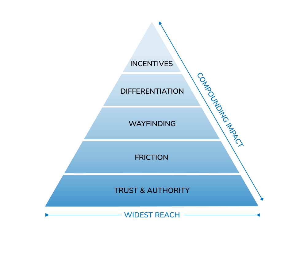
Think of a pyramid. There are sections that represent themes from bottom to top. We use this pyramid as a way to assess the overall potential impact of the changes we could make, and it informs the order of a site’s optimization roadmap. As we optimize a website, we progressively work our way up from the bottom to the top.
At the bottom of the pyramid, you have the biggest opportunities that will impact the largest portion of your audience. As you work your way up the pyramid, the audience you’re speaking to might get smaller, but the improvements you’ve made below impact them too, so the efforts are compounding.
Ok, so it’s a pyramid shape, the opportunity audience gets smaller and smaller as you go up the pyramid, but the gains are cumulative.
Exactly.
So what’s at the widest point of the pyramid? Where do you start optimizing?
The bottom of the pyramid is trust and authority.
We tackle these issues first because they turn off both web-savvy shoppers and those with less experience buying online. Examples might be bugs or errors, low visibility of who’s behind the company, or an unconventional checkout that just feels not secure for some reason. Anything that makes a user second guess your authenticity or security would fall under this category.
I tend to think this trust factor is the area where small business operators have the biggest blindspot since “trustworthiness” in the eyes of the user tends to be based on a range of things from visual design to breaking from convention.
Users might not be able to put into words what they mean when they are on a checkout page and they say the website “looks sketchy” but one of my strategists can look at the same checkout page and identify the parts that are a little off right away.
They’ll say “well of course they think it’s sketchy, there is no order summary and the footer looks generic, not to mention the logo changed from the last page to this one, so I’m not confident I’m on the same website anymore.” It takes a trained eye to know where a site could improve that trust factor.
Web design is a lot like writing in that you have to know the rules in order to break them. A lot of custom websites break the rules in a haphazard way.
Enjoying this article?
Subscribe to our newsletter, Good Question, to get insights like this sent straight to your inbox every week.
I get that trust is important, but why is it first on the list? Why is this the bottom of the pyramid?
Just because someone trusts you, doesn’t mean they’ll give you their money. We see this play out in non-profit organizations. Users may think that the organization seems trustworthy but, they still need more than that in order to convert. Trust is required, but not a clincher. So trust is the foundation we build off of. Without it, you’re toast.
What kind of impact do you see when you work on a site with really low trustworthiness?
One of the best parts of my job is that I never get to critique a client site without offering an improvement strategy in return. So on presentation day, the more it feels like a pile-on of really bad news about trustworthiness, the more room for improvement there is. We’ve seen double-digit percentage point gains within months for some of the sites with the lowest initial trust scores. It’s really gratifying.
Next in the pyramid is Friction. Can you tell me what that is?
For us, Friction is really about removing all the micro-frustrations from the site that simply prevent people from moving forward. It’s not the same as just saying “make it a good user experience.”
In this case, we’re focused on the pain points that just give people a hard time when they’re already motivated to buy, but something is standing in their way. The issues individually might be small, but the user may not have the patience to overcome all the issues combined.
Can you give me some examples of painful user experiences?
It definitely depends on the site, but we’re generally looking for any place we can mitigate annoyance, reduce repeated tasks, or simplify convoluted purchase funnels.
These are things like cumbersome customization processes, poor functionality of search widgets, a bad categorization that requires users to burn time hunting down products, etcetera.
How do you know when you’re done with optimizing the user experience?
Ha! You’re never done. Our favorite saying here at The Good is “it could be further optimized.” But there is usually a point where the issues are small enough that there are diminishing returns. That’s when we know we’ve gotten the big stuff out of the way and can largely start focusing on the next tier.
What’s your approach to adding content to a website? I bet there’s a tension between saying too much and not enough.
Totally! My approach should be a poster hung on the wall, I say it so much: Show when you can. Tell when you can’t.
Instead of writing the measurements of a product in a chart, show a schematic or an in-situ photo that represents the scale. It’s about users absorbing the info with minimal effort.
What about the next tier, Wayfinding? What is this about?
I’ll compare it to something I think a lot of people have experienced. Everyone has that one friend who you invite to dinner, you ask “where do you want to eat?” and they say “I don’t know, where do you wanna go?”
Some people just need someone to say “right this way,” and lead them to where they need to go. They need extra guidance, otherwise, they won’t have an easy time deciding on their own.
In the context of ecommerce, this could be about banners, collections, landing pages, or anything that is tailored to helping a specific audience navigate seamlessly to their perfect product.
I think that makes a lot of sense. And I definitely have that friend who needs a lifestyle concierge. Can you give me any examples?
One that relates to categories specifically, yeah. We had data suggesting we should create more meaningful menu categories for a client who sold sit-stand desks, so we surveyed new customers to understand how people were planning to use their desks. We were asking them at the moment of peak excitement what their plans were, so we got to hear about how these desks would improve their lives.
We asked about where the desks were going to go within their homes and what they were doing with them, and the range of responses was incredible. Everything from the geared-up YouTuber with dual monitors, a mic, lighting, etc. to parents who work from home at their dining table. Some of the parents had to dramatically change their setup twice per day and needed a lot of flexibility.
We created some really fun featured categories based on the research. We landed on “Best for maximalists” for people who needed maximum desk space and plenty of accessories like the YouTubers, as well as “Small but mighty” for people who needed to be able to turn any surface into a standing desk and then back again.
That’s a really fun way to shop for desks.
We thought so too!
So, tell me about the next layer of the pyramid, Differentiation.
Differentiation is probably what most people think of when they think about optimizing a website. This is about images, words, value propositions, comparison charts, and the like. I think this is actually where ecommerce managers spend most of their time already, making sure the editorial-type stuff matches their vision.
When it comes to optimizing content, we’re not talking about rebranding or completely starting from scratch. We’re more focused on getting to some of the nuances that customers are asking about after having reviewed the website already.
We use think-aloud protocol for our usability testing, so we get to hear from users what questions they have after browsing a website. You’d be shocked what users still don’t know after 10-15 minutes of looking at a website! Differentiation is focused on answering the lingering questions in the quickest way possible and making it clear why you should purchase from this company over another.
Ok, onto the next category. Incentives. What is this about?
Incentives can cover a lot of things, but in general, this is meant to address the portion of the audience who has every reason to purchase but just needs a little added incentive. They trust your site, they can find what they need and get all their questions addressed, but they need a little motivation to make the purchase.
I think about cart parkers in this case. People who have items in their carts for months on end wanting to make the purchase but not making the move. They might be waiting for a sale, but discounts are only one way to turn a desire into a purchase.
If we’re not just talking about seasonal sales, what are some other high-incentive motivators you’ve used?
It’s really based on the brand because every company kind of has a different personality when it comes to incentives. But some we’ve used in the past are bundle pricing, loyalty programs, warranties, free gift with purchase, things like that.
These can be both things that show up in your inbox (like limited-time offers) and more long-term implementations that make it more appealing to purchase now rather than later (or buy from you rather than your close competitors).
That makes sense, you’re talking about being more than just a purchase. It’s about getting more value from the transaction—beyond the product.
Exactly.
And do you A/B test these?
Sometimes yes, but most of the time the way we support here is to provide research and recommendations since a loyalty program for instance are usually a big undertaking in terms of implementation. We would provide guidance and research and then ultimately let the client team decide what is right for them in terms of timing and approach.
Alright, so not on the pyramid, but something we have chatted about being a “bonus tier” is the crème de la crème of optimization: Untapped opportunities. What does this consist of?
Untapped is about that special something that we really won’t figure out until we work with the client for a while. We never know what it is ahead of time, but when you get to know a customer base as well as we do throughout the research process, it’s inevitable that we’ll stumble upon something really spectacular.
Can you share an example?
Well for one client, Snow Peak, it was about this exclusivity effect. We worked with the US website, but they were headquartered in Japan, so there were often stock issues. They might have an item on the website that was sold out for months longer than anticipated.
I think the team at the time was a little sheepish that they had so much out of stock, but when we talked to their customers it was clear that they didn’t care. The quality of the goods was unparalleled and the limited supply added to this air of exclusivity. So our recommendation was basically “own it.” Lean into that exclusivity.
We added messaging in key areas of the site that told people basically these are limited runs, made with care, and when we say the last one we mean it. We also added more visibility to the product guarantees to relate the limited stock to the quality manufacturing, and we recommended an approach to start waitlisting people for the sold-out products. The results were really bonkers.
And you find this with all your clients?
Every long-term client, yes. There’s always this moment where we feel like we’ve unlocked a door we didn’t previously know was there.
This framework can serve both new to CRO brands and experienced optimization teams as they build an optimization roadmap.
Remember, conversion rate optimization is an iterative process, so once you’ve gone through the pyramid and executed your subsequent optimization roadmap, start back at the bottom with fresh learnings.
If you want a quality-driven CRO firm to help your team better understand the hierarchy of conversion optimization, we would love to hear from you. Contact us.
Interested in learning the laws of optimization?
Opting In To Optimization is a set of principles that will help digital leaders capitalize on unprecedented market demand and build sustainable, thriving businesses.
About the Author
Caroline Appert
Caroline Appert is the Director of Marketing at The Good. She has proven success in crafting marketing strategies and executing revenue-boosting campaigns for companies in a diverse set of industries.