
How A Fast Checkout Experience Can Improve Your Conversion Rate
Learn how to improve customer experience, reduce your cart abandonment rate, and increase conversions by building a fast checkout process.

At the end of a long journey, the last thing you want to do is jump through hoops before you can sit down and relax. Similarly, after a customer has chosen a product, compared it against others, and made it all the way to checkout, they don’t want to navigate a nightmare checkout experience.
The faster the checkout process, the better–but it’s also about removing any potential friction: does the customer have to create an account? Or is that just another unnecessary step towards the end goal? Hint: it’s probably the latter, since creating an account is more of a bonus for the merchant than the shopper.
When shopping cart abandonment rates are so high (currently sitting at an eye-watering 69.8%) it’s important to do everything you can to keep the checkout experience slick and friction-free. It’s near-on impossible to shave your abandonment rate down to a big fat zero, but there are definitely some tactics you can put in place to help customers relax at the end of a long journey.
Don’t know where to start? We’ve got you covered.
Why is a fast checkout process important?
Did we mention how high cart abandonment rates are right now?
Depending on the industry, you could be losing almost 70% of people who put something in their cart for reasons that are easily rectified.
Maybe they got distracted. Maybe you tacked on additional fees they weren’t expecting. Or maybe they found a better option elsewhere.
When a customer is in “buy mode”, they’re ready to buy. They basically have their wallet out, cash in hand, and are ready to throw their money at you. Don’t make it difficult for them to do that! The quicker you can whizz them through the checkout, the more seamless the journey becomes and the fewer chances there are for shoppers to back out.
When you have a robust and well-oiled checkout process in place, you can:
- Increase conversions by removing any friction and potential sticking points
- Attract repeat customers who had a great experience the first time they bought from you
- Create happier customers who enjoy buying from you

The key components of a checkout page design
It’s easy to relegate your checkout page to an afterthought–after all, customers have made it this far, so why wouldn’t they just continue until the end?
But in reality, this is the most crucial, make-or-break moment of the sales cycle. If a customer gets frustrated or confused, they’re going to ditch you quicker than you can say “enter your card details” and find a brand that provides them with a better experience.
Before we look at how you can improve your checkout experience, let’s recap the must-have elements of a decent checkout page design.
1. Summary page
Customers can get a quick overview of everything in their cart and continue on to checkout by clicking a “proceed to checkout” button or something similar.
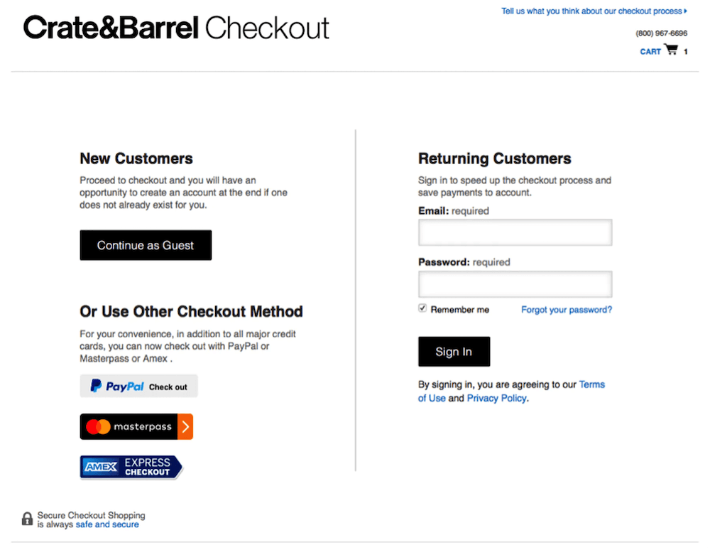
2. Login, sign up, or guest checkout
Shoppers can either log in to their account if they already have one, create a new account from scratch, or checkout as a guest.
3. Billing and shipping information
Customers can enter their billing information and delivery details. This is where any shipping fees or extra costs are tacked onto the total.
4. Preview order
Before a customer hands over their money, they should have a final opportunity to preview their order and see the total pricing.
Optimizing the checkout experience: the limitations of popular platforms
One of the biggest concerns for shoppers is safety when buying online.
Giving their payment information and other personal details to online stores they might never have bought from before can be daunting. In fact, 92% of consumers are worried about purchasing from unfamiliar websites, but they’re also frustrated by slow page load times when their card information is involved.
While most popular platforms like Shopify and BigCommerce offer a handful of different security measures, it’s often up to a retailer to explain how they keep customer data safe. This often means integrating a third-party security tool or displaying safety badges.
It’s not just security that’s a problem. Speed is so important for shoppers that 50% are much less likely to buy something if the checkout process takes more than 30 seconds. The easiest way to condense the process is to offer single-click checkout. If it’s good enough for Amazon, it’s good enough for smaller ecommerce brands.
Reducing the number of clicks a customer has to take to complete a purchase reduces the number of opportunities they have to back out or rethink their purchase. But it’s also annoying to have to go through multiple steps when you just want to buy something–particularly if a consumer is shopping on the go via their mobile device which can make going back and forth between checkout stages clunky.
The problem with current platforms is that it’s difficult to combine both speed and safety. Brands that are able to connect the two while still providing an excellent experience will come out on top.
On top of this, popular ecommerce platforms tend to have a standard checkout process that all brands must use in one form or another. While this makes it easy to implement a checkout process in minutes, it doesn’t necessarily allow for creativity and optimization.
The Guide To Optimizing Your Checkout And Post-Purchase Experience
How Swiss Gear increased conversions by 14% with an optimized checkout experience
Outdoor adventure brand Swiss Gear was struggling to generate conversions and boost its revenue. It found that many of its customers were shopping on the go from various different travel locations around the world, and therefore demanded a fast and easy checkout experience (which, at the time, they weren’t providing).
With the help of The Good’s Digital Experience Optimization Program™, they identified who their target market was and the points of friction in the buying process–including during the checkout experience.
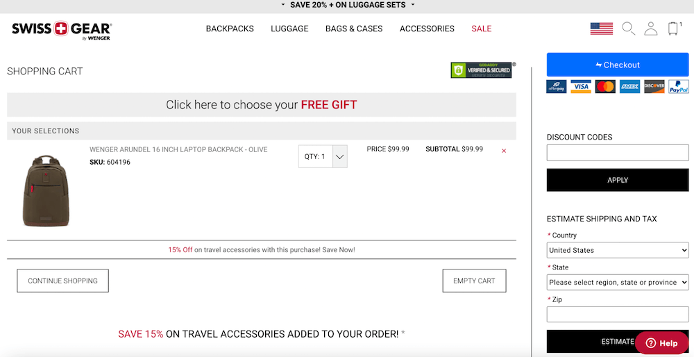
By optimizing the checkout process and making it mobile-friendly, Swiss Gear was able to dramatically decrease their cart abandonment rate and keep customers coming back even in the off-season. This led to a 14.1% year-on-year increase in conversion rate, a 20.1% increase in AOV, and a 132.7% increase in online year-on-year revenue.
How to optimize your checkout experience
Now you know why optimizing the checkout experience can lead to an explosion in conversion rates, happy customers, and a quicker sales process, it’s time to hone yours to start getting those results.
Here are some top tips for getting started.
1. Reduce form fields
The fewer steps a customer has to take, the better. No one wants to be greeted with an endless form that asks for their firstborn’s name and the kitchen sink.
Think about what information you really need and stick to that. According to research by the Baymard Institute, 18% of shoppers have no problem abandoning their cart if the ecommerce checkout process is too long or complicated.
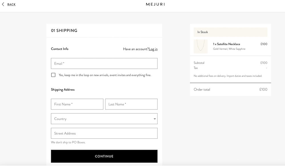
Mejuri keeps its form fields to an absolute minimum.
2. Offer guest checkout (or social sign-in)
Everyone’s inbox is crammed with new promotions, brand launches, and *LAST CHANCE SALES* emails. So much so, that adding yet another brand to their inbox can be the final straw for a shopper–not to mention creating an account and remembering a new password can be a real headache.
Avoid this by offering a guest checkout option that requires minimal information or take it one step further and let shoppers log in using their socials.
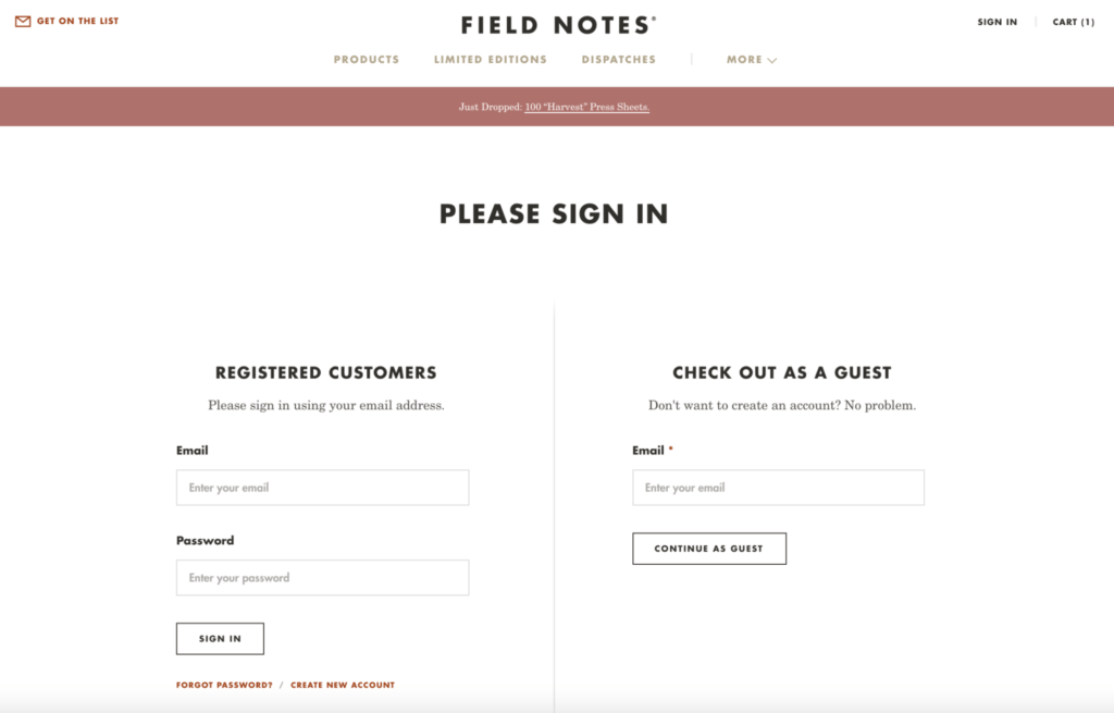
Field Notes offers customers the chance to checkout as a guest.
3. Cater to international shoppers
The great thing about online shopping is it can be done from anywhere in the world.
You might be based on the sunny shores of California, but your products can be snapped up by people in Australia, Japan, South Africa, and elsewhere. However, if you want to make international shoppers feel comfortable buying from you, it’s important that you provide a localized experience.
This means offering prices in their local currency, translating the ecommerce checkout process into their own language (40% of Europeans will never buy products in a language other than their own), and being sensitive to cultural differences.
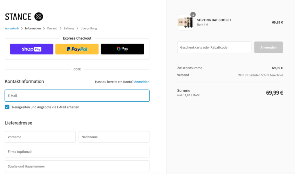
Stance translates its checkout and uses local currency for international shoppers.
4. Display trust signals
Security is paramount for shoppers today. They want to know their personal data is kept safe and that their credit card information won’t be compromised in any way. In fact, one survey revealed that 17% of shoppers have abandoned a checkout flow this year because they “didn’t trust the site with their credit card information”.
Instill a sense of safety in your customers by displaying trust signals like safety badges, credit card logos, and a clear privacy policy that explains exactly what you do with their data.
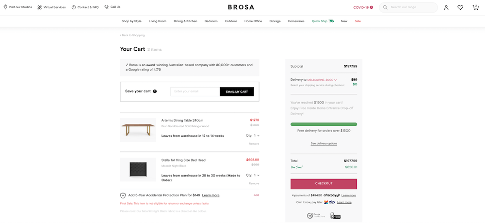
Brosa displays two security badges to give customers peace of mind.
5. Show checkout progress
If you’re going for a multi-page checkout experience, keep shoppers in the loop with a real-time progress bar. This shows them how far through the process they are and how long they have left. It’s a simple tactic, but it builds trust and keeps the momentum going.
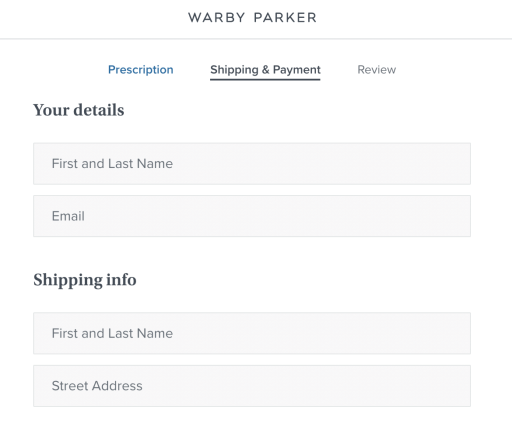
Warby Parker shows customers where they’re at in the checkout progress at the top of the screen.
6. Autofill customer information
It can be a real drag typing in your personal information over and over again on the same site. These days, shoppers almost expect you to make things easier for them by remembering what they’ve told you in the past and using that to speed up the checkout process.
If you can, autofill key information so the customer doesn’t have to tire out their fingers typing it in again. It’s a no-brainer that this speeds up the checkout process because it eliminates the need to fill out endless forms and reduces the chance of shoppers providing incorrect information.
7. Make it mobile-friendly
More than half of all online shopping now comes from a mobile device, so if you’re not making mobile-first a priority, you could be missing out on a huge chunk of sales.
Ensuring your online checkout process is slick on mobile means:
- Offering different payment options so shoppers can choose their favorite
- Auto filling form fields
- Reducing the number of form fields
- Including prominent CTA buttons including a fast checkout button
- Providing a one-click checkout option
- Simplifying the information you show on screen
- Allowing shoppers to log in using their socials
8. Clear CTAs
Customers will struggle to make it through the checkout process if they don’t know what to do next. CTAs guide them in the right direction and improve the flow of the checkout experience.
Think about making your CTAs stand out with contrasting colors, larger fonts, and placing them in prominent places on the screen. Some brands have success providing floating CTAs so that customers can see them at all times, wherever they are on the page.
Allbirds has a stand-out CTA that pops up when a customer adds an item to their cart.
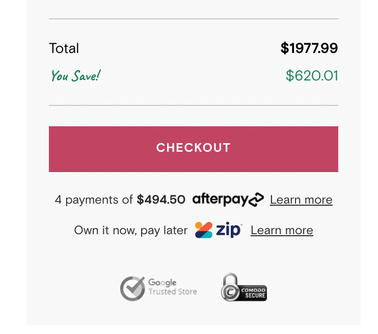
9. Multiple payment options
Different shoppers prefer different payment methods. By limiting the options you offer, the more you limit the shoppers you appeal to. If someone can’t pay the way they want, there’s a high chance they’ll go elsewhere (and never come back).
Consider offering all different kinds of payment options, including credit cards, PayPal, Stripe, and digital wallets, like Google Pay and Apple Pay.
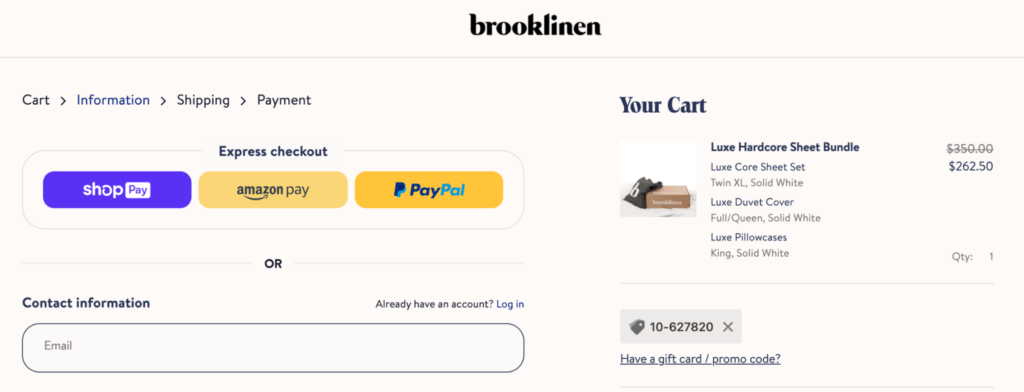
Brooklinen offers express checkout payment options.
Increase conversions and reduce abandoned cart rate with a fast checkout
The checkout might be the last stage in the sales cycle, but it’s the step that leaves a lasting impression. If a customer has a bad experience or it takes too long for them to checkout, there’s a high chance they won’t come back and shop with you again.
This is why it’s crucial to streamline your checkout process and make it as fast as possible. Consumers today expect a quick and easy purchase process, and tapping into their needs will dramatically reduce your abandoned cart rate and increase conversions.
Enjoying this article?
Subscribe to our newsletter, Good Question, to get insights like this sent straight to your inbox every week.
About the Author
Jon MacDonald
Jon MacDonald is founder and President of The Good, a digital experience optimization firm that has achieved results for some of the largest companies including Adobe, Nike, Xerox, Verizon, Intel and more. Jon regularly contributes to publications like Entrepreneur and Inc.