Customer Experience Teardown: Equal Parts Cookware
For this customer experience teardown, we’ll be looking at the DTC cookware brand, Equal Parts.

Every few years there seems to be an industry that’s struck by a surge of stylish, new direct-to-consumer (DTC) startups.
Several years ago it was the mattress industry. Brands like Casper, Purple, and Tuft & Needle quickly dominated the mattress business by offering consumers extended trial periods and significantly discounted price-points. In turn they gave big name retailers like Sleep Country and Mattress Firm a run for their money (so much so that the latter company filed for bankruptcy in late 2018).
The latest wave of DTC startups hitting the ecommerce market seem to be concentrated in the cookware industry. Made In was one of the first to launch (in early 2016), followed by Great Jones, Potluck, and a long-list of other contenders. Over time, many of these companies have started to overlap, often offering limited selections of premium, stylized cookware marketed toward a younger age-demographic.
Here’s the thing: as competition heats up, user-experience design and brand story are becoming increasingly important as differentiators for these companies. Relying solely on high-quality products and a trendy marketing campaign just doesn’t cut it anymore.
In this Insight, I’ll be “tearing down” the customer experience of a DTC cookware newcomer called Equal Parts. I’ll walk you through each step of the customer journey—from homepage to checkout—and identify key Stuck Points™ that could potentially be interfering with the website’s conversion path. I’ll then provide actionable solutions that can help remedy those hangups.
Here’s what I’ll be covering:
- An in-depth analysis of Equal Parts’ user experience, from homepage to checkout
- How conversion optimization can help improve your website’s user experience
Note: The goal here is not to shame a company’s design choices, but rather provide helpful feedback that other ecommerce store owners can potentially implement on their own sites.
Ready? Let’s dive in.
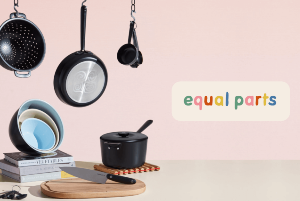
Homepage
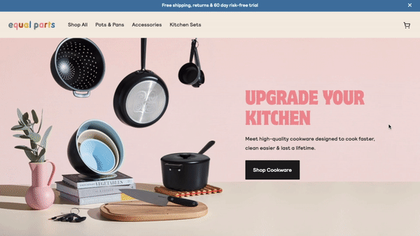
When you first arrive on the Equal Parts homepage you’re greeted with a time-based popup offering a 15 percent discount on your first order.
Here’s my issue with this: popups can be great for reducing cart abandonment and growing your email list, but displaying one to visitors before they have a chance to learn anything about your brand is a serious detriment to the user experience.
There are a few glaring usability problems involved in displaying a time-based popup like this:
- Showing a popup as soon as a visitor reaches the site leaves a bad first impression for first-time visitors. You should wait until users have at least reached the product category page before you start offering them any discounts or promo codes, so they can get a clear understanding of your company’s unique selling proposition.
- It positions Equal Parts as a discount brand. Relying on discounting to attract new customers is not a sustainable way to organically grow a business and will negatively impact your customer lifetime value (CLV). It encourages customers to expect a discount whenever they purchase from you in the future. Discounting is not a sustainable approach to optimization.
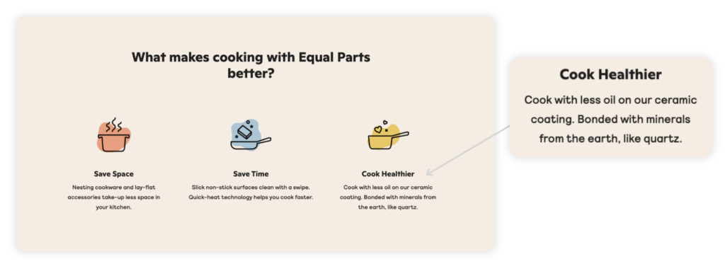
Just below-the-fold, we’re shown a few of Equal Parts’ unique product differentiators. It’s always important to highlight these points early on in the customer experience, especially if there’s already substantial competition in your industry.
Here’s my problem with these differentiators: they all seem to be features that a consumer could easily find from any of their competitors, or they’re completely irrelevant.
For Example: “Cook with less oil on our ceramic coating. Bonded with minerals from the earth, like quartz.”
First, this seems like a made-up product benefit. If their products use a nonstick ceramic coating, they should be mentioning that it’s: 1) Teflon-free, and 2) nontoxic.
Second, this is an extremely vague description of a benefit. Why would a consumer care if the ceramic coating is “Bonded with minerals from the earth, like quartz”? Do these minerals benefit the efficiency or usability of the cookware?
I guess we’ll never find out, because it isn’t mentioned again anywhere else on the website.
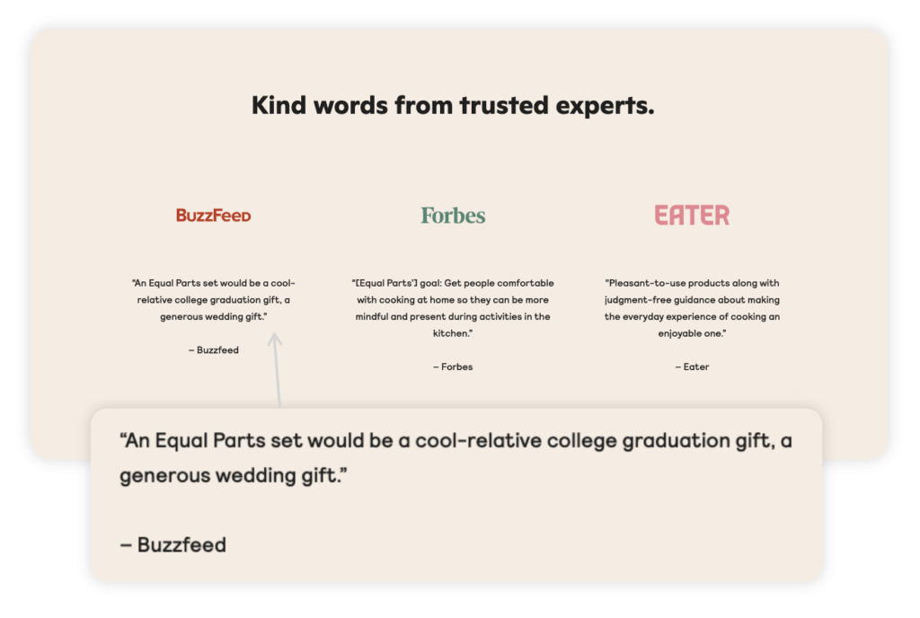
Toward the bottom of the homepage, you’ll find quotes from prominent media companies BuzzFeed, Forbes, and Eater. Normally this wouldn’t be a problem, but the quotes they highlight barely speak to the quality of the products or brand.
Take the BuzzFeed quote for example, “An Equal Parts set would be a cool-relative college graduation gift, or a generous wedding gift.” Instead of speaking to the value and quality of the products, this feels more like a general statement about how Equal Parts cookware would make a good gift.
A better alternative to showing brand quotes would be to display customer testimonials. The homepage can be one of the best places to show off positive customer reviews.
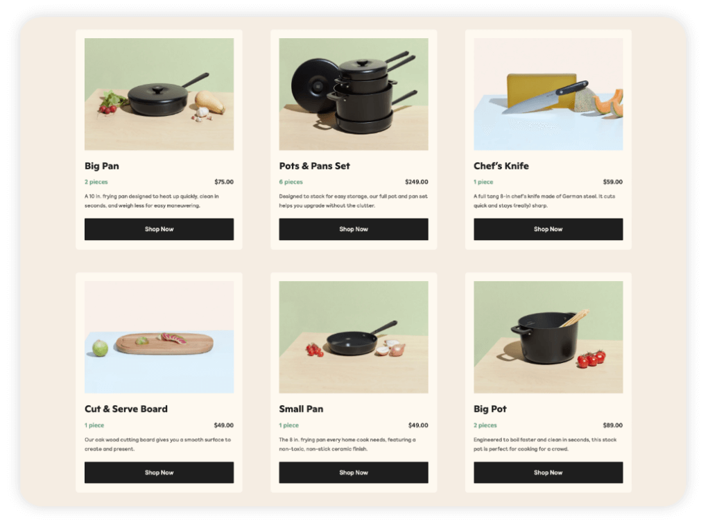
Product Category Page
In general, Equal Parts has a very standard Shopify-style categories page for a brand that only carries a limited number of SKUs. What sticks out the most about this page is how bare it is. No customer reviews, no product filtering options, no tags to indicate best sellers or most popular products. From a conversion rate optimization perspective, this category page is a blank slate for optimization.
The first place I’d start with optimizing this page would be to introduce some social proof.
Displaying customer reviews on the category page lets users know what the company’s best-sellers are, and can influence their perceived value of the products. If you click through to a product page, you can see that they have positive reviews for most of their products, so why aren’t they capitalizing on the value of those reviews?
Enjoying this article?
Subscribe to our newsletter, Good Question, to get insights like this sent straight to your inbox every week.
An additional test worth running on this page would be to include product filtering options for a variety of product attributes. For example, they could implement a filter for product size (dimensions, weight), product type (pots, pans, accessories), or get creative and ask how many people the user typically cooks for, or how many nights a week they prepare a meal at home.
For someone who’s just interested in purchasing an Equal Parts knife and nothing else, product filtering would make it easier for that user to locate and purchase the product without needing to scan the entire page.
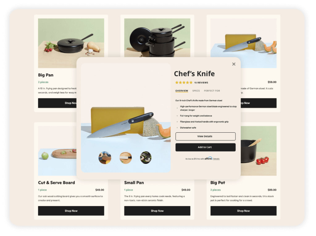
Lastly, it may be worth testing different messaging for the Shop Now CTAs on this page. Instead of showing a button that takes users directly to the product detail page, they should try implementing a Quick View popup, so users can get a glimpse of the product without having to move to a different page of the site. Here’s an example of what this popup might look like on the Equal Parts website:
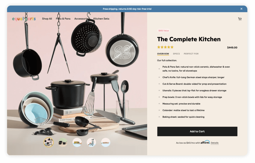
Product Detail Page
The product detail pages (PDP) on this website check all the boxes for what an average PDP should have: product description and features, customer reviews, a variety of high-quality product photos, etc. It wasn’t until I started reading through the contents of this page that I noticed the glaring issues present.
The way the product descriptions are segmented into categories (overview, specs, perfect for) is great, and does an excellent job of giving you product details without being too wordy.
The size guide they provide for bundled products is a solid addition to the page (so you can make sure the cookware fits in your cupboard before purchasing), and the product photography is well done (aligns with branding, and shows multiple product angles).
Here’s where things start to take a turn for the worse: as you scroll down the PDP, you start seeing information that’s irrelevant to the product.
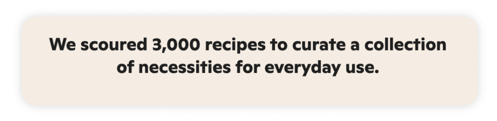
Just below-the-fold, we’re shown a section of content that reads, “We scoured 3,000 recipes to curate a collection of necessities for everyday use”. My question is: how does this pertain to the quality or value of the cookware? This feels like an insignificant benefit that was included as filler for the PDP.
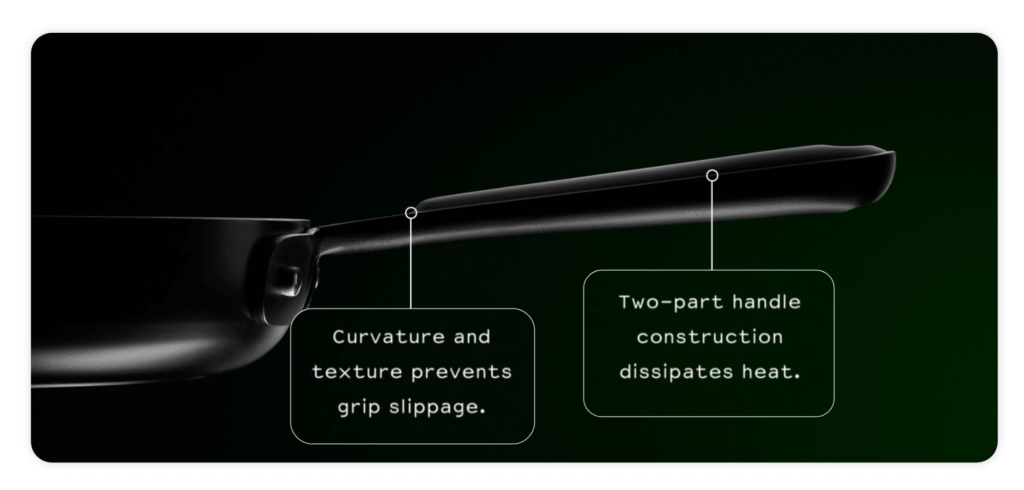
Further down the page, we’re shown an image that calls out two additional product features of questionable relevance (see screenshot below). What I don’t understand is why Equal Parts chose to highlight these features.
Instead of speaking to what makes their nontoxic ceramic coating unique, they’ve dedicated a large section of the PDP to calling out the curvature and texture of the handle.
The page ends with customer reviews, which only slightly redeems this user experience. In general, Equal Parts should be focusing on highlighting real product benefits that consumers care about. Clearly the company has some attributes that set it apart from competitors, but the average user would never be able to pick up on them because they’re barely touched-on throughout the buyer’s journey.
Checkout
The checkout page is an often overlooked aspect of the user experience, but from our perspective, it’s one of the most pivotal points in the path to conversion.
The design of an ecommerce website’s checkout page can have a significant impact on a site’s cart abandonment rate, average order value (AOV), and conversion rate. If you’re looking to improve any (or all) of those metrics for your own ecommerce site, the checkout page is one of the best places to start.
In general, this is a very standard Shopify checkout page. It’s contained to one-page (which is great), they’ve incorporated elements of their branding (logo, colors), and it’s a relatively straightforward process to complete the purchase.
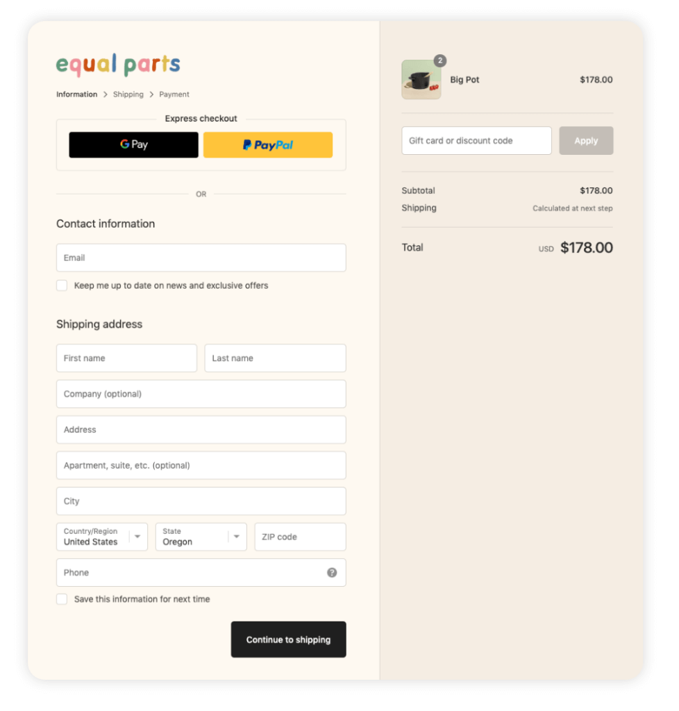
That being said, I did come up with a few test ideas that can help improve conversions on this page:
Upselling or cross-selling at checkout can be a great way to improve average order value for your site. Since Equal Parts focuses on bundling many of its products, it may be advantageous to upsell related products directly in the cart or on the checkout page.
For example, if someone is buying a charcuterie board it can be beneficial to recommend they also add a chef’s knife to their cart (or vice versa). There are a variety of third-party plugins available that’d make this test easy to implement, and could potentially lead to sizable gains in average order value.
Another potential test to run on this page would be to hide (or completely remove) the discount code field. With the rising popularity of discount-finder apps like Honey and Wikibuy, consumers have grown to expect a discount on every purchase they make online. Unless your business is relying on discounts to draw in new customers, showing this form field to users is only going to encourage them to leave your site in search of a discount code. After they leave your site, it’s very unlikely they’ll return empty-handed to complete the purchase at full-price.
Final Recommendations
Here are the three key recommendations I would suggest to help improve Equal Parts’ customer experience, and conversion rate:
Emphasize social proof. A significant problem on the Equal Parts website is the lack of substantial social proof throughout the buyer journey. The homepage should be a critical place to display customer testimonials or product reviews, but instead, Equal Parts opted to include quotes from media publications.
I’d recommend running a test that displays customer reviews on the homepage, and including reviews on the category page of the site. Social proof plays an essential role in building trust and credibility with prospective customers—especially for a new-to-market brand like Equal Parts.
Optimize the product detail page. To justify the price point of these products, Equal Parts needs to be focusing on what makes their products better (or at least different) than everything else on the market.
Here are a few ideas that can elevate their current product descriptions and add value to the product page:
Create a product comparison chart that breaks down product specs (dimensions, weight), benefits, and price.
Focus on features that make Equal Parts products unique. What is something they have that no other cookware brand can offer? There’s no mention on the product page of their Text a Chef service, despite that being one of the biggest value-adds for customers.
Cross-sell complementary products on the product page to help increase average order value and strengthen customer relationships. Cross-selling can strengthen your relationship with existing customers because they see you’re looking out for their needs, not just trying to make a buck.
Offer options for customization. Only offering one color for your entire line of products is a bold move, especially when every competitor in the market (e.g., Great Jones, Made In, even Le Creuset) focuses on providing a multitude of patterns and colorways. From the consumer’s perspective, not providing the opportunity for product customization makes their price points hard to justify. I feel like I could find something that looks very similar on Amazon for about half the price.
Develop a style guide for product/brand imagery. Product imagery is often one of the defining elements of an ecommerce website. Apple always comes to mind when thinking about great product photography. They have rigid guidelines for how they display their products, and all the imagery on their website feels cohesive and aligned. Equal Parts should consider establishing stricter guidelines for how they visually represent their brand.
Next Steps
If you operate an ecommerce website and are interested in receiving feedback about your site, sign-up for a free landing page teardown.
In your teardown, a strategist from our team will take a close look at one page on your website, and provide specific feedback on how to remove the roadblocks in your customer’s path to purchase.
About the Author
Rudy Klobas
Rudy Klobas is a former Content Marketer at The Good. He regularly works to produce insightful, informative content and copywriting designed to help digital leaders improve the user experience.