
Best Practices For Naming, Pricing, And Messaging SaaS AI Credits
The best AI products don't just charge for usage; they make the constraint feel fair. Here's how tools like Runway, Canva, Claude, and Higgsfield AI handle naming, transparency, and upsells, and what your SaaS can borrow from each.

A leading creative software company came to us with a timely problem. Its AI tools ran on a currency it called “credits,” a monthly allotment that let subscribers generate images, edit video, and more across its suite of creative apps.
While users have become familiar with credits in the world of AI, the company’s own research showed that users didn’t understand, in relation to this product, what a credit was, what it was worth, or how fast they were spending it. So, roughly 80% of these subscribers never came close to hitting their limit.
They asked us to help them solve this challenge, but before touching a single pixel of its pricing page or product experience, we wanted to know what the best AI products in the market were already doing well, when they were being transparent about usage and credit details, and when they chose to be more abstract. So we looked closely at how tools like Canva, Notion, Runway, Midjourney, Higgsfield AI, ChatGPT, Lovable, and Claude name, price, and message their own usage limits.
A handful of patterns kept showing up, largely dependent on company size, category, or how technical the audience was. Each one is a deliberate design decision, not a naming accident, and each shows up clearly enough in at least one product that you can point to it and say “do that.”
Here are seven of those patterns, along with the products executing each one best.
1. Name your currency for your audience, not your engineers
Pattern: Matching currency language to how sophisticated the audience already is, from pure capability words to explicit unit names.
The clearest signal across the best AI products: how “mainstream” a tool’s audience is predicts, almost perfectly, whether it uses the word “credits” at all.

ChatGPT and Claude never mention credits or tokens to their consumers when selling their plans, on the pricing page, or in marketing content. ChatGPT sells tiers described as “Limited,” “Expanded,” and “Unlimited” (with an asterisk doing a lot of quiet work). Claude sells “more usage” and lets Max subscribers “choose 5x or 20x more usage than Pro.” Tokens exist, but only in developer and API documentation, never in the consumer product.
Canva splits the difference nicely. It calls its usage an “AI allowance,” counted in plain “AI uses” rather than anything that sounds like currency, capability language dressed up just enough to feel concrete.
Runway, Higgsfield AI, and Lovable go the other direction on purpose. They lead with “credits” as the headline spec on every pricing tier, no modifier, no rebrand. Runway’s free tier is simply “125 credits.” For a prosumer audience that already thinks in units, burying the currency would feel evasive rather than reassuring.
The lesson here is to match the word to how sophisticated your buyer already is. A consumer audience wants capability language. A power-user audience wants an honest number.
2. Publish the real math somewhere findable
Pattern: Giving users an exact, traceable answer to “what does one credit cost,” even when it isn’t headline copy.
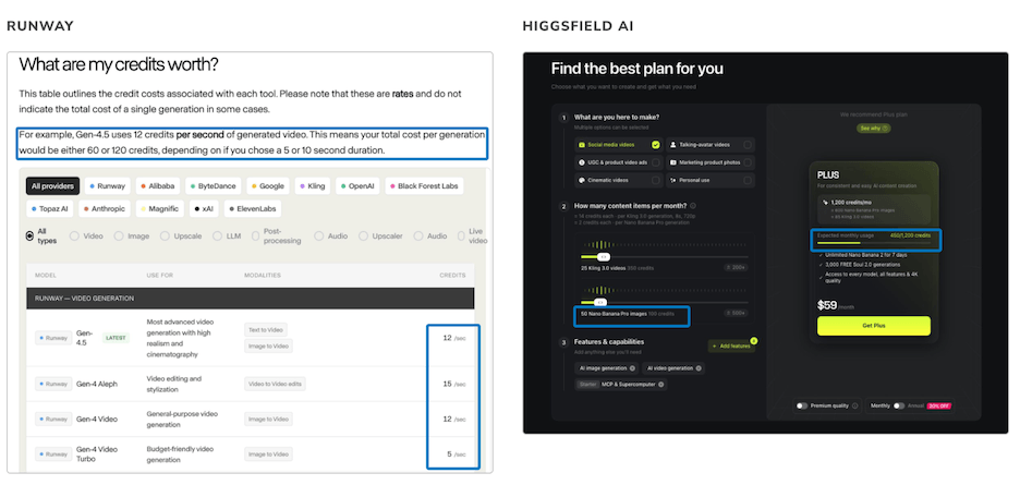
Runway and Higgsfield AI are the standard to beat here. Runway’s help center states plainly that “credits are the unit you spend,” then gives a worked example: Gen-4.5 video costs 12 credits per second.
Higgsfield pairs a published rate table with an interactive calculator. Users select what they want to make, how much of it, and the tool recommends a plan and shows exactly how many credits that usage profile will burn.
Compare that to Notion, whose actual definition of what counts as “one AI response” (every AI action, and notably, every time a user clicks “Try again”) is buried in help documentation. Or Canva, whose pricing table just says “10x more AI than Canva Free” while the real ranges (up to 200 uses of standard AI tools) only show up in the FAQ.
The biggest difference here is how much the product costs actually varies by action. The more AI usage spans multiple models with genuinely different costs, the more a real rate card earns its place. If AI is a single feature riding on a broader product, the math matters less, and abstracting it away is a reasonable call, not a lesser one.
3. Translate the abstract number into something a user can picture
Pattern: Converting the currency into a concrete, relatable unit of output.
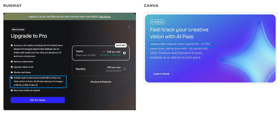
Runway doesn’t just publish a number, it translates it. Hover over any plan and the pricing page shows what that credit count actually produces, and at the point of purchase, Runway spells it out directly: “2,250 credits = 187s of Gen-4.5 video, or 112 images.” Higgsfield’s calculator does the same thing in reverse, converting a usage profile into a concrete output count, like 50 Nano Banana Pro images for 100 credits.
Canva takes a different, comparative route. Instead of stating a literal count, its AI Pass add-on is marketed as “40x more AI than Canva Pro.” No unit, no ceiling, just scale relative to a baseline the user already understands.
Either method beats leaving a customer to hold an unknown in their head. The instant someone can picture what a credit buys in their own workflow, the currency stops feeling like a threat.
4. Warn before the wall, not just after
Pattern: Alerting users before they hit the ceiling, not just after.
Canva and Claude both add a layer most products skip: a proactive heads-up before the limit hits, not just a message after it does.
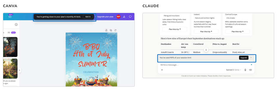
Canva tells users “You’re getting close to your plan’s monthly AI limit” ahead of time. Claude warns at “90% of your session limit,” expressed as a proportion rather than a countable unit. Both give the user a chance to pace themselves instead of hitting a wall with no notice, which is a meaningfully different emotional experience
5. Let people keep working when you can
Pattern: Letting the user keep working after the limit, just in a reduced or delayed form.
Midjourney, ChatGPT, and Claude all favor graceful degradation over a hard stop. Midjourney drops paid users into “Relax mode,” an unlimited but slower generation queue, once Fast GPU time runs out. ChatGPT and Claude frame a limit as one paused capability with an exact, automatic reset time (“resets at 11:00 PM,” “try again tomorrow after 4:37 PM”), not a balance a user has to actively manage.
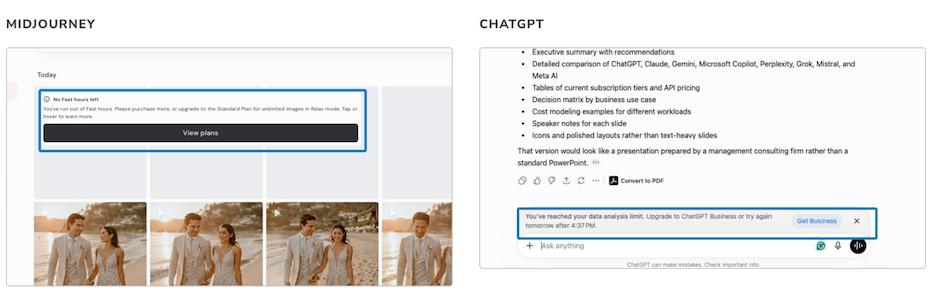
Compare that to Notion’s “You’ve run out of free Notion AI,” which gives no counter, no remaining-uses meter, and no reset date, just an upgrade CTA and a dead stop.
Graceful degradation isn’t free. It gives up a clean conversion trigger, and some users will happily settle into the reduced tier forever rather than upgrade. But it preserves goodwill in a way a hard stop never does, and for a feature people are still forming a habit around, goodwill can be more effective than a forced decision point.
6. Put the balance where people are already looking
Pattern: Surfacing a persistent, real-time balance where the user is already working.
Runway, Higgsfield AI, and Lovable all show a persistent balance somewhere the user is already working, not buried in account settings. Runway pins a running credit count to the top of every page. Higgsfield shows a color-coded meter in the account menu that shifts from green to red as the balance depletes, alongside a full itemized transaction log. Lovable places “1.80 free credits remaining today” directly above the chat input box.
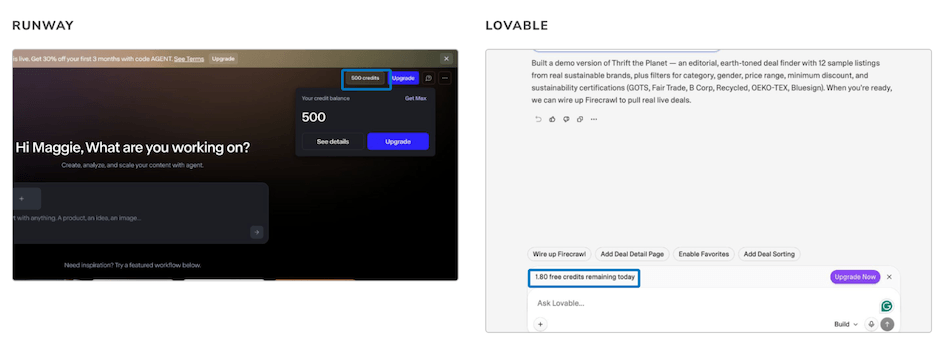
Midjourney’s visibility exists but is harder to find (remaining Fast Hours only show up if a user navigates into account settings looking for them), and Canva, Notion, and ChatGPT offer no live counter at all on their standard plans.
Persistent visibility can be helpful in both helping the user continue to use and find value in the product and pushing them to a conversion if they run out of credits.
7. Sell the upgrade on value, not urgency
Pattern: Pitching the upgrade on what the user gains, not on the fact that they’ve been blocked.
Canva, Claude, and Lovable all lead their upsell with what the user gains. Canva’s limit modal opens with “Upgrade to get more AI,” bundled with unrelated plan features rather than a bare credit top-up. Claude’s upgrade modal doesn’t even lead with price; it cross-sells other Claude capabilities under the pitch “here’s more you can do with Claude.” Lovable’s “Daily limit reached” modal lists exactly what a user unlocks: custom domains, credit rollover, on-demand top-ups.
Higgsfield AI is worth studying as the counterexample, precisely because it’s so aggressive. Running out of credits triggers an “Out of Credits” paywall stacked with a 61% off promo code and a live countdown. Complete the purchase, and a second offer appears immediately: an “86% off secret plus offer,” with its own countdown. Decline that, and a third offer appears with an extra 10% off and a claim that it’s “a price you will never see again.”
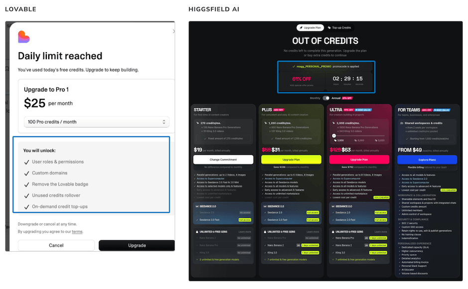
Urgency and discount tactics almost certainly convert harder in the immediate moment. They’re also the fastest way to make a product feel like a slot machine instead of a tool. Value-forward messaging converts less aggressively per interaction, but it protects the thing that’s harder to rebuild once it’s gone: the user’s trust that the product isn’t trying to manipulate them.
It’s four decisions, not one
Line these seven patterns up and they collapse into four underlying decisions: how clear to be about what a unit of usage actually costs, how visible the balance should be, whether to degrade gracefully or stop hard, and whether the upsell leans on value or urgency. Every product in this study has made a choice on each axis, whether they know it or not.
But the real confirmation from the patterns is that transparency is its own decision, made in conjunction with each of these four axes. It can be easy to skip making that decision at all, which was exactly the creative software company’s original problem. Its 80% number is the tell: when four in five users never approach a limit but still ration their own behavior, a lack of transparency became the clear culprit.
Getting your own usage limits right
If your SaaS product has an AI feature with a usage cap, cost constraint, or credit system bolted onto it, the question worth asking isn’t “what should we call it?” It’s “what does a user need to believe about this constraint to keep using the product without anxiety?” The seven patterns above are just the answer to that question, borrowed from the products already getting it right.
That’s the kind of gap The Good helps SaaS teams close: research-backed clarity on how real users interpret your pricing, your limits, and your product’s language, before you ship a change based on a guess.
If your team is wrestling with how to introduce, rename, or re-message an AI usage limit, let’s talk about running a competitive and user research study of your own.
About the Author
Maggie Paveza
Maggie Paveza is a Strategist at The Good. She has years of experience in UX research and Human-Computer Interaction, and acts as an expert on the team in the area of user research.