5-Minute Website Assessment Based on 16+ Years of Optimization Data
Revenue Opportunities Hidden in
warbyparker.com's User Experience
3 Free Data-Backed Website Optimization Opportunities
We analyzed your website's digital experience using our proprietary database of 2,000+ tests, 10,000+ research data points, proprietary frameworks, and initial research methods. Now we've identified significant revenue in potential revenue improvements.
Our Methodology
To create this analysis, we:
- Analyzed your website's user experience patterns
- Compared against 200+ similar Ecommerce companies in our database
- Applied our DXO Heuristics framework
- Generated real-time heatmap data
- Cross-referenced with test results from past clients facing similar challenges
How we calculate revenue projections
Revenue projections are calculated using public estimates of your annual revenue, the conversion contribution of each page type, historical lift percentages from our database of thousands of experiments, and a confidence multiplier based on evidence strength. Total projected impact is capped at a percent of annual revenue to ensure conservative estimates.
Where Your's Visitors Are Actually Looking
We used AI-powered attention prediction to understand how visitors perceive your page at first glance. Red areas indicate where visitors focus their attention most.

Hero section with large lifestyle video/image featuring person wearing glasses
The heatmap shows intense red and orange attention on the hero lifestyle imagery of a person wearing glasses, but the primary CTA buttons below receive minimal yellow/green attention, indicating users are captivated by the visual but not converting that attention into action
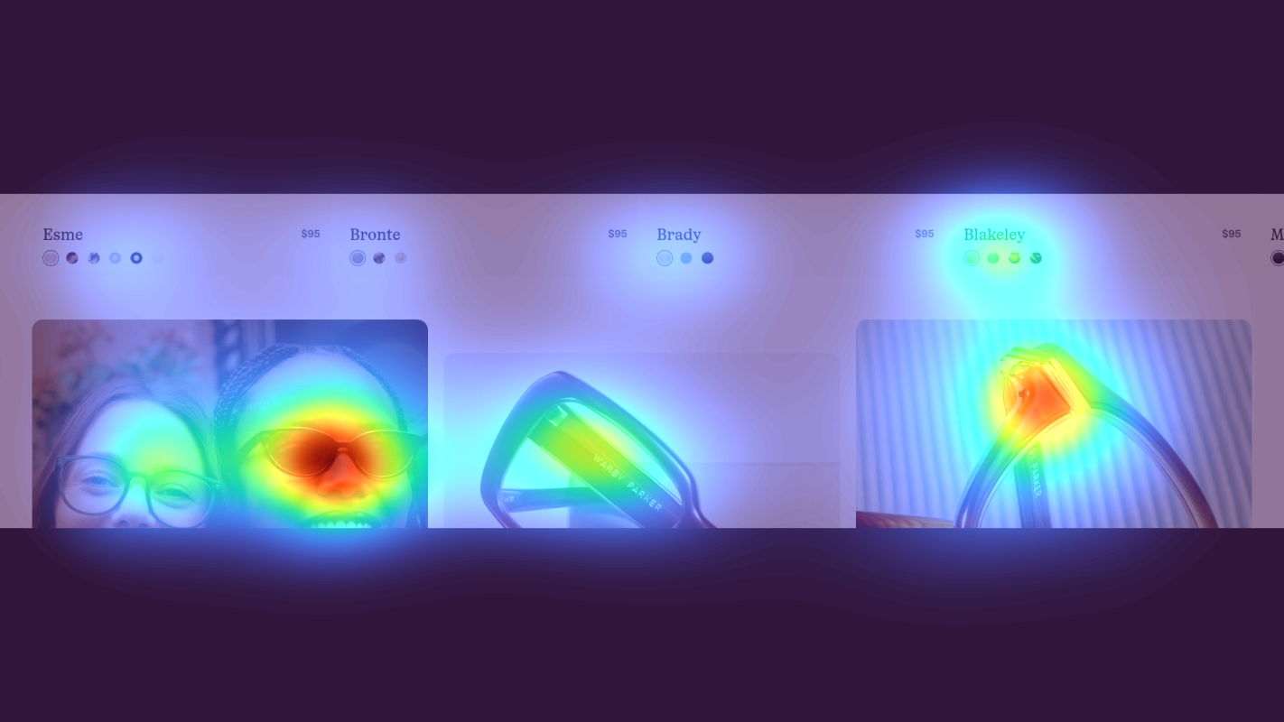
Product grid displaying eyeglass frames with model photos
The heatmap shows moderate yellow and green attention scattered across product images of eyeglass frames, but attention is diffuse with no clear focal point. The 'Try 5 pairs at home for free' messaging receives weak green/blue heat despite being a key differentiator and conversion driver.

Customer testimonial section with review quotes and star ratings near bottom of page
The heatmap shows solid blue with no color across the customer testimonial section featuring review quotes and a 4.8-star rating average, indicating this social proof is completely invisible to users who have dropped off before scrolling this far
3 Critical Issues Affecting Your's Conversions
Issue: Make Hero CTAs Impossible to Miss After Video Engagement
The hero lifestyle imagery captures intense user attention, but the primary CTAs below receive minimal engagement. Users are captivated by the visual storytelling of someone wearing glasses, yet that attention doesn't translate into clicks. The CTAs lack the visual prominence and directional cues needed to convert this peak engagement into action.
Issue: Elevate Home Try-On Value Prop to Reduce Choice Paralysis
The product grid shows scattered, fragmented attention across multiple frames with no clear focal point. Users scan many options without deep engagement, and the 'Try 5 pairs at home for free' differentiator—which should overcome purchase hesitation—receives minimal attention. This creates cognitive overload as users process numerous choices without understanding the risk-free trial benefit that makes the decision easier.
Issue: Surface Social Proof Where Purchase Decisions Happen
The customer testimonial section with a strong 4.8★ rating and detailed reviews about fit, quality, and the try-on experience receives zero attention because users never scroll this deep. This trust-building content could validate the purchase decision and overcome hesitation about buying glasses online, but it's positioned too late in the journey to impact the 85%+ of users who drop off earlier.
3 Specific Changes That Could Increase Revenue by a significant amount
Recommendation 1: Make Hero CTAs Impossible to Miss After Video Engagement
The hero lifestyle imagery captures intense user attention, but the primary CTAs below receive minimal engagement. Users are captivated by the visual storytelling of someone wearing glasses, yet that attention doesn't translate into clicks. The CTAs lack the visual prominence and directional cues needed to convert this peak engagement into action.
Increase CTA button size by 40% and use high-contrast warm colors (bright orange or teal) that pop against the hero imagery. Add a subtle directional element—like an animated arrow or the model's eyeline pointing downward—to guide attention from the hero image to the CTAs. Test overlaying the primary CTA ('Shop These Frames' or 'Find Your Perfect Pair') directly on the hero image in the lower third where attention is strongest, creating an immediate action path at the moment of peak visual engagement.
This addresses a critical conversion gap: users are engaged but not guided to act. In our tests, CTA visibility improvements like this average 8-10% lift when they capture attention that's already present. By positioning CTAs where attention naturally flows and making them visually unmissable, we convert passive viewing into active shopping behavior. The overlay approach has proven especially effective in fashion and eyewear, where lifestyle imagery drives desire but needs clear next steps.

Recommendation 2: Elevate Home Try-On Value Prop to Reduce Choice Paralysis
The product grid shows scattered, fragmented attention across multiple frames with no clear focal point. Users scan many options without deep engagement, and the 'Try 5 pairs at home for free' differentiator—which should overcome purchase hesitation—receives minimal attention. This creates cognitive overload as users process numerous choices without understanding the risk-free trial benefit that makes the decision easier.
Reduce the initial product grid to 3-4 hero frames to lower choice paralysis and focus attention. Create a bold, visually distinct banner directly above the grid with the message 'Try 5 Pairs at Home—100% Free' using an icon (house + checkmark) and contrasting background color to make it unmissable. Add individual 'Add to Try-On Kit' CTAs below each frame with a live counter ('Your Kit: 0/5 frames') to create clarity, urgency, and engagement with the unique service model.
This addresses two conversion barriers simultaneously: choice paralysis and invisible differentiation. In our tests, simplifying product grids and elevating unique selling points like home try-on programs average 9.5% lift. The Home Try-On is Warby Parker's core competitive advantage—it removes purchase risk and should be the hero message, not buried text. By making this benefit unmissable and adding interactive progress indicators, we transform browsing behavior into committed trial kit building.

Recommendation 3: Surface Social Proof Where Purchase Decisions Happen
The customer testimonial section with a strong 4.8★ rating and detailed reviews about fit, quality, and the try-on experience receives zero attention because users never scroll this deep. This trust-building content could validate the purchase decision and overcome hesitation about buying glasses online, but it's positioned too late in the journey to impact the 85%+ of users who drop off earlier.
Extract the 4.8★ rating into a compact trust badge and position it strategically at three decision points: (1) directly beside the hero CTA as a small badge ('★4.8 from 15,000+ reviews'), (2) as a hover overlay on product grid frames showing frame-specific ratings, and (3) create a condensed 3-review carousel in the mid-page area with the headline 'Why 15,000+ Customers Love Their Warby Parker Glasses' featuring testimonials specifically about the try-on experience, fit accuracy, and quality. This surfaces social proof at multiple conversion moments rather than burying it at page bottom.
Trust signals only work if users see them. In our tests, repositioning social proof to high-attention areas averages 4.8% lift. The 4.8★ rating and specific testimonials about the try-on program are powerful conversion drivers—they validate the unique service model and reduce perceived risk of buying glasses online. By surfacing this proof at the hero CTA (initial interest), product grid (selection), and mid-page (deeper consideration), we address purchase hesitation at each stage of the decision journey instead of after users have already left.

How You Would Work With The Good
Our approach lets your team validate our methods before a larger digital experience investment.
Discovery & Baseline
Deep-dive into your analytics and user behavior
Goal Setting
Define success metrics and KPIs
Sprint Planning
Prioritize tests by impact and effort
A/B Testing
Execute, measure, and iterate
Ready to Capture Your Revenue Potential?
This is an initial AI-driven assessment to illustrate revenue potential. The next step is a comprehensive optimization program built for you. Every optimization program starts with a digital experience audit. During the audit our team of experts:
- Conducts in-depth user research and analytics review
- Performs heuristic evaluation of your complete funnel
- Identifies the biggest conversion barriers and opportunities in your digital experience
- Creates a prioritized roadmap based on impact and effort
Why You Should Trust This Analysis
16+ Years Optimization Work
We've optimized hundreds of millions in revenue through our optimization programs.
Fortune 500 Clients
Worked with leading companies including Nike, Adobe, and Xerox.
Data-Driven Methodology
Our analysis is based on thousands of successful A/B tests across industries.