5-Minute Website Assessment Based on 16+ Years of Optimization Data
Revenue Opportunities Hidden in
Old Navy's User Experience
3 Free Data-Backed Website Optimization Opportunities
We analyzed Old Navy's digital experience using our proprietary database of 2,000+ tests, 10,000+ research data points, proprietary frameworks, and initial research methods. Now we've identified $216.0M in potential revenue improvements.
Our Methodology

To create this analysis, we:
- Analyzed your website's user experience patterns
- Compared against 200+ similar Retail Apparel companies in our database
- Applied our DXO Heuristics framework
- Generated real-time heatmap data
- Cross-referenced with test results from past clients facing similar challenges
How we calculate revenue projections
Revenue projections are calculated using public estimates of your annual revenue, the conversion contribution of each page type, historical lift percentages from our database of thousands of experiments, and a confidence multiplier based on evidence strength. Total projected impact is capped at a percent of annual revenue to ensure conservative estimates.
Where Old Navy's Visitors Are Actually Looking
We used AI-powered attention prediction to understand how visitors perceive your page at first glance. Red areas indicate where visitors focus their attention most.
Top promotional banner and navigation menu
The shipping promotion banner and navigation menu receive disproportionately high attention (bright red), potentially distracting from main shopping content

Product category grid with pricing
Price points receive minimal attention (light yellow/green) despite being key decision factors
Product recommendations section
Personalized recommendations section shows very low engagement (mostly blue/no color), indicating users rarely scroll this far
3 Critical Issues Affecting Old Navy's Conversions
Issue: Simplify Header Navigation to Focus Attention
The header area (showing bright red attention) contains multiple competing elements - shipping promo, rewards messaging, and navigation - causing attention dispersion from primary shopping paths
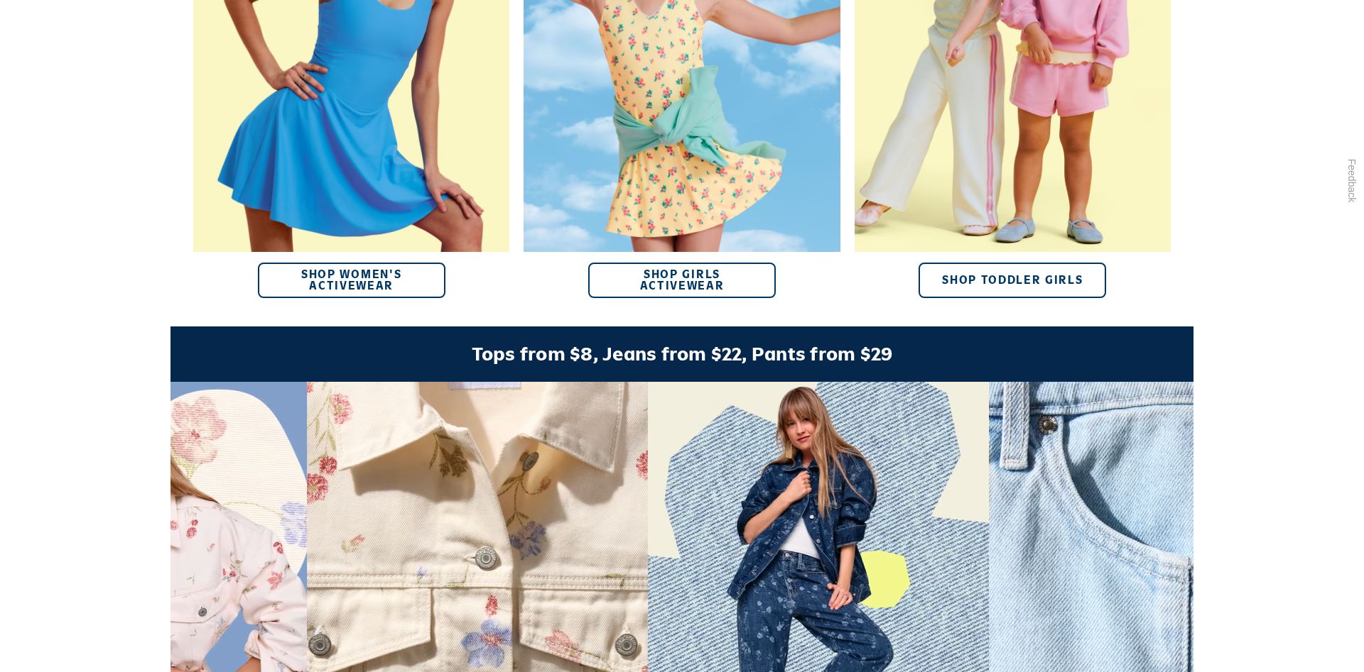
Issue: Enhance Price Point Visibility in Category Grid
Price points in the product category grid receive minimal attention (light yellow/green in heatmap) despite being key conversion drivers
Issue: Elevate Personalized Recommendations Section
The 'WE PICKED THESE JUST FOR YOU' section shows very low engagement (blue/no color in heatmap), with users rarely reaching this valuable personalized content
3 Specific Changes That Could Increase Revenue by $216.0M
Recommendation 1: Simplify Header Navigation to Focus Attention
The header area (showing bright red attention) contains multiple competing elements - shipping promo, rewards messaging, and navigation - causing attention dispersion from primary shopping paths
Consolidate the promotional messaging into a single rotating banner and streamline the navigation menu structure. Move 'Sign In/Join' to top right corner and combine shipping/rewards messaging into one clear value proposition.
Reducing navigation complexity will help direct attention to primary shopping content. Similar tests have shown streamlined headers improve click-through rates to product pages.
Recommendation 2: Enhance Price Point Visibility in Category Grid
Price points in the product category grid receive minimal attention (light yellow/green in heatmap) despite being key conversion drivers
Redesign price presentation with larger typography, high-contrast treatment, and 'Compare at' pricing. Group pricing info 'Tops from $8, Jeans from $22, Pants from $29' into visually distinct value proposition blocks.
Making competitive pricing more prominent will help communicate value and drive purchase intent
Recommendation 3: Elevate Personalized Recommendations Section
The 'WE PICKED THESE JUST FOR YOU' section shows very low engagement (blue/no color in heatmap), with users rarely reaching this valuable personalized content
Reposition personalized recommendations higher on page, enhance with lifestyle imagery, and add an engaging headline that emphasizes personal curation
Moving personalized content higher will increase discovery and engagement with relevant products
Combined Impact: Here's What Old Navy Could Achieve
A conservative projection based on our methodology
Breakdown by Change
- Simplify Header Navigation to Focus Attention $6.4M/mo
- Enhance Price Point Visibility in Category Grid $5.2M/mo
- Elevate Personalized Recommendations Section $6.4M/mo
How Old Navy Would Work With The Good
Our approach lets your team validate our methods before a larger digital experience investment.
Discovery & Baseline
Deep-dive into your analytics and user behavior
Goal Setting
Define success metrics and KPIs
Sprint Planning
Prioritize tests by impact and effort
A/B Testing
Execute, measure, and iterate
Ready to Capture That $216.0M in Revenue?
This is an initial AI-driven assessment to illustrate revenue potential. The next step is a comprehensive optimization program built for you. Every optimization program starts with a digital experience audit. During the audit our team of experts:
- Conducts in-depth user research and analytics review
- Performs heuristic evaluation of your complete funnel
- Identifies the biggest conversion barriers and opportunities in your digital experience
- Creates a prioritized roadmap based on impact and effort
Why Old Navy Should Trust This Analysis
16+ Years Optimization Work
We've optimized hundreds of millions in revenue through our optimization programs.
Fortune 500 Clients
Worked with leading companies including Nike, Adobe, and Xerox.
Data-Driven Methodology
Our analysis is based on thousands of successful A/B tests across industries.