5-Minute Website Assessment Based on 16+ Years of Optimization Data
Revenue Opportunities Hidden in
Wip's User Experience
3 Free Data-Backed Website Optimization Opportunities
We analyzed Wip's digital experience using our proprietary database of 2,000+ tests, 10,000+ research data points, proprietary frameworks, and initial research methods. Now we've identified $54.0K in potential revenue improvements.
Our Methodology

To create this analysis, we:
- Analyzed your website's user experience patterns
- Compared against 200+ similar Consumer Packaged Goods (CPG) / Beverages companies in our database
- Applied our DXO Heuristics framework
- Generated real-time heatmap data
- Cross-referenced with test results from past clients facing similar challenges
How we calculate revenue projections
Revenue projections are calculated using public estimates of your annual revenue, the conversion contribution of each page type, historical lift percentages from our database of thousands of experiments, and a confidence multiplier based on evidence strength. Total projected impact is capped at a percent of annual revenue to ensure conservative estimates.
Where Wip's Visitors Are Actually Looking
We used AI-powered attention prediction to understand how visitors perceive your page at first glance. Red areas indicate where visitors focus their attention most.
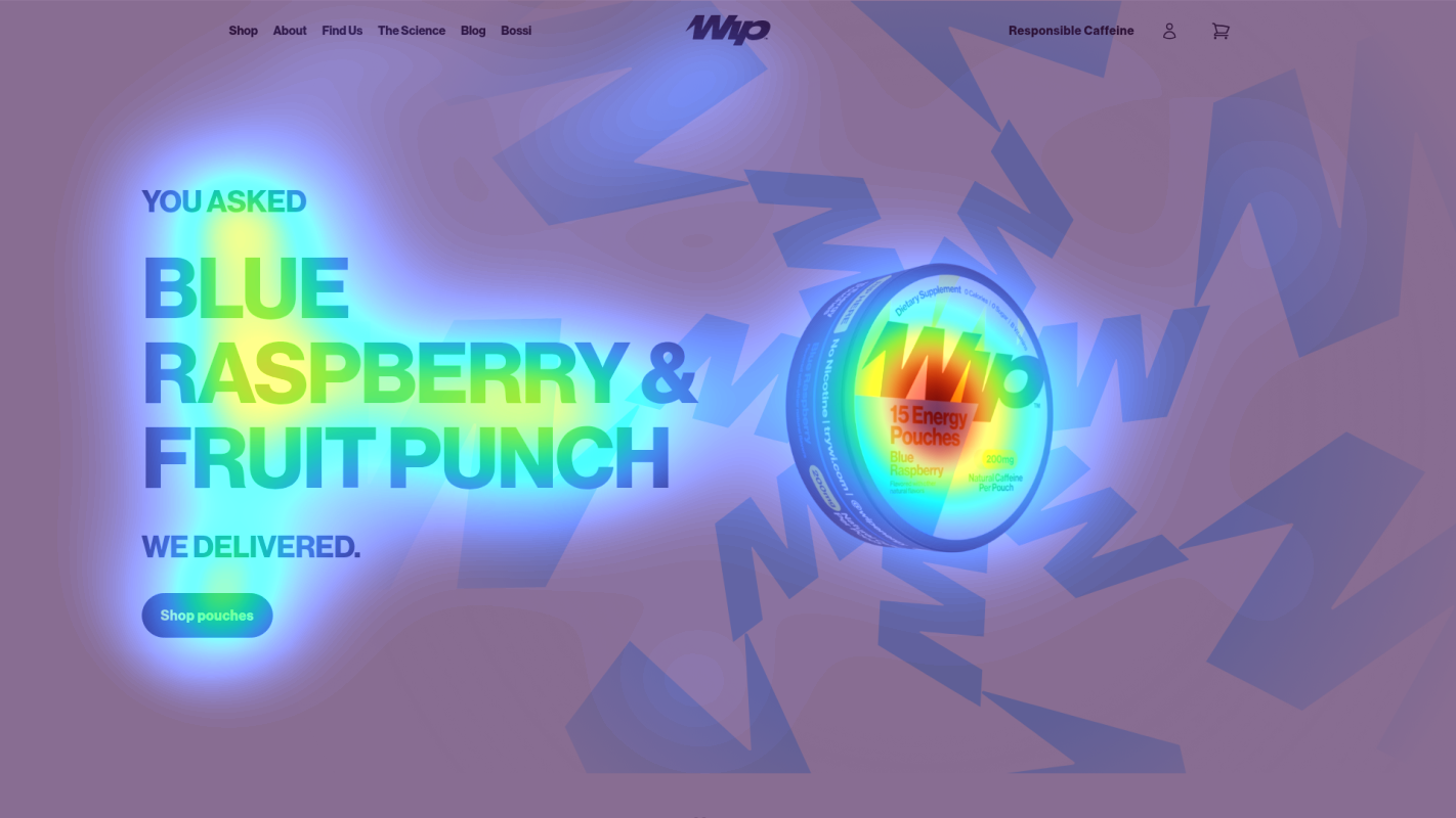
Main headline
The product name receives moderate attention but fails to effectively communicate value proposition
Navigation menu
Navigation elements drawing disproportionate attention away from main conversion path
Product information section
Product details receiving scattered, unfocused attention patterns
3 Critical Issues Affecting Wip's Conversions
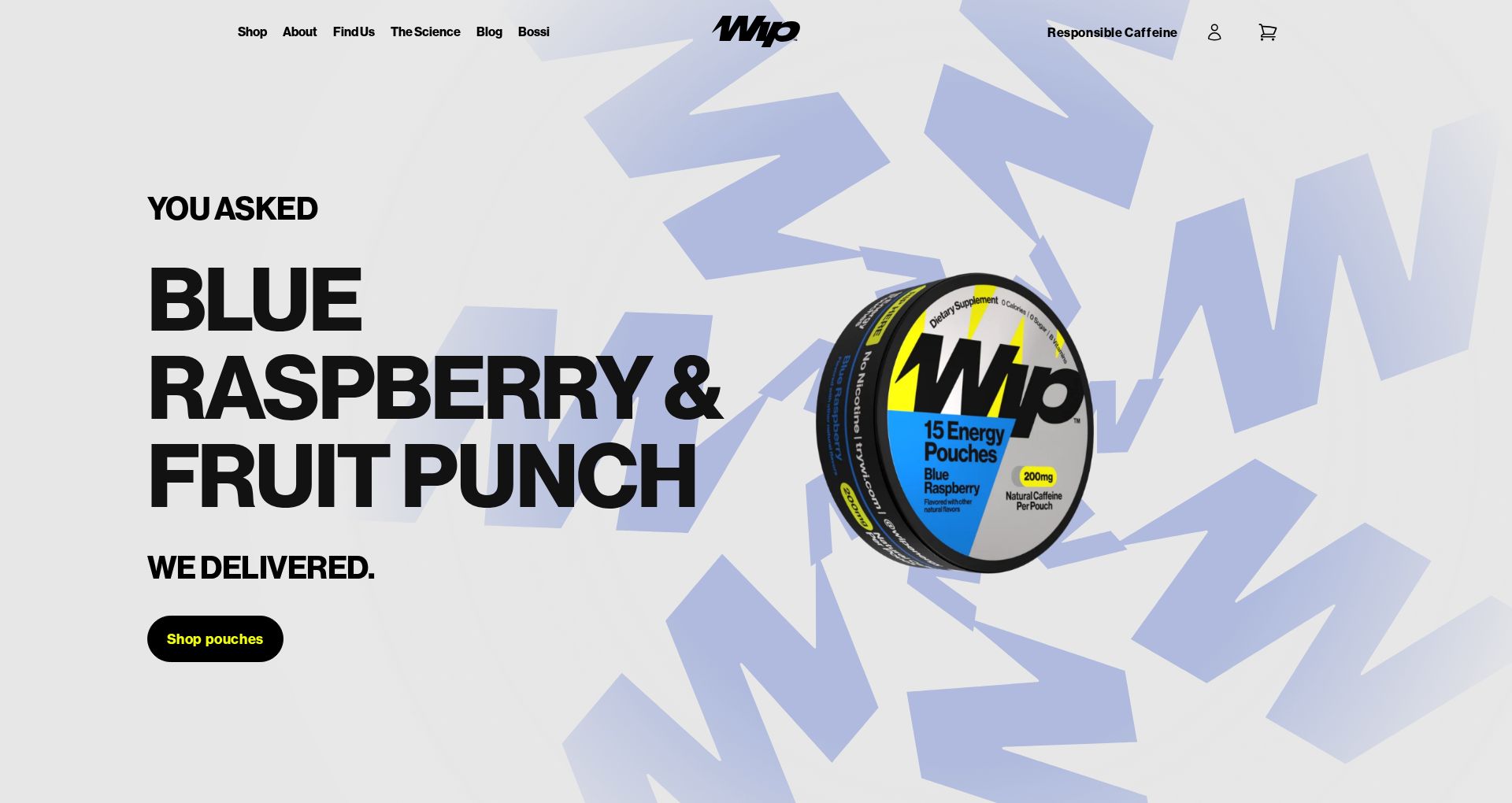
Issue: Strengthen Hero Section Value Proposition
The hero section's 'BLUE RASPBERRY & FRUIT PUNCH' headline focuses on flavors rather than benefits, with the heatmap showing moderate but unfocused attention. The 'Shop pouches' CTA lacks prominence and clear value communication.
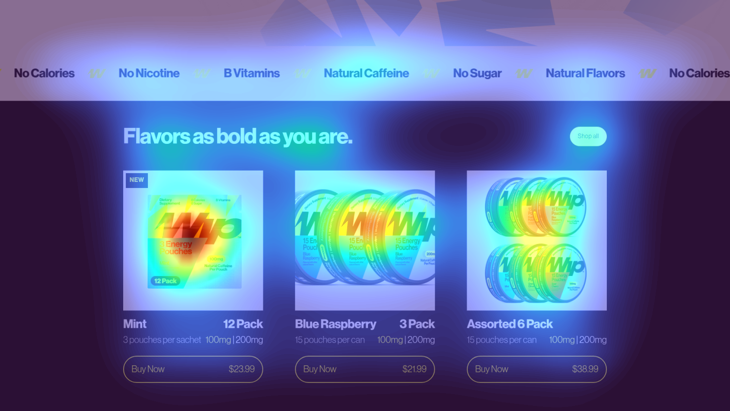
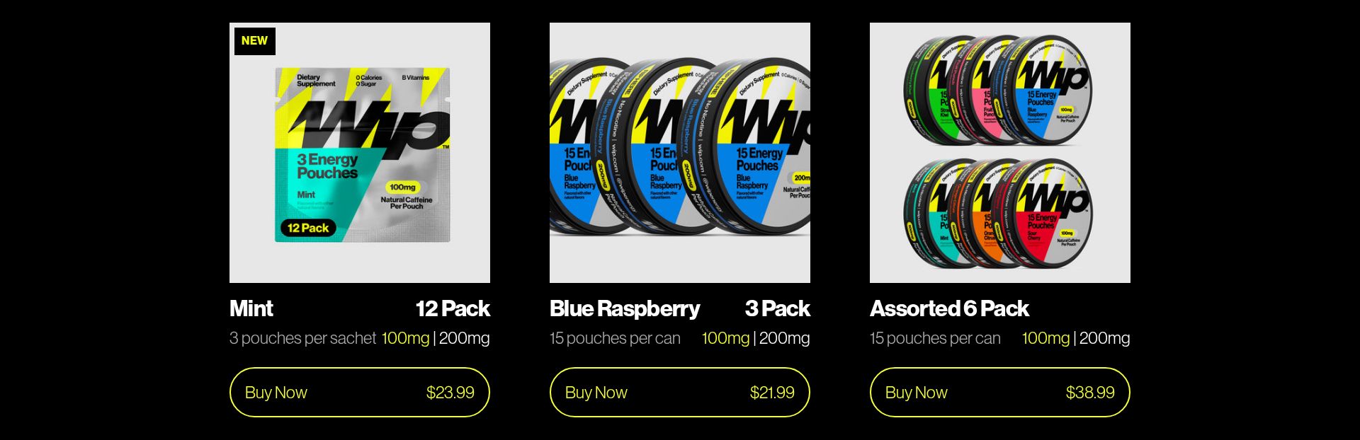
Issue: Enhance Product Price Comparison Clarity
Product pricing section shows scattered attention patterns across multiple price points ($23.99, $21.99, $38.99) without clear value differentiation, causing decision paralysis.
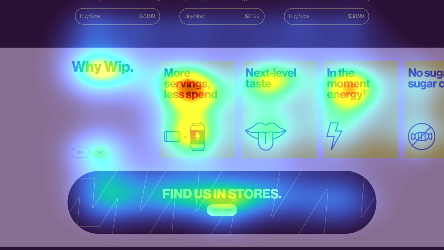
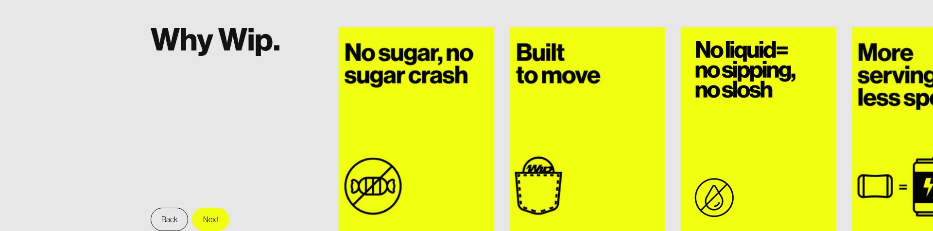
Issue: Optimize 'Why Wip' Section Navigation
The 'Why Wip' section shows unfocused attention patterns with simple 'Back/Next' navigation, failing to effectively guide users through key product benefits.
3 Specific Changes That Could Increase Revenue by $54.0K
Recommendation 1: Strengthen Hero Section Value Proposition
The hero section's 'BLUE RASPBERRY & FRUIT PUNCH' headline focuses on flavors rather than benefits, with the heatmap showing moderate but unfocused attention. The 'Shop pouches' CTA lacks prominence and clear value communication.
Restructure the hero section to lead with a benefit-driven headline and more prominent CTA. Change to: 'ENERGIZE YOUR DAY | Now in Blue Raspberry & Fruit Punch' with a high-contrast 'SHOP NOW - GET ENERGIZED' CTA button.
Leading with benefits rather than flavors creates stronger emotional connection and purchase intent. A clearer value proposition typically increases click-through rates to product pages.
Recommendation 2: Enhance Product Price Comparison Clarity
Product pricing section shows scattered attention patterns across multiple price points ($23.99, $21.99, $38.99) without clear value differentiation, causing decision paralysis.
Add clear comparison table above product options showing 'Best Value', 'Most Popular', and 'Starter Pack' labels. Include per-pouch price calculation and savings percentage for larger packs.
Clear value comparison reduces decision friction and typically increases conversion on higher-value packages.
Recommendation 3: Optimize 'Why Wip' Section Navigation
The 'Why Wip' section shows unfocused attention patterns with simple 'Back/Next' navigation, failing to effectively guide users through key product benefits.
Replace basic Back/Next navigation with visual benefit cards showing key value propositions. Add progress indicators and benefit-focused headlines for each slide.
Clearer benefit communication and improved navigation can increase product understanding and purchase intent.
Combined Impact: Here's What Wip Could Achieve
A conservative projection based on our methodology
Breakdown by Change
- Strengthen Hero Section Value Proposition $1.7K/mo
- Enhance Product Price Comparison Clarity $1.4K/mo
- Optimize 'Why Wip' Section Navigation $1.4K/mo
How Wip Would Work With The Good
Our approach lets your team validate our methods before a larger digital experience investment.
Discovery & Baseline
Deep-dive into your analytics and user behavior
Goal Setting
Define success metrics and KPIs
Sprint Planning
Prioritize tests by impact and effort
A/B Testing
Execute, measure, and iterate
Ready to Capture That $54.0K in Revenue?
This is an initial AI-driven assessment to illustrate revenue potential. The next step is a comprehensive optimization program built for you. Every optimization program starts with a digital experience audit. During the audit our team of experts:
- Conducts in-depth user research and analytics review
- Performs heuristic evaluation of your complete funnel
- Identifies the biggest conversion barriers and opportunities in your digital experience
- Creates a prioritized roadmap based on impact and effort
Why Wip Should Trust This Analysis
16+ Years Optimization Work
We've optimized hundreds of millions in revenue through our optimization programs.
Fortune 500 Clients
Worked with leading companies including Nike, Adobe, and Xerox.
Data-Driven Methodology
Our analysis is based on thousands of successful A/B tests across industries.