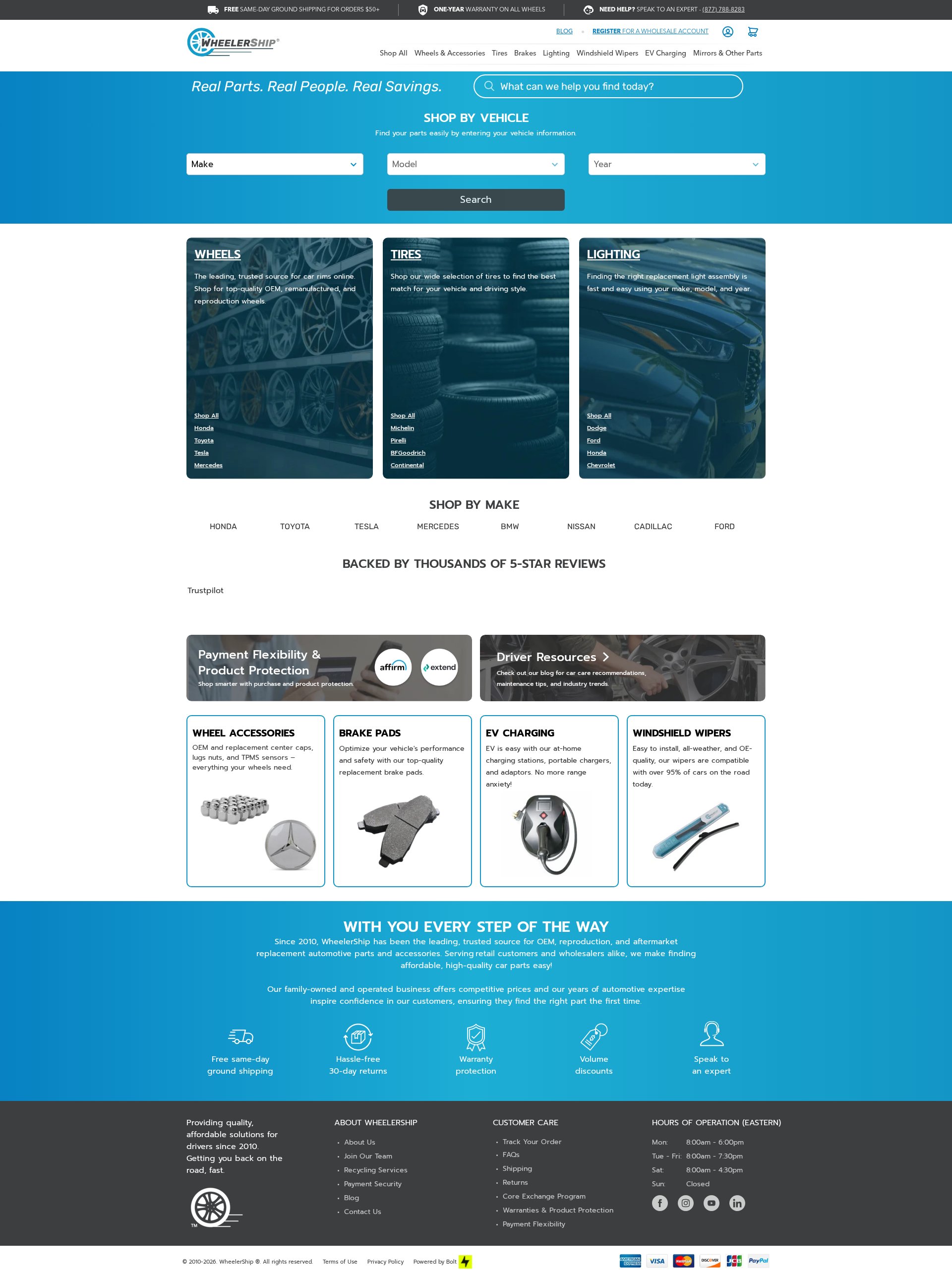
5-Minute Website Assessment Based on 16+ Years of Optimization Data
Revenue Opportunities Hidden in
WheelerShip's User Experience
3 Free Data-Backed Website Optimization Opportunities
We analyzed WheelerShip's digital experience using our proprietary database of 2,000+ tests, 10,000+ research data points, proprietary frameworks, and initial research methods. Now we've identified $432.0K in potential revenue improvements.
Our Methodology
To create this analysis, we:
- Analyzed your website's user experience patterns
- Compared against 200+ similar Automotive E-commerce companies in our database
- Applied our DXO Heuristics framework
- Generated real-time heatmap data
- Cross-referenced with test results from past clients facing similar challenges
How we calculate revenue projections
Revenue projections are calculated using public estimates of your annual revenue, the conversion contribution of each page type, historical lift percentages from our database of thousands of experiments, and a confidence multiplier based on evidence strength. Total projected impact is capped at a percent of annual revenue to ensure conservative estimates.
Where WheelerShip's Visitors Are Actually Looking
We used AI-powered attention prediction to understand how visitors perceive your page at first glance. Red areas indicate where visitors focus their attention most.
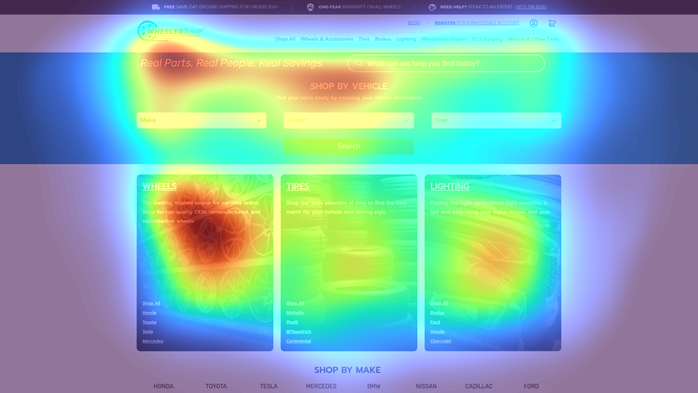
Vehicle Selection Tool
The vehicle selector tool receives moderate attention but lacks clear visual hierarchy and directional cues
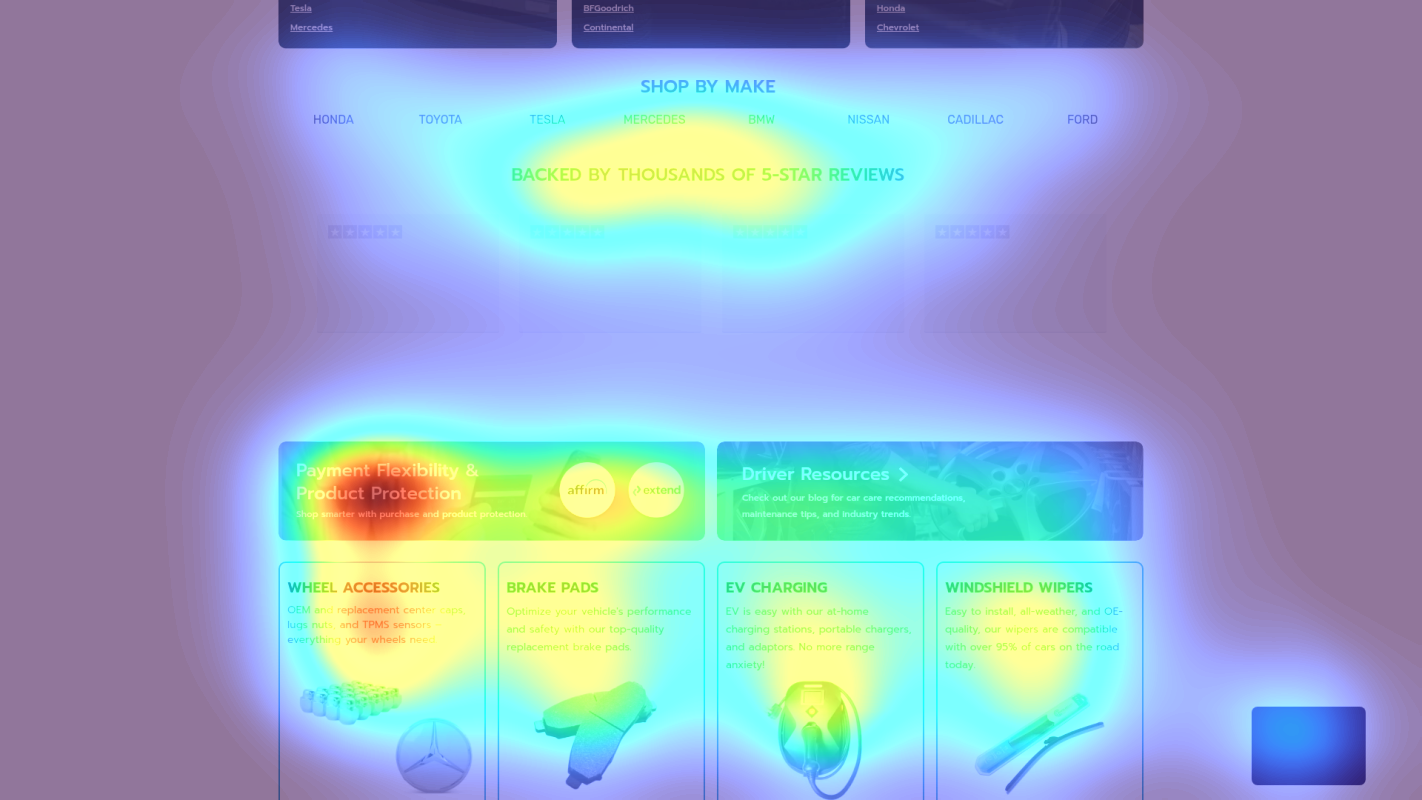
Trust Signals Section
Trust indicators and value propositions receive minimal attention in the cold zones
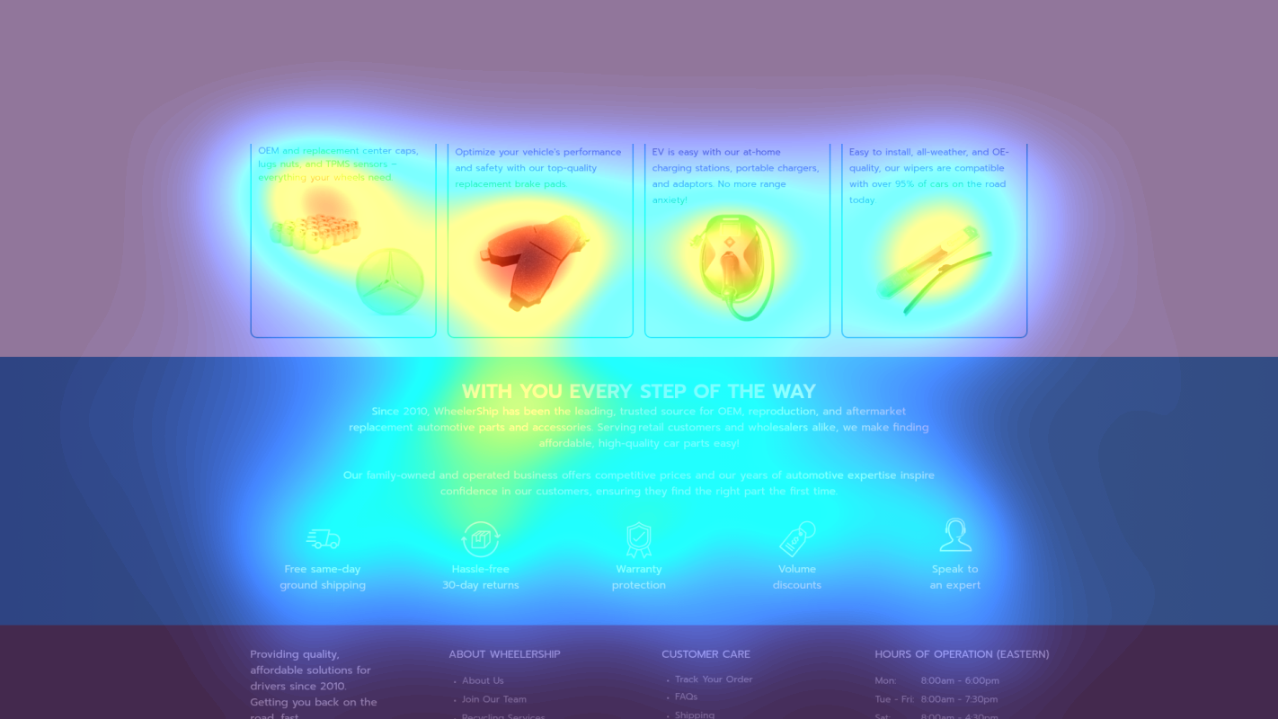
Product Navigation
Secondary navigation options receive scattered attention, creating decision paralysis
3 Critical Issues Affecting WheelerShip's Conversions
Issue: Elevate Vehicle Search Tool to Hero Section
Vehicle selector tool receives moderate attention but lacks visual hierarchy, appearing below multiple banners (200-400px from top), reducing its effectiveness as the primary conversion path
Issue: Consolidate Top Banner Messages
Multiple competing messages in top banner (0-150px) create cognitive load and receive scattered attention according to heatmap
Issue: Enhance Social Proof Visibility
Trustpilot reviews section (800-900px from top) receives minimal attention and lacks specific review content
3 Specific Changes That Could Increase Revenue by $432.0K
Recommendation 1: Elevate Vehicle Search Tool to Hero Section
Vehicle selector tool receives moderate attention but lacks visual hierarchy, appearing below multiple banners (200-400px from top), reducing its effectiveness as the primary conversion path
Redesign the vehicle search tool as a prominent hero section with larger input fields and visual enhancements: 1) Increase size by 30%, 2) Add background contrast, 3) Include vehicle icons for make/model selection, 4) Add a prominent 'Find My Parts' CTA button in bright accent color
Making the vehicle selector the dominant visual element will streamline the user's path to finding compatible parts, directly addressing the scattered attention pattern shown in the heatmap

Recommendation 2: Consolidate Top Banner Messages
Multiple competing messages in top banner (0-150px) create cognitive load and receive scattered attention according to heatmap
Consolidate all value propositions into a single, organized banner strip with icons: Free Shipping ($50+) | 1-Year Warranty | Expert Support (877-788-8283) | Wholesale Available
Simplified messaging hierarchy will reduce cognitive load and increase focus on key value propositions, addressing the attention dispersion shown in heatmap

Recommendation 3: Enhance Social Proof Visibility
Trustpilot reviews section (800-900px from top) receives minimal attention and lacks specific review content
Create a prominent trust-building section below the vehicle selector featuring: 1) Large Trustpilot score, 2) Review count, 3) Three specific customer testimonials with photos, 4) Key statistics (e.g., '50,000+ wheels shipped')
Enhanced social proof visibility will build immediate customer confidence and address the cold zones identified in the heatmap analysis

Combined Impact: Here's What WheelerShip Could Achieve
A conservative projection based on our methodology
Breakdown by Change
- Elevate Vehicle Search Tool to Hero Section $12.8K/mo
- Consolidate Top Banner Messages $10.5K/mo
- Enhance Social Proof Visibility $12.8K/mo
How WheelerShip Would Work With The Good
Our approach lets your team validate our methods before a larger digital experience investment.
Discovery & Baseline
Deep-dive into your analytics and user behavior
Goal Setting
Define success metrics and KPIs
Sprint Planning
Prioritize tests by impact and effort
A/B Testing
Execute, measure, and iterate
Ready to Capture That $432.0K in Revenue?
This is an initial AI-driven assessment to illustrate revenue potential. The next step is a comprehensive optimization program built for you. Every optimization program starts with a digital experience audit. During the audit our team of experts:
- Conducts in-depth user research and analytics review
- Performs heuristic evaluation of your complete funnel
- Identifies the biggest conversion barriers and opportunities in your digital experience
- Creates a prioritized roadmap based on impact and effort
Why WheelerShip Should Trust This Analysis
16+ Years Optimization Work
We've optimized hundreds of millions in revenue through our optimization programs.
Fortune 500 Clients
Worked with leading companies including Nike, Adobe, and Xerox.
Data-Driven Methodology
Our analysis is based on thousands of successful A/B tests across industries.